On China’s Bleeding Edge: Web Design Trends 2015
There are many parallels between the volatility of the web industry and China’s breakneck rate of change: For one thing, it’s hard to keep a finger on the pulse of either. But add the two together and you get China’s tech scene, a virtual landscape in such constant flux that our only hope of keeping pace is to look as far into the future as we’re able, try to discern what’s coming, and brace for impact.
Make no mistake: The Chinese web is in some ways a different place than the web you’re used to — particularly in two or three crucial respects — and user expectations are not quite the same as they are in the West. In this article, I’ll examine the things all web professionals should know before swan-diving into the Chinese market, including how mobile-only social platforms have become the revolutionary new frontier of Chinese web design, and who’s designing beautiful websites in China today.
A New Paradigm
Looking to be pointed in the right direction, I stopped in to see Saber Zou, who spends his days designing that frontier. Saber is head of creative at Logic Design, the Beijing-based multi-disciplinary digital studio that concepted AnimalsAsia’s website Exploring Moonbear, one of the most visually ambitious desktop websites in the country, and one of only a tiny handful of Chinese-made websites ever to receive Awwwards’ coveted recognition as Site of the Day.
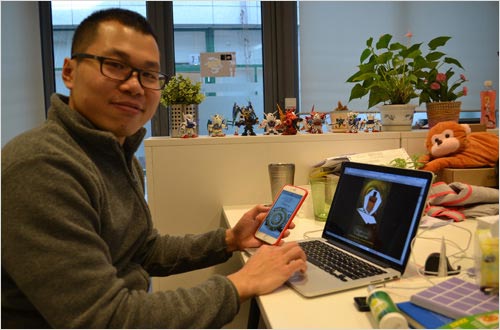
“So, how do you feel China’s coming along in terms of supporting responsive design?”
Saber shrugs at me, like I asked the wrong question. “There aren’t a lot of responsive websites in China, as most clients prefer separate websites for different devices. In terms of responsive, we don’t really relate to the web in that way; we don’t think of the desktop website as a mothership, or even as a scaled-up version of a more streamlined mobile website. Actually, a significant number of Chinese companies are bypassing the desktop experience entirely.”
I don’t know why it took so long for all of the evidence staring me in the face to crack my Western perspective, but Saber’s words finally did it. Total paradigm shift: Here we are, patting ourselves on the back for coming around to a solid mobile-first approach, but in China, mobile is not viewed as some inevitable and expansive outgrowth of desktop browsing that has taken on a life of its own. They’re separate, they’ve always been separate, and today desktops are increasingly the tertiary, potentially optional platform.
Mobile First? Puh-leez. China Is Already Going Mobile Only
You hear it all the time, and you’ve been hearing it for years: China’s mobile usage numbers are out the roof. As far back as 2010, Nielsen reported that “mobile consumers in China have surpassed their American counterparts when it comes to using the devices to access the Internet.” And the market’s only getting bigger. A July 2014 article from The Next Web adds to the throng of media trumpeting that truth:
"Chinese users accessing the internet via mobile grew to 83.4 percent as of June 2014, for the first time surpassing the percentage of users who access the internet via PCs (80.9 percent)."
“But everyone in the Western world has a smartphone,” you think. You’ve got one, yeah? You probably don’t know anyone who doesn’t, so it’s hard to imagine an increased level of saturation or to imagine that the difference between China usage and non-China usage could be significant. There is, though, and I would argue that the difference is evident not in the number of mobile users, but rather in the level of mobile-centrism. A few statistics out there support this theory, but they don’t encapsulate the story the way that anecdotal evidence does, so let me offer some, based on my own experience:
- In China, your mobile phone number is nearly as important as a social security number in the United States. If you lose access to your mobile number, you may also irrevocably lose access to e-commerce accounts, digital wallets, social network accounts (which are tied directly to the mobile number) and much more. Because of this, people take great care to go through the process of officially associating their number with their government-issued state ID to prevent identity theft and to ensure easy retrieval in case of SIM loss or damage.
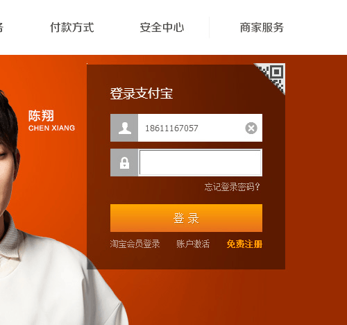
- Most websites in China use a mobile phone number instead of an email address as the primary identifier for logging in and as the primary password-recovery tool — particularly relevant since email doesn’t have nearly the saturation in China that it does in the West.
- For certain Chinese digital wallets that let users scan a QR code to instantly pay for anything from a city cab ride to a fancy dinner to a pay-per-view movie, payment is a single step. They don’t even require password input or verification for purchases under 300 Chinese yuan (CNY) or so (around $50 USD). That being the case, a stolen phone is just as bad as a stolen pocketbook.
- World Bank data indicates that in 2011, China was rocking 69 motor vehicles (cars, trucks and buses) per 1000 people. Compare that with the US’ 768 per 1000 in the same year and you can imagine how many non-car-owning Chinese ride public transportation to work every day — which means long periods of staring at a mobile screen, trying to ignore the lady picking her earwax across from you. ```
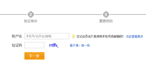
With a culture so completely mobile-focused, it’s no wonder that many companies feel safe turning their back on the desktop, creating experiences that are solely intended to be used on a phone and that have no desktop-friendly equivalent. Those experiences have a name — “light apps” — and they’re quickly becoming one of the most popular ways to interact with consumers.
Light Apps
Websites are so 2010. In 2015, Chinese companies are building light apps, or qing ying yong (轻应用). Light apps are one-off, zero-download, hyper-targeted mini-sites that are typically built (and often animated) with HTML5. Oh sure, they do have a dedicated URL and they’ll load in a desktop browser if you absolutely insist, but they’ll probably look awful on a desktop screen. In some cases, they don’t even function at all after the page loads, given that some of them require swipes to navigate.
Light apps are designed for fruit-fly attention spans. They’re often single-page, single-message and intended to be single-use. In other words, users would open a light app once, flip through it, ideally pass it on to friends via mobile sharing, and then never look at it again.
Light Apps In The Wild
Live App is a Chinese company that specializes in light app development, and the broad scope of its portfolio is a testament to the light app’s many applications.
Below is a small sampling of Chinese light apps. There are two ways to load these on your phone: the Chinese way, which is to use your mobile device to scan the QR code that auto-loads the website, or the hackneyed non-Chinese way, which is to follow a link to the URL on your phone. If you try to access these in a desktop browser, they might load, but they are unlikely to work well or at all. I encourage you to try to load the direct URLs in any desktop browser to get a feel for how completely development of light apps ignores the desktop.
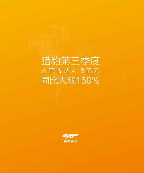
Brands might create a light app to share an annual financial report, like this one from Cheetah Mobile:
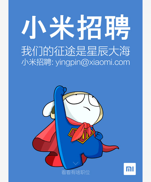
This one, from emergent mobile manufacturing powerhouse Xiaomi, is for recruitment:
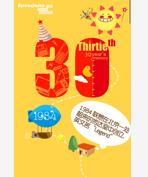
Some light apps celebrate corporate milestones, like this one for Lenovo’s 30th anniversary:
Some whip up excitement in advance of a movie premier, like this trivia game that tests users’ knowledge of the films of Chinese director Jiang Wen:

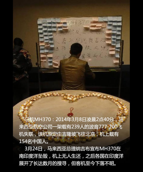
Yet others explain specific news stories, like this look into 2014’s dark year in aviation by Chinese news website NetEase:
Want More Chinese Light Apps?
Bear in mind that because light apps are usually intended for short-term use, the links to these websites will go down in short order. Happily, more are always going up. See more examples of light apps on LiveApp’s portfolio page or on Brand Social’s frequently updated list (best loaded on a phone), or check out the mobile articles on Digitaling, which often feature demos of light apps.
Call To Action Is “Share,” Not “Buy”
Getting to the end of a light app sequence, users are most often urged only to share — direct or obvious links to monetization are rare. But unlike most Western mobile sharing functions, which typically give users the choice to share on any one of their preferred social platforms, Chinese light apps only bother pressing users to share on a single network: one that’s frequented by over 83% of China’s mobile Internet community but one that is largely undiscussed in the West.
WeChat: Driving The Light App Revolution With Almost 500 Million Monthly Active Users
China has “527 million mobile internet users, according to CNNIC, and 438 million of them are on WeChat” (thanks, Tech in Asia). That’s almost double the number of monthly active users on Twitter.
While you may be used to asking your non-Chinese contacts whether they prefer to be reached by email, Google+, Twitter, Facebook or SMS, historically speaking, social network fragmentation isn’t a Chinese conundrum, and “What’s the best way to reach you?” isn’t a Chinese question. That’s not to say the country has only one social network, but regardless of whatever other platforms are out there, there has typically always been a centralizing, nearly universal umbrella network that dominates the rest at any given time, scooping up the lion’s share of national users.
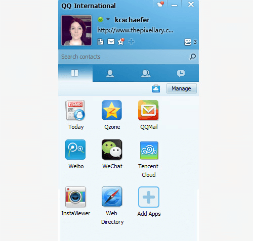
Back in the day, that network was Tencent’s QQ. Then, it was Sina Weibo (China’s answer to Twitter).
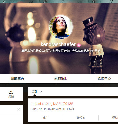
“But Weibo,” says Saber, “has already become a place where people go to read the news and passively consume information. It’s not really as social as it once was.”
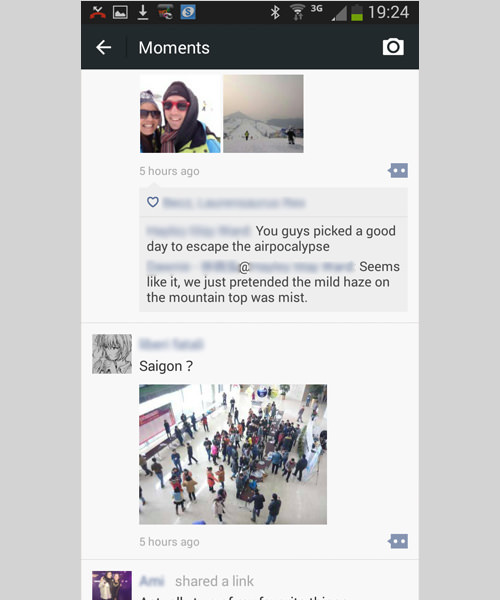
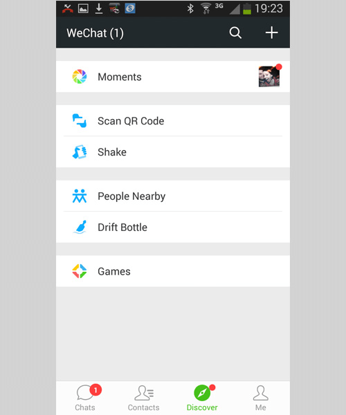
In China today, the network du jour is Tencent’s WeChat, locally known by the Chinese name WeiXin (微信). Launched in 2011, WeChat is a mobile-app-only network that combines the features of text messaging (voice and key input), group chat, a Facebook-like feed and timeline (called “Moments”), hookups for lonely folks (WeChat’s “Nearby” feature lists all users by physical distance from your location) and a whole lot of emojis. Perhaps of most interest to web designers and developers, it also has a native browser and offers an API for developers.
Du HaiHang, also known by his English name Seah, is a digital creative designer and developer focusing on branded and advanced interactive experiences, and the lead designer at Activation Nodeplus, a cutting-edge web design studio headquartered in Shanghai. Like Saber, Seah places great importance on creative experimentation, and he is the only Chinese designer ever to win two unique Awwwards recognitions. Widely lauded by local and international design pundits, Seah is the creative brain responsible for some of the most innovative work coming out of mainland China today.

"Three or four years ago, brands spent large budgets on Flash campaign minisites, but not today. Today, these budgets have been moved to WeChat on smartphones. The change started with the death of Flash and the start of the iPhone boom, and the web design trends in China naturally followed it. If your website here sucks on WeChat, it’s meaningless to the marketplace."
Light Apps And WeChat
WeChat is so popular that light apps are nearly always optimized specifically for WeChat’s native browser, and “Share to WeChat Moments” is by and large the only call to action in a light app’s interface.
“I read a ton of articles by non-Chinese mobile developers who have to test their work in multiple browsers,” says WeChat expert Thomas Graziani, founder of Beijing-based social marketing firm Walk the Chat, to my knowledge the first shop specializing in tailor-developed WeChat solutions for foreign companies seeking to enter the Chinese market. “In China, we need only test our light apps in the WeChat browser, and if it works there, we’re good to go. That’s how universal the platform is.”
Though Tencent’s administration interface for WeChat is only available in Chinese, Thomas’ team has opened these golden gates to the non-Chinese-speaking market by building a multilingual WeChat account admin panel (currently available in English and Chinese, but easily translatable to other languages) that talks to WeChat’s API. Thomas explains:
"Companies are happy to build experiences that operate exclusively in WeChat, because they get so much more data on their users than they do from standard mobile websites. When a user accesses your website via their WeChat browser, you see their WeChat ID, and if they follow you on WeChat, you get to see seven points of data about them: WeChat ID, nickname, profile picture, location (city), primary WeChat language, gender and date when they started following the account. This enables companies to tightly target their marketing right out of the gate, especially in terms of the gender and geographic variables. On top of that, “WeChat Sign-Up” enables HTML5 game developers to customize the experience for users, with their nickname and profile picture."
QR Codes Everywhere
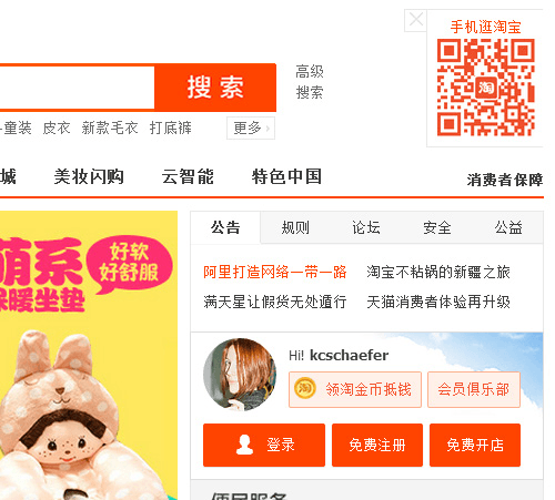
QR codes: fun for 10 minutes, and then they start killing kittens? Elsewhere, maybe, but QR codes are the Robert Downey Jr. of China digital: They were on shaky ground there for a little while, but now they’re off the coke, back with a vengeance and doing quite well for themselves. They’re ubiquitous in print, but including QR codes in desktop web layouts and TV ads is also common, allowing users to scan directly off the screen into their mobile devices, like this light app holiday card designed by Seah for Activation Nodeplus:
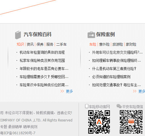
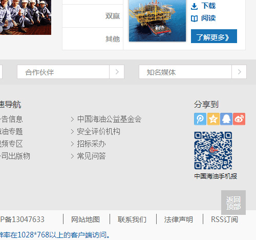
Scanning a desktop screen might sound bizarre, but it’s a common user behavior in China. Again, because WeChat is everywhere, your basic QR code most typically links directly to a corporate WeChat account that users can follow, or to a light app that loads in WeChat’s native browser. QR codes provide an entry point to WeChat experiences that can be distributed via non-mobile media, such as print ads, business cards and website footers.
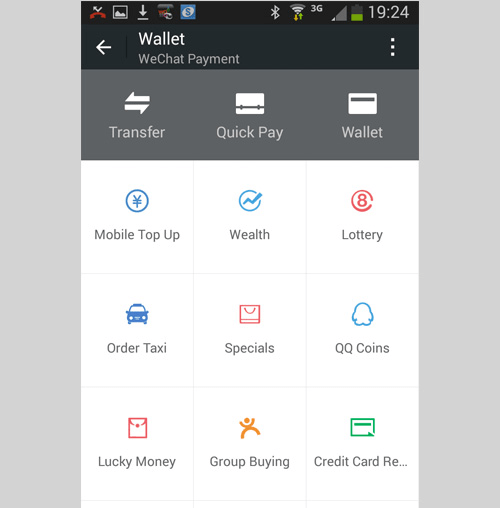
It’s hard to overemphasize the importance of WeChat in supporting the rise of the QR code in China. WeChat comes with a built-in QR scanner, and codes scanned with this scanner can interact with WeChat in a variety of ways — linking to light apps, user accounts, URLs that load directly in the WeChat browser, payment systems that enable users to instantly transfer money to each other via WeChat Wallet, and endless other applications. Many advertisements don’t bother spelling out the company’s URL — they simply display a QR code, and users scan it to access the company’s landing page.
Need Some Eye Candy?

We could do this all day.
Bringing It All Together: A QR-Code-To-WeChat Light-App Dining Experience
At popular table-BBQ restaurant chain Henjiuyiqian (很久以前), which draws hungry crowds with its mix of Darwinian caveman decor, techno jams and track-suited wait staff, first-time diners are asked to scan the QR code on the menu and follow the restaurant’s WeChat account before placing an order. The server then asks to see the digital membership card that Henjiuyiqian’s light app issues to each of its WeChat followers. The card entitles diners to immediate discounts on their meal, and as soon as they pay their bill, they receive a WeChat message detailing their receipt. If there’s a long wait to snag a seat, similar apps are used to manage the waiting list: Customers scan a QR code on arrival and then are free to wander off. The light app sends a WeChat notification when a table is free. Thomas explains:
"While service WeChat account holders are usually limited in the number of times they can push messages to their followers each month, if a follower has reached out and interacted with a service account in the past 48 hours, the service account may directly contact that user to send “customer service messages.” And since WeChat released their own digital wallet, customers can pay for services instantly via their accounts as well."
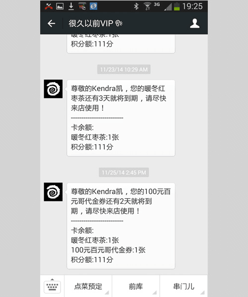
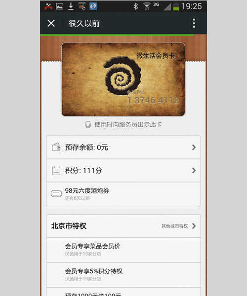
All this isn’t to say that desktop has completely gone the way of the dinosaur, but I believe that if desktop websites in China are going to have real value, they will need to make that big screen work for its paycheck through exceptional usefulness or particular beauty.
Chinese Web Typography Is Still Bleeding-Edge
The beautification of the Chinese web has been mildly hindered by difficulties in transcending the four standard Chinese web fonts and implementing snazzier fonts à la @font-face. The dependence on such a limited range of options is a dreadful shame, since the hills are alive with sexy Chinese fonts begging to display blog post titles. You can read my blah-blahs on this if you’re interested in the long version, but the basic nature of the problem is that Chinese fonts are huge, comprising thousands of characters (think 20,000 glyphs or so), and 3 to 7 MB font files are usually too clunky to embed because they significantly slow down page-loading times. So, until recently, it looked like dynamic logographic interfaces would be left dejectedly kicking cans around the backyard as Germanic language-based designs frolicked around in the sprinklers.
Then, along came Youziku, a Taiwan-hosted, Typekit-style dynamic font solution for the Chinese language. Youziku grabs strings of text sent either to its server or to a locally hosted script, renders them and returns the resulting live text.
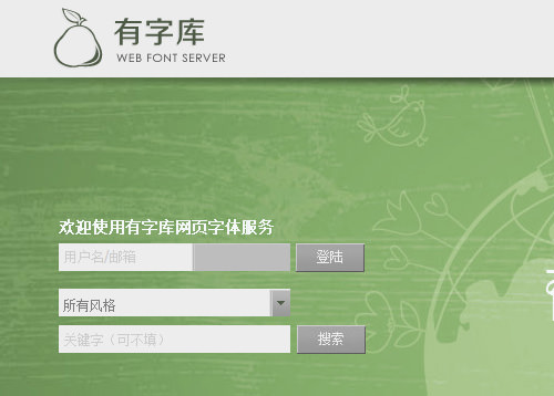
I’ve had the pleasure of participating in some experimental trials of the Youziku system. It works pretty well, and selecting non-standard Chinese text with the mouse is like running your hand down the body of a brand new Corvette. The tech is still pretty new, though, and I’ve run into three snags:
- Thin Chinese fonts don’t render very well and can look painfully ragged in Chrome. If they’re super-duper thin, strokes may even partially disappear. It’s not a big issue with bolder fonts and not (in my experience anyway) an issue in Firefox, but that kink needs some finessing.

What happens when Chinese fonts via Youziku are too small and too thin in Chrome? (View large version) - There’s often a little lag between a page loading and a font loading. So, you might see a visual stutter as the page loads the content and then applies the rendered text.
- Youziku’s website is currently only in Chinese, as are the installation instructions. If that’s an issue for you, another rival font library, Justfont, displays its library and sign-up instructions in English, but its font selection is significantly smaller.
Seah agrees. “As everyone knows, Chinese typefaces are comprised of a huge number of characters, so they’re difficult to embed on the web. In our office, we use images or SVG for static-text characters, but we still mostly use standard web fonts for dynamic text.”
Some Of The Prettiest Desktop Websites
ACNPL\WGL
Created by Seah for Activation Nodeplus as an online playground for mucking about with emerging real-time graphics technologies, the ACNPL\WGL website took home a much-deserved Awwward win, Seah’s second.
"The company was started in early 2012 as Nodeplus by Welson Tu, a Taiwan-based digital marketing pioneer… After two years’ rapid growth, it was acquired as the digital division of Activation Group in May 2014. I was mainly doing interactive design and Flash development three years ago, and I wanted to start doing some advanced experimentation with real-time graphics, HTML5 canvas and WebGL, something truly world-class and far beyond where China’s interactive design was at that time. Welson was interested in supporting this idea, and his agency provided me a totally free space to pursue it. So, I quit my former job at a creative agency, then partnered with his agency in early 2013, managing to turn my focus from Flash ActionScript to new web technologies. That’s our how our collaboration began and continues: I design, develop or experiment with whatever I’m interested in, on behalf of our agency. At the same time, I support the agency’s projects as well."

Sixpence
When Seah was ready to ask his lovely (now) wife to marry him, he developed a custom proposal iPhone app that could only be opened by one person: her. And when her fashion design business was ready to open its doors, Seah poured his whole heart into designing and developing an award-winning website for her. (Beat that, guys!)
"This is the website for my wife’s store. The two founders of Sixpence wanted to create a label with attitude. They make hand-sewn limited-edition apparel by reservation only, so the branding of the microsite is meant to convey this indie attitude and offer their audience a unique, modern and seamless browsing experience. There wasn’t a particular commercial goal with the build. Sometimes I feel it’s difficult to do cutting-edge work in China because many users are still using old technology, and when you use very new technology, you must make a decision either to lose some users or to spend a lot of time creating fallbacks for older browsers. Many clients are unwilling to support experimental work like that."

Exploring Moonbear
This is a beautiful website with a beautiful purpose. Well, two purposes, actually: Exploring Moonbear was created for AnimalsAsia to raise awareness of the cruelty of moonbear bile farming (bear bile is used in traditional Chinese medicine), but it was also crafted as a Microsoft GCE (Game-Changer Experience), a website intended to exhibit IE 11’s range of capabilities. Saber talks a bit about the process:
"IE actually brought another company into project for the coding part, given the tight timeline. That company is named Vision Soar. We came up with the idea, overall architecture, content, design and prototype, and they coded it. The visual inspiration for this was a tour we took of the AAF Rescue Centre in Chengdu. We took a lot of pictures there. Because one of our goals is to have 3D elements on the website, we did a lot of visual research, and at the time, low-poly style was quite popular, so we also borrowed some of those visual cues. Before doing any actual design, we usually create a mood board, where we collect all sorts of visual inspiration and decide on a direction for the design. We collect screenshots, we explore on the Internet or go out to take pictures. Creating the 3D bear was the biggest technical challenge we faced. We needed to create a bear that could animate and respond to touch. In addition, it needed to perform well in all major browsers that support WebGL. We ended up using ThreeJS and Unity. In terms of process flow, communication between the various stakeholders was the biggest challenge we faced."

Words Can Be Weapons
Created by Ogilvy Asia for the Center for Psychological Research in Shenyang, Words Can Be Weapons was intended to increase viewer understanding of the negative psychological impact of hurtful language on children, drawing a link between abusive words and the rise in juvenile crime. The website design shows rude phrases in Chinese turning into guns, knives and other instruments of violence. More information is available on Huffington Post.

30ml
This FWA-winning stop-motion website for Chinese creative agency 30ml (creatively helmed by Shanghai-based designer Yong Yu) is rendered in clay.

Adidas Originals
Another win by 30ml, the Adidas Originals website is evidence that a ton of the great design work happening in China today is being done by agencies for international brands.

Dashilar
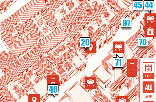
G_Lab created this website for the Dashilar area revitalization project in Beijing, a collaborative effort between government, designers, architects, investors and residents to breathe new life into a once-languishing historic district.
Wrapping Up
I do a bit of UI consulting for foreign firms that are thinking of entering the Chinese market, and I find myself saying one thing quite a bit: Localizing for China means more than translating your desktop website into Mandarin and calling it a day. It might sound harsh but here’s my advice: Do China right or don’t bother. If you half-arse it, it will be obvious, and you will lose money and credibility. Know who you’re talking to and how they use the web, and open communication via the channels they expect (WeChat, light apps, QR codes), and you’ll be that much closer to a meaningful connection with your users.
So, Kiddos, What Did We Learn?
- Light apps are China’s new web design frontier.
- If your website doesn’t work in WeChat’s native browser, it will be irrelevant to the Chinese marketplace.
- QR codes are relevant and widely used in China.
- Chinese web font technology is just getting warmed up.
More Resources
- Download, WeChat (English)
- Portfolio page (light app gallery), Live App
- Light app examples (load in mobile browser), Brand Social
- Youziku (Chinese web fonts)
Further Reading
- Beyond The Boring: The Hunt For The Web’s Lost Soul
- Showcase Of Web Design In China
- Upcoming Web Design Conferences
- Five Rules Of App Localization In China


 Register Free Now
 Celebrating 10 million developers
 Try ProtoPie AI free →
 SurveyJS: White-Label Survey Solution for Your JS App


