How Geometry Influences Logo Design
Galileo knew it. Every ancient culture that left traces of knowledge in their art knew it. Basic shapes compose the fundamental geometry of the universe. We can take credit for a lot of things, but human beings did not invent geometric shapes. We discovered them through the observation of nature. Understanding basic shapes and their functions have taught us to mark time and space in a variety of ways inspiring mathematics, technology, language and ever-evolving civilization.
“The universe cannot be read until we learn the language in which it is written. It is written in mathematics, and the letters are triangles, circles and other geometrical figures, without which it is humanly impossible to understand a single word.” – Galileo Galilei
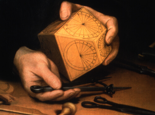
A handful of simple shapes have been used throughout time in the art of all cultures: the circle, intersecting lines, the triangle, the square and the spiral. Cultural anthropologist Angeles Arrien researched and documented commonalities in cultural art forms over several decades and found consistent geometric shapes embedded in all art. She called them the “five universal shapes.”

Each fundamental shape never varies in its basic function because each unifies purpose with form. A circle rolls freely, lines travel and intersect, a triangle sits securely while pointing away from itself, a four-sided shape is imminently stable, and a spiral curls with elegant persistence. Don’t let the simplicity of these forms fool you. It is because they are so simple that they have the ability to scale consistently and are used as the building blocks of nature and the man-made world. They also provide consistent messaging for a logo.
This three-part series explores fundamental creative strategies for designing effective logos. The first part shows how to use symbols, metaphors and the power of intuition. The second part shows how to use nature’s patterns in logo design. This last part is about how geometry influences logo design.
A Little Geometry (Goes A Long Way)
The purpose of a logo is to communicate the client in the simplest but most comprehensive way possible. The basic shapes communicate fundamental qualities of the organization in the most immediate way and they are used in design of every ilk — graphic, environmental, interior, product and industrial design, and architecture.
To understand the connections between form and function in each geometric shape, I’ll give an overview of how it is created, how it sets the stage for the next shape, how it appears in nature and the built world, and the kinds of clients it would be a good fit for. The shapes begin simply but become complex as they are developed, just as our experience of living does over time. They are also related to the spatial dimensions we experience through the process of living.
“To me no experience of childhood so reinforced self-confidence in one’s own exploratory faculties as did geometry.” – Buckminster Fuller
Our senses are responsible for processing an incredible amount of information every moment of every day. Only a small fraction of that information makes it into consciousness because the brain simply can’t process the endless stream generated by the outside world. Because of the sheer quantity of it, most of our experience is absorbed subliminally.
Digital technology has removed much of the tactile experience in just a few decades. But touch has been an important part of how we have understood the world throughout our entire history. Using traditional drawing tools keeps us rooted in the tangible world. So, now and then, be hands-on to get a more comprehensive understanding of what you are creating. Draw, spend time in nature without an agenda, and experiment with geometry by hand so that your design is multifaceted in meaning but elegant in presentation. Just as geometry provides fundamental truths about the universe and how it works to help shape our understanding of it, a designer’s understanding of how the basic shapes work can give subtle and substantial reinforcement to a logo to align it with its message.
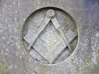
The basic geometer’s tools are as simple as the initial shapes they construct. A drawing compass, pencil and straightedge are the only tools you need to create a range of geometric possibilities.
Not only do geometric forms describe specific functions that don’t change when scaled from micro to macro sizes (for example, the containment of a circular egg to a spherical planet), the progressed order of how the shapes are constructed parallels the order of dimensional space. Zero, one, two, three and four dimensions are also known as degrees of freedom. Degrees of freedom express the progression of independence from lower to higher dimensions, beginning with the zero dimension, which corresponds with the initial geometric shape of the circle.
The Circle: Zero Dimension
Geometry begins with the center point of a compass, the source of the all-encompassing circle. The simple point is also considered a zero dimension. In physics terminology, a zero point refers to a location in space and nothing more; therefore, it has no freedoms — or a zero degree of freedom. The starting center point of a drawing compass results in the circle, which is, interestingly, a shape independent enough to continuously roll or revolve in physical space. It doesn’t have the same constraints of angled shapes that are stopped by corners (which have their purpose, too).
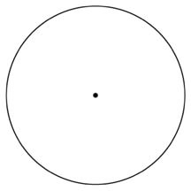
The circle is known as the mother of all shapes because it is the archetypal shape from which all other geometry is drawn. This is true in nature as well: Life begins as an absolute in the form of a single-celled egg or seed. The primary principle of the circle — a container that protects, supports and ultimately produces life — allows it to scale from minuscule organisms like cells to the mega size of our planet, which supports an immense variety of life forms.

In geometry, the circle begins as a single point that is surrounded with an infinite number of points joined as a circle. Just as a fertilized egg contains everything necessary to create any part of a living organism, the circle holds all possibilities.
In logos, a circle template implies many individuals or parts that comprise an overall whole. A circle effectively represents encompassing groups, such as collectives, non-profits, global organizations and governmental agencies.

The Dallas Opera, PBS™ and AgriCultura are examples of circular template use in logos to convey basic information about the client. The “O” of the Dallas Opera logo represents one of the two initial caps of their name and provides an encompassing template that helps to “orchestrate” a diverse collective of musicians that compose the whole of the organization. The style of the design further supports the client by referencing the grace and flow of music. The circle surrounding the PBS™ logo encompasses the diverse demographic (represented with multiple repeating heads) of a national public broadcasting company. And the hand/leaf elements representing a network of farmers that comprise the non-profit AgriCultura are included within a circular template to describe their singular purpose.
The Line: One Dimension
Just as an egg must first divide to become a multi-celled organism, the circle must be cloned to create the next geometric shape. By placing the point of a drawing compass on the outer edge of the original circle and drawing a second circle at the same diameter as the first, the original is duplicated. This presents an opportunity to connect the two center points together and “push the point” into a line, developing the point into one-dimensional space. The line can move in only one direction (forward or backward) and, therefore, has one degree of freedom. Not much happens in one-dimensional space, but it has one more degree of freedom — or one more level of independence — than the single location in space that a point occupies.

The two circles provide another line-joining reference at their intersections. A second line connects the overlapping circles and intersects the first line drawn between center points at a 90° angle. When two opposites come into contact with one another, they establish a connection or relationship, an important consideration for some clients.
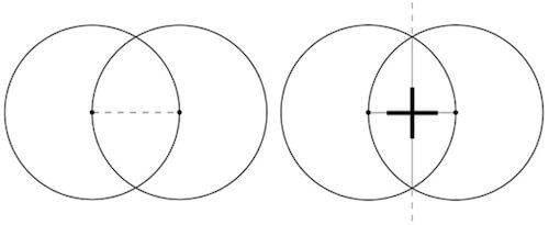
In logos, elements that intersect at right angles represent opposites working together, as the visual construction describes. The power of symbolism expands this basic concept into other uses, and this configuration can be useful to represent a merger or a cooperative relationship between two primary, but different, purposes.
The basic template of intersecting lines in the Heart Hospital of New Mexico’s logo supports its purpose of treating patients who are balancing between life and death, and it complements the more specific visual communication of the design.
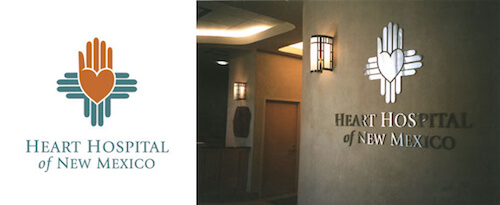
Hospitals (and most of the Red Cross worldwide services) have historically used crossed lines as a generic icon. At a symbolic level, hospitals and emergency services are at the intersection of life (or birth) and death. I used the Zia (the symbol New Mexico uses to represent the state) and integrated a heart and hand to complete this logo concept for the Heart Hospital of New Mexico to depict the primary criteria the client wanted this logo to convey of New Mexico, cardiology and hands-on care. The specific visuals give metaphorical information to the basic template of the design (more on metaphors in part 1, “Symbols, Metaphors and the Power of Intuition”).
You can also communicate the idea of complementary opposites with the almond-shaped center of the two overlapping “mother” circles. This shape, called a mandorla or vesica piscis, is the byproduct of the geometric process that constructs a point-to-point connection.
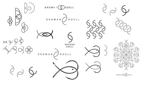
Swedish designer Fredrik Lewander used the principles of the mandorla shape to represent Broman Odell, a tackle company that joins the two business owners’ lifelong knowledge of fishing and tackle into one business. As his process shows, he worked on many options, beginning with overlapping the initial letters of their name. By expanding on this initial direction and within a simple range of concepts, he designed an elegant logo that says everything about who they are.
The Triangle: Two Dimensions
Once the point has been pushed into a line, you can take the next geometrical step by enclosing the three points as a two-dimensional triangular plane. Two degrees of freedom goes quite a bit further than one degree. The enclosed plane allows for independent motion of the x and y axis throughout its surface, rather than just the forward or backward motion of the one-dimensional line.
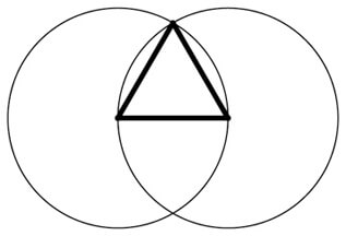
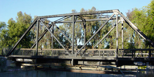
The triangle is very secure when set on its base or when combined with upside-down versions of itself in translation symmetry — which is why it is often used as a structural support in building construction or as a two-dimensional border design in artwork. This is the shape of geodesic domes, bridge trusses, arched doorways (a triangle that incorporates a curve at its top point), as well as the triangular skeletal scaffolding of the human pelvis which enables upright walking.
As a shape, the triangle’s structure funnels from a solid base into a point. Philosophically, it is grounded in the here and now and points to something unseen. It’s evident why the triangle is used as an arrow: it leads the eye away from one thing and toward something else. Because of these properties, the triangle is often used to symbolize inspiration or aspiration beyond a current stasis. A mountain’s summit is an inspirational metaphor, as a common example.
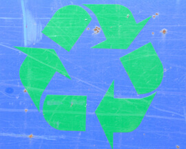
Recycling is the three-part act of coming into existence, existing, and then being folded back into the mix for another future purpose. More simply stated, the triangle is a metaphor for birth, life and death, or beginning, middle and end. The recycling symbol expresses this sequence in the simplest way possible: as triangular arrows that enclose the three parts of a triangle.
The triangle is also a symbol of transformation as the go-between of one- and three-dimensional space. All words that begin with the prefix tri- (for the three parts necessary to achieve the balance of a midpoint) or trans- (Latin for “across”) refer to the power of the triangle to secure space so that a significant change or movement can occur. Metaphorically, life begins as a zero dimension with a single-celled egg. It then divides in order to multiply at conception (as a metaphor for one dimension) and develops into a multi-celled embryo within the secure, triangular space of the pelvis (as a metaphor for two dimensions). When gestated, what was once a single-celled egg emerges into life fully formed and infinitely more complex (as a metaphor for three dimensions). Life is then lived through time, as a metaphoric reference to the fourth dimension.
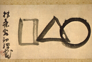
The nineteenth-century calligraphic design by Japanese Zen master Sengai Gibon, entitled “Universe,” literally translates as “Circle, Triangle, Square.” The painting shows the universal process of wholeness dividing, transforming and becoming, as a symbolic process of shapes read right to left in traditional Asian style.
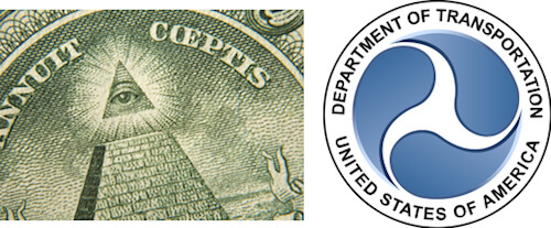
The triangle has powerful associations. Incorporated into a logo, it can symbolize “looking beyond” or inspiration, a significant change (transformation) or a significant movement (transportation). Note that many automobile makers use a triangle or three elements to describe their products.
The triangle sitting at the top an unfinished pyramid in the dollar bill symbolizes the inspired hope of a new country, security and transforming the past into a better future. The three-legged symbol of the Department of Transportation’s logo references the ancient triskelion, a symbol of perpetual motion. Note that the circle template is also used here to represent an organization responsible for the mass movement of an entire country. Geometrical symbols are simple enough to be used together to instantly enhance meaning in a logo.
In the logo design for MuSE (Multi-User Synthetic Environment), I wanted to represent the client’s purpose of interpreting raw computer data as useful visuals. For example, a surgeon must use an MRI scan to successfully navigate the brain to remove a tumor; the program can also test various launch patterns to ensure that a missile isn’t accidentally deployed in a random occurrence such as a lightning strike.
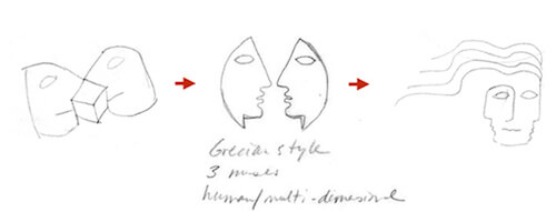
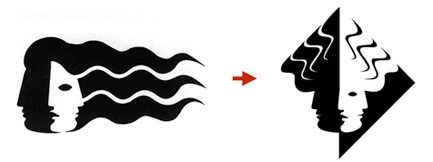
Mythical muses relate the visual to the name; the triangular template aligns the company’s purpose of transforming numerical data into something more; and the three parts of the face defined in shadow represent the quality of contour, or depth visualized in two dimensions.
Four-Sided Figures: Three Dimensions
Squares and rectangles are probably the least interesting of the basic geometric shapes, but they are still useful. Adding a fourth point of depth creates a tetrahedron (or a pyramid) with the z axis, bringing it into the three-dimensional realm. We use the shorthand of a four-sided shape to describe the four points of three-dimensional space (or three degrees of freedom).
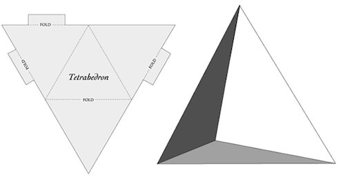
Everything about a shape with four points says stability. While not a common shape in nature, four-sided shapes make reliable human-made structures such as city grids, parks and center squares, buildings, building materials (bricks, adobes, ceiling and floor tiles), windows, monitors, and framed artwork — even paper money gets a boost to further substantiate its value through shape. (Precious metals minted in coins are a historical benchmark of value that remains relatively consistent because weight can be measured accurately. Conversely, the worth of paper money vacillates wildly because it is based in markets that can be willfully manipulated. The massive printing worldwide of paper currencies during the economic crisis of the last several years is an example of this.)
The four-sided figure exemplifies the world as manifest, solid and real. It is forthright, fortified and forward — words that connect the etymology of the number four to stability and tangibility. This shape is plain and boxy, and the logos that use it present the client in just that sort of straightforward way. Banks, attorneys, insurance and accounting companies and, of course, contractors commonly use this template to identify themselves as stable institutions or makers of reliable structures.
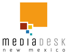
MediaDesk NM gives non-profits access to advanced communication infrastructure services so that they can leverage mutual resources leaving more resources to contribute to their communities. Visual specifics were taken from the company’s name: media, desk and New Mexico. Desks are four-sided, and the shape of the state of New Mexico is squarish. These qualities were broken down into smaller boxes as a speech bubble tail to illustrate communication and media. The smaller squares also metaphorically represent the individual non-profits that contribute to the overall stability of the non-profits in New Mexico.
The Five-Pointed Star And Its Sister Shape, The Spiral: Four Degrees Of Freedom
Five points are the foundation of pentagons and five-pointed stars. Stars are associated with excellence: five star generals, restaurants, hotels and flag designs all come to mind, as do the celebrities who burn brightly above the rest of us as “stars.” The human body exhibits the number five in several iterations: we have five extensions that branch from our torso, five fingers on each hand to use tools, five toes on each foot to move us through space, and five primary senses. The number five is pervasive in human functionality.
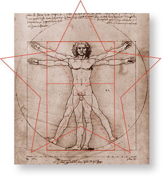
While I would never suggest you eat anything you don’t know to be safe, if you ever find yourself in the position of needing to source food from nature to survive (relatively speaking, this was the norm not very long ago), keep in mind that fruits produced from five-petaled blossoms (such as apricots and pears) or spiral flowering plants (such as the rose, which produces vitamin C in rose hips) are typically nutritious for the human body. In contrast, many six-petaled flowering plants are poisonous or medicinal (medicine and poison are the same thing in different proportions).

When it comes to something as important as our body and the nutrition that feeds it, it is no wonder that stars represent the best of the best. Converse and Starbucks are two high-profile contemporary logos that use stars as a design element to convey their status as the very best. Stars are not one of the shapes used widely in cultural artwork, but they have a deep connection to the spiral, which is.
Stars Love Spirals And Spirals Love Stars
A star can be used as a template to create the spiral, one of the universal shapes. Multiple embedded rotations of the star’s triangular arm can be scaled to smaller and smaller sizes and their outline traced to create a spiral. This shape’s ability to rotate itself at smaller or greater scales consistently and infinitely speaks to the principle of regeneration.

The spiral is a visual representation of cyclical time in space, repeating as a consistent but new cycle with each rotation. This is the fourth dimension of time and space (see the phi construction animation in part 2, “Using Nature’s Patterns in Logo Design,” for a more visceral understanding of this phenomena).
The five-pointed star and the spiral are also entwined in nature. You can see this relationship in a sunflower. From a bird’s-eye view, the five-pointed star is visible in the sequential growth of a plant’s leaves, and in profile those leaves travel around the plant’s stalk in a spiraling pattern. The two aspects work together to provide the most access to sunlight to the plant because of minimized shadows and the spiral path also funnels rainwater along the stalk, sending it to directly the roots where it does the most good.
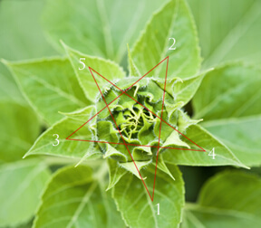
Clients involved in creative ventures and potential or futuristic visioning and thinking organizations (time figuring in here again) are good matches for the principles expressed by this shape.
Swan Songs is a non-profit collective of musicians who play requests for the dying, and I knew instantly that the treble clef could embody a swan in its shape. It was just a matter of drawing it out. The client chose an appropriate name for their organization, and I integrated qualities of the swan with the musical symbol to capture their purpose of providing musical last requests to individuals with a terminal illness.
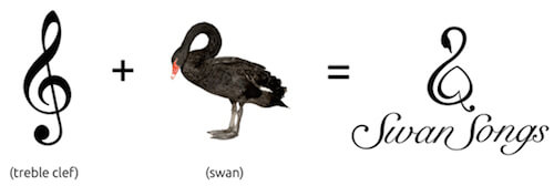
Besides integrating the organization’s most distinct visual qualities, the spiral shape of this logo relates to the symbol for infinity, a metaphor for the endless loop of existence that regenerates life. The logo’s message is consoling and positive to its audience — and it complements the non-profit’s purpose.
Conclusion
Who would have thought that simple geometry has such depth and relevance? It is supremely efficient when applied thoughtfully to a logo. While geometric shapes are far too broad to stand on their own as a logo design, their ability to communicate universally can support the overall message you want your design to convey. Add to that a combination of symbols, metaphors and relevant natural patterns, and your simple but elegantly crafted logo will speak volumes to your audience instantly, seamlessly and memorably.
Further Reading
- Effective Logo Design, Part 1: Symbols, Metaphors And Intuition
- Effective Logo Design, Part 2: Using Nature’s Patterns In Logo Design
- The Evolution of The Logo
- Logo Design For Responsive Websites


 Try ProtoPie AI free →
 Celebrating 10 million developers

 SurveyJS: White-Label Survey Solution for Your JS App
 Register Free Now


