How To Use A Nature Logo Pattern – Effective Logo Design Part 2
There are only a handful of fundamental patterns that create all of the natural diversity around us. Nature’s patterns perform three basic tasks that get the work of the universe done by moving, storing and connecting energy.
Nature communicates within an interconnected and intricate system of checks and balances to weave patterns and processes together for perfect and purposeful outcomes. Nature is the ultimate economist when it comes to creating so much from so little. Everything gets used in this supremely elegant system. Nothing is wasted. And all of it happens in the moment. We covered Symbols, Metaphors And The Power Of Intuition in the first post of the series last week; this week let’s take a closer look into nature’s patterns.
“Man invented things by imposing a shape on nature. Man discovered things by revealing the pattern of nature.” – Alan Fletcher
The essential property of a pattern is repetition. Because they are continuous, they read like a story. Human beings learned the language of nature to survive. The periodic migration of herds, the transit of constellations across the sky and the distinct features of different terrains are all examples of patterns that create expectations upon which we depend.
Designers use patterns based on nature because they are reliable. Biomimicry is relevant not just to product and industrial designers. Bio-inspired graphics yield more communicative power to a logo by relating it to a pattern that all human beings inherently know.
This three-part series explores fundamental creative strategies for designing effective logos. The first part showed how to use symbols, metaphors and the power of intuition. The second part shows how to use nature’s patterns in logo design.
The Relationship Between Natural Patterns And Design
Natural patterns establish relationships between dynamically opposed, seemingly unrelated or invisible forces — everything that compels good communication. A designer’s understanding of this can be carried into the planning of a logo’s “genetic material” to integrate universal relationships, giving the logo a wider reach. Intuitive sensing is free of cultural associations and the encumbrances of language because it uses imprints far older than civilization. It is a direct route to establishing a connection with your audience.
Awareness of how patterns work in nature helps a designer choose the most appropriate visual elements to describe a client’s unique qualities while simultaneously using easily understood, universal concepts. When the audience’s initial glance is bridged with relevant visual information, a profound opportunity to get into the details of the communication is established.
Essential natural patterns combine in ways that are stable and efficient enough to be practical within the limits of three-dimensional space. These basic patterns underlie processes that are pervasive from micro- to macro-scales throughout the universe. As movement is the fundamental principle of life, we’ll begin there.
Patterns Of Movement: Branching And Meanders
Patterns of movement transfer energy from one place to another and occur in a variety of circumstances. The linear patterns of tree branches and roots, rushing rivers, blood veins and neural circuitry, streams meandering through pastures, and brain and intestinal convolutions are all examples of energetic transference.
The branching pattern transfers energy from leaf to plant in the same focused manner it moves impulses through our nervous system, while the lackadaisical meander distributes energy over a broad area in an easy roll-and-turn motion, much like brain or intestinal convolutions.
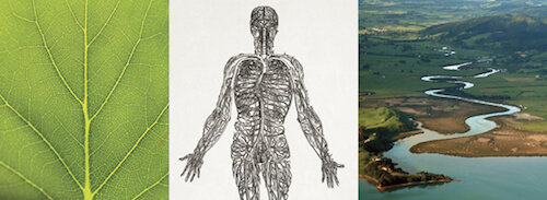
The purpose of the branching and meandering patterns are implied by their forms: A point of origin is connected to its destination point in a line. Our bodily fluids carry air, water and nutrients through an intricate system of tubes from the outside in and the inside out; sunlight is converted into energy in a plant’s leaves and transported throughout its branches, stems, trunks and roots; waterways meander and branch into the contours of the earth to provide nutrients and water to plants and animals; and lightning transforms carbon and nitrogen into compounds that plants can assimilate from soil.
The two basic patterns of movement have specific differences but are equally efficient for the tasks they perform. Branching patterns are direct, angular and no-nonsense, while meanders roll and relax into their destination. There’s a reason for that — nature always has a good reason — branching is concerned with the task of getting energy urgently from one place to another, while meanders distribute energy in curves that slowly and evenly wind their way to an eventual destination with greater coverage (a clue as to when to use angles and when to use curves as dominant shapes for different clients).
The Branching Pattern In A Logo
The logo for ISTEC (Ibero-American Science and Technology Education Consortium…sometimes acronyms are essential for certain clients!) has multiple cultural and technological references that provide information instantly about the organization. ISTEC is a non-profit that procures technology software, hardware and training from large tech companies in the United States and delivers them to universities in Central and South America, as well as Spain and Portugal. The corporations that provide the tech services have access to the best students graduating from these programs, providing a back-and-forth exchange.
The underlying template of the branching pattern intuitively suggests movement to describe the process of exchange, an appropriate metaphor for a tech-transfer business that moves the energy of current (or urgent) technology from one place to another. The overall square shape of the logo further substantiates the client as stable and reliable, an important consideration when representing new technologies and establishing cross-cultural relationships. (More on shapes in “Effective Logo Design, Part 3: How Geometry Influences Logo Design.”)
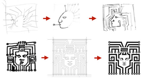
The conceptual process for this logo shows specific references to the client in both cultural and technological terms, and the design is further supported by integrating the branching pattern to address its purpose of tech transfer.
The Meander Pattern In A Logo
The meander transfers energy just as a branching pattern does, but with a significant difference: it displays no real urgency and has a certain amount of fluidity and freedom. Duffy+Partners created an identity to brand the Islands of the Bahamas with distinctly atypical and vibrant characteristics of form and color. A meander isn’t a typical pattern to use in logo design because it is so loosely organized, but in this case — as a descriptor of travel, fun and spontaneous island-hopping — it works perfectly.

The designer’s process shows the conceptual development of blending the island chain with the bright flora typical of a Caribbean destination as appropriate visual cues for this logo.
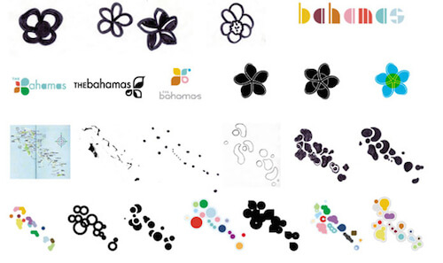
At first glance, the logo doesn’t look like a meander, but think a little deeper, as in below the surface. Island chains are connected below the ocean’s surface (maps were also referenced by the designer in the conceptual roughs). The bright colors, random shapes and underlying meander pattern all fit and support the idea of a relaxing, fun-filled tropical vacation.
Stacking And Packing Patterns: The Hexagon And Other Tessellating Shapes
The stacking and packing pattern accomplishes two primary objectives in nature: it stores and stabilizes energy for later use. Drying mud, bubbles and cracking cement all tend to break at approximately 120° angles. There’s a reason for that. Nature is primarily composed of spherical atoms, molecules, germs, viruses and cells, which achieve the tightest fit when packed with their own kind — a hexagon made up of approximate 120° angles.
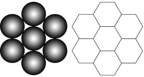
Spherical objects make up the bulk of physical space and have the tightest fit in a six-around-one configuration. The hexagonal pattern results when the objects are compressed by heat, gravity and pressure in physical space. This perfect-fit pattern, called a tessellation, has neither empty space nor redundant overlaps, just like pieces of a puzzle. Because of its perfect fit, it is the most efficient and stable mode of energy storage. Only two other shapes can achieve a periodic, or regular, tessellation: four-sided and triangular figures.
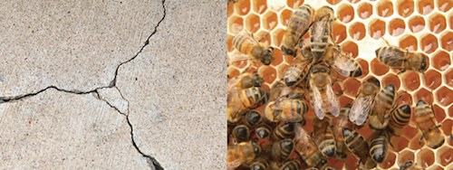
Classic examples of the stacking and packing pattern: Breaks in a cement sidewalk at approximately 120° angles from the molecular scale up display a self-similar pattern. The beehive is perfectly formed for extraordinary strength and economy of space — a shape also adopted by architect Buckminster Fuller for the ultra-energy-efficient geodesic dome.
Stacking And Packing Patterns In A Logo
Stacking and packing patterns are a perfect fit for businesses that want to communicate security or storage. Angled shapes in general are included in this group (the triangle, rectangle and square are discussed further in part 3 of this series). An angled shape sits squarely on its bottom, and the corners provide exact points of measurement. This suggests reliability and precision, which, in turn, imply transparency and honesty. When something can be accurately measured it is said to be “true” or “trued up.”
Angled shapes are favored by banks and other organizations in the financial industry for this reason, as well as contractors and others who want to imply those qualities in physical space. (Keep in mind that today’s technology allows decimal points to be manipulated at will: Reinforcing the idea of security is very important — most particularly with digital currency.)

The logos of HSBC, Chase Manhattan, the NYSE and many other financial players use angular templates in their design to reinforce their message of security and stability.
Connection And Regeneration Patterns: The Helix And Spiral
The helix and spiral have similar shapes but different purposes, much like the meander and branching patterns. A helix’s diameter never expands or contracts but remains a constant distance from its center, enabling it to penetrate substantial structures or stand up to formidable forces. The spiral, on the other hand, follows an ever-expanding path in a geometric progression of self-similar curves. As you may have guessed, each has specific — but related — purposes.
The Helix Pattern
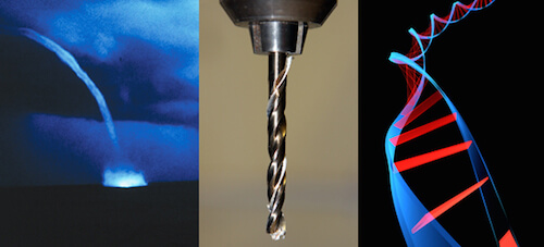
The helix is a concentrated form of energy designed for a serious and intentional purpose. In nature, the singular helix is the underlying pattern of the concentrated power of funnel clouds and waterspouts. We apply this principle to tool design to create the drill, which penetrates strong structures so they can be bound together for longevity, or a corkscrew that grips and extracts a plug from an ultra-tight fit. When paired, the back and forth twisting motion of two helices weave a complementary relationship that bring together and balance opposites. The double helix pattern points to the immense power necessary to funnel the genetic blueprints of DNA into a new generation.

The Helix In A Logo
The helix communicates information about cooperation between opposites, intense strength at minute sizes and longevity that spans generations. It was the template pattern I chose to describe an acupuncture clinic. When you understand how patterns work you can validate your initial intuitive choice as the right one. Intuition is the genius of our senses and helps us to make choices that are inherently correct. (See the first part of this series, “Symbols, Metaphors and the Power of Intuition.”) Understanding this information also helps sell your idea to the client because the logo has been “trued up” to the story it needs to tell — and it’s easy to explain.
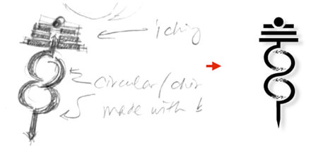
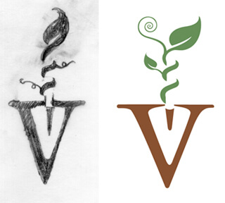
Several years ago I created this logo for an alternative healthcare clinic with a concentration in Chinese medicine. The founders were already traditional Western medicine caregivers and expanded their services as licensed acupuncturists. I used a caduceus to incorporate both traditional Western medicine and the “qi” (chi) — or the balancing of energy in Eastern medicine. This was one of those logos that didn’t need a lot of conceptual thought. The solution presented itself in my first sketch (a reminder to collaborate with your intuition to get “inside” access to workable ideas). The hybrid caduceus-chi logo addresses the two healthcare modalities, and the underlying pattern of the helix alludes to the (literally) penetrating nature of acupuncture to achieve effective results by stimulating the energetic meridians of the body.
The Spiral Pattern
The spiral is a pattern of creativity and regeneration with the purpose of connecting energies together. This is geometrically described in the construction of the logarithmic spiral, or a spiral that grows geometrically at a progressive rate. The connecting circles that create a phi spiral demonstrate this fact in form.
A phi spiral is constructed when a series of ever larger and geometrically progressive circles are connected at their points of intersection. This particular construction is based on the Fibonacci sequence.
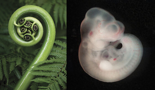
The progressing spiral is a pattern of growth in nature, and it is the only pattern that is also a shape (see more about the spiral in “Effective Logo Design, Part 3: How Geometry Influences Logo Design”). This pattern expresses new life as it unfurls into the world. It is common in developing embryos and sprouting seeds.
The Spiral In A Logo
A helix and spiral were both included in the logo design for Valle Encantado, a small farming group that grows food for their communities. The helical tendril curling up the handle of the spade defines the handle and represents the intense work of digging and growing, while the logarithmically progressing spiral points to the creativity of producing food to support the community. Other graphical elements are used in the design to more specifically address the client (see part 1, “Symbols, Metaphors and the Power of Intuition,” for more about them).
Exercises
Patterns Exercise 1: Walk The Nature Talk
Get your sketchbook and pencils and go on a walk.
- Focus only on natural forms (not buildings, sidewalks or anything else manmade) Try to identify each of the five basic patterns discussed in the article: branching, meander, stacking and packing shapes, and the spiral and weaving (helix) patterns. As you find them, sketch them and identify what pattern you think is dominant in the forms you are observing, as nature typically weaves several pattern processes together.
- Look a little deeper What does their form tell you about the kind of work they do (moving, storing, connecting)? Can you identify what the pattern is doing in the context of how it is used?
- Patterns work together Can you find more than one pattern working together? How do they interact or support one another?
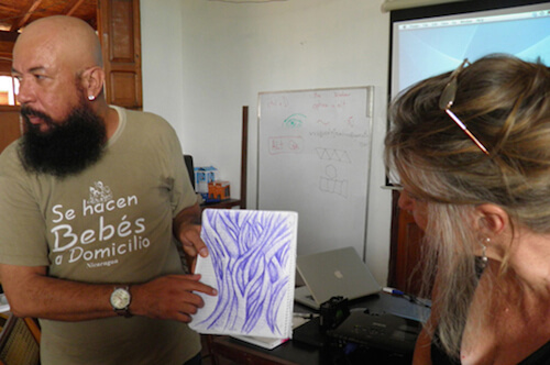
Patterns Exercise 2: Expressing Pattern As Design
To be an effective logo designer, you must learn to identify and extract valuable information. This pattern exercise is designed to give you a true working context of observation, interaction, refinement, extraction, elimination and reordering, while using critical thinking skills in all stages of the process. Choose any form from nature that intrigues you (animal, plant, mineral, any of the elements), and use this exercise as an opportunity to learn more about it in an immersive experience.
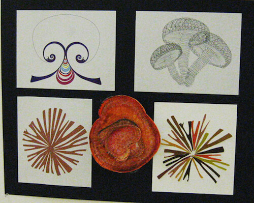
- Create a realistic drawing Draw your subject as accurately as you can with your choice of media (pencil, colored pencils, pen, etc.). If the subject is too detailed and you find it overwhelming to draw the entire object, pick a part of it and focus on that.
- Explore your subject in three dimensions Take an aspect of your subject (or the whole subject, if you care to), and create a three-dimensional representation of it. You can do this with paper folding, craft materials or natural materials. Observe the primary movements or shapes of patterns to help define a three-dimensional representation that accurately conveys the pattern. Origami is not difficult to do, and you can find all sorts of instructional videos on the Internet of how to create different folded forms.
- Create a detail Find an aspect of the object to detail. This could be an edge, a shape or the overall pattern refined as a simplified detail. (Note: You might want to research micrographs of your subject as well. Seeing it at different scales or dimensions will give important clues to help identify the dominant pattern.)
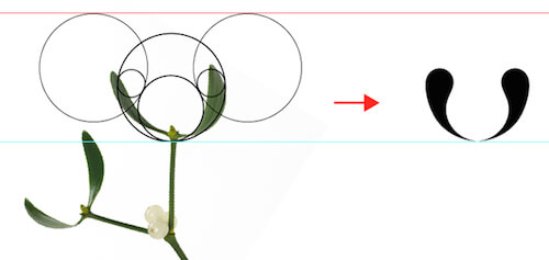
- Stylize the form From the previous parts of the exercises, identify the dominant pattern you are working with and stylize it as black-and-white vector illustration, created in Illustrator as a repeating form.
Conclusion
The process of distilling general information into specific communication provides value for your audience. When you develop your awareness of the universal meanings of the basic patterns of nature, you can effectively integrate them as simple strategies for good logo design.
Integrating patterns appropriately reinforces the message at every level — beginning with the first glance, which queues the audience’s intuition and interest. Combined with effective symbolism and metaphors, pattern templates bring more communicative depth to your logo. Another sound design strategy is the use of basic geometric configurations in logo design, coming up next in “Effective Logo Design, Part 3: How Geometry Influences Logo Design.”
Coming up next: “Effective Logo Design, Part 3: How Geometry Influences Logo Design.” Galileo knew it. Every ancient culture that left traces of knowledge in their art knew it. Basic shapes compose the fundamental geometry of the universe. We can take credit for a lot of things, but human beings did not invent geometric shapes. We discovered them through the observation of nature.
Further Reading
- Effective Logo Design, Part 1: Symbols, Metaphors And Intuition
- Effective Logo Design, Part 3: How Geometry Influences Logo Design
- Feeling Stuck? Design What You Don’t Know
- Logo Design For Responsive Websites


 Celebrating 10 million developers
 SurveyJS: White-Label Survey Solution for Your JS App
 Register Free Now
 Try ProtoPie AI free →


