Introducing RAIL: A User-Centric Model For Performance
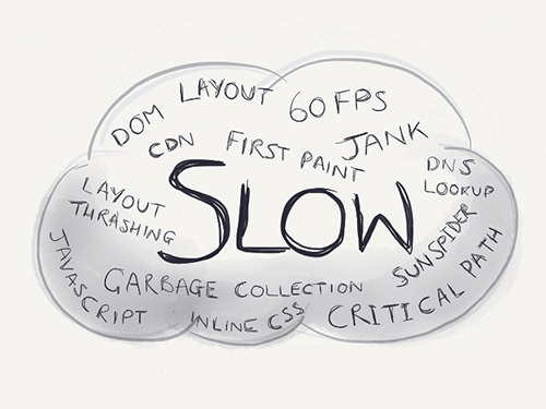
There’s no shortage of performance advice, is there? The elephant in the room is the fact that it’s challenging to interpret: Everything comes with caveats and disclaimers, and sometimes one piece of advice can seem to actively contradict another. Phrases like “The DOM is slow” or “Always use CSS animations” make for great headlines, but the truth is often far more nuanced.
Take something like loading time, the most common performance topic by far. The problem with loading time is that some people measure Speed Index, others go after first paint, and still others use body.onload, DOMContentLoaded or perhaps some other event. It’s rarely consistent. When it comes to other ways to measure performance, you’ve probably seen enough JavaScript benchmarks to last a lifetime. You may have also heard that 60 FPS matters. But when? All the time? Seems unrealistic.
Very few of us have unlimited time to throw at optimization work, far from it, and we need criteria that help us decide what’s important to optimize (and what’s not!). When all is said is done, we want and need clear guidance on what “performant” means to our users, because that’s who we’re building for.
On the Chrome team, we’ve been thinking about this, and we’ve come up with a model to put the user right back in the middle of the performance story. We call it the RAIL model.
If you want the TL;DR on RAIL to share with your team, here you go!
- RAIL is a model for breaking down a user’s experience into key actions (for example, tap, drag, scroll, load).
- RAIL provides performance goals for these actions (for example, tap to paint in under 100 milliseconds).
- RAIL provides a structure for thinking about performance, so that designers and developers can reliably target the highest-impact work.
Before diving into what RAIL involves and how it could be helpful in your project, let’s step back and look at where it comes from. Let’s start with every performance-minded person’s least favorite word in the whole wide world: “slow.”
“Slow”
Is changing the DOM slow? What about loading a <script> in the <head>? JavaScript animations are slower than CSS ones, right? Also, does a 20-millisecond operation take too long? What about 0.5 seconds? 10 seconds?

While it’s true that different operations take different amounts of time to complete, it’s hard to say objectively whether something is slow or fast without the context of when it’s happening. For example, code running during idle time, in a touch handler or in the hot path of a game loop each has different performance requirements. Put another way, the people using your website or app have different performance expectations for each of those contexts. Like every aspect of UX, we build for our users, and what they perceive is what matters most. In fact, number one on Google’s ten things we know to be true is “Focus on the user and all else will follow.”
Asking “What does slow mean?,” then, is really the wrong question. Instead, we need to ask “What does the user feel when they’re interacting with the things we build?”
Putting The User In The Center Of Performance
Luckily for us, there’s long-standing academic HCI research on this topic, and you may have seen it before in Jakob Nielsen’s work on response time limits. Based on those thresholds, and adding an extra one for animations (because it’s 2015 and we all love a bit of showbiz), we get the following:
- 100 milliseconds. Respond to a user action within this time window and they will feel like the result is immediate. Any longer and that connection between action and reaction breaks.
- 1 second. Within this window, things feel part of a natural and continuous progression of tasks. Beyond it, the user will lose focus on the task they were performing. For most users on the web, loading a page or changing views represents a task.
- 16 milliseconds. Given a screen that is updating 60 times per second, this window represents the time to get a single frame to the screen (Professor Math says
1000 ÷ 60 = ~16). People are exceptionally good at tracking motion, and they dislike it when their expectation of motion isn’t met, either through variable frame rates or periodic halting.
These perception thresholds are great because they give us the building blocks we need. What we need to do next is map them to reality. Let’s consider a typical interaction that our users have:
In that brief session were a number of distinct interactions:
- waiting for the page to load,
- watching an animation,
- scrolling the page,
- tapping an icon,
- watching the navigation animate open,
- waiting for the page to load,
- watching an animation,
- scrolling the page.
Labeling those actions from the video would give us something like this:

Each of those color blocks represents a type of action, and you can see that there are four of them. And there are four letters in RAIL. Curious.
Here’s another user journey that we can break down and label, this time from Voice Memos:
We can break down user interactions and categorize them into four distinct areas. At Google, we call these areas RAIL, and each comes with its own performance goals, which are based on the human perception thresholds we just saw.

The RAIL Performance Model
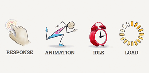
RAIL stands for response, animation, idle and load.
These four distinct areas are a way to reason about the actions in your websites and apps. If you optimize based on each area’s performance goals (which we got from those perception thresholds), then your users will be very happy.

Let’s look at each one in detail.
1. Response
If a user clicks on a button, you have to respond to their click before they notice any lag. This applies to any input, really, whether it’s toggling a form control or starting an animation. If it doesn’t happen in a reasonable window of time, then the connection between action and reaction breaks and the user will notice.
Response is all about input latency: the lag between the finger touching the glass and the resulting pixels hitting the screen. Have you ever tapped on something and it took so long to respond that you started wondering whether it registered your tap? That’s exactly the kind of thing we want to avoid!
Response’s primary interaction is:
- tapping — when the user taps or clicks on a button or icon (for example, tapping a menu icon to open off-screen navigation).
To respond responsively, we would:
- provide feedback in less than 100 milliseconds after initial input.
- Ideally, the feedback would show the desired state. But if it’s going to take a long time, then a loading indicator or coloring for the active state will do. The main thing is to acknowledge the user so that they don’t start wondering whether their tap was registered.
2. Animation
Animation is a pillar of modern apps, from scrolling to view transitions, and we must be judicious with what we do in this period of time, because the user will often be interacting directly and will really notice if the frame rate varies. However, the user expects very smooth feedback for more than what falls under the classic definition of animation.
Animation includes the following:
- visual animation. This includes entrance and exit animations, tweened state changes, and loading indicators.
- scrolling. This refers to when the user starts scrolling and lets go and the page is flung.
- drag. While we need to respond to the user’s interaction in under 100 milliseconds, animation might follow as a result, as when panning a map or pinching to zoom.
To animate properly, each frame of animation should be completed in less than 16 milliseconds, thereby achieving 60 FPS (1 second ÷ 60 = 16.6 milliseconds).
3. Idle
Creating apps that respond and animate well often requires deferment of work. The Optimistic UI patterns leverage this technique to great effect. All sorts of work that must be completed likely does not need to happen within a critical time window in the same way as “response” or “load”: Bootstrapping the comments functionality, initializing components, searching and sorting data, and beaconing back analytics data are all non-essential items that we can do when the browser is idle.
To use idle time wisely, the work is grouped into blocks of about 50 milliseconds. Why? Should a user begin interacting, we’ll want to respond to them within the 100-millisecond response window, and not be stuck in the middle of a 2-second template rendering.
4. Load
Page-loading time is a well-trodden area of performance. We’re most interested in getting the user to the first meaningful paint quickly. Once that’s delivered, the app must remain responsive; the user mustn’t encounter trouble when scrolling, tapping or watching animations. This can be super-challenging, especially when much of the work for a page shares a single thread.
To load pages quickly, we aim to deliver the first meaningful paint in under 1 second. Beyond this, the user’s attention starts to wander and the perception of dealing with the task at hand is broken. Reaching this goal requires prioritizing the critical rendering path and often deferring subsequent non-essential loads to periods of idle time (or lazy-loading them on demand).
Performance Goals
Performance is essentially the art of avoiding work. And when it’s unavoidable, make any work you do as efficient and well timed as possible.
With the stages of RAIL interaction laid out, let’s summarize the goals:
| Response | Animation | Idle | Page Load |
|---|---|---|---|
| Tap to paint in less than 100 milliseconds. | Each frame completes in less than 16 milliseconds. | Use idle time to proactively schedule work. | Satisfy the “response” goals during full load. |
| Drag to paint in less than 16 milliseconds. | Complete that work in 50-millisecond chunks. | Get first meaningful paint in 1,000 milliseconds. |
A Note On Measurement
Here are a few handy tips on measuring your project’s performance profile:
- Measuring these on a MacBook Pro or comparable machine (which many of us designers and developers have) won’t give a representative idea of your mobile users. Common phones can be over ten times slower than a desktop!
- A Nexus 4 is a good middle-of-the-road device to use.
- “Regular 3G” is recommended for network throttling.
- Also, look at your analytics to see what your users are on. You can then mimic the 90th percentile’s experience for testing.
What About Battery And Memory?
Delivering on all of the goals above but leaving the user with 10% battery and 0% available memory isn’t putting the user first.
We’re not yet sure how to quantify being a responsible citizen of the shared resources, but RAIL may some day get a B (for battery) and an M (for memory), turning into BLAIMR, PRIMAL or something else equally fun and memorable.
Business Impact Of RAIL
Many of us do what we do because we love building awesome things. We don’t work in a vacuum, though, and sometimes we have to make the business case to managers, stakeholders and clients to be able to prioritize performance as part of the user experience.
Luckily, many large companies have shared numbers that help us make our case:
- Google: 2% slower = 2% less searching per user
- Yahoo: 400 milliseconds faster = 9% more traffic
- AOL: Faster pages = more page views
- Amazon: 100 milliseconds faster = 1% more revenue
- Aberdeen Group: 1 second slower = 11% fewer page views, 7% less conversion
- Google uses website speed in search ranking.
Summary
The RAIL model is a lens to look at a user’s experience with a website or app as a journey comprising individual interactions. Once you know each interaction’s area, you will know what the user will perceive and, therefore, what your goals are.
Sometimes it takes extra effort, but if you’re kind to the user, they’ll be good to you.
Resources
If you want more information on RAIL and how to optimize your websites and apps, take a look at these.
Presentations On RAIL
- “Performance RAIL’s: The Art and Science of optimizing for Silicon and Wetware” (slides), Ilya Grigorik, Google, May 2015
- “How Users Perceive the Speed of The Web” (slides), Paul Irish, FluentConf, April 2015
- “Performance on RAILs” (video), Paul Lewis, Nordic.js, September 2015
Guidance And Documentation
- “Optimizing Performance,” Web Fundamentals, Google Developers
- “Browser Rendering Optimization” (course), Udacity
- “Profile” (performance), Google Web Tools, Google Developers
- “The RAIL Performance Model,” Web Fundamentals, Google Developers
Performance Audits
- Performance Audit of theverge.com” (July 2015)
- Performance Audit of imore.com” (July 2015)
- Performance Audit of m.espn.com” (April 2015)
- Performance Audit of squarespace.com” (April 2015)
- Performance Audit of cafepress.com” (April 2015)
- Performance Audit of CNET, Wikipedia and Time.com” (February 2015)
- Performance Audit of Wikipedia Rich Editor” (February 2015)
Academic Research On Perceivable Performance
- 1968: “Response Time in Man-Computer Conversational Transactions” (PDF), Robert B. Miller, Fall Joint Computer Conference 1968
- 1991: “Response Times: The 3 Important Limits,” Jakob Nielsen, Nielsen Norman Group
- 2004: “A Study on Tolerable Waiting Time: How long Are Web Users Willing to Wait?” (PDF), Fiona Fui-Hoon Nah, Behaviour and Information Technology, 2004
- 2005: “Interaction in 4-Second Bursts: The Fragmented Nature of Attentional Resources in Mobile HCI” (PDF), Antti Oulasvirta, Sakari Tamminen, Virpi Roto, and Jaana Kuorelahti, Interruptions in Human Computer Interaction
- 2006: “Quantifying Interactive User Experience on Thin Clients” (PDF), Niraj Tolia, David G. Andersen, and M. Satyanarayanan, The Internet Suspend/Resume Project, Carnegie Mellon
- 2012: “Characterizing Web Use on Smartphones” (PDF), Chad C. Tossell, Philip Kortum, Ahmad Rahmati, Clayton Shepard, Lin Zhong, Conference on Human Factors in Computing Systems 2012
- 2011: “Playing With Tactile Feedback Latency in Touchscreen Interaction: Two Approaches” (PDF), Topi Kaaresoja, Eve Hoggan, Emilia Anttila, Human-Computer Interaction: INTERACT 2011
Further Reading
- Front-End Performance Checklist 2017
- Getting Ready For HTTP/2
- Everything You Need To Know About AMP
- Progressive Enhancement
- Improving Smashing Magazine’s Performance


 Try ProtoPie AI free →
 SurveyJS: White-Label Survey Solution for Your JS App
 Celebrating 10 million developers

 Register Free Now

