Printed Smashing Books
We care about quality content and work hard to support and spread best practices, innovative techniques and forward-thinking ideas. Our printed Smashing Books are crafted to deliver in-depth knowledge and expertise shared by experts and practitioners from the industry. They are our editorial flagships—and they look damn good on a coffee table!
Quick Overview
We proudly craft affordable, practical books for pros like yourself who want to improve skills and make a difference. No fluff, no theory — just actionable insights applicable to your work right away. Here’s a quick overview of the last ones:
- Design Systems
- White Hat UX
- User Experience Revolution
- The Sketch Handbook
- Inclusive Design Patterns
- Smashing Book #5: Real-Life Responsive Web Design
- Digital Adaptation
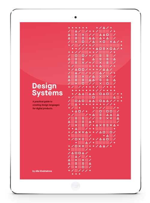
Design Systems (October 2017)
As the web continuously becomes more complex, designing static pages has become untenable, so that many of us have started to approach design in a modular way. In this book, Alla Kholmatova will identify what makes an effective design system that empowers teams to create great digital products. Get the book now →

About The Book
Many of us have started to approach design in a more modular way recently. It’s just more manageable this way. We experiment with pattern libraries and style guides and almighty design systems, yet while some of us succeed, most of us fail. Our systems get out-of-date too quickly or just don’t get enough traction in our companies. It’s about time to fix it.
Not all design systems are equally effective. Some can generate coherent user experiences, others produce confusing patchwork designs. Some inspire teams to contribute to them, while others are neglected. Some get better with time, more cohesive and better functioning; others get worse, becoming bloated and cumbersome.
Throughout this book, Alla Kholmatova, previously a lead designer at FutureLearn, will share an approach and the key qualities of effective, enduring design systems. It’s based on Alla’s experiences, case-studies from AirBnB, Atlassian, Eurostar, TED, and Sipgate, plus 18 months of research and interviews — all attempting to figure out what works and what doesn’t work in real-life products. It may not answer every question, but it will help you figure out just the right strategy for establishing and evolving a design system in your organization.
Who The Book Is For
The book is aimed mainly at small and medium-sized product teams trying to integrate modular thinking into their organization’s culture. Everyone in the product team could benefit from reading this book, but particularly visual and interaction designers, UX practitioners, and front-end developers.
The result is now for you to judge. Printed hardcover, 280 pages. Reviewed by Karen McGrane and Jeremy Keith. Cover design by Espen Brunborg. Get the book now.
Testimonials
It has been our goal to make the book as practical and useful as possible. We’ve been honored to receive very positive reviews from people working on design systems on small and large scale.
- “Alla’s book outlines a process not just for creating a design system, but sustaining it over time. If you work on today’s web, I’d strongly recommend reading this insightful, approachable book.” — Ethan Marcotte, Designer
- “Design Systems is essential reading for all designers and design teams. Like great design – and effective systems – this book is a complete, connected, compelling guide for crafting great digital product experiences. No single resource has been more integral to our thinking about design systems than Alla’s book.” — Jon Bell, Design manager, MailChimp
- “Alla’s thoughtful analysis of systems-oriented thinking is a fundamental primer for anyone looking to establish a universal language across their team or organization.” — Bethany Sonefeld, Design lead, Carbon Design System, IBM
- “The magic of this book is its recognition that building a design system is as much about forming human connections as it is about technical solutions. It embraces the hard problems, and clears a path to help teams work towards a shared, cohesive vision.” — Amy Thibodeau, UX lead, Polaris Design System, Shopify
- “Great designers make equally great writers because they are meticulous. This superb introduction to design systems is written with the meticulous care the subject deserves.” — Heydon Pickering, Author of Inclusive Design Patterns
What’s In The Book
The book explores design systems from the perspective of an interaction and visual designer. You won’t find any code samples or in-depth analysis of development tools. The book looks both into the main building blocks of a system and the workflow that would support the integrity of the system — all applied to designing and building websites or products today.
“Design Systems” is about how to approach your design process more systematically, and ensure your design system helps to achieve the purpose of your product and fits with the culture of your team.
The book consists of two parts:
Part 1: Foundations
In the first part, we’ll talk about the foundations of a design system – patterns and practices. Design patterns are repeatable, reusable parts of the interface, from the concrete and functional (like buttons and text fields) to the more descriptive (like iconography styles, colors, and typography). Patterns interconnect, and together they form the language of your product’s interface.
Shared practices are how we choose to create, capture, share and use those patterns by following a set of principles, or by keeping a pattern library.
- Chapter 1: Design Systems
- Chapter 2: Design Principles
- Chapter 3: Functional Patterns
- Chapter 4: Perceptual Patterns
- Chapter 5: Shared Language
- Summary
Part 2: Process
A design system cannot be built overnight – it evolves gradually with your product. But, there are certain principles and practices that we can follow to make sure the system develops in the right direction and provides us some degree of control over it. The second part of the book focuses on practical steps and techniques to establish and maintain a design system, including planning the work; conducting an interface inventory; setting up a pattern library; creating, documenting, evolving and maintaining design patterns.
- Chapter 6: Parameters Of Your System
- Chapter 7: Planning And Practicalities
- Chapter 8: Systemizing An Interface: Functional Patterns
- Chapter 9: Systemizing An Interface: Perceptual Patterns
- Chapter 10: Pattern Libraries: What, Why And How
- Conclusion
About The Author

Alla Kholmatova is a UX and interaction designer with a nine-year experience of working on the web, for a range of products and companies. Most recently she was a senior product designer at an open education platform, FutureLearn.
She’s particularly interested in design systems, language, and collaborative ways of working. In the last two years, she has been spending a huge amount of time working on and researching the subject. She’s been sharing her insights with people through articles, workshops, and projects. Alla contributes to design publications, such as A List Apart, and speaks at conferences around the world.
Sneak Preview (Free PDF Sample)
To give you a more detailed idea of what the book is like, feel free to download a free sample of the book — a chapter on solid principles which are the foundation for any well-functioning system. In this chapter, we’ll discuss the qualities of effective design principles and look at some of the ways of defining them.
- Free PDF sample: “Design Principles” (PDF, 0.7 MB)
Quick Summary
- Printed hardcover, 280 pages. The eBook is included for free!
- Available as eBook (PDF, ePUB, Amazon Kindle).
- Free worldwide airmail shipping.
- Get the book and start reading right away!
What You’ll Learn In This Book:
- How to get support for a design system in your organization,
- How to conduct a purpose directed interface audit,
- How to establish and evolve a shared design language within your team,
- How to think in patterns without losing sight of the whole,
- How to shift your team’s design process from thinking in pages to connected systems,
- How to define effective design principles,
- How to identify patterns early in the design process,
- How to strike a balance between reusability, consistency, and creative expression of the brand,
- How to eliminate duplicates and inconsistencies,
- How to establish foundations for a pattern library,
- How to define patterns and integrate them into the system,
- How to document and evolve design patterns.

White Hat UX (August 2017)
Most things in life come with a dark side. For years, the online space has acted as a playground for thieves, bandits and murky types who will use every trick in the book to make you do the opposite of what you set out to do. But there is hope. The next generation in user experience is coming.

White Hat UX - The Next Generation in User Experience is the right book for you when you find yourself in one of the following situations:
- You’re not trained in UX, yet you now have the responsibility for it
- You struggle to follow along in the conversations about user experience in your team
- You are a manager and want to understand how your company can become leaders in the modern digital market (hint: serving a great user experience is a competitive advantage)
- You want to learn about ethical design but you’re not sure where to start
White Hat UX starts by defining UX - done in a straightforward way that allows people with limited UX knowledge to gain a clear understanding of the field.
It shows and tells what many companies do wrong (either by intent or stupidity).
It describes how privacy is being violated, and what consequences it has for the businesses that will keep doing so because they think it’s good business (and because they don’t care about people).
And finally, it explains how you improve the user experience of your product, service and company to gain the most powerful competitive advantage in today’s consumer driven market: a White Hat, honest user experience. Also, you’ll sleep better at night knowing you are doing the right thing.
Table Of Contents
Discover
- White Hat, Grey Hat and Black Hat UX
- A Brief Introduction to UX
- Privacy Zuckering
- Black Hat UX: 12 Design Patterns
- UX Gone Wrong
Evaluate
- The Competition is Only a Click Away
- Test Methods in UX
- Test Reports and Release Notes
- Windows 10 Privacy
- Quality Assurance and Quality Control
- Baseline
Build
- The Principle of Least Astonishment
- UX and Scrum
- Shitstorms and Candystorms
- Grey Hat UX: 7 Anti-Patterns
Join The Light Side Of The Force
- White Hat UX Design Patterns
- From Dark Patterns to White Hat UX
- Becoming Proficient
- Things Take Time
- Strategic White Hat UX
Technical Details
- Quality hardcover with stitched binding and a ribbon page marker,
- 136 pages,
- ISBN (eBook): 978-87-994915-9-9,
- The eBook is available in EPUB format.
- Available as printed, gorgeous hardcover and eBook.

User Experience Revolution (April 2017)
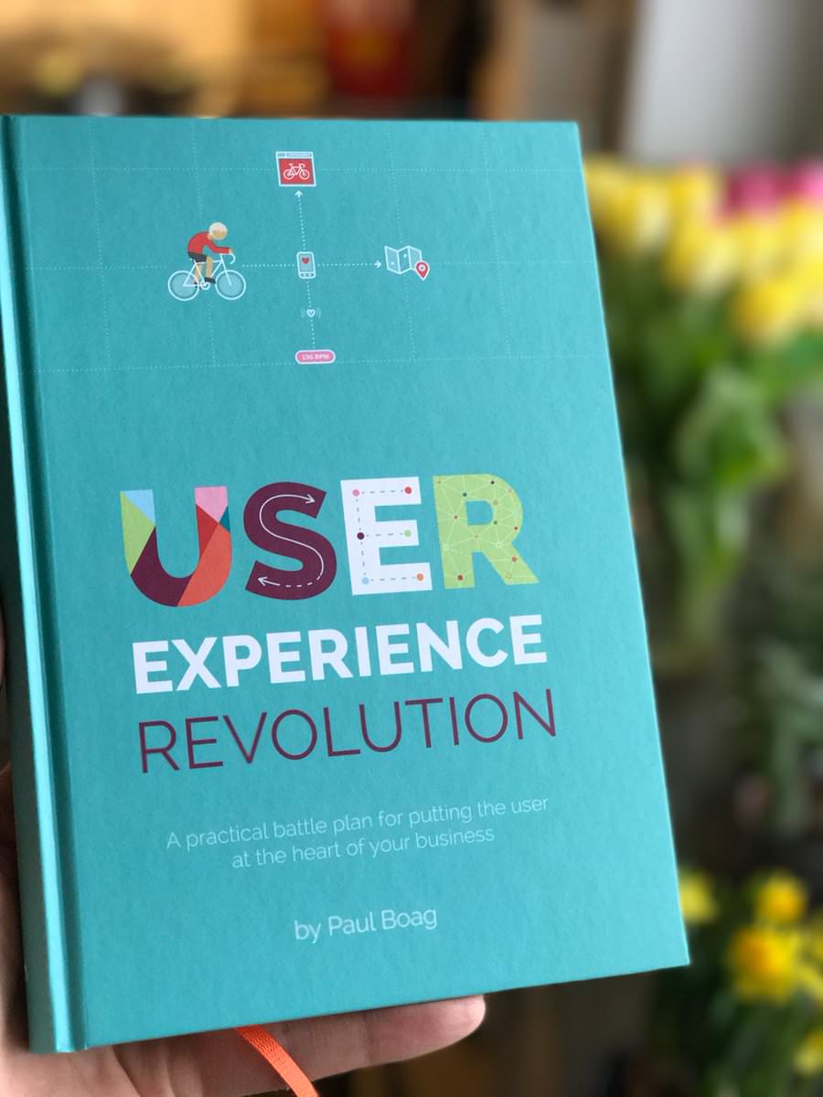
Many companies try to create a great experience for customers. However, few are willing to make the changes required to deliver on that promise. In fact, most companies don’t even realize how bad their experience can be. This is why we made a new book called “User Experience Revolution,” a practical battle plan for placing the user at the heart of your company. (Image credit: Artem Pereverzev)
Who Is The Book For?
This book is for anybody passionate about user experience, but who is working in a company that is failing its customers. It contains a battle plan of practical advice for changing the culture of businesses. Changing them, so they put the user first.
You might be a designer, marketer, content specialist or any one of many jobs concerned about user experience.
You do not need to be a manager, although you might be. You do not need to be an expert in user experience. You just need a willingness to challenge the way your company does things and be relentless at putting the user first.
This Book Will:
- Encourage you to break out of your comfort zone and start influencing the full scope of the user experience.
- Teach you how to articulate the benefits of user-centric thinking efficiently.
- Guide you through the process of building a grassroots movement within your company — a movement that will advocate the needs of your users.
- Provide practical ways you can raise the profile of the user within your organization.
- Help you find and build a proof of concepts to sell the benefits of a user-centric approach.
- Show you how to get management interested in user experience, and gain their support.
- Identify ways of embedding user-centric methodologies into the culture of the company.
Table Of Contents
| CHAPTER | DETAILS |
|---|---|
| 1. Getting Real About User Experience Design | |
Summary • The world has changed and there is a new generation of empowered, connected consumers – consumers with higher expectations than ever before. If your company does not meet those expectations customers will go elsewhere. In fact, according to Customer Think, 89% of customers will stop doing business with a company after a single poor customer experience. Keywords • Customer Relationship • Involving Customers Into The Product Design Process • Understanding Users' Needs | |
| 2. How To Sell The Benefits Of User Experience Design | |
Summary • Across all sectors, executives are more concerned with their agendas than fulfilling the needs of users. This makes convincing them of the value of user experience design very hard. Keywords • Understand Customer Expectations • Users Have Limited Time and Tolerance • User Experience In The B2B Sector • User Experience Builds Brand • User Experience Cost Savings • User Experience And Increase Sales | |
| 3. Create Customer Experience Evangelists | |
Summary • Harry saw himself as the sole custodian of the user experience, a lone maverick trying to bring about change single-handedly. The more he met resistance, the more he saw himself as the only one who cared. Over time, he ended up bitter and angry at his management team and colleagues. He came to see them as the enemy. Keywords • Find Colleagues Who Care • Reach Out To Your Potential Evangelists • Establish A Common Vision • User Experience Principles | |
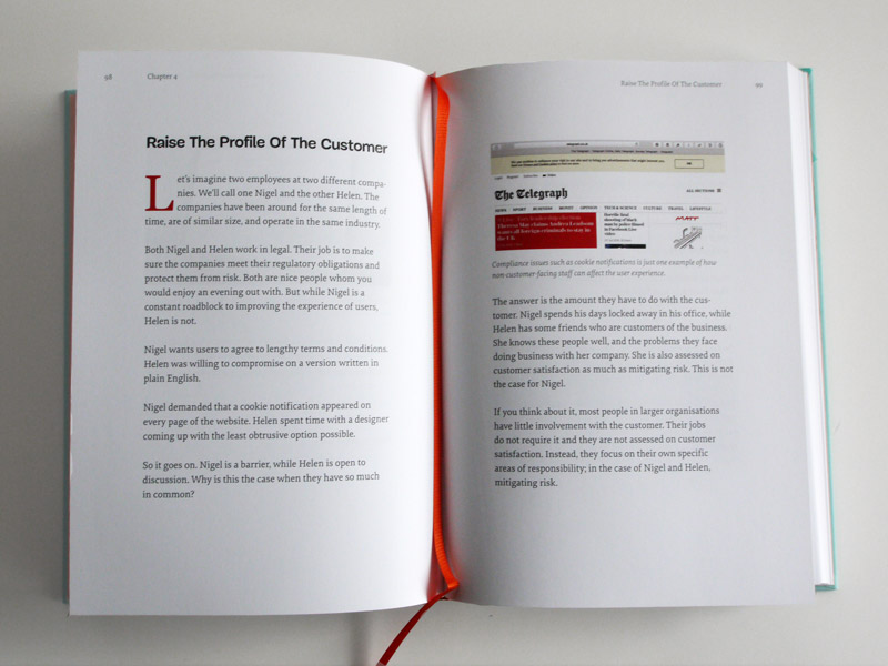
| 4. Raise The Profile Of The Customer | |
Summary • Let’s imagine two employees at two different compa- nies. We’ll call one Nigel and the other Helen. The companies have been around for the same length of time, are of similar size, and operate in the same industry. Both Nigel and Helen work in legal. Their job is to make sure the companies meet their regulatory obligations and protect them from risk. Both are nice people whom you would enjoy an evening out with. But while Nigel is a constant roadblock to improving the experience of users, Helen is not. Keywords • Pages • Humanise Your Customer • Tell The Customer’s Story • Communicate With Data • Ask Users For Feedback • Establish Regular Communication • Encourage Action • | |
| 5. Get Managerial Support | |
Summary • The time will come when you will have done all you can behind the scenes. You will need permission to take the next big step. Where that line is and what that next big step will be will vary from company to company. The longer you leave it, the more momentum will be behind your cause and the more compelling your case will be. You will have more support, more statistics, more stories. In short, you will be better prepared. That will be important if you want management to take you seriously. Keywords • Get The Attention Of Management • Apply Ux Design Principles To Management Needs • Frame Your Request Around Management’s Agenda • Validate Your Arguments • Get An External Perspective • Find Comparable Case Studies • Get Management’s Approval • Scare Your Management • Inspire Management • Give Management A Simple Next Step | |
| 6. Develop A Proof Of Concept | |
Summary • The real barriers to implementing the principles of user experience design are external constraints: constraints of the technology; constraints around compliance and policies; constraints around requirements. These limitations have prevented you from ever showing what a great user experience looks like. Keywords • An Experiment In User Experience Design • Delivering A Successful Pilot Project • Put Together The Right Team • The Three Rules Of Piloting • Find The Time For Your Pilot | |
| 7. Establish Better Working Practices | |
Summary • Although Hannah and her team were experts in their field, they were constantly prevented from doing their best work by the organisational culture. They found themselves compromising their work just to get it out of the door in a difficult environment. Keywords • Begin With User Needs • Enforcing Usability Testing • Collaborate Through Prototyping • Explore Alternative Approaches • Focus On Saving Users’ Time • Focus On Simplicity • Help Colleagues See Complexity • Making Legacy Simple | |
| 8. Transform The Organizational Culture | |
Summary • I was fortunate enough to work with an organisation whose senior management team sent out such an email. They made it clear that customer experience was their number one goal. Yet, a year on and little had changed, despite countless initiatives and training sessions. Any momentum gathered had stalled despite the best intentions of management. What had gone wrong? Keywords • Work Across Silos • Address Organisational Structure • Break The Fear Of Failure • Make UX An Operational Expense • Update Policies And Procedures Establish • New Metrics At Every Level | |
| 9. A Vision Of A UX-Focused Company | |
Summary • Changing an organisation’s culture is a major undertaking. It will take years and you might not see the end. But it is a journey worth making. It won’t just help the business. It will help you, too. It will develop your skills and increase your employability. It will raise your profile in the business. Most of all, it will make a tangible difference here and now. Although some of what I have written about will take years to achieve, you can apply much of what I have covered today, things that will make a difference immediately. Keywords • Work Across Silos • Address Organisational Structure • Break The Fear Of Failure • Make UX An Operational Expense • Update Policies And Procedures Establish • New Metrics At Every Level | |
Testimonials From Our Readers
- “I’m currently reading the User Experience Revolution book and I absolutely like it because of the strategic thinking, and its excellent examples.”
— Norbert Boros - Free PDF Sample: “Get Managerial Support” (PDF, 0.8 MB)
- Get Managerial Support (HTML, audio)
- Extra Goodie: 52 Free Culture Cards (PDF, 112 MB)
- 248 pages, 14 × 21 cm (5.5 × 8.25 inches),
- ISBN: 978-3-945749-51-7 (print),
- Quality hardcover with stitched binding and a ribbon page marker,
- All pre-orders have been shipped already. The hardcover book will be sent out starting from April 18th) via free worldwide airmail shipping from Germany.
- The eBook will be immediately available in PDF, EPUB, and Amazon Kindle formats,
- Available as printed, gorgeous hardcover and eBook.
- 376 pages, 17 × 24 cm (6.5 × 9.5 inches),
- ISBN: 978-3-945749-47-0 (print),
- Quality hardcover with stitched binding and a ribbon page marker,
- The eBook is available in PDF, EPUB, and Amazon Kindle formats.
- Free worldwide airmail shipping from Germany.
- Available as printed, gorgeous hardcover and eBook.
- How to style elements and text layers, change their properties and organize them properly,
- How to use artboards to evolve a design and iterate on ideas quickly,
- How to apply symbols and shared styles that allow you to reuse elements and keep them in sync,
- How to combine basic shapes into complex objects and optimize for maintenance,
- Advanced techniques such as dealing with masks, shadows, gradients and rotations,
- How to use an 8-pixel grid to bring more structure to designs and avoid random placement of elements,
- To work with grids and layouts and how to lay out the content in a structured, systematic way,
- How to efficiently design logos and icons in Sketch,
- How to export your assets and preview your designs on actual devices,
- How to use Sketch not only for digital design, but also for print projects,
- Tips and tricks for responsive design workflow with Sketch and adapting a mock-up from one breakpoint to another,
- How to define how elements react when they are resized with group resizing,
- The workarounds you can use when working together with developers on Windows.
- “I have been using Sketch for a while but wanted this to understand the software at a more foundational level rather than just diving head first into it. The book is organized in a manner that it is simple at the beginning and gets more complex as you progress. The writing is crisp, clear and the author does well what he set out to do - impart his Sketch knowledge to folks who want to know more about it. I highly recommend it for people who want a great foundation and an effective bunch of lessons. ”
— Justin Watts - “At first look I can see I’m going to get heaps of value from The Sketch Handbook. Already picked up some tips just by skim reading. I ordered the hardcover as a reference book for the studio. Can’t wait to get deeper into Sketch. Christian obviously knows his stuff! ”
— Simon Uxer - 312 pages, 14 × 21 cm (5.5 × 8.25 inches),
- Quality hardcover with stitched binding and a ribbon page marker,
- The eBook contains PDF, EPUB, and Kindle.
- Free worldwide airmail shipping from Germany.
- Available as print and eBook.
- Accessibility myths and misconceptions as well as common solutions and rules of thumbs,
- A library of well-tested accessible HTML/CSS components that you can use right away,
- How to properly use WAI-ARIA roles and Content Accessibility Guidelines,
- How to tackle common accessibility issues in responsive design,
- How to deal with “skip” links and external links, as well as navigation regions and landmarks,
- How to keep labels, buttons, tables of contents, dynamic widgets and tabbed interfaces accessible,
- How to implement infinite scrolling, grid display and dynamic content accessibly,
- How to deal with password validation, error messages, web forms, JavaScript patterns and touch targets,
- How to keep an interface accessible in legacy browsers,
- How to prototype with accessibility in mind.
- “Cannot say enough good things about this book!!! Best thing I’ve read all year! Full of useful info! […]. Worth every penny! Honestly think it’s a must read for both designers and developers.” — Tristan White
- “Just got @heydonworks @smashingmag book on coding accessibility. Only 2 chapters in but it already has me rethinking my approach.” — Jay Bellew
- “I’m currently reading it. It’s a remarkable book. All points are well founded and applicable.” — François Cardinaux
- “I’ve already used it at work!” — Tracy MacMath
- 584 pages, 16.5 × 24.0 cm (6.5 × 9.5 inches),
- Quality hardcover with stitched binding and a ribbon page marker,
- The eBook contains PDF, EPUB, and Kindle.
- Free worldwide airmail shipping from Germany.
- Available as print or eBook.
- Tackle bureaucracy and overcome legacy culture,
- Develop a flexible and effective digital strategy,
- Use responsibility matrix to minimize delays and costs,
- Adopt a digital culture and become digital by default,
- Apply techniques from mid-sized and large organizations,
- Avoid toxic practices and improve internal processes,
- Organize teams and boost their efficiency,
- Embrace social media and use them effectively,
- Understand the value of digital team and invest in them,
- Break down the walls and nourish collaboration, ownership and innovation.
- 176 pages, 16.5 × 24.0 cm (6.5 × 9.5 inches).
- Quality hardcover with stitched binding and a ribbon page marker.
- The eBook contains PDF, EPUB, and Kindle.
- Free worldwide airmail shipping from Germany.
- ISBN: 978-3-94454064-1.
- Life Is Too Short For A Broken Front-End - A New Smashing Book
- Smashing Book #4 — New Perspectives on Web Design (eBook)
- How To Boost Your Design Workflow With Setapp
- Is The Internet Killing Creativity?
Sneak Preview (PDF Sample)
To give you a more detailed idea of what the book is like, feel free to download a free sample of the book on how to get managerial support of your ideas. You should also check out my free culture cards. This pack of 52 cards each contain a technique you can use to shift the culture of companies to be more user centric.
Technical Details
The Sketch Handbook (November 2016)
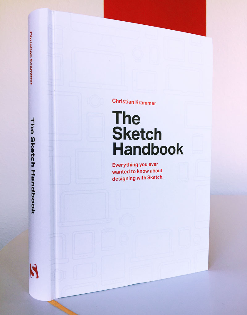
Sketch offers a wealth of tools and features to make it the perfect application for today’s designers: It lets you design interfaces, websites and icons with ease. To help you get the most out of this mighty tool, The Sketch Handbook will show you every aspect of it. Not in theory, but backed up by practical examples that you can follow along, step-by-step. Please note that this book is based on Sketch 41, the latest version of Sketch.
The book will guide you through every aspect of Sketch: From smart guides and layer manipulation to responsive baseline grid, nested symbols and group resizing. Whether you are a beginner to design or just started to use graphic apps, this book will teach you the techniques you need to start designing user interfaces in Sketch.
What’s in it for you? Well, you’ll get an overview of practical techniques and strategies that will make your design workflow more efficient and future-proof. You’ll learn how to design an advanced multi-screen mobile app, a responsive article and a variety of icons, and dive deep into organizing the artboard and exporting your assets for iOS and Android. Icon and logo design and export are also covered — along with recommended plugins and some obscure but handy tips and tricks. Pretty much everything you wanted to learn about Sketch, in one place.
About The Author

Christian Krammer is a web designer and Sketch app pro. He’s been running SketchTips for more than two years and has shared a number of tips and tricks about Sketch there. Christian also released two Sketch courses on Skillshare recently. When he’s not fiddling around with Sketch, he loves to spend time with his family or watch a good movie. Occasionally, he also shares Sketch tips on Twitter — but who doesn’t?!
Table Of Contents
You’ve probably guessed it — the book doesn’t deal with theoretical concepts but real-life examples. A centerpiece of the book is workflow efficiency: You will learn how to get great results quickly, using the full power of available features, shortcuts and techniques that other designers have learned over the years, and apply regularly.
| CHAPTER | DETAILS |
|---|---|
| 1. An Introduction To Sketch | |
Summary • The first chapter gives you a compact overview of the most important features of the design app, as well as an introduction to the interface of Sketch. Mainly, you will get a short peek into its best features: Sketch is easy to learn, fast and lightweight, it has a clean, uncluttered UI, grids are built right in, it provides powerful export options, lets you easily adapt your design to different sizes, and most of all: Sketch is vector based. Everything you build is indefinitely scalable — a must with today's vast array of devices. Keywords • Interface basics • Sketch basics • Bitmaps vs. vectors | |
| 2. Designing An App | |
Summary • The first screen we tackle is the details page. Everything starts here with the artboards which give your design a defined space. After you have added the first elements and text layers, you can read how to style them and change their properties. This includes an overview of the available shapes and fill types, as well as the usage of images. With the first layers appearing in the layers list, it’s also important to learn the best way to organize them. Lastly, you will employ an 8-px-grid, that gives the design some structure and avoids random placement of the elements. Keywords • Artboards, Designing at 1x, Shapes, Smart guides, Layer manipulation and organization, Fill types, 8-px-grid, Colors, Opening and closing shapes, Dashed and dotted lines | |
| 3. The Power Of Iterations And Artboards | |
Summary • A design is never finished, so we will use artboards to evolve its elements and try out different ideas. You will learn about symbols and shared styles that allow you to reuse elements and keep them in sync. This chapter also comes with some advanced techniques, such as masks, shadows, gradients, and boolean operations. The latter are especially important, as they let you combine basic shapes to form complex objects. This is also the first touch point with plugins to enhance Sketch. To round things up, we will have a look at how easy it is to recreate an icon in the design app. Keywords • Artboard organization • Image fills • Symbols • Customize the toolbar • Aligning layers • Custom shortcuts • Masking • Zooming • Shared styles • Undo and redo actions • Plugins • Icon creation • Shadows and blurs • Gradients • Fill types • Distribute content • Boolean operations • Pixel precision | |
| 4. Creating A Logo For The App | |
Summary • In this chapter, you will not only learn how to create a logo but also how to generate ideas surrounding it. The logo creation process involves a great deal of vector manipulation. You'll get an overview of the different point types and their specialties. Most of the time you don’t even need to create a vector from scratch, but you can manipulate a basic shape instead. Once the logo is done, we'll also finish the details' page. Keywords • Pages • How to get inspired • Types of vector points • Vector point mode • Create custom vectors • Manipulate text • Kerning and tracking • Scale layers • Layer management | |
| 5. Creating The Overview Page | |
Summary • Now that we have a detail page and an overview page, let's introduce a new options bar that contains a couple of different icons. We'll create those icons all by ourselves, as this is the perfect way to apply all the skills you have already learned, such as nested symbols and the usage of rotation. Furthermore, you will also learn how to create the list of places to visit a card view. Keywords • Nested symbols • Advanced icon creation • Layer styles • Black is never black • Rotations • Transformations • Duplicate content • Rulers and guides • Pasting • Design with real data (featuring the Craft plugin) • Create color variations | |
| 6. Exporting | |
Summary • This chapter is all about one of the strongest features of Sketch: exporting assets. When doing the setup right, all you need to do to export all your different assets is press a button. We'll walk you through a set of iOS and Android assets and you'll learn how to preview your designs on real devices and how to make your design workflow more developer-friendly. Keywords • Exporting options • File formats • Save space • Multiple export • Exporting iOS and Android assets • Device preview • Collaboration • What about Windows? • Printing • Alternatives • Prototyping tools | |
| 7. Design The Article Page | |
Summary • We'll focus on how to work with grids and layouts and how to lay out the content in an ordered manner. While dealing with lots of text and images, we'll also look at how to sync paragraph and character styles. Keywords • Grids and layouts • Baseline grid • Text and borders • Adding content with the Craft plugin • Choosing font sizes • Text options • Tracking • kerning and ligatures • The optimal reading experience • Add a drop cap • Images • Image manipulation • Text styles • Maximize available space • Blending modes • Duplicate content with Craft • Nested symbols • Layer order | |
| 8. Going Responsive | |
Summary • In this chapter, we look at a few different screen widths to figure out how any possible adaptations might look. Sketch will help us define how those elements react when they are being resized. With a little preparation, you just need to adapt the parent container and everything changes accordingly. Finally, this chapter will provide some important tips and tricks on how to best adapt the font sizes from one breakpoint to another. Keywords • Designing with constraints (group resizing) • Responsive grid • How to go from one breakpoint to another • Adapt content with Craft | |
| 9. The Final Breakpoint: Desktop Widescreen | |
Summary • After we've finished the first two breakpoints, we'll look at how the available information can be arranged on a widescreen display. Therefore, we'll adjust the grid and adapt most of the article elements to this new grid. Keywords • Designing with constraints (group resizing) • Responsive grid • How to go from one breakpoint to another • Adapt content with Craft • Make the app responsive | |
| 10. Designing The Category Icons | |
Summary • We'll create four different icons to reuse them as often as possible and to combine them into complex shapes with boolean operations. We'll use keyboard shortcuts whenever possible. Also, we'll learn how to use these icons with a grid. Keywords • Advanced icon creation • Icon creation workflow • Grids • Pixel perfection • Efficiency with keyboard shortcuts • Vector manipulation • Boolean operations • Pixel preview • Layer duplication | |
| 11. Export The Category Icons | |
Summary • The category icons are finished, but the work isn't done yet. This chapter focuses on their optimization. These optimizations include adapting to borders wherever possible to keep the file size down when exporting these assets. Keywords • Icon export workflow • Which format to choose: SVG or PNG • Optimize icons for small file size | |
| 12. Mini-Projects | |
Summary • In this course we will recap some of the topics we already have touched, but in a less formal way. Consider these as “design snacks” of sorts: fun projects that let you play around in Sketch. You will learn how to create a realistic clock, five different versions of pie charts, textured type, a round progress bar, and some logos. If you are already an intermediate user of Sketch, this is the chapter for you. Keywords • Create a realistic clock • Create textured type • Create pie charts (five different methods) • Create a round progress bar • Create some logos • Advanced shadows • Multiple borders and gradients • Rotations • Rotate copies • Masks • Image and pattern fills • Blending modes • Advanced vector manipulation • Advanced border options • Text on a path • Create branding assets • How to account for missing fonts | |
Technical Details
Who Is The Book For?
This book is for everybody who is designing for the web today. If you’ve used tools like Photoshop or Illustrator before and want to try out something that’s more geared towards interface design, take a close look at the book. Intermediate Sketch users will get valuable tips and tricks that they (probably!) didn’t know yet too, of course. Among other things, you will learn:
Testimonials From Our Readers

Inclusive Design Patterns (October 2016)
Accessibility has always been a slightly unsettling realm for web developers. Surrounded with myths, misunderstandings and contradicting best practices, it used to be a domain for a small group of experts who would “add” accessibility on top of the finished product. Today, in many simple and complex websites, it’s still unclear what makes up an accessible interface and what developers need to know to get there.
So let’s get to the bottom of it all: accessibility myths and rules of thumbs, WAI-ARIA roles, content accessibility guidelines, landmark roles, keyboard and touch accessibility, accessible markup and interaction patterns, accessible forms and widgets, multimedia accessibility and inclusive prototyping. Everything you need to know about accessibility gathered in one practical, smashing book, fully dedicated to building and designing accessible user interfaces.
Written by Heydon Pickering, the book comes with dozens of practical examples of accessible interface components and inclusive design workflow, applicable to your work right away. With this book, you’ll know exactly how to keep interfaces accessible from the very start, and how to design and build inclusive websites without hassle and unnecessary code.
Why An Accessibility Book?
We make inaccessible and unusable websites and apps all the time, but it’s not for lack of skill or talent. It’s just a case of doing things the wrong way. We try to build the best experiences we can, but we only make them for ourselves and people like us. We’ve got to fix this for good.
That’s why we set out with Heydon to work on a new accessibility book. The result, the Inclusive Design Patterns book looks at common accessible interface patterns from the perspective of an inclusive designer—someone trained in building experiences that cater to the huge diversity of abilities, preferences and circumstances out there.
There’s no such thing as an ‘average’ user, but there is such a thing as an average developer. This book will take you from average to expert in the area that matters the most: making things more readable and more usable to more people.
About The Book
Many web design articles and books are all about improving your workflow and making your life easier as a developer. Should you wish to adopt a framework or employ a processor to speed up your development process, be our guest. However, this book is not about you; it’s about your audience.
The Inclusive Design Patterns book covers all the techniques, gotchas and strategies you need to be aware of when building accessible, inclusive interfaces. We’ll explore the document outline, external links and “skip” links, navigation regions and landmarks, labelling and alternative text for illustrations, buttons, tables of contents, JavaScript patterns, touch targets, filter widgets and infinite scrolling and “load more” button and grid display and dynamic content and tab interfaces and password validation and web forms and error messages — and pretty much anything else you need to know about accessibility, including how to prototype with inclusivity in mind, how to deal with legacy browsers and dozens of practical snippets to use when building inclusive interfaces.

What’s in it for you? You can take away Heydon’s lessons learned and apply them within any framework sufficiently flexible to allow you to write and organize good interfaces. One thing is certain: once you read the book, accessibility won’t appear difficult nor confusing any longer — you’ll know exactly what to do, and when.
Table Of Contents
You’ve probably guessed it — the book doesn’t deal with theoretical concepts or things that are supposed to work. The book deals with practical design patterns and common interface components, and provides ready-to-use code snippets for applying to your work right away.
Table Of Contents
You’ve probably guessed it — the book doesn’t deal with theoretical concepts or things that are supposed to work. The book deals with practical design patterns and common interface components, and provides ready-to-use code snippets for applying to your work right away.
Introduction
Summary • We will look at an interactive element, a button, from the perspective of three types of designers. The purpose of this example is to show you how a little bit of knowledge about the medium can lead to a simpler and (therefore) more inclusive solution.
1. The Document
Summary • We will look into discrete interface patterns; modules, components, widgets, conventions, whatever-you-want-to-call-thems. It would be foolhardy not to first acknowledge that each will ultimately belong to a web document. HTML pages vary dramatically in shape and size and can include any combination of patterns, but there are a handful of ‘document level’ best practices to which we should adhere. The aim here is not to go in search of the ultimate ‘boilerplate’ but to configure a parent web page to support inclusive design. nhancement
2. A Paragraph
Summary • We’ll be looking at typefaces, leading, measure, justification, contrast, focus indication and more, to help you design paragraphs suited for a hugely diverse audience. We’ll also tackle specific issues for folks with limited vision, dyslexia, Irlen syndrome, low literacy and limited technical knowledge.
3. A Blog Post
Summary • We’ll show how to incorporate accessible landmarks and a sound section structure to make the content more navigable and interoperable to a diversity of users and parsers. This will be bolstered by giving well-written and context independent structural as well asand context independent structural and navigational cues.
4. Navigation
Summary • We’ll progressively enhance HTML’s primitives to create the inclusive means to navigate within and between web pages. We will also cover design provisions transferable to many other patterns, including logical source order and the virtue of eliminating redundancy. We will also tackle how to progressively enhance the navigation with JavaScript.
5. A Menu Button
Summary • In this chapter, we’ll ensure our menu button and the content it reveals are inclusive of differing user settings, circumstances, devices, and assistive technology software.
6. Inclusive Prototyping
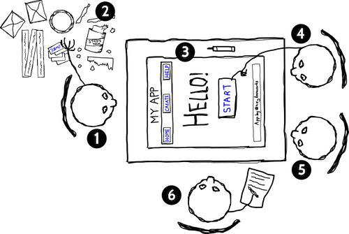
Summary • By going straight from paper to HTML, we lay the foundations for efficient code and inclusive experiences.
7. A List Of Products
Summary • In this chapter, we’ll practice our inclusive design chops. As in previous patterns, the organization and structure of content is paramount. We’ll look deeply into image accessibility, from both the perspectives of alternative text composition and performance. In catering to blind consumers, to those who cannot afford generous data contracts, and anyone accessing your content from outside your interface, this is a chance to really push the limits of inclusive design.
8. A Filter Widget
Summary • We’ll explore the importance of giving users choice and control over how their content is arranged. We’ll also use some techniques to make sure our design was tolerant of dynamic and fluctuating content. Inclusive design also means a visual design which is not too strict about the nature of the content imparted to it.
9. A Registration Form
Summary • This chapter will give you everything you need to develop inclusive forms. By using standard form elements, effective labeling and facilitating the correction of errors, users of all walks are able to access and contribute to your websites and apps. By keeping the form simple and avoiding irritating experiences like disappearing labels and passwords that you cannot check, we’ve made sure using the form isn’t just possible but pleasurable.
10. Test-Driven Markup
Summary • Test-driven development allows developers working with frequent iterations to move forward with confidence. By writing tests first, to prescribe outcomes, then creating the functionality to achieve them, you can ensure successful builds behave in a predictable and reliable fashion.
Technical Details
Why This Book Is For You
If you’re looking for smart accessible design patterns and strategies for building fast, flexible websites efficiently, this book is just for you. It’s a handbook with valuable, time-saving techniques that will help you avoid hacky workarounds and solve common issues effectively. You’ll learn how to:
Testimonials From Our Readers
Frequently Asked Questions
If you have any questions, we are right here to answer them. We’d love to help you in any way or just listen to your story. So please feel free to ask questions via Twitter @smashingmag — we’ll get back to you right away. Just in case: here are answers to some frequently asked questions.
| Question | Details | |
|---|---|---|
| Shipping costs for my country? | ||
There's no shipping costs for the The Sketch Handbook or any other order with the total cost above $20 — wherever you are in the world! We ship everywhere worldwide via airmail. We pay a share of the shipping costs ourselves to make it possible for anyone to purchase the book. Our prices are transparent: we don't have any hidden costs, and we won't confuse you with tricky calculations. What you see is what you pay. Also, check estimated delivery times. | ||
| Delivery times to my country? | ||
All books will be shipped via airmail to keep delivery times as short as possible. You can find the anticipated delivery time for your country in the delivery times overview. | ||
| Is the book available as an eBook? | ||
Yep, sure is! The book is available in PDF, ePUB and Amazon Kindle formats. You can get the eBook right away! | ||
| What payment methods are accepted? | ||
We accept PayPal, VISA, MasterCard and American Express. Of course, we use a secure connection, with 256-bit AES encryption and a green GeoTrust Extended Validation SSL CA certificate. And no, we don't store your credit card data on our servers. | ||
| Is there a money-back guarantee? | ||
Yes, absolutely! No risk is involved. Our 100-day full money-back guarantee keeps you safe. Don't hesitate to return your purchase. You'll get your money back with no ifs, ands, or buts! | ||
| I have a question that is not covered here. | ||
Please leave a comment below, or get in touch with us via the contact form or via @SmashingSupport on Twitter. We would love to help you in any way we can — you know that! | ||
Smashing Book #5: Real-Life Responsive Web Design
Responsive design is a default these days, but we are all still figuring out just the right process and techniques to better craft responsive websites. That’s why we created a new book — to gather practical techniques and strategies from people who have learned how to get things done right, in actual projects with actual real-world challenges.
Neatly packaged in a gorgeous hardcover, the book features practical front-end techniques and patterns from well-respected designers and developers. The book isn’t concerned with trends or short-lived workarounds — it should stand the test of time and as such, it’s focused on actual techniques used today in real-life projects. The techniques that you could apply to your websites today, too.
About The Book
Smashing Book 5: Real-Life Responsive Web Design is our brand new, upcoming book with smart front-end techniques and design patterns derived from real-life responsive projects. With 13 chapters on responsive workflow, SVG, Flexbox, Web fonts, responsive images, responsive email, content strategy, debugging, performance and offline experience, this is just the book you need to master all the tricky facets and hurdles of responsive design.

Once again, the book is going to be quite thick, and both hardcover or digital editions (eBook in PDF, ePUB and Kindle) will be available. So if you want to get your hands on the book, you better don’t wait too long. We know it — you’ll love the book as much as we do. Free worldwide shipping.
Table Of Contents
We invited respected designers and developers who know a thing or two about responsive websites. The chapters have also been reviewed by active members of the community such as Jake Archibald, Dmitry Baranovsky—just to name a few.
| AUTHOR | CHAPTER | DETAILS |
|---|---|---|
| Vitaly Friedman | Preface | |
Summary • As designers and developers, we solve problems for a living. Yet, these problems are often quite tricky and complex, and the context of these problems requires us to be creative and flexible in our workflows. With responsive design, we are prompted to create scalable design systems that work well in unpredictable environments. To do that, we need to be pragmatic and find solutions that work well within given constraints. That’s why we created this book: to find techniques that have actually worked in real-life projects with real-world challenges. Keywords • design systems • scalability • bulletproof solutions • front-end techniques • real-world challenges | ||
| Daniel Mall | Responsive Designer’s Workflow | |
Summary • In practice, responsive projects usually require more time, more skills, more testing and hence more flexibility in budgets. Addings changes late delays projects immensely, and process involving designers, developers and clients is usually tiring to say the least. Keywords • responsive workflow • element collage • style tiles • tools • deliverables • performance budget • interface inventory • sketching • planning • manifestos • hypothesis • atomic design • designing in the browser • Photoshop | ||
| Vitaly Friedman | Responsive Design Patterns and Components | |
Summary • So, how do we deal with complex tables when building responsive websites? What about advanced interface components? Dashboards? What about the behaviour of web forms, navigation, mega-drop down menus, filters? Can we utilize vertical media queries and portrait/landscape orientation change? In this chapter, Vitaly will provide an overview of clever practical techniques for improving UX of responsive sites, with innovative approaches to designing "responsive modules" such as mega-drop downs, tables, calendars, accordions, maps, sliders, responsive PDF and responsive iconography — and a dash of anti-patterns to avoid as well. Keywords • design patterns • navigation • smart front-end techniques • priority+ pattern • improved off-canvas • lazy loading • autocomplete • filters • responsive PDF • portrait/landscape mode • sliders • country selector • responsive iconography. | ||
| Eileen Webb | Structured Content For RWD | |
Summary • Content created by one department is never updated by the next. Services get renamed in the navigation, but are still referenced by the old name in the body text. Important information is buried in the murky depths of flowery prose. Keywords • structured content • content consistency • content models • structural audit • editorial content • content types • content relationships • data-driven gaps • feature-driven gaps • authors and editors • CMS • content maintenance | ||
| Sara Soueidan | Mastering SVG For RWD And Beyond | |
Summary • This chapter has hands down on everything you need to know in order to start designing and building flexible components and visual assets with SVG. Sara will take you on a journey through SVG syntax, SVG accessibility, SVG viewport and viewBox, creating and exporting SVGs, embedding SVGs, building SVG sprites, creating SVG icon systems, using SVG Data URIs, optimizing SVG for performance, SVG conditional processing, clever SVG tricks and techniques and making SVG cross-browser responsive with CSS. Yep, everything you need to know about SVG, as promised. Keywords • SVG • syntax • accessibility • viewport • viewBox • exporting • embedding • sprites • icon systems • data URIs • performance • smart SVG techniques • responsive iconography • cross-browser fallbacks | ||
| Zoe M. Gillenwater | Building Responsive Components With Flexbox | |
Summary • We can use Flexbox for a while now. In fact, Flexbox solves a lot of CSS shortcomings and makes building responsive layouts much easier than with floats or positioning. It gives you more control over the things you care about in a responsive layout (such as order, alignment, and proportional sizes of your boxes) and lets the browser figure out the rest; the math-y stuff that computers are good at, like the exact dimensions that are needed on the boxes to perfectly fill the available space. Keywords • syntax variants • | ||
| Bram Stein | Web Fonts Performance | |
Summary • By default, web fonts block rendering, hiding content from the user. The only way to make content accessible as soon as possible is by treating web fonts as a progressive enhancement. This doesn’t mean web font performance is not an issue. You still need to load web fonts as quickly as possible so that users experience your site exactly how you designed and built it. Let's fix this. Keywords • font formats • font loading • font-rendering • FOIT and FOUT • Font Loading API • fallback fonts • inlining fonts • simulating swapping • promises • asynchronous loading and caching • prioritized loading | ||
| Yoav Weiss | Using Responsive Images, Today | |
Summary • So you want to serve different images to different screens. Perhaps a Retina image (only) to Retina screens, or an art-directed image to small screens, or a portrait image for portrait orientation, or perhaps .webp to browsers supporting the format — without performance hits. Since images are the heaviest assets on the web, dealing with them intelligently is both our responsibility and opportunity for more dynamic layouts. That's what native responsive images are for. Keywords • CSS pixel and DPR • Retina displays • fixed-width images • variable-width images • srcset and sizes • art direction • <picture> element • separation of concerns • image format fallback • accessibility • background images • image optimization • WebP and JPEG-XR • compressive images • deployment • common pitfalls | ||
| Fabio Carneiro | The Dark Side Of Responsive HTML Email | |
Summary • Explaining responsive HTML email is always an uphill battle, because just about every single designer and developer hates it. But there’s a lot of great, forward-looking innovation going on in the email design world. In fact, melding of responsive design techniques is absolutely possible. Keywords • email landscape • CSS in email • market share • navigation and CTA buttons • foundational markup • reset and client-specific CSS • fluid containers • pattern-based development • layout techniques • Microsoft Outlook • Windows Live Mail • Apple Mail • Mozilla Thunderbird • Outlook.com • Yahoo! Mail • AOL • iOS Mail • Gmail | ||
| Tom Maslen | Testing, Maintaining And Debugging RWD | |
Summary • We talk a lot about designing and building responsive websites, but not so much about maintaining and testing them. Speaking from his experience at BBC, Tom has built up a way of working that minimizes the pain points that responsive web design has. Keywords • "cutting the mustard" • predictable, simple CSS • naming conventions • BEM and class names • Sass organization • debugging media queries • lazy loading • content-out media queries • separation of concerns • exploratory testing • functional testing • visual regression testing • automated testing • dealing with false positives • common dependencies • troubleshooting bugs on mobile | ||
| Andrew Clarke | Counting Stars: Creativity Over Predictability In RWD | |
Summary • Our responsive designs lack soul. You can think of many websites that are well presented, easy to use, triumphs of UX and technically competent, but few that might be remembered for years to come. Why do you think this is? Why are so few websites memorable? Could the design processes we’ve come to rely on, particularly in relation to responsive design, have hindered our creativity? Our modern web design magazines are full of advice about process, techniques and tools, but little about creativity, about humanity, or about ideas. Keywords • advertising • user experience design • creative hijinks • allergic to research • process and predictability • building blocks of creativity • intoxicated by process • platform for creativity • creative brief • line between control and chaos • buying creativity • copywriting • creative teams • creative direction | ||
| John Allsopp, Matt Gaunt | Beyond Responsive: Optimizing For Offline | |
Summary • What if we told you that as a user, you don’t have to be online to use the web, and a website or a web application would respond to this accordingly? Think Offline First: "We can’t keep building apps with the desktop mindset of permanent, fast connectivity, where a temporary disconnection or slow service is regarded as a problem and communicated as an error." John and Matt cover main technologies and practices that you’ll need to use to make your apps work as well offline, as they do online. We’ll discuss how to detect if we are online or not, HTML5 Application Cache, WebStorage and offline events, but most importantly Service Workers and how we can use them today to not only make content available offline, but also significantly improve performance and create snappy, fast experiences in (almost) no time. Keywords • navigator.onLine • online and offline events • HTML5 Application Cache • cache manifest • fallbacks • AppCache gotchas • Web Storage • localStorage • Service Workers | ||
| Ben Callahan | Efficient Responsive Process With Clients | |
Summary • Design deliverable is one thing, an efficient collaboration between teams and stakeholders is a different beast entirely. This chapter provides strategies for keeping this collaboration sane and focused. Keywords • collaboration • estimates • spiraling • "one-deliverable" workflow • efficiency • content priority guide • style comparisons • testing the aggregate • content prototype • wireframes • style prototypes • pattern libraries • happy teams | ||
| Vitaly Friedman | Performance Optimization Roadmap | |
Summary • If somebody tells you that responsive websites are bloated, heavy and slow by default, and that it's very difficult to make them fast, don't believe them — they are liars. If you set the priorities right and build the website with progressive enhancement in mind, you can create extremely fast responsive websites that work well across devices: with one code base working everywhere. Keywords • mobile first • jQuery dependence • dealing with IE8 • advertising • refactoring • code inventory • front-end optimization • performance budget • SpeedIndex • deferring web fonts • critical CSS • smart font fallback • dealing with JavaScript • asynchronous loading • SPDY/HTTP 2.0 • core content/functionality priority lists • responsive images | ||
Please note that Ben Callahan’s chapter and Vitaly Friedman’s “Performance Optimization Roadmap” chapter are only included in the eBook edition of Smashing Book 5, not in the hardcover.
Technical Details
Digital Adaptation
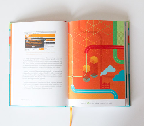
Nothing is more frustrating than stubborn management entangled in dated workflows and inefficient processes. That’s why we created Digital Adaptation, a new practical book on how to help senior management understand the Web and adapt the business, culture, team structure and workflows accordingly. No fluff, no theory — just techniques and strategies that worked in practice, and showed results.

The book will help traditional businesses and organizations to overcome their legacy, and help you plant the seeds of change with very little power. If you do want to finally see changes happening, this is the book to grab.
Written by Paul Boag. Designed and illustrated by Veerle Pieters. 176 pages. The books are shipping now. Get the book now.
Why This Book Is For You
If you’ve got enough of your co-workers not understanding the Web, Digital Adaptation is just what you need — ideas and concepts that you can put in front of senior management to make real changes. You’ll learn to:

Table Of Contents
| CHAPTER | TITLE | DETAILS |
| Foreword | A Message for Web Professionals | |
Summary • The foreword introduces the purpose of the book and explains why we decided to choose you as the audience for it. In fact, the book is written primarily for you as web professionals. A book you can quote to senior management and make real, lasting changes in your organization. Your job is to take the concepts covered in this book and put them in front of senior management. Keywords • audience • strategy • video. | ||
| Chapter 1 | The Digital Divide | |
Summary • The core problem with digital, faced by many large organizations, is that they were formed before the web as we know it today existed. Their systems, processes, and (in many cases) people are not configured to support it. In this chapter, Paul discusses warning signs of digital incompatibility in your company, organizational and cultural barriers and changes that the new digital landscape has brought. This is a chapter of how most organizations struggle with their digital strategy and what you have to know to avoid the problems in a long run. Keywords • pre-web organizations • legacy systems • digital incompatibility • structure • fragmented web presence • culture • customer needs • shifting digital landscape • digital strategy. | ||
| Chapter 2 | Setting Your Digital Direction | |
Summary • As Richard Rumelt said, "good strategy works by focusing energy and resources on one or a very few pivotal objectives whose accomplishment will lead to a cascade of favorable outcomes." In this chapter, you'll learn how to select the right digital direction and how to deal with prioritization paralysis. Backed up by case studies and real-world examples, you'll also learn how to form a digital strategy and how to use guiding principles, digital policies, and a responsibility matrix to complement the strategy. The chapter also explains how reorganizing teams and processes will help tackle dated, inefficient departmental structures. Keywords • business objectives • digital team • defining priorities • problem diagnosis • guiding principles • web steering committees • responsibility assignment matrix • digital policy • remote work. | ||
| Chapter 3 | Adopting A Digital Culture | |
Summary • Forming a digital strategy is one thing, but making it work requires changes in the digital culture. This chapter discusses main components of a digital culture, including collaboration, agile development, digital by default, innovation and service-oriented culture. The web can't be neatly separated from the rest of organization; what's necessary is a single organizational strategy that is heavily influenced by online. This chapter explains just how such a strategy can be established in practice. Keywords • Gov.uk redesign • digital by default • aspects of digital • Business Model Canvas • innovation and failure • service culture • user testing • customer engagement. | ||
| Chapter 4 | Digital Teams: Agents of Change | |
Summary • There are various ways in which digital teams can be organised, but some approaches are more effective than others. This chapter discusses how to build an effective team and what role it should have, as well as how to find a good digital lead and attract and retain appropriate digital staff. Sometimes the digital team can feel like a Ping-Pong ball that ricochets around the organization—you are never quite sure where it will end up. This chapter explains the place, the position and the working environment of an effective digital team. Keywords • team structure • roles and responsibilities • digital leads • attracting good staff • light leadership • working environment • skills, not roles • hiring digital workers. | ||
| Chapter 5 | Digital Demands Another Way Of Working | |
Summary • There is no shortage of big digital failures, from the London Olympics website to the Healthcare.gov website. The costs are staggering and the impacts devastating. The more complex and ambitious a digital project, the more traditional management approaches will struggle to scale. This chapter explores why digital projects fail and how you can minimize the risk of this happening by identifying and prioritizing user needs and involving the entire digital team in the conversation. Of course, this would work best within an iterative and collaborative context in which failure, prototyping and experimentation are deeply rooted within the digital culture. Keywords • failures • the boom-bust cycle • usability testing • user needs • prototyping • iterative, incremental process. | ||
| Chapter 6 | Grassroots Change | |
Summary • Anybody can instigate change. As somebody working at the grassroots level of your organization’s digital strategy, you are a key catalyst of change. That work begins in your own team. You can plant the seeds of change by establishing good team-working relationships and atmosphere, enforcing good working practices, building bridges with colleagues and educating them, approaching management strategically, and being disruptive. If you don’t take action to change it, nobody else will. But if you do take action, there is a real opportunity to make your work more enjoyable and to have a real impact on your company. Keywords • down-top change • transforming a team • wartime mentality • work environment • work practices • convincing management • SWOT analysis • disruption. | ||
About The Author

Paul Boag is quite a character. With over 35 articles published on Smashing Magazine, he is not really an author that requires an introduction. Paul has been working on the web since 1994. He is web strategist at Headscape Ltd, a web design agency that he co-founded back in 2002. Paul also produces and hosts the longest-running web design podcast at boagworld.com. He is a regular speaker at conferences and author of Client-Centric Web Design.
Technical Details
Thank You!
We take pride in the time and efforts we put into creating our Smashing Books. We sincerely appreciate your support and trust — without you, we wouldn’t be able to release the books, and you should know that.


 Try ProtoPie AI free →
 Register Free Now


 SurveyJS: White-Label Survey Solution for Your JS App

