Product Design Principles: How Does Your Product Stack Up?
A company proves that it has a strong creative process by developing successful products repeatedly. We see this in companies like Apple, BMW and Google. Founders such as Steve Jobs formed a corporate culture with an intense focus on creativity and design. This culture highlights two core elements in the creative process: the ideas and the team.
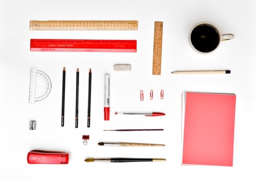
The creative process can be described in one sentence: Ideas begin with a small team of creative people at the heart of the company who communicate easily with each other.
While many companies are founded on principles such as value, quality or customer service, an innovative company is built with design at its core. With invariable dedication to design principles, a company distinguishes itself by following a creative process led by a skillful team of product designers and engineers. The purpose of this article is to answer the question, “What do the greatest product designers consider to be the most important product design principles, and how can we apply them to our products?”
In this article, you will learn:
- six core product design principles,
- how to apply these design principles, with the aid of 15 product examples.
As a guide, I’ll be quoting from some of the world’s greatest product designers, including Apple’s chief designer, Jonathan Ive, and Apple cofounder Steve Jobs; PayPal and Tesla cofounder and SpaceX founder, Elon Musk; Raymond Loewy, the “father of industrial design”; and Dieter Rams, the German functionalist designer of over seven decades.
Six Product Design Principles
Here are the principles:
- irreducible simplicity
- immediate intuition
- beauty underneath
- approachable innovation
- form and color agreement
- replicable methodology
To make decisions, we can use these principles as a test by rating a product on a scale from 1 to 10 for each of the principles above. The lowest rating is a 1, and the highest is a 10. Each explanation below comes with examples to give you an idea of how to rate your product. Keep in mind that creative analysis is, ultimately, subjective and personal (like appreciating wine or a painting); therefore, each person’s rankings will be different.
But keep in mind that the purpose of this “test” is to facilitate a thought process that leads to the best product iterations possible. Let’s begin.
Irreducible Simplicity
You’ve created a product to meet a need. (If this isn’t true, then stop reading this and first build something helpful.) Now ask yourself, “Does my product have extraneous features that diminish the experience and satisfaction it provides?”
“Deciding what not to do is as important as deciding what to do.” – Steve Jobs
Take a car. A car is created, in its most basic form, to get you from point A to point B. The audio system doesn’t help you get from point A to point B, right? Therefore, should the audio system be removed for the sake of simplicity? No. The audio system is left in because it makes the experience of getting from point A to point B more satisfying. The goal of any product design is to reduce everything until you reach the point that satisfaction is not sacrificed.
Some might say, “My product is too complex to remove features.” There are cases where multiple features are combined to make up “the product” — such as an iPhone, as opposed to, say, a spoon. Take, for example, a product with a large number of features: the Vantage Elan, a magnetic resonance imaging (MRI) system, manufactured by Toshiba in Japan.

The basic hardware components on an MRI scanner include a graphics window, components of the imager, the superconducting magnet, the gradient coils, the radiofrequency coil, a patient table that has a positioning accuracy of 1 millimeter, the control console and an array processor. Additionally, the software that tells these components how to work with each another is as complex as it is critical to maintain safety.
How on earth do we apply the principle of irreducible simplicity to something so complex?
Here’s how: Apply the principle to each feature of the product on its own. By applying the principle to each feature of your product, the product’s gestalt (or the sum of the parts) will remain simple.
The Vantage Elan is a perfect example of irreducible simplicity. It won the Red Dot Award in 2014 for product design. It was described thus (emphasis mine):
“The Vantage Elan features an installation footprint nearly 29 per cent smaller than familiar MRI systems. It eliminates the need for a special equipment room, shortens the installation period and reduces total energy consumption. The greater overall energy efficiency also makes the scanner quieter in terms of operation. The outer surfaces have been kept minimalist on purpose to heighten the device’s appeal for patients.”
In each feature, the Vantage Elan reduces size, power, sound and time but captures incredible high-quality images. This makes the huge machine feel like a simple experience for both doctors and patients — an indication of an excellent product. In our test, I would give the makers of the Vantage Elan an 8.5 for reducing complex components in size, encasing the machine in a round and friendly body, with clean white and baby-blue accents, and maintaining a high-quality image output that will help save lives.
Now, look at your product and apply the principle of irreducible simplicity:
- What single problem does it solve clearly and thoroughly?
- Does each feature solve a single problem clearly and thoroughly?
- What features can be taken away without sacrificing satisfaction?
Immediate Intuition
You’ve read about the central tension between Android and iPhone: an open system versus a closed one. Google allows its users to tinker extensively, allowing full customization of its software, whereas Apple controls the user’s experience by setting up parameters and standards that limit the iPhone’s flexibility. (For example, an iPhone app cannot be programmed to close another app.)
“Any product that needs a manual to work is broken.” – Elon Musk
While both mobile providers would argue that their approach is best, they have both created products that make different statements about the principle of immediate intuition. Google is essentially saying, “We’ve made a product that could be more intuitive — and we want you to help us figure it out. Enjoy!” Apple is claiming, “We’ve made a product for which there is no rational alternative. Enjoy!”
The market share split between Android and iPhone suggests Android is more popular (78% to Apple’s 17.8%), but Apple’s 92% profit share in the smartphone industry suggests a stronger product that people are willing to pay more for. This tension highlights that what is intuitive to me might not be intuitive to you. So, remember that, when designing for intuition, empathize with your target customer.
Product Example: The Materious Cubby
After emailing each other for a while, two design professors fell in love. Stephanie and Bruce Tharp felt butterflies over the same passion: that good design is obvious. Their story led them to open Materious, their own independent design studio that produces interesting products, including the Cubby.
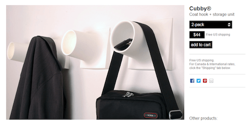
The Cubby is an innovative, award-winning coat-hook and storage-unit system that can be installed anywhere. The large round diameter preserves your coat’s collar while storing items such as sunglasses, a phone, a wallet, spare change and gloves.
How is the Cubby immediately intuitive?
- You don’t need an instruction manual.
- It’s difficult to break.
- A six-year-old would know what to do with it.
- It’s effortless for the mind.
The Materious Cubby performs magnificently across these criteria, and for these reasons, I would give the Materious Cubby a 9.5 out of 10
Analyze your own product against the principle of immediate intuition using the following questions:
- How does using it reduce stress?
- How long would it take someone to fully understand it?
- In what ways can it be improved?
Beauty Underneath
“[Be] fanatical in terms of care and attention to things people don’t see immediately. It’s like finishing the back of a drawer. Nobody’s going to see it, but you do it anyway. Products are a form of communication — they demonstrate your value system, what you care about.” – Jonathan Ive
A Second Date
Let’s say you put your dating hat on (or back on) and take an attractive and interested person out to dinner, sharing wine and having a great time. As the night goes on, it dawns on you that this person has an incredible story, a humble self-regard and a genuine heart for others. You stop seeing their physical attractiveness and are now passionately curious to really get to know this person. Hence, a second date. In the same way, when the user of a product unexpectedly discovers beauty underneath (the hidden value), they will want to continue using the product.
The Lagniappe
A bad product is one that does exactly what it says — and that’s it, no more. Continuing the date analogy, if you instead found the attractive person to be self-absorbed and gossipy, then you would have ended the night with no desire for a second date. Conversely, a good product does exactly what it says, and then adds a “lagniappe.”
If you are an entrepreneur, then you must add this French word to your vocabulary. Lagniappe means “an extra bonus or gift.” A lagniappe is the 13th doughnut in a baker’s dozen. It is the warm chocolate-chip cookie waiting for you on the bed of your DoubleTree hotel room.
Example: Starbucks Table
My laptop’s battery died once in Starbucks, as I was sitting at a large dark table made of reclaimed wood. I looked forlornly at the wall, where the power sockets were, and dreaded running my charger awkwardly across the laps of the other people sitting at the table. I rustled in my bag for the charger and began apologizing for getting in the way of others, dragging my charger to the wall and bending down to plug in. I sat back down. That’s when the person across from me said, “You know there is a power socket in the table, right? It’s, like, right there.” He pointed right in front of me. I looked underneath the table, and just four inches from my face were two power sockets. Oh. Beauty underneath.
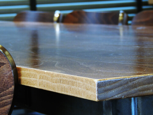
I would rate the Starbucks table a 9 out of 10 for beauty underneath because of its tasteful, unobtrusive appearance and its surprisingly useful technological undergirding. Soon, we will see Powermat Spots built right into the tables, allowing customers to wirelessly charge compatible mobile devices simply by placing them on the table — no plugging or cords involved.
To assess your product against the principle of beauty underneath, ask yourself:
- Does my product have usefulness that is not immediately apparent?
- Is a hidden gem of value lying below the surface of my product?
- Does my product have a lagniappe?
Approachable Innovation
Loudcloud introduced cloud computing five or six years too early; people didn’t get it. The Palm Pilot was a breakthrough in the market for personal digital assistants, but Palm didn’t innovate enough to keep up. Instagram, on the other hand, beautifully reduced the clutter in the social photo-viewing experience.
“Design should not dominate things. Not dominate people. It should help people.” – Dieter Rams
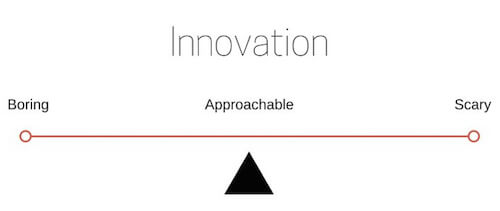
These are stories that demonstrate that, for an innovation to be successful, it must be approachably innovative. Loudcloud’s product was too revolutionary, and it scared or confused people. The Palm Pilot became mundane, which bored or annoyed people. Instagram was approachable — falling right in the middle of the boring-scary scale.
Example: Jar With A Twist
Most people love peanut butter. In 2014, Statista studied consumption of peanut butter in US households and found that approximately 91% of Americans eat it. The peanut-butter jar is familiar to us all: Unscrew the cap, dip in a knife and spread it smoothly on bread. (FIY: 80% of Americans prefer creamy, while 17% prefer crunchy peanut butter. The remainder represents a mixture of peanut butter and jelly together in the same jar.)
Given its ubiquity, what happens when someone tries to innovate on the peanut-butter jar?
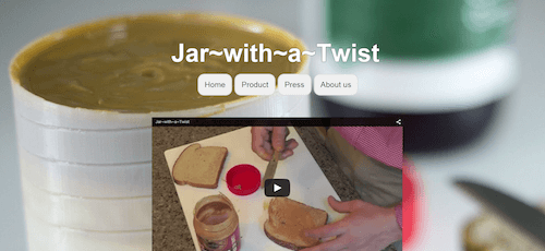
Jar With a Twist is a patent-pending peanut-butter jar. Its rotating bottom functions similarly to that of a deodorant stick, bringing the contents of the jar up to the top for easier access. Does Jar With a Twist’s design strike this balance in innovation between boring and scary? It might be too early to tell, but here are my predictions:
- Great job with the functionality. It works simply and intuitively, and the lagniappe is that rotation increments are adjusted to serving sizes.
- The appearance is dreadful. It looks like a bio-medical container to me. However, the second iteration looks much better.
- The logo (see below) is too literal, and the typography is plain. It doesn’t convey the excitement or strength of the product.
- The size, shape and lid remind me of the six-pound Peter Pan peanut-butter container. This builds credibility through familiarity.
For the design principle of approachable innovation, I’d give Jar With a Twist a correctable 5 out of 10. The concept is brilliant, but rapid innovations are needed if we are going to see a sizeable portion of the 90% of US peanut-butter consumers using it.
Assess your product against the principle of approachable innovation by asking these questions:
- What is different about your product from others like it?
- When you tell others about it, do they understand it right away?
- Will customers be familiar with at least some elements of your product?
Form And Color Agreement
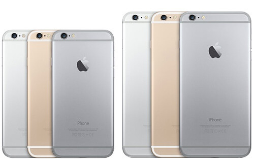
It is absolutely critical that form and color agree with a product’s purpose. All products — whether books, cups, apps, clothes — have a form and color for a specific purpose. For example, throughout the iPhone generations, the most visible changes have been in form and color — larger sizes, new colors, rounded edges. The iPhone 6 was very deliberately released with only three colors: gold, silver and space gray.
“The world is filled with archaic objects — mailboxes which look like alarm boxes, banks which look like places to break out of rather than places to enter.” – Raymond Loewy
Why these colors? Because they express the purpose of the product. If the hue of the gold or silver was a smidge deeper, the color would have said, “flash and glitz,” instead of “intelligence and power.” If you removed the “space” from “space gray,” the color would have said “dull” instead of “imaginative.” A helpful product can be ruined by misaligned form and color. Getting it right is important.
Example: Bud Light Lime
It doesn’t take much to see that Bud Light Lime is different from Bud Light. But Anheuser-Busch did not reflect this significant difference in the form of the Bud Light Lime bottle.
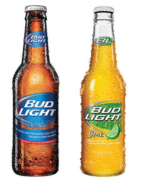
Bud Light and Bud Light Lime should not have the same bottle. From a design perspective, this was a mistake. Using the same bottle to house different products diminishes the new brand and could even cannibalize sales. In 2015, in a stroke of pure genius, Anheuser-Busch released a new bottle for Bud Light Lime.
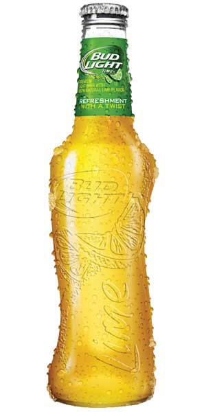
Here’s everything they did right with the redesign:
- They twisted the bottle to look like a slender female torso, matching the “Refreshment with a twist” brand slogan.
- They removed the body wrapper to put the focus on the lustrous beach-golden color of the liquid.
- The bottle’s shape is eye-catchingly asymmetrical yet gorgeously hand-fitting.
The designers of this new bottle truly understand the story and purpose of this beverage and crafted the bottle to reflect this. I’d give this a 9.7 out of 10.
As a product designer, have you chosen the best form and colors for your product? Ask yourself these questions:
- Have you researched the emotions behind the colors you’ve chosen?
- What do the curves, lines, angles, dimensions and textures say about the product?
- Do the color and form agree with your product’s purpose?
Repeatable Methodology
Apple discovered that what is critical is not necessarily the product itself, but rather the methodology by which the idea behind it comes to life. In other words, anyone can get lucky and make a good product; but a methodology can produce generations of great products.
“What I love about the creative process, and this may sound naive, but it is this idea that one day there is no idea, and no solution, but the next day there is an idea. I find that incredibly exciting and conceptually actually remarkable.” – Jonathan Ive
The Wall Street Journal published an article, “After the One-Hit Wonder,” telling the stories of four products that followed a similar pattern. One person gets an idea, executes, experiences rapid growth and makes millions in sales. Then, sales drop off, and the person launches another product, which performs moderately or not well at all.
This happens because one-hit wonders come not from a methodology, but from a one-off idea of one person.
Example: Silly Bandz
Entrepreneur Robert Croak had a ton of ideas and worked hard at them for years, but none of them took off. One day in 2006, he was visiting a Chinese trade show and saw shaped rubber bands made by a Japanese designer. The light bulb went off in his head, and his Ohio-based company Brainchild Products began manufacturing thicker and more detailed silicone bracelets, which came in an endless variety of shapes for kids. He called them Silly Bandz.
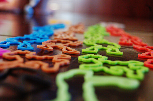
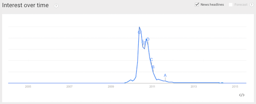
The business took off. Croak found himself with a product in huge demand, selling a million packs a week during peak seasons in 2008. Then, in the summer of 2010, sales dropped, and fast. Google Trends illustrates the sudden lift off and drop in interest.
Croak looked back on his experience with Silly Bandz in 2011:
“Our U.S. sales started to slow during the summer of 2010, and we expected it. The craze in the United States is over, and that doesn’t offend me at all. That’s why we’re so vigorous about adding new products to go with the brand. Once you’ve had a big hit, it seems people are willing to give you more chances, because they think maybe, just maybe, your luck will strike twice.”
This is the opposite of a creative process. A creative process seeks to remove the “chance” and “luck” behind a great product and replace it with a methodology for delivering value and design consistently over time.
Analyze how repeatable your methodology is with these questions:
- Did the idea come from one person or from a team of people?
- Will the product continue to satisfy a need in three to five years from now?
- Is the product multi-generational?
Instead of rating Silly Bandz against the repeatable methodology principle alone, let’s run it through the our entire product design test.
Silly Bandz And The Product Design Test
- Is it irreducibly simple? Because it’s made of a single material, it accomplishes its child-focused fashion purpose. And it has recognizable fun shapes that stretch and make people feel silly. I would rate Silly Bandz a 9 out of 10.
- Is it immediately intuitive? Because a young child could figure it out without instructions, and the most logical thing is to wear it as a bracelet, I would rate it a 9 out of 10 for immediate intuition.
- Is there beauty underneath? There is no surprise or hidden value in this product. What you see is what you get. On the contrary, in fact: Silly Bandz were eventually found to cut off circulation in children in certain circumstances, and they were deemed a distraction in school. I would rate it a 2 out of 10.
- Is it approachably innovative? Fads don’t become fads unless they are approachable and easy to adopt. Silly Bandz did a great job of being inviting and of innovating in the bracelet industry. Yet, it did not last or change the world in a lasting positive way. I’d give it a 3.5 out of 10.
- Do the form and color match the purpose? The bright eye-catching colors and familiar shapes perform well here. I would give it an 8 out of 10.
- Is the methodology repeatable? The company operated under the radar, then rode this one-hit wonder for 12 months and then disappeared again. I would give the methodology a 2 out of 10.
A brilliant product will score between 50 and 60. A mediocre product will score between a 20 and 40. A product below a 20 is better left uncreated. Silly Bandz scores a 33.5 — a weak product. Remember that ranking is subjective, so have someone unbiased rate your product according to the principles.
Conclusion
Now it’s your turn. If you have read this far, then you know about the six design principles inspired by the world’s greatest product designers and how they apply to the 15 products we’ve looked at. To try this out yourself, pick a product — perhaps yours, perhaps a random one, perhaps a website or mobile app — and run it through the six steps of the product design test. Here they are again:
- irreducible simplicity
- immediate intuition
- beauty underneath
- approachable innovation
- form and color agreement
- replicable methodology
How does your product stack up? Share in the comments which product you picked and the score it got. The acronym SIBIAM might help you remember the principles. As you get accustomed to applying these design principles, you’ll be surprised by how your mind picks up on small things to appreciate, or to change, in the products you encounter every day.
Product Design Resources
Continue exploring the landscape of product design with these helpful resources:
- “Tools for Designers,” Product Hunt A collection of 35+ tools for designers
- “What Is Industrial Design?,” Industrial Designers Society of America A breakdown of the steps involved in designing a physical product
- “4 Myths About Apple Design, From an Ex-Apple Designer,” Mark Wilson, Fast Company Design An interview with an Apple alumnus who shares what he learned from seven years in Cupertino
Further Reading
- Giving Your Product A Soul
- Great Products Focus On A Motif
- How To Make Innovative Ideas Happen
- Better Product Pages Turn Visitors Into Customers


 Register Free Now
 Try ProtoPie AI free →
 Celebrating 10 million developers
 SurveyJS: White-Label Survey Solution for Your JS App


