Optimizing Your Design For Rapid Prototype Testing
Product teams in startups and mid-sized and large companies are all implementing usability testing and prototyping as a way to de-risk product development. As the focus shifts from engineering to prototyping, it is becoming increasingly important for anyone who creates prototypes to understand the differences between a prototype and a product build.
By optimizing the prototyping process, you can produce mockups that deliver the most actionable user insights, while being as efficient as possible with design time. Regardless of which prototype tools you use or whether you test wireframes, clickable mockups or coded prototypes, what’s most important to focus on is what you want to test and what you want to learn from it.
With that in mind, here are six tips for designers to consider when creating prototypes specifically to generate user testing insight.
Design To Test Specific Stimuli, With Few Variables At A Time
You need to ensure that you can make apple-to-apple comparisons with your test variants by removing any unnecessary differences between the variants. Make sure that whatever variable stimuli you want to test is primary in the visual hierarchy, so that users do not miss it.
Example
Here are two design variants we created for a peer-to-peer payment app. We wanted to learn: “Would a rewards redemption feature increase a user’s perception of value?”
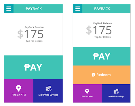
In variant A, basic features of the payment app are shown. In variant B, the same features in variant A are used but with one addition: a “Redeem” button, to indicate the rewards feature of the app. Both variants have the same basic layout, content and color palette, which nullifies design as a variable of the test.
In prototype testing, your design variants should be identical except for the variables being tested. Control for all but the test variable in split testing, so that you can measure what specific changes to a prototype affect the user’s perception of value. Variables for test variants often include different copy, button placement, interstitial screens and images. These variables should be easy for users to identify and also have a chance at meaningfully shifting the user’s perspective for better or worse.
Don’t confuse a design “test variant” with a “version” or “concept.” Designers often create multiple layouts at the concept stage, and while these creative options could trigger differences in user behavior, too many differences between each test variant will make it impossible to measure which differences caused the behaviors in the first place. Be scientific about what is a “variable” within the “variants,” as well as what stays the same, so that you can measure the impact of each change.
Example Of What Not To Split Test
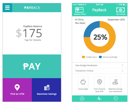
These design concepts show two different visual approaches to the peer-to-peer payment app. While having more visual options for your product is always better, using the different visual concepts as test variants is a bad practice. There are so many variables between these two screens (content, color, icons, features, etc.) that isolating which exact variables were catalysts for changing user behavior would be impossible.
Make Copy Consistent When It Is Not Being Tested
In split testing, remove any unnecessary differences from the test visuals. One easy way to do this is to keep copy the same across variants. Personal user information (such as the name and address) should remain consistent from experiment to experiment with the types of questions asked, the general design elements and cues, and the simulated environment.
Example
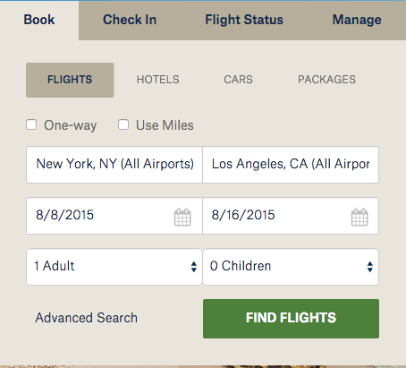
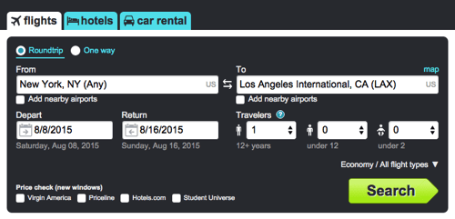
When testing a design with multiple inputs, such as a search engine for flights, we used the same search information for locations (New York City and Los Angeles), dates (August 8th to 16th) and number of travelers (1). Because we weren’t testing this information, we did not want this to be a variable in our split test.
Don’t Sweat Details That Don’t Matter
When designing for final production, you’ll need to consider issues such as responsiveness across screen sizes, branding elements, stakeholder concerns and technical feasibility. Prototypes for testing, on the other hand, are primarily utilized to learn about and capture user feedback. Many of the constraints for final production would be irrelevant throughout most of the prototype testing process and would do nothing more than prolong iteration cycles.
Do worry about including variables that need to be tested: color prominence, consumer messaging and proper prioritization of features. Having a clear visual hierarchy is much more important than choosing the correct font according to the branding guidelines.
Example
We created this simple clickable hotel app prototype to learn about user impressions of a proposed feature set.
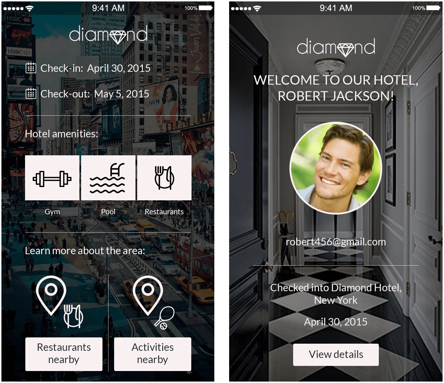
If this were a design to be included in a specification sent to engineers, we’d have to ensure that colors matched our brand, that the pictures are our own, that legal had reviewed the terms of service (and that there actually are terms of service) and that all of the links work, as well as dozens of other aspects. But because our goal was to capture user reaction to and perception of a specific value proposition, we could disregard all that.
Remember that prototyping is a cost-saving mechanism. Time spent on perfecting designs or assets that are irrelevant to the test will decrease the efficiency of using prototypes in the first place.
Focus On What You Want To Learn From Users, Not Stakeholders
Prototypes designed for user tests are not necessarily intended for presentation to primary stakeholders in your organization. While these stakeholders should be involved early on in the experimentation process, this quick prototyping process is not when you want to present pixel-perfect designs to your internal team.
It cannot be overstated: Rapid prototyping is a gateway to understanding users. The polished interface designs that you present for final approval might not look like what you prototyped weeks earlier. Think of prototyping as a process to inform the design concept stage, rather than to determine the final form of the product.
Once you’ve validated core components of the product with target users, use these insights to inform the formal design, including appropriate branding and other necessary details. And plan to test again after these elements are included, to capture as many data points as possible.
You might find that your proposed design goes against the direction set by leadership. Use this as opportunity to test your design against the leadership’s variant! Using one to three screens maximum (to save time), create two prototypes that represent both variants and see which variant users prefer. Then, the next design iteration will have been supported by real data based on user feedback, not opinion (yours or your stakeholders’).
Leadership in any organization will respond to well-presented data. Support your point of view with recordings of users reacting to the product. Nothing is more humbling than listening to the voices of frustrated users.
Create A Clear Path
If you’ve ever witnessed user testing in action, then you’ll know that users have impressively short attention spans. If they can’t figure out a prototype, they will often abandon the test before completion. This is simply the nature of a simulated environment in which users haven’t opted to pay for the product or to use it long term.
Therefore, while the final product might have multiple paths, you’ll want to limit the areas of interaction during an insight prototype test and remove anything that distracts from what you want to test. Not all buttons have to be clickable or show interactions — only enable hotspots that will drive users through the desired flow.
Example
To gather user feedback on TripAdvisor’s hotel-booking process, we’d need to show specific screens that relate to this flow and enable the user to see each step from start to finish. The red outlines below show the main areas we’d want the user to touch. Note that because we are only testing hotel booking, user flows for unrelated areas, such as flight and restaurant searches, would not be included in this prototype.

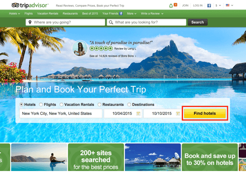
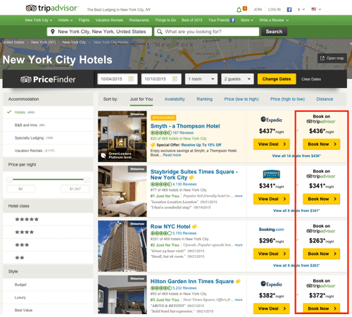
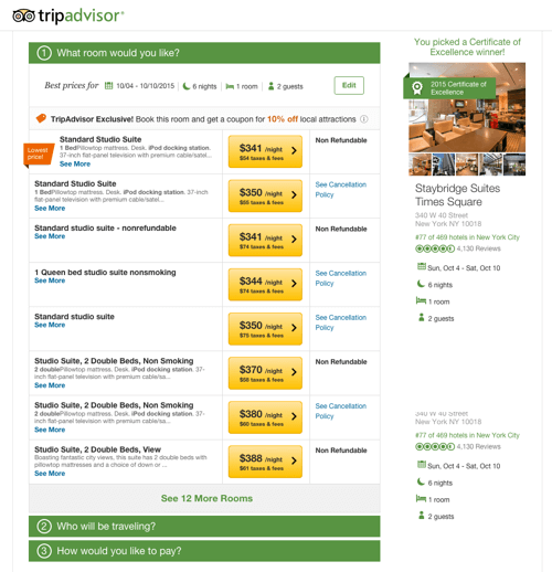
The four screens selected show the basic blocks of TripAdvisor’s hotel-booking flow. Any views we add to this prototype must relate to the main flow we are testing. Otherwise, the unrelated hotspots will serve as rabbit holes for the user, increasing the likelihood of feedback that is irrelevant to your primary focus.
Capture User Behavior, In Addition To Feedback
Early on, prototype tests might involve just putting a screen or two in front of users and having them answer some questions. Later, though, you’ll want to be able to capture behavioral information, such as what screens users navigated to and how long they were there. Ensure that your prototyping tools enable you to collect robust data from each experiment to maximize the insights you gain.
Keep In Mind
- When creating prototypes for rapid testing cycles, do not prototype the entire product. Focus on the piece of the product you are looking to test and the user journey that is critical to the product’s success, and show screens that empower users to complete the desired flows (one to two maximum per test). This will allow you to rapidly create test variants and will save the designers or developers time.
- Plan for multiple rounds of testing as often as you can (daily, weekly, monthly) after you’ve modified the test variants. User impressions could change as the product evolves; as long as you test often, you will be prepared for any positive or negative turns indicated by user feedback.
- Educate your stakeholders. Help them understand that your prototypes are for gathering user insight in the most cost-effective way possible and that the designs might not represent what will actually be built in the final production. Mockups created for testing do not have to exactly represent the product in order to benefit your team.
- Before creating anything, define up front what a successful user experience looks like (for example, “the user completes all steps of payment flow,” “the user can check their account balance,” “the user knows how to sort a list of items, etc.). Once you know what you want the outcome of the test to be, create test variants to optimize success.
- Don’t make the prototype difficult to read. Pay attention to the size of copy in the prototype, and ensure that important instructional areas (navigation, calls to action, selling points) are easy to follow.
- Even if it’s not your primary role on the product team, learn as much as possible about how the test will be conducted. What questions will users be asked? Will it be a survey, an unmoderated test or an in-person guided session? Understanding the format will help you prioritize what to show during the test.
- Create reusable templates of the main product views, so that you can quickly turnaround mockups.
- Save a set of “unbranded” templates as well, if you want to test the product under a generic name and keep the brand’s name hidden. You might want to remove all logos or use generic logos to eliminate brand-recognition bias.
- Leverage standard user interface elements and visual cues from familiar apps and solutions.
- Choose images and content that will not potentially bias the outcome of the test. For example, instead of using well-known books, magazines, movies and other media in your prototype, use obscure titles, so that the content itself does not influence the user’s perception of value.
- When testing live websites against prototype websites, consider recreating the live website in prototype form, and test this “current” website version on the same platform as the new design prototype. This will eliminate any bias in the user between using a fully functional website and using a prototype with limited functionality.
Cheat Sheet
What To Include In Your Prototype
- Common information across variants
- Specific stimuli
- Variables necessary for testing
- Similarities across variants
- Screens relevant to whatever user flow is being tested
- Standard UI elements
- Focused mockups on the one thing you want to test
- Any elements that add credibility to the product
What To Eliminate From Your Prototype?
- Stakeholder interests that are not relevant to the test
- Variables that are not being tested
- Anything that distracts the user from what you need to learn
Summary
By focusing almost exclusively on the user insights that each test is designed to yield, prototype testing can be an impressively efficient method for product teams to run experiments. While complex prototypes might be helpful to the engineers, leaders and other stakeholders who want to play with and celebrate a completed product design, they’ll only weigh you down if your goal is to solicit user feedback as quickly as possible.
Further Reading
- Choosing The Right Prototyping Tool
- Content Prototyping In Responsive Web Design
- Resurrecting User Interface Prototypes


 SurveyJS: White-Label Survey Solution for Your JS App

 Try ProtoPie AI free →
 Celebrating 10 million developers
 Register Free Now

