‘Web Development Reading List #121: The Illusion Of Completeness, Client Hints, CSS Subgrids’
Over the last two weeks, I had the chance to review about eighty job applications for a front–end position. The position requires strong JavaScript knowledge, but it also requires HTML and CSS. And here’s a thing: nearly no one could show off substantial markup skills, not to talk about accessibility.
Although I only had the chance to review their personal websites or GitHub profiles and this might of course not be a full show–off of their knowledge, it assured my lately developed opinion on web developers. Many are not able to choose the right HTML elements, to explain why and how a clearfix works, or what ARIA roles are for, but they can use React and Angular. If you got some spare time over the next weeks, learn semantics and re–read the basics (or specs if you like the challenge) of HTML and CSS from time to time.
General
- There’s a lot of discussion currently about the web getting too complex, and some even claim the web is broken. Remy Sharp instead has a different view on the new technologies, options we have today and how we can use them together with our base technology from 25 years ago. The article is best described by Remy’s own words: “Why I love working with the web”.
Concepts & Design
- Overpass is a new open source web font family inspired by Highway Gothic, looking fresh and solid.
- Kim Flaherty examines the user’s illusion of completeness on websites and explains why it’s important to clearly show a user that additional content exists off–screen.
Security
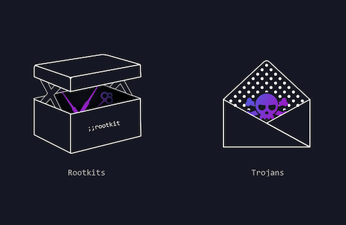
- Jack Leonard from Barricade, a security service provider, explains with a very nice infographic how an attack to a web app works today. In another post he also describes how you can develop for security.
- As a follow–up to my recent article on being careful when choosing a third party to handle your HTTPS, Robin Rendle interviewed me for CSS–Tricks. In the interview, I give a deeper insight and some more practical advice and background on the topic.

Web Performance
- Because a
<picture>element can get really bloated when you provide a lot of resolutions and image sources, Jon Arne Sæterås explains how to use Client Hints for a leaner, more automated approach to serve responsive images. The only issue here is that you need a server to support it and that not all browsers support Client Hints at the moment, so you need to find a smart fallback for those.
Accessibility
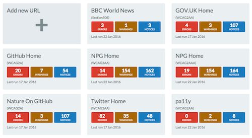
- pa11y is your new best friend if you want to have automated accessibility testing. It monitors your website and reports accessibility issues. In that, it is similar to Tenon, a commercial SaaS alternative that you don’t need to set up and maintain on your own.

JavaScript
- Ada Rose Edwards shares how she writes modern ES6 JavaScript code and why she follows the approach to “use
constby default,letonly where it is required andvarto identify code which needs to be refactored”. - Since years we use
consolein our code all the time to debug our applications. Finally, the WHATWG created a specification that standardizes APIs for console debugging facilities. - This neat trick for CSS object–fit fallback on Edge (and other browsers) by Primož Cigler explains how you can build an easy, basic fallback for IE11 and MS Edge for
object-fit. Actually, as my own polyfill for this is non–functional in Edge, this is a great way to add support for it. And if you really love the property, let Microsoft know with your vote. - This short guidance article gives you some of the best resources on how to learn ES6.
CSS / Sass
- Eric Meyer wrote about why CSS grid layouts are such a great thing for us developers but also noted why they will utterly fail if browsers ship them without providing support for subgrids.
- Alex Sharp explains why Facebook created a solution to write CSS in JavaScript and concludes why you should avoid following this approach at all cost.
Work & Life
- After reviewing a lot of applications in the past days, I can only agree with Kristian Glass here and say: “If you get the chance, always send a cover letter”. It’s your opportunity to say something about yourself and make clear why you apply for the job.
Going Beyond…
- We have an ongoing problem with growing inequality around the world and a few super rich people (latest numbers say it’s down to 65) have as much money as the poorest 3.5 billion people. If we don’t change anything and do not oblige people to pay their taxes in their own countries or reject trickle-down economics as the World Bank officially declared just recently, this system will break and our own lives are likely to be affected.
And with that, I’ll close for this week. If you like what I write each week, please support me with a donation or share this resource with other people. You can learn more about the costs of the project here. It’s available via e–mail, RSS and online.
Thanks and all the best, Anselm
Further Reading
- “Mind Your En And Em Dashes: Typographic Etiquette,” David Kadavy
- “Macrotypography For A More Readable Web Page,” Nathan Ford
- “How To Choose A Typeface — A Step-By-Step Guide!,” Douglas Bonneville
- “Respect Thy Typography,” Espen Brunborg


 SurveyJS: White-Label Survey Solution for Your JS App
 Celebrating 10 million developers
 Register Free Now


