How To Integrate Motion Design In The UX Workflow
As UX professionals, we play a key role in raising the bar for customer experiences. A simple attention to detail is often what signals to the customer that we’re thinking about them. In the digital space, we focus on user interactions within applications devices and processes.
With the ever-increasing computing power of desktops, browser sophistication and use of native apps, every day we learn of new ways to push the limits of what defines a well-crafted UI. When used correctly, motion can be a key utility in helping your users achieve their goals.
When To Consider Animation
As a UX designer, you’re most likely a part of, if not running, the discovery phase of your project. This might include stakeholder interviews, personas, brand interviews, usability tests, journey mapping, contextual inquiries, etc. During this phase, you’ll learn a lot about your users, but most likely they will never come right out and tell you that they need animation or motion. So, how do you know whether animation is worth considering in a UI design?
When talking with users, you might hear feedback such as:
- “I don’t know where to focus.”
- “What’s most important here?”
- “I have no desire to use this tool.”
- “How do I know what to do next?”
- “How do I know I have completed my task?”
- “I don’t understand what this data is telling me.”
Statements like this might reveal opportunities to use motion to enhance the experience.
Getting Buy-In From The Team
At this point as a designer, you might be considering some initial ideas on how motion can enhance the experience. How do you get buy-in for your ideas? Trying to convince a team of stakeholders, product managers, clients and developers that spending extra time and money on animation enhancements “just feels like the right thing to do” will get you only so far. How do you make time for the extra effort in your typical project’s already demanding timeline? How do you convince the team that animation is the right solution for a particular UX scenario?
The quickest and most universal path to gaining buy-in from your team is to align your animation ideas to user needs and goals. This will ensure that you aren’t merely creating animation for yourself, with no benefit to the user in any way.
How To Align Animation To User Needs
When animation concepts are aligned to specific user needs, they start to reveal their value. This also prevents you from contemplating meaningless, overly complex animation. Avoid wasting everyone’s time and effort, especially if an animation provides no value to your audience.
Key Functions Of Animation
Animation has the following functions:
- orient users within their environment,
- provide a deeper level of clarity,
- provide useful feedback to the user,
- allow for more imaginative use of screen real estate (on and off canvas),
- reinforce the hierarchy of elements,
- direct the user’s focus,
- hint at what to do next,
- smoothly transport the user between navigational contexts,
- explain changes in the arrangement of elements on screen,
- provide visual cues that acknowledge user input immediately,
- better communicate a brand’s message,
- create affordances that look and feel like direct manipulation of the screen,
- create visceral aesthetics and appeal that encourage usage and increase adoption.
This matrix illustrates how to map user research feedback to animation functions:

“UX animation has the power to address many common user needs to help people complete their goals. This matrix aligns sample user research feedback(top) to animation functions (side).
When prioritized this way, it shows how animation can primarily be a tool for enhancing the UX and less of a novel way to create appeal.”
— Mark Di Sciullo
How To Integrate Animation Into The UX Workflow
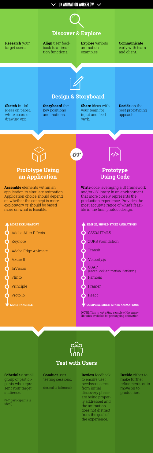
The following is a suggested strategy for integrating animation in the UX workflow. If your project is agile, this approach should occur within the duration of a sprint cycle.
Discover And Explore
Only once you understand your audience well and can confirm that your design matches that understanding should you enter into a collaborative effort with your team. So, lay the groundwork first.
- Research Consume and familiarize yourself with all of the available information about your target audience. This could be artifacts such as personas, customer journey maps, user research, branding guidelines, style guides, etc.
- Align Ensure that your animation addresses specific user needs and goals. When possible, align your proposed animation function(s) to specific user feedback (as illustrated in the chart above), and show how it will enhance the user’s ability to complete their goal(s).
- Explore Take time to explore various sources of inspiration that showcase animation. There are plenty of portfolio websites, such as Dribbble, Behance and CodePen, where you can find many examples to riff on.
- Communicate Share your intentions early with your development team and client. Let them know that you are considering a solution that needs motion. Prepare yourself with the results of your legwork of researching and aligning your ideas to users’ needs and goals. Doing it alone is more challenging; work with your developer. Technologists can expand on what’s possible. Communicating early will reduce the chance of an idea getting shot down prematurely.
Design And Storyboard
- Sketch
As with any design process, the best place to start is with paper, a whiteboard and/or a drawing app. This medium gets the creative juices flowing in an uninhibited, iterative way. You’ll need:
- a pad of paper or notebook (storyboard templates are ideal);
- a whiteboard;
- any drawing program or app (SketchBook Pro, Mischief, Photoshop);
- bonus points if you are using a pen (stylus) display or pen tablet.
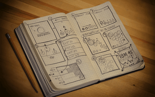
- Storyboard Once you have some thoughts and ideas going, create a storyboard of the key states of your animations. Rely on simple annotations to envision the flow. This is an effective way to communicate your ideas with others early in the process.
- Share Sketches and storyboards are great tools for getting some early feedback from your team. Don’t be shy about sharing your sketches and storyboards. They are great tools for getting your team to understand what you plan to create and gathering valuable collaborative insights.
- Decide Based on time available, decide what needs to be prototyped and how your animation will be reviewed and/or user-tested. You’ll then need to choose the proper approach for creating your prototype.

Prototyping Animation
Prototypes rapidly get your ideas into motion before you’ve spent much time coding. From a UX perspective, the main purpose of a prototype is to get your ideas in front of users early in the design process, when refinements and iteration are easier and less costly.
There are two main ways to approach prototyping animation. The spectrum ranges from highly exploratory prototypes using one of the many applications on the market, to jumping directly into a coded prototype that provides the most accurate representation of what’s feasible in a production environment.
The choice of whether to use a prototype application or to create a coded prototype boils down to the following:
- How much fidelity is required to explain the interactions?
- How much time is available? (Time equals costs. Do you have time to learn a new tool?)
- What tools or approaches are you currently most comfortable with?
- How complex or sophisticated is the motion?
Use your own judgment to determine the right approach. If you can easily and quickly communicate a motion using a simple Photoshop timeline animation, that will be just as effective as a fully coded prototype.
Applications For Prototyping
Applications for prototyping streamline how we think about animation in an interface. Every day, more and more tools become available to designers. These tools are rapidly evolving to include features for creating transitions, transforms and tweens.
The application you choose will depend on whether the motion concepts are more exploratory. Also, consider how rapidly a prototype needs to be created, how it will be reviewed, how it will be tested with users, and the designer’s comfort level with the application.
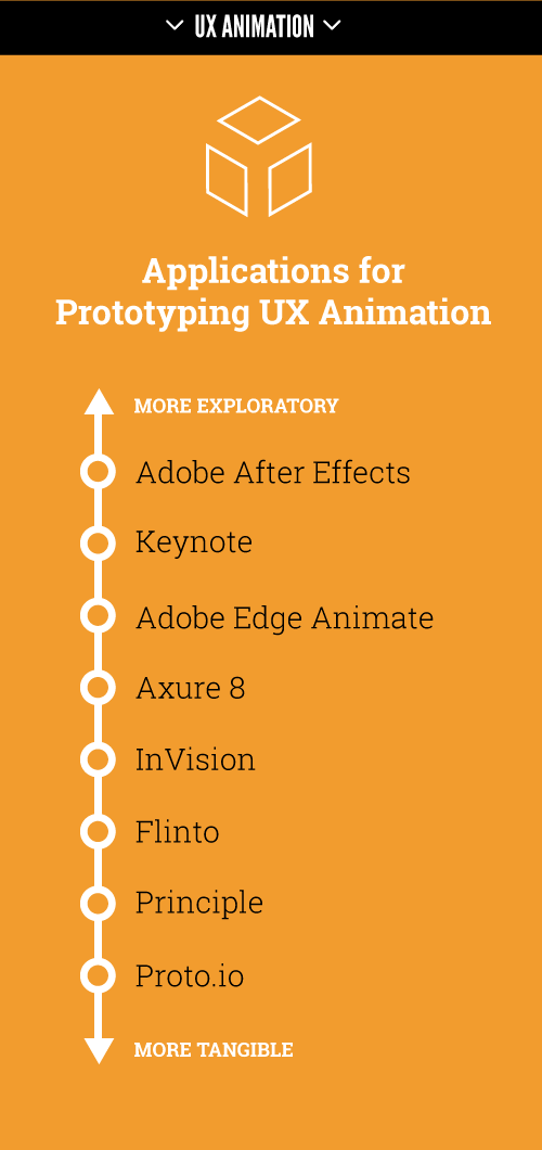
The following is a list of popular prototyping applications for UX animation:
- Adobe Photoshop Through the use of the timeline, comps that start out in a Photoshop canvas can easily be converted to frame animation. Photoshop is very useful for motion exploration on top of existing comps.
- Adobe After Effects This tool is a powerhouse for unbounded creative exploration. The danger with overuse of this tool is that it’s very easy to create something that is not feasible to build with current front-end technologies. Risk aside, it’s worth considering how After Effects fits into a UX workflow, because this tool has many creative uses, especially for exploring new possibilities and pushing the envelope with motion.
- Keynote Yes, Keynote. A self-playing presentation that leverages the “Magic Move” properties is a fast way to show UI interactivity and motion. Thoughtbot has a wonderful overview of prototyping animation with Keynote.
- Adobe Edge Animate This environment allows designers to explore motion UI concepts using keyframe-like animation. Its generated output relies on proprietary JavaScript libraries, which will make many developers leery of the production-readiness of animations produced with this tool.
- Axure 8 (in beta)
This exciting new version of Axure adds more animation patterns with many interesting easing options. Axure gets you thinking about motion during your early wireframing efforts. Animation is done mainly through events (
onPageLoad,OnClick,OnHover,OnMouseOver, etc.) and does not include any keyframing. It does, however, get a designer thinking in a way that makes it easier for them to communicate with a developer. - InVision This highly collaborative browser-based application includes an array of animated transitions and gestures. The screen-flow prototyping tool (in which you build prototypes around a series of screens that are connected via interactions) is ideal for quickly setting up clickable hotspots without getting overly complex. All motion occurs on either click events or page redirects. Easily preview your design on any device. It even includes free mobile user-testing features so that you can conduct your user studies within InVision. There are plans to incorporate more timeline-based animation features, too. Very cool.
- Flinto This mobile app prototyping tool for the Mac allows you to rapidly link screens and apply animated transitions. It has many animation-transition properties that can be fine-tuned to get motion just right. Iterating in this screen-flow prototyping tool is easy by dragging and dropping new screens on top of old ones.
- Principle This prototyping tool for mobile apps, also for the Mac, allows you to use a timeline to keyframe animated transitions.
- Proto.io This browser-based app includes some sophisticated animation abilities. Through the use of “interactions” and “states,” a designer can prototype complex motion and can even create keyframe-like animations.

Coded Prototypes
More technically inclined designers can cut to the chase and jump right into the libraries available in their front-end UI framework to start the prototyping process. Otherwise, this part of the process would require collaboration with a developer.
Relying on standard out-of-the-box motion pattern libraries could possibly limit your exploration of solutions, resulting in bland outcomes. At the same time, not considering what is feasible is risky and guaranteed to produce disappointment and wasted time.
A UX designer who is comfortable rolling up their sleeves and digging into the code will be more in control of the details. They’ll also stay grounded in reality. This requires a comfort level with HTML and CSS and sometimes JavaScript. Designers will need to have a good grasp of how to work in a modern front-end development environment. When a designer and developer can collaborate in this way, the probability of success is always high.
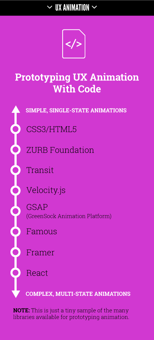
The following is a small sample of the many UI frameworks and libraries available for coding UX prototypes.
- CSS3 Animations This is the most basic way to get started. A UX animator who wishes to create coded prototypes needs to have a solid foundation in CSS3 and HTML5 to understand the fundamentals of how a web UI works.
- Motion UI, ZURB This Sass library, originally for ZURB’s Foundation for Apps, will help you quickly create CSS transitions and animations. Rapidly prototype animated elements and movements with a simple class or Sass mixin.
- Transit This simple CSS transitions and transformations library is for those who are familiar with jQuery.
- Velocity A more robust and well-documented JavaScript library, this one is tailored specifically to motion designers.
- GSAP (GreenSock Animation Platform) This full-fledged animation platform will animate anything JavaScript can touch (CSS properties, canvas library objects, SVG, generic objects, etc.). It’s recommended by Google for JavaScript animations.
- Famous A full-fledged app framework (mainly for mobile), Famous is built on an open-source 3D layout engine, fully integrated with a 3D physics animation engine. The idea behind Famous is that browsers were never made to render apps — games were built to render apps. If you want smooth graphics and animation (60 FPS), you’ll need GPU acceleration, which Famous makes possible by rendering to the DOM, canvas or WebGL.
- Framer Framer is a self-contained prototyping framework and coding environment. It integrates with Photoshop and Sketch. While it doesn’t produce production-ready code (and it’s switch from JavaScript to CoffeeScript is questionable), it does help designers share prototypes that feel real. Supporting fine-grained control of gestural interactions and motion, it allows designers to accurately communicate these interactions with developers.
- React Developed by Facebook, React is a JavaScript library for building large, dynamic, data-driven, production-ready user interfaces.

Test With Users
Here is the basic process for testing with users:
- Schedule Round up a small group of participants who represent your target audience (five participants is ideal).
- Conduct tests User-testing sessions are ideal for validating whether your animation is effective. Run participants through typical tasks that would be performed in your application. Observe whether your animation is helping or harming the experience. Ideally, UX sessions are captured with video so that they can be referred to and reviewed afterwards. If you are conducting your sessions remotely, take advantage of the screen-recording features available in web conferencing applications such as GoToMeeting and WebEx.
- Review feedback Take time to reflect on the insights gathered from the user-testing sessions. Ensure that user needs and concerns from the initial discovery phase are being properly addressed.
- Decide Once user testing is complete and feedback has been reviewed, you can make an informed assessment of whether further refinements are needed or you’re ready to move to production.

Final Notes
UX designers who are considering motion in their designs will find themselves under pressure to explain, communicate and defend why the extra effort is required.
Know your audience, and communicate your intentions to the team early on. Leverage the growing range of approaches available today, from paper to code, that will help you get the buy-in needed to smoothly integrate animation in your workflow.
With UX animation, subtlety is key. Focusing on helping users achieve their goals is paramount.
Resources
- “Functional Animation in UX Design,” Amit Daliot, Smashing Magazine Daliot gives an overview of how animation in UX design is a tool to create clarity and logic within an experience, including many useful examples.
- “Your UI Isn’t a Disney Animation,” Sophie Paxton, Medium Paxton offers great insight into how to avoid creating animation that merely gets in the way of the user.
- Animate.css, Daniel Eden Here are a bunch of cool, fun and cross-browser animations you can use in your projects.
- CodePen animation examples CodePen’s inspirational playground of UI animations can be dissected and forked to create new concepts or just to experiment.
- “Animating SVG With CSS,” Chris Coyier, CSS-Tricks Get started using inline SVG code, right inside HTML, and animating the elements through CSS.
- “A Modern Web Designer’s Workflow” (video), Chris Coyier, CSS-Tricks Although a few years old, this is still a relevant example of a modern front-end workflow.
- “Animation Examples,” react.rocks This gallery demonstrates the power of React for animation.
Further Reading
- The Ultimate Motion Graphics Tutorials Round-Up
- Fitting After Effects Into A UX Workflow
- The Art Of Film Title Design Throughout Cinema History
- Creating Advanced Animations In Photoshop


 SurveyJS: White-Label Survey Solution for Your JS App
 Celebrating 10 million developers
 Register Free Now


