Tools And Resources For A More Meaningful Web Typography
It’s the small details that make a project shine. Solid typography, well-crafted with attention and care is one of them. A harmonious visual rhythm, typographic subtleties like soft caps, margin outdents or the correct use of hyphens and dashes — there are a lot of things that add up to it.
In practice, however, publishing on the web is supposed to be fast, and the little details are often overlooked, which is a pity, because they are not only pleasing to the eye but also improve the reading experience.
The tools and resources compiled in this article will help you bring some of that meaning that typography has always benefited from in print to your web projects. They simplify the process of establishing a solid foundation and modular scale to build upon, take care of the little details, so they don’t get lost along the way, and offer solutions to common pitfalls. Are you ready to do some catching up on that type game?
Establishing Visual Rhythm
Setting the Baseline Grid
Web typography often lacks that sense of craftsmanship that typography in print has benefited from since Johannes Gutenberg invented the printing press more than 500 years ago. To bring back a more meaningful typography, the Gutenberg Web Typography Starter Kit sets the baseline grid to establish a proper vertical rhythm which makes sure all elements fit into it harmoniously. The kit is based on Sass and comes with two predefined themes based on the Google Fonts Merriweather and Open Sans, but custom options allow you to load custom typefaces as well. The backbone of your typography.
Calculating A Modular Scale
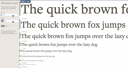
A modular scale sets the visual harmony of your design. You use it like a ruler to set type sizes or to measure and set the size of any element or negative space in your composition. Body text size is a good base to establish your scale, also fixed-width images, for example. The modular scale calculator by Scott Kellum and Tim Brown provides valuable tips to choose a base and ratio for your design and uses these values to calculate your scale. Once set, you can get your scale as a Sass or JavaScript plugin, or you can reference your calculated results right on the site. A great tool to achieve responsive typography.

A Framework To Build Upon
To start your typography endeavour off right, you might also want to take a look at the Typeplate starter kit. It offers solid, modular and flexible base styles, proper markup that you can extend to your liking. The library is not concerned with aesthetic design choices but gives you the building blocks to establish your own typographic framework. The CSS file weighs in at only 10KB, Sass at 18KB, and a Bower package is also available.
Taking Care Of The Details
Small Caps, Ligatures And Other Finesses Made Easy
Caring for fine typographic details often comes with a downside: there’s usually no getting around a convoluted CSS. Kenneth Ormandy’s Utility Open Type puts an end to this. Its 1.75KB small CSS file provides CSS utility classes for advanced typographic features such as ligatures, small caps, number variants and other finesses, making them as easy to apply to your elements and <span>s as using bold and italics. To spare you a lot of maintenance work, Utility Open Type cascades predictably. It supports Chrome, Firefox and IE 10+ and falls back gracefully elsewhere.
An HTML Preprocessor For Better Readability
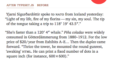
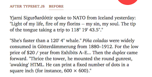
Real hanging punctuation, optical margin outdents, punctuation and space substitution, soft hyphens — it’s the small details that improve a reading experience significantly. But, unfortunately, we often don’t pay as much attention to them as they’d deserve it. That’s where the HTML preprocessor Typeset.js comes in. It takes care of all these typographic subtleties, so they don’t get lost along the way.


Dealing With Long Words In CSS
It might not be too much of a problem for English-speaking websites, but some languages, German, for example, have words that are very, very long. So how to deal with them in responsive web design without breaking layouts and causing cropped words? Michael Scharnagl has found a solution: combine overflow-wrap with word-wrap and hyphens that will show in browsers supporting it and will break lines in other browsers. Good to know.
Making Footnotes More User-Friendly
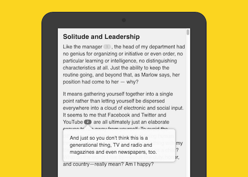
Long reads often call for footnotes and sidenotes. The common solution to provide them on the web, however, is quite distracting to the reading flow: you click a tiny number and jump to the bottom of the page. Chris Sauvé found a less interruptive way to enrich a text with additional information. His jQuery plugin Bigfoot.js detects the footnote link and content, turns the link into an unobtrusive button and opens a pop-over when the reader clicks on the button.

Guides And Cheatsheets
A Practical Typography Guide
If you’re looking for one comprehensive guide that covers all the essentials of professional typography, check out Donny Truong’s free eBook. It leads you step by step through the craft of making informed typographic choices, shaping your attention for detail and providing you with the technical background you need to gain full control of your typography. The eBook is free, but if you find it useful, be fair and consider paying for it. The price is up to you.
Typography Cheatsheet
Smart quotes, dumb quotes, dashes, hyphens — do you have a hard time telling them apart? Then Typewolf’s Typography cheatsheet is one for your bookmarks. It answers all your questions about their proper usage and recalls their Mac and Windows shortcuts and HTML entities as well as those for some other useful characters such as mathematical and non-English ones. Handy.
Choosing The Right Font
Try A Typeface Before You Purchase It
Usually, the only impression you get of a typeface before purchasing it is the specimen on the type foundry’s website. It needs a lot of imagination to asses from that little piece of default text what the typeface will look like in your own design. So if previewing is not enough for you, Font Stand has a licensing model which might be more to your liking. It gives you the chance to try any font for free in any of your applications for one hour — perfect for some quick prototyping. You can also rent a font on a monthly basis and after 12 months it automatically becomes yours. There are currently 635 families from 32 foundries to choose from. One little downside: the service is only available for Mac users.
Inspiring Font Combinations
Combining two fonts can be a challenge. What works, what doesn’t? Do-Hee Kim’s 100 Days Of Fonts project is a great source for some fresh inspiration. She designed and coded another combination of two Google fonts every day for 100 days. Impressive.

How Widespread Is Your Font?
Arial, Helvetica Neue, Verdana — these are still the three most-used typefaces on the web (at least if you take into account the top million websites). If you want to know how widespread a font is before you use it in your project, well, Font Reach will tell you. The site scans the font stacks of the top million websites to rank them by popularity. You can also search for a specific font to see which websites use it. A nice tool no matter if you want to make a unique choice or plan to go with the current trend.
Web Font Loading And Performance
Web font loading has gone through a lot of iterations in the past: from data URIs to using scoped classes. The next iteration: Critical FOFT. The method builds on the Flash of Faux Text (FOFT) using a two stages loading process. Instead of loading the full Roman web font in the first stage, it loads a small subset of it (only upper and lower case characters, for example), and, thus, shrinks the first stage significantly. Zach Leatherman has done a comprehensive write-up describing the technique in detail and comparing its performance with other font loading techniques.
You have something to add to this collection? Feel free to share your favorite typography helpers in the comments section below.
Further Reading
- Balancing Line Length And Font Size In RWD
- Responsive Typography With Sass Maps
- Using System UI Fonts In Web Design
- Whitespace Characters in Unicode & HTML
- The Good, The Bad and The Great Examples of Web Typography
- Freebie: Freebie: Exo 2.0, a Sans Serif Font


 Celebrating 10 million developers

 Register Free Now

 SurveyJS: White-Label Survey Solution for Your JS App

