Printed Smashing Books
We care about quality content and work hard to support and spread best practices, innovative techniques and forward-thinking ideas. Our printed Smashing Books are crafted to deliver in-depth knowledge and expertise shared by experts and practitioners from the industry. They are our editorial flagships—and they look damn good on a coffee table!
Quick Overview
We proudly craft affordable, practical books for pros like yourself who want to improve skills and make a difference. No fluff, no theory — just actionable insights applicable to your work right away. Here’s a quick overview of the last ones:
- Hardboiled Web Design: Fifth Anniversary Edition
- Smashing Book #5: Real-Life Responsive Web Design
- Mobile Web Handbook
- Digital Adaptation
Hardboiled Web Design: Fifth Anniversary Edition
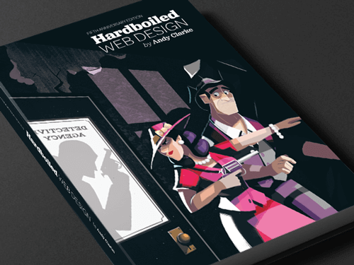
Some books deserve a spot at your desk. The brand new Hardboiled Web Design by Andrew Clarke is one of them. In its 5th anniversary edition, Andy explains how you can use HTML/CSS efficiently in responsive design — and how to reduce wasted time in the process with developers, designers and clients. No fluff, no theory — just insights into his own experiences with clients such as ISO and WWF.
About The Book
With a reputation for being a reference book that “spends more time open on the desk than closed in the bookcase”, Hardboiled Web Design: Fifth Anniversary Edition features a wealth of updated front-end techniques, strategies and attitude overhauls that anyone working on the web can benefit from.
Across 441 pages with plenty of code samples, Andy sets out the “hardboiled” ethos, stripping markup to the bone, making it more flexible and scalable. You’ll also get insights into Andy’s workflow and learn how to establish a design atmosphere and develop a design style guide, create type proofs, use brand personality interviews and reduce wasted time in the process.
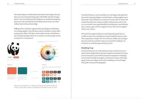
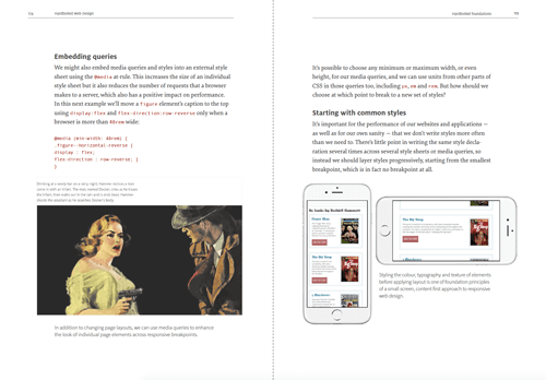
You’ll also learn how to avoid predictable generic layouts and embrace creativity within a responsive mindset and how to establish a better “responsive” process with clients. If you want to explore a workflow that will not hold you back, freeing your potential for crafting rich and expressive responsive websites today, this book is your new constant companion. Ah, and did we say that it’s gorgeous, too? Get the book today.
Table Of Contents
| CHAPTER | DETAILS | |
|---|---|---|
| Part I | ||
Summary • In Getting Hardboiled, you’ll learn what it means to be hardboiled. You’ll discover why it’s important to constantly re-evaluate concepts such as progressive enhancement and graceful degradation, and you’ll find out the cold, hard truth about how standards are really developed. You’ll find out how to create the atmosphere of a design independent of responsive layouts and how to demonstrate those designs to our bosses and clients. Above all else, you’ll learn that responsive web design is an opportunity to make fabulous creative work, an opportunity that you should grab with both mitts. | ||
| What The Hell Is Hardboiled? | ||
Summary • You’ll discover what it means to be hardboiled for you, your designs and your workflow. Think again about what we can do instead of what we couldn’t. Embrace the possible, instead of complaining about limitations. | ||
| (Give Me That) Ol’ Time Religion | ||
Summary • You’ll discover why it’s important to constantly re-evaluate concepts such as progressive enhancement and graceful degradation. Learn about the basics of how a page should work in first place, not necessarily how a design should look. Get away from limiting your creativity to the capabilities of a lowest common denominator browser. | ||
| The Way Standards Develop | ||
Summary • You’ll find out the cold, hard truth about how standards are really developed. Learn about ten CSS modules that are most relevant to the work we do, its vendor-specific prefixes, and how to manage them with your favorite tools effectively. | ||
| It Doesn’t Have To Look The Same | ||
Summary • You’ll learn that responsive web design is an opportunity to make fabulous creative work, an opportunity that you should grab with both mitts. Embrace that not all browsers should render websites in the same way and focus on providing the most appropriate experience for the capabilities of a browser or device. All that without anyone being left unable to access content or features. | ||
| Atoms And Elements | ||
Summary • You’ll learn about designing atoms and elements and how web design style guides help you presenting designs in a more effective way. Learn how to present the atmosphere of a design while designing components separate from layout with Style Guides. | ||
| Designing Atmosphere | ||
Summary • You’ll find out how to design a great atmosphere by starting with typographic elements, how to select the right typeface, weight, line-height, and more. Learn how to use type proofs for presentation, how to balance them the right way and how to make them legible and readable on many different screens. Last but not least, you'll dig into color accessibility and add decorative aspects that help give a design its personality. | ||
| Part II | ||
Summary • In Hardboiled HTML, you’ll learn about the latest semantic elements. You’ll also discover microformats2 — an evolution of those simple patterns for giving your markup added structure — and investigate WAI-ARIA roles. All of these will reduce your reliance on presentational elements and attributes. | ||
| Destination HTML5 | ||
Summary • You’ll learn how to use HTML’s semantic elements alongside the BEM naming system. You'll repeat the widely supported contemporary HTML5 standards such | ||
| Hardboiled Microformats2 | ||
Summary • Because your SEO ranking matters, you’ll discover the updated microformats2 — simple markup patterns for making your data machine-readable and therefore search engine friendly. | ||
| WAI-ARIA Roles | ||
Summary • While microformats2 are dedicated to make you website machine-readable, WAI-ARIA roles have different but complementary goals. You'll learn how to make your web content easier to use by people who use assistive technologies such as navigation menus, sliders, progress meters, properties that define dynamically updated sections of a page, ways to enable keyboard navigation and roles to describe the structure of a page, including headings, regions, and tables (grids). | ||
| Part III | ||
Summary • In Hardboiled CSS, you’ll learn about Flexbox, web fonts for better type and typography, how to layer colour with RGBa and how to use opacity. You’ll discover how use multiple background images and how to make borders rounded and full of images. You’ll wind up knowing how to replace many images with CSS gradients to make your designs lighter and more responsive. All the while you’ll be making your design look fabulous across responsive breakpoints and that’s where we’ll start, with CSS media queries. | ||
| Hardboiled Foundations | ||
Summary • In this chapter, you’ll dive deep into CSS Media Queries. By organizing it into six groups of elements that consider site-wide page styles, typography, form elements, tables, and images, you'll learn how to style small screens first and how to choose breakpoints that are based on content rather than devices. | ||
| Flexible Box Layout | ||
Summary • You’ll investigate new Flexible Box layouts and how to visually reorder content without laying a hand on your markup, how to overcome common frustrations such as equal height backgrounds on unequal height columns, and more. | ||
| Responsive Typography | ||
Summary • Much of the web content we consume every day consists of the written word. Learn about the different web font formats and how to implement them properly, with fallback fonts and website performance in mind. You'll learn how to specify the web fonts to low-resolution and high-resolution display, and how to test them on different resolution screens. | ||
| RGBa and opacity | ||
Summary • With your hardboiled HTML all set and your smaller screen styling in place, you’ll now give your design an extra level of fidelity and interaction that makes the most of the space available on larger screens. You’ll redevelop our vertical list into a grid of eight magazine covers that reveal their descriptions when we press on them. You'll do this by applying relative positioning but without any horizontal or vertical offsets. | ||
| Borders | ||
Summary • CSS borders can be exciting because they include properties that open up a wealth of creative opportunities. You'll investigate new design possibilites with properties such as | ||
| Background Images | ||
Summary • Since we’re also able use multiple background images and to change their origin point and size, there's a vast variety new creative opportunities. You'll get started by making a design using multiple background images. Background properties give us precise control over the size of our background images and how they’re rendered behind our elements. | ||
| Gradients | ||
Summary • Flat design aesthetic has become the norm. Almost every site you see these days include large, flat areas of colour, often laid out across horizontal bands, almost always the full width of our screens, with flat or outlined buttons, and icon graphics that are also flat. You'll learn how to move on from the mediocrity this flat aesthetic epitomises and you'll see web design that’s rich and full of life. Whether you like linear gradients, radial, repeating or with multiple background images — you’ll need to know how to handle them. | ||
| Part IV | ||
Summary • In More Hardboiled CSS, you’ll learn about the background blends and CSS filters, how to translate, scale, rotate and skew elements using CSS transforms in two and three dimensions. You’ll find out how to make state changes smoother with a host of CSS transitions, and finish off by discovering how to add columns to your layout without a extra division in sight. | ||
| Background Blends And Filters | ||
Summary • The rapidly increasing pace of change is a good thing for designers and developers, businesses and brands, and the internet in general. New technologies like CSS filters and background blends are not only being introduced faster, but they’re being implemented in browsers and turned into standards faster, too. Now’s not a time to kick back — it’s a time to use these exciting new tools to make creative work with depth and subtlety, work that’s hardboiled. | ||
| Transforms | ||
Summary • CSS layouts can sometimes be a little strait-laced. You'll learn how two-dimensional and three-dimensional transforms can help your designs break out of the box. | ||
| Transitions | ||
Summary • In web pages and applications, changes in state can have a huge impact on how it feels to use an interface. Make a change too fast and an interaction can feel unnatural. Make it too slow, even by a few milliseconds, and an interface will feel sluggish. You'll learn how to make state changes smoother with a host of CSS transitions. | ||
| Multi-column Layout | ||
Summary • You might be surprised how unimaginative most website layouts are today, particularly since the responsive web design came up. But there's so much to learn from print design that should inspire your work on the web. The different ways that magazine designers use columns of text to make their publications individual are an enormous inspiration. In this chapter, we'll learn how to use CSS multicolumn layout and how to use it for today’s responsive designs. | ||

Smashing Book 5: Real-Life Responsive Web Design
Responsive design is a default these days, but we are all still figuring out just the right process and techniques to better craft responsive websites. That’s why we created a new book — to gather practical techniques and strategies from people who have learned how to get things done right, in actual projects with actual real-world challenges.

Neatly packaged in a gorgeous hardcover, the book features practical front-end techniques and patterns from well-respected designers and developers. The book isn’t concerned with trends or short-lived workarounds — it should stand the test of time and as such, it’s focused on actual techniques used today in real-life projects. The techniques that you could apply to your websites today, too.
About The Book
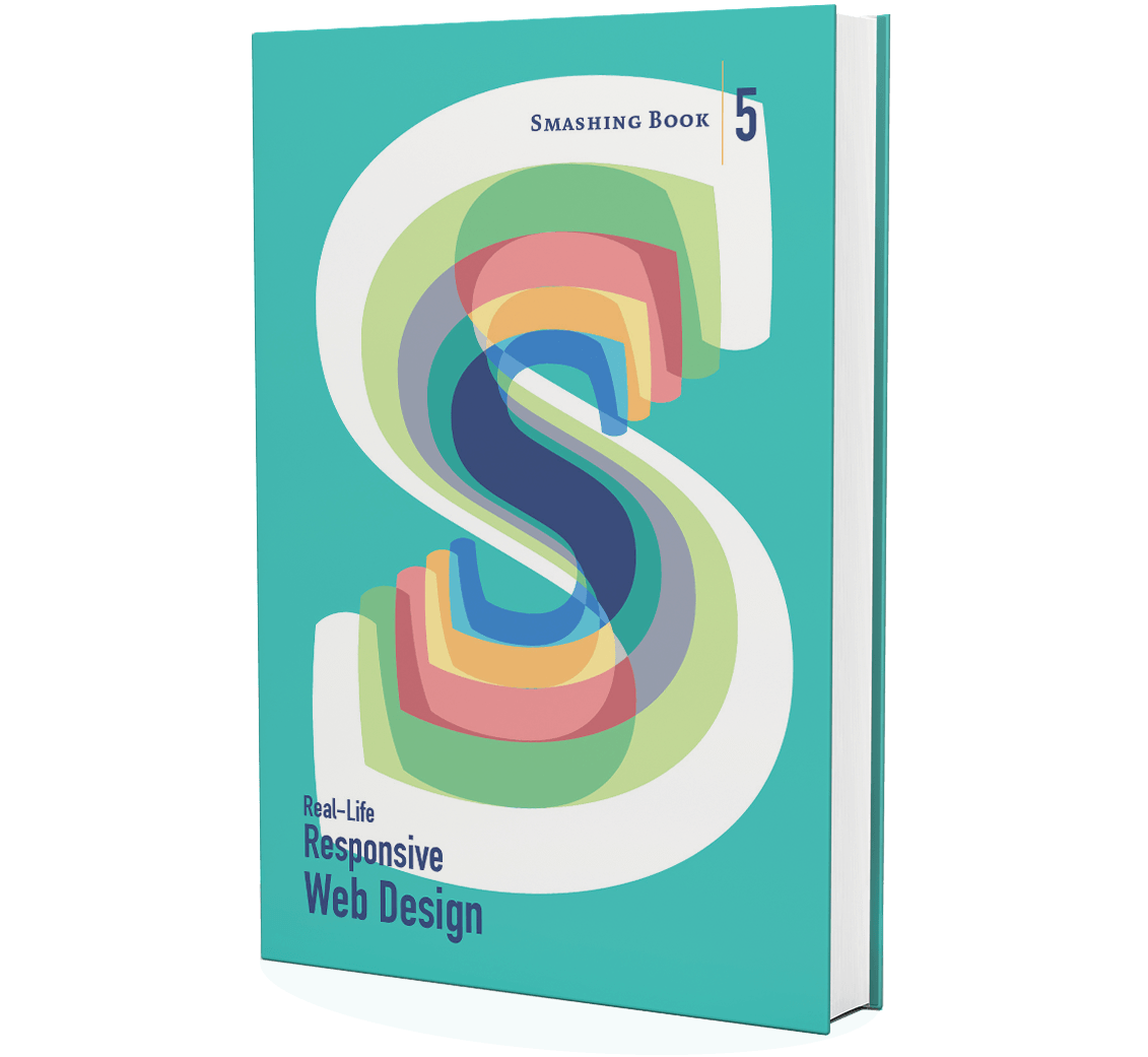
Smashing Book 5: Real-Life Responsive Web Design is our brand new, upcoming book with smart front-end techniques and design patterns derived from real-life responsive projects. With 13 chapters on responsive workflow, SVG, Flexbox, Web fonts, responsive images, responsive email, content strategy, debugging, performance and offline experience, this is just the book you need to master all the tricky facets and hurdles of responsive design.

Once again, the book is going to be quite thick, and obviously both hardcover or digital editions (eBook in PDF, ePUB and Kindle) will be available. So if you want to get your hands on the book, you better don’t wait too long. We know it — you’ll love the book as much as we do. Free worldwide shipping.
Table Of Contents
We invited respected designers and developers who know a thing or two about responsive websites. The chapters have also been reviewed by active members of the community such as Jake Archibald, Dmitry Baranovsky—just to name a few.
| AUTHOR | CHAPTER | DETAILS |
|---|---|---|
| Vitaly Friedman | Preface | |
Summary • As designers and developers, we solve problems for a living. Yet, these problems are often quite tricky and complex, and the context of these problems requires us to be creative and flexible in our workflows. With responsive design, we are prompted to create scalable design systems that work well in unpredictable environments. To do that, we need to be pragmatic and find solutions that work well within given constraints. That’s why we created this book: to find techniques that have actually worked in real-life projects with real-world challenges. Keywords • design systems • scalability • bulletproof solutions • front-end techniques • real-world challenges | ||
| Daniel Mall | Responsive Designer’s Workflow | |
Summary • In practice, responsive projects usually require more time, more skills, more testing and hence more flexibility in budgets. Addings changes late delays projects immensely, and process involving designers, developers and clients is usually tiring to say the least. Keywords • responsive workflow • element collage • style tiles • tools • deliverables • performance budget • interface inventory • sketching • planning • manifestos • hypothesis • atomic design • designing in the browser • Photoshop | ||
| Vitaly Friedman | Responsive Design Patterns and Components | |
Summary • So, how do we deal with complex tables when building responsive websites? What about advanced interface components? Dashboards? What about the behaviour of web forms, navigation, mega-drop down menus, filters? Can we utilize vertical media queries and portrait/landscape orientation change? In this chapter, Vitaly will provide an overview of clever practical techniques for improving UX of responsive sites, with innovative approaches to designing "responsive modules" such as mega-drop downs, tables, calendars, accordions, maps, sliders, responsive PDF and responsive iconography — and a dash of anti-patterns to avoid as well. Keywords • design patterns • navigation • smart front-end techniques • priority+ pattern • improved off-canvas • lazy loading • autocomplete • filters • responsive PDF • portrait/landscape mode • sliders • country selector • responsive iconography. | ||
| Eileen Webb | Structured Content For RWD | |
Summary • Content created by one department is never updated by the next. Services get renamed in the navigation, but are still referenced by the old name in the body text. Important information is buried in the murky depths of flowery prose. Keywords • structured content • content consistency • content models • structural audit • editorial content • content types • content relationships • data-driven gaps • feature-driven gaps • authors and editors • CMS • content maintenance | ||
| Sara Soueidan | Mastering SVG For RWD And Beyond | |
Summary • This chapter has hands down on everything you need to know in order to start designing and building flexible components and visual assets with SVG. Sara will take you on a journey through SVG syntax, SVG accessibility, SVG viewport and viewBox, creating and exporting SVGs, embedding SVGs, building SVG sprites, creating SVG icon systems, using SVG Data URIs, optimizing SVG for performance, SVG conditional processing, clever SVG tricks and techniques and making SVG cross-browser responsive with CSS. Yep, everything you need to know about SVG, as promised. Keywords • SVG • syntax • accessibility • viewport • viewBox • exporting • embedding • sprites • icon systems • data URIs • performance • smart SVG techniques • responsive iconography • cross-browser fallbacks | ||
| Zoe M. Gillenwater | Building Responsive Components With Flexbox | |
Summary • We can use Flexbox for a while now. In fact, Flexbox solves a lot of CSS shortcomings and makes building responsive layouts much easier than with floats or positioning. It gives you more control over the things you care about in a responsive layout (such as order, alignment, and proportional sizes of your boxes) and lets the browser figure out the rest; the math-y stuff that computers are good at, like the exact dimensions that are needed on the boxes to perfectly fill the available space. Keywords • syntax variants • | ||
| Bram Stein | Web Fonts Performance | |
Summary • By default, web fonts block rendering, hiding content from the user. The only way to make content accessible as soon as possible is by treating web fonts as a progressive enhancement. This doesn’t mean web font performance is not an issue. You still need to load web fonts as quickly as possible so that users experience your site exactly how you designed and built it. Let's fix this. Keywords • font formats • font loading • font-rendering • FOIT and FOUT • Font Loading API • fallback fonts • inlining fonts • simulating swapping • promises • asynchronous loading and caching • prioritized loading | ||
| Yoav Weiss | Using Responsive Images, Today | |
Summary • So you want to serve different images to different screens. Perhaps a Retina image (only) to Retina screens, or an art-directed image to small screens, or a portrait image for portrait orientation, or perhaps .webp to browsers supporting the format — without performance hits. Since images are the heaviest assets on the web, dealing with them intelligently is both our responsibility and opportunity for more dynamic layouts. That's what native responsive images are for. Keywords • CSS pixel and DPR • Retina displays • fixed-width images • variable-width images • srcset and sizes • art direction • <picture> element • separation of concerns • image format fallback • accessibility • background images • image optimization • WebP and JPEG-XR • compressive images • deployment • common pitfalls | ||
| Fabio Carneiro | The Dark Side Of Responsive HTML Email | |
Summary • Explaining responsive HTML email is always an uphill battle, because just about every single designer and developer hates it. But there’s a lot of great, forward-looking innovation going on in the email design world. In fact, melding of responsive design techniques is absolutely possible. Keywords • email landscape • CSS in email • market share • navigation and CTA buttons • foundational markup • reset and client-specific CSS • fluid containers • pattern-based development • layout techniques • Microsoft Outlook • Windows Live Mail • Apple Mail • Mozilla Thunderbird • Outlook.com • Yahoo! Mail • AOL • iOS Mail • Gmail | ||
| Tom Maslen | Testing, Maintaining And Debugging RWD | |
Summary • We talk a lot about designing and building responsive websites, but not so much about maintaining and testing them. Speaking from his experience at BBC, Tom has built up a way of working that minimizes the pain points that responsive web design has. Keywords • "cutting the mustard" • predictable, simple CSS • naming conventions • BEM and class names • Sass organization • debugging media queries • lazy loading • content-out media queries • separation of concerns • exploratory testing • functional testing • visual regression testing • automated testing • dealing with false positives • common dependencies • troubleshooting bugs on mobile | ||
| Andrew Clarke | Counting Stars: Creativity Over Predictability In RWD | |
Summary • Our responsive designs lack soul. You can think of many websites that are well presented, easy to use, triumphs of UX and technically competent, but few that might be remembered for years to come. Why do you think this is? Why are so few websites memorable? Could the design processes we’ve come to rely on, particularly in relation to responsive design, have hindered our creativity? Our modern web design magazines are full of advice about process, techniques and tools, but little about creativity, about humanity, or about ideas. Keywords • advertising • user experience design • creative hijinks • allergic to research • process and predictability • building blocks of creativity • intoxicated by process • platform for creativity • creative brief • line between control and chaos • buying creativity • copywriting • creative teams • creative direction | ||
| John Allsopp, Matt Gaunt | Beyond Responsive: Optimizing For Offline | |
Summary • What if we told you that as a user, you don’t have to be online to use the web, and a website or a web application would respond to this accordingly? Think Offline First: "We can’t keep building apps with the desktop mindset of permanent, fast connectivity, where a temporary disconnection or slow service is regarded as a problem and communicated as an error." John and Matt cover main technologies and practices that you’ll need to use to make your apps work as well offline, as they do online. We’ll discuss how to detect if we are online or not, HTML5 Application Cache, WebStorage and offline events, but most importantly Service Workers and how we can use them today to not only make content available offline, but also significantly improve performance and create snappy, fast experiences in (almost) no time. Keywords • navigator.onLine • online and offline events • HTML5 Application Cache • cache manifest • fallbacks • AppCache gotchas • Web Storage • localStorage • Service Workers | ||
| Ben Callahan | Efficient Responsive Process With Clients | |
Summary • Design deliverable is one thing, an efficient collaboration between teams and stakeholders is a different beast entirely. This chapter provides strategies for keeping this collaboration sane and focused. Keywords • collaboration • estimates • spiraling • "one-deliverable" workflow • efficiency • content priority guide • style comparisons • testing the aggregate • content prototype • wireframes • style prototypes • pattern libraries • happy teams | ||
| Vitaly Friedman | Performance Optimization Roadmap | |
Summary • If somebody tells you that responsive websites are bloated, heavy and slow by default, and that it's very difficult to make them fast, don't believe them — they are liars. If you set the priorities right and build the website with progressive enhancement in mind, you can create extremely fast responsive websites that work well across devices: with one code base working everywhere. Keywords • mobile first • jQuery dependence • dealing with IE8 • advertising • refactoring • code inventory • front-end optimization • performance budget • SpeedIndex • deferring web fonts • critical CSS • smart font fallback • dealing with JavaScript • asynchronous loading • SPDY/HTTP 2.0 • core content/functionality priority lists • responsive images | ||
Technical Details
- 584 pages, 16.5 × 24.0 cm (6.5 × 9.5 inches),
- Quality hardcover with stitched binding and a ribbon page marker,
- The eBook contains PDF, EPUB, and Kindle.
- Free worldwide airmail shipping from Germany.
- Available as print or eBook.
Mobile Web Handbook
We have all been there. With Responsive Web Design (RWD) becoming a convenient strategy for device-agnostic design, we keep running into annoying technical issues that all those quirky (and not so quirky) mobile browsers are raising so very often. However, fixing these issues can be quite easy — once you understand exactly why they come up.
Weird browser bugs, inconsistent CSS/JavaScript support, performance issues, mobile fragmentation and complicated nuances such as device pixels, viewports, zooming, touch event cascade, pointer/click events and the 300ms delay. To make sense of it all, we created Mobile Web Handbook, a new practical book by Peter-Paul Koch to help you understand technical issues on mobile and deal with them effectively.

The book is useful to mobile strategists, developers, designers, and everyone willing to better understand the intricacies of mobile — both technical and market-related. Whether you want to get a better picture or dive deep into common browser bugs on mobile, this is just the book you need.
224 pages. Written by Peter-Paul Koch. Reviewed by Stephanie and Bryan Rieger. Designed by Stephen Hay. Get the book.
Why This Book Is For You
Developing websites for mobile is pretty much the same as it has always been, but it does require you to learn a few new things, and some of them are quite confusing. In Mobile Web Handbook, you’ll learn to:
- Make sense of the mobile value chain of operators and device/OS vendors,
- Distinguish between different mobile/proxy browsers and ongoing browser developments,
- See through the complicated browser situation on Android devices,
- Understand CSS pixels, physical pixels, device pixels,
- Make sense of layout viewport, visual viewport and ideal viewport,
- How zooming works and why page zoom is different than pinch zoom,
- The intricacies of the meta viewport and related CSS/JS properties,
- How to deal with technical issues of touch events in JS,
- Understand the touch event cascade and its bugs,
- Handle 300ms delay, pointer events and the click event,
- Fix common bugs caused by
position: fixed,overflow: autoandbackground-attachment, - Set up a device testing lab and test on mobile,
- Reconsider outdated development practices,
- Adjust expectations for mobile networks and latency.
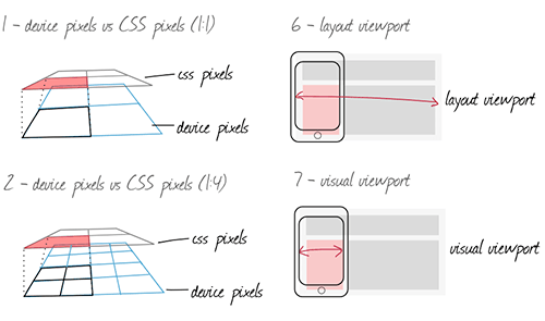

Table Of Contents
| CHAPTER | TITLE | DETAILS |
|---|---|---|
| Chapter 1 | The Mobile World | |
Summary • The mobile world is a complicated, highly fragmented environment. The mobile value chain involves operators, device vendors and OS vendors—all having their own interests and goals that shape the device market and complicate things for us, web developers. If you read The Mobile Book already, this chapter is a revised and extended version of the chapter. It's been updated with the latest figures and developments, though, and contains a few new sections. Keywords • operators • networks • mobile value chain • device vendors • hardware • fragmented market • phone's production cycle • global device market • OS vendors and sales • developer relations • identity management • payments. | ||
| Chapter 2 | Browsers | |
Summary • If you’re used to the simple five-browser ecosystem that exists on the desktop, you’re in for a rough surprise in the mobile market. There are 30 mobile browsers, ranging from lousy to great. Besides, there are also proxy browsers, default browsers, downloadable ones, confusing Android ones, and of course WebViews. What do you need to know about prevailing browsers and prevailing platforms? A comprehensive overview of the browser market, worldwide market shares and ongoing developments—and a few browser stats. Keywords • browser ecosystem • rendering engines • WebKits • WebViews • Android browsers • platforms • proxy browsers • statistics. | ||
| Chapter 3 | Android | |
Summary • The most complex part of the mobile world is Android. With Android now spanning about three quarters of the smartphone market, it has a few problems and oddities that are uniquely its own. In this chapter we'll look at Google's wishes and actions, the reactions of the device vendors, and the complicated browser situation caused by the gradual replacement of Android WebKit by Chrome. Keywords • differentiation • Android updates • Android WebKit • Chrome. | ||
| Chapter 4 | Viewports | |
Summary • Mobile devices have far smaller screens than desktop/laptop computers. As a result, browser vendors had to perform some sleight of hand in order to make sure desktop-optimized websites also display decently. They split the viewport, which on desktop means the browser window, into three. What are these viewports and why do we need them? By discussing pixels, viewports, resolutions, the meta viewport, media queries, and related JavaScript events and properties, you'll gain some insight into how mobile browsers (and web developers) deal with the fundamental problem of the small screen. Keywords • device pixels • CSS pixels • layout viewport • visual viewport • ideal viewport • zooming • page zoom • pinch zoom • min/max-zoom • resolution • device-pixel-ratio • meta viewport • media queries • CSS/JavaScript • events. | ||
| Chapter 5 | CSS | |
Summary • There are a few CSS declarations that are harder to implement in mobile browsers than in desktop ones. Some, such as Keywords • position: fixed • overflow: auto • overflow-scrolling • background-attachment • vw and vh units • :active and :hover. | ||
| Chapter 6 | Touch Events | |
Summary • Mobile devices generally use touchscreens, and support a new set of touch events to monitor user actions. At first sight, touch events seem to be roughly the same as mouse events. What are the differences? How do they work? Do we need separate events for each interaction mode, or can we merge mouse and touch into one, as Microsoft wants? It is quite likely that future new web-enabled device classes such as TVs, cars, or even fridges, will bring new interaction modes and a new set of events. How do we prepare for them? That's exactly what this chapter is all about. Keywords • touchcancel • gesture events • dropdown menu • drag and drop • scrolling layer • event equivalencies • merging touch and mouse • detecting interaction modes • touch event cascade • the tap action • anatomy of a click • 300 ms delay • touchLists • pointer events. | ||
| Chapter 7 | Becoming a Mobile Web developer | |
Summary • This last chapter gives you practical details about how to become a mobile web developer, or to be more precise, how to set up a device library and conduct mobile tests. Which devices do you need? How do you run tests? What would an ideal device lab look like? And what should you keep in mind in terms of the improvements of the mobile networks in the future? Keywords • ideal device lab • acquiring and sharing devices • what and how to test • device test batches • managing updates • browser detection • JavaScript libraries • mobile networks • latency • connection speed. | ||
About The Author

Peter-Paul Koch (PPK) has been around for quite some time. Known for his browser compatibility tables on Quirksmode.org, he is a mobile platform strategist, browser researcher, consultant, and trainer in Amsterdam, the Netherlands. He specializes in the mobile web, and especially mobile browser research, advising mobile and desktop browser vendors on their implementation of web standards.
Technical Details
- 224 pages, 16.5 × 24.0 cm (6.5 × 9.5 inches).
- Quality hardcover with stitched binding and a ribbon page marker.
- The eBook contains PDF, EPUB, and Kindle.
- Free worldwide airmail shipping from Germany.
- ISBN: 978-3-94454093-1.
Digital Adaptation
Nothing is more frustrating than stubborn management entangled in dated workflows and inefficient processes. That’s why we created Digital Adaptation, a new practical book on how to help senior management understand the Web and adapt the business, culture, team structure and workflows accordingly. No fluff, no theory — just techniques and strategies that worked in practice, and showed results.

The book will help traditional businesses and organizations to overcome their legacy, and help you plant the seeds of change with very little power. If you do want to finally see changes happening, this is the book to grab.
Written by Paul Boag. Designed and illustrated by Veerle Pieters. 176 pages. The books are shipping now. Get the book now.

Why This Book Is For You
If you’ve got enough of your co-workers not understanding the Web, Digital Adaptation is just what you need — ideas and concepts that you can put in front of senior management to make real changes. You’ll learn to:
- Tackle bureaucracy and overcome legacy culture,
- Develop a flexible and effective digital strategy,
- Use responsibility matrix to minimize delays and costs,
- Adopt a digital culture and become digital by default,
- Apply techniques from mid-sized and large organizations,
- Avoid toxic practices and improve internal processes,
- Organize teams and boost their efficiency,
- Embrace social media and use them effectively,
- Understand the value of digital team and invest in them,
- Break down the walls and nourish collaboration, ownership and innovation.


Table Of Contents
| CHAPTER | TITLE | DETAILS |
| Foreword | A Message for Web Professionals | |
Summary • The foreword introduces the purpose of the book and explains why we decided to choose you as the audience for it. In fact, the book is written primarily for you as web professionals. A book you can quote to senior management and make real, lasting changes in your organization. Your job is to take the concepts covered in this book and put them in front of senior management. Keywords • audience • strategy • video. | ||
| Chapter 1 | The Digital Divide | |
Summary • The core problem with digital, faced by many large organizations, is that they were formed before the web as we know it today existed. Their systems, processes, and (in many cases) people are not configured to support it. In this chapter, Paul discusses warning signs of digital incompatibility in your company, organizational and cultural barriers and changes that the new digital landscape has brought. This is a chapter of how most organizations struggle with their digital strategy and what you have to know to avoid the problems in a long run. Keywords • pre-web organizations • legacy systems • digital incompatibility • structure • fragmented web presence • culture • customer needs • shifting digital landscape • digital strategy. | ||
| Chapter 2 | Setting Your Digital Direction | |
Summary • As Richard Rumelt said, "good strategy works by focusing energy and resources on one or a very few pivotal objectives whose accomplishment will lead to a cascade of favorable outcomes." In this chapter, you'll learn how to select the right digital direction and how to deal with prioritization paralysis. Backed up by case studies and real-world examples, you'll also learn how to form a digital strategy and how to use guiding principles, digital policies, and a responsibility matrix to complement the strategy. The chapter also explains how reorganizing teams and processes will help tackle dated, inefficient departmental structures. Keywords • business objectives • digital team • defining priorities • problem diagnosis • guiding principles • web steering committees • responsibility assignment matrix • digital policy • remote work. | ||
| Chapter 3 | Adopting A Digital Culture | |
Summary • Forming a digital strategy is one thing, but making it work requires changes in the digital culture. This chapter discusses main components of a digital culture, including collaboration, agile development, digital by default, innovation and service-oriented culture. The web can't be neatly separated from the rest of organization; what's necessary is a single organizational strategy that is heavily influenced by online. This chapter explains just how such a strategy can be established in practice. Keywords • Gov.uk redesign • digital by default • aspects of digital • Business Model Canvas • innovation and failure • service culture • user testing • customer engagement. | ||
| Chapter 4 | Digital Teams: Agents of Change | |
Summary • There are various ways in which digital teams can be organised, but some approaches are more effective than others. This chapter discusses how to build an effective team and what role it should have, as well as how to find a good digital lead and attract and retain appropriate digital staff. Sometimes the digital team can feel like a Ping-Pong ball that ricochets around the organization—you are never quite sure where it will end up. This chapter explains the place, the position and the working environment of an effective digital team. Keywords • team structure • roles and responsibilities • digital leads • attracting good staff • light leadership • working environment • skills, not roles • hiring digital workers. | ||
| Chapter 5 | Digital Demands Another Way Of Working | |
Summary • There is no shortage of big digital failures, from the London Olympics website to the Healthcare.gov website. The costs are staggering and the impacts devastating. The more complex and ambitious a digital project, the more traditional management approaches will struggle to scale. This chapter explores why digital projects fail and how you can minimize the risk of this happening by identifying and prioritizing user needs and involving the entire digital team in the conversation. Of course, this would work best within an iterative and collaborative context in which failure, prototyping and experimentation are deeply rooted within the digital culture. Keywords • failures • the boom-bust cycle • usability testing • user needs • prototyping • iterative, incremental process. | ||
| Chapter 6 | Grassroots Change | |
Summary • Anybody can instigate change. As somebody working at the grassroots level of your organization’s digital strategy, you are a key catalyst of change. That work begins in your own team. You can plant the seeds of change by establishing good team-working relationships and atmosphere, enforcing good working practices, building bridges with colleagues and educating them, approaching management strategically, and being disruptive. If you don’t take action to change it, nobody else will. But if you do take action, there is a real opportunity to make your work more enjoyable and to have a real impact on your company. Keywords • down-top change • transforming a team • wartime mentality • work environment • work practices • convincing management • SWOT analysis • disruption. | ||
About The Author

Paul Boag is quite a character. With over 35 articles published on Smashing Magazine, he is not really an author that requires an introduction. Paul has been working on the web since 1994. He is web strategist at Headscape Ltd, a web design agency that he co-founded back in 2002. Paul also produces and hosts the longest-running web design podcast at boagworld.com. He is a regular speaker at conferences and author of Client-Centric Web Design.
Technical Details
- 176 pages, 16.5 × 24.0 cm (6.5 × 9.5 inches).
- Quality hardcover with stitched binding and a ribbon page marker.
- The eBook contains PDF, EPUB, and Kindle.
- Free worldwide airmail shipping from Germany.
- ISBN: 978-3-94454064-1.
Thank You!
You can find more books in the online version of this page. We take pride in the time and efforts we put into creating our Smashing Books. We sincerely appreciate your support and trust — without you, we wouldn’t be able to release the books, and you should know that.
Further Reading
- Understanding Privacy: Protect Your Users, Protect Yourself
- Meet Success At Scale, A New Smashing Book By Addy Osmani
- What Was SmashingConf In San Franciso Like?
- How To Become A Better Speaker At Conferences


 Try ProtoPie AI free →

 Register Free Now
 SurveyJS: White-Label Survey Solution for Your JS App


