The Evolution Of Media - Design Or Get Undesigned
What would a page look like if it had no designer? This odd question occurred to me in the 1980s, while overseeing the transition from lead-based typesetting to phototypesetting of an Indian newspaper. The Patriot’s distinctive design seemed to emerge, not from a designer, but the tactile interaction between lead and the illiterate villager who assembled the pages. This article examines how design has changed as materials have evolved, and underlines how the need for deliberate design is greater than it has ever been.
It is nearly two decades now since The Patriot newspaper in New Delhi shuttered its doors, but in the early 1980s it was one of the most exciting places to be. It was India’s first newspaper to make the technology transition from letterpress printing based on molten lead to computer-based phototypesetting.
None of us could have known then that the comfortable days when you could physically hold the tools and ingredients of page design were coming to an end.
We could not have anticipated that in the following two decades, emerging technologies would cannonball us forward to desktop publishing, and from there to web pages that live entirely in an electrical binary world that needs only software and a screen with pixels.
We certainly could not have foreseen how dramatically these rapidly changing technologies would change and influence the way we think about design. But back in 1982, I was in the enviable position of being hired as the consultant to midwife the transition.
I had no experience in managing such transitions, since the field itself was new, but I was expected to master the new technology and phototypesetting, develop training methods to upgrade the letterpress compositors to phototypesetting and, finally, redesign the newspaper to take advantage of the new technologies.
Along the way, I learned three startling and entirely unexpected things about media, materials and the design process. The characteristics of physical materials that make up a page, such as thickness, fluidity, height and weight, can profoundly influence the page’s design and appearance.
If the physical materials change, then the page’s appearance will inevitably change.
The question I could not ask then was, “What would happen to a page’s design if the materials were no longer physical and could not be manipulated?” It was simply inconceivable in those days that you could design an entire publication without touching anything but a mouse.
The Patriot was an odd newspaper in many ways. It was India’s only leftist broadsheet publication. It subsisted on hardly any advertising, relying instead on funds from ideologically compatible groups and organizations. But with Gorbachev showing that commercialism and profit were not at odds with communist ideals, The Patriot’s editor started a project to modernize the newspaper and make it competitive with other mainstream publications.
Studying The Newspaper’s Workflow
I spent a good deal of time studying the daily workflow of the newspaper, from the newsroom down to the basement where the pages were assembled. I noticed a curious gap: Try as I might, I could not find the point in the workflow where the next day’s pages were designed. There were no designers or layout artists to be seen, and no one in the editorial section was responsible for what the next day’s paper would look like. They just marked reports and news with the point size and sent it down to the basement for compositing.
Yet, of all of Delhi’s newspapers, The Patriot was perhaps the most distinctively designed. Not only would you have easily recognized it in a blind test with the masthead covered, you would also have concluded that an excellent graphic designer was probably behind it.
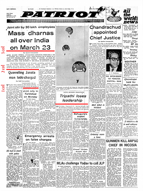
The Patriot was based on a stepladder look: Typically, under a three-column heading, there would be one long column and two shorter ones, creating a shoulder. In there would be tucked a two-column headline, again with a long column and a shorter one under it; into this shoulder would be tucked a single column headline and item. The overall effect was of a stepladder.
But who was behind the stepladder look? For sure, it wasn’t anyone in the newsroom. It was some time before I got to the bottom of the mystery.
As with all newspapers, news poured into The Patriot’s news desk from reporters, wire services and out-station correspondents. The news editor would select items for the next day’s paper and mark a type size for the heading. He was then supposed to mark a position for it on an A4-sized layout sheet, showing a reduced version of the newspaper’s eight-column page.
In practice, though, the news editor merely scribbled the page number on the layout sheet and sent it down to the basement. No layout or page position was marked.
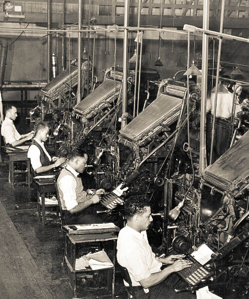
Next, compositors typed the matter into giant keyboards attached to looming Linotype machines, with built-in furnaces that melted down small buckets of lead. As the compositor typed, the machine would line up alphabet molds. As soon as he hit “Return,” hot lead would be injected into the mold, solidify and slide out a short while later as a single hot “biscuit” of lead, with a single line of type on its upper edge — hence, line o’ type or Linotype.
In another corner, I saw an older technology, in which text and headlines were hand-assembled painstakingly, alphabet by alphabet, by nearly blind compositors, almost all of them villagers who knew no English.
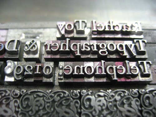
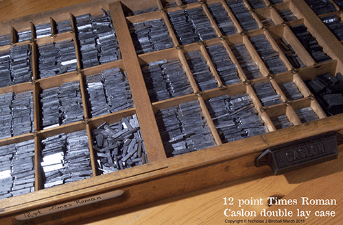
Each character, inverted as on a rubber stamp, was mounted on a matchstick of lead and gathered alphabetically into pigeonholes in a large case. In the upper part of the case were the capital letters, while the lower case held the uncapitalized characters. This is the origin of the terms uppercase and lowercase, still used by many today.
Once typeset, lines of type would be stacked into columns held together by twine and sent along with the corresponding headline on a tin tray to the man responsible for assembling the page.
This was where the layout happened.
When The Medium Dictates Its Design
And this was where I met the swarthy, amiable Dhanushdhari, from the Indian state of Bihar. One of the newspaper’s older employees, Dhanushdhari had not gone to school and could not read a word of English. Yet, the next day’s newspaper was fashioned by his deft, chubby hands.
Layout began as soon as the typeset matter and headlines for a particular page reached him. Columns were assembled within a metal frame called a “chase.”
As I watched, Dhanushdhari’s logic became apparent.
He assumed, correctly, that the larger the point size and width of the headline, the more important the story must be. A long headline could be spread over three columns on one or two lines, and he would position it at the highest available point on the page, starting from the left.
Next, Dhanushdhari did something that you could only do with biscuits of lead. He grasped as many lines as he could between his stocky thumb and middle finger and stacked the story into three side-by-side columns, roughly equal. Then, with a few deft moves, he “unequalized” them by shifting biscuits from one column to another, creating one longer column and two shorter but equal-length columns.
He now had a two-column shoulder and started looking for a two-column heading that would fit into it, and a two column story below it. He did the same operation here, moving biscuits till he had one longer column and a shorter one. Into this he tucked a single column story.
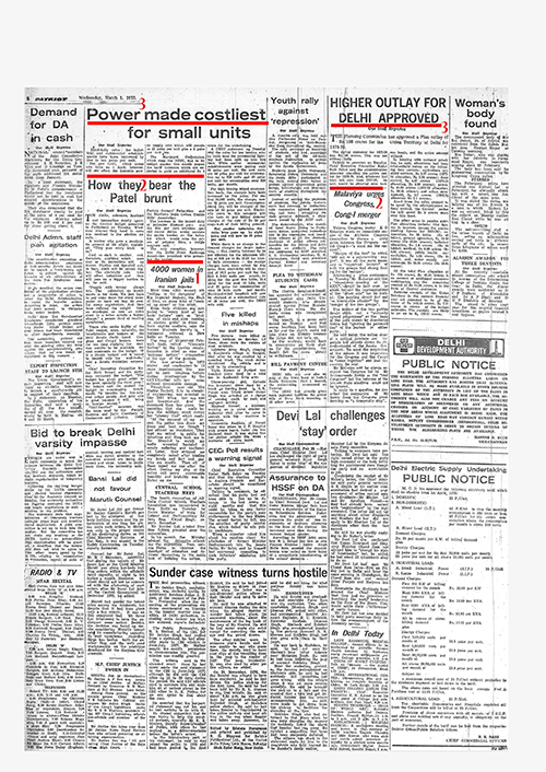
On a typical Patriot page, you would see a vertical narrowing from a three-column to a two-column to a one-column headline on both sides of the page. This would end a little below the fold, about two thirds of the way down the page. In the space below, Dhanushdhari would start over, arranging another long large headline. To keep it from looking repetitive, this time he would stretch the headline over five or six columns.
Dhanushdhari let the lead biscuits guide his hands, arriving at a nearly inevitable layout. Lead allows itself to be gathered up in stacks and permits the manipulation of individual lines of type. Adding or subtracting lines to or from a column was the work of an instant.
The medium was dictating its own design.
Moving From Hot Metal To Phototypesetting
My obvious next question was, What would happen to the stepladder look when the newspaper moved to computers and the lead disappeared, replaced by “bromides,” those long galleys of text on photographic paper? If the stepladder was the default layout when lead was the medium, what would be the default for phototypeset bromides?
We decided that the best way to find out was to allow Dhanushdhari to play around with bromides, unguided. We set up a room for him with a large table, a broadsheet-sized layout page, scissors, glue — and miles of bromides with their accompanying headings.
At first, he was at a complete loss, unable to do with paper all the things he had done so easily with lead. But soon he began to assign priorities to stories, using the headline point sizes as an indicator of the story’s relative importance, and this sorted the bromides.
Then, with surefire native instinct, he began “handling” the bromides. He figured out soon enough that he could not create shoulders with bromides, the way he used to with lead. However, they could easily be folded in half and cut, creating two equal columns.
That was it.
In no time, Dhanushdhari had figured out the “default” layout of phototypeset bromides. He put together a page of two- and three-column boxes with equal-length columns of text.
To verify that my conclusion was indeed correct, I looked up early issues of The Telegraph, another pioneer of phototypeset offset printing in India — and saw the same “boxed” look there, too.
In both newspapers, the material had dictated the design, since no graphic designer had intervened in either.
A Quick History Of The Evolution Of Media
Communication media has undergone four distinct incarnations in the last three decades — from hot metal to phototypesetting to desktop publishing (DTP) to the web.
Along the way, media has also gone from being palpable to insubstantial. Paper, lead and bromides (the photographic paper on which typesetting is chemically etched) can be held between the fingers, establishing a sensory communication with the designer and giving them material control over the page. However, the computer monitor is only a representative space, populated by pixels of endlessly variable values. The content — words and pictures — can no longer be touched, because there is nothing to touch. Everything exists within the computer as binary electrical signals.
A direct casualty of this is the notion that a designer can exercise specific and granular control over a page.
One way to understand this is by looking at how the descriptive parameters of media have changed. Paper was described in immutable units that included grammage, length, width and thickness, and color. The web medium is assayed in monitor size, resolution, pixel depth, pixel shape and RGB values, among others.
The importance, or priority, of content, which used to be indicated with size, type strength and width in old media, is now signaled by keywords, tags and search engine optimization (SEO).
DTP was a transitional skeuomorphic stage that tried to maintain the illusion of a fixed page with a “manually” adjustable layout, exemplified in programs like QuarkXPress, Adobe PageMaker and Adobe InDesign, in which text literally “flowed” within column containers. But the illusion of direct control by the designer had to be abandoned with the web.
Let us take a quick look at how the descriptive parameters evolved:
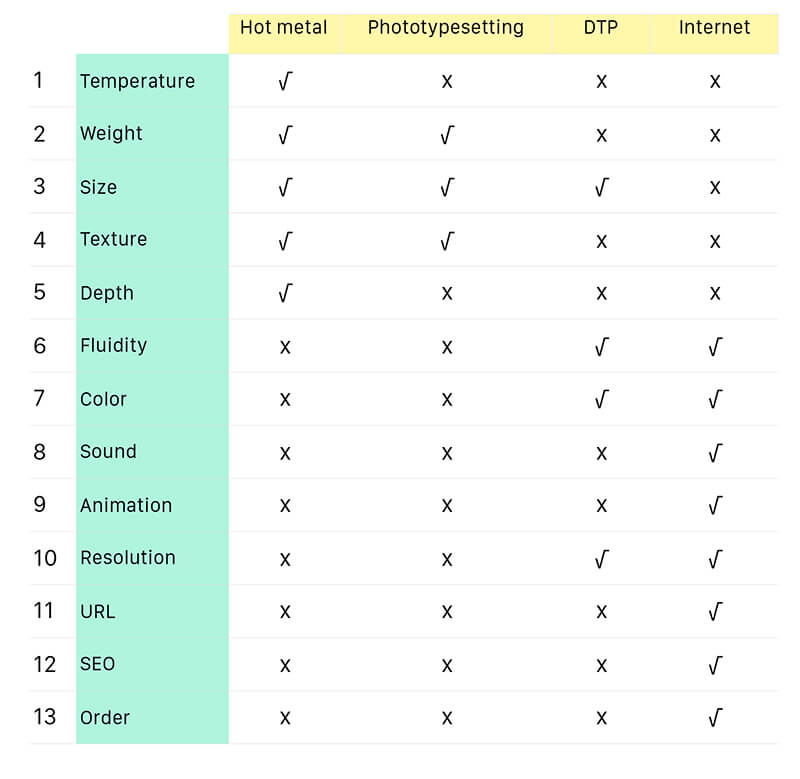
Temperature, a feature only of lead-based production, was the first to go as media evolved. Weight and texture, both features of palpable media, disappeared with the move to DTP; size and depth disappeared with the advent of DTP.
The illusion of fluidity emerged in DTP, which treated columns as containers and text as liquid that “flowed” into them. Other features that emerged with digital media were color, sound and animation.
Meanwhile, game-changing new parameters had to be reckoned with — monitor resolution (which could make the same element vary dramatically on different displays), pixel density (which also affected an element’s display) and page width.
The Designer’s New Role
What would Dhanushdhari have done with a medium he could not hold in his hands? Very little, actually. The description parameters of the web — fluidity, color, sound, animation, resolution, URL, SEO and so on — are insubstantial, impalpable. Dhanushdhari would not have known where to start.
Instead, he would have seen multiple device platforms, with differing dimensions and pixel resolutions. On these, the appearance of the page is slave to the technical and mechanical specifications of the display areas of innumerable rapidly evolving and upgrading devices. Trying to design pages for this mutable shapeshifting web would be a bit like throwing cooked noodles into flowing water. An “undesigned” web page would be an infuriating anarchic chaos of words, images and ads, of the kind we often see on many devices.
In this scenario, how can a graphic designer exert any control over the appearance of the final page?
The document object model (DOM), specified by the World Wide Web Consortium (W3C), is an important step in designing for an environment where rules vary with device and operating system. The DOM is an application programming interface (API) for valid HTML and well-formed XML documents, defining the logical structure of documents and the way a document can be accessed and manipulated in different environments.
The DOM, designed to be used with any programming language, describes the structure of elements such as text, graphics, headings, sidebars, widgets and menus on a page, as well as the relationships between them, so that different device environments may assemble the pages on their displays on the fly, as it were. To do this in a visually coherent and logical way, the order of elements in the DOM should ideally match the visual order of elements on the final page.
The DOM alone does not ensure consistent page design across devices; it only provides a unified basis for getting there. Responsive design, powered more by CSS and HTML at the page level, has been a parallel development, also geared towards enabling us to retain control of the appearance and integrity of the final design across multiple interfaces.
The lesson is simple and important: The modern web page is the result of a collaboration between two professionals who never really work together, the designer and the programmer. The former plans the content, its visual structure and relationships, and its coherence across platforms — but it is the latter who, through coding and the development of new protocols, creates a meta-environment in which that design can be translated on the fly without losing its core or integrity.
Like Dhanushdhari, the programmer is not concerned with the content and its meaning, only its structure and order. But whereas the villager worked within the framework of a metal chase and finite columns and could produce visually coherent pages day after day for years, the web programmer lives in an infinite binary space governed by algorithms. In the absence of strong and deliberate intervention by a graphic designer, the web page would be unintelligible and dysfunctional.
Design, or you’ll get undesigned.
Further Reading
- Award-Winning Newspaper Designs
- Newspaper Website Design: Trends And Examples
- Why Subtle Typographic Choices Make All The Difference
- Free Fonts For Interface Designers


 Try ProtoPie AI free →
 Register Free Now
 SurveyJS: White-Label Survey Solution for Your JS App

