Sketch, Illustrator or Fireworks? Exploring A New Free UI Design App: Gravit
One of the most popular tools for screen design and illustration in the last couple of years has undoubtedly been Sketch, which became an important part of many designers’ responsive web design and mobile design and prototyping workflows.
However, an increasing number of other tools are becoming available. In this article, I will explore the first browser-based app to be viable in the vector illustration and UI design space: Gravit.
First, a bit of background. I’ve been a fan of Adobe Fireworks for many years — I have used it for UI design, for digital illustration and for creating a quick mockup or wireframe every once in a while. (You can check Smashing Magazine’s Fireworks section for a quick refresher. Really, many excellent articles and tutorials are out there.)
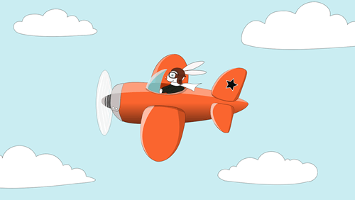
I enjoyed Fireworks mostly as an illustration tool — I used it for all of my digital illustration work and in various side projects, such as my Friday Bunny series.

Using Fireworks was intuitive to me, and its tools and features perfectly matched my needs.
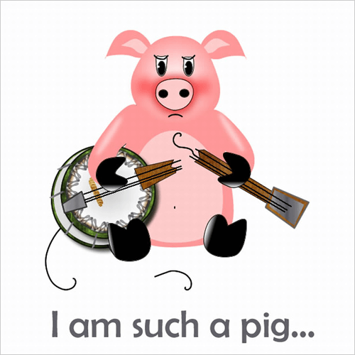
So, back when Adobe declared that it would stop development of Fireworks, it was a sad day for me, as well as for many others who didn’t need the overcomplicated Photoshop and who favored the lightweight yet powerful Fireworks. Since then, many user interface designers have been searching for a reliable alternative, one such being Bohemian Coding’s Sketch. Smashing Magazine even published not so long ago a pretty good collection of tips for people who want to switch from Fireworks to Sketch.
Unluckily for some of us, Sketch is a Mac-only app, which means that if you don’t own a Mac, you won’t be able to even try it. So, here comes Gravit, a promising app that I discovered a few months ago as part of my research to find a good alternative to Fireworks.
Why Gravit? Mainly because Sketch and Affinity Designer (a Mac-only app, too) are not options for me. (Note: While my article was been prepared for publishing, the Affinity team announced that they’ll release a version of Affinity Designer for Windows, but we’ll have to wait for the first public beta at least a few months.)
Don’t get me wrong — I’ve read many positive articles about Sketch, and I am sure it is a worthy alternative to Fireworks. However, being Mac-only is a serious limitation, in my opinion — what if you use both Windows and Mac and need to be able to run Sketch on both systems? What if you don’t use a Mac at all? (I’m not the only one who feels this way.)
This is why Gravit raised my hopes. So, I decided to give it a try and test it seriously. After a few months of using it, I feel ready to review its features and offer some practical tips and tricks I’ve learned along the way.
Note: Some people still use Fireworks for illustration and UI design because it has excellent capabilities. However, development of Fireworks stopped over two years ago, and I strongly recommend finding a replacement, if you haven’t already.

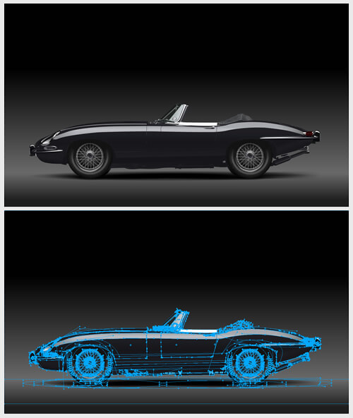
Let’s start with the basics.
What Is Gravit?
Gravit is a screen design (and collaboration) tool that runs in the browser, so it does not need installation or configuration. To try it, go to the sign-up page, create an account and then you can create (and save) your first design. Simple, huh?
Of course, a tool that runs in the browser has some pros and cons (both of which I’ll speak about in more detail further on). The main pro is that if you have access to a modern desktop browser, it doesn’t matter whether you use Gravit on Windows, Mac or Linux — it should run equally well everywhere. The downside of this is that your designs are kept on Gravit’s server, and without an Internet connection you won’t be able to access them. (Minor note: The development team recommends Chrome for running Gravit, but it performs well in Firefox, too.)
Gravit is free to use and, as far as I know, will always be free. I suppose some paid extras might be offered in future, though.
Now, I know what you’re thinking: “A design tool that works as a web app? Its feature set must be very limited.” Surprisingly, that is not the case.
Gravit’s feature set is actually quite solid, and some of its features are on par with those in Fireworks, Sketch and even Illustrator. Because Gravit was initially created in the spirit of FreeHand, the two have quite a few similarities, but many differences as well.
(In case you’re interested in ancient computer history: Macromedia FreeHand was a vector illustration tool similar to Illustrator, and it was quite powerful. Before Adobe acquired Macromedia, Macromedia decided to stop its development because many of its features closely overlapped Illustrator’s. FreeHand also integrated well with Fireworks and Flash, two design tools later acquired by Adobe, one of which, as mentioned, has been discontinued as well.)
I have many years of experience with Fireworks (and Illustrator), and I have been doing illustration work with Gravit for a few months now. I have to admit that, so far, I like Gravit. A few important features are still missing, but the development pace is fast and perhaps they will be added later. (Here’s to hoping, at least!)

Features Of Gravit
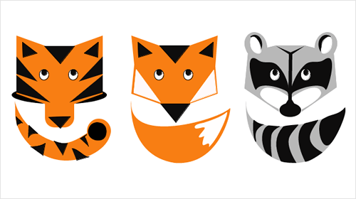
I use Gravit mostly as a tool for vector illustration. So, in the next section, I will review some of its most interesting features in more detail. But it should be pretty good for user interface design, too, because it has plenty of tools geared to UI designers.
Interface Overview
If you have used other graphic design programs, such as Fireworks, Illustrator, Photoshop and Sketch, Gravit’s interface will immediately look and feel familiar to you. There’s the familiar main toolbar (at the top), a Layers panel on the left, and a Properties panel (called “Format” in Gravit) on the right.
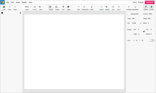
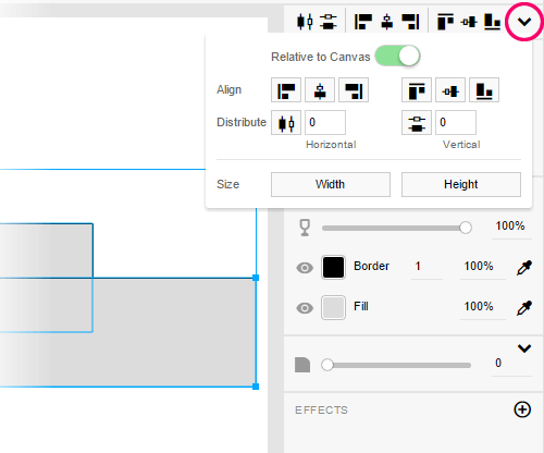
The lone toolbar and two panels makes the user interface feel quite minimalist, but (as I discovered after spending some time with it) this is a result of some clever planning to reduce clutter. For example, unlike in Fireworks and Illustrator, Gravit has no dedicated Align panel; however, once you select one or more objects on the canvas, options to align them appear at the top of the Format panel. And if that’s not enough, you can access a few more advanced options simply by expanding this section in the panel. Smart!
Canvas
Let’s begin with the canvas because this is where everything starts.
In Gravit, the canvas can be a fixed width or infinite in size. To switch from fixed width to infinite (or vice versa) at any time, simply type 0 (zero) in either the “Width” or “Height” field in the Format panel. (One thing I’ve always missed in Fireworks is an infinite canvas. Fireworks allows only a fixed-width canvas of up to 6000 × 6000 or 10,000 × 10,000 pixels. In this regard, Gravit is much closer to Sketch, which supports an infinite canvas as well, and I really like it.)
Gravit’s canvas can be set to transparent, a solid color or a radial or linear gradient.
Vector Tools (Overview)
Most of the user interface design and digital illustration tasks involve working with vectors. Thus, the vector tools are the most widely used in any serious design application.
I am happy to say that the vector engine in Gravit is excellent — I have explored it extensively and I think it performs quite well. Here’s a list of vector tools currently available in Gravit:
- Pen tool,
- Bezigon tool,
- Text tool,
- Line tool,
- Auto shapes: rectangle, ellipse, triangle, polygon and star.
Working with vectors in Gravit is intuitive, perhaps even more intuitive than in Fireworks or Illustrator. (I’ll talk about some of the vector tools in Gravit in more detail later in this article.)
There are also many options for selecting and subselecting objects, paths and vector nodes:
- For example, in addition to the common Pointer tool and Subselection tool, you have a Lasso tool (for quickly selecting multiple objects) and a Layer tool (for selecting whole layers directly on the canvas).
- The Pointer and Subselection tools work roughly the same way as in Fireworks and Illustrator. However, some smart little workflows are built in here. For example, double-click an object and it will switch to edit mode. Or select a group (a single click with the Pointer tool), and then you can subselect any object within the group without having to switch to the Subselection tool.
Here’s another thing that Gravit does well. If you select a rectangle with rounded corners and then scale it, the corners will not distort. (Fireworks would sometimes skew corners when a transformation is applied.)
Bitmap Tools (Overview)
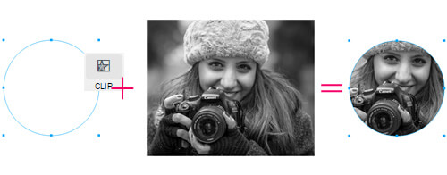
Gravit supports some basic bitmap manipulation. You can quickly clip a bitmap object using a vector shape (see one of the following quick tutorials on using the clipping feature), you can use different blending modes for bitmaps, and you can create masks with alpha transparency.
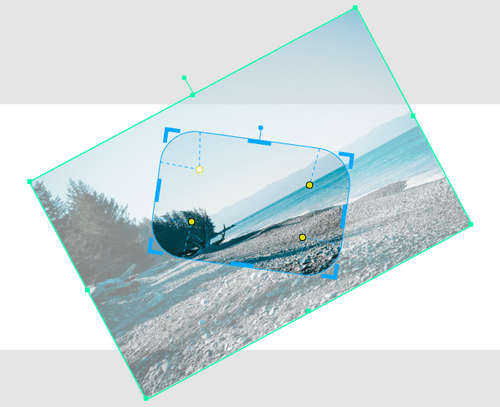
Apart from clipping, masking, adjusting blending modes, resizing and adding live filters, you can’t do much else with bitmaps in Gravit. There is no way to create marquee selections to cut or copy portions of a bitmap, and there are no tools for manipulating individual pixels. But how often would you miss advanced bitmap tools when you’re working on an illustration project or a user interface design? I have to admit that, when I am working on a digital illustration, I rarely need any bitmap tools at all.
Features are being added quite often, so if you can’t find one, chances are it’s coming in a future update. For example, as I was writing this, I learned that the much-needed Crop tool (for bitmaps) would appear in the next update; indeed, within a few days, the tool showed up.
Nevertheless, when I used Fireworks, being able to quickly edit a bitmap object without having to switch to another program was quite useful in some cases. So, I would be happy to see more bitmap tools come to Gravit in the future.
Pen Tool And Bezigon Tool
A basic yet essential feature for designers and illustrators is the Pen tool, because of its flexibility and value when you’re quickly creating a wide range of editable lines, curves and shapes.
The Pen tool in Gravit works as I would expect. You can create vector points (vector nodes), connect them and create both straight and curved paths. When using the Pen tool, you can use modifier keys (Alt or Shift) and combinations thereof to easily switch between straight and curved paths, to set the created paths at 0-, 45- and 90-degree angles, and so on.
You also have the Bezigon tool, which nicely complements the Pen because it allows you to create complex vector shapes, while providing more control over each new node created. Using the Bezigon tool, it’s easy to create perfect circles, ellipses, wave shapes, spirals and other symmetrical vector paths.
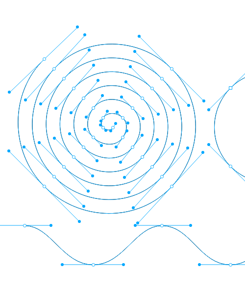
Tip: To create a simple path using the Bezigon tool, click with the mouse (to create a point), move the mouse and click again (to draw a straight line between the two points); you will not notice any difference between this and the Pen tool. Things get more interesting when you use the following workflow: Click, hold Alt and click again; the next node will be created with two symmetrical handles attached to it, and their angle will change automatically depending on the next node created!
See a live demo of how I was able to create a perfect spiral with just a few clicks:
Alt and click again — you’ll get a perfect spiral path! (I’ve switched on the Grid option in Gravit so that it’s easier to space out nodes at specific distances from each other.) (View large version)Mastering the Bezigon tool requires some time, but I think it’s worth it because it offers more possibilities than what you’d expect from the Pen tool. The following few tutorials might help:
- “Gravit Tutorial: Pen vs. Bezigon” (video) A quick overview of Gravit’s Pen and Bezigon tools and the difference between them
- “FreeHand MX Bezigon Tool” (video)
- “Creating Paths With the Bezigon Tool” (tutorial) A tutorial on using FreeHand’s Bezigon tool
Knife Tool
The Knife tool is also an important part of any illustrator’s workflow, and I was pleasantly surprised to find that Gravit’s Knife tool offers more options than the Knife tool in other design programs I’ve used.
For example, the Knife tool in Gravit can make multiple cuts in one pass (using both straight and curved lines), and you can cut text objects like any regular vector path.
Alt and click a few times to make multiple cuts in one pass. To keep the Layers panel better organized, after you make multiple cuts in one pass, the Knife tool will create two groups of objects; however, these can easily be ungrouped at any time (Control/Command + Shift + G) if you need to tweak the individual shapes. (View video)Compound Shapes
Being able to non-destructively combine two or more vector objects is a key part of any designer or illustrator’s workflow, and this is why most design applications have such a feature.
But what are compound shapes? They are dynamic, editable groups of objects. You can combine multiple vectors into a single complex shape, and each component vector will remain editable on its own. Multiple combination methods allow the designer to choose whether shapes are added or removed and whether the shape or the negative space is the focus of the combining action.
Gravit has a compound shape feature that allows vector objects to be combined into a single group non-destructively. Four modes are available for combining shapes:
- Union,
- Subtract,
- Intersection,
- Difference.
One clear advantage of compound shapes in Gravit is that you can switch a shape from one type to another easily and as many times as needed. For example, a Union shape can be changed to Subtract using the dropdown menu next to the “Merge” button in the main toolbar, or by using the Format panel.
Note: In Gravit, the option to create a compound shape is called “Merge” in the main toolbar, but if you’re using the menus, you’ll find the same feature in “Modify” → “Create Compound Shape.”
The individual objects within a compound shape group remain fully editable. To edit them, simply subselect the individual shapes using the Subselection tool. You can also manipulate individual shapes within a compound shape group using the Layers panel — you can subselect them, change their stacking order and even add a new object to an existing compound shape group simply by dragging and dropping it from another layer into the compound shape’s group layer.
Converting a compound shape into a single path (i.e. a single vector object) is also possible by going to “Modify” → “Path” → “Convert to Path” (or Control/Command + Shift + P).
Tip: The same command in Gravit — “Convert to Path” — will also convert any auto shape object into a simple vector path.
When working on a more complex illustration or design in Gravit, you can even use nested compound shapes! Basically, you can insert a compound shape group into another one. This can be a pretty powerful feature when used in the right place, and I think it’s pretty special.
Exporting, Saving And Importing Options
You might feel your options are a bit restricted in this area, because Gravit currently supports exporting and saving to the following formats only:
- PNG32 and PNG24;
- JPG (exported JPG files are usually rather large because they are exported at the highest possible quality);
- SVG.
Note: “Export” in Gravit is labeled “Download.”
You can import all of the file formats mentioned above, plus EPS (although that is limited).
In Gravit’s defence, SVG is more important than ever today, and the app offers excellent SVG support. It can both export to SVG and import SVG files. Importing is as easy as dragging and dropping to the canvas (or, in the menu, “File” → “Import” → “SVG”). What’s more, you can use the clipboard to copy and paste from Photoshop CC and Illustrator CC into Gravit (preserving the clipboard’s content as editable vectors), because the latest versions of these Adobe programs copy editable SVG vectors to the clipboard.
I have also tested SVG files exported from Gravit, and they display perfectly in Chrome and Firefox. While an exported SVG file sometimes exhibits a few differences from the original, this doesn’t worry me much because SVG exporting in Gravit is still a work in progress and constantly improving.
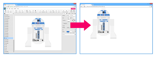
(Note: Fireworks never supported SVG natively. Even if you get SVG support with the help of free extensions such as SVG Export or SVG Import, you might often run into various problems, especially when dealing with more complex SVG files.)
Working With Color
Working with colors in Gravit is fairly straightforward. While the pop-up Color panel is a bit too minimal, it does the job. Recent update to the panel also introduced swatches and “Colors in use” (a feature that shows all colors used within the current document).
Gravit supports RGB and HSB color modes, which are more than enough for my needs. (It also supports CMYK, but because CMYK is for print only, I haven’t needed it in my workflow so far; however, Gravit can be used for print tasks, too.)
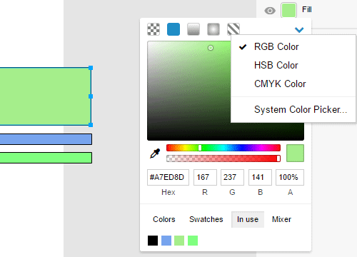
Gradients work like in Fireworks, too. And they are live, so it’s easy to transform them and see the changes in real time. Gravit has only two types of gradients, though: radial and linear (Fireworks has many more). In Gravit, you can apply gradients to both fills and strokes, which is very useful. (Please note that in Gravit, “stroke” is labeled as “border,” just as in CSS.)
In addition to the standard color options for fills (transparent, solid color, and radial and solid gradients), Gravit also has an option for background fill. You can also pick colors right from the canvas using the simple Eyedropper tool. And, just like in Fireworks, you have access to the system’s color picker.
Gravit has separate opacity settings for fill and stroke.
(Pre)view Mode
Gravit has four (pre)view modes: Full, Fast, Outline and Output, which give you a lot of flexibility. However, a “real pixels” preview mode is missing; so, if you zoom in, you’ll see that all of your vectors are perfectly smooth, no matter the zoom level (similar to how Illustrator works).
Meanwhile, Fireworks has only one preview mode for all of your design documents, “real pixels,” which means that when zoomed in, you would see the vectors exactly as they would be rendered when exported. This is a very useful feature for any UI designer or illustrator out there. Sketch also offers a real-pixels mode.
Personally, I prefer the real-pixels preview because it shows my illustrations for the screen more realistically. I hope this preview mode comes to Gravit in a future update.
Copy And Paste Object Attributes (And Other Small Enhancements)
Sometimes the little details (or a combination of several minor features) make an app very useful for certain purposes. I’ll list a few such features that I find particularly useful:
Copy And Paste Object Attributes
Fireworks had one minor feature that I used every day. Select any object on the canvas, press Control/Command + C (or go to “Edit” → “Copy”), and then select any other object(s), and press Control/Command + Alt + Shift + V (or “Edit” → “Paste Attributes”); as a result, the attributes of the first object (the fill, stroke, live filters and their settings, etc.) will be applied to the other object(s).
In Gravit, you can copy and paste object attributes, too, except that the feature is called “Copy and paste style,” and the shortcuts are a bit different. To copy and paste an object’s attributes (or style) to the clipboard, select an object on the canvas and press Control/Command + C (or “Edit” → “Copy”), then select the other object(s), and press F4 (or “Edit” → “Paste Style”).
Other illustration tools might have a feature similar to this one, but as of a couple of years ago, I am pretty sure only Fireworks could copy and paste an object’s attributes so easily and effectively. Copying and pasting selected attributes from object to object was even possible! This is why I was so happy when I saw the same feature in Gravit, working in the same way.
Fill And Stroke Color Settings
Speaking of minor (but important) features, here’s another. In Gravit, if you select an object and then create a new object right after that, the new object will be created with the same fill and stroke color settings. This works the same as in Fireworks, and I find it really enhances my workflow!
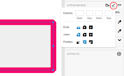
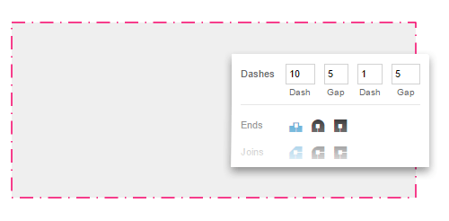
In Gravit, accessing the stroke options (such as Ends, Joins and Position) is quite easy. You can also make the stroke solid, dashed or dotted, with numeric precision.
Math Operations
Only recently, I discovered (quite by accident) that, just like in Sketch, you can perform many math operations (such as add, subtract, multiply and divide) right from the Format panel! For example, if you select an object that is 440 pixels wide and, in the “Width” field, type 440 * 3, the object’s width will update to 1320 pixels. (This feature was always missing in Fireworks, unfortunately.)
Easily Attach Arrows To paths
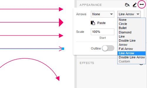
You can attach a few different types of arrows to any path on the canvas with just a couple of clicks. (In Fireworks, you could also attach arrows to paths; the feature could be found by going to “Commands” → “Creative” → “Add Arrowheads.”)
Smart Options
Gravit has a smart duplicate feature (Control/Command + D). It allows you to duplicate objects while simultaneously applying multiple move, rotate, scale and skew transformations to each duplicated object. The command can be used to create equally spaced objects and to combine multiple transformations, while duplicating can produce many different effects. (A similar feature exists in Illustrator, called “Transform Again” but with the same shortcut, Control/Command + D).
Gravit also supports smart guides (like Fireworks and Illustrator), which allow you to more easily position objects relative to each other and relative to the canvas. Also, the smart alignment guides allow you to more easily and more precisely create and position duplicates of objects at even distances from each other (or to reposition existing objects on the fly).

Auto Shapes
Auto shapes (which are special vector objects) work similar to how they do in Fireworks. You can adjust their properties (for example, adjust the radius of rounded corners on a rectangle or the number of points on a star) using the Format panel or their yellow control points. Perhaps this would be better illustrated with a quick example (click the image to view an animated version):
Zooming
If an object is selected, zooming in will zoom with that object in the center, just like in Fireworks. (If an object is not selected, zooming in will zoom towards the center of the canvas, as you would expect.) This might seem like a small enhancement, but believe me, if you constantly zoom in and out on details in your illustrations, you’ll save a lot of time with this smart zoom feature!
Collaboration And Other Features
Gravit has other features, some of which I haven’t fully explored yet.
- With the collaboration feature, two or more designers can work on the same design from anywhere. (This is nice, but if you work alone, you might not need it.) Also, you can make any design either public (allowing anyone to see and comment on it) or private (allowing only you and your optional collaborators to see and edit the design). Some advanced permissions for design documents are coming soon.
- In Gravit, you can create new designs from premade templates. However, I usually create illustrations from scratch, so I can’t comment on these.
- Gravit has built-in access to a large library of SVG icons. Simply go to “Insert” → “Icon.” From there, you can browse the library or search for an icon by keyword. I’ve tried this feature a few times and it’s worked pretty well — as long as the library has the icon I’m looking for, of course.
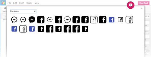
Working on a design and need to quickly insert a vector Facebook icon? Go to “Insert” → “Icon,” search for “Facebook,” and there you are! (View large version) - Gravit has over 40 live filters (or live effects). These can be added, removed and edited using the “Effects” section in the Format panel. The stacking order of filters can be easily changed by dragging and dropping, and multiple filters of the same type can be applied to any element. In this way, Gravit is as flexible as Fireworks.
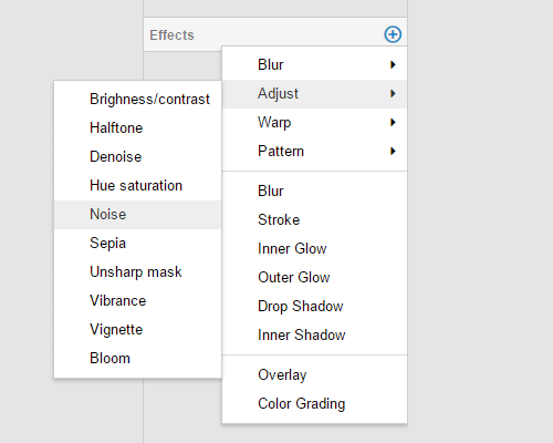
Live filters in Gravit can be added and removed, and their individual settings can be changed using the “Filters” section in the Format panel. (View large version) - Gravit supports two advanced settings for fills on compound paths: “Non-Zero (Fill Holes)” and “Even-Odd (Keep Holes).” To access these settings, click on the “Advanced fill settings” icon in the Format panel. I believe this feature is also available in Illustrator, and Fireworks has it in the Path panel.
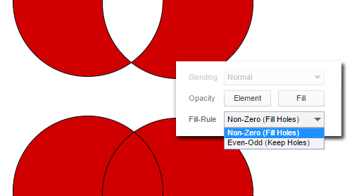
An example using a “Non-Zero (Fill Holes)” and “Even-Odd (Keep Holes)” fill in Gravit. (View large version)
What’s Missing?
While I find Gravit to be quite a promising tool, I have to admit that it has some shortcomings — or rather things that could work better. Some of them are minor, while others more serious. Here’s my personal list:
Online
A major plus is that Gravit works in many desktop browsers and that all of your design projects will always stay in sync. Unfortunately, this could be also a serious problem. Go offline, and you will instantly lose access to all of your designs stored in the Gravit cloud. So, in the future, an offline, standalone version of Gravit would be more than welcome, or else you’ll have to say good-bye to the idea of working with Gravit on a long flight or when an Internet connection is otherwise unavailable.
Shortcuts
A desktop application has access to all possible keyboard shortcuts. A web app, on the other hand, is somewhat limited because the browser itself (where a web app runs) reserves some of the shortcuts for itself.
Performance
When working on more complex illustrations, I’ve noticed some performance issues. However, from experience, I know that Fireworks also slows down in similar situations. I hope future updates improve on this.
Mobile
When I hear that something is “cross-platform,” I almost always imagine that it works on any desktop, laptop, tablet or even smartphone. Gravit works well in desktop browsers (I use it in Chrome and Firefox most of the time, and the experience has been pretty smooth), but I don’t think it has been optimized for mobile browsers and devices — at least, not yet.
Features
Some features are still missing in Gravit. For example, the app does not support multiple pages within a single design, nor does it support symbols — two features that would be super-handy when working on a mobile or web design project. Also, there is no option to attach text to a path, no textures or patterns, no access to system fonts and no live prototyping. I hope future updates bring some or all of these, as I see updates are released often.
Bugs
Every design app out there has bugs and occasionally crashes or freezes. Unfortunately, Gravit is no exception. I once lost some changes I made to a design because the server was experiencing some issues (or maybe the app was being upgraded). I’ve also seen Chrome freeze once or twice when using Gravit, and sometimes I see a random bug or other strange behavior. The good news is that the Gravit team has a good support page (called “Community”); if you report a problem, chances are you’ll receive prompt feedback. Alternatively, you can share your feedback on the team’s Twitter account, @gravit_io.
Conclusion: Would I Recommend Gravit?
The short answer is yes. I am still testing Gravit, but I find myself increasingly using it. The app is actively developed and has many of the tools I need for my illustration work. It’s also focused, geared to digital design and illustration tasks.
I am not part of Gravit’s development team, but I did contribute to the project voluntarily by reporting a few bugs that I discovered (and I was happy to see that a few were fixed soon after I reported them). I also created a funny illustration, which the team liked a lot and from which it adopted a mascot (the little monster Gravil). I do empathize with the developers’ efforts, which is why I will definitely be keeping an eye on this project.
While the feature set is not complete yet, I am sure experienced designers and illustrators will find Gravit interesting and useful. It might also be suitable for people who want to experiment with design or illustration for the first time, and for designers who want to work together (because documents can be shared and edited online by more than one person — a feature that Fireworks and many other desktop design apps don’t offer). In time, if development keeps its current course, many people are probably going to like Gravit.

In the modern graphic design world, dominated as it is by companies such as Adobe and by smaller teams making many new design apps (but developing exclusively for the Mac platform), it’s a breath of fresh air to see a team invest so much effort in creating an application that feels a bit different and that works not only on Macs. I think we need more competition in this field, because more competition means better, easier tools.
If you have tried Gravit already, I’d love to hear your experience. And if you have comments or questions about how to use any of its features, you’re welcome, too!
Author’s (last-minute) note: Some of the screenshots generated for this article might look slightly different from the most recent version of Gravit. The reason is that, while the article was being edited and proofread, Gravit’s team rolled out a new update, which, among other things, slightly changed parts of its interface, including the Format panel. I was able to update some of the screenshots, but not all.
Further Reading
- Using Sketch For Responsive Web Design
- Responsive Web Design Guidelines and Tutorials
- Unleashing The Full Potential Of Symbols In Sketch
- The Power of Adobe Fireworks: What Can You Achieve With It?


 SurveyJS: White-Label Survey Solution for Your JS App
 Try ProtoPie AI free →
 Celebrating 10 million developers
 Register Free Now


