How To Prepare Your Logo For Responsive Design Systems
The modern logo has to work harder than ever before. In the past, a company logo was perhaps intended simply for a shop sign and printed in local newspaper adverts. Today’s logos have to work with a growing plethora of smart devices with varying screen sizes and resolutions, displaying responsive websites.
Often logos end up suffering within responsive website design. Many have not been designed with responsive frameworks and variable sizes in mind, and are just resized to fit whatever available space has been provided for them or not.
However, there are brands that do well within the responsive web space. These are brands that have been designed carefully and with consideration as to how they will display within changing formats. The very best logos are simple and flexible, with varying formats and layout options so that when a site is optimized for a device, the brand is also optimized to the space allocated for it.
In this article we will see why simple, flexible and versatile logo design has become so important. Industry-leading, born-in-the-cloud brands such as Twitter, Facebook, Spotify and Google are refining and simplifying their brands owing to responsive web design and the growing impact of the mobile device market. We can consider their solutions when thinking about our own brands, and how to optimize our logos to thrive within responsive web design.
A Simple Fact
The human brain remembers simple forms far more easily than complex ones. One of the most common factors that separates a good logo from a bad logo is the element of simplicity. Quality, memorable, successful brands are always simple.
This concept is nothing new and was known long before responsive web design started pushing the envelope of simplicity. Look at Apple’s first attempt at a logo from 1976, designed by an engineer, Ron Wayne. As creative as it was (especially for an engineer) it was too complex and unsurprisingly it was replaced just a year later.
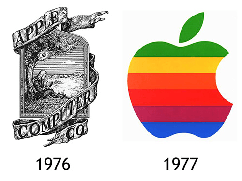
Steve Jobs commissioned professional graphic designer Rob Janoff to design something simple, memorable and modern. The colours may have varied but this basic shape has remained unchanged for over 30 years and has become one of the most iconic and recognizable logos in history. The simplicity of this design allows it to work well at any size on practically anything. Perfect for responsive web design, despite being made decades prior to the availability of such technology.
However, Apple’s original branding mistake is a common recurring issue for most businesses. Small startup companies typically have a limited budget. To avoid costs they mistakenly turn to the wrong person for a logo, someone who is not a professional logo designer. Someone who feels compelled to add things to create something.
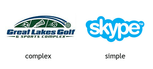
Consider the Great Lakes Golf logo above on the left. Somebody spent a lot of time adding things to that design. The result is quite busy and it’s not going to scale down well at all; whereas the Skype logo on the right is simple, clean and memorable. It will work on anything and is scalable to small areas on mobile devices.
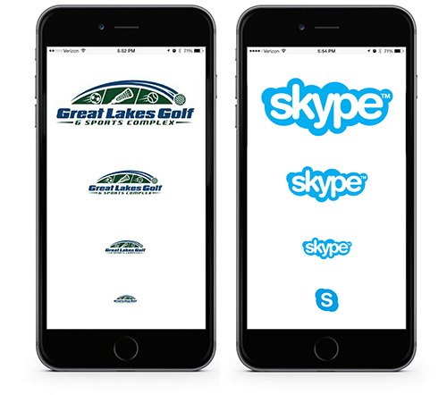
At full width you can identify the ball sport elements on the Great Lakes Golf logo. But scale down 50% and it’s barely readable. On the right, the Skype logo scales down beautifully. And if space gets too small, the Skype brand is flexible enough to drop the wordmark altogether.
This simple comparison shows how simple, clean and versatile design wins over more complex arrangements. The Great Lakes Golf logo probably suited its original intention just fine. However, in the context of a responsive website, the inability to scale cleanly becomes very apparent.
The Tech Industry Response
Web-savvy brands are simplifying their logos to suit responsive mobile web design. Facebook removed the faint blue line from the bottom of its icon’s ‘f’ in 2013. And in July 2015 it simplified its wordmark by removing the ascender on the lowercase ‘a’, swapping it out for a simpler, more rounded version.
Overall, the other letters have also been slimmed and refined. The changes might seem insignificant but the reasoning is not. Facebook is changing its brand as a direct response to viewing on mobile devices.

“This is actually a huge change and it's much more than the 'a'. It's driven by mobile.” * Howard Belk, co-chief executive and chief creative officer of branding firm Siegel+Gale.
Spotify
Back in 2006 the original Spotify logo was a mix of playful type with small wave elements that would get lost when it was scaled down. It was redesigned and simplified in 2013 to the black type and the green icon we are all familiar with. It has now been refined further to a single flat green colour. There has been some confusion expressed over the change with some asking why Spotify fixed what wasn’t broken. However, the change is part of a larger branding update for Spotify and it’s fairly obvious the driving factor is the search for further flexibility within mobile web spaces.

“Because the system is so flexible it can go anywhere Spotify goes from screens, to print, to environments and interactive experiences. We pressure tested the system with tiny mobile ads on tiny mobile screens.” * Leland Maschmeyer, creative director at New York design firm, Collins.
Another case in point is Google. While I was writing this article, Google unveiled its latest logo update, their simplest yet. The Google logo has been evolving to new levels of simplicity since it first graced our browsers in the 90s.
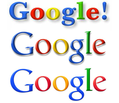
In recent years it would have quickly become apparent that their thin, serif type was not going to scale nicely within responsive web design. So, like other tech brands, they’ve simplified to a sans serif typeface with a flat design and a friendly and distinctive ‘G’ icon.
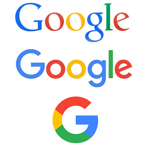
“Once upon a time, Google was one destination that you reached from one device: a desktop PC. These days, people interact with Google products across many different platforms, apps and devices… Today we're introducing a new logo and identity family that reflects this reality and shows you when the Google magic is working for you, even on the tiniest screens.” * Posted on the official Google Blog by Tamar Yehoshua, VP, Product Management.
No Words
When Prince changed his name to a symbol in 1993 most of us thought he was nuts. But perhaps he was ahead of his time.
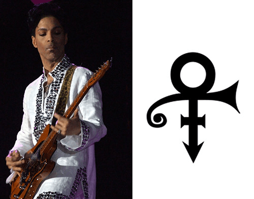
An increasing number of companies are refining the simplicity of their logo, moving towards a flat, simple symbol design with no wordmark at all.

Remember the bubble type and bird illustration that used to make up the Twitter logo? Over time, Twitter refined the logo, removing unnecessary detail; now it is just a very simplified version of the bird. No lower case ’t’ icon, no twitter word-mark, just the bird logo.
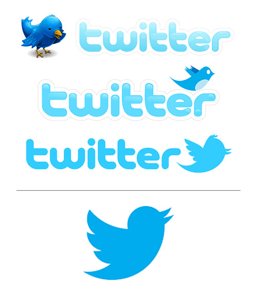
“Twitter is the bird, the bird is Twitter. There's no longer a need for text, bubbled typefaces, or a lowercase 't' to represent Twitter.” * Creative director Doug Bowman
Of course, these are all well-known brands that can get away with reducing their logos to only a simple icon. Not everyone can or should do this. However, this is another example of the effect responsive web design is having on brands. Certainly, using an icon graphic as part of an identity increases the flexibility of the brand for use on mobile devices.
Moving Forward
Does this mean all logos are going to end up as simple flat icons or flat sans serif typefaces? I don’t think so. However, there is little denying the influence responsive web design is having on branding and it will be interesting to see how far this goes.
The historically sacred view that a company’s logo is a rigid form that must never change is giving way to a new kind of branding freedom, where logos respond and vary. From horizontal formats to vertically stacked, from wordmarks to simple icons, even changing colours to suit dark and light screen backgrounds.
One might argue that looking at the branding direction of the tech industry isn’t relevant to, say, a law firm or a restaurant. However, all industries are going to eventually end up within responsive web design one way or another and become affected by the rise of mobile devices. Some companies may wonder why this doesn’t seem to work as well for their brand as it does for Twitter or Pinterest.
Those who understand the design principle of simplicity and embrace this flexible approach to their branding will respond best within this new medium. At the very least, how a brand appears when scaled down on a mobile device will become a staple test for any logo designer or branding project.
Logo designers ought to help educate clients to embrace this new flexible approach, where logos can be optimized within responsive web design while maintaining brand consistency. Otherwise we will witness more web builders taking it on themselves to alter a problematic logo on the fly to suit their individual project. Not an ideal solution for anyone.
Keep an eye out for our upcoming practical how-to guide on responsive logo design.
Further Reading
- Responsive Web Design: What It Is And How To Use It
- How To Get A Logo Accepted: 8 Steps To A Better Design Workflow
- Vital Tips For Effective Logo Design
- Photoshop Etiquette For Responsive Web Design


 Try ProtoPie AI free →
 SurveyJS: White-Label Survey Solution for Your JS App
 Register Free Now

 Celebrating 10 million developers

