Designing Card-Based User Interfaces
Web and mobile apps are moving away from pages towards completely personalized experiences. These new experiences are built on an aggregation of many individual pieces of content. The way this content is now being presented is in the form of cards. The card-based interaction model is spreading pretty widely, and you can see digital cards almost everywhere — from news sites to food delivery apps.
In this article, I’ll explain what cards mean to UI designers, and I’ll review three popular card-based services. If you’re interested in prototyping your own card-based user interface, you can download and test Adobe’s Experience Design CC for free and get started right away.
What Are Cards?
Cards are those little rectangles full of inclusive images and text that serve as entry points to more detailed information. The word ‘cards’ is an excellent metaphor since they look like real-world tangible cards in user interfaces.
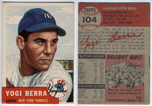
Before web and mobile apps, cards were always all around us — business cards, baseball cards, and even sticky notes. Thus, it is more intuitive for us to know that these cards are representing piece of content just like in real life.
The Advantages Of Cards
Digital cards can be applied to a variety of contexts, implemented correctly, they can improve the user experience aspect of the app. Here are some examples to illustrate why cards can be good for your UI:
Chunking Content
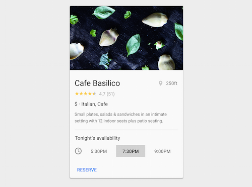
Cards organize information into chunks of content, and users appreciate chunked content because it aids for scannability: it helps avoid walls of text, which can appear intimidating or time-consuming and allows users to dive deep into their interests quicker. Cards divide content into meaningful sections, similar to the way text paragraphs group sentences into distinct sections. They can gather various pieces of information to form one coherent piece of content.
Easy To Digest
Cards are a great tool for communicating quick stories. Placing content in cards makes it digestible for users. Users can easily access the content that they are interested in, and this empowers users to engage in any way they want.
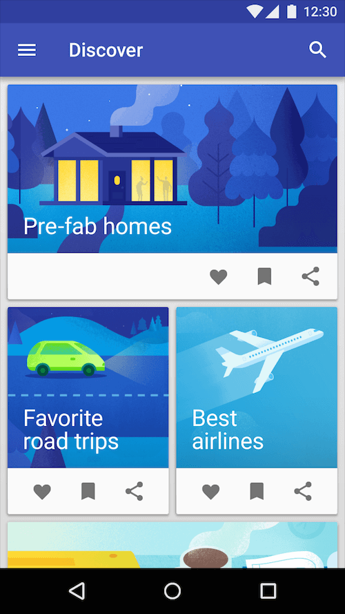
### Visually Pleasing Card-based design usually heavily relies on visuals. Actually, going heavy on images is a strength of card-based design. Studies confirm that images elevate site and app design, because images draw the user's eye efficiently and immediately. The emphasis on using images makes card-based design more attractive to the users.
Good For Varying Screen Sizes
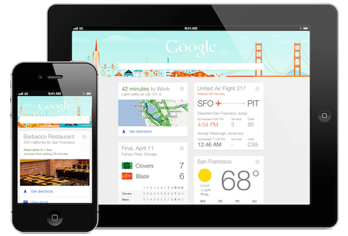
The most important thing about cards is that they are almost infinitely manipulatable. They are a good choice for responsive design since cards act as content containers that easily scale up or down. This feature allows us to create a single aesthetic across multiple devices and to establish a consistent experience regardless of the device.
Designed For Thumbs
Cards are made for thumbs. Cards are a style that seem just made for apps. Digital cards behave in the same way as physical cards. Users like the simplicity of the cards and intuitively understand the physics of turning a card over for more information or swiping for the next chunk of information.
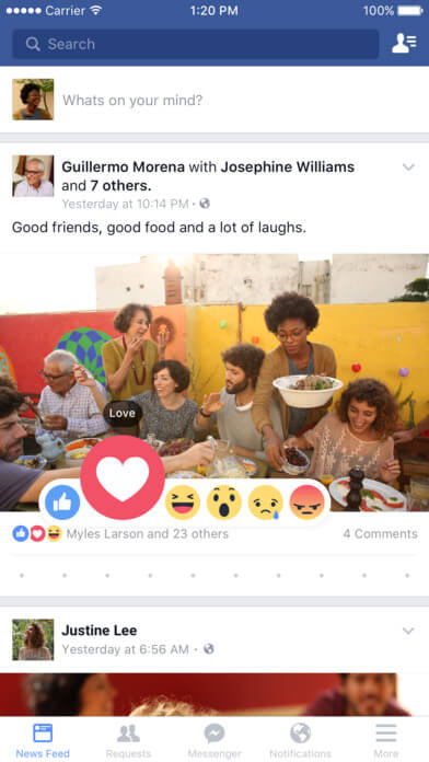
## Best Card Design Examples Card-style design lies at the intersection of design for desktops and mobile devices, bridging the gap between interaction and usability. But in order to be successful, card-based interface requires both clean aesthetics and direct user engagement with a certain action. ### Stream Cards can appear in a stream, creating a timeline of events. For example, Facebook uses them to present a quick overview of recent events in the news feed. Facebook's news feed is an endless stream, whereas cards are individual. The point of cards here is disaggregation. They're taking things out of infinite stream, packetizing them, and making them sharable. This action also encourages users to share the content on social media.
Discovery
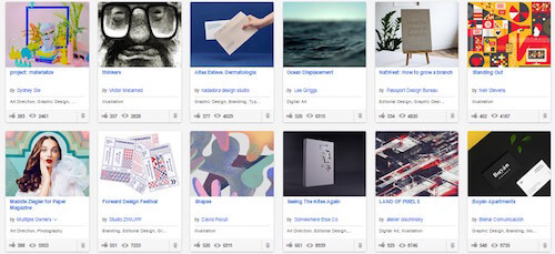
Cards allow relevant content to naturally reveal itself, making possible for users to dive deep into their interests. Take a look at Behance, an online creative community which showcases creative work. Card-based design is the most suitable way for presenting such type of content.
Workflow
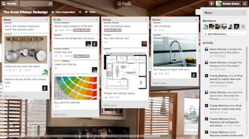
Cards are easily categorized for a list of tasks. The Trello task management app does a great job of using a card-style interface to create a dashboard for users, where each card represents a separate task.
Dialog
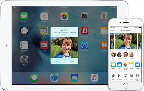
Since cards are content containers, they’re perfect for representing actions. Consider the AirDrop service on Apple devices. When you have an incoming request for data transfer, a card pops-up with a notification to accept or decline the transfer. Apple’s screenshots focus on photos, but developers can put anything in card — coupons, songs or web links.
Dashboard
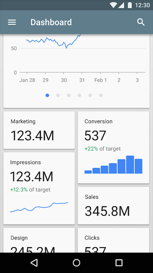
Сard design offers fantastic precision when it comes to organizing content from varying sources. Using cards, you can organize information collections into logical groups, aggregate your content and show it context specific. A selective content from many different content providers can be easily gathered together and redistributed as a “deck” of related information.
Card-Based Design Language
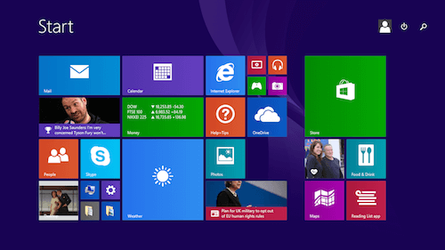
In 2010, Microsoft introduced its Metro design language. A key design principle is better to focus on the content of applications, which is achieved by using flat elements, relying more on typography and cards. A card for Metro design is more than just a design element; it’s an essential functional part which provides an easy interaction.
Creating Card In More Detail
Cards And Simplicity
When you think about cards, simplicity should be the number one thing to keep in mind. A great advice from Carrie Cousins is “one piece of information per card”: card can contain multiple elements within a design, but each should focus on only one bit of information or content. This gives users the opportunity to select the parts of your content they want to consume or share.
Cards And Responsive Design
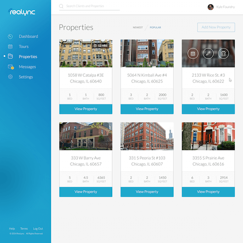
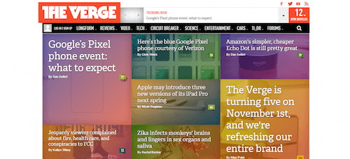
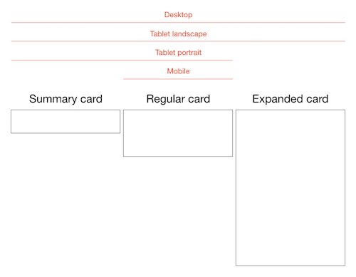
We all know how important it is to make your app or site look and work equally well across all devices. When we are designing for different screens, we should take full advantage of target environment and using cards we can adjust content quickly and easily depending on the size of the screen. Cards offer excellent compatibility with responsive frameworks — cards grids can restructure themselves to fit any breakpoint or screen size.
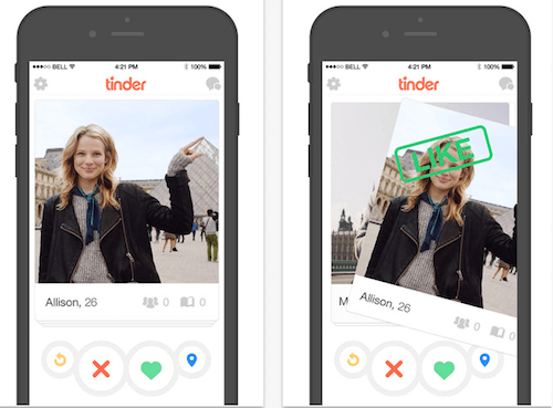
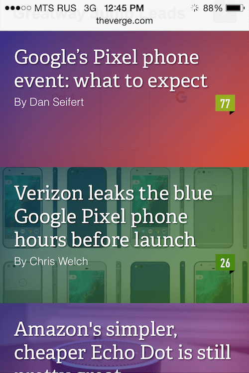
What’s nice about a digital card is that it can be manipulated in a variety of ways. For example, on mobile devices, cards can be stacked vertically, like an activity stream on a phone:
Cards And Typography
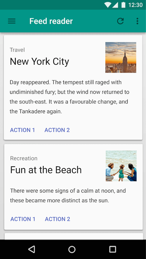
Everything about a card design should be easy to read and understand. You should design for maximum readability:
- Opt for simple typefaces and easy to read color schemes (text is most legible when placed on a solid color background with a sufficient contrast ratio to the text).
- Try to limit the number of typefaces as well. For most card projects a single typeface is enough.
Conclusion
Most of you probably have a better understanding why card-style design is so popular and will continue to increase in popularity. This trend won’t end anytime soon. Cards are here to stay and continue to be an essential part of app design.
What makes cards work is good design and great usability. Cards are more than just a look, they are one of the most flexible layout formats for creating rich content experiences. Today, people seek out information quickly, and cards serve it up well, regardless of device.
"This article is part of the UX design series sponsored by Adobe. The newly introduced Experience Design app is made for a fast and fluid UX design process, as it lets you sketch out ideas, create interactive prototypes, test and share them all in one place. You can check out more inspiring projects created with Adobe XD on Behance, and also visit the Adobe XD blog to stay updated and informed. Adobe XD is being updated with new features frequently, and since it's in public Beta, you can download and test it for free".
Further Reading
- In-App Gestures And Mobile App User Experience
- The Thumb Zone: Designing For Mobile Users
- How To Design Error States For Mobile Apps
- Beyond The Button: Embracing The Gesture-Driven Interface
- What Sci-Fi Tells Interaction Designers About Gestural Interfaces


 SurveyJS: White-Label Survey Solution for Your JS App
 Register Free Now
 Try ProtoPie AI free →


