In-App Gestures And Mobile App User Experience
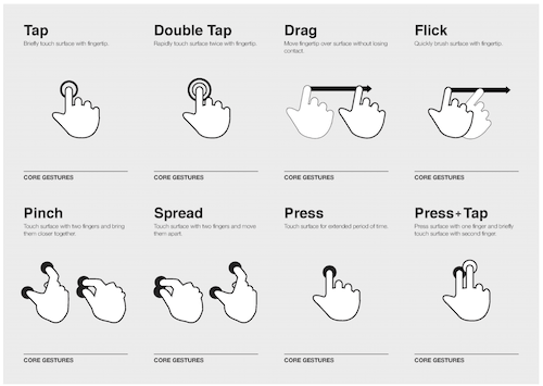
Remember the days when hovering and clicking using the mouse were the most used trigger for interaction with site or app? Those days are gone. When Apple introduced the iPhone, multi-touch technology became mainstream and users learned that they could not only point and tap on the interface, but also pinch, spread, and swipe. Gestures are the new clicks.
The rise of touch and gesture-driven devices has dramatically changed the way we think about interaction. Gestures are more than merely entertaining, they are very useful and feel familiar. Today, the success of a mobile app significantly depends on how well gestures are implemented into the user experience. Even Adobe introduced a new design and wireframing app called Experience Design CC (Adobe XD) that lets you prototype on everything from simple wireframes to multiscreen experiences. You can download and test Adobe XD for free.
The Power Of Gesture-Driven User Interfaces
The main reason gesture controls feel so natural and intuitive to us is because they resemble interacting with a real object. There are three main reasons to use a gesture over a button:
- Less Clutter
The more an app relies on gesture controls, the less buttons appear onscreen, leaving more space for valuable content. This makes the app content-focused and lets the user do what’s most important without obstructions or distractions. - Ease of Use
A gesture, once discovered and learned by a user can become a delightful part of the user experience and can improve interaction by reducing steps in the user flow. For example, when you need to delete items on a mobile device, tapping one item at a time to delete is time consuming. A simple shortcut is to swipe to delete. - Seamless Interaction
While buttons might seem to be useful triggers, gestures have great potential to make interaction with content more intuitive.
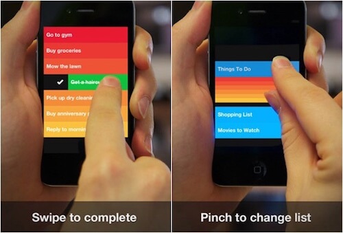
Clear is a good example of a “gesture driven” app. The app is based solely on the use of gestures: swipes, pulls, and pinches. It has a minimalist user interface (there are no buttons), and yet, it’s surprisingly simple to use.

The Role Of Animations In Gesture-Based Design
Gestures are invariably linked to animations in mobile apps. Animations play a very important role in maintaining an illusion of interactivity for users. When paired with gestures, animation essentially makes the brain believe that it’s interacting with tangible objects.
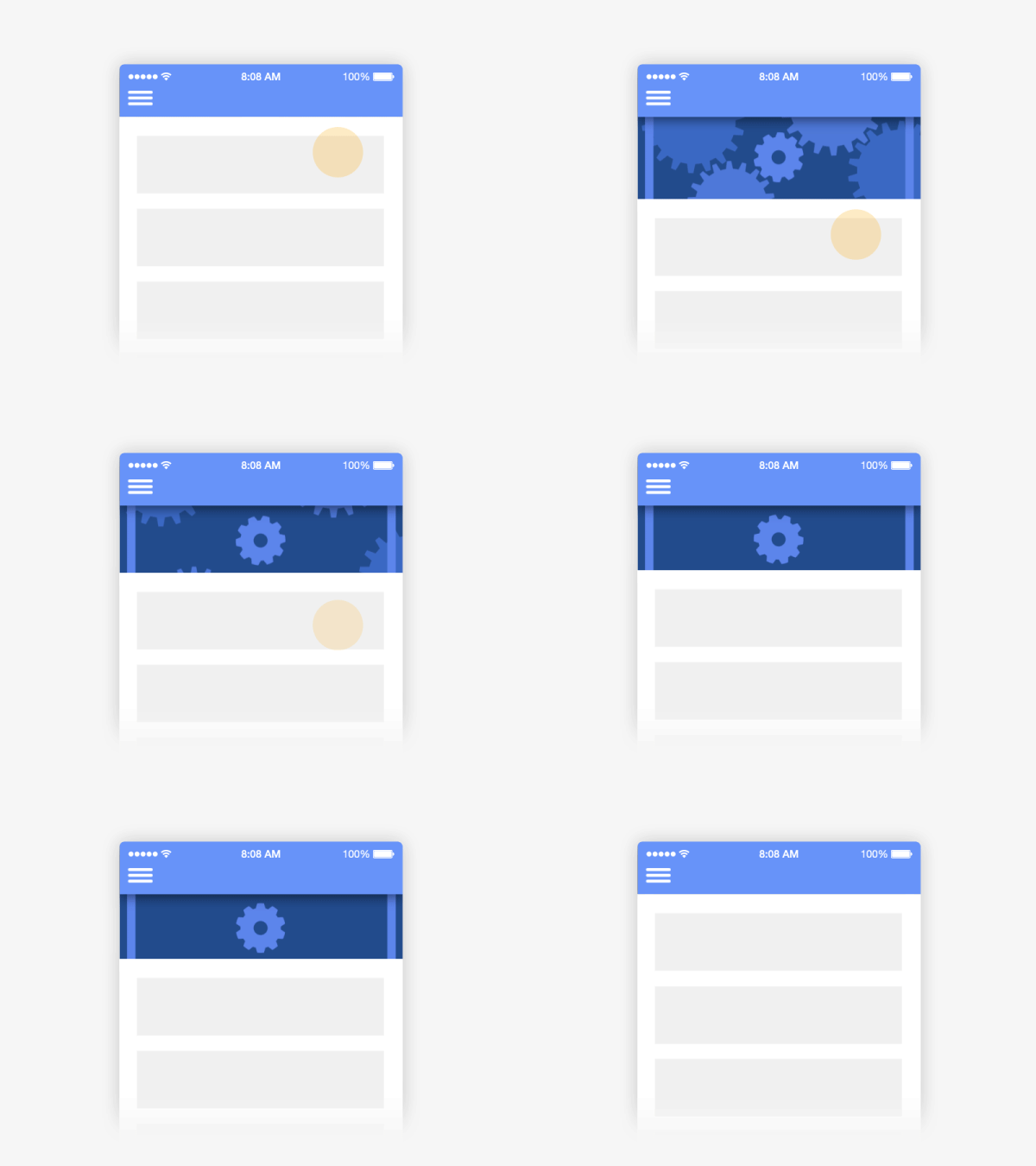
Also, animation is invaluable in providing visual feedback to the user. Without animations, users wouldn’t have enough feedback informing them if they’ve successfully completed a gestural action.
Even a very innovative gestural interaction, such as Pull-To-Refresh, paired with animation has become standard. It feels so intuitive that countless list-based applications adopted this gesture simply by convention.

The Dark Side Of Gestures
When designing mobile apps we sometimes assume that the gestures we use in our applications are so natural (natural for us, not for users) that we don’t need to follow basic usability principles. But visibility is still a very important principle to consider when designing mobile apps.
As Thomas Joos points out, the biggest downside of the gesture controls is a learning curve. Every time you remove UI clutter, the app’s learning curve goes up. This happens because gestures have a lower discoverability — they are always hidden and people need to be able to identify these options. That’s why the more your UI relies on gestures over visible buttons, the greater the possibility for confusion.

Other things you should take into account before designing a gesture-based interface:
- Increased User Effort. Most gestures are neither natural nor easy to learn or remember. For example, in most apps a single finger gesture means one thing, the same gesture with two fingers means another, and yet another with three or four.
- Lack of Feedback. In most cases gestures do not leave behind any record of their path, which means if one makes a gesture and either gets no response or the wrong response, there is little or no information available to help understand why.
- Lack of Consistency. Most gestures aren’t standard and consistent across apps yet. They are not always obvious for users. Even a simple gesture like swiping over an email item might work differently in various mail apps. For example, in Apple Mail to delete an unread item you should swipe left across the unopened mail and the interface reveals the option to delete the item. In Gmail, swiping to the left marks an email as unread.
Explicit Hints
You should design user interfaces (UI) in a way that gives cues to users about the availability of a gesture, because without visual cues users might get confused on how to interact with an app. When it comes to teaching users to use your UI, you should provide a set of visual hints together with animation and progressive disclosure.
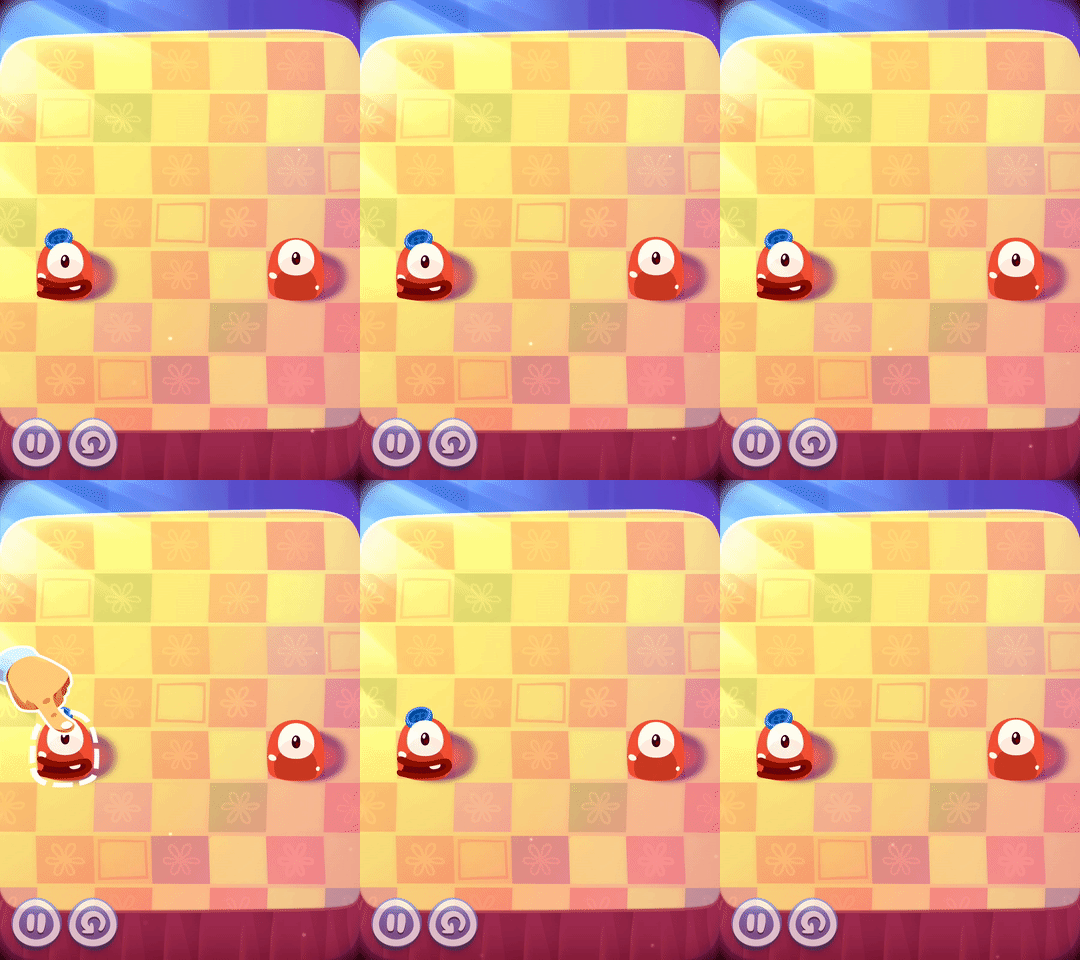
Well executed UI gestures can often be found in games which tend to implement visual hints and progressive disclosure. It’s well known fact that the best games are the ones that let people learn tricks over time, rather than guiding them. For example, Pudding Monsters’ game mechanics are based solely on gestures, but they allow users to get the basic idea of what to do without guessing too much. They showcase a scenario with animation and it immediately becomes clear for users what to do.

Conclusion
Are gestures a powerful mode of interaction? Yes. Mobile devices have evolved from a brick to sophisticated computers powered by our fingers. Touch and gesture interactions have a lot of potential to make mobile experiences easier and more interesting.
There’s no way to design a mobile app without thinking about gestures. They should serve as facilitators and time savers. In order to design a meaningful gesture you should tie it to an action and allow the gesture to stand with the action. It’s very important to provide feedback, explicit hints as to possible action, and guides for how a gesture is to be conducted.
Further Reading
- The Thumb Zone: Designing For Mobile Users
- How To Design Error States For Mobile Apps
- Beyond The Button: Embracing The Gesture-Driven Interface
- What Sci-Fi Tells Interaction Designers About Gestural Interfaces


 Register Free Now
 SurveyJS: White-Label Survey Solution for Your JS App
 Celebrating 10 million developers


