Brush Lettering: It Only Gets Better After Practice (Part 1)
The resurgence of hand lettering, calligraphy, signage, penmanship, or really anything that is graphic and handmade is increasingly difficult to ignore. Along with letters drawn in any of the categories just mentioned, drawing, sketching, sketchnoting, and any hybrid style (combinations of the above) have also been gaining attention among designers, illustrators, and other professionals. A quick look around social media or simply googling lettering will quickly show impressive and notable work.
Last year I deliberately started practicing brush lettering, meaning I had a dedicated time to practice exercises, write out words and practice letterforms. In the process, I learned a few things I would like to share. These tips are not just about how to write messages or repeating letters over and over. Instead, I have become familiar with methods and approaches that have helped me in my journey to improve my lettering work.
This is the first part of two articles which aim to provide you with a good foundation of why lettering is more than just drawing pretty letters and explains the principles behind the practice. I believe that knowing why we do things is important because it helps us create a mindful practice. With that in mind, we will start with a little background, context, and supplies. In the second part of this article, we will move on towards practical advice, how-to videos, and freebies. If you would like to see my work and how I have progressed, please visit my Instagram page or go to my blog.
More Than Just Pretty Drawings Of Letters
As I mentioned before, hand lettering, calligraphy, signage, and penmanship, have experienced a resurgence among designers, as well as non-designers. These graphic forms of expression have one common element: they are activities performed manually through observation and, often, repetition. The acts of drawing, doodling, illustrating, and by extension, drawing or illustrating letters, and writing are considered extremely beneficial to increase memory, retention, and to improve eye-hand coordination.
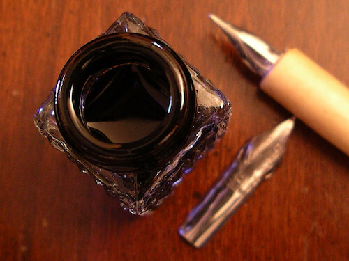
Recent studies (one referenced in Science Daily and the others referenced in The New York Times) claim there is evidence that the act of drawing itself helps to boost memory and learning. These new findings are important as they show the act of drawing itself is what matters — not what is being drawn. Thus, one could infer that drawing letters would contribute to the benefits gathered by simply engaging in the act of creating them. It has also been noted that taking notes with the keyboard is not as beneficial in the learning process and retention as taking notes by hand.
A Little Bit Of Context
The popularity boom that lettering has experienced in recent years, is in contrast with the national decline in cursive handwriting since the 1970’s in the United States. Just in 2008, Vitaly Friedman, founding editor of Smashing Magazine, published an article titled Beautiful Handwriting, Lettering, and Calligraphy, in which he stated the following:
"Handwriting seems to have lost some of its attraction over the last years. Nobody writes beautiful handwritten letters, and uses digital means of communication with smileys, abbreviations and standard lettering instead. And that’s a pity. Since handwriting is unique, it has a tremendous expressive power a standard lettering isn’t able to achieve."
This article published in The Washington Post titled “Cursive Handwriting Is Disappearing From Public Schools” by T. Ress Shapiro in 2013 echoes Friedman’s sentiment and explains how handwriting was disappearing from the school curriculum in the United States mainly due to two factors:
- Technology has been slowly replacing handwriting.
- Common Core Standards do not require students to learn cursive handwriting. It leaves it as a decision to be made by local school officials.
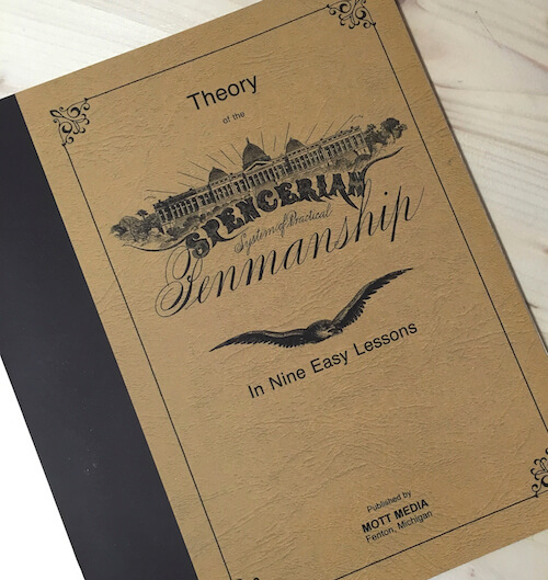
In contrast, the Spencerian Penmanship Theory book, a book that focuses on teaching both the theory and practical lessons of handwriting, states in its Introductory Remarks:
"Writing is a secondary power of speech, and they who cannot write are in part dumb."
Because there is still much debate going on regarding teaching or not teaching handwriting, at least in the United States, we may have young designers who have not learned specifics of writing by hand. In turn, these designers who may become interested in lettering as an extension of typography, will find themselves looking for ways to learn to do lettering. However, even those of us who learned handwriting and also find typography intriguing, find ourselves fascinated by lettering. Thus, I decided to learn and practice.
My Journey As A Learner
Engaging in deliberate practice was not new to me. Back in January 2010, I committed to do something creative every day inspired by Jad Limaco’s article Design Something Every Day. Because Instagram had not been released yet — it was released in October 2010 — I documented all the work in a blog and on Twitter.
A little over a year ago, I started practicing lettering and sometimes penmanship deliberately each day. If you ask me why, I could offer several reasons. Among those reasons: drawing letters has been something I practiced since I was young. Another: I am fascinated (ahem, “obsessed” would be the best term) with typographic forms and letters. I was one of those kids who could write their name on long stretches of notebook paper in three or four different styles. One of my hobbies was to try to imitate my father’s signature because it was not only beautiful but also complicated.
Though my affinity for letterforms has been a long-standing affair, as soon as I started to post my work on Instagram, it was clear that I did not have a full grasp of the basic concepts as I once thought. That said, Instagram is very encouraging and, while it may sound silly and childish, the likes are a good encouragement to keep going.
As they say, practice makes progress. Here are examples of my lettering in chronological order of my progress:

The Rise Of Brush Lettering
As we discussed, teaching cursive has been in decline in the education system. I believe that it is precisely due to the lack of exposure in the formative school years, that lettering, calligraphy, and penmanship in general has grown among designers. For instance, on any social media outlet: Twitter, Pinterest, Flickr, Facebook, and Instagram, one can find evidence of its popularity. Instagram has become the preferred online space to share work for calligraphers and letterers. Using any of the terms on the list below would prompt various examples.
Hashtags (each is a link to a page featuring the results of the hashtag search)
- typelettering
- handlettering
- brushcalligraphy
- brushlettering
- handtype
- handtypography
- lettering
- calligraphy
- moderncalligraphy
- dailylettering
- watercolorlettering
- watercolorcalligraphy
- brushscript
- brushletterpractice
- abstractcalligraphy
- gesturalcalligraphy
Rather than delving into a historical and background account of brush lettering and its relationship to its first cousins, calligraphy, penmanship, and signage, I thought we would discuss the tools, paper, the lessons I have learned, and my favorite letterers and calligraphers. However, before we do that, let’s go over some terms and parameters so that we are all on the same page.
Defining The Terms
Because the terms “calligraphy”, “lettering”, and “typography” are often used interchangeably, I think it would be beneficial to define each of these. For the most part, people are not obsessively trying to correct each other. Nonetheless, understanding the differences and similarities is very helpful.
Calligraphy
Calligraphy is the art of writing beautiful letters. Laura Lavender, in her book Creative Lettering and Beyond, explains the following:
"The word 'calligraphy' comes from the Greek words kallos, 'beauty', and graph, 'writing'."
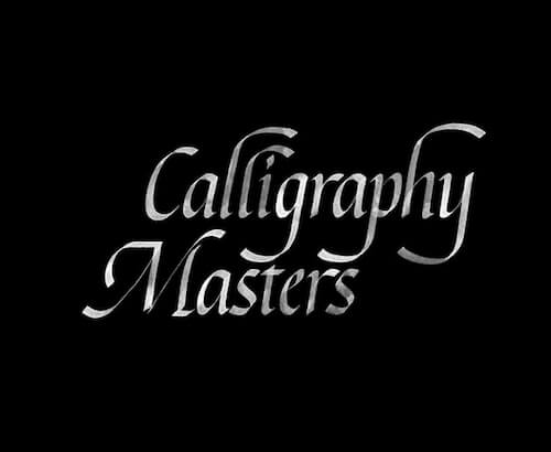
Thus, calligraphy is an art, but it is the art of writing out the words. It has a close relationship to penmanship. The dictionary defines penmanship as the art or skill of writing by hand; a person’s handwriting. Calligraphy, on the other hand, is the art of producing decorative handwriting or lettering with a pen or brush. There are rules to follow and alphabets, called hands in calligraphy, to learn: Neuland, Roman Capitals, Italic, Foundational, Uncial, Carolingian, Gothic, and Versals. (Each term is linked to a Google Image search for your benefit). However, here are examples of some of the calligraphic hands:
Italic Hand
Gothic Hand
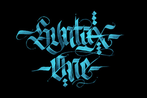
Uncial Hand
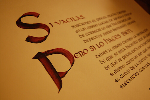
Neuland Hand
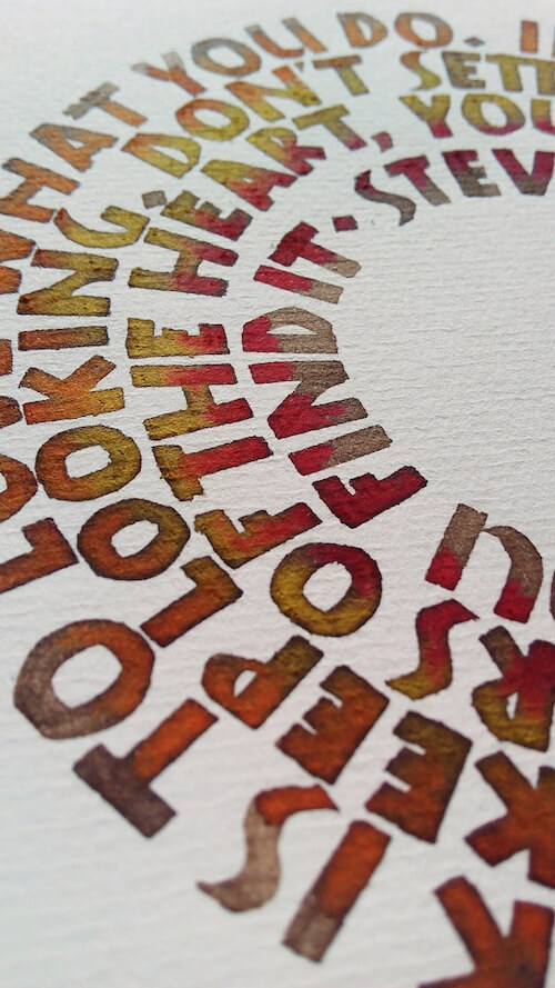
When you practice one of these alphabets, or a calligraphic hand, it is crucial that you do them correctly. There are many technical nuances in the construction of any calligraphic alphabet to be mindful of. To me, calligraphy is the equivalent of classical ballet. Learn it well and you are versed in the principles and theory that open the key to more expressive styles. Not every letterer is a calligrapher but every calligrapher can be and is a letterer.
Lettering
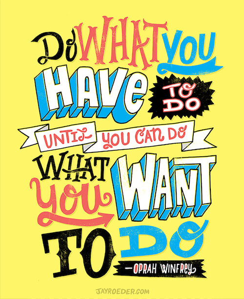
Mary Kate McDevitt, in her book Hand Lettering Ledger, defines lettering as the art of drawing letters. Lettering is the customization of letters. In other words, lettering allows the designer and artist to create a style that was not there before or to embellish an existing letterform beyond its original form. You can see many examples of lettering by doing an image search on Google or just by clicking here.
Typographic Design
In the book Typographic Design: Form and Communication, Rob Carter states that typography and writing are magic because they create a “record of the spoken language.” Before the computer, letters (typography) were set to specific types or molds and arranged in the printing press. The letters were carved out of wood or metal and moved to create words, sentences, paragraphs, and pages. These letters needed to be functional, meaning that, because the letters belonged to a family, they needed to share many elements to look like they belong.
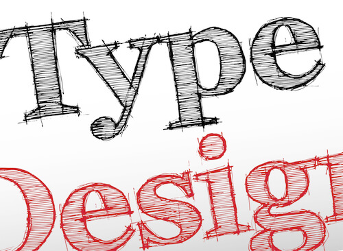
In this aspect, typeface design is similar to calligraphy. The letters in each font as in calligraphy had to look alike. Robert Bringhurst, in his book The Elements of Typographic Style, states that letters need to be “set with affection, intelligence, knowledge, and skill.”
And Finally, Brush Lettering
Now that we have these terms defined, let’s focus on brush lettering. You may be wondering why I make a point to differentiate between lettering (drawing letters) and brush lettering as if they are not the same. Well, they are not the same. In my case, specifically, I don’t tend to create illustrative letters. Perhaps I am a little too impatient for it. I admire and respect those who create illustrative lettering, like the work of Jason Roeder.
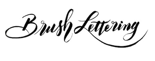
As its name says, brush lettering is lettering done with a brush. Though it has been around for a long time, it is still often seen as a very modern style of writing based on calligraphy. The brush width is not as important as the angle you hold it. You can use a flat, angled brush, or a pointed brush. Though, something to keep in mind: the size or width of the brush determines the size of the lettering.
What Do You Need To Get Started?
Let’s talk about some of my favorite tools and supplies to start lettering.
Pens
The best pen to use is the one you have. Believe this. The specific pen helps, but it is your ability to use the pen correctly and your understanding of the basic principles of forming a letter that ultimately will make you a good letterer (brush or otherwise). That said, there are many pens out there. Some are inexpensive while others are very expensive. The best advice I can give you is to try as many pens as you are able. One thing to remember is, the larger the size of the tip of the brush pen, the larger the letters will be. Below are some of the best pens to get started with.
Crayola Broad Tip Markers
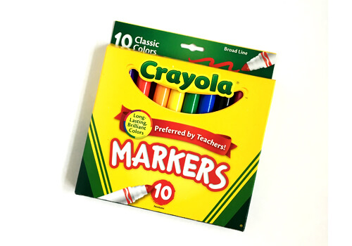
Crayola markers broad tips are a great way to get used to changing the pressure of the marker on the page. Also, they are very inexpensive. (Large preview)
At the beginning, it was easier for me to use Crayola markers than other brush pens. Why would I use these markers if I wanted to practice brush lettering? Here are a few reasons:
- Crayola broad tip markers are great to use when you are just starting out because they can take a lot of abuse. Their tip is broad and sturdy. Thus, I did not have to be concerned with the tip. Brush pens are delicate and the tip may fray after a lot of use. Plus, while learning, replacing the Crayola markers is a lot cheaper than replacing a Tombow brush pen. I also used the Crayola broad tip markers to help me get the feel of the most basic principle: pressure when drawing a down stroke and very light pressure when going up. More on the pressure later. If you are like me, get a set of Crayola markers and be happy practicing.
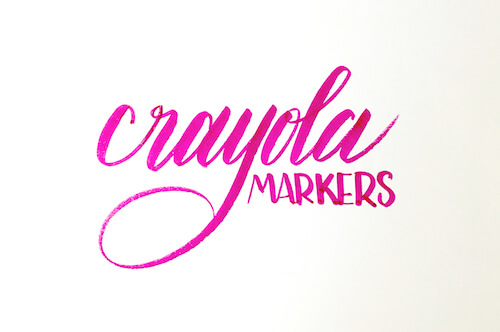
- Crayola broad tip markers have become popular to the point that there is now a term mixing calligraphy and Crayola. The term is Crayligraphy. The term was coined by Colin Tierny and he defines it as:
“The art of stylistically writing with a Crayola marker.”
Here is an example of what lettering looks like with Crayola markers.
Crayola Brush Pens
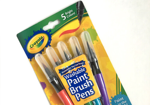
Once I began getting used to the techniques, I decided to try these brush pens. They are very inexpensive and last for a while. The tip is very sturdy, so it is hard to fray, but one has to be careful when and how to apply the pressure. The brush tip is very flexible; thus it may be hard to make the transition between the sturdiness of the Crayola broad tip markers and their brush pens. However, the good news is that replacing them will not be painful as they are inexpensive. I find the color in them to be very rich, vibrant, and it runs very well.
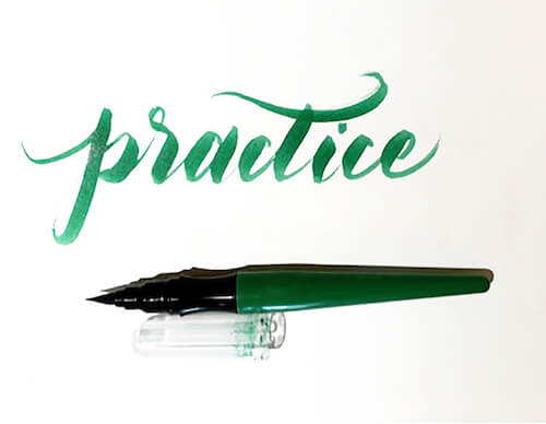
Tombow Fudenosuke Soft And Hard Tips
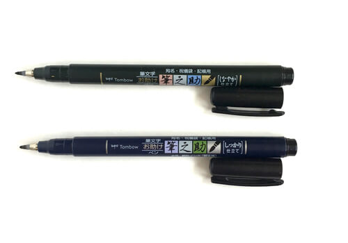
These are the pens I have been using in all the videos for this article (you will be able to see them in part 2). These are a great next step from the Crayola markers or pen brushes. Tombow Fudensouke pens have a tip that feels like a brush but is actually plastic. The soft pen tip is very flexible, which allows you to experiment with the pressure and bending the tip. Since the tip is not a brush and there are not brush hairs to speak of, the tips will not fray. The hard tip is very firm and it really helps you to be conscious of how much pressure you need to apply on each stroke to get the thick and thins on paper. These are more expensive than the Crayola markers but, you can get them in sets. Plus, they last a long time.
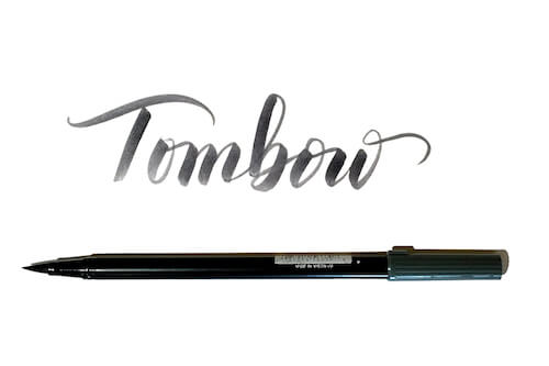
Tombow Dual Tip Brush Pens
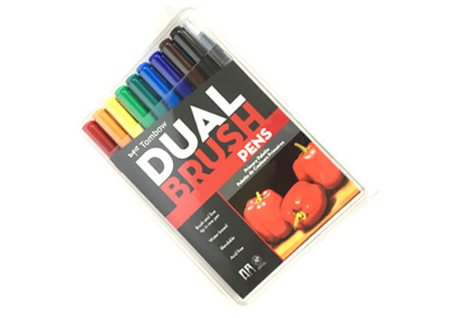
Many brush letterers consider these pens the top of the line. Their tip is large compared to the Fudenosuke pens above, so these brush pens are more appropriate when lettering at a larger scale. They are very smooth and work best when used with marker paper or soft paper. However, I like texture, and sometimes I use them on paper with some teeth in it. This is where you need to be careful, because that can fray the tip of the brush.
You can buy these pens individually or in sets at several art supply stores.
Pentel Art Aquash Brush Pens
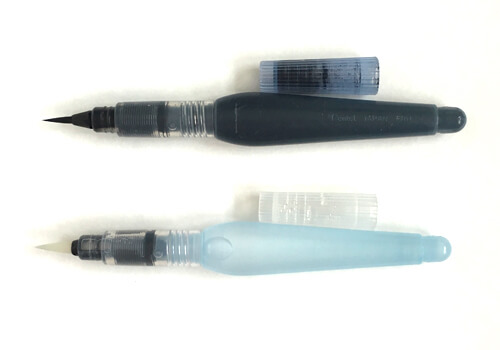
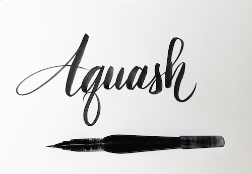
These are my favorite brush pens. I even make excuses to use them. The brush tip is very smooth and glides on the paper even when the paper has some texture. Here are some advantages to these brush pens:
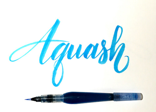
- The body or barrel can be filled with water, ink, or simply liquid watercolors. If filling with ink or liquid watercolor, I found that using a dropper works best to fill the barrel. The liquid tends to create a bubble that you will need to burst, or you will be a mess of ink or color! I use a dropper and a paper towel to burst the bubble on the opening. Though this process can be slow, the good news is that the ink or liquid watercolor tends to last a long time. When filled with water, the brush pen will likely be used with watercolors. Thus, it runs out of water a little faster. However, if I want to take my supplies with me when traveling (and I do take my supplies with me everywhere), these are great if using watercolors as there is no need to change the water regularly.
- These brush pens can be bought separately or in a set of three: fine, medium, and large. I rarely use the medium and large, but it is more cost effective to buy them as a set. I find that the fine tip allows me to do different sizes in my lettering depending on how I hold the brush and how much I bend it.
Pentel Arts Sign Pen With Brush Tip
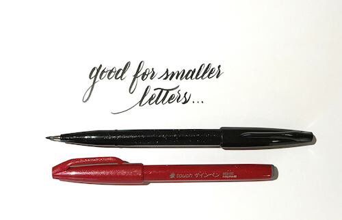
These brush pens are also one of my favorites. The tip is plastic and flexible like the Fudenosuke Soft above, but they come in sets of color and can be used for small to medium lettering. The color is very crisp, and it looks like watercolor depending on the paper you are using. You can also buy them in sets of six and twelve.
Akashiya Sai Watercolor Brush Pen
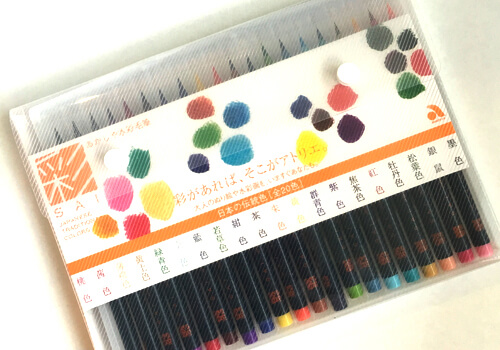
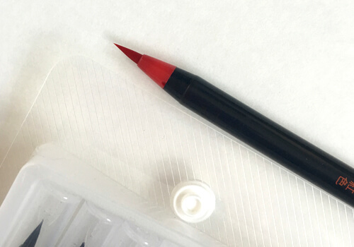
My best friend gave me these watercolor brush pens as Christmas gift and I must say they are divine. They have a very delicate tip so I don’t use them to practice with. I use them to do final pieces or nice lettering for someone. The color is beautiful, really beautiful, and the tip just glides on the paper. These brush pens are a must have if you want a piece with a more delicate and polished finish.
There are of course more brush pens available at different online stores. JetPens, for instance, offers two sets of brush pens; an assortment of different pens to try. This deal may be a good option before you commit to a brand or if you just want to explore.
One thing to remember about the brush pens: the size of the tip determines the size of the letters you will write. Keep that in mind when choosing pens for your work. I know I keep reminding you of this, but it is important.
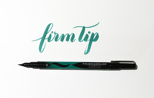
Prismacolor Premier Illustration Brush Tip Art Markers
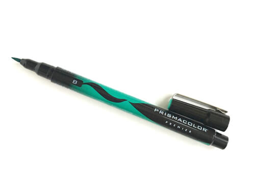
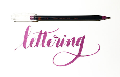
These brush pens are both firm and flexible. They allow me to create drastic thick and thin strokes, making for a beautiful contrast effect. They are small, thin, and light to hold. However, they do not last as long as other brands.
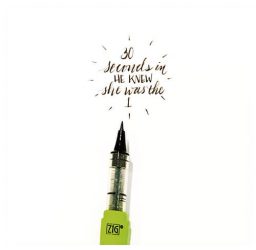
Kuretake Zig Letter Pen CocoIro LP
This is my newest pen, and I love it. I can write really small and delicately and the tip is firm but not so hard that it has no flexibility. The pen is sold in parts: the body and the fill and you can buy the refill in a variety of colors. See how small I can write with it in these images below.
There are of course more brush pens available. However, the list offered to you here is a good place to start. When I started, I had no idea which pens were best, and the Crayola markers were my favorite for a long time. Now, I switch it around depending on the type of work I am doing. If you feel like you need to have one pen to start with, I would recommend the Tombow Fudenosuke soft and hard tip brush pens.
Let’s now discuss the second most important supply: paper.
Paper
There are many brush letterers and brush calligraphers, and each one of them will have a list of which papers are best. What I am listing here are the ones I have used and like.
Laser Paper
I started out practicing on laser paper. It is an inexpensive way to get started, and some of it is thick enough to hold the moisture. Lindsey Bugbee from The Postman’s Knock recommends using Georgia Pacific 20lb on one of her blog posts. I have found that laser paper, both in 24lb and 32lb weights, is very nice and the brushes handle it very well. Please note that if you use your brush pens on laser paper, your pens will eventually fray. For practice purposes, laser paper is good but use the least expensive brushes on it. Also, remember that the cheapest writing tool you can practice with is a pencil.
If you plan to keep your practice sheets, it is best to use archival quality paper. For final pieces, it is best to find paper that is not only archival but also smooth. The smooth type of paper will be very gentle on your brush pen markers. Amanda Arneilla has a great post on her site about paper that you may want to check out!
Rhodia
Many brush letterers and brush calligraphers prefer Rhodia pads. I have a pad with a quad-grid, and I love its texture. It’s very smooth, and the brush pen glides on it. The only drawback is that it can be a tad expensive, or not as cost effective as others.
Drawing Paper
A few years ago, I took calligraphy classes and my teacher, Clint Voris, had me practice on a large (11” x 14”) drawing paper pad. The brand he recommended was Strathmore. The ink did not bleed through the paper, and I have found that some drawing papers, as long as they are smooth, can work well for brush pens. However, I would use the plastic and synthetic brush tips with this paper. As the Tombow markers are delicate, I would only use them on either the Rhodia pads or smooth laser paper.
Canson Mixed Media paper
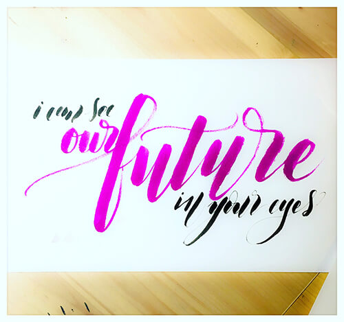
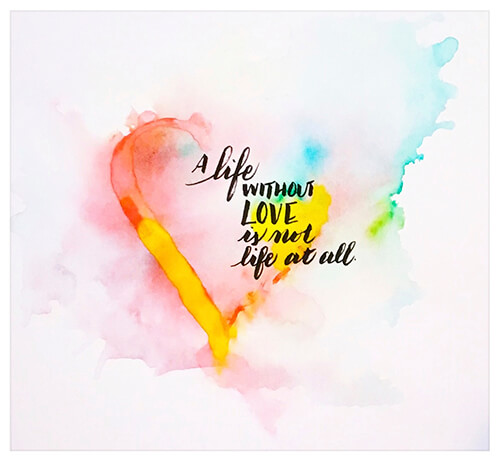
This is my favorite paper as I do a lot of watercolor lettering and it comes in pads and large rolls. However, for some reason, the paper in the roll is lighter than in the pads. Regardless, it is very thick and holds a lot of moisture. Since this paper is intended for both dry and wet media, it works very well with the plastic and synthetic brushes due to its soft texture. The stroke you make with the brush will reflect that (see picture below). I don’t mind a little bit of texture; in fact, I find it gives the lettering a very rich feel. This pad is also great if you are experimenting with watercolor lettering or watercolor backgrounds.
These pads are not expensive and for practicing purposes, and I use both sides. The best news? If your practice turns out well, you may be able to sell it, as this is good paper!
As with the Canson and Strathmore, I don’t use the Tombow dual brush pens on this paper. Even the soft texture of this paper would fray the Tombow brushes a little. However, if you do like some texture, you can use the frayed brush tips to give you that feel of texture. Below are two example of lettering done on this paper.
Printmaking Paper
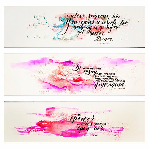
Since I teach design at a university, I have access to lots and lots of discarded pieces of printmaking paper. You may find this paper strange because it has a lot of texture. That is true, but it also holds a lot of moisture. Sometimes I use my brush pens, such as the Crayola brush pens, on it, and I get great results. The texture of the paper makes it even better for my purposes. I love to see how the ink and the watercolor interact with it. See this image below.
Other Items You Will Need But Probably Have Around
Pencil
I can’t stress how crucial it is to plan out your letters before marking the paper with ink. Once there is ink, well, it will not be erased. Plus, sketching out or planning where you want your letters will help you get better at understanding proportions: how large the letters should be in relation to the size of the sheet you are using. If you use soft pencils, you can practice creating thick and thin strokes in your letters. Any soft pencil will do but among some brush letterers the Palomino Blackwing Pencils are a favorite.
Ruler
I will be honest and confess that I dislike drawing straight lines because, for some reason, they always end up in a slight diagonal. But, better some lines than none, right? As you get better, your sense for letter placement will improve, and you will rely less on the ruler. But please, at least use one to create a few guidelines to start. I will say that if you practice on a grid or lined paper, you will get used to writing on a line. After a while, even when no line exists, you may notice that you are able to write fairly straight.
Eraser
There is no explanation needed except that make sure to use plastic erasers. They are usually white and are not abrasive on the paper. These erasers are so good that they fade dried watercolor.
Closing Thoughts
We have discussed brush lettering, its definition, its context, and the supplies you will need to get started. In the second part of this article, we will discuss the practice itself. Plus, there will be some videos and freebies. Stay tuned!
Further Reading
- The Art Of Hand Lettering
- The Difference Between Type And Lettering
- Beautiful Handwriting, Lettering and Calligraphy
- An Interview With Type Designer Akira Kobayashi


 Try ProtoPie AI free →
 Celebrating 10 million developers


 Register Free Now
 SurveyJS: White-Label Survey Solution for Your JS App

