True Lies Of Optimistic User Interfaces
Three user interfaces (UIs) go to a pub. The first one orders a drink, then several more. A couple of hours later, it asks for the bill and leaves the pub drunk. The second UI orders a drink, pays for it up front, orders another drink, pays for it and so on, and in a couple of hours leaves the pub drunk. The third UI exits the pub already drunk immediately after going in — it knows how the pubs work and is efficient enough not to lose time. Have you heard of this third one? It is called an “optimistic UI.”

Recently, having discussed psychological performance optimization at a number of conferences dedicated to both front-end development and UX, I was surprised to see how little the topic of optimistic UI design is addressed in the community. Frankly, the term itself is not even well defined. In this article, we will find out what concepts it is based on, and we will look at some examples as well as review its psychological background. After that, we will review the concerns and main points regarding how to maintain control over this UX technique.
But before we begin, truth be told, no single thing could be called an “optimistic UI.” Rather, it is the mental model behind the implementation of an interface. Optimistic UI design has its own history and rationale.
Once Upon A Time
A long while ago — when the word “tweet” applied mostly to birds, Apple was on the verge of bankruptcy and people still put fax numbers on their business cards — web interfaces were quite ascetic. And the vast majority of them had not even a hint of optimism. An interaction with a button, for example, could follow a scenario similar to the following:
- The user clicks a button.
- The button is triggered into a disabled state.
- A call is sent to a server.
- A response from the server is sent back to the page.
- The page is reloaded to reflect the status of the response.
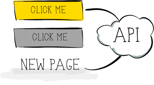
This might look quite inefficient in 2016; however, surprisingly enough, the same scenario is still used in a lot of web pages and applications and is still a part of the interaction process for many products. The reason is that it is predictable and more or less error-proof: The user knows that the action has been requested from the server (the disabled state of the button hints at this), and once the server responds, the updated page clearly indicates the end of this client-server-client interaction. The problems with this kind of interaction are quite obvious:
- The user has to wait. By now, we know that even the shortest delay in the server’s response time has a negative effect on the user’s perception of the entire brand, not only on this particular page.
- Every time the user gets a response to their action, it is presented in quite a destructive way (a new page loads, instead of the existing one being updated), which breaks the context of the user’s task and might affect their train of thought. Even though we are not necessarily talking about multitasking in this case, any switch of mental context is unpleasant. So, if an action is not inherently meant to switch contexts (online payment is a good example of when a switch is natural), switching would set up an unfriendly tone of dialogue between user and system.
Good Not-So-Old Days
Then, the so-called Web 2.0 arrived and provided new modes of interaction with web pages. The core of these were XMLHttpRequest and AJAX. These new modes of interaction were complemented by “spinners”: the simplest form of progress indicator, the sole purpose of which was to communicate to the user that the system is busy performing some operation. Now, we did not need to reload the page after getting a response from the server; we could just update a part of the already-rendered page instead. This made the web much more dynamic, while allowing for smoother and more engaging experiences for users. The typical interaction with a button could now look like this:
- The user clicks a button.
- The button is triggered into a disabled state, and a spinner of some kind is shown on the button to indicate the system is working.
- A call is sent to the server.
- A response from the server is sent back to the page.
- The visual state of the button and the page are updated according to the response status.
This new interaction model addressed one of the aforementioned problems of the old method of interaction: The update of the page happens without a destructive action, keeping the context for the user and engaging them in the interaction much better than before.
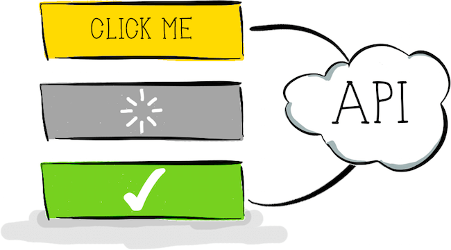
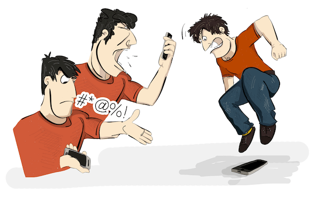
This kind of interaction pattern has been widely used everywhere in digital media. But one issue remains: Users still have to wait for a response from the server. Yes, we can make our servers respond faster, but no matter how hard we try to speed up the infrastructure, users still have to wait. Again, users do not like to wait, to put it mildly. For example, research shows that 78% of consumers feel negative emotions as a result of slow or unreliable websites. Moreover, according to a survey conducted by Harris Interactive for Tealeaf, 23% of users confess to cursing at their phones, 11% have screamed at them, and a whole 4% have actually thrown their phone when experiencing a problem with an online transaction. Delays are among those problems.
Even if you show some kind of progress indicator while the user waits, unless you are very creative with the indicator, nowadays that is simply not enough. For the most part, people have gotten accustomed to spinners indicating a system’s slowness. Spinners are now more associated with purely passive waiting, when the user has no option other than either to wait for the server’s response or to close the tab or application altogether. So, let’s come up with a step to improve this kind of interaction; let’s look at this concept of an optimistic UI.
Optimistic UI
As mentioned, an optimistic UI is nothing more than a way of handling human-computer interaction. To understand the main ideas behind it, we will stick with our “user clicks a button” scenario. But the principle will be the same for pretty much any kind of interaction that you might want to make optimistic. According to the Oxford English Dictionary:
"op-ti-mis-tic, adj. hopeful and confident about the future."
Let’s begin with the “confident about the future” part.
What do you think: How often does your server return an error on some user action? For example, does your API fail often when users click a button? Or maybe it fails a lot when users click a link? Frankly, I don’t think so. Of course, this might vary based on the API, server load, level of error-handling and other factors that you, as the front-end developer or UX specialist, might not be willing to get involved in. But as long as the API is stable and predictable and the front end properly communicates legitimate actions in the UI, then the number of errors in response to actions initiated by the user will be quite low. I would go so far as to state that they should never go above 1 to 3%. This means that in 97 to 99% of cases when the user clicks a button on a website, the server’s response should be success, with no error. This deserves to be put in a better perspective:
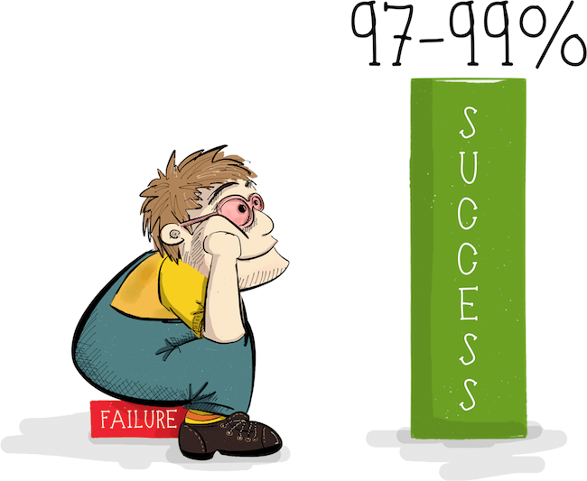
Think about it for a moment: If we were 97 to 99% certain about a success response, we could be confident about the future of those responses — well, at least much more confident about the future than Schrödinger’s cat was. We could write a whole new story about button interaction:
- The user clicks a button.
- The visual state of the button is triggered into success mode instantly.
That’s it! At least from the user’s point of view, there is nothing more to it — no waiting, no staring at a disabled button, and not yet another annoying spinner. The interaction is seamless, without the system crudely stepping in to remind the user about itself.

From the developer’s point of view, the complete cycle looks like this:
- The user clicks a button.
- The visual state of the button is triggered into success mode instantly.
- The call is sent to the server.
- The response from the server is sent back to the page.
- In 97 to 99% of cases, we know that the response will be success, and so we don’t need to bother the user.
- Only in the case of a failed request will the system speak up. Don’t worry about this for now — we will get to this point later in the article.
Let’s look at some examples of optimistic interactions. You are probably familiar with “like” buttons, as found on Facebook and Twitter. Let’s take a look at the latter.
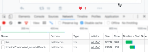
It starts, obviously enough, with the click of the button. But note the visual state of the button when the user is no longer pressing or hovering over the button. It switches to the success state instantly!

Let’s see what’s happening in the “Network” tab of our browser’s developer tools at this very moment.

The “Network” tab shows that the server request has been sent but is still in progress. The “likes” counter number has not been incremented yet, but with the change in color, the interface is clearly communicating success to the user, even before having gotten a response from the server.
After a successful response is received from the server, the counter is updated, but the transition is much subtler than the instant color change. This provides the user with a smooth, uninterrupted experience, without any perceived waiting.
Another example of optimistic interaction is seen on Facebook, with its own like button. The scenario is quite similar, except that Facebook updates the counter instantly, together with success color of the button, without waiting for the server’s response.
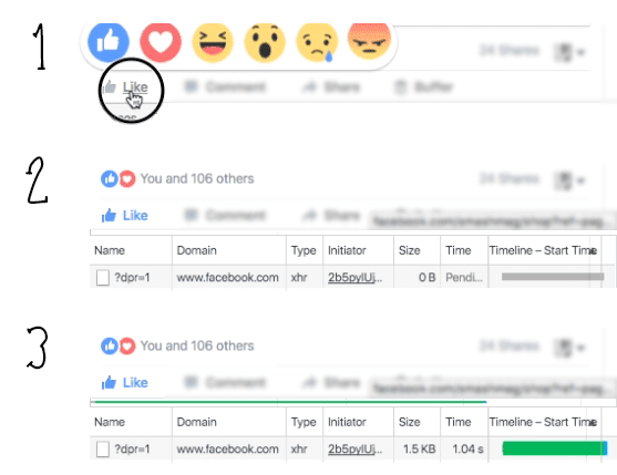
One thing to note here, though. If we look at the server’s response time, we’ll see that it is a little over 1 second. Considering that the RAIL model recommends 100 milliseconds as the optimal response time for a simple interaction, this would normally be way too long. However, the user does not perceive any wait time in this case because of the optimistic nature of this interaction. Nice! This is another instance of psychological performance optimization.
But let’s face it: There is still that 1 to 3% chance that the server will return an error. Or perhaps the user is simply offline. Or, more likely, perhaps the server returns what is technically a success response but the response contains information that has to be further processed by the client. As a result, the user will not get a failure indicator, but we cannot consider the response a success either. To understand how to deal with such cases, we should understand why and how optimistic UIs work psychologically in the first place.
The Psychology Behind Optimistic UIs
So far, I have not heard anyone complain about the aforementioned optimistic interactions on the major social networks. So, let’s say that these examples have convinced us that optimistic UIs work. But why do they work for users? They work simply because people hate waiting. That’s it, folks! You can skip to the next part of the article.
But if you’re still reading, then you are probably interested in knowing why it is so. So, let’s dig a bit deeper into the psychological ground of this approach.

An optimistic UI has two basic ingredients that are worth psychological analysis:
- the fast response to the user’s action;
- the handling of potential failures on the server, on the network and elsewhere.
Fast Response To User Action
When we talk about optimistic UI design, we’re talking about an optimal response time in human-computer interaction. And recommendations for this type of communication have been around since as far back as 1968. Back then, Robert B. Miller published his seminal piece “Response Time in Man-Computer Conversational Transactions” (PDF), in which he defines as many as 17 different types of responses a user can get from a computer. One of those types Miller calls a “response to control activation” — the delay between the depressing of a key and the visual feedback. Even back in 1968, it should have not exceeded 0.1 to 0.2 seconds. Yes, the RAIL model is not the first to recommend this — the advice has been around for about 50 years. Miller notes, though, that even this short delay in feedback might be far too slow for skilled users. This means that, ideally, the user should get acknowledgement of their action within 100 milliseconds. This is getting into the range of one of the fastest unconscious actions the human body can perform — an eye blink. For this reason, the 100-millisecond interval is usually perceived to be instant. “Most people blink around 15 times a minute and a blink lasts on average 100 to 150 milliseconds,” says Davina Bristow, of University College London’s Institute of Neurology, adding that this “means that overall we spend at least 9 days per year blinking.”
Because of its instant visual response (even before the actual request has finished), an optimistic UI is one of the examples of the early-completion techniques used in psychological performance optimization. But the fact that people like interfaces that respond in the blink of an eye should not come as a surprise to most of us, really. And it’s not hard to achieve either. Even in the old days, we disabled buttons instantly after they were clicked, and this was usually enough to acknowledge the user’s input. But a disabled state in an interface element means passive waiting: The user cannot do anything about it and has no control over the process. And this is very frustrating for the user. That’s why we skip the disabled state altogether in an optimistic UI — we communicate a positive outcome instead of making the user wait.
Handling Potential Failure
Let’s get to the second interesting psychological aspect of optimistic UI design — the handling of potential failure. In general, plenty of information and articles are available on how to handle UI errors in the best possible way. However, while we will see how to handle failure later in this article, what matters most in an optimistic UI is not how we handle errors, but when we do it.
Humans naturally organize their activity into clumps, terminated by the completion of a subjectively defined purpose or sub-purpose. Sometimes we refer to these clumps as a “train of thought,” a “flow of thought” or simply a “flow.” The flow state is characterized by peak enjoyment, energetic focus and creative concentration. During a flow, the user is completely absorbed in the activity. A tweet by Tammy Everts nicely illustrates this:

On the web, the durations of such clumps of activity are much shorter. Let’s revisit Robert B. Miller’s work for a moment. The response types he cites include:
- a response to a simple inquiry of listed information;
- a response to a complex inquiry in graphic form;
- a response to “System, do you understand me?”
He ties all of these to the same 2-second interval within which the user should get the relevant type of response. Without digging deeper, we should note that this interval also depends on a person’s working memory (referring to the span of time within which a person can keep a certain amount of information in their head and, more importantly, be able to manipulate it). To us, as developers and UX specialists, this means that within 2 seconds of interacting with an element, the user will be in a flow and focused on the response they are expecting. If the server returns an error during this interval, the user will still be in “dialogue” with the interface, so to speak. It’s similar to a dialogue between two people, where you say something and the other person mildly disagrees with you. Imagine if the other person spent a long time nodding in agreement (the equivalent of our indication of a success state in the UI) but then finally said “no” to you. Awkward, isn’t it? So, an optimistic UI must communicate failure to the user within the 2 seconds of the flow.
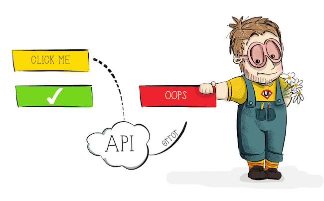
Armed with the psychology of how to handle failure in an optimistic UI, let’s finally get to those 1 to 3% of failed requests.
The Pessimistic Side Of Optimistic UI Design
By far, the most common remark I hear is that optimistic UI design is a kind of black pattern — cheating, if you will. That is, by employing it, we are lying to our users about the result of their interaction. Legally, any court would probably support this point. Still, I consider the technique a prediction or hope. (Remember the definition of “optimistic”? Here is where we allow some room for the “hopeful” part of it.) The difference between “lying” and “predicting” is in how you treat those 1 to 3% of failed requests. Let’s look at how Twitter’s optimistic “like” button behaves offline.
First, in line with the optimistic UI pattern, the button switches to the success state right after being clicked — again, without the user pressing or hovering over the button any longer, exactly as the button behaves when the user is online.

But because the user is offline, the request fails.
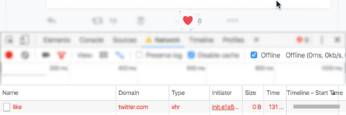
So, as soon as possible within the user’s flow, the failure should be communicated. Again, 2 seconds is usually the duration of such a flow. Twitter communicates this in the subtlest way possible, simply by reverting the button’s state.

The conscientious reader here might say that this failure-handling could be taken one step further, by actually notifying the user that the request could not be sent or that an error has occurred. This would make the system as transparent as possible. But there is a catch — or, rather, a series of issues:
- Any sort of notification that appears suddenly on screen would switch the user’s context, prompting them to analyze the reason behind the failure, a reason that would probably be presented in the error message.
- As with any error message or notification, this one should guide the user in this new context by providing actionable information.
- That actionable information would set yet another context.
OK, by now we can all agree that this is getting a bit complicated. While this error-handling would be reasonable for, say, a large form on a website, for an action as simple as clicking a like button, it’s overkill — both in terms of the technical development required and the working memory of users.
So, yes, we should be open about failure in an optimistic UI, and we should communicate it as soon as possible so that our optimism does not become a lie. But it should be proportional to the context. For a failed like, subtly reverting the button to its original state should be enough — that is, unless the user is liking their significant other’s status, in which case the thing better work all the time.
Extreme Pessimism
One other question might arise: What happens if the user closes the browser tab right after getting a success indicator but before the response is returned from the server? The most unpleasant case would be if the user closes the tab before a request has even been sent to the server. But unless the user is extremely nimble or has the ability to slow down time, this is hardly possible.
If an optimistic UI is implemented properly, and interactions are applied only to those elements that never wait longer than 2 seconds for a server response, then the user would have to close the browser tab within that 2-second window. That’s not particularly difficult with a keystroke; however, as we’ve seen, in 97 to 99% of cases, the request will be successful, whether the tab is active or not (it’s just that a response won’t be returned to the client).
So, this problem might arise only for those 1 to 3% who get a server error. Then again, how many of those rush to close the tab within 2 seconds? Unless they’re in a tab-closing speed competition, I don’t think the number will be significant. But if you feel this is relevant to your particular project and might have negative consequences, then employ some tools to analyze user behavior; if the probability of such a scenario is high enough, then limit optimistic interaction to non-critical elements.
I intentionally haven’t mentioned cases in which a request is artificially delayed; these do not generally fall under the umbrella of optimistic UI design. Moreover, we have spent more than enough time on the pessimistic side of things, so let’s summarize some main points about implementing a good optimistic UI.
Rules Of Thumb
I sincerely hope this article has helped you to understand some of the main concepts behind optimistic UI design. Perhaps you’re interesting in trying out this approach in your next project. If so, here are some things to keep in mind before you begin:
- A prerequisite to everything we’ve talked about so far: Make sure the API you’re relying on is stable and returns predictable results. Enough said.
- The interface should catch potential errors and problems before a request is sent to the server. Better yet, totally eliminate anything that could result in an error from the API. The simpler a UI element is, the simpler it will be to make it optimistic.
- Apply optimistic patterns to simple binary-like elements for which nothing more than a success or failure response is expected. For example, if a button click assumes a server response such as “yes,” “no” or “maybe” (all of which might represent success to varying degrees), such a button would be better off without an optimistic pattern.
- Know your API’s response times. This is crucial. If you know that the response time for a particular request never goes below 2 seconds, then sprinkling some optimism over your API first is probably best. As mentioned, an optimistic UI works best for server response times of less than 2 seconds. Going beyond that could lead to unexpected results and a lot of frustrated users. Consider yourself warned.
- An optimistic UI is not just about button clicks. The approach could be applied to different interactions and events during a page’s lifecycle, including the loading of the page. For example, skeleton screens follow the same idea: You predict that the server will respond with success in order to fill out placeholders to show to the user as soon as possible.

Optimistic UI design is not really a novelty on the web, nor is it a particularly advanced technique, as we have seen. It is just another approach, another mental model, to help you manage the perceived performance of your product. Being grounded in the psychological aspects of human-computer interaction, optimistic UI design, when used intelligently, can help you to build better, more seamless experiences on the web, while requiring very little to implement. But, in order to make the pattern truly effective and to keep our products from lying to users, we must understand the mechanics of optimistic UI design.
Resources
- “Response Time in Man-Computer Conversational Transactions” (PDF), Robert B. Miller, Fall Joint Computer Conference, 1968
- “Introducing RAIL: A User-Centric Model for Performance,” Paul Irish, Paul Lewis, Smashing Magazine, 2015
- “Mobile Web Stress: The Impact of Network Speed on Emotional Engagement and Brand Perception,” Tammy Everts, Radware Blog, 2013
- Applications of Flow in Human Development and Education, Mihaly Csikszentmihalyi, 2014
- “Mobile Design Details: Avoid the Spinner,” Luke Wroblewski, 2013
- “Why Performance Matters, Part 2: Perception Management,” Denys Mishunov, Smashing Magazine, 2015
Further Reading
- The User Is The Anonymous Web Designer
- Designing Card-Based User Interfaces
- Conversational Interfaces: Where Are We Today?
- Modern Technology And The Future Of Language Translation


 SurveyJS: White-Label Survey Solution for Your JS App
 Celebrating 10 million developers
 Register Free Now
 Try ProtoPie AI free →


