Colorful Inspiration For Gray Days: Illustration And Photography At Their Best
If it’s still snowy where you live, then you’re probably tired of the cold weather by now. Winter may be in full swing but that shouldn’t stop us from hunting for inspiration. While the gray days always seem to find a way to make us more and more anxious for springtime to finally arrive, it’s also a time we can use to reflect on our work and perhaps better decide what it is that we hope to improve or change in the next months.
Believe it or not, some of these photographs and illustrations are the starting point of a design that I create. They are the spark that sets the process of creation in motion. It doesn’t take much; it can be any part of an element that catches my eye, be it a particular color, style, texture, or anything really. You’ll find a bit of everything in today’s selection: Architecture, colors, some of the best photographs from 2016, and more. I hope you’ll like my playground! ;)
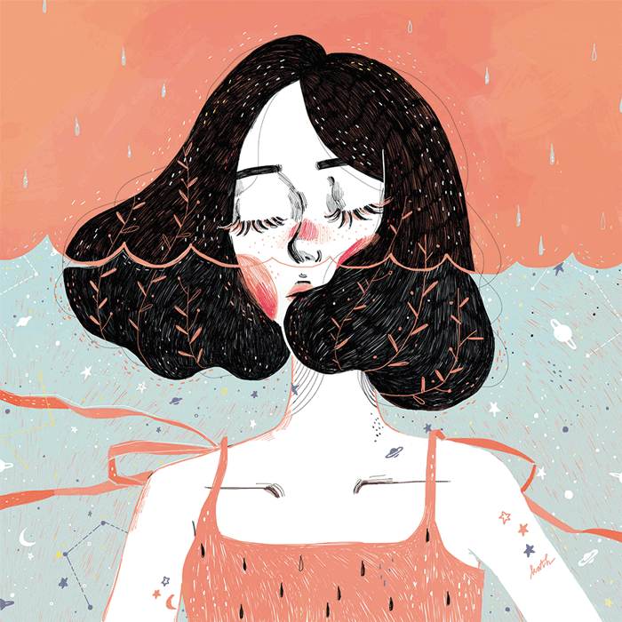
Drowning In Thoughts
I’m admiring the textures and colors here. Wonderful to get some new ideas for backgrounds.
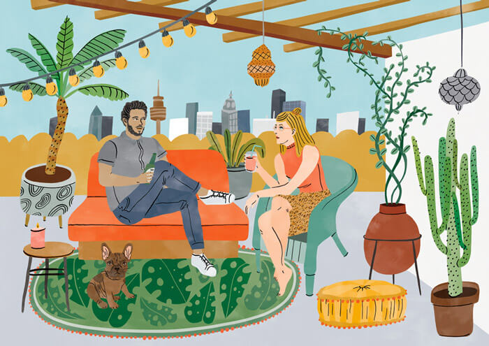
Rooftop
I really like the style of Bodil Jane. This piece of beautiful artwork looks almost like a collage of separate items that is glued on a canvas.
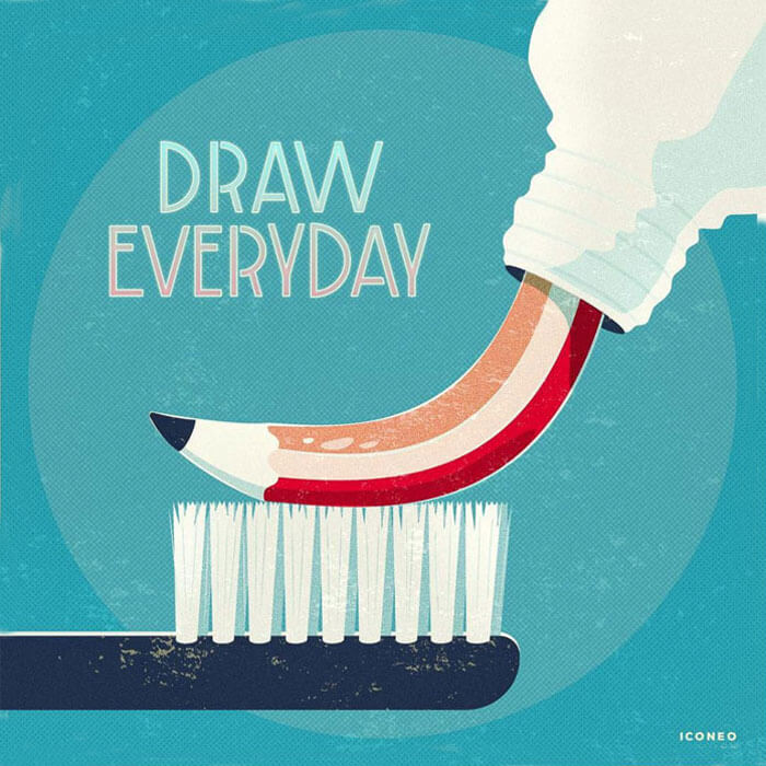
Draw Everyday
Some good advice that I can totally get behind. Cleverly translated to something else you do everyday.
Shop Magazine — Karolis
The view angle is so well done in this illustration, as well as the shadow and light effects. A few other gems in here, such as the transparency of the bag on the desk and the wooden floor under the desk.

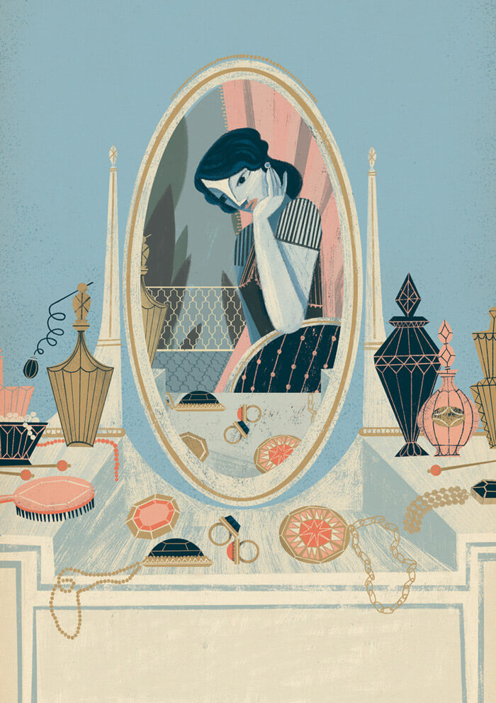
Vita Sackville-West
Beautiful book cover illustration. How deep she is in her thoughts is just so inspiring.
Fire In The Sky
A wonderful advertisement for planet Earth. Look at that fire in the sky! Purdy.
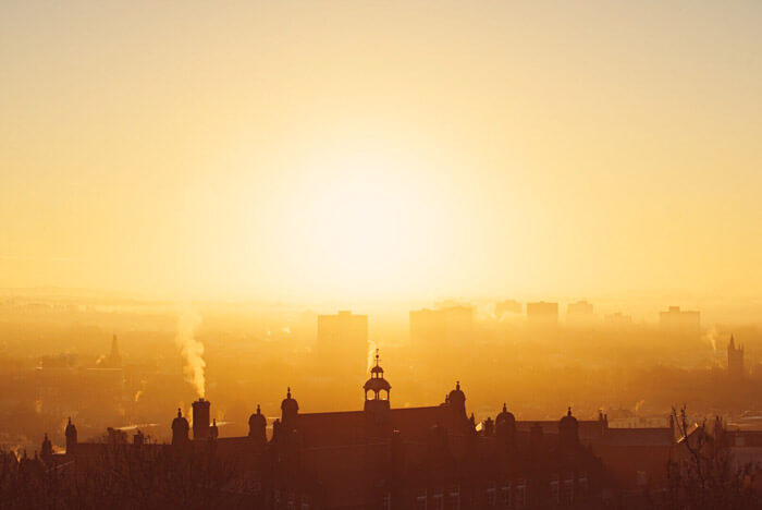
The Golden Bicycle Touch
One of my own pictures shot during a morning bicycle ride. The best kind! Those colors are just wow!
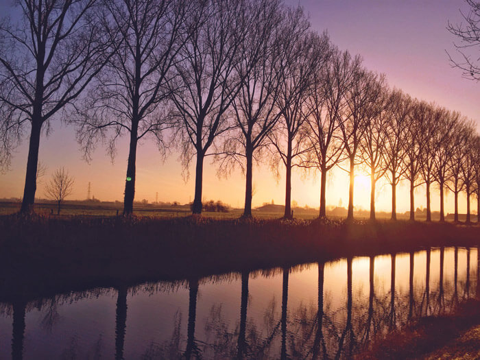
Twins In The Forest
Creating hair is among the most difficult things to achieve. It takes a long time to get it right. That’s why I always study the ones who master it. The hair is simply gorgeous in this illustration, especially those braids.
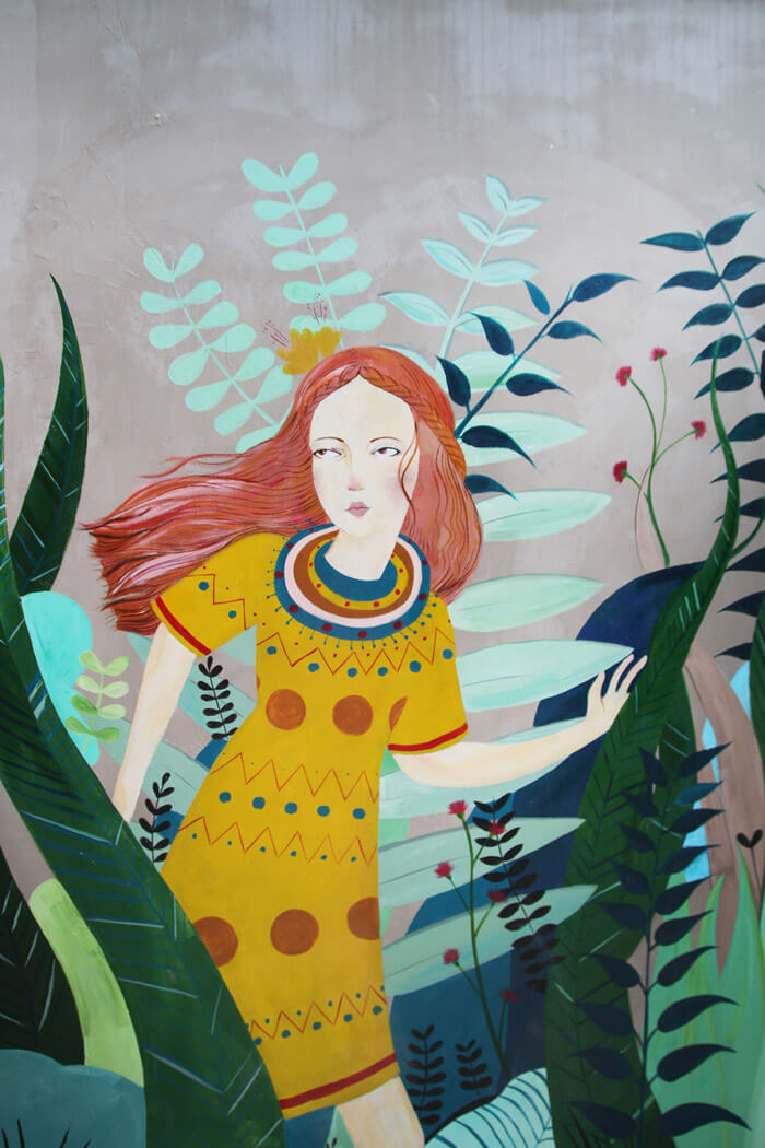
The Best Photos Of The Year
Some fantastic photographs in this Strava collection of 2016. Hard to pick just one, but after much deliberation I chose this one. Isn’t it marvelous?
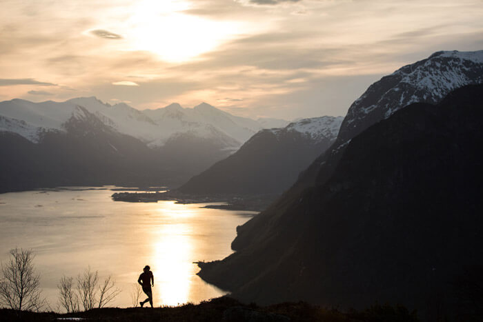
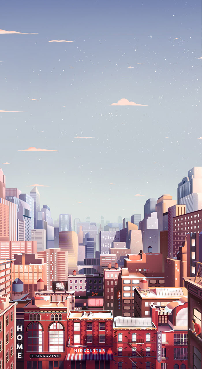
The New York Times Gift Guide
The first thing I noticed is the wonderful color palette. I’m also admiring all the different buildings created with very little elements. Imagine how it would look like if it was brought to life. Well, look here!
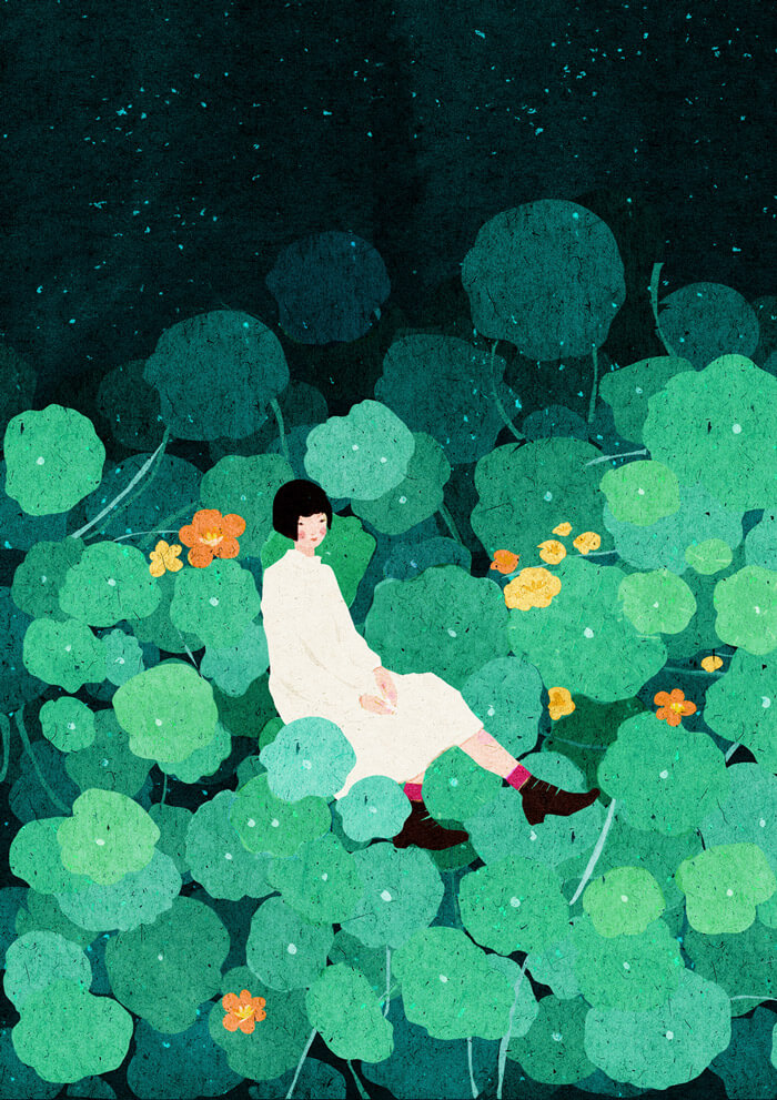
Sitting In Green
Perfect scenery for some daydreaming. The texture used in this illustration is awe-inspiring.
The Law Of Attraction
Not your typical color palette. They really work quite well together. Lovely shapes, too!
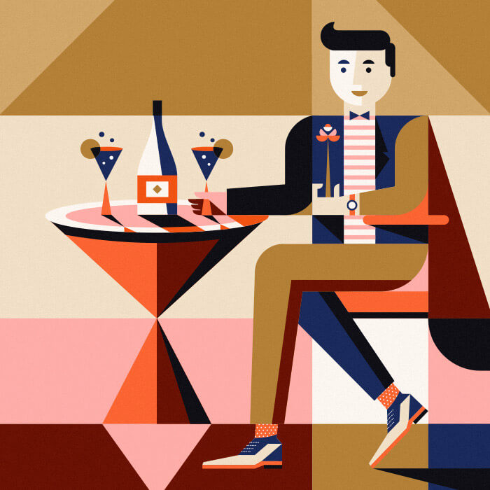
Modelle / BBDO Moscow
Using negative space in illustration is one of my favorite things. I’ve personally never done it, but would love to one day. This is one of those nice examples to look up to.

Jenna Arts
I love the style in which the illustrator doesn’t draw perfect characters. It’s an illustration style that embraces the awkward. Hard to pull off right.
Tuff Shed
First thing I checked out was the pattern on the guy’s shirt. I also love the use of sharp angles for the arms, legs and other elements in this scene.
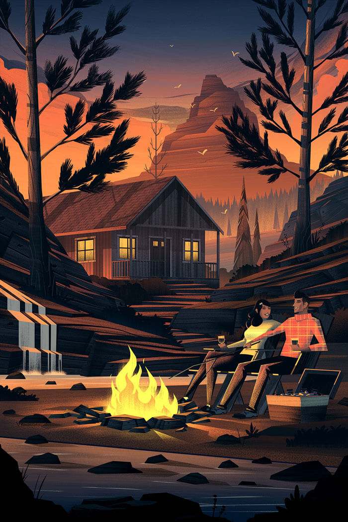
Tuff Shed II
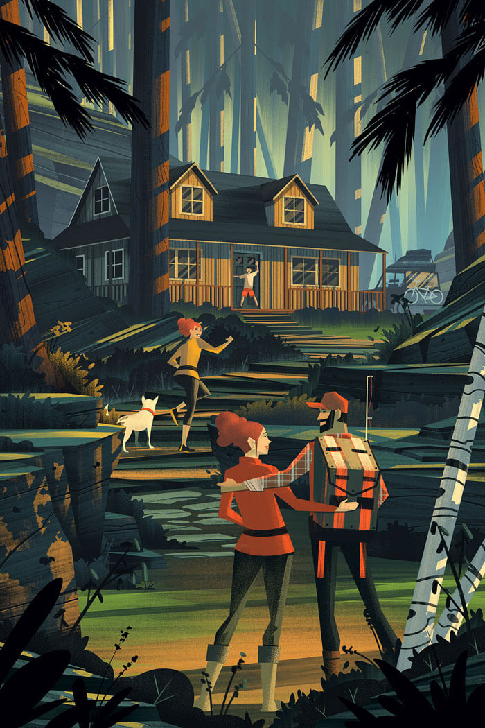
Just like the illustration above, this one also features the sharp angles, but also some interesting textures. Look at how the shadows and highlights are applied. Truly amazing!
Space: Planets, Stars, Rockets
The choice of colors and shapes are well considered here. Simple, yet effective.

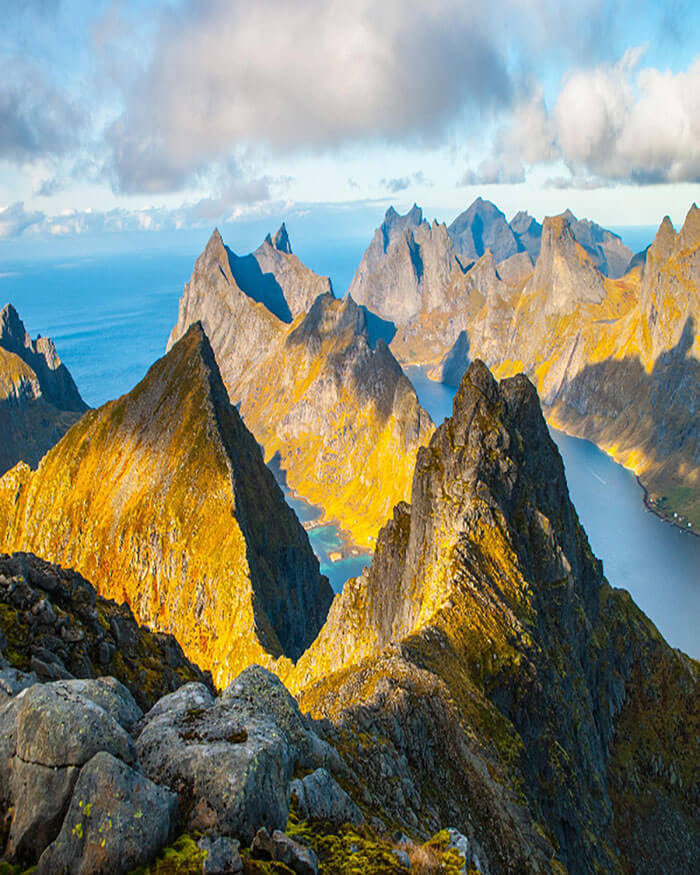
Lofoten, Norway
Such an incredible spot! Beautifully captured with some gorgeous light.
Jun Takahashi | Square Up
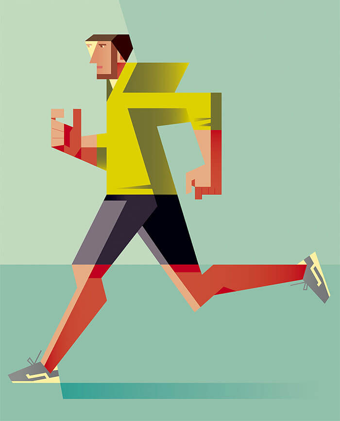
Speaking of the use of sharp angles and shapes, Tokyo-based illustrator Jun Takahashi uses this technique to create geometric sports characters. All this with a muted, contemporary palette of colors. His series is called Square Modern.
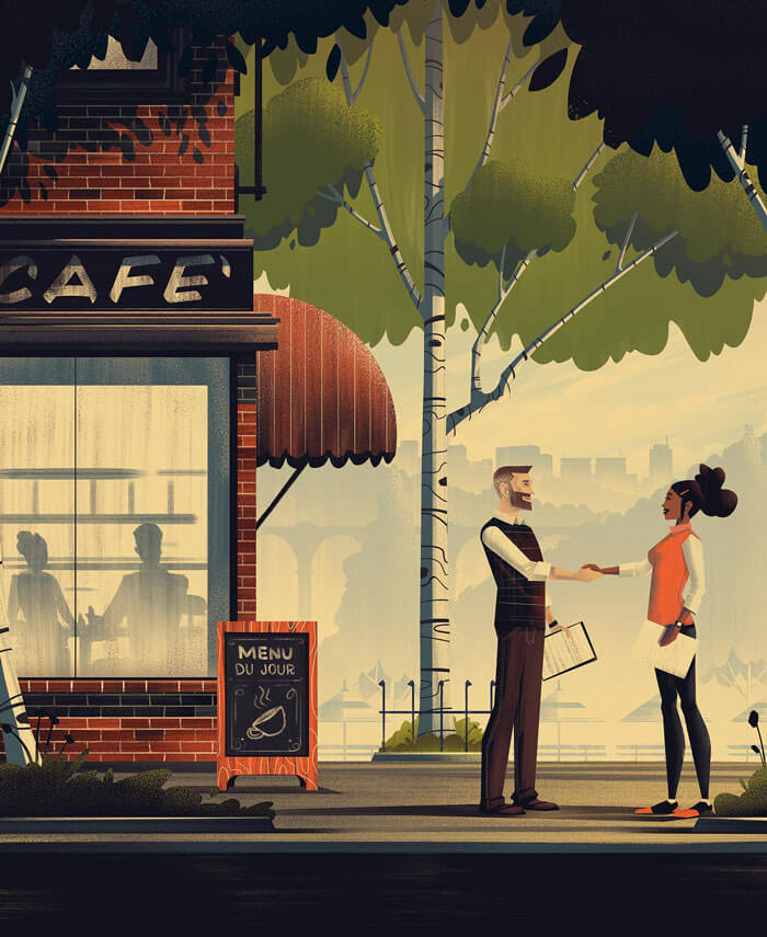
Merkur Magazine
Some fine details in this cover such as the dotted stripes on the pants of the male character. Another is the tree bast structure.
Merkur Magazine II
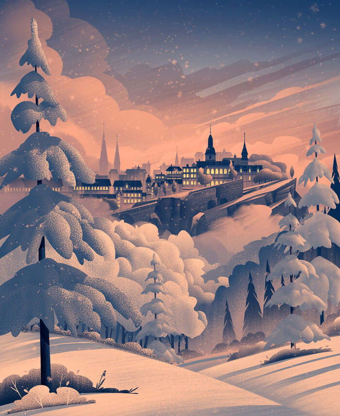
Very appropriate since we are still in the middle of winter. This snow landscape is just beautifully executed. Works so well with this pinkish mood/sky.
Mount Fuji
Splendid shot! Stunning light, colors and lovely composition.

Light Of A Spring Sunset
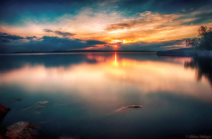
Beautiful smooth water and great sunlight colors.
Sports
What makes this interesting is the way this illustration is compiled: the mix of lines and fills, in combination with a limited color palette. Clever.

5 Seasons
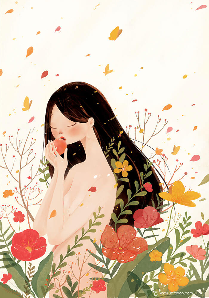
So delicate and beautiful! Colors, subtle use of gradients, everything is inspiring.
5 Seasons II
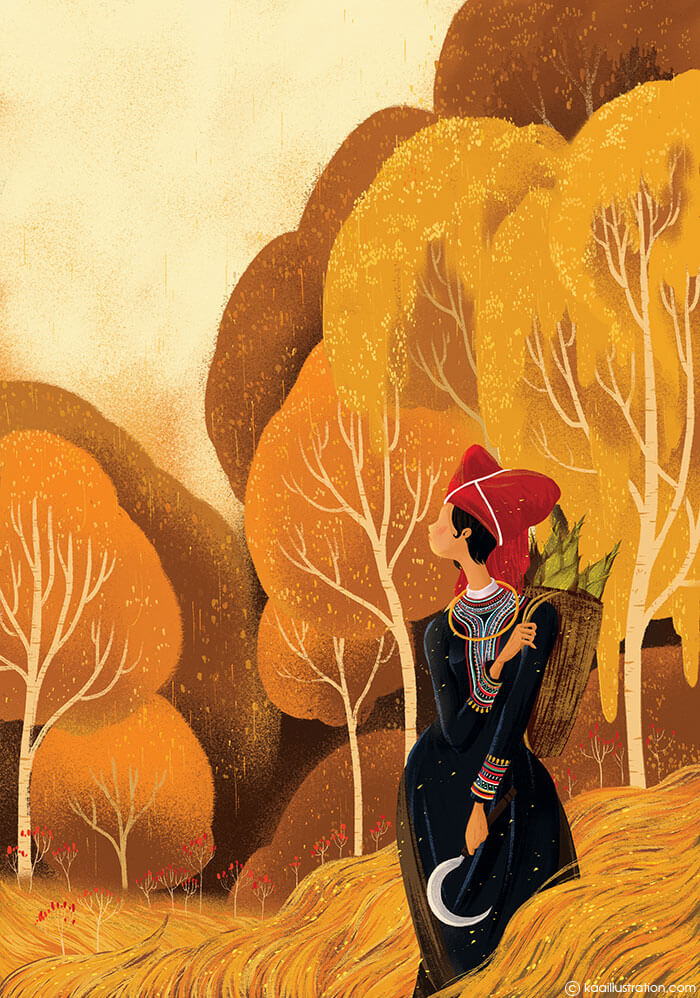
I like the atmosphere in this fall like scenery. Many great details such as the way the collar and sleeve patterns are created. It creates a lovely accent.
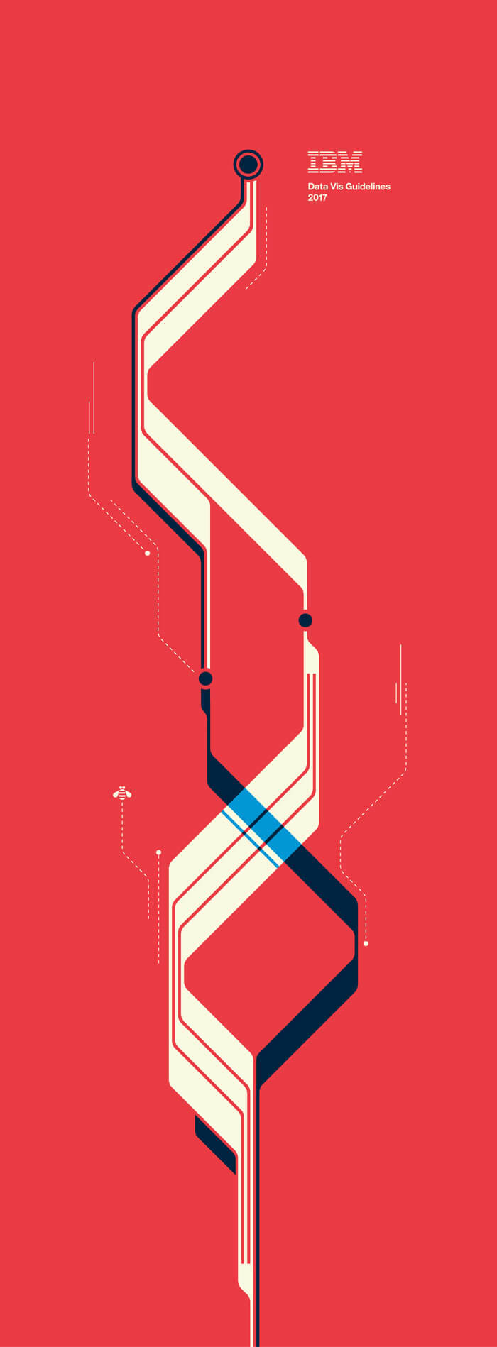
IBM Data Vis Guidelines
This is gorgeous! Loving the colors for this first set of Data Visualization Guidelines from IBM. Great composition and geometry.
Time Travel Destinations Posters
If time travel was possible it would look like this. Jurassic Age is part of the Time Travel Destinations Posters. There are a few more, and some are animated too. Go have a look.

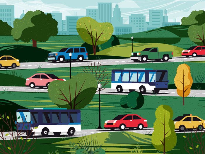
City Streets
Really diggin’ the stylized perspective. It creates a nice composition.
Tin Star BBQ
Great character in this clever logo illustration. That type is great - it really fits the tone of the logo.

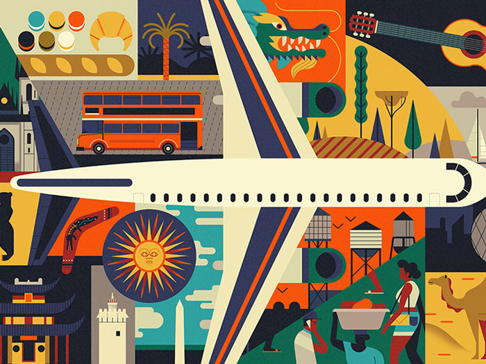
NYU Travel
So many details in this colorful illustration.
Business City
Admiring the simplicity in this illustration.

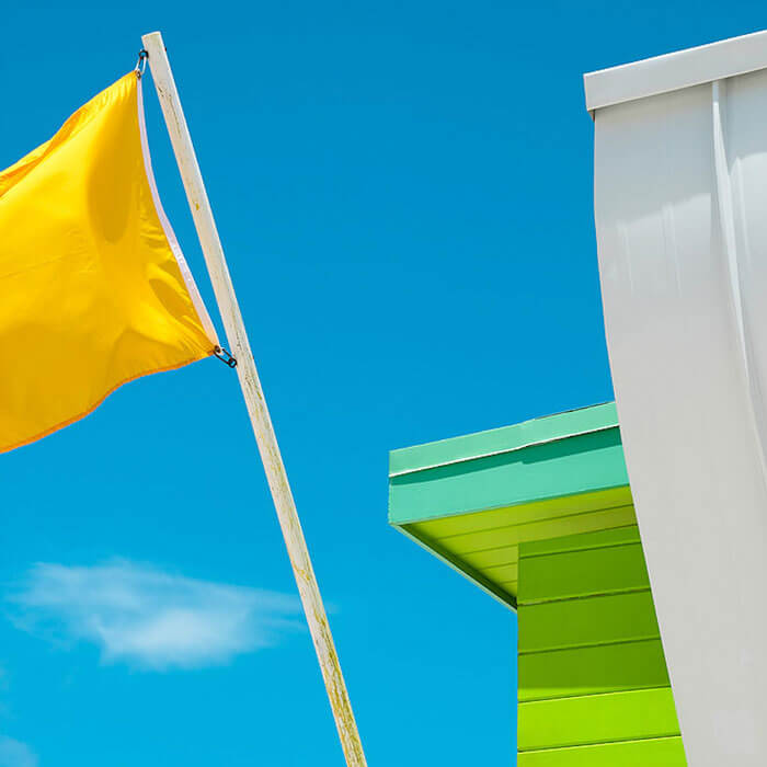
Colorful And Minimalist Miami Rescue Towers
If you love minimalistic architecture and colors like me, you’ll appreciate this work by Paolo Pettigiani. The new series is called “SHAPEGUARD”.
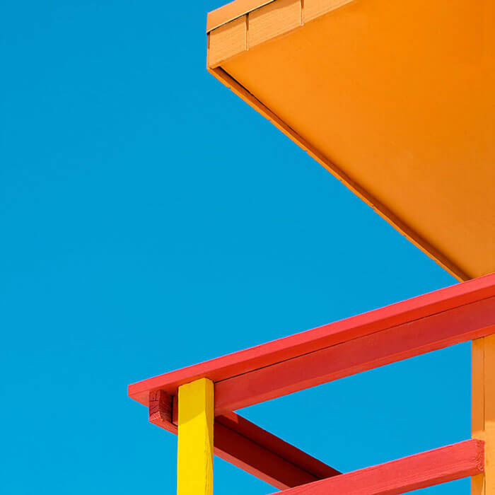
Colorful And Minimalist Miami Rescue Towers II
A second one from the new series called “SHAPEGUARD” by Paolo Pettigiani.
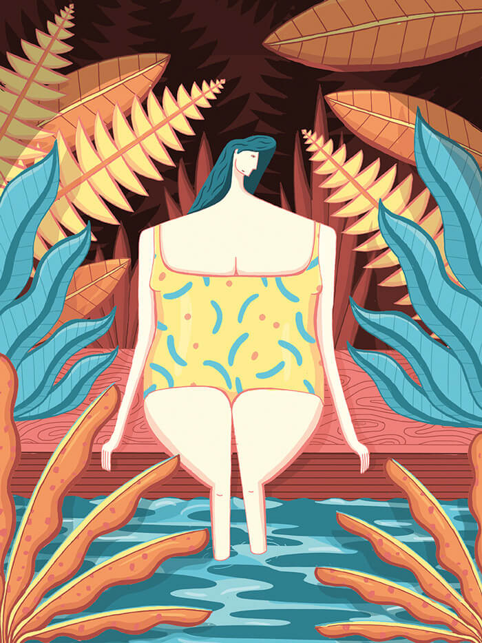
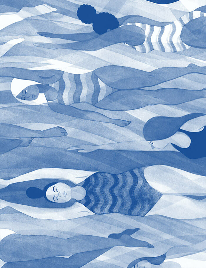
Bitch Magazine
Wonderful duotones at work, especially to create the feeling of the movement of the water. Those swimsuits are not too shabby as well.
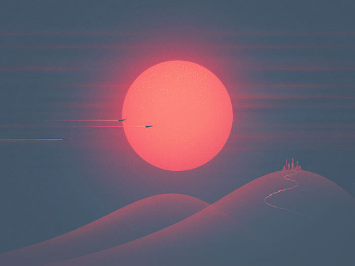
Red Dwarf Sunset
For the sci-fi fans among us. A hi-tech village on a transparent hill, enjoying a dramatic red sunset of a class M red dwarf sun. Those gradients and the glowy sun is so perfect!
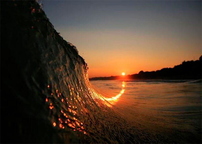
Sunset Curving Up
Talking about being in the right place at the right time. Sunset curving up a wave!
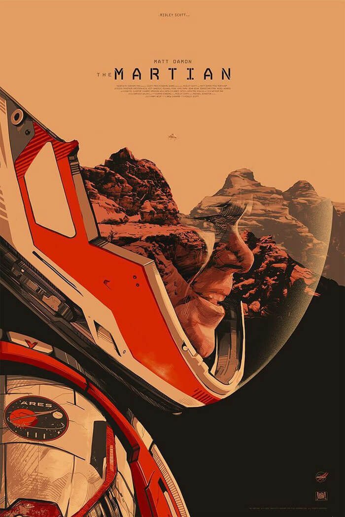
The Martian II
One more for the sci-fi fans. A special color palette and a great illustration style.
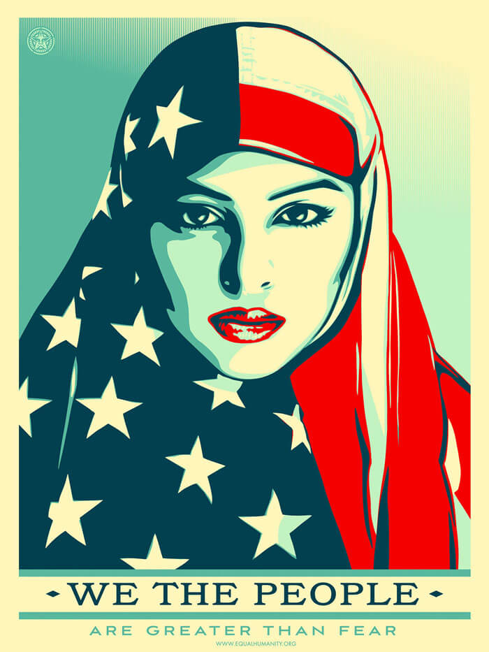
We The People
Shepard Fairey, whose iconic posters supporting Barack Obama’s 2008 election and won him Design of the Year, has a new offering. The American graphic designer has applied the same posterized style and palette of red, beige and blue of the Hope imagery to three new designs, created for a nonprofit organization called ‘the Amplifier Foundation’.
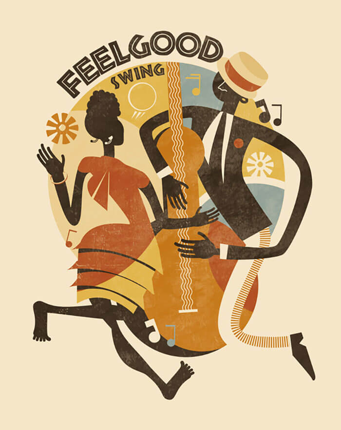
Feel Good Swing
Loving this muted color palette and the organic style.
Lindy Hop
If you love your classics you’ll recognize the Lindy Hop in this wonderful illustration.

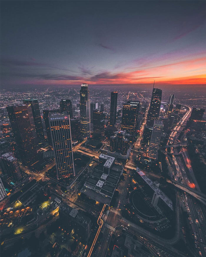
Sky-High Images Of Los Angeles At Dusk
Creative Director and photographer Dylan Schwartz‘s point-of-view is high above the cities he photographs, capturing the bridges, sports complexes, and tips of high rises from the cockpit of a helicopter.
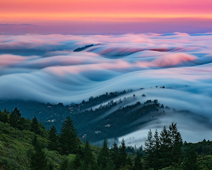
Rolling Images Of San Francisco’s Fog
I’ve featured an image of San Francisco’s fog here before. The waviness is almost surreal.
Charles Manson
When Charles Manson and The Beach Boys’ Dennis Wilson meet. So beautifully stylized!

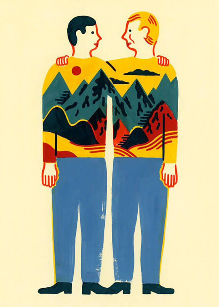
Sweater Friends
Such a great concept to have a panoramic scenery on the sweaters.
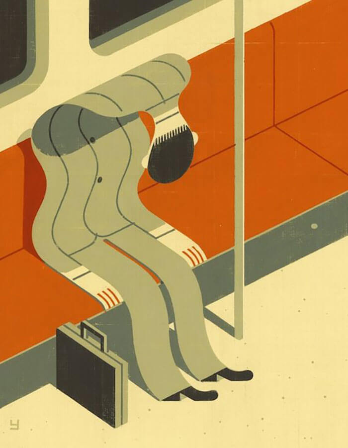
Rough Day At Work
How does one look like after a rough day at work? I think this illustration pretty much nails it.
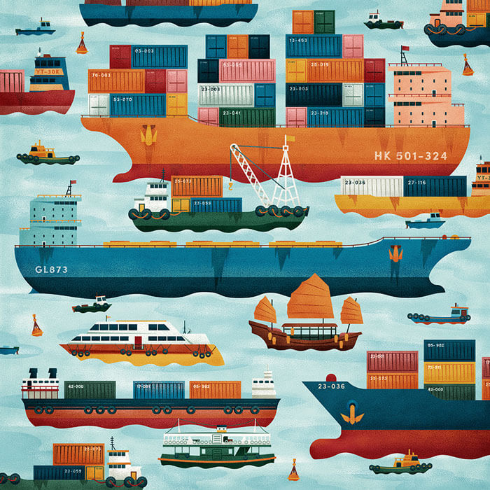
Hong Kong
Great view on the hustle of Hong Kong. The flow of the water is greatly executed. Lovely color palette, perfectly executed.
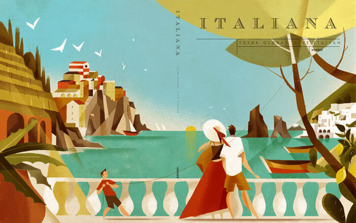
Magazine Italiana
Riccardo is a regular guest here. Love how he works with flat colors and sharp-angled shapes.

Magazine Italiana II
One more of Riccardo’s recent work. Brilliant as always! I also love the retro touch in all of them.
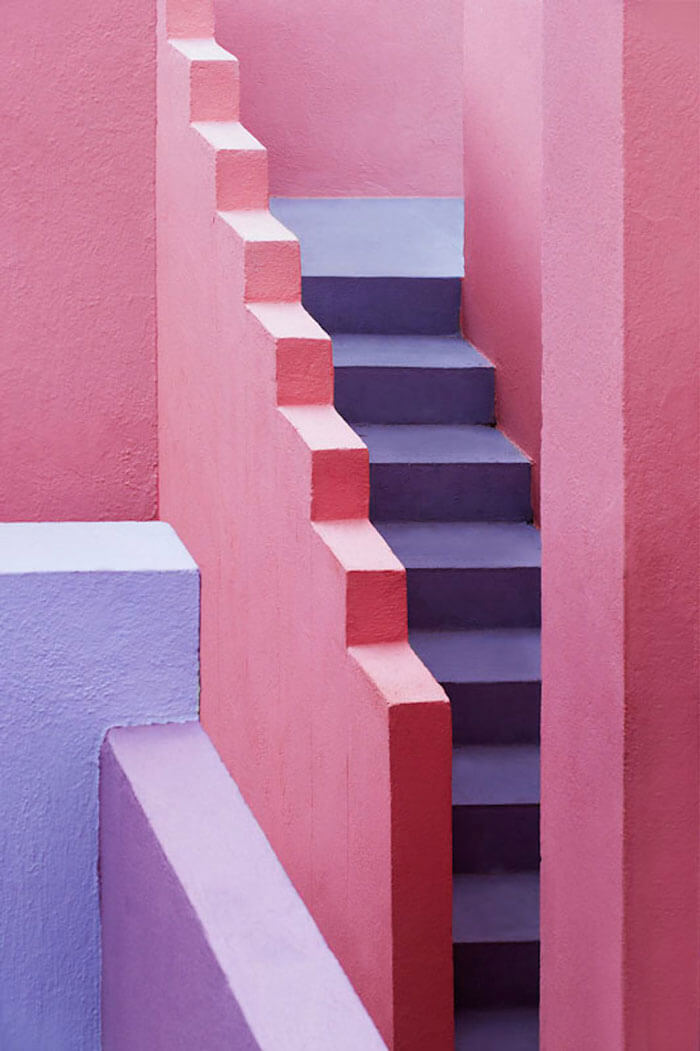
Multicolored Architectural Photography In Spain
The Swedish photographer Jeanette Hägglund seems to have found a nice playground in the city of La Manzanera, near Alicante. She plays with the architecture, colors, and light and shadows. Be sure to see the rest of the series.
Further Reading
- Art Inspirations with Individual Artist Portfolios
- Beautiful Black and White Photography
- Beautiful Photoshop Illustrations By Artists Around The World
- 35 Brilliant Examples of Rain Photography


 Try ProtoPie AI free →


 Celebrating 10 million developers
 SurveyJS: White-Label Survey Solution for Your JS App
 Register Free Now

