Let The Content Delivery Network Optimize Your Images
Sometimes you have to step back and ask why a tradition exists. In mobile-first design, serving an image in three sizes — one for smartphones, one for tablets and one for desktops — using media queries and responsive images has become a tradition. But is it the best solution?
It’s most likely better than doing nothing, but how well does it actually work? And is there room for improvement? In this article, we’ll look closely at how well the one-size-per-form-factor approach really works and how we can use smart content delivery networks to improve image performance.
Images Drive Payload And Performance
Performance is a complex aspect of making a website. Here, we’ll focus on images because it’s low-hanging fruit on the tree of performance. The effort you spend on optimizing image delivery will most likely have visible and measurable results — especially if you have a website with many images, such as an e-commerce website or an online news website.
Over time, websites have become more image-heavy. Research by Radware indicates that the average e-commerce web page is over 1.3 MB; 64% of that payload comes from images. More than half of your users (and potential customers) will abandon your website if it takes longer than three seconds to load. Literally millions of dollars are at stake in this question of how images affect web performance.
Picking The Right Sizes: Breakpoints
The three image sizes referred to above are usually implemented with responsive images (and a polyfill) or with JavaScript that hijacks image-loading.
The latter was the way to go until responsive images came around. The idea was that the browser shouldn’t load the images by reading the HTML, but instead should load and execute JavaScript to figure out which images to download. Usually, it would query the viewport’s width, compare that width to the static breakpoints and then select the best fit out of a few predefined image sizes. As we now know, this approach has two major problems. First, it breaks browser preloading; the browser can’t start loading images referenced in the markup right away, rather having to wait for the JavaScript to execute. Secondly, there is a significant risk of an oversized version of an image being downloaded because you have only a few predefined image sizes to pick from.
Replacing this JavaScript-based image-loading with the new responsive images specification addresses the preloading issue. However, the risk of an oversized version of an image being downloaded is just as significant if you have breakpoints for only three image sizes.
Picking the right, and right number of, breakpoints is not an easy task. Even if tools exist to help you in the process, breakpoints tend to be a moving target. The ideal breakpoints today could change tomorrow due to new screen sizes and form factors.
How Many Breakpoints Do You Need?
How serious is the problem of breakpoints for images? Asked differently, how many versions do you need to save more? Over time, the number of image requests will increase the variety of devices and screen sizes visiting your website.
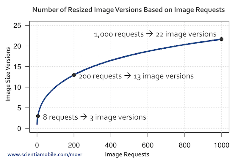
An experiment done by ScientiaMobile found that it takes on average only eight requests for a given image to surpass three breakpoints. The experiment collected data over four months and compared the size of the image actually served to the optimal size for the particular device and screen size. Due to the wide diversity of devices of different forms and shapes accessing the web over time, statistically, the ninth image request will require a size that does not exist and most likely will get the performance penalty of downloading a larger and heavier image than necessary. The more requests you get for a given image’s URL, the more fragmented will be the devices making the requests: At 180 requests, you will surpass 11 breakpoints. At 1,000 image requests, you will surpass 20 breakpoints.

Note that this experiment only covers image sizes. Especially with responsive images, you should also consider alternative image formats (such as GIF, JPG, PNG and WebP) for more efficient file compression. For example, you could send WebP to devices supporting it and PNG to others. This means you would need to render a few formats for each image size. You can see how this quickly multiplies image versions and requires additional logic to serve the appropriate version.
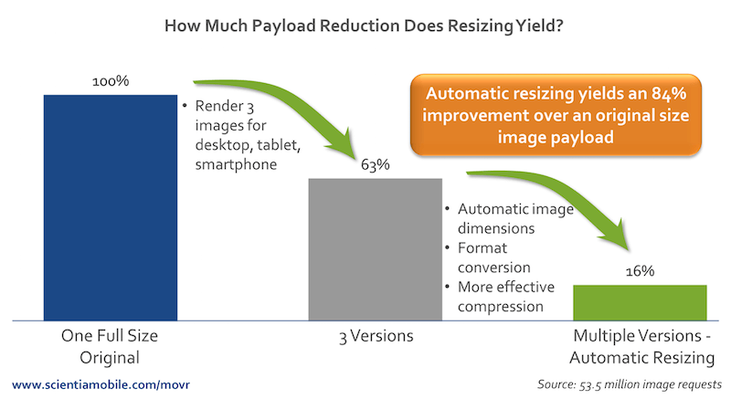
The experiment further explains that the strategy of using media queries and breakpoints to serve three different images to different device sizes reduces the payload served down to 63% of the original scenario in which only one size is served to all devices. But we can go further: Introducing content negotiation and server-side image optimization and resizing would reduce the payload to 16%!

Dynamically optimizing images for any device and screen size will, according to the experiment above, reduce the payload by about 75% compared to using the three static breakpoints.
Smart Content Delivery Networks
As we’ve seen, displaying an image on a web page might not be as easy as it sounds if your performance budget is tight. There are many factors to account for. Picking the best breakpoints, image formats, image sizes, compression rate and implementation is challenging enough, but the solution should also be future-friendly. As new devices and form factors are launched into an already diverse landscape, supporting legacy devices becomes just as important as supporting the latest fashion. Automating this process seems to be worthy of serious consideration.
We are starting to see several turnkey solutions that optimize images in this manner. These solutions are smart content delivery networks (CDNs), and they have intelligence built in at the edge of the network. These CDNs offer device-aware image optimization by combining three elements: device detection, real-time image optimization and a classic CDN cache geographically close to the end user. Unlike regular CDNs that do not have an interest in minimizing your payload, smart CDNs seek to improve web performance by tailoring your payload to the capabilities of the device and even network conditions.
What options do you have if you want to implement a dynamic image-optimization CDN on your website? Be aware that there are a lot of image-manipulation services for performing static operations such as resizing, cropping and filtering. This is not what we’re looking for. Nor are we looking for a service that uses JavaScript to determine the best size and format of an image.
We’re looking for a CDN that implements server-side logic, or “edge logic,” using client hints or device detection to determine the best image size and format. This is known as content negotiation. This makes the list significantly shorter. Let’s compare the most prominent contenders:
| Client hints | Device detection | Push or pull | |
|---|---|---|---|
| Cloudinary | yes | no | push/pull |
| imgix | yes | no | push |
| ImageEngine | yes | yes | pull |
All of the above use client hints to determine the best size. Client hints is a fairly new initiative, currently implemented only in Blink-based browsers, and it includes some additional information about preferred image sizes in the HTTP request. The server can use this information to generate a properly sized image. Even though support and adoption of client hints are growing, only about 3% of image requests come with client hints. This number is expected to grow. In the near future, however, it would be a good idea to pick a CDN with device detection built in, so that all images are optimized. If you want to play around with the concept a bit, look for a pull-based CDN (which requires less configuration) with a trial option or a free tier.
All of the CDNs mentioned above require registration. Cloudinary have a free tier. ImageEngine a and Imgix has a trial concept, which is convenient if you want to try before you buy. Let’s have a closer look at ImageEngine. ImageEngine is pull-based, which means you don’t have to upload your images anywhere before you start. With ImageEngine, you simply keep images on your server, and ImageEngine will pull images from there on demand.
Once registered for ImageEngine, you will get a dedicated hostname, which is your CDN’s URL. The only thing left to do is prefix all of your image sources with that hostname.
Say your original image tag is like this:
<img src="https://mysite.xyz/dog.png" alt="My dog">
Your new image tag with ImageEngine would look like this:
<img src="//{personal-token}.imgeng.in/https://mysite.xyz/dog.png" alt="My dog">
In this example, ImageEngine makes use of client hints and device detection to determine the optimal pixel size, compression ratio and image format for each device requesting the image. If you want to be more specific, all services listed above support explicit “commands” to override any automatically detected parameters. For ImageEngine, requesting a 360-pixel-wide image in WebP format would look like this:
<img src="//{personal-token}.imgeng.in/w_360/f_webp/https://mysite.xyz/dog.png" alt="My dog">
Of course, to make use of client hints, remember to enable it in your markup. Put this in your <head> tag:
<meta http-equiv="Accept-CH" content="DPR, Viewport-Width, Width">
ImageEngine even has a WordPress plugin, which handles all of this automatically for you.
The process for imgix and Cloudinary is similar, aside from some additional setup.
All of the services can, of course, be combined with responsive images. With any CDN that supports client hints or device detection, the sometimes verbose markup for responsive images becomes much more maintainable. Responsive images with client hints is covered in greater detail in the article “Leaner Responsive Images With Client Hints” here on Smashing Magazine.
Conclusion
Moving from one image for all kinds of devices to the common one-size-per-form-factor approach is definitely a step in the right direction. The downside is that, from a performance perspective, the approach is too general. There is more juice to be squeezed. However, from a development and maintenance perspective, it might make sense because three image sizes, or breakpoints, are manageable. The logistics are still fairly easy to maintain. But we must not forget why we do this. We’re not doing this for ourselves as developers, but for our end users. Hence, automating this process if we can makes sense. This is not a job for humans. Offloading this task is a win-win: easier maintenance and less data transfer.
Smart CDNs give you core CDN functionality, as well as dynamic and automatic image optimization for any size and form factor by using client hints and device detection at the edge of the network. Experiments suggest that payload savings can run as high as 84% compared to serving one static image, and run around 75% compared to the common one-size-per-form-factor approach.
Luckily, a few smart CDNs are out there already. It’s fairly easy to get started and measure the difference. Once you’ve created an account, you can put up a simple page and run it through WebPagetest to see the difference.
Further Reading
- Don’t Get Crushed By The Load: Optimization Techniques And Strategies
- Turn Your AMP Up To 11: Everything You Need To Know About Google’s Accelerated Mobile Pages
- Why Static Site Generators Are The Next Big Thing
- Automate Your Responsive Images With Mobify.js


 SurveyJS: White-Label Survey Solution for Your JS App
 Celebrating 10 million developers
 Register Free Now
 Try ProtoPie AI free →


