The iOS 10.3 Security Alert Is Killing App Store Downloads: Here’s How To Fix It
In its move to patch a security hole as part of the iOS 10.3 release, Apple has introduced (yet) another redirection mechanism that developers must handle when attempting to implement mobile deep-link routing (i.e. the mechanism to route users to a specific page inside a mobile app, rather than the App Store or app home page).
This redirection instance has introduced additional friction to the app download and reopening process, and data shows that it has decreased conversion rates on iOS 10.3. This post examines the issue in detail and discusses solutions to help developers fix it.
Keeping Your App Popular After Launch
You’ve launched your app and it’s doing well. So, how do you maintain that momentum and ensure that your app keeps gaining in popularity? Read a related article →
With iOS 10.3, Apple has gifted the world powerful new features, as well as fixes for critical security holes. For your typical iPhone user, it’s a really nice upgrade. For a software developer who is responsible for either a mobile website or a native app, it can be a huge pain.
Why? At some point in early 2017, a few enterprising scammers figured out how to hijack iOS Safari by abusing the custom URI scheme confirmation alert. This alert prevented user interaction until it was dismissed; so, the result of triggering it in an endless loop was essentially low-tech ransomware. Unfortunately, it was realistic enough to trick many users into paying up. In iOS 10.3, Apple fixed this security hole by changing the confirmation alert into a new non-blocking dialog. It looks like this:
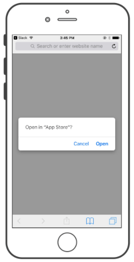
From a user’s perspective, no big deal. For developers, there is a hidden change that has more important implications: the App Store had always received a special exemption from the old version of this alert, but that exemption has now been removed.
How Deep-Linking Is Supposed To Work
A basic deep-linking system for an app has two goals:
- If the app is installed, open it and take the user to the content requested.
- If the app is not installed, take the user somewhere else so they can download it.
Apple’s official deep-linking standard, “universal links,” is designed for the first case. It’s not perfect: Configuration is complicated, and there are many places (Facebook, Twitter and any app using SFSafariViewController, to name a few) where things don’t “just work.” But the user experience of deep-linking into an app is generally quite good once that app is installed. None of this has changed in iOS 10.3.
It’s the second case where iOS 10.3 makes things complicated. If a user doesn’t have your app installed, they have always ended up in Safari, looking at the web version of that link. You are then responsible for redirecting that user to download the app. Because Apple has not implemented universal links for the App Store, developers have had to rely on a custom URI scheme redirection. And a custom URI scheme redirect on iOS 10.3 now means an alert. Apple even does it this way itself: Just try visiting Airbnb on an iOS 10.3 device, and you’ll run straight into the new confirmation dialog.
The App Store Redirection Issue On iOS 10.3
Here’s the situation. When a user clicks any link that leads to the App Store, iOS 10.3 will display a modal asking the user whether they’d like to go there. We’ve tested Apple’s appsto.re short links, full App Store long links, links from attribution providers and deep-linking platforms, and our own Branch-hosted deep links. There is no way around this new alert.
Why is this bad? There are actually two problems:
- It’s an extra step.
Users don’t like extra steps, especially because downloading a new app is already relatively high-friction. Adding another tap certainly doesn’t help. - Users can press “Cancel.”
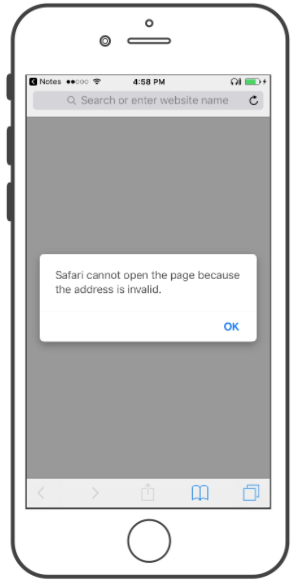
This is the much bigger problem. Pressing “Cancel” can leave users trapped on an empty page in Safari. Even worse, if they’ve come from another app and then go back to click the same link again, it’ll show this error message and do nothing:
Fixing The iOS 10.3 Redirection Issue
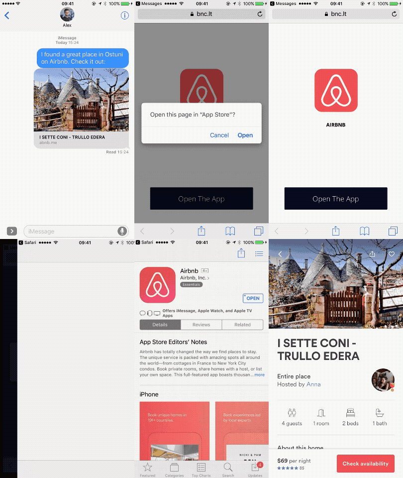
You can’t avoid the alert. And the reality is that some users will click “Cancel,” either on purpose or by mistake. What you can do is give more context, to help visitors complete their journey if they fall off in the middle. I’m calling this a “second chance” screen, and it looks like this:
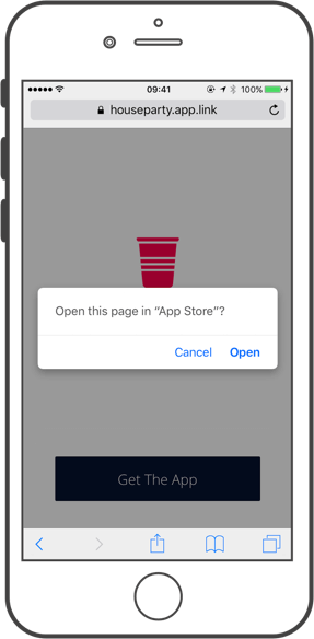
Yes, the new iOS 10.3 confirmation dialog is still there. But now we also have a friendly URL in Safari’s address bar, the app logo and name in the background, and a button that users can click to try again:
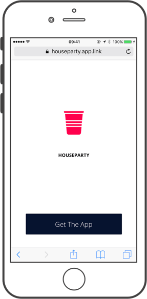
At Branch, we pushed the first version of this second-chance screen live for all apps on the Branch platform within hours of discovering this new edge case in iOS 10.3. It has since become a widely adopted solution; here are just a few examples we have seen pop up in the last few weeks from various services:
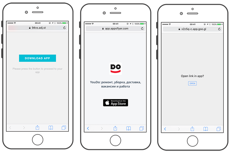
Making the best of a bad situation, some apps have built custom second-chance screens:
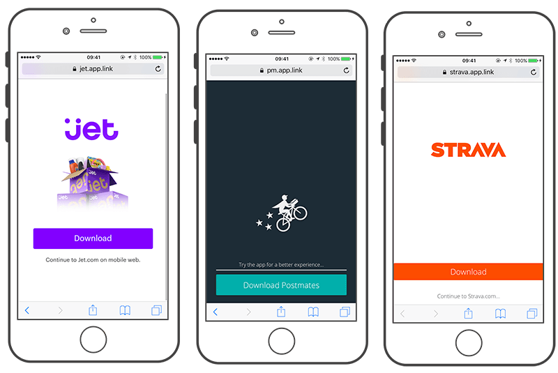
All of these screens are solving the same basic problem: give visitors an escape hatch if they accidentally hit that “Cancel” button. It is still less than ideal, but the result works:
A Basic Template
Here is the default template we use on the current second-chance screen for all of the apps on Branch’s platform:
The key part of this is the JavaScript snippet at the end:
<script type="text/javascript">
    window.onload = function() {
        window.location = "<% iTunes Store URL %>";
    };
</script>
The logic works like this:
- When the page loads, attempt to forward to the App Store. (JavaScript redirections like this are fully supported by Google and have no adverse effect on SEO.)
- The redirection presents the confirmation dialog to the user.
- If the user taps “Open,” all is good.
- If the user taps “Cancel,” the rest of the template will have rendered in the background.
- The user has unlimited opportunities to tap your download button. This displays the confirmation dialog again, but hopefully the user is now ready to continue.
However, I wouldn’t personally recommend building this solution yourself; you have better things to do than to constantly fix new edge cases like these from Apple, Google, Facebook, etc. If you’re using a hosted deep-link provider such as Branch or Firebase (with its Dynamic Links), then this edge case is already being handled for you. Attribution tools such as Adjust and AppsFlyer have also built similar workarounds for their paid tracking links.
Impact On App Conversion Rate
We wanted to know how much this new confirmation alert actually affects download conversion rates. The Branch platform has millions of link clicks per day, across almost 25,000 apps, so we took a sample of this data from 2 May 2017. Here is what we found:

What does this actually mean? Let’s break it down
Visitors Who Click “Cancel”
Safari does not allow clicks on this new “Cancel” button to be tracked directly. However, Branch can infer the number based on changes to other metrics that we measure, further down the funnel. In our sample, almost 19% of users were clicking it.
Installations Recaptured By Second-Chance Screen
The good news is that visitors still want your app — they are just getting confused by this new warning. When we give them another opportunity to click by showing a content preview with a download button, over 5% of our sample continued to install successfully.
Why Apple Needs To Fix This
Here is the bottom line: This new confirmation dialog is enough of a roadblock that almost a fifth of iOS users press the “Cancel” button. Even with a workaround enabled, the iOS 10.3 installation rate in our sample was about 2.25% lower than on iOS 10.2. Data shows that a second-chance screen helps, but some users still fail to make it all the way through to download.
From a more technical perspective, serving up a screen like this requires returning an HTTP 200 response, serving a page of content and waiting for the client to execute Javascript. The costs of adding just 100 milliseconds in latency are well known, and sophisticated deep-linking implementations have long since moved to the far more efficient 307 redirection to reduce this redirection delay. Apple’s new iOS 10.3 behavior has broken this option, forcing the ecosystem to fall back on a slower, outdated solution.
Patching the original ransomware-esque custom URI exploit was the right thing for Apple to do, but the App Store is unlike any other platform. It is a core part of the iOS infrastructure. Applying such a flawed UX to a critical platform component is a costly decision.
With the early iOS 11 betas showing no change to this behavior, it seems possible we are stuck with a confirmation alert for the long haul. This makes it even more critical for you to offer your app’s users a fallback option. In the competitive mobile app world, having such an easy way to increase your installations is unheard of and is absolutely worth the small amount of effort it takes.
Further Reading
- The Safest Way To Hide Your API Keys When Using React
- Multivariate Testing In Action: Five Simple Steps To Increase Conversion Rates
- The Growing Need For Effective Password Management
- Picture Perfect: Meet Pixo, A Photo Editor For Your End Users


 SurveyJS: White-Label Survey Solution for Your JS App
 Celebrating 10 million developers
 Register Free Now


