Why I Switched To Sketch For UI Design (And Never Looked Back)
User interface design has changed dramatically in the last few years, as traditional computers have ceded dominance to smaller screens, including tablets, mobile phones, smartwatches and more.
As the craft has evolved, so has its toolset; and from one app to rule them all — looking at you, Photoshop! — we have gotten to a point where it seems like a new contender among UI design tools crops up every month. And I have to admit that many of the new UI design tools look pretty good and promising.
The one app that seems to tower over everything else at the moment, though, is Sketch. It has grown in popularity like I’ve rarely seen an app do in the recent past, and for a good reason: The developers of Sketch have figured out exactly what interface designers have been looking for and have steadily added functionality to address those needs. The pace of development of Sketch has been phenomenal, to say the least.
Yes, Sketch is Mac-only. I stayed away for a very long time simply because my entire team was using Windows. A couple years ago, I got my first Mac — a MacBook Air — and decided to give Sketch a try. I found Sketch so much better than my solution at the time (I was a proud Fireworks aficionado!) that I decided to invest in converting every one of our eight-member design team over to Macs and Sketch. We never looked back! Sure, the options were more limited then: Figma was not yet on the scene, Gravit Designer was just getting started, and Adobe XD was just a fledgling experiment, which we were not ready to bank on. That is not the case today, and you should consider the options if you are in the same boat. For us, though, Sketch has proven to be a great asset — even with all of the baggage. If you want to know why, read on!
Moving From Photoshop And Illustrator To Sketch
Unlike Photoshop, Sketch was made for UI design right from the start; UI wasn’t an afterthought. If you’re a UI designer and are still using mostly Photoshop or Illustrator, it may be time to consider using Sketch instead. Read a related article →
Fast Evolution
Sketch 3 was released in April 2014, marking one of their most substantial updates with the introduction of symbols. It was followed by a bunch of incremental updates over the next two years. These included features such as artboard presets, a consolidated file format, improvements in performance, sharing capabilities and more.
Two years later, in April 2016, version 3.7 introduced much more powerful symbols, with the ability to nest and the option to override text and images in symbols per instance. This also kicked off a much more rapid development cycle, with powerful new features being released much more quickly. Version 39 (3.9) in July 2016 saw the introduction of symbol resizing, taking the first step towards easing responsive and multi-device design in Sketch. This release — and the versioning change — coincided with Sketch’s revenue model changing from one-time purchases to annual subscription. There was some backlash from users, but by and large, designers have embraced the new model in anticipation of faster development cycles. And Bohemian Coding, the developers of Sketch, did not disappoint.

In November 2016, version 41 brought along a complete visual overhaul of the user interface, and the ability to override nested symbols per instance. Version 43, released in April 2017, seemed like a small update, barring one huge change: a completely reworked file format. Sketch moved from a proprietary format to an open one (or almost open), making it easier than ever for third-party applications to read, parse and manipulate Sketch files outside of the application. AnimaApp’s Sketch Web Viewer is a great example of what the new format enables. (Read more in “New File Format in Sketch 43.”
Version 44 arrived in May 2017 with a completely reworked resizing interface for symbols, groups and artboards — heavily inspired by the UI in Figma, probably Sketch’s closest competitor at the moment. This has rendered some functionality of the Autolayout plugin redundant and was a huge step forward for responsive and scalable design in Sketch. This release also introduced some major updates to artboard management — again, geared towards scalable design and taking advantage of the new, more powerful resizing controls.

Speed At The Cost Of Stability?
Some might say that Sketch’s breakneck pace of development has come at the cost of stability and performance. Almost every major release seems to bring with it some performance issues, which take a couple of patches to address. For example, Sketch Mirror had a bug that caused the system’s bandwidth usage to skyrocket — and it stayed for a good three to four major releases before being fixed.
Around version 42, an issue was introduced that caused symbols to be duplicated when the user made copies of its instances. This one lingered for a couple of major releases and, in fact, is still a problem when dealing with files that were created in older versions.
These are not deal-breakers by any stretch, but I did consider other options for a brief period, wondering whether I was sailing on a slowly sinking ship. Thankfully, the developers seem to have taken notice of the situation and are doubling down on quality with newer releases. Besides, nothing out there seems to come anywhere close to the power and flexibility of Sketch as of now. The new open file format, a thriving (and mostly free) plugin scene and steadily growing support from third-party applications pretty much ensure that Sketch is here for at least the foreseeable future.
Features
What sets Sketch apart from the rest is its well-rounded set of features that cater to my requirements as a UI designer. Sure, it does not have the gazillion functions and filters of Photoshop, the built-in prototyping capabilities of Adobe XD, the collaboration features and vector networks of Figma or the cross-platform capabilities of all of the above. Sketch simply does what I need for the most part, does it well, and has a thriving plugin ecosystem that more often than not makes up for what’s not already built in.
What follows is just a sample of Sketch’s features that make life easy for me and the team at my UX design studio day to day.
Artboards And Pages
For as long as I can remember, my biggest pet peeve with Photoshop was its single canvas. Creating a new file for every page on a website just didn’t make sense to me. Fireworks understood the problem, and its pages feature was a godsend. Illustrator got around this with artboards. In today’s mobile and responsive era, though, neither of those concepts is enough. Sketch has both pages and artboards, and having used the application for a while now, I cannot imagine going back to one that doesn’t have them!
For my web and UI design projects, I use artboards for individual screens and pages for flows. For example, I’ll have a page for the onboarding flow of an app, another for the core actions, one more for settings, and so on. This makes it very easy to keep everything together and organized. You can even nest artboards, so that you can get a big-picture PDF of an entire flow, while at the same time exporting individual screens for prototyping.
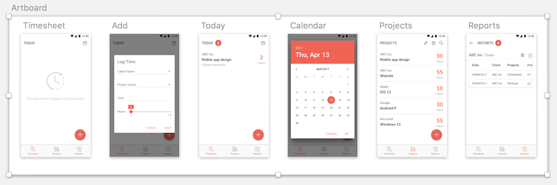
Sketch also comes with a whole set of templates for the most common use cases (iPhone and Android apps, responsive websites, etc.), to be used as starting points for projects. These include artboards with the appropriate dimensions, named properly, and in some cases a basic set of UI elements to boot. The artboard picker was redesigned in a recent version, making it easy to quickly switch between sizes — and even to toggle vertical and horizontal orientation — on the fly. This, combined with the new resizing controls (more on that in a bit), makes designing responsive and multi-platform layouts extremely easy.
Layout Grids
Grids are an integral part of the modern UI design arsenal. It is surprising, then, how arcane the process of setting up grids in popular design applications is. I remember dreading the thought of setting up guidelines to precisely match a 12-column Bootstrap grid in Photoshop or Fireworks. (That’s before I hit upon a Fireworks plugin that did it.) But a grid made up of guidelines was still a hack and could be easily lost the moment you started adding more guides of your own.
Sketch addresses this problem by allowing you to set up layout grids for each artboard that are separate from guidelines and the traditional grid (both of which it still supports). You set the total width, number of columns and gutter width, and a nice red translucent grid is overlaid on your design instantly. Edit the numbers as needed and the grid adjusts accordingly. Again, these are per page, so you may have a 12-column grid for the desktop layout and switch to 8 columns for tablet and 4 columns for mobile. What’s more, you can also add rows to the grid, which can be invaluable when working with a set baseline grid.
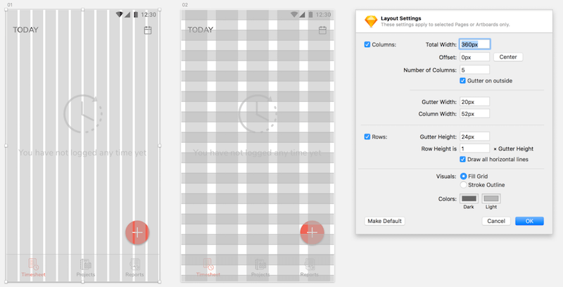
Couple this with the new resizable symbols and you’re looking at a massive boost in productivity when designing responsive layouts. Add to this the continuous stream of ingenious plugins being developed by the Sketch community and… well, you get my point.
Symbols And Styles
Symbols are by far one of the most powerful features in Sketch. And given how much they have improved, it is hard to believe that the feature was introduced less than a year ago. What started as simply a way to reuse a certain component across a design — à la Freehand and Fireworks — today has become a powerful feature in Sketch. I can safely say that symbols have saved hundreds of hours of work for me and my team in the last few months. And things are only getting better with each release.
A symbol could be as humble as a button with a rectangle and text on it, or as complex as an entire calendar with customizable dates, states and statuses. The example below is an extreme case, and I don’t recommend you go this far, but it helps to demonstrate how flexible symbols can be.
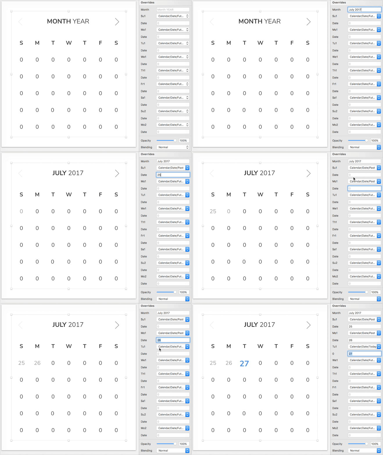
You can nest symbols within symbols, toggle them on and off at an instance level, replace or even hide text, replace images, displace elements based on the width of a text object, resize entire symbols (with full control over how each element within the symbol reacts to resizing)… the list goes on and on. Let me demonstrate some of the capabilities below with examples from our UI design projects.
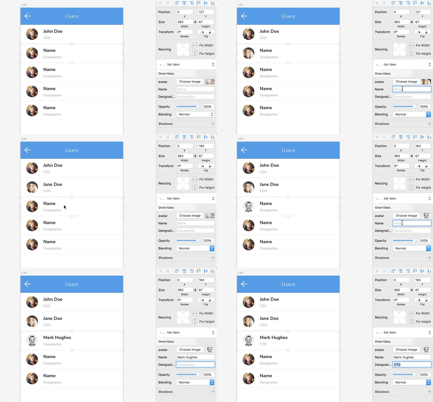
As with any good tool, I keep discovering new and exciting ways to use its feature set every day. As an example, I recently figured out that you can convert an entire artboard to a symbol. Let’s say you’re designing the workflow for an app, and certain screens appear multiple times with subtle changes. Just convert those screens to symbols, and place them wherever you need with the appropriate overrides. Later, when you need to change a color (and trust me, you will), just change it in the original artboard, and every instance will follow.
The power of symbols in Sketch is much broader than I can cover here, so here are a few places to look for more in-depth coverage:
- “Unleashing the Full Potential of Symbols in Sketch,” Javier Cuello, Smashing Magazine
- “Using Sketch to Quickly Swap Between Different OS Designs,” Stewart Curry, Prototypr
- “Sketch Workflow: Atomic Symbols,” Anthony Collurafici, Medium
The upcoming version 47 includes an update to the symbols, with the inclusion of shared libraries - individual Sketch files that act as central repositories for symbols across a team and files. It has created quite a buzz within the Sketch community as you can see in this roundup of related coverage.
Styles are a set of properties that can be applied to multiple elements and synced throughout a document to ensure consistency. They’re not unlike the styles we have come to know and use in everything from Microsoft Word to Adobe Illustrator and InDesign. In my team, we use these mostly to define text styles for elements such as h1, h2, h3 and p. But they go much beyond, covering fonts, fills, border, shadows and more.
Mirror And Sketch Cloud
There was a time when design was usually handled by an individual designer (or two) who worked on individual Photoshop files that didn’t really have much to do with each other. Today, it is not uncommon to see teams of tens or even hundreds(!) of designers working together on a single product. That makes the ability to collaborate on design files extremely critical.
Sketch has enabled a designer to share a read-only view of the file open in the app for some time now. Simply share a URL, and anyone else on the same Wi-Fi network will be able to view the file you’re working on. This is very helpful when you want to share a work in progress with a fellow designer or developer sitting at the other end of the office or even in the same room, where everyone can see the files on their own screens.
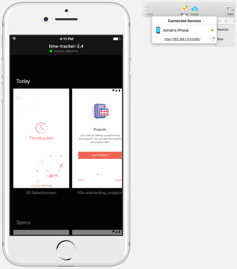
Another use case for Sketch Mirror is for testing mobile UI screens on mobile devices. Simply open the link on a mobile phone — or use one of the many apps on iOS and Android — to see the preview in real time. Any changes you make to the design in Sketch are immediately reflected in all previews.
Useful as it is, Mirror does have the limitation of being restricted to devices on the same network. Sketch Cloud addresses that by allowing you to upload your files to the cloud and have others access them publicly or via a link that you share.
Bits And Pieces
Those are not the only big things that make Sketch great. For me, it is the smaller touches that make life just that tiny bit easier every day and make it difficult for me to move to another app.
Need to save an artboard to a file? Just drag and drop the thumbnail from the right panel into Finder.
Working on a slide deck? just drag and drop a group from the layers panel straight into Keynote or PowerPoint.
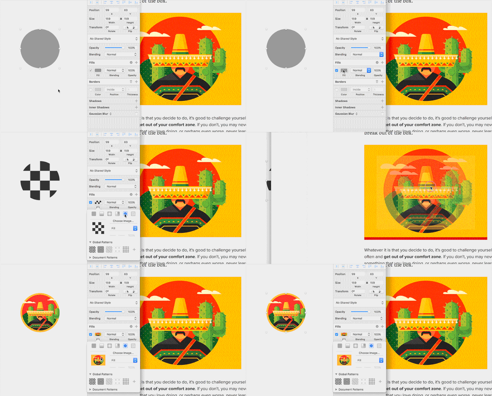
Found a nice photo on the web to replace an avatar? just drag and drop it from the browser onto the image thumbnail inside the image fill panel of a rectangle. Here’s what I mean:
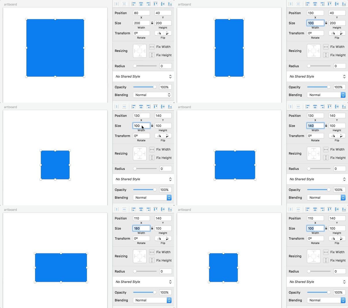
Smarter dimensions are another nice touch. Need to increase the width of an element by 23 pixels? Forget the mental math — append +23 to the width field, and let Sketch do the math for you. The same goes for subtraction, multiplication and division. You can even use percentage values to change dimensions proportionally to the element’s parent (which is the immediate parent group or the artboard, in that order). What’s that, you say? You want to increase the width on the left side instead of the right? Easy. Use +23r instead, and the resizing will be on the left, keeping the object anchored to the right ® edge. Ditto for left (l), top (t) and bottom (b).
You’ve created a bunch of objects and now need to rename them? Hit Cmd + R, change the name, press Tab to go to the immediate next object in the Layers list, and continue typing. Rinse and repeat.
Per-artboard grid toggles are great, too! I like to work with the 8-pixel grid when designing mobile apps, but having it either on or off across all pages is just plain annoying. With Sketch, I can turn the grid on or off at the artboard level.
There’s even more, but you get the idea.
The (Awesome) Plugin Ecosystem
One of the things that makes Sketch so powerful is the almost endless stream of plugins available for it. Bohemian Coding has made it easy for users to build on top of Sketch’s functionality and extend it in almost any way imaginable. Here are just a few stand-out plugins that prove that. There are tons more, and I would encourage you to explore them to see which ones work for you. Or, if you are up to the challenge, try building one yourself.
### Craft
We all work with dummy data — be it placeholder images, lorem ipsum text, fake names and addresses, blog post titles, the list goes on and on. Rather than hunting for these every time or copying and pasting the same set of data over and over, Craft lets you insert a whole host of placeholder content, randomized from a prebuilt set, from your own collection, or directly from the web. It even lets you import content from JSON sources! This is by far one of the biggest time-savers for me when working on new designs.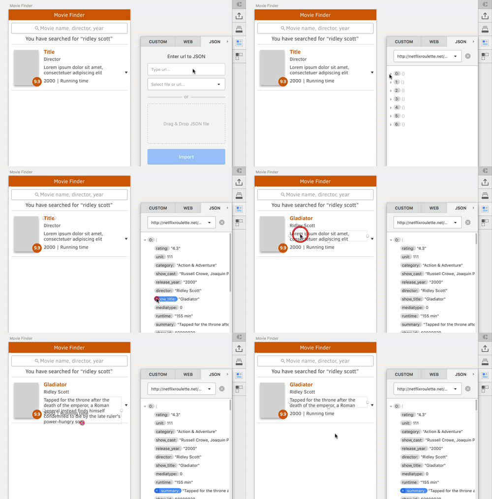
OK, so you’ve created a card with placeholder content, but it is just one of a list. The duplicate feature lets you take that card and create as many duplicates as you need, all with randomized content from the same sources that you used for the first instance. No more copying and pasting and changing text — or even images — manually. Need to increase the size of the grid? Just resize the container, and Craft is clever enough to fill the space with more duplicates (with different content). Genius!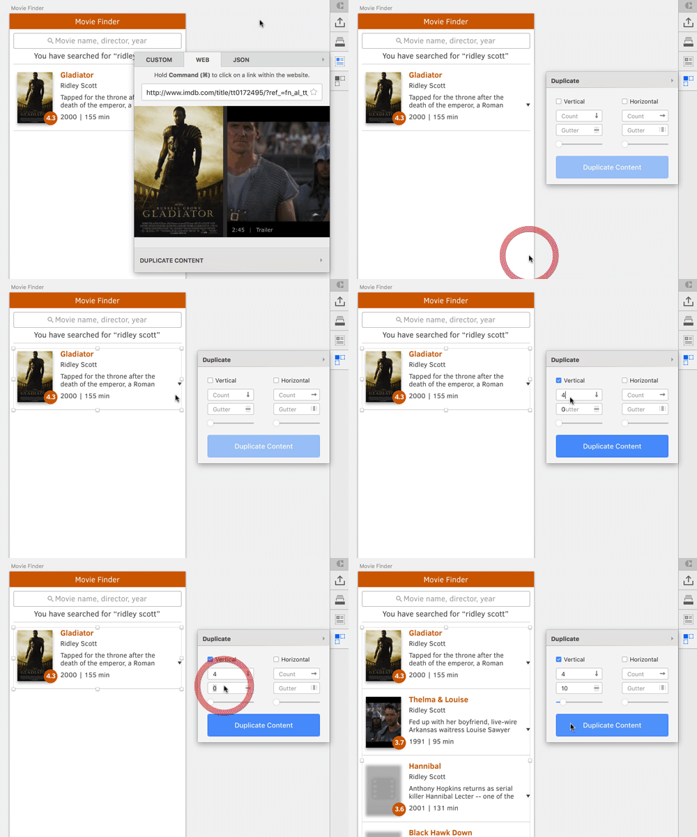
As projects and teams grow bigger, collaborating on source files gets trickier. The library feature in Craft tries to address that by allowing you to define and share symbols, styles and colors with your team and by allowing for quick changes that reflect across all files and team members. It is a bit tricky to set up and has its quirks, but once you’ve set it up, it can be a huge time-saver for the entire team.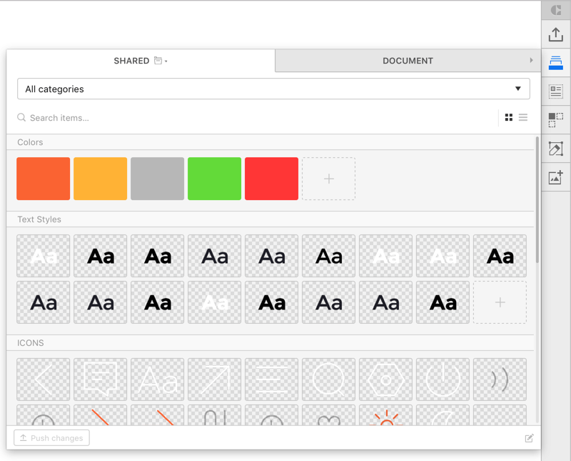
If you use InVision to share mockups and collaborate with colleagues and clients, this is a big step up from what used to be the Sketch-to-InVision workflow. With Sync, you can upload any or all of the artboards in a Sketch file to an InVision prototype or board.
* Prototype
Here’s a great example of a plugin adding essential functionality to Sketch. This brings the often requested prototyping tools right inside Sketch. Just select an element, tap C and pick the artboard it should link to. The only limitation, really, is that your prototypes can only be previewed by syncing the screens with a project on InVision.

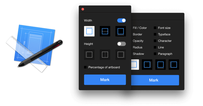
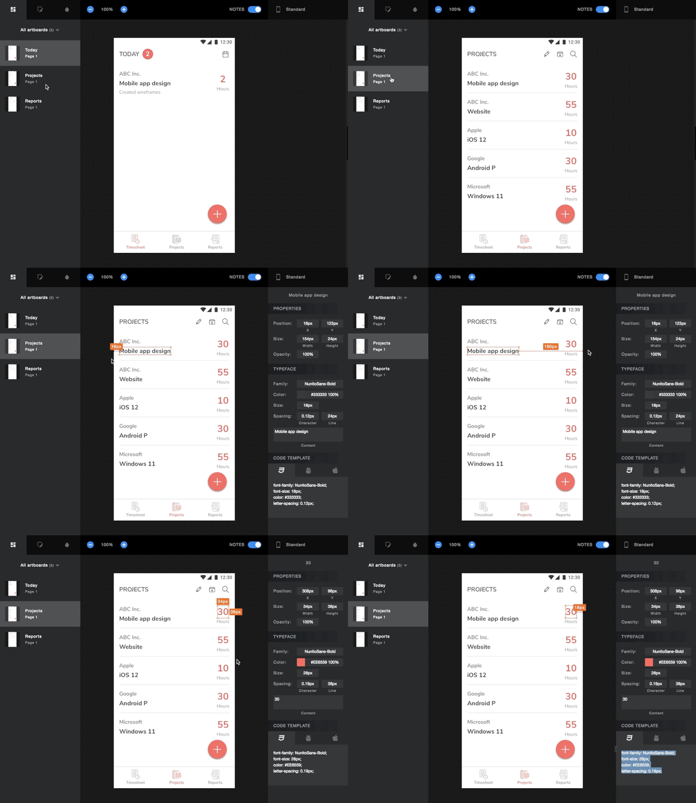
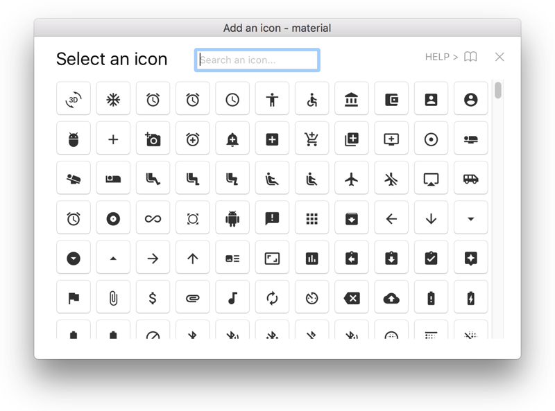

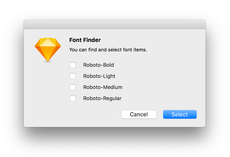
And More
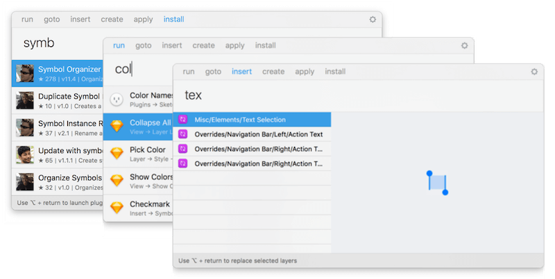
There are more plugins that do any number of things, including replacing text and colors, organizing symbols, publishing websites, even creating native apps directly from Sketch. There’s a good chance that, if you need it, someone has already built it. You only have to search for the plugin.
Summary
Sketch remains the most important tool in my design toolkit at the moment, but I’m keeping my eye on other contenders for now. Figma is probably the front-runner, given how much it has matured in the last year or so. A lot will depend on whether Sketch can build on the momentum it has picked up over the last year or so.
If you’re considering coming on board the Sketch train or have already boarded, here are a few resources geared to helping UI designers:
- “A Component-Based Workflow for Sketch,” Tim Van Damme, Abstract
- “Responsive Design in Sketch, Part 1,” Emin Inanc Unlu, Medium
- “Designing a Responsive Music Player in Sketch, Part 1,” Christian Krammer, Smashing Magazine
- “Sketch App Awesomeness,” Greg R, Medium
- “Unleashing the Full Potential of Symbols in Sketch,” Javier Cuello, Medium
- “Harness the Power of Symbols,” Andrew Couldwell, Medium
- The Sketch Handbook, Christian Krammer
Further Reading
- Inspiring Everyday Graphic Design
- 33 Tempting E-Commerce Icons For Free
- Breaking Out Of The Box: Design Inspiration
- Modern Art Movements To Inspire Your Logo Design


 SurveyJS: White-Label Survey Solution for Your JS App

 Try ProtoPie AI free →
 Celebrating 10 million developers

