The Role Of Storyboarding In UX Design
To come up with a proper design, UX designers use a lot of different research techniques, such as contextual inquires, interviews and workshops. They summarize research findings into user stories and user flows and communicate their thinking and solutions to the teams with artifacts such as personas and wireframes. But somewhere in all of this, there are real people for whom the products are being designed for. In order to create better products, designers must understand what’s going on in the user’s world and understand how their products can make the user’s life better. And that’s where storyboards come in.
In this article, we’ll focus on storyboards as a means to explore solutions to UX issues, as well as to communicate these issues and solutions to others. In case you’ve been looking for a way to go from idea to prototype much faster than you usually do, you can download and test Adobe XD, the all-in-one UX/UI solution for designing websites, mobile apps, and more.
What Is A Storyboard?
A storyboard is a linear sequence of illustrations, arrayed together to visualize a story. As a tool, storyboarding comes from motion picture production. Walt Disney Studios is credited with popularizing storyboards, having used sketches of frames since the 1920s. Storyboards enable Disney animators to create the world of the film before actually building it.
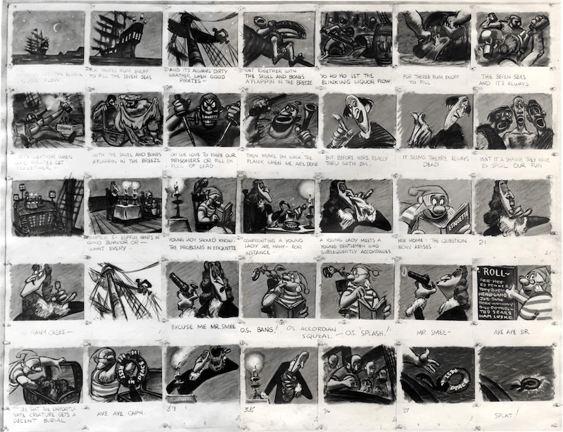
Stories are the most powerful form of delivering information for a number of reasons:
- Visualization
A picture is worth a thousand words. Illustrating a concept or idea helps people to understand it more than anything else. An image speaks more powerfully than just words by adding extra layers of meaning. - Memorability
Stories are 22 times more memorable than plain facts. - Empathy
Storyboards help people relate to a story. As human beings, we often empathize with characters who have challenges similar to our own real-life ones. And when designers draw storyboards, they often imbue the characters with emotions. - Engagement
Stories capture attention. People are hardwired to respond to stories: Our sense of curiosity immediately draws us in, and we engage to see what will happen next.
What Is A Storyboard In UX Design?
A storyboard in UX is a tool that visually predicts and explores a user’s experience with a product. It presents a product very much like a movie in terms of how people will use it. It can help UX designers understand the flow of people’s interaction with a product over time, giving the designers a clear sense of what’s really important for users.
Why Does Storytelling Matter In UX?
Stories are an effective and inexpensive way to capture, convey and explore experiences in the design process. In UX design, this technique has the following benefits:
- Design approach is human-centered
Storyboards put people at the heart of the design process. They put a human face on analytics data and research findings. - Forces thinking about user flow
Designers are able to walk in the shoes of their users and see the products in a similar light. This helps designers to understand existing scenarios of interaction, as well as to test hypotheses about potential scenarios. - Prioritizes what’s important
Storyboards also reveal what you don’t need to spend money on. Thanks to them, you can cut out a lot of unnecessary work. - Allows for “pitch and critique” method
Storyboarding is a team-based activity, and everyone on a team can contribute to it (not just designers). Similar to the movie industry, each scene should be critiqued by all team members. Approaching UX with storytelling inspires collaboration, which results in a clearer picture of what’s being designed. This can spark new design concepts. - Simpler iteration
Storyboarding relies heavily on an iterative approach. Sketching makes it possible for designers to experiment at little or no cost and to test multiple design concepts at the same time. Designers can be shot down, move on and come up with a new solution relatively quickly. Nobody gets too attached to the ideas generated because the ideas are so quick and rough.
Storyboarding In The UX Design Process
A storyboard is a great instrument for ideation. In UX design, storyboards shape the user journey and the character (persona). They help designers to string together personas, user stories and various research findings to develop requirements for the product. The familiar combination of images and words makes even the most complex ideas clear.
When Is Storyboarding Useful?
Storyboarding is useful for participatory design. Participatory design involves all parties (stakeholders, UI and UX designers, developers, researchers) in the design process, to ensure that the result is as good as possible. With a compelling storyboard that shows how the solution addresses the problem, the product is more likely to be compelling to the target audience.
It can also be helpful during design sprints and hackathons, when the prototype is being built by multiple people in a very short time. Communicating design decisions with a storyboard really comes in handy.
When Is There No Need For A Storyboard?
If everyone involved in creating a product already shares a solid understanding of how the product should be designed and agrees on the direction of the design and development, then there’s no need for a storyboard.
Use Storyboarding To Illustrate Experiences
Before you start creating a storyboard, it’s important to know exactly why you want to do it. If you don’t have a clear goal in mind, you might end up with a few attractive storyboards, but they won’t give you important insights into the user’s experience.
The Primary Purpose Of Storyboards Is Communication
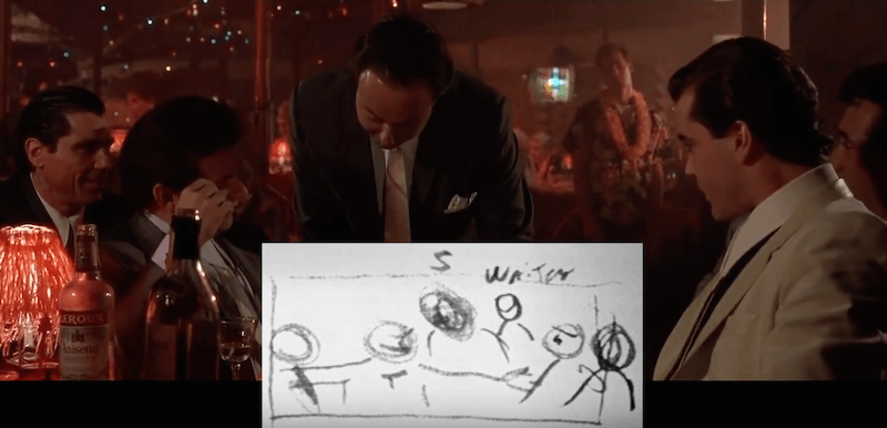
When you search for storyboards online, they always look really nice. You might think that in order to do them properly, you have to be really good at drawing. Good news: You don’t. A great storyboard artist isn’t necessary the next Leonardo da Vinci. Rather, a great storyboard artist is a great communicator.
Thus, it doesn’t matter whether you’re a skilled illustrator. What is far more important is the actual story you want to tell. Clearly conveying information is key. Keep in mind that a designer’s main skill isn’t in Photoshop or Sketch, but rather is the ability to formulate and describe a scenario.
How To Work Out A Story Structure?
Before drawing a single line on a piece of paper or whiteboard, prepare to make your story logical and understandable. By understanding the fundamentals of the story and deconstructing it to its building blocks, you can present the story in a more powerful and convincing way.
Each story should have following elements:
- Character
A character is the persona featured in your story. Behavior, expectations, feelings, as well as any decisions your character makes along the journey are very important. Revealing what is going on in the character’s mind is essential to a successful illustration of their experience. Each story should have at least one character. - Scene
This is the environment inhabited by the character (it should have a real-world context that includes a place and people). - Plot
The plot should start with a specific event (a trigger) and conclude with either the benefit of the solution (if you’re proposing one) or the problem that the character is left with (if you’re using the storyboard to highlight a problem the user is facing). - Narrative
The narrative in a storyboard should focus on a goal that the character is trying to achieve. All too often, designers jump right into explaining the details of their design before explaining the backstory. Avoid this. Your story should be structured and should have an obvious beginning, middle and end. Most stories follow a narrative structure that looks a lot like a pyramid — often called a Gustav Freytag pyramid, after the person who identified the structure. Freytag broke down stories into five acts: exposition, rising action, climax, falling action (resolution) and denouement (conclusion).
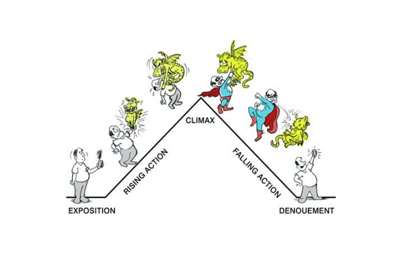
To make your story powerful, account for these things:
- Clarity
The main thing is to make the character, their goal and what happens in their experience as clear as possible. The outcome of the story should be clear for anyone who sees it: If you use a storyboard to communicate an existing problem, end with the full weight of the problem; if you use a storyboard to present a solution that will make the character’s life better, end with the benefits of that solution. - Authenticity
Honor the real experiences of the people for whom you’re designing. If you’re writing a story that isn’t faithful to the product, it won’t bring any value to you and your users. Thus, the more realistic the storyboard is, the better will be the outcome. - Simplicity
Each detail in the story should be relevant to experience. Cut out any unnecessary extras. No matter how good a phrase or picture may be, if it doesn’t add value to the overall message, remove it. - Emotion
Bake emotion into the story. Communicate the emotional state of your character throughout their experience.
Step-By-Step Guide To Creating Your Own Storyboard
With so many things to take into account, creating a storyboard might seem like an impossible task. Don’t worry, the following guide will help you turn out a good one:
- Grab a pen and paper.
You don’t have to use special software to leverage storyboards in the design process. Start with a pen or whiteboard marker, and be ready to experiment. - Start with a plain text and arrows.
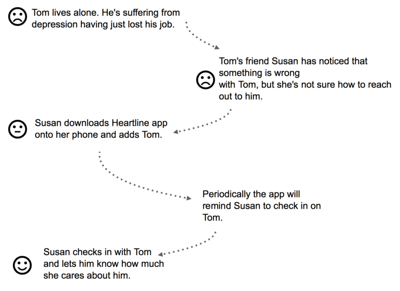
Break up the story into individual moments, each of which should provide information about the situation, a decision the character makes and the outcome of it, whether a benefit or a problem.
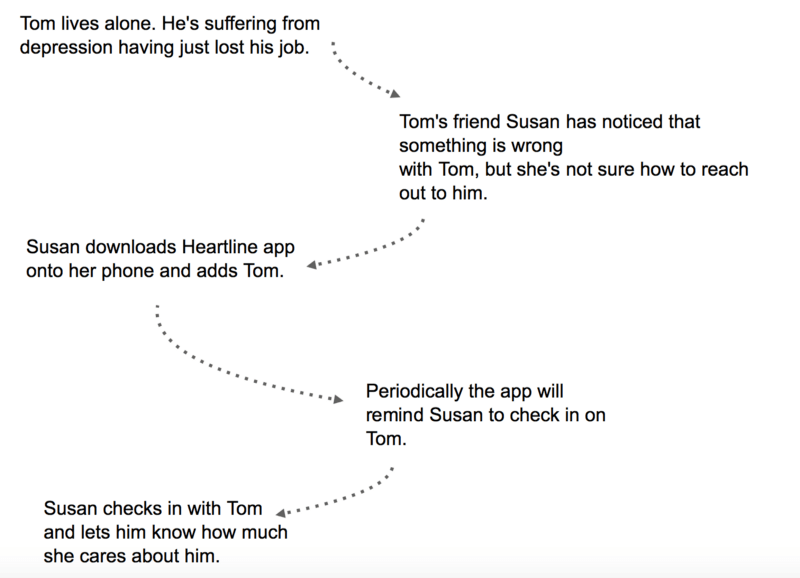
Next, convey what the character feels during each step. I add emoticons at each step, to give a feeling for what’s going on in the character’s head. You can draw in each emotional state as a simple expression.
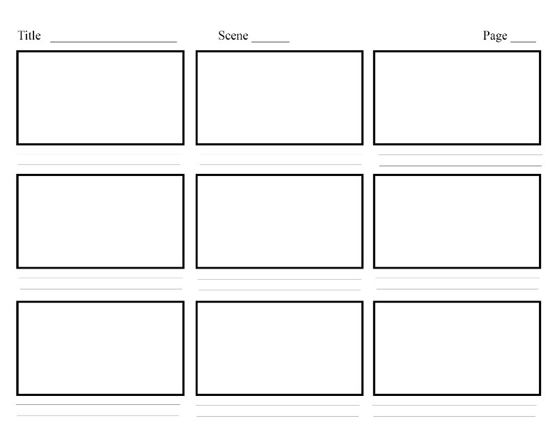
Roughly sketch a thumbnail in each frame of the storyboard to tell the story. Emphasize each moment, and think of how your character feels about it. Visuals are a great way to bring a story to life, so use them wherever possible. You can leave a comment on the back of each frame to give more context. You can also show a character’s thinking with thought bubbles.
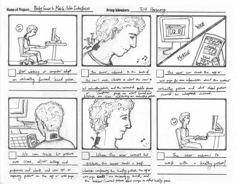
After you’ve drawn the storyboard, show it to other team members to make sure it’s clear to them.
A Few Notes On Fidelity
High-fidelity storyboards (like the one in the example below) can look gorgeous.
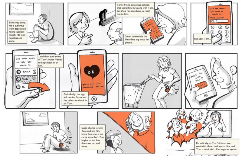
However, in most cases, there’s no need for high-fidelity illustration. The level of fidelity will determine how expensive the storyboard will be to create. As I said before, conveying information is what’s important. A more schematic illustration can do that perfectly, while saving a lot of time.
Real-Life Storyboard In Action
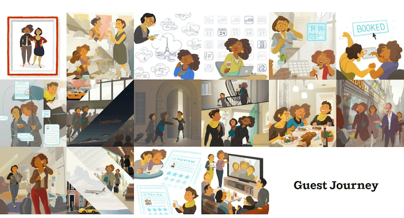
Airbnb is a great example of how storyboarding can help a company understand the customer experience and shape a product strategy. To shape the future of Airbnb, CEO Brian Chesky borrowed a strategy from Disney animators. Airbnb created a list of the emotional moments that comprise an Airbnb stay, and it built the most important of those moments into stories. One of the first insights the team gained from storyboarding is that their service isn’t the website — most of the Airbnb experience happens offline, in and around the homes it lists on the website. This understanding steered Airbnb’s next move: to focus on the mobile app as a medium that links online and offline.
Conclusion
Dieter Rams once said, “You cannot understand good design if you do not understand people; design is made for people.” Storyboarding in UX helps you better understand the people you’re designing for. Every bit you can do to understand the user will be tremendously helpful.
"This article is part of the UX design series sponsored by Adobe. Adobe XD tool is made for a fast and fluid UX design process, as it lets you go from idea to prototype faster. Design, prototype and share — all in one app. You can check out more inspiring projects created with Adobe XD on Behance, and also sign up for the Adobe experience design newsletter to stay updated and informed."
Other Resources
- “Storyboarding and UX,” Ben Crothers
- “The 8 Steps to Creating a Great Storyboard,” Jake Knapp, Fast Company
- “Storyboarding in the Software Design Process,” Ambrose Little, UX Magazine
Further Reading
- Facilitating Inclusive Online Workshops (Part 1)
- Better Context Menus With Safe Triangles
- Make ‘Em Shine: How To Use Illustrations To Elicit Emotions
- How To Create A Flat Vector Illustration In Affinity Designer


 Register Free Now
 Celebrating 10 million developers

 Try ProtoPie AI free →

