Using CSS Grid: Supporting Browsers Without Grid
When using any new CSS, the question of browser support has to be addressed. This is even more of a consideration when new CSS is used for layout as with Flexbox and CSS Grid, rather than things we might consider an enhancement.
In this article, I explore approaches to dealing with browser support today. What are the practical things we can do to allow us to use new CSS now and still give a great experience to the browsers that don’t support it?
Debugging CSS Grid Layouts With Grid Inspector
Whether you’re starting to learn about CSS Grid or already use it in production, we’ll have a look at Firefox’ known and obscure features of DevTools. Read a related article →
What Do We Mean By Support?
Before deciding how you are going to support browsers without grid support, it is worth working out what you mean by support. Support might mean that the site has to look absolutely identical in all the browsers on your list. It might mean that you are happy for some finishing touches not to be available in all browsers. It might mean that you are testing these browsers but are completely happy for them to receive a much simplified experience.
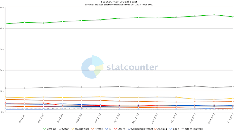
A linked question is how do you come up with your list of supported browsers? Even for a brand new website, this shouldn’t need to be a guess. For most businesses today, a new website won’t be the first site they have ever built. You probably have some analytics you can look at to see the browsers in use, although you need to take care that they are not skewed by a site that is entirely mobile unfriendly for example. People won’t be visiting the site on mobile if it is impossible to use on a small screen!
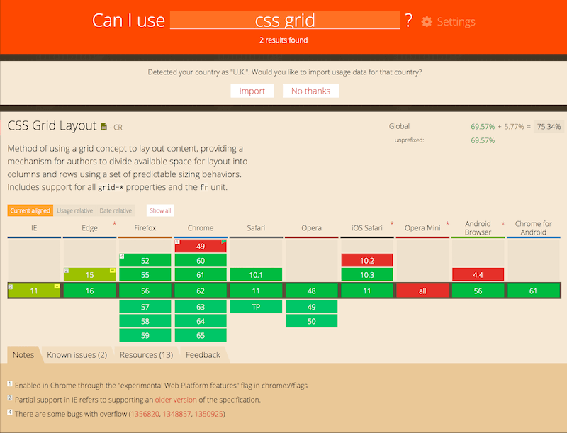
If you don’t have any relevant analytics you can look at data on Can I Use, where you can import the data for your location.

It is also worth keeping the site goals in mind here too. For example, a site hoping to attract visitors who live in emerging markets such as India will want to ensure the site works well in browsers used in those countries.
Is It Just Old Browsers I Should Worry About?
A the time of writing Edge, Chrome, Firefox, Opera, Safari, iOS Safari all support Grid Layout.
IE10 and IE11 have support for the original spec with an -ms prefix. In terms of old browsers you are looking at:
- Internet Explorer 9 (or IE 11 and below if only considering the new spec)
- Edge 15 and below
- Firefox older than version 52
- Safari and iOS Safari older than version 10.1
- Chrome older than version 57
- Samsung Internet older than version 6.2
However, as mentioned in the last section, these popular desktops and mobile browsers are joined by browsers more commonly used in emerging markets. These browsers haven’t yet adopted grid. For example, if we take a worldwide view UC Browser comes in at 8.1% of traffic — the third most popular browser in the world. If you happen to live in the USA or Europe, it’s possible that you may have never heard of it.

UC Browser does not support Grid Layout. It is also a browser optimized for lower powered devices, but also for users in areas with expensive, often metered data. This is an important thing to consider as we begin to plan a strategy for support.
Is There A CSS Grid Polyfill?
When first encountering CSS Grid, an obvious question is, “Can I use a polyfill?” Unfortunately, a magic polyfill for your entire layout is unlikely to be forthcoming or a great idea to use even if there were such a thing.
Grid does things that are pretty much impossible with older layout methods. So, in order to replicate Grid in browsers that don’t have support, you would need to do a lot of work in JavaScript. Even on a well-resourced computer, with a fast rendering engine that is likely to give you something of a janky experience as heights are calculated and items positioned. As we already know, the browsers that don’t support grid are older, slower browsers or browsers most often found on lower powered devices in emerging markets. Why would you force a bunch of JavaScript onto those devices?
Instead of searching for a polyfill, consider how using Grid Layout can actually provide a better experience to those browsers that don’t support it. Grid will allow you to create complex layout experiences for supporting browsers with minimal CSS, while still offering a good experience to those browsers without support. Yes, it will be a little more work than just throwing a polyfill at the problem, but by doing so, you are ensuring that support means providing a good experience, rather than making the site looking the same the most important goal.
Providing Support For Browsers That Don’t Understand Grid Layout
So, how do we provide support that is tailored to the device and browser in use? It turns out that CSS has the answers for you.
Browsers Ignore CSS They Don’t Understand
The first part of the picture is the fact that browsers ignore CSS they don’t understand. If a browser that doesn’t support CSS Grid, comes across the grid-template-columns property, it doesn’t know what it is and so throws that line away and continues.
This means that you can use some old CSS, for example, floats or display: table-cell to provide a grid type layout for older browsers, just as you would in the past. The browsers that do not support Grid Layout will use this layout and ignore all the grid instructions. Browsers that do support Grid Layout will continue and discover the grid instructions and apply those. At which point we need to consider what happens if an item using another layout method becomes a grid item.
New Layout Knows About Old Layout
Defined in the specification is exactly how Grid behaves if you have elements in your page positioned by other layout methods.
Items that are floated or that use the clear property, which then become a grid item, no longer exhibit any floating or clearing behavior. As if this was never applied. Remove all of the properties applied to the class .grid in this next CodePen, and you can see how we have floated all of the items and cleared the third one. However, once we are in Grid Layout this is ignored.
See the Pen display: grid overrides float and clear by rachelandrew (@rachelandrew) on CodePen.
The same is true for inline-block. The value inline-block can be applied to the child item, but as soon as the parent has display: grid the inline-block behaviour will no longer be applied.
I often use CSS display: table-cell when I need to create a column layout and also align items in non-supporting browsers, as the vertical-align property works when you use display: table-cell.
If this is new to you, read The Anti-hero of CSS Layout — “display:table”. I wouldn’t suggest you use this today as your main layout method, but it can be very helpful as a fallback.
When you use display: table-cell to create columns, CSS will create what is known as anonymous boxes. These are the missing parts of the table — a table cell in a real HTML table will be inside a tr element, and that will be inside a table element. The anonymous boxes essentially fix up these missing parents. If your table-cell item becomes a Grid Item however, this happens before the boxes are generated and so once again the item will act as if the CSS tables display had never happened.
The vertical-align property does not apply once in Grid Layout either and so if you use it in a CSS tables layout or with inline-block you can safely ignore that and use Box Alignment for Grid Layout. You can see a layout that uses display: table-cell and vertical-align overwritten by Grid Layout in this next CodePen.
See the Pen display: grid overrides display: table-cell, and vertical-align by rachelandrew (@rachelandrew) on CodePen.
You can also use Flexbox as a fallback, if you have used the flex property or individual flex-grow, flex-shrink or flex-basis properties on the item these will be ignored once it becomes a Grid Item.
Finally, don’t forget that Multi-column layout can be used in some cases as a fallback. For example, when laying out a list of card components or images. It will display items in columns rather than across the row but in some circumstances can be useful. You apply column-count or column-width on the container to make it a multicolumn container, if you then apply display:grid the column-* behaviour will be ignored.
Feature Queries
In the majority of other layout methods, we target the individual items rather than their container. For example in a floated layout, we have a set of items that we have given a percentage width and then set to float: left. This causes them to line up next to each other. As long as we don’t end up with more than a total of 100%, we can make something that looks like a grid.
.grid > * {
  float: left;
  width: 33%;
}

If we then turn that layout into a CSS Grid Layout, we create a grid on the parent. The only thing we apply to the items is an instruction as to how many columns to span.
.grid {
  display: grid;
  grid-template-columns: 1fr 1fr 1fr;
  grid-auto-rows: 100px;
  grid-gap: 20px;
}
In our old layout we have floated items with a size applied, in our new layout those items become Grid Items, and typically we don’t want to give those items a size, as they will get that information from the grid tracks that they span.
It is here that we come to an issue with simply being able to override one layout method with another. In the example of a floated layout where the items have been given a percentage size, once that item becomes a Grid Item the size becomes a percentage of the Grid Area it is in and not a percentage of the overall container width. You can see this by using the Firefox Grid Inspector to highlight the lines — the items are now squashed to one side of the Grid Cell.

This is where Feature Queries can help. Feature Queries act much like a Media Query, instead of checking for the width or orientation of a device, we check to see if the browser supports a CSS feature.
In our example of a floated layout that we want to turn into a grid layout, we only need to override one thing inside the Feature Query — we want to set the width back to auto.
See the Pen display: feature queries demo by rachelandrew (@rachelandrew) on CodePen.
How much overwriting of CSS used for nonsupporting browsers you need to do depends on how much you have decided to create a different layout for those older browsers.
The IE10 And 11 Version Of Grid Layout
While Edge has now updated to the modern grid layout, IE10 and 11 only have support for the early version first shipped with a -ms prefix in those browsers. The Grid specification that we know of today came originally from Microsoft. So far from being unhappy about this old implementation, we should be glad they kickstarted the process and gave us Grid in the first place. You can read more about the story in the article The Story of CSS Grid, from Its Creators.
You might decide to offer IE10 and 11 a fallback experience based on a floated or other layout type as described above. This will work well, as will using Feature Queries, which are not supported in IE10 and 11. As long as you use these to overwrite your older methods checking for support, then creating the version for supporting browsers, IE10 and 11 will continue to use the older method.
You could however make use of the -ms-grid version to create a fallback method. However this prefixed version is not the same as modern Grid Layout, it was the first version and experimental version. Things have changed in the five years or so since it shipped. This means you can’t just use autoprefixer to add the prefixes, that approach will probably leave IE10 and 11 users with a worse experience than if you do nothing at all. Instead, you need to create a layout using this different and more limited spec.
The key points to note are as follows:
- There is no auto-placement. You need to place each item on the grid using line-based positioning.
- The
grid-template-areasascii-art method of positioning is not part of the implementation. - There are no grid gap properties.
- Instead of specifying start and end lines, you specify a start line and the number of tracks to span.
You can find a full breakdown of all of these properties in my blog post, Should I try to use the IE implementation of Grid Layout?
If you have a large number of users with these browsers then you may find that this old spec is helpful. It is definitely worth knowing it exists even if you only use it to solve a couple of small issues that are real showstoppers for you.
Why Bother Using Grid If I Have To Support These Browsers?
If you have non-supporting browsers in your list, and you have to offer them an identical experience to supporting browsers then I would indeed question whether to use Grid Layout, or any new CSS. Use the methods that work. That approach is still perfectly valid.
You might still consider using Grid Layout with a high level of fallback if you know that within the short-term it is likely that you will be dropping a bunch of those browsers from the “must be identical” list. Especially if you know the development you are doing now will have a long shelf-life. You could then lose the fallbacks at a later date and only use the Grid version.
However, support for you may mean that it is possible for non-supporting browsers to get some level of simplified experience, and there are things you want to do with Grid Layout that are essentially impossible without it. That’s the time to use Grid Layout and design a good non-grid experience for those browsers.
Testing Fallbacks
A final note on testing these fallbacks. The only real way to test your fallbacks is to have access to browsers that do not support CSS Grid. One way to do this, without buying a stack of extra computers, is to download the Virtual Machines offered by Microsoft. You could then test using a version of Internet Explorer without support.
You could download UC Browser onto a phone, or use the desktop version on Windows or in a Virtual Machine.
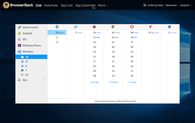
There are also tools such as BrowserStack which give you access to remote Virtual Machines running a whole range of browsers. These services aren’t free, but they can save you a lot of time setting up VMs for testing.

I have seen people recommend switching your Feature Query to test for something that doesn’t exist — such as testing for support of display: gridx. This will work reasonably well. However, you do then need to put all of your Grid code inside the Feature Query Block, rather than relying on the fact it is ignored by browsers that don’t support it. You could easily end up with a false positive result by not realizing that some Grid code had wound up outside of a Feature Query. Even if you are using this method for quick checks, I would highly recommend doing some testing on actual browsers too.
Other Resources
I’ve rounded up the URLs referenced in this article and also some additional resources to help you navigate your own path to supporting browsers while still taking advantage of new layout. If you have come across any good resources, or particularly tricky issues, add them to the questions. Grid Layout is still new to all of us as something we can use in production, so there are bound to be some unanswered questions we can take a look at.
- “The Story of CSS Grid, from Its Creators,” Aaron Gustafson, A List Apart
- “BrowserStack,” A cross-browser testing tool
- “Should I try to use the IE implementation of Grid Layout?” Rachel Andrew
- The Anti-hero of CSS Layout — “display:table”,” Colin Toh
- “CSS Grid Fallbacks and Overrides cheatsheet” Rachel Andrew
- “Using Feature Queries in CSS,” Jen Simmons, Mozilla Hacks
- “A video tutorial on Feature Queries,” Rachel Andrew
- “CSS Grid and Progressive Enhancement,” MDN web docs, Mozilla
Further Reading
- Inspiring Everyday Graphic Design
- 33 Tempting E-Commerce Icons For Free
- Breaking Out Of The Box: Design Inspiration
- Modern Art Movements To Inspire Your Logo Design


 See the full picture →
 SurveyJS: White-Label Survey Solution for Your JS App
 Celebrating 10 million developers


