Level-Up Email Campaigns With Customer Journey Mapping
I became a huge fan of customer journey mapping (CJM) the first time I was introduced to it. And after a few years of mapping, tweaking and presenting maps, my team and I started looking for other more exotic uses of this technique. The law of the instrument at its best, I suppose. Well, seek and ye shall find.
Customer journey mapping is a visualization technique that helps marketing specialists, user experience designers, and product and business owners see the journey people take when interacting with products and services. It is a great way to put on your customer’s shoes and see where your business fails to deliver a great user experience.
The way CJM works is pretty straightforward: You collect user research data, break down the entire funnel into steps (i.e. stages) and describe each stage from multiple points of view, such as your business goal, the customer’s goals, touchpoints (the very moments of interaction), customers expectations and pain points, their thoughts and feelings, etc. In the end, you have a table that looks something like this:
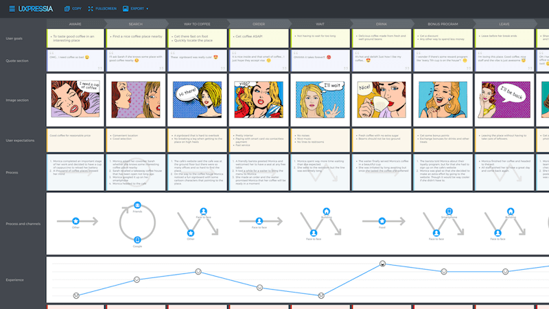
From this table, you can tell at which points customers are not happy, and you can come up with some ideas to improve the situation.
Сustomer journey mapping is mainly used to find flaws in the entire path of the user, but I was curious if there was some unconventional way to use this technique. Turns out there is, and here the story of how it found me.
It’s Not A Journey Map… Or Is It?
After reading Baremetrics CEO Josh Pigford’s brilliant article about an email campaign that Baremetrics created to reduce churn and convert customers, our team at UXPressia decided that we needed something similar for our app.
Fast-forward a few weeks, and we had a sequence of emails ready to fly to our users’ mailboxes. They looked somewhat like this:
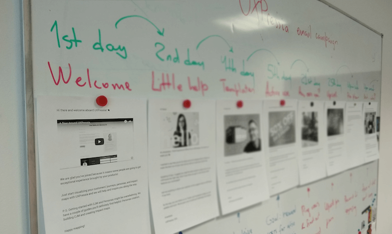
These printed emails stuck around on our whiteboard for a while. Then, one day, while we were having coffee after a long and tedious CJM workshop, one of the participants glanced at the emails still hanging on the board and asked, “What’s this journey map for, guys?”
“Oh no, that’s not a journey…” — I was about to say that this was not a journey map, but I suddenly stopped. Our guys looked at each other. “Are you thinking what I am thinking?” Yes, our email campaign had stages and our business goals, so it could be. After all, we made a tool for mapping customer journeys, so it was a great opportunity for us to put it to the test. The question was: Is it OK to just cut out one channel from the entire user journey and focus on it solely?
On the one hand, customer journey mapping is all about a holistic approach, so it isn’t entirely right to focus on just one channel. On the other hand, we want to follow the “individuals and interactions over processes and tools” principle from the agile manifesto.
Besides, we tried our best to make our emails as personal as possible. Today, email campaigns are no longer carpet-bombing monologues. They are more of ongoing conversations in which we try to bond with our users. And customer journey mapping is all about finding a better and more personal approach.
So, why not try?
Everyone in the room started pitching ideas. Someone noticed that we had our goals linked to every email. “If we could add our user goals and see if both goals match…” he said.
At this point, it was clear that this was going to become a map. But two CJM sessions on the same day? You have got to be kidding. We took a break and agreed to sleep on this idea.
Doubts, The First Draft
The next day, after rebooting our brains, we gathered in the same room and asked ourselves, “What is the problem we are trying to solve here?” And is there any problem in the first place?
Well, have you ever seen how email campaigns are stored, organized and manipulated? We had a Google Doc with text and pictures, and it was kind of fine, although it was not easy to get a bird’s-eye view of the whole campaign all at once.
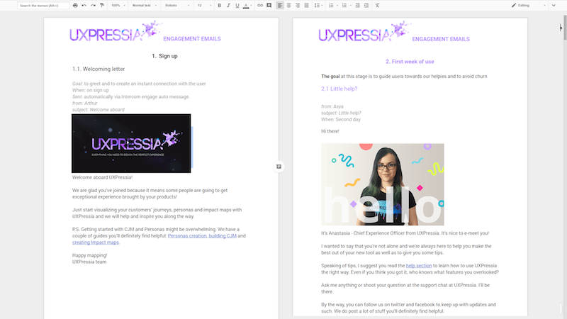
Our campaign was not very long and complex. It was a sequence of about 12 emails in which we welcome our users, give them tips and do some upselling.
Now, imagine if you had a longer campaign consisting of 50 emails triggered at different moments. I remembered my friend telling me how his company had an enormous spreadsheet file linking to different sources with multiple emails.
And there is no way to evaluate each letter out of the context. Setting up your campaign in some tool like MailChimp or Intercom would make your campaign a lot less messy, but you would still have to open each email to see the details.
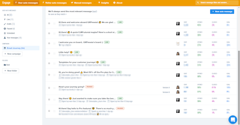
Turns out that hundreds of people working on email campaigns have terrible experiences themselves while crafting a better experience for others. Trying to unweave webs of interrelated email letters scattered over a spreadsheet would drive anyone crazy. This had to stop.
So, we rolled up our sleeves and drafted the first map using emails from our campaign.
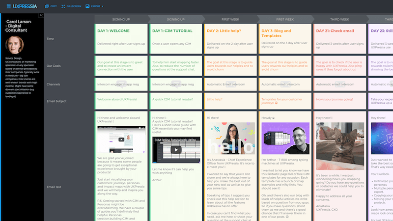
By mapping out the whole chain of emails on a single canvas, we could finally see everything in one place. Timing, email texts, business goals at each stage, as well as goals of each letter — it was all there. Having it all aligned in such a way instantly raised (and even answered) questions like:
- “Are we bombarding our users with a number of emails from the same person? Would it be more appropriate to introduce someone new?”
- “Is the timing correct and in line with the overall experience?”
And these questions were way easier to answer once we saw the whole picture. This alone was valuable enough because this clarity turned out to be a huge time-saver.
For example, shortly after the launch of our campaign, we noticed a pretty high unsubscribe rate from our emails. We tried to understand why this was happening and what we could do to fix it. Then, we looked at our email map and realized that the time gap between the first two emails was quite short, so we increased it. Guess what? The unsubscribe rate slowed down. This would have been more difficult to troubleshoot without the clear picture we had from customer journey mapping.
But we decided to take it up a few notches.
Leveraging Personas
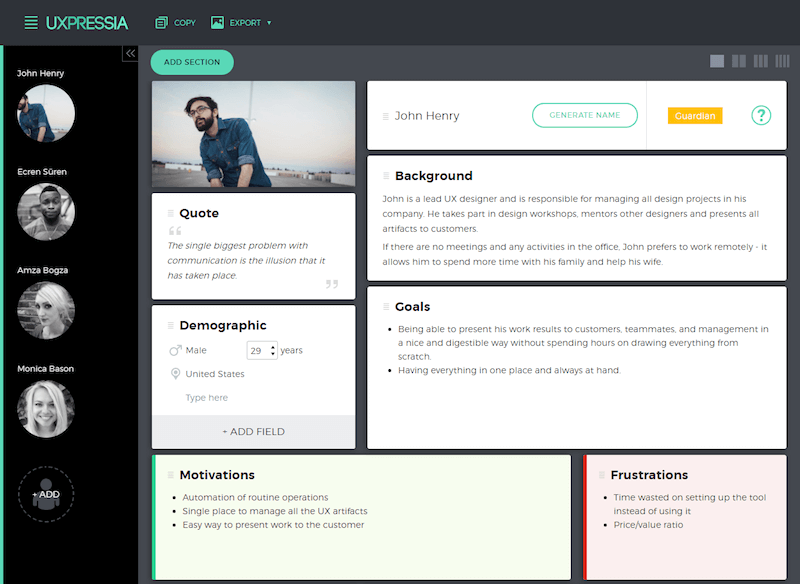
Remember I said we were trying to find a better and more personal approach? That’s what personas are best at. And having a well-researched persona when creating this email campaign was a game-changer for us.
By that time, we had already defined our customer personas, so it was no biggie to take each email and read it as if the reader was our persona.
A Brief Example
In one of our letters, we asked our users to tell us about themselves, so that we could make some suggestions and offer personalized help just in case. We expected them to drop us emails with some really short stories. So we “read” this email to our personas. Hey, picture a bunch of fellows reading to a poster on a wall. Bonkers!
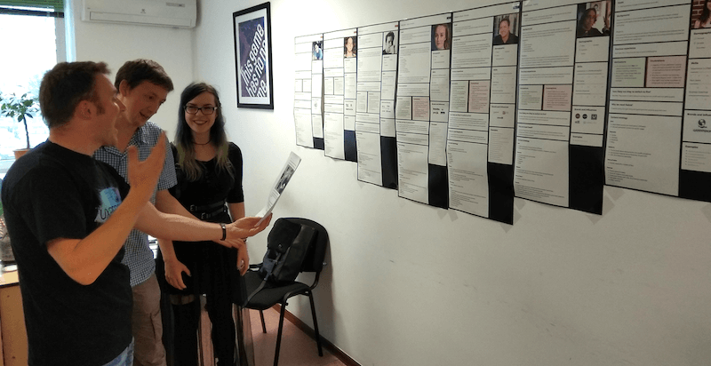
We tried to understand why this or that persona wouldn’t answer, and we realized that what we had in mind was not the way to go. What if our business-owner persona didn’t have time to sit there and compose emails? What could we offer to eliminate this objection? A quick call? Meh. Maybe. An online poll with predefined answers? Better!
So, using personas certainly had a great impact on our email campaign in the end.
Campaigns For Different Personas And A/B Tests
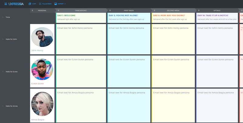
By the way, what if you have multiple personas in your email campaign? That poor spreadsheet! Unless, again, you use customer journey mapping. In this case, we’d be able to easily map different letters to corresponding personas — and even find where these emails intersect!
Example
In her case study, one of our customers told us an interesting story. She was working on a complicated email campaign for multiple personas. The tricky part was to bring together all possible scenarios and see which email she should write for each specific case.
And she was quite amazed by how customer journey mapping saved her a lot of time and effort. Once all emails had been mapped out, it became apparent which letters repeated, so she could merge them into one.
This applies not only to scenarios like this one, but also to A/B tests. Imagine doing the same without customer journey mapping. Ugh! But wait, the best part is yet to come.
Email Campaign On CJM Steroids
And here is it. Once we started putting our campaign on CJM steroids, there was no going back. Customer journey mapping offers a ton of sections that we could use to take our email campaign to a whole new level. We tried some of them, and the results were quite surprising.
User Expectations And Goals
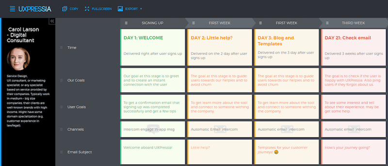
Adding user goals and expectations to our map cocktail changed the way we saw our email campaign for the better. When sending an upsell email, is this what our user expects from us at that very moment? Does the goal of this letter match the goal of our customers?
By that moment, we had already rolled out our campaign, so we had some stats on hand. And adding these sections and answering these questions made us realize why the unsubscribe rate for some of our emails was so high. Speaking of which…
Key Performance Indicators And Other Metrics
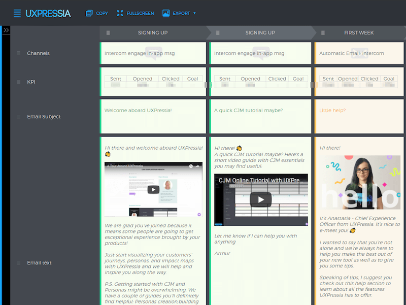
Now, what if we had real statistics under each email? Seeing how this or that letter performed enabled us to instantly find where our campaign hit the dirt. It did require some maintenance, but in the end, it was totally worth all the effort.
Quote Or User Response
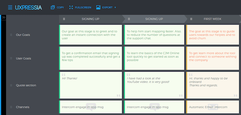
Because we believe that email campaigns are conversations rather than monologues, we expect our users to say something back. Why not add some of their responses to our map? They could be from a single quote or an entire response. And based on their reactions, we were able to draw an…
Experience Graph
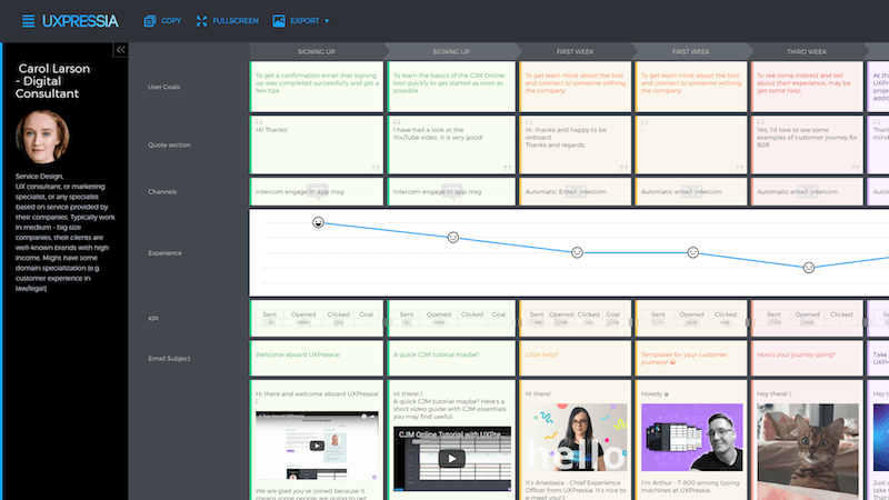
The experience graph made it so easy for us to see the whole flow of our email campaign. Tracking performance enabled us to see which emails failed most and which did the best job. For us, this was priceless.
Problems And Ideas
Finally, once we had identified problematic emails in our campaign, it was time to think about what caused fails and how we could improve their performance. We pitched some ideas and started testing them ASAP!
Wrapping Up
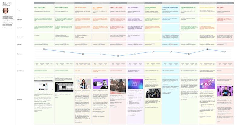
When we finally called it a day (or, rather, a night), everyone was so inspired. Using customer journey mapping to map our email campaign turned out to be not just a huge timesaver, but a well of insights, too. Not to mention that we were able to achieve a 40% open rate! Not a bad result in today’s world, where users develop email-blindness syndrome.
Of course, using CJM for mapping email campaigns will not work for all cases, but it was a lifesaver — and not just for us.
One of our customers transformed their existing email campaign the same way shortly after our debut. What they did was compare the email journey they created with the customer journey map they already had. Once they saw all emails on a single CJM canvas right next to the customer journey map, they got quite a few insights, like:
- The first email in the campaign promoted the web application heavily right after a user downloaded the mobile app. The business goal at this stage was to decrease the number of users leaving the mobile app, but they were encouraging people to do just that!
- The second email was pushing people towards providing more personal data. But from looking at the CJM as a whole, it was obvious that the timing was completely wrong: It happened at the stage when the majority of users were not yet ready to share anything — they simply hadn't yet perceived any value from using the app.
- The third email promoted the blog, which indeed had some great content. But the content was focused on just two personas, whereas the email campaign was sent to everyone. The majority of users were obviously not interested, so they kept unsubscribing.
These were not all of the insights they had, but even with these, it was pretty clear that the campaign needed some rethinking. Even more importantly, they already knew what had to be changed.
Anyway, here are some ideas about when transforming an email campaign into an email journey map will work for you as well:
- You are working on a massive email campaign that you want to be consistent and well crafted as much as sympathetic and humane.
- You believe that your team should try CJM, but people hesitate to engage because of the time commitment and unclear value. Seeing how it works for one channel would be less time-consuming and might help to convince your team to try a full-blown customer journey map after all.
- You want to present campaign content to clients or stakeholders (which would be way more attractive than the bunch of separate files mentioned before).
The worst-case scenario here is that you would put your emails in order and save a lot of time in the long run.
Plus, you can do the same thing not just with emails but with virtually anything, be it call scripts for support or sales, alongside postal or face-to-face interactions.
Oh, and one more thing. We created a free template you can use to start mapping your email journey now! It has a predefined persona and all the sections we used in our own journey map.
But what about you? Have you tried using CJM for email campaigns? What insights can you share? Do you know of any unusual uses of CJM? Share your ideas in comments!
Links And Resources
- Email Journey Map Template A free PDF template we created for you to play with email journey mapping.
- “The 17 Emails We Send to Engage Customers, Reduce Churn and Increase Revenue,” Josh Pigford, Baremetrics The article that inspired us to create an email campaign.
- “All You Need to Know About Customer Journey Mapping," Paul Boag, Smashing Magazine A good introduction to customer journey mapping.
- Intercom The app we use for our email campaigns and communication with users.
Further Reading
- Modern Technology And The Future Of Language Translation
- Improving Customer Service with UX - Idiots, Drama Queens and Scammers
- How To Use Storytelling In UX
- What 22 Billion Newsletters Tell Us About Designing For Mobile Email


 Register Free Now
 SurveyJS: White-Label Survey Solution for Your JS App
 Try ProtoPie AI free →


