A Comprehensive Guide To Product Design
(This is a sponsored article.) What is a product? Until recently, the term was used only in relation to something material and often found in a retail store. Nowadays, it is coming to mean digital products as well. Apps and websites are modern products.
When it comes to building great products, design is the most important “feature.” We’ve moved into the stage where product design dominates — it’s what sets companies apart and gives a real edge over competitors.
Whether you’re a designer, developer, product manager, program manager, marketing manager or project manager, it’s essential to understand (and have a reference guide to) the product development process in order to create your best work.
In this article, I’ll focus on the main principles and approaches that will help you to design great products. I’ll start with global things (like what product design is all about) and work down to the individual phases of product design (such as research, ideation, testing and validation).
What Is Product Design?
Product design is the process of identifying a market opportunity, clearly defining the problem, developing a proper solution for that problem and validating the solution with real users.
Design Thinking As The Foundation For The Design Process
Design thinking is a method for the practical resolution of problems. Originally coined by David Kelley and Tim Brown of IDEO, design thinking has become a popular approach to creating products. This approach encapsulates methods and ideas of human-centered design into a single unified concept. According to Tim Brown:
"Design thinking is a human-centered approach to innovation that draws from the designer’s toolkit to integrate the needs of people, the possibilities of technology and the requirements for business success."
Good designers have always applied design thinking to product design (whether physical or digital) because it’s focused on end-to-end product development, and not just the “design phase” part.

When thinking about products or features, designers should understand the business objectives and be able to answer the following questions first:
- What problem are we solving?
- Who has this problem?
- What do we want to achieve?
Answering these questions helps designers understand the user experience of a product as a whole, not purely the interaction (feel) or visual (look) part of design. Only after answering these questions does it make sense to move to finding a solution for the problem.
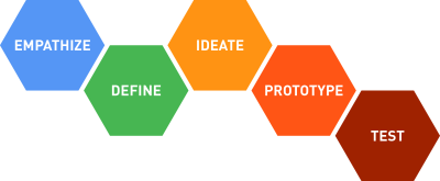
Finding a solution to a problem includes the following five phases:
- Empathize
Learn about the people for whom you are designing. Conduct research to develop a deeper understanding of your users. - Define
Create a point of view that is based on user needs and insights. - Ideate
Brainstorm and come up with as many creative solutions as possible. Generate a range of potential solutions by giving yourself and your team total freedom. - Prototype
Build a prototype (or series of prototypes) to test your hypothesis. Creating a prototype lets designer see if they’re on the right track, and it often sparks different ideas that you wouldn’t have come up with otherwise. - Test
Return to your users for feedback.
Design Process
Now, with an understanding of what design thinking is, it’s time to define the design process. The design process is a series of steps that product teams follow during the formulation of a product from start to finish. Having a solid well-structured process is essential for two reasons: It helps you to stay focused and helps you to stay on schedule.
While it’s impossible to provide a universal design process that fits all projects, it’s still possible to describe a general flow for designing new products. This flow includes the following steps:
- Defining the product vision
- Product research
- User analysis
- Ideation
- Design
- Testing and validation
- Post-launch activities
1. Define Product Vision And Strategy
One of the most important phases of product design is actually done before the design process even starts. Before you start building a product, you need to understand its context for existence. It’s the time when the product team must define the product vision and product strategy.
Have you ever worked on a project whose overall goal was not clear? In which the people involved in the design and development only vaguely understood the purpose of the product? Quite often this happens because there is no vision for the product. Unfortunately, this scenario happens all too often. In most cases, this has negative consequences. As the old Japanese proverb goes, “Vision without action is a daydream. Action without vision is a nightmare.”
Every design project needs a product vision that sets the direction and guides the product development team. Vision captures the essence of the product — the critical information that the product team must know in order to develop and launch a successful product. Vision helps build a common understanding of “what we are trying to build here and why.” Vision also helps you to define what you are not building. Being clear about the boundaries of your solution will help you to stay focused when crafting your product.
But vision is only half of the picture. The other half is strategy. Product strategy defines a product’s journey. Your vision helps you define a destination (the target condition) — the ultimate user experience toward which you’re aiming. You can plan your route toward the target destination by focusing on exactly what you need to build. By setting the goal (the challenge), you can adjust the direction of your product efforts.
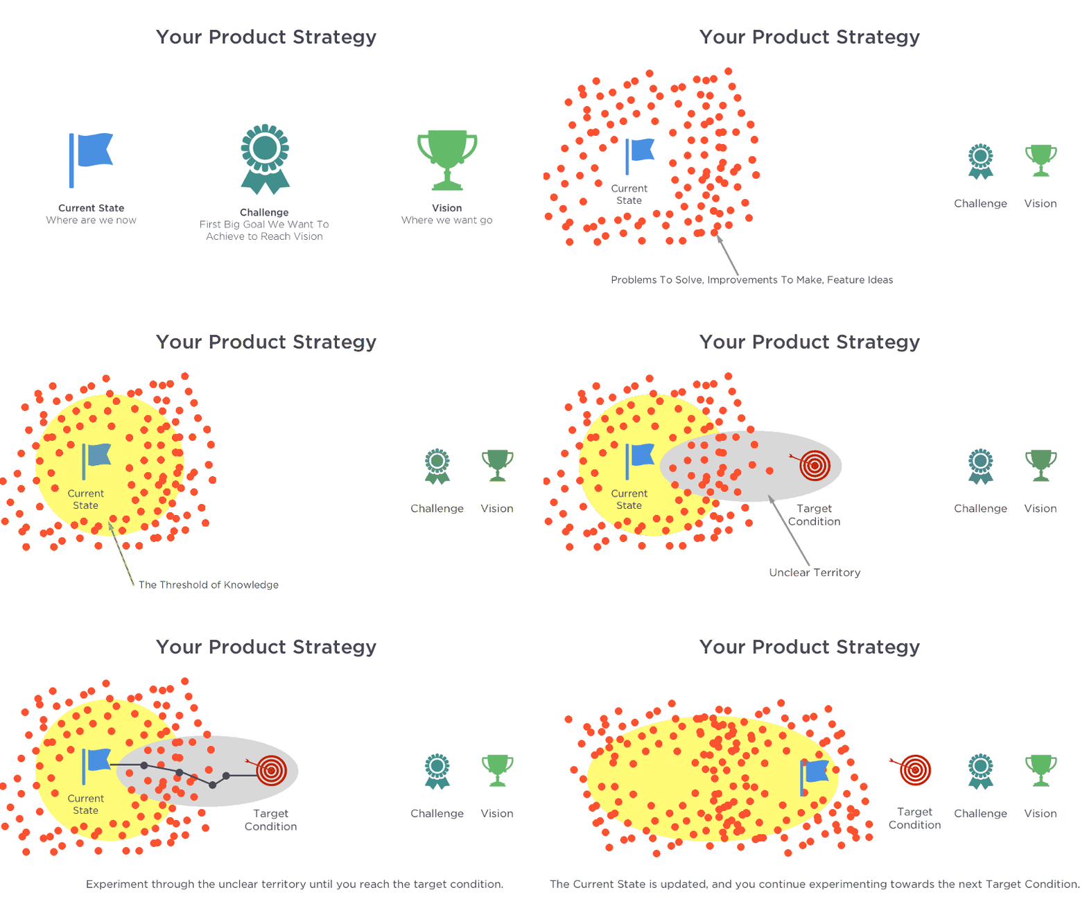

Spending time and money on vision creation is a worthwhile investment because this phase sets the stage for the success of a product.
Define Value Proposition
Value proposition maps out the key aspects of the product: what it is, who it’s for, and when and where it will be used. Value proposition helps the team and stakeholders build consensus around what the product will be.
Working Backwards
A simple technique called “working backwards” adds clarity and definition to the vision of a product. As the name suggests, the product team starts with target users and works its way back until it gets to the minimum set of requirements to satisfy what it is trying to achieve. While working backwards can be applied to any specific product decision, this approach is especially important when developing new products or features.
For a new product, a product team typically starts by writing a future press release announcing the finished product. Such a press release describes, in a simple way, what the product does and why it exists. As with any other press release, the goal is to explain to the public what the product (or new feature) is and why it matters to them. The press release should enable each team member to envision the future product.
Tips:
- Put the user at the center.
The press release should center on the customer’s problem. When writing a press release, focus on the value that the product brings to customers. - Read the press release to potential users, and ask for their feedback.
If the benefits listed in the press release don’t sound very interesting or exciting to the target audience, then perhaps they shouldn’t be built. Instead, the team should keep iterating on the press release until they’ve come up with a proper set of benefits. - Trim the fat.
A press release isn’t a product specification. If the press release is more than a page, it is probably too long. - Make sure everyone on the team shares the same vision.
You need to not only define a clear product vision but also ensure that all team members share it. - Use the press release as a reference during product development.
Once the project moves into development, the press release can be used as a reference. The press release can function as a north star to guide your team in times of uncertainty.
Define Success Criteria
It’s essential to have a clear business goal that you want to achieve with the product. If you don’t know at the beginning of the project what the business goal is and how success will be measured, then you’re headed for trouble. Defining explicit success criteria — such as expected number of sales per month, key performance indicators (KPIs), etc. — during this phase establishes targets for evaluating progress. This also helps to establish a more results-driven process.
Tip: It’s worth interviewing stakeholders to define business goals and objectives for the project.
Schedule A Project Kickoff Meeting
The kickoff meeting brings all the key players together to set proper expectations for both the team and stakeholders. It covers a high-level outline of the product’s purpose, who is involved in designing and developing the product, how they will work together, and what the stakeholders’ expectations are (such as the KPIs and how success of the product should be measured).
2. Product Research
Once the product vision is defined, product research (which naturally includes user and market research) provides the other half of the foundation for great design. To maximize your chances of success, conduct insightful research before making any product decisions. Remember that the time spent researching is never time wasted.
Good research informs your product, and the fact that it comes early in the design process will save you a lot of resources (time and money) down the road (because fewer adjustments will need to be made). Plus, with solid research, selling your ideas to stakeholders will be a lot easier.
Product research is a broad discipline, and covering all aspects of it in this article would be impossible. For more information on the topic, make sure to read “A Comprehensive Guide to UX Research.”
Conduct User Research
As product creators, our responsibilities lie first and foremost with the people who will use the products we design. If we don’t know our users, how can we create great products for them?
"Life’s too short to build something nobody wants."
— Ash Maurya
Good user research is key to designing a great user experience. Conducting user research enables you to understand what your users actually need. What it comes to product research, researchers have a few different techniques to choose from.
Users Interviews
Gathering information through direct dialog is a well-known user research technique that can give the researcher rich information about users. This technique can help the researcher assess user needs and feelings both before a product is designed and long after it’s released. Interviews are typically conducted by one interviewer speaking to one user at a time for 30 minutes to an hour. After the interviews are done, it’s important to synthesize the data to identify insights in the form of patterns.
Tips:
- Try to conduct interviews in person.
If you have a choice, in-person interviews are better than remote ones (via phone or web-based video). In-person interviews are preferable because they provide much more behavioral data than remote ones. You’ll gain additional insights by observing body language and listening for verbal cues (tone, inflection, etc.). - Plan your questions.
All questions you ask during the interview should be selected according to the learning goal. A wrong set of questions can not only nullify the benefits of the interview session, but also lead product development down the wrong path. - Find an experienced interviewer.
A skilled interviewer makes users feel comfortable by asking questions in a neutral manner and knowing when and how to ask for more details.
Online Surveys
Surveys and questionnaires enable the researcher to get a larger volume of responses, which can open up the opportunity for more detailed analysis. While online surveys are commonly used for quantitative research, they also can be used for qualitative research. It’s possible to gather qualitative data by asking open-ended questions (for example, “What motivates you to make a purchase?” or “How do you feel when you need to return the item you purchased from us?”). The answers to such questions will be very individualized and in general cannot be used for quantitative analysis.
Online surveys can be relatively inexpensive to run. The downside of this method is that there’s no direct interaction with respondents, and, thus, it’s impossible to dive more deeply into answers provided by them.

Tips:
- Keep it short.
Don’t forget that every extra question reduces your response rate. If the survey is too long, you may find that you don’t get as many responses as you’d like. Better to send a few short surveys than to put everything you want to know into one long survey. - Open-ended versus close-ended questions.
Asking open-ended questions is the best approach, but it’s easy to get stuck in data analysis because every user answer requires researcher time for analysis. Plus, users quickly tire of answering open-ended questions, which usually require a lot of reading and typing.
Contextual Inquiry
Contextual inquiry is a variety of field study in which the researcher observes people in their natural environment and studies them as they go about their everyday tasks. This method helps researchers obtain information about the context of use: Users are first asked a set of standard questions, such as “What is the most frequent task you typically do?,” and then they are observed and questioned while they work in their own environment. The goal of contextual inquiry is to gather enough observations that you can truly begin to empathize with your users and their perspectives.

Tips:
- Don’t just listen to users; observe their behavior.
What people say can be different from what people do. As much as possible, observe what users do to accomplish their tasks. - Minimize interference.
When studying the natural use of a product, the goal is to minimize interference from the study in order to understand behavior as close to reality as possible.
Conduct Market Research
You cannot ignore competitors if you want to build a great product. To be competitive, you need to know what products are available on the market and how they perform. That’s why conducting market research is a crucial component of the product design process. Your ultimate goal should be to design a solution that has a competitive advantage.
Competitive Research
Competitive research is a comprehensive analysis of competitor products and presentation of the results of the analysis in a comparable way. Research helps product teams understand industry standards and identify opportunities for the product in a given market segment.
A competitor is a company that shares your goals and that fights for the same thing that your product team wants. There are two types of competitors:
- Direct competitors.
Direct competitors are ones whose products compete head to head with your value proposition (offering the same, or very similar, value proposition to your current or future users). - Indirect competitors.
Indirect competitors are those whose products target your customer base without offering the exact same value proposition. For instance, an indirect competitor’s primary product or service might not capture your value proposition, but their secondary product definitely does.
The product team should consider both types of competitors because they’ll affect the overall success of the product. As a rule of thumb, shoot for identifying the top three direct competitors and obtaining the same number of indirect competitors.

Tips:
- Start listing competitors before doing competitive research.
Most likely you will begin to learn about competitors way before you conduct competitive research. For example, during user interviews, users might share names of products that they think are similar to the one you’re proposing. During stakeholder interviews, the product owners will certainly give you a few names of products they see as competitors. It’s worth creating a spreadsheet that will be used to collect the names of competitors right at the beginning of the project, and try to fill it as you do product research. Add new names to the list so that you don’t forget them. - Use a cloud-based tool for competitive research.
Tools such as Google Spreadsheet make it easier to share the latest up-to-date research information with a larger group of people (both teammates and stakeholders) and ensure that everyone is on the same page.
Consider reading Conducting Competitive Research by Jaime Levy for more tips on competitive audits.
3. User Analysis
After research, the product team must make sense of the data it’s collected. The aim of the analysis phase is to draw insights from the data collected during the product research phase. Capturing, organizing and making inferences about what users want, think or need can help UX designers begin to understand why they want, think or need that.
Modeling The Users And Their Environments
Personas
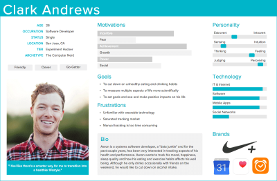
Based on the product research results, UX designers can identify key user groups and create representative personas. Personas are fictional characters created to represent the different user types that might use a product in a similar way. The purpose of personas is to create reliable and realistic representations of the key audience segments for reference. Once created, personas help product teams to understand the users’ goals in specific contexts, which is particularly useful during ideation.
Tips:
- Base the persona on real data.
It can be tempting to invent some details about personas to make them attractive. Avoid that temptation. Every bit of the information in the persona should be based on the research. If you don’t have some information, do research to fill in the gap. - Avoid using real names or details of research participants or people you know.
This can bias the objectivity of your personas. (You’ll end up focusing on designing for this person, rather than a group of people with similar characteristics.)
If you want to read more information on personas, consider reading “Putting Personas to Work in UX Design: What They Are and Why They’re Important”
Empathy Map
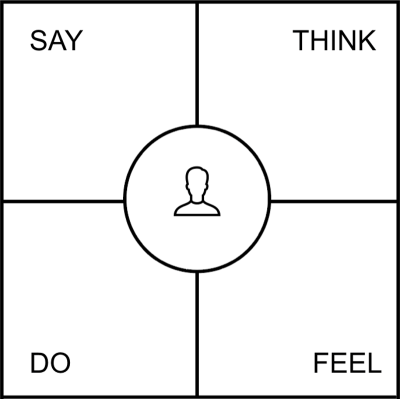
An empathy map is a visualization tool used to articulate what a product team knows about the user. This tool helps a product team build a broader understanding of the “why” behind user needs and wants. It forces product teams to shift their focus from the product they want to build to the people who will use the product. As a team identifies what they know about the user and then places this information on a chart, they gain a more holistic view of the user’s world and the problem or opportunity space.
Tip:
- Turn your empathy map into a poster.
It’s possible to create a nice reminder of what is user thinking or feeling by turning the empathy map into a poster. Create a few copies of the map and hang them around the office. This helps to ensure the user remains on people’s minds as they work.

4. Ideation
The ideation phase is a time when team members brainstorm on a range of creative ideas that address the project goals. During this phase, it’s critical not only to generate ideas but also to confirm that the most important design assumptions are valid.
Product teams have a lot of techniques for ideation — from sketching, which is very helpful for visualizing what some aspects of the design will look like, to storyboarding, which is used to visualize the overall interactions with a product.
Generate Ideas (How Users Will Interact With A Product)
User Journey Mapping
A user journey map is a visualization of the process that a person goes through in order to accomplish a goal. Typically, it’s presented as a series of steps in which a person interacts with a product.
A user journey can take a wide variety of forms depending on the context and business goals. In its most basic form, a user journey is presented as a series of user steps and actions in a timeline skeleton. Such a layout makes it easier for all team members to understand and follow the user’s narrative.
A simple user journey reflects only one possible path during one scenario:
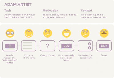
A complex user journey can encompass experiences occurring at different time sessions and scenarios:

Tip:
- Don’t make user journeys too complex.
While designing a user journey it is easy to get caught up in the multiple routes a user might take. Unfortunately, this often leads to busy user journeys. Focus on creating a simple, linear journey (the ideal way to get users to the given goal).
Scenarios And Storyboards
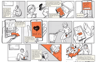
After you’ve identified personas, you can write scenarios of interactions. A scenario is a narrative describing a day in the life of a persona, including how a product fits into their life. A storyboard presents the user’s story in a visual way — similar to a movie or comic. It can help product designers understand how people interact with a product in real life, giving designers a clear sense of what’s really important to users.
Tips:
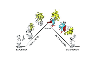
- Build a strong narrative.
The narrative in the story should focus on a goal the character is trying to achieve. All too often, designers jump right into explaining the details of their design before explaining the backstory. Avoid this. Your story should be structured and should have an obvious beginning, middle and end.
- Design a clear outcome.
Make sure your storyboard leaves the audience with no doubt about the outcome of the story. If you’re describing an unfavorable situation, end with the full weight of the problem; if you’re presenting a solution, end with the benefits of that solution for your character.
You’ll find more tips on how to create storyboards in the article “The Role of Storyboarding in UX Design.”
User Stories
A user story is a simple description of something that the user wants to accomplish by using a product. Here is a template for user stories:

Tip:
- Use user stories to prevent feature creep.
Feature creep is the tendency to add more features than a product requires. When designing a product, try to refuse adding any feature without a user story that explains why that particular feature matters.
Job Stories
A job story is a way to describe features. It’s a description of a feature from a jobs-to-be-done perspective. A job story is an effective technique for defining a problem without being prescriptive of a solution.

Tip:
- Define problems worth solving.
At some point, you’ll have several jobs (problems) that you want to create solutions for. Identify which of those problems have the most substantial impact on the user experience or your business goals.
Plan The Structure Of A Product
Information Architecture
Information architecture (IA) is the structure of a website, app or other product. It enables users to understand where they are and where the information they want is in relation to their current position. Information architecture results in the creation of navigation, hierarchies and categorizations. For example, when a UX designer sketches a top-level menu to help users understand where they are on a website, they’re practicing information architecture.
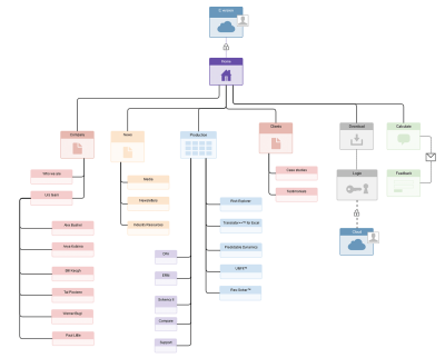
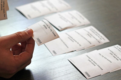
Information architecture would benefit from the involvement of users in the IA development process. Product teams typically use a technique called card sorting for this purpose. Designers ask users to organize items (major features or topics of the product) into groups and assign categories to each group. This method helps you find out how users expect to see information grouped on a website or in an app.
Tip:
- It’s possible to conduct a card-sorting session online.
Online card-sorting tools allow for easier scaling to a higher number of study participants. One of the most popular online tools is OptimalSort (which is free for card-sorting studies with up to 10 participants).
Generate Ideas (What Will The User Interface Look Like)
Sketching
Sketching is the easiest way to visualize ideas. Drawing by hand is a fast way to visualize a concept — enabling the designer to visualize a broad range of design solutions before deciding which one to stick with.

Tip:
- Use a stencil when sketching user interfaces.
When you sketch on paper, it can sometimes be hard to imagine how certain UI element will look like at a realistic size. Using a stencil, it’s possible to draw elements for the actual size of the device you’re designing for. This is especially great when you need to understand whether a UI element you’ve just drawn is large enough for interaction.

Wireframing
A wireframe is a visual guide that represents a page’s structure, as well as its hierarchy and key elements. Wireframes are useful for discussing ideas with team members and stakeholders, and to assist the work of visual designers and developers. Wireframing acts as the backbone of the product — designers often use them as skeletons for mockups.
Wireframes can be presented in the form of sketches:

Wireframes can also be presented as digital illustrations:

Tips:
- Keep wireframes simple, and annotate them.
The aim of a wireframe is to show the structure of a page’s design — all other details come later. When presenting a wireframe to teams, try to include annotations. Annotations help to create context and quickly deliver key ideas. - Don’t use wireframes for product testing.
Wireframes are hardly used for product testing. Even though they help designers gather feedback on design during initial research, they don’t replace actual interaction with a product (through an interactive prototype).
Validate Ideas
There are two types of ideas: good ideas that lead \to product success, and bad ideas that can lead to failure. Of course, design execution is important, but the idea itself plays a crucial role in the process. A well-executed bad idea is a big waste of time and energy. It’s critical to reveal bad ideas as early as possible. So, how do you distinguish a good idea from a bad one? A technique called a design sprint can help you with that.
Design Sprint
A design sprint is a five-day design framework for validating ideas and solving challenges. It enables product teams to build a prototype that they can put in front of users to validate the initial design hypothesis (to see if it solves the problem for the user).
Design sprints are a process of quickly creating a product’s future state, be it a website or app, and validating it with a group of users, stakeholders, developers and other designers. This whole concept is based on the idea that, by a design team setting a direction and iterating rapidly, it’s possible to design a product that presents the maximum value for people who will use it.

Tip:
- Don’t get stuck with the first solution that comes to mind.
In most cases, your first ideas won’t be good enough, because at the early stage of ideation, you won’t yet have a good understanding of the problem you’re trying to solve. Generate as many different designs as possible instead of focusing solely on your first solution.
5. Design
After the ideation phase, the product team should have a clear understanding of what they want to build. During the design phase, the product team will begin to create the solution to solve the client’s problem and implement concepts.
Prototyping
To deliver a good user experience, prototyping must be a part of your design process. A prototype is an experimental model of an idea that enables you to test it before building the full solution. A prototype often starts small, with you designing a few core parts of a product (such as key user flows) and grows in breadth and depth over multiple iterations as required areas are built out. The finalized version of a prototype is handed off for development.
When it comes to prototyping, efficiency is vital. One of the most efficient prototyping processes is rapid prototyping. The process of rapid prototyping can be presented as a cycle with three stages:
- Prototyping
Creating a solution that can be reviewed and tested. - Reviewing
Giving your prototype to users and stakeholders and gathering feedback that helps you understand what’s working well and what isn’t. - Refining
Based on feedback, identify areas that need to be refined or clarified. The list of refinements will form the scope of work for your next design iteration.

Prototypes range from rough sketches on a piece of paper (low-fidelity prototypes) to interactive simulations that look and function like a real product (high-fidelity prototypes). Depending on the stage of the design process and the goals of the prototype, you’ll need to select the appropriate prototyping technique. It’s crucial to choose the method of prototyping that minimizes work and maximizes learning.
Paper Prototyping
A lot of digital prototyping tools today help us to create prototypes with the least possible amount of effort, but sketching on a paper still remains the most important tool for any designer. That’s because sketching allows designers to quickly explore a lot of different design alternatives without investing much time and energy in each one. It forces designers to concentrate on the essence of a product’s design (what it does), rather than its aesthetics (how it looks). And what’s especially great about sketching is that it opens up design to everyone — anyone can sketch, and no special tools are required. The fact that anyone can participate in the design process makes sketching an ideal tool during brainstorming sessions.

Tip:
- Paper prototyping allows for rapid experimentation.
Different user interface elements can be drawn, cut out, copied to make extras, and then assembled on a new piece of paper. Digital Prototyping With paper prototyping, explaining complex interactions in words can be tough. When a designer needs to explain a complex design detail such as an animation to a developer or wants to run a user research session to validate a design, they usually use a digital interactive prototype.
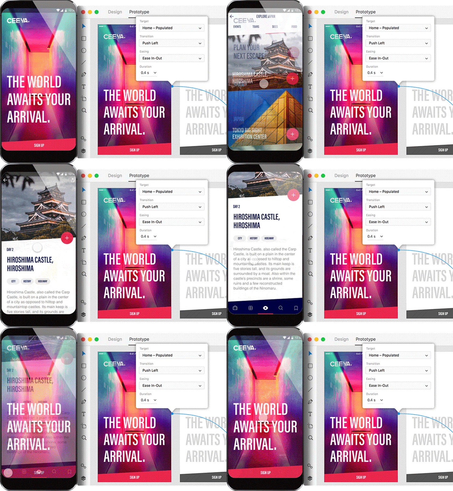
Digital prototyping is the process of creating an interactive design that other people can experience themselves. Just a decade ago, in order to build a high-fidelity prototype, you actually had to code the solution using programming language. These days, prototyping tools allow non-technical designers to create high-fidelity prototypes that simulate the functionality of a final product in just a few clicks.
Tips:
- Avoid dummy text.
Dummy text, like lorem ipsum, should be avoided in early stages of digital prototyping. Use real content to understand how it affects the overall design. - Use digital prototypes as an up-to-date specification for developers.
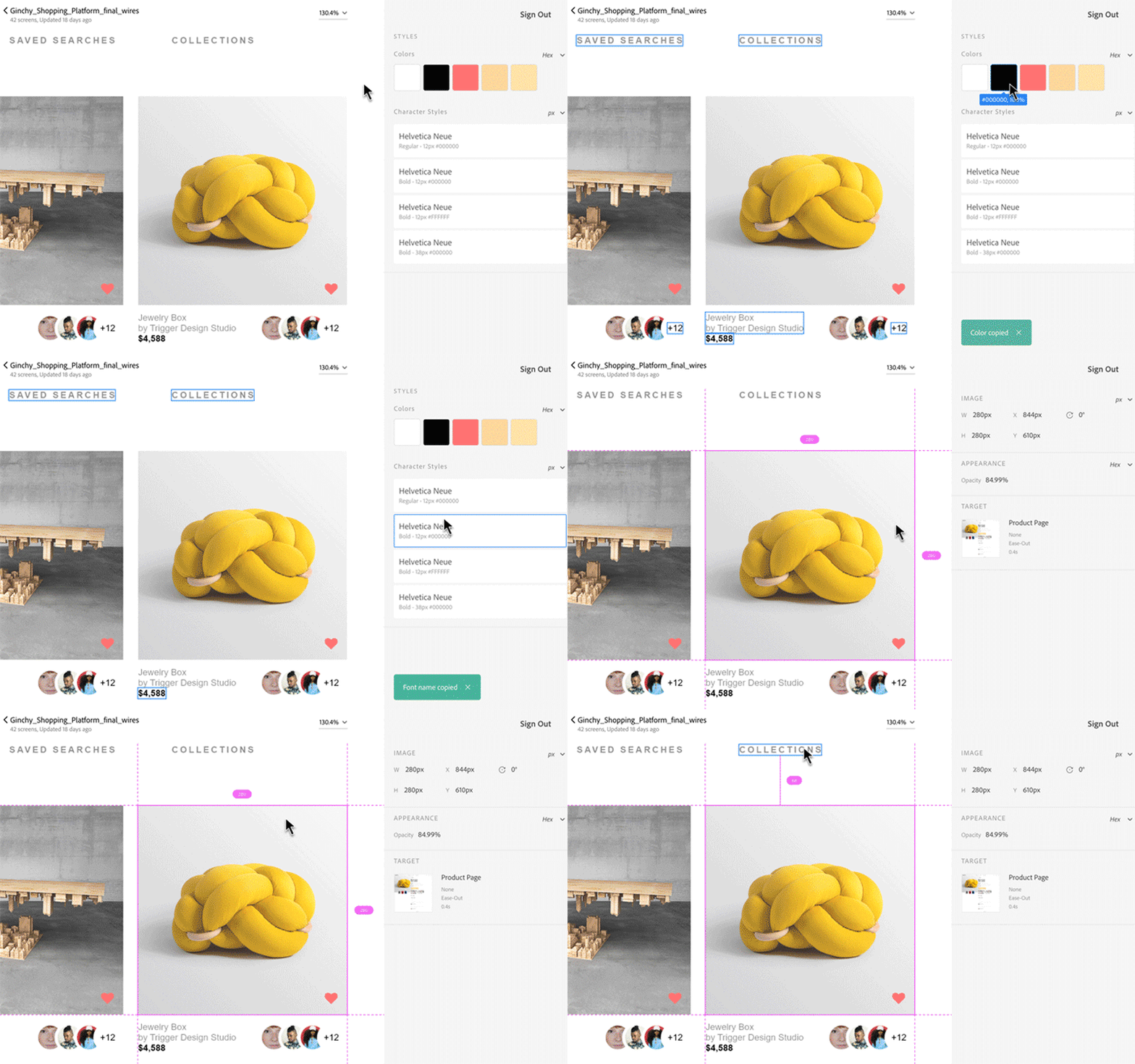
Prototyping tools such as Adobe XD allow you to spit out specification documentation in just a few clicks. It’s an always up-to-date specification available to developers.
Design Handoff
At the end of the prototyping phase, the design will be ready for production. It’s the time when the designer hands over the design to a developer for coding. During the developer handoff, a designer must clearly communicate to the developer how every piece of the design looks and works. Multiple layers of information and detail need to be conveyed, and it’s critical for designers and developers to be on the same page.
Design Specification
Design specs are detailed documents that provide information about a product, such as user interface design details (colors, character styles and measurements) and information (flows, behaviors and functionality). A developer uses this document to take the design into production and build the product to the designer’s specifications.

Read “Design Specifications: Speeding Up the Design to Development Workflow and Improving Productivity” for more information about design specifications.
6. Testing And Validation
The testing and validation phase helps a product team ensure the design concept works as intended. Product testing is an art in itself. Do it wrong and you’ll learn nothing. Do it right and you might get incredible, unexpected insights that might even change your product strategy.
Usually, the validation phase starts when the high-fidelity design is fleshed out. Similar to the product research phase, this phase also varies between projects.
Testing With The Product Team
It’s possible to conduct limited testing for the product using resources you already have — your team.
Dogfooding
“Eating your own dog food” is a popular technique of testing. Once the design team has iterated on the product to the point where it’s usable, testing it in-house is a great way to find the most critical issues.
Tip:
- Practice dogfooding to develop empathy among your team.
Testing With Real Users
Usability Testing
According to the Nielsen Norman Group, if you want to select just one type of user research for your project, it should be qualitative usability testing. The basic idea behind a usability test is to check whether the design of a product works well with the target users. It’s relatively easy to test a concept with representative users: Once an interactive version of a product idea is in the hands of real users, a product team will be able to see how the target audience uses the product. The primary goal of this user experience testing method is to identify usability problems, collect qualitative data, and determine the participants’ overall satisfaction with the product. Gathering and analyzing verbal and non-verbal feedback from the user helps a product team create a better user experience.
Usability testing is often done formally (where a researcher creates a screener, hires participants, has them come into the lab environment, records the session, etc.).

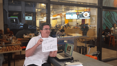
Usability testing can also be done informally — in the format of guerrilla testing. With guerrilla testing, a product tester goes to the nearest coffee shop, finds participants, asks them to play with a product for 10 minutes, and then gives them a small treat as a thank you.
Tip:
- You don’t need a lot of test participants.
According to Jakob Nielsen’s research, up to 85% of core usability problems can be found by observing just five people using the product.
Read the article “Simple Tips to Improve User Testing” for more information on usability testing.
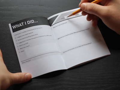
Diary Study
A diary study can be used to see how users interact with a product over an extended period of time (ranging from a few days to even a month or longer). During this period, study participants are asked to keep a diary and to log specific information about their activities. Usually, the diary includes open-ended questions such as:
- Where were you when using the product?
- What tasks did you hope to achieve?
- Did something frustrate you?
A diary study helps a researcher find answers to questions like:
- What are users’ primary tasks?
- What are their workflows for completing complex tasks?
The answers provide organic behavioral insights and help develop a rich understanding of a participant’s context and environment.
Tips:
- Create clear and detailed instructions for logging.
Be as specific as possible about what information you need participants to log. - Remind study participants about logging.
Prompt participants to fill in their diary (for example, through a daily notification). - Make it possible to add screenshots to a diary.
If you use a digital version of a diary, make it possible for participants to upload screenshots. Screenshots are a nice supplement for user data and will help you with future data analysis.
7. Post-Launch Activities
Just because a product officially launches doesn’t mean the product design is over. In fact, product design is an ongoing process that continues for as long as a product’s in use. The team will learn and improve the product.
Understand How Users Interact With The Product
Metrics Analysis
You need to know how users are using your product out in the wild — and that’s where analytics come in. Numbers provided by an analytics tool (clicks, navigation time, bounce rates, search queries, etc.) can be used to understand how people are actually using your product. Metrics can also uncover unexpected behaviors that are not explicit in user tests. Product team must continually track product performance to see if it meets customer satisfaction and if any improvements can be made.

Tips:
- Use analytical tools.
Powerful tools such as Google Analytics and Hotjar can be used to understand user behaviors. - Don’t rely solely on analytics.
You can’t determine the effectiveness of a product’s design based solely on analytics. To validate the analytical insights, you should conduct further hallway tests.
Feedback From Users
The best way to avoid having to rework a product is to inject feedback into the process. Regular user feedback (in the form of online surveys or analysis of customer support tickets) should be at the heart of the product design process. This information will drive product refinement.
Tip:
- Don’t make it hard for users to provide feedback.
Don’t hide the “Leave feedback” option. Make it easy and, if possible, rewarding for users to share their feelings and ideas about your product.
Testing Changes In Design
A/B Testing
An A/B test is an appropriate testing method when designers are struggling to choose between two competing elements. This testing method consists of showing one of two versions randomly to an equal number of users and then reviewing analytics to see which version accomplished the specific goal more efficiently.
Tip:
- Get into the habit of A/B testing your design changes.
Knowing that all of your changes will be A/B tested will give you a tremendous amount of freedom to try new (and potentially risky) things. You won’t have to worry that some change you’ve made will ruin everything.
Four Essential Things To Remember About Product Design
1. The Process Should Morph To Fit The Project
When it comes to product design process, there’s no one-size-fits-all solution. The process employed should be tailored to fit the project’s particular needs, both business and functional. Here are just a few factors that can affect the design process:
- customer’s needs or preferences;
- how much time you have (the project’s deadline);
- project’s budget (for example, a limited budget won’t allow you to conduct a lot of interviews).
A process tailored to the capabilities of the business and of users is most effective. Thus, use what works the best for your project, get rid of the rest, and evolve your design process as the product evolves.
2. Product Design Is Not A Linear Process
A lot of product teams think design is a linear process that starts with defining the product and ends with testing. But that assumption is wrong. The phases of the process often have considerable overlap, and usually there’s a lot of back and forth. As product teams learn more about the problem being solved, the users and the details of the project (especially the constraints), it may be necessary to revisit some of the research undertaken or try out new design ideas.
3. Product Design Is A Never-Ending Process
Unlike more traditional forms of design (such as print design), the design process for digital products isn’t a one-time thing, and designers should never assume they’ll get everything perfect right from the start. Implementation often reveals gaps in the design (for example, bad assumptions about product usage, which are hard to predict without shipping the product).
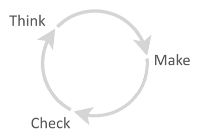
To design successful products, teams need to adopt a process of continual improvement. Iterative design follows the idea that design should be done in repeated cycles: It’s a process of constantly refining and improving the product based on both qualitative and quantitative feedback data from your users. This is a great opportunity for designers to see the bigger picture, improve their work based on user feedback and make the product inherently more valuable to users.
4. Product Design Is Based On Communication
While doing great design is one thing, communicating great design is equally as important. The best concepts will fail if they don’t get approval from the team and stakeholders. That’s why the best product designers are great communicators.
Conclusion
The most important thing to remember when designing products is that design is for people. To design great products, you must deliver the right features, with the right user experience for the right people. Thus, define your target audience, then research their problems, and, finally, focus on building a product that solves those problems!
This article is part of the UX design series sponsored by Adobe. Adobe XD tool is made for a fast and fluid UX design process, as it lets you go from idea to prototype faster. Design, prototype and share — all in one app. You can check out more inspiring projects created with Adobe XD on Behance, and also sign up for the Adobe experience design newsletter to stay updated and informed on the latest trends and insights for UX/UI design.
Further Reading
- Crafting A Killer Brand Identity For A Digital Product
- The Feature Trap: Why Feature Centricity Is Harming Your Product
- Getting Started With Neon Branching
- Using Friction As A Feature In Machine Learning Algorithms

