Ghost Button Design: Is This Really Still A Thing (And Why)?
For such a small design element, buttons sure are a complicated one to tackle. It makes sense, what with call-to-action buttons serving as the next step in your visitors’ path to conversion. Mess that up and you might as well say “bye-bye” to business.
Though we have a good understanding of the types of button design rules that universally work, there will be times when you’re surprised by a rogue element that performs well. Like ghost buttons.
How To Design Better Buttons
Buttons are a common element of interaction design. While they may seem like a very simple UI element, they are still one of the most important ones to create. Read a related article →
Ghost buttons aren’t much of a mystery, despite their eerie-sounding name. They’re call-to-action (CTA) buttons for your website, like any other. The key difference is in how they look.
This Dropbox tooltip is a great example of how a traditional button looks compared to a ghost button:
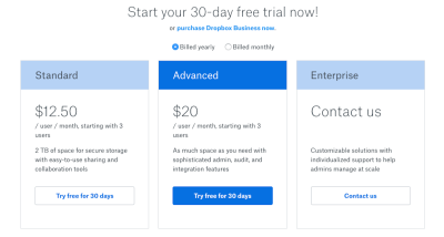
The blue button in the center is the standard flat design button we’re accustomed to. The outlined transparent buttons on the left and right are ghost buttons.
Logic would dictate that ghost buttons are no good for web design because they don’t appear to be tangible or clickable, and they’re devoid of the attention-grabbing elements of traditional buttons. Yet, research shows us that visitors don’t necessarily see them that way.
What I’d like to do today is talk about the known pros and cons of ghost button design and then delve into some case studies in order to set the record straight.
What We Know About The Ghost Button
Web design bloggers spend a lot of time talking about how to design better buttons. In these guides, they try to make sense of the questions that so often plague web designers and developers:
- What colors will attract the most attention? Or even the right kind of attention?
- What about size? Does it matter?
- What should the message say in the button?
- How about the text placed around it?
- Should the button be designed the same way for both desktop and mobile experiences? Or would it interfere with the thumb zone?
Regardless of how you feel about ghost buttons in web design, you likely ask yourself these same questions when it comes time to using them.
Before we explore what the research says, let’s examine the pros and cons of this design element.
Ghost Button Cons
There are a number of arguments against ghost buttons, and, to be honest, they’re valid. That’s not to say, of course, that I’m against the use of ghost buttons in web design. I just believe that there are very specific use cases in which they actually work well. So, let’s get the bad stuff out of the way and then focus on what we can do to actually get more conversions out of them.
Simplicity
The reason why CTAs are often designed with bold colors is to easily guide visitors’ eyes to the parts of the website where we want them to engage. But a ghost button is colored only in the thin outline of the button and the text inside. Because color is applied only to these elements, it won’t be a major factor in drawing anyone’s attention to the button. Other elements will have to come into play, like animation or the placement of other eye-catching graphics or companion CTAs near it.
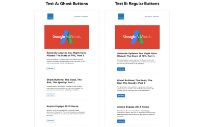
I think this A/B test from Elevated Third is a good example of how ghost buttons can fail to impress when used as the primary button design — whether on a website or in email.
Familiarity
We’ve conditioned visitors to look for the traditionally bold and filled-in button design when they’re ready to move on to the next page or step. In some cases, those buttons are strategically designed with shadows and 3D effects to make them look like buttons that can actually be pressed. Ghost buttons take away that familiarity and require visitors to adjust their brains to look for something new.
Readability
Whereas traditional CTAs can use a bright color for the button and a lighter color for the text, ghost buttons don’t have that flexibility. Instead, they have to rely on a darker and easily readable font color, which limits the choice of colors that can be used.
Transparency
The transparency of a ghost button can be problematic if you don’t think through what exactly it’s sitting on top of. While the button might look fine when you’re testing a new design in your desktop’s browser, the button might sit atop a busy image on smaller screens and compromise the readability of the message within. The same goes for parallax scrolling, where an image might move behind the button and, again, make it difficult to find the button on the page or to read it.
If you’d like to see an example of the above three cons in action—familiarity, readability and transparency—pay close attention to the Fresh Egg research examples provided in the case study further below. They are clear demonstrations of how ghost buttons should never be used.
Location
One of the nice things about traditional buttons is that there’s leeway in where you place them on a website. With ghost buttons, however, you don’t want to run the risk of them getting lost in the shuffle, which means you need to place them in predictable locations.
This isn’t a matter of above the fold or below the fold, as you will see in the examples below. Rather, it’s about context. The most common area you’ll find ghost buttons is centered beneath the main text in the home page header. They also work well when placed directly under short, descriptive blurbs.
Ghost Button Pros
Obviously, none of the cons mentioned above will be shocking to you. When you work with such a simple design element, there are bound to be tradeoffs. That being said, you can achieve some neat things in your design with ghost buttons. It’s simply a matter of understanding what their strengths are and playing to them.
Minimalism
Ever wonder where the ghost button design comes from? Well, most people attribute it to the release of iOS 7 at the end of 2013. With Apple’s decision to go with a simpler and flatter UI, the ghost button’s design was seemingly a natural evolution from that.
With minimalism, the focus is less on stuffing websites with as much information as possible and more on developing clean and simple aesthetics that highlight concise yet powerful messaging.
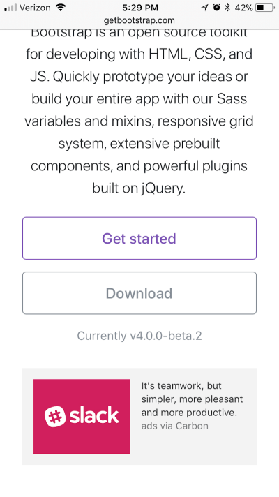
Bootstrap’s use of ghost buttons throughout its design is a beautiful example of this minimalist practice in action:
Professionalism
There’s something quite logical and professional-looking about ghost buttons. Take Neil Patel’s website, for example:
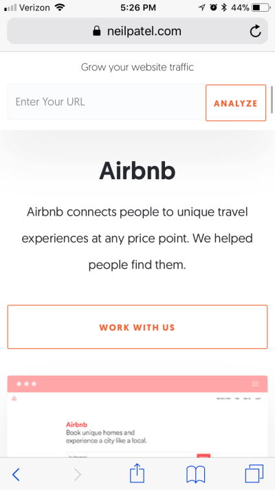
I would suggest that ghost buttons are best suited to professional business websites because of this very fact. On a business website, you won’t find large swatches of bold, funky colors to detract from the company’s message or to compete with surrounding visuals. Instead, ghost buttons are unobtrusive and ready to be engaged with once a visitor has made up their mind.
Size
When placing a CTA on your website, think about the ideal size for it — especially on mobile. Will it be too small to be seen? Will it be too large and obtrusive in that space? And what about clickability? With bold buttons, it’s sometimes better to play it safe with the size because you don’t want to add unnecessary distraction or friction to the UX.
With ghost buttons, though, size isn’t really an issue. For instance, check out this Samsung example:
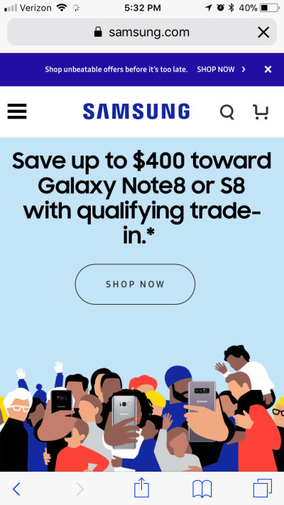
See how large it is, without compromising your ability to focus on the message above it or the fun graphic below? Now, look at how its competitor LG handles the solid CTA on its website:
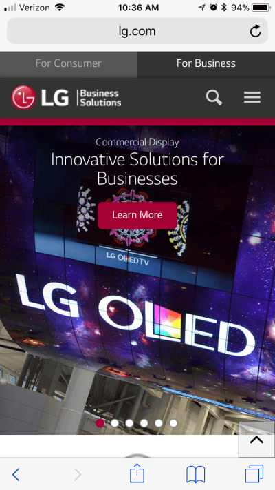
There’s a distinct difference in size, and it likely has to do with how the button is designed and filled.
Frictionless
There might be some cases where you don’t want your CTA to stand up and scream, “Look at me!” Of course, you want people to click on the button, but perhaps you’d like them to ingest the content around it before doing so.
Asana has a good example of this on its website:
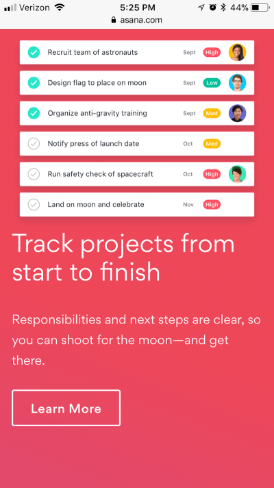
This goes to show that buttons don’t always have to be in your face, especially if the surrounding text and images make it perfectly clear that the next step is to click that button.
Animation
When you’re unsure of how to bring a design to life, functional animation is always a smart choice. It gives your design elements a fun element of surprise, while aligning with the order and logic you’ve established elsewhere. Ghost buttons are one such element that would benefit from this type of subtle animation.
In case you hadn’t noticed, Smashing Magazine has a couple of cool examples of these types of animated ghost buttons.
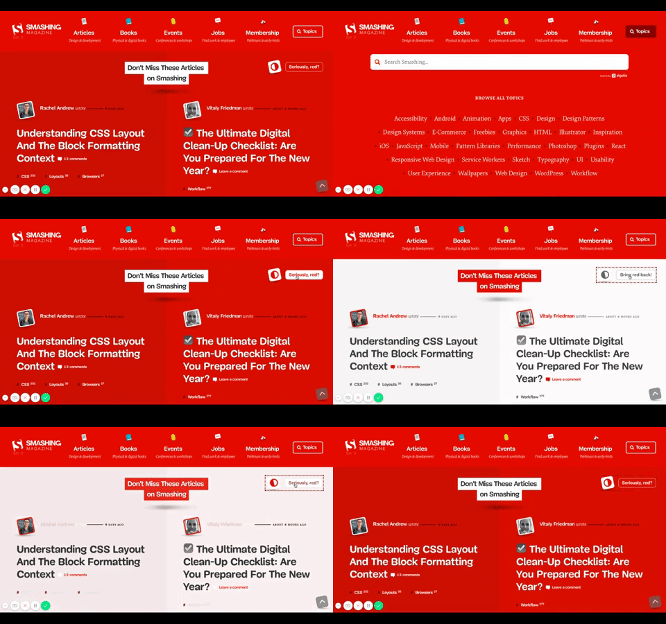
As you can see, the animation provides a sort of feedback and confirmation to users, saying, “Yes, this is indeed a button, and if you click on it, it will take you somewhere worthwhile.”
Author Haruki Murakami’s website has a nice example of how to animate ghost buttons.
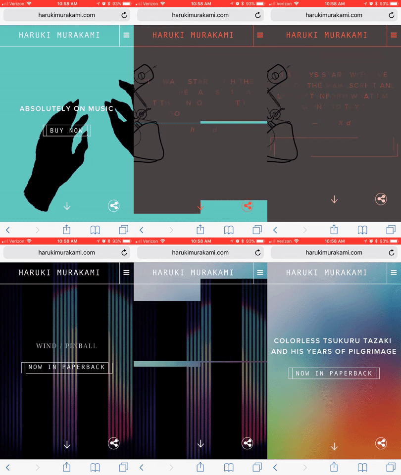
This one is less about providing feedback for an action taken and more about keeping the visitor engaged as they transition from page to page.
Multiple CTAs
Usually, I am against the use of multiple CTAs within a single area, especially in mobile UX. Space is limited enough as it is. There’s also the problem of giving visitors too many options to choose from. However, ghost buttons don’t have these problems because they leave such a minimal footprint and usually aren’t a heavy distraction from the rest of the website.

See how there are two CTAs at the very top of the website? The orange button is clearly meant to be the primary CTA, while the ghost button is there as a secondary option.
Google Maps has another good example of this:
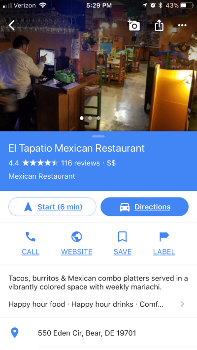
The two side-by-side buttons in this case aren’t necessarily meant to be primary and secondary options, though. Instead, the ghost button is meant simply to serve as a contrast for when two similarly designed buttons are placed next to each other.
Apple often uses ghost buttons in its app designs, too. In this case, however, they function as a toggle:
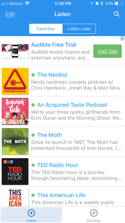
When a page or tab is not currently open, the ghost button indicates its inactive state.
Ghost Button Tests: What The Research Says
OK, we’ve looked at the good and the bad of ghost buttons. But, in practice, what do they actually do? Are they effective in getting visitors to convert? Here is what the research says.
Test 1: SEEK’s Secondary Buttons
UX designer and researcher Kayla J. Heffernan of SEEK decided to test whether ghost buttons are as bad as some designers believe them to be. In the first A/B test she conducted, four variations were pitted against one another:

During this test, she was surprised to find that the solid blue button and the blue ghost button stayed neck and neck throughout the campaign.
Having ruled out the pink and and gray buttons as viable CTA design choices, she set forth with a second A/B test:
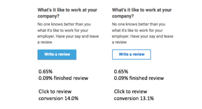
At the end of the test, Kayla and her team found that, again, both the solid blue and the ghost blue buttons resulted in similar clickthrough rates. The only difference was in the number of conversions each received, with the solid blue button garnering 14% and the ghost button 13.1%.
Conclusion
After reviewing the results, Kayla decided not to change the primary CTA button design from the brand’s pink to the blue or ghost button winners of the test. This is mainly because the test was conducted on a secondary button (to “Write a review,” instead of something like “Buy now”). That said, she does believe that ghost buttons would be helpful in offsetting an overabundance of primary buttons on a page, which could otherwise lead to too much competition on a single page and a negative response from visitors.
Test 2: TruConversion’s Landing-Page Buttons
On this single landing page are three differently styled CTA buttons:
- a big, clickable green “Claim Your Free Copy” button;
- a small, flat black “Claim Your Free Copy” button;
- a small black-outlined red-texted “Look Inside” button.
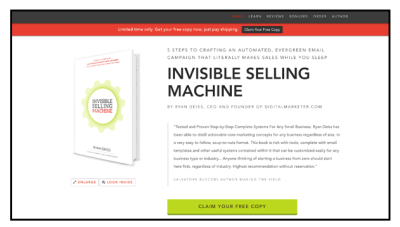
TruConversion was curious to see how each of these competing buttons would perform on the same page. It used a heat map to determine which button visitors were drawn to the most:
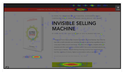
Unsurprisingly, the big green button received the most clicks, with 38.68% of all total clicks on the page. What was most surprising to the researchers, though, was that the black button — which was in a sticky bar that followed visitors no matter where they scrolled down the page — got only 5.22% of clicks.
The ghost button, which was only meant to be a secondary CTA, got 7.9% of clicks on desktop — much more than what the researchers expected to see. It’s important to note, however, that when the landing page was viewed on mobile, the “Look Inside” ghost button received the fewest clicks from users.
Conclusion
Justin Rondeau backs up Heffernan’s hypothesis that ghost buttons make for a great secondary button on websites. When you have a main initiative to push but don’t want other clickable elements to distract from that, a ghost button is a smart choice. Users will know it’s there, and they can interact with it when they decide that it would be beneficial to their decision-making process.
That said, Rondeau stresses that you really have to consider what that decision-making process entails, especially when it comes to the device on which the website is being viewed. While desktop users might want more details about a product before purchasing, mobile users tend to be in a hurry and just want to commit or cut and run. So, think about that before adding an extra CTA to the mobile experience.
Test 3: Fresh Egg’s Ghost Versus Solid Buttons
Before showing what these three Fresh Egg tests consist of, I should point out that I think the results were rigged in favor of the solid buttons. As noted earlier in the pros and cons, you have to be careful with how you use ghost buttons because of their transparency. In the examples below, the ghost buttons were placed against backgrounds that aren’t ideal for this type of design.
That said, I think these tests serve as a good example of what not to do with ghost buttons, which is why I want to share them with you.
Fresh Egg began with its own website. It conducted an A/B test on the following:

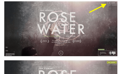
In its second test on ghost buttons versus solid buttons, Fresh Egg ran a click test on three websites, in spots that heat map testing indicated was a hub of activity for users. It wanted to know how long it actually took users to find and click on a button.
It looked at the speed of clicking, as well as the level of attention, in the top-right corner of this website:
Fresh Egg examined the speed of clicks in the subheader of this page:
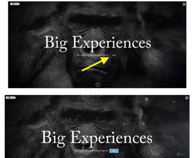
And the same for the CTA below the header of this one:
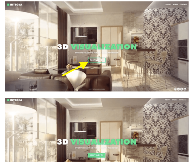
It’s no surprise that, as Fresh Egg discovered, the ghost buttons performed poorly:
- They got significantly fewer clicks.
- They were more difficult to find than solid buttons, which meant lower clickthrough rates.
- The error rate in trying to find a button and then clicking it increased with ghost buttons.
- They also attracted a lot less attention than solid buttons.
Conclusion
As I mentioned, I believe these were not the right types of designs for ghost buttons — and I think the people at Fresh Egg realized this. When you place something so simple, unresponsive (i.e. lacking in animation, not mobile-friendliness) and devoid of color on top of dark and complicated background designs, you can’t expect visitors to notice it.
In reviewing the statistics, Fresh Egg did conclude that context matters. Ghost buttons might have failed these tests, but that doesn’t mean they wouldn’t do well when used as secondary CTAs or in a design that is more compatible with the simplicity of ghost buttons.
Conclusion: Use Ghost Buttons In The Right Context
As you can see from the list of pros as well as the supporting research, ghost buttons aren’t always a bad thing. In fact, in some cases, ghost buttons prove to be just as effective as solid buttons in gaining clicks and conversions from users. While those cases are usually where the ghost button is a secondary clickable element (i.e. an element that you don’t necessarily want visitors to click right away), it’s still effective in its purpose.
As I said, button design is complicated. However, once you’ve nailed a design that results in clicks and conversions, you can rest easy, right?
Of course not. You’ll still need to constantly review the analytics, assess your design, test alternate options, rinse and repeat. With web design trends changing as often as they do, it’s the only way you can really stay ahead of the curve. And that’s why I believe that ghost buttons are worth considering as you tackle new projects.
To sum up, I don’t think that ghost buttons are right for every website. The best ghost button designs I’ve seen are almost always on business or SaaS websites (as opposed to personal blogs, freelancer portfolios, e-commerce websites, news aggregators, etc.). The simplicity of the button design goes a long way to creating a beautiful and tidy style for a company that doesn’t want to be too in-your-face with its CTAs.
Also, ghost buttons are a fantastic choice as a secondary CTA. For a while, I had argued against placing more than one button in any given location of a website or app. But I think that a ghost button is a brilliant choice if you want the other button to get more clicks. I also think it works well as a complementary FYI-type of button. You are essentially saying to the user, “If you want to get the goods, click on the big bold button. But if you’re on the fence, then go with this other button for more details.”
Ultimately, it comes down to using the ghost button in the right time and place. It’s a matter of determining what your buttons communicate to visitors and whether that’s the message you want to send them.
Further Reading
- Designing Age-Inclusive Products: Guidelines And Best Practices
- Rethinking Authentication UX
- Practical Design Tips And Guidelines For Beginner Designers
- Designing Web Design Documentation


 Register Free Now
 SurveyJS: White-Label Survey Solution for Your JS App


 Celebrating 10 million developers

