How BBC Interactive Content Works Across AMP, Apps, And The Web
In the Visual Journalism team at the BBC, we produce exciting visual, engaging and interactive content, ranging from calculators to visualizations new storytelling formats.
Each application is a unique challenge to produce in its own right, but even more so when you consider that we have to deploy most projects in many different languages. Our content has to work not only on the BBC News and Sports websites but on their equivalent apps on iOS and Android, as well as on third-party sites which consume BBC content.
Now consider that there is an increasing array of new platforms such as AMP, Facebook Instant Articles, and Apple News. Each platform has its own limitations and proprietary publishing mechanism. Creating interactive content that works across all of these environments is a real challenge. I’m going to describe how we’ve approached the problem at the BBC.
Example: Canonical Vs. AMP
This is all a bit theoretical until you see it in action, so let’s delve straight into an example.
Here is a BBC article containing Visual Journalism content:
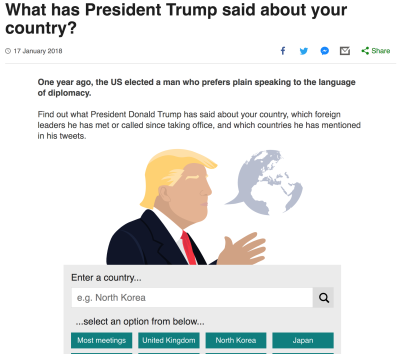
This is the canonical version of the article, i.e., the default version, which you’ll get if you navigate to the article from the homepage.
Now let’s look at the AMP version of the article:
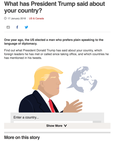
While the canonical and AMP versions look the same, they are actually two different endpoints with different behavior:
- The canonical version scrolls you to your chosen country when you submit the form.
- The AMP version doesn’t scroll you, as you cannot scroll the parent page from within an AMP iframe.
- The AMP version shows a cropped iframe with a ‘Show More’ button, depending on viewport size and scroll position. This is a feature of AMP.
As well as the canonical and AMP versions of this article, this project was also shipped to the News App, which is yet another platform with its own intricacies and limitations. So how do we do support all of these platforms?
Tooling Is Key
We don’t build our content from scratch. We have a Yeoman-based scaffold which uses Node to generate a boilerplate project with a single command.
New projects come with Webpack, SASS, deployment and a componentization structure out of the box. Internationalization is also baked into our projects, using a Handlebars templating system. Tom Maslen writes about this in detail in his post, 13 tips for making responsive web design multi-lingual.
Out of the box, this works pretty well for compiling for one platform but we need to support multiple platforms. Let’s delve into some code.
Embed Vs. Standalone
In Visual Journalism, we sometimes output our content inside an iframe so that it can be a self-contained “embed” in an article, unaffected by the global scripting and styling. An example of this is the Donald Trump interactive embedded in the canonical example earlier in this article.
On the other hand, sometimes we output our content as raw HTML. We only do this when we have control over the whole page or if we require really responsive scroll interaction. Let’s call these our “embed” and “standalone” outputs respectively.
Let’s imagine how we might build the “Will a robot take your job?” interactive in both the “embed” and “standalone” formats.
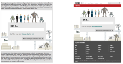
Both versions of the content would share the vast majority of their code, but there would be some crucial differences in the implementation of the JavaScript between the two versions.
For example, look at the ‘Find out my automation risk’ button. When the user hits the submit button, they should be automatically scrolled to their results.
The “standalone” version of the code might look like this:
button.on('click', (e) => {
    window.scrollTo(0, resultsContainer.offsetTop);
});
But if you were building this as “embed” output, you know that your content is inside an iframe, so would need to code it differently:
// inside the iframe
button.on('click', () => {
    window.parent.postMessage({ name: 'scroll', offset: resultsContainer.offsetTop }, '*');
});

// inside the host page
window.addEventListener('message', (event) => {
    if (event.data.name === 'scroll') {
        window.scrollTo(0, iframe.offsetTop + event.data.offset);
    }
});
Also, what if our application needs to go full screen? This is easy enough if you’re in a “standalone” page:
document.body.className += ' fullscreen';
.fullscreen {
    position: fixed;
    top: 0;
    left: 0;
    right: 0;
    bottom: 0;
}
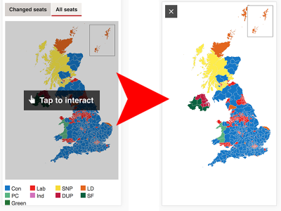
If we tried to do this from inside an “embed,” this same code would have the content scaling to the width and height of the iframe, rather than the viewport:
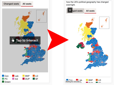
…so in addition to applying the full-screen styling inside the iframe, we have to send a message to the host page to apply styling to the iframe itself:
// iframe
window.parent.postMessage({ name: 'window:toggleFullScreen' }, '*');

// host page
window.addEventListener('message', function () {
    if (event.data.name === 'window:toggleFullScreen') {
       document.getElementById(iframeUid).className += ' fullscreen';
    }
});
This can translate into a lot of spaghetti code when you start supporting multiple platforms:
button.on('click', (e) => {
    if (inStandalonePage()) {
        window.scrollTo(0, resultsContainer.offsetTop);
    }
    else {
        window.parent.postMessage({ name: 'scroll', offset: resultsContainer.offsetTop }, '*');
    }
});
Imagine doing an equivalent of this for every meaningful DOM interaction in your project. Once you’ve finished shuddering, make yourself a relaxing cup of tea, and read on.
Abstraction Is Key
Rather than forcing our developers to handle these conditionals inside their code, we built an abstraction layer between their content and the environment. We call this layer the ‘wrapper.’
Instead of querying the DOM or native browser events directly, we can now proxy our request through the wrapper module.
import wrapper from 'wrapper';
button.on('click', () => {
    wrapper.scrollTo(resultsContainer.offsetTop);
});
Each platform has its own wrapper implementation conforming to a common interface of wrapper methods. The wrapper wraps itself around our content and handles the complexity for us.
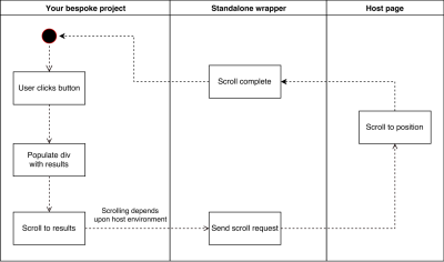
The standalone wrapper’s implementation of the scrollTo function is very simple, passing our argument directly to window.scrollTo under the hood.
Now let’s look at a separate wrapper implementing the same functionality for the iframe:
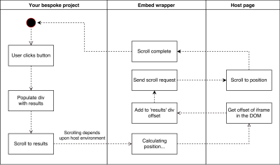
The “embed” wrapper takes the same argument as in the “standalone” example but manipulates the value so that the iframe offset is taken into account. Without this addition, we would have scrolled our user somewhere completely unintended.
The Wrapper Pattern
Using wrappers results in code that is cleaner, more readable and consistent between projects. It also allows for micro-optimisations over time, as we make incremental improvements to the wrappers to make their methods more performant and accessible. Your project can, therefore, benefit from the experience of many developers.
So, what does a wrapper look like?
Wrapper Structure
Each wrapper essentially comprises three things: a Handlebars template, wrapper JS file, and a SASS file denoting wrapper-specific styling. Additionally, there are build tasks which hook into events exposed by the underlying scaffolding so that each wrapper is responsible for its own pre-compilation and cleanup.
This is a simplified view of the embed wrapper:
embed-wrapper/
    templates/
        wrapper.hbs
    js/
        wrapper.js
    scss/
        wrapper.scss
Our underlying scaffolding exposes your main project template as a Handlebars partial, which is consumed by the wrapper. For example, templates/wrapper.hbs might contain:
<div class="bbc-news-vj-wrapper--embed">
    {{>your-application}}
</div>
scss/wrapper.scss contains wrapper-specific styling that your application code shouldn’t need to define itself. The embed wrapper, for example, replicates a lot of BBC News styling inside the iframe.
Finally, js/wrapper.js contains the iframed implementation of the wrapper API, detailed below. It is shipped separately to the project, rather than compiled in with the application code — we flag wrapper as a global in our Webpack build process. This means that though we deliver our application to multiple platforms, we only compile the code once.
Wrapper API
The wrapper API abstracts a number of key browser interactions. Here are the most important ones:
scrollTo(int)
Scrolls to the given position in the active window. The wrapper will normalise the provided integer before triggering the scroll so that the host page is scrolled to the correct position.
getScrollPosition: int
Returns the user’s current (normalized) scroll position. In the case of the iframe, this means that the scroll position passed to your application is actually negative until the iframe is at the top of the viewport. This is super useful and lets us do things such as animate a component only when it comes into view.
onScroll(callback)
Provides a hook into the scroll event. In the standalone wrapper, this is essentially hooking into the native scroll event. In the embed wrapper, there will be a slight delay in receiving the scroll event since it is passed via postMessage.
viewport: {height: int, width: int}
A method to retrieve the viewport height and width (since this is implemented very differently when queried from within an iframe).
toggleFullScreen
In standalone mode, we hide the BBC menu and footer from view and set a position: fixed on our content. In the News App, we do nothing at all — the content is already full screen. The complicated one is the iframe, which relies on applying styles both inside and outside the iframe, coordinated via postMessage.
markPageAsLoaded
Tell the wrapper your content has loaded. This is crucial for our content to work in the News App, which will not attempt to display our content to the user until we explicitly tell the app our content is ready. It also removes the loading spinner on the web versions of our content.
List Of Wrappers
In the future, we envisage creating additional wrappers for large platforms such as Facebook Instant Articles and Apple News. We have created six wrappers to date:
Standalone Wrapper
The version of our content that should go in standalone pages. Comes bundled with BBC branding.
Embed Wrapper
The iframed version of our content, which is safe to sit inside articles or to syndicate to non-BBC sites, since we retain control over the content.
AMP Wrapper
This is the endpoint which is pulled in as an amp-iframe into AMP pages.
News App Wrapper
Our content must make calls to a proprietary bbcvisualjournalism:// protocol.
Core Wrapper
Contains only the HTML — none of our project’s CSS or JavaScript.
JSON Wrapper
A JSON representation of our content, for sharing across BBC products.
Wiring Wrappers Up To The Platforms
For our content to appear on the BBC site, we provide journalists with a namespaced path:
/include/[department]/[unique ID], e.g./include/visual-journalism/123-quiz
The journalist puts this “include path” into the CMS, which saves the article structure into the database. All products and services sit downstream of this publishing mechanism. Each platform is responsible for choosing the flavor of content it wants and requesting that content from a proxy server.
Let’s take that Donald Trump interactive from earlier. Here, the include path in the CMS is:
/include/newsspec/15996-trump-tracker/english/index
The canonical article page knows it wants the “embed” version of the content, so it appends /embed to the include path:
/include/newsspec/15996-trump-tracker/english/index/embed
…before requesting it from the proxy server:
https://news.files.bbci.co.uk/include/newsspec/15996-trump-tracker/english/index/embed
The AMP page, on the other hand, sees the include path and appends /amp:
/include/newsspec/15996-trump-tracker/english/index/amp
The AMP renderer does a little magic to render some AMP HTML which references our content, pulling in the /amp version as an iframe:
<amp-iframe src="https://news.files.bbci.co.uk/include/newsspec/15996-trump-tracker/english/index/amp" width="640" height="360">
    <!-- some other AMP elements here -->
</amp-iframe>
Every supported platform has its own version of the content:
/include/newsspec/15996-trump-tracker/english/index/amp/include/newsspec/15996-trump-tracker/english/index/core/include/newsspec/15996-trump-tracker/english/index/envelope...and so on
This solution can scale to incorporate more platform types as they arise.
Abstraction Is Hard
Building a “write once, deploy anywhere” architecture sounds quite idealistic, and it is. For the wrapper architecture to work, we have to be very strict on working within the abstraction. This means we have to fight the temptation to “do this hacky thing to make it work in [insert platform name here].” We want our content to be completely unaware of the environment it is shipped in — but this is easier said than done.
Features Of The Platform Are Hard To Configure Abstractly
Before our abstraction approach, we had complete control over every aspect of our output, including, for example, the markup of our iframe. If we needed to tweak anything on a per-project basis, such as add a title attribute to the iframe for accessibility reasons, we could just edit the markup.
Now that the wrapper markup exists in isolation from the project, the only way of configuring it would be to expose a hook in the scaffold itself. We can do this relatively easily for cross-platform features, but exposing hooks for specific platforms breaks the abstraction. We don’t really want to expose an ‘iframe title’ configuration option that’s only used by the one wrapper.
We could name the property more generically, e.g. title, and then use this value as the iframe title attribute. However, it starts to become difficult to keep track of what is used where, and we risk abstracting our configuration to the point of no longer understanding it. By and large, we try to keep our config as lean as possible, only setting properties that have global use.
Component Behaviour Can Be Complex
On the web, our sharetools module spits out social network share buttons that are individually clickable and open a pre-populated share message in a new window.

In the News App, we don’t want to share through the mobile web. If the user has the relevant application installed (e.g. Twitter), we want to share in the app itself. Ideally, we want to present the user with the native iOS/Android share menu, then let them choose their share option before we open the app for them with a pre-populated share message. We can trigger the native share menu from the app by making a call to the proprietary bbcvisualjournalism:// protocol.
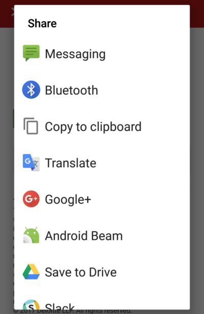
However, this screen will be triggered whether you tap ‘Twitter’ or ‘Facebook’ in the ‘Share your results’ section, so the user ends up having to make their choice twice; the first time inside our content, and a second time on the native popup.
This is a strange user journey, so we want to remove the individual share icons from the News app and show a generic share button instead. We are able to do this by explicitly checking which wrapper is in use before we render the component.

Building the wrapper abstraction layer works well for projects as a whole, but when your choice of wrapper affects changes at the component level, it’s very difficult to retain a clean abstraction. In this case, we’ve lost a little abstraction, and we have some messy forking logic in our code. Thankfully, these cases are few and far between.
How Do We Handle Missing Features?
Keeping abstraction is all well and good. Our code tells the wrapper what it wants the platform to do, e.g. “go full screen.” But what if the platform we’re shipping to can’t actually go full-screen?
The wrapper will try its best not to break altogether, but ultimately you need a design which gracefully falls back to a working solution whether or not the method succeeds. We have to design defensively.
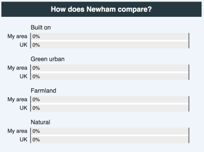
Let’s say we have a results section containing some bar charts. We often like to keep the bar chart values at zero until the charts are scrolled into view, at which point we trigger the bars animating to their correct width.
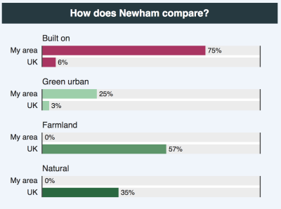
But if we have no mechanism to hook into the scroll position — as is the case in our AMP wrapper — then the bars would forever remain at zero, which is a thoroughly misleading experience.
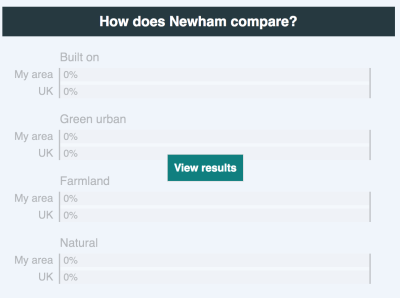
We are increasingly trying to adopt more of a progressive enhancement approach in our designs. For example, we could provide a button which will be visible for all platforms by default, but which gets hidden if the wrapper supports scrolling. That way, if the scroll fails to trigger the animation, the user can still trigger the animation manually.
Plans For The Future
We hope to develop new wrappers for platforms such as Apple News and Facebook Instant Articles, as well as to offer all new platforms a ‘core’ version of our content out of the box.
We also hope to get better at progressive enhancement; succeeding in this field means developing defensively. You can never assume all platforms now and in the future will support a given interaction, but a well-designed project should be able to get its core message across without falling at the first technical hurdle.
Working within the confines of the wrapper is a bit of a paradigm shift, and feels like a bit of a halfway house in terms of the long-term solution. But until the industry matures onto a cross-platform standard, publishers will be forced to roll out their own solutions, or use tooling such as Distro for platform-to-platform conversion, or else ignore entire sections of their audience altogether.
It’s early days for us, but so far we’ve had great success in using the wrapper pattern to build our content once and deliver it to the myriad of platforms our audiences are now using.
Further Reading
- A High-Level Overview Of Large Language Model Concepts, Use Cases, And Tools
- Exploring The Potential Of Web Workers For Multithreading On The Web
- CSS Scroll Snapping Aligned With Global Page Layout: A Full-Width Slider Case Study
- Vanilla JavaScript, Libraries, And The Quest For Stateful DOM Rendering


 Try ProtoPie AI free →


 Celebrating 10 million developers
 Register Free Now

