How Mobile Web Design Affects Local Search (And What To Do About It)
As mobile-first takes center stage in the majority of articles I write these days, I’ve had a number of designers and developers question why that is. Sure, Google has made a big push for it, so it’s smart to do what Google tells you. But, for some websites, the majority of traffic doesn’t come from mobile users.
At the moment, there are certain websites that happen to receive more mobile traffic than others, and a lot of it boils down to location. As Google explains it:
“Looking for something nearby—a coffee shop, noodle restaurant, shoe store—is one of the most common searches we do. In fact, nearly one-third of all mobile searches are related to location.”
Logically, it makes sense. If a user has access to a desktop or laptop at home or work, they’re more likely to use it to initiate a search. Whether they’re multitasking (like while coordinating dinner with a friend through Skype), walking around a city, or decide to order dinner in but don’t want to move from the couch, the mobile device is a quick way to get that information.
In this article, I’m going to focus explicitly on these kinds of consumers and the websites that appeal to them. In other words, if you design websites for businesses with a local presence, keep reading to learn how to use mobile web design to improve their local search ranking.
Seven Mobile Web Design Strategies To Use For Local Search
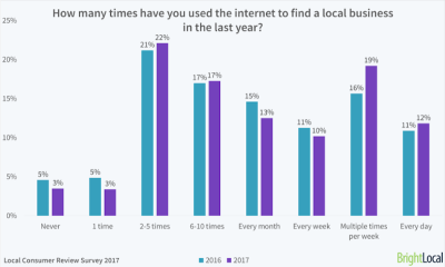
In last year’s Local Consumer Review survey, Bright Local revealed that 97% of consumers had used the Internet to search for local businesses at some point in 2017. For some users, the Internet was frequently used as a resource, with 12% looking for new businesses every day and 29% doing so at least once a week.
A report by hitwise shows that the majority of online searches begin on mobile:
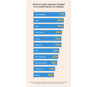
Notice the trend in business types whose users most often begin their searches on mobile (i.e. they’re mostly local businesses).
Further, it appears that these kinds of searches are done for the purposes of research at the start of the buyer’s journey. If web designers and developers can get into the minds of their target users and the kinds of questions they might ask or features they might seek out, they can more effectively build a relevant mobile experience through their sites.
For those of you who specialize in building websites for clients with a local user base, you should utilize mobile design strategies that improve local search results. While some of your efforts outside the website will help with this (like creating a Google My Business page and responding to reviews on Yelp), there’s a lot that can be done with your design to greatly contribute to this as well.
Strategy 1: “Design” Your Metadata For Mobile
Copywriters and web developers are already aware of what a critical role metadata plays in a website’s search marketing efforts. In just a few succinct strings of text, you can tell search engines and your audience a lot about your website and each of its web pages. This is particularly helpful in local search as users look for results that answer the “[fill in the blank] near me” question.
But that’s not the strategy I’m talking about here. Instead, I want to focus on how you can “design” your metadata so that it’s more attractive to mobile users once your website actually appears in their local search results.
There are a couple ways to do this:
The first is to craft succinct metadata strings for each web page. Let’s take the Liquid Surf Shop website, for instance:
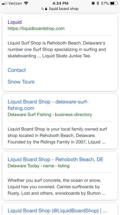
The first search result looks nice, doesn’t it? The web page name and URL each fit on one line. The description accurately describes what the shop does (and points out where it’s located!) while also fitting within the allotted space for mobile search descriptions.
Now, take a closer look at the Liquid Surf Shop when it’s compared against direct competitors in mobile search:
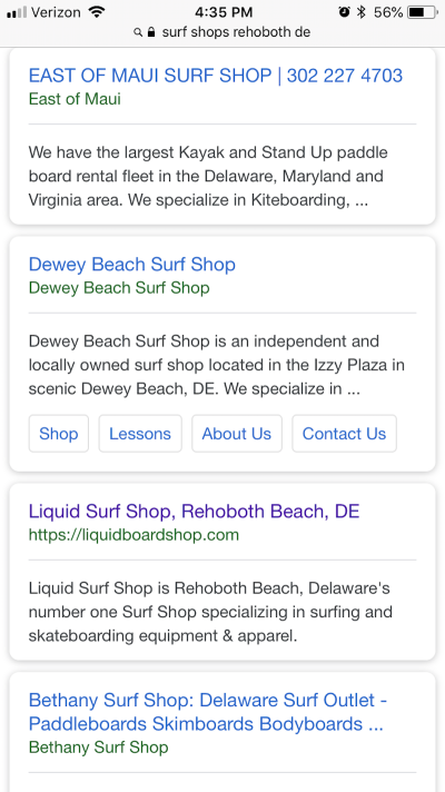
If you look at the entries for East of Maui and Dewey Beach Surf Shop above, notice how their descriptions end with an incomplete sentence. Then, look at the Bethany Surf Shop below it. The meta title is way too long for the space given. This lack of attention to metadata might cost these websites visitors when positioned around a well-written listing like the one at the Liquid Surf Shop.
Another thing you can do to improve local search listing appearance (as well as how high it ranks on the page) is to use schema markup in your design’s code.
Schema.org has created a robust set of structured data that businesses can use to improve search engine comprehension and, consequently, results. Local businesses, in particular, would find schema markup especially helpful as it allows them to “tag” various elements consumers tend to use in the decision-making process.
Here’s an example of schema markup done well for a local business: Henlopen City Oyster House:
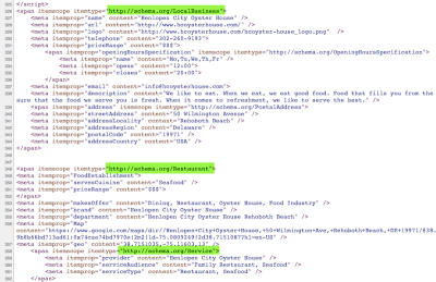
As you can see, the developer has marked up the home page with various structured data. Specifically, they have associated it with three “types”: Local Business, Restaurant, and Service. Each of those schema types have been drilled down even further into details about the location, contacting the restaurant, cuisine type, and so on. This is great for connecting mobile users to the kind of local business they seek out.
Strategy 2: Shorten The Website
With some mobile websites, it may be okay to ask users to scroll four or five times before they reach the end of the page. Or to go two or three pages deep to get to a desired endpoint.
That said, that type of extended on-site experience probably isn’t ideal for local mobile users. While Google does pay attention to factors like time-on-site and pages visited, what you need to be more concerned with is high bounce rates and lack of engagements or conversions.
In order to create this ideal situation for users while still appeasing the search gods, your focus when designing a website and its navigation is to keep it short and to the point.
I’m going to use the Bad Hair Day website for this example:
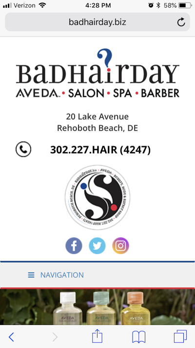
The header of the website contains all the information someone might realistically need if they want to contact the hair salon and spa. The address is there along with a phone number (which does have a click-to-call function) and social media icons.
Other types of websites would do well to put business-specific information and calls-to-action here as well. For example:
- Location search
- Hours of operation
- Make an appointment or reservation
- View a menu (for food)
…and so on.
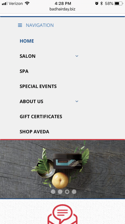
Scroll just a little bit down the website and you can open the hamburger menu. As you can see, this navigation is simply structured and keeps all the essentials on the top level for easy discovery.
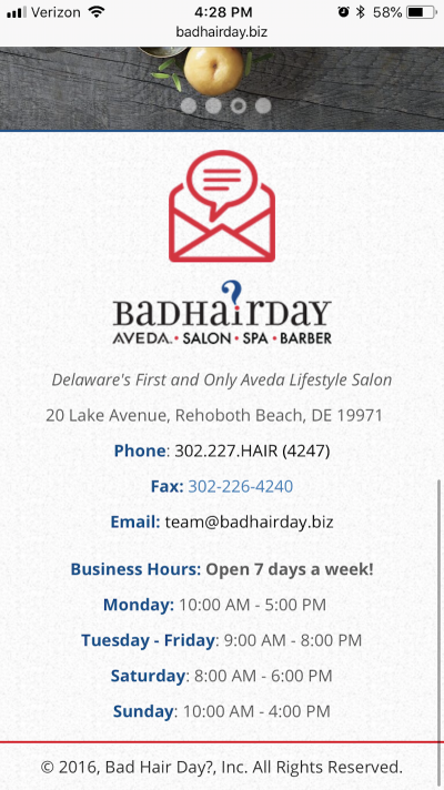
The home page of this mobile website only requires three full swipes before you get to the end of it, which is a truly nice touch. Rather than create an overly elaborate home page with summary sections of each page that force users to scroll and scroll, Bad Hair Day keeps it simple.
By offering such a user-friendly layout and structure, Bad Hair Day has created a truly awesome first impression. In addition, by keeping things simple, the website isn’t burdened by excessive amounts of images, animations, scripts, and so on. Because of this, the mobile site loads quickly.
Strategy 3: Localize Visual Content
If your sites are mostly comprised of large swatches of color and stock photography, this one won’t apply. However, if the designs you create include custom-made photos and videos, there’s a unique opportunity to use this visual content to rank in local search.
If it makes sense, include photos that strongly resonate with local residents. Recognizable images of the local landscape or cityscape will give visitors a reason to feel a stronger connection to the business. It’s kind of like bonding over a local sports team during a consultation call or first meeting. Only, you’re able to make this connection with them through your choice of imagery.
But that’s just how you appeal to visitors’ local ties on the website. How about in search?
For this, use alt text on images and videos. This is typically recommended for the purposes of accessibility (i.e. helping impaired visitors consume your content even if they can’t see or hear it). However, alt text is also readable by Google bots. If you use the right kinds of location-driven keywords in your image’s alternative text, that visual content can rank higher in local image searches. Just keep in mind that you don’t want to sacrifice accessibility for local SEO. Make your alt text descriptive while finding ways to infuse local keywords into it.
One of the local business types I think this is particularly useful for is a real estate agency. Like Jack Lingo Realty. Here is a listing Jack Lingo posted on its website for a home in Rehoboth Beach:
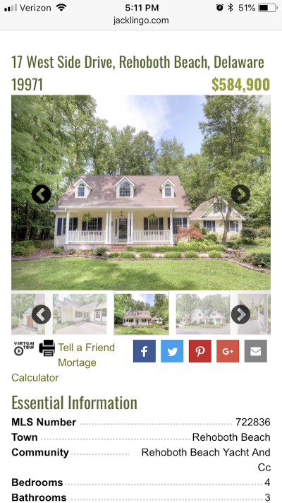
The top of the page includes a series of beautiful images taken of the house located at 17 West Side Drive, Rehoboth Beach, Delaware.
Now, open up the page source and look at what the first image’s alt text says:

The alt text includes a unique identifier at the start of it (probably to distinguish it from the other images in the gallery), but is then followed by the address of the property. For prospective homeowners who do their research via Google for properties in that particular neighborhood and community, well, guess what they find when they do a Google image search for it?
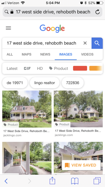
Jack Lingo’s property images take the top spots. Pretty impressive, right? So, the next time you design a website for a client whose business depends on showing off a product or property, think about how you can optimize it for local image results.
Strategy 4: Add Reviews And Ratings When Possible
I always like to refer to the aggregation of reviews and ratings on your own website as a way to control the conversation about your brand. It makes sense, right? When customers are left without a podium to speak from, they’re going to make their own… on Yelp, Google, Facebook, TripAdvisor, and wherever they feel like it. While there’s no escaping this entirely, offering a space for reviews and ratings on your website can help control the flow of feedback.
It also can improve the look of a local search result.
The example I’m going to use for this is the Fairfield Inn & Suites Rehoboth Beach:
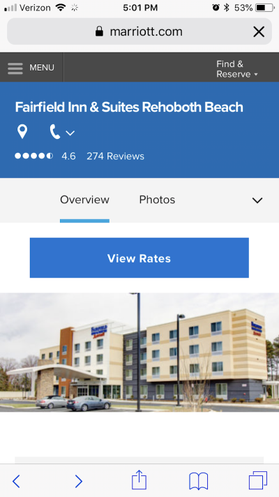
As you can imagine, a major hotel property owned by Marriott will already receive a lot of reviews from the web.
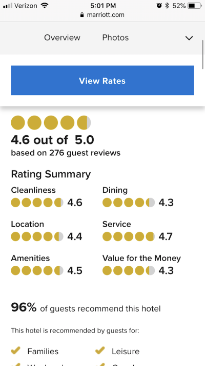
However, by adding reviews and ratings to its own website, Marriott is accomplishing a few things that will help it with local search users. For starters, there’s the transparency factor. Marriott has actively solicited customers for feedback on their hotel stay and published those reviews for all to see. Local users are very fond of online reviews, with 73% claiming that positive reviews increase their trust in a local business.
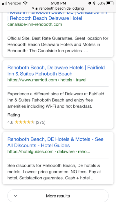
In addition, Marriott’s inclusion of a rating system on its website proves beneficial within local search results, too.
As you can see in the list of results for “Rehoboth beach de lodging”, Marriott is the only one that includes a rating—and an impressive one at that. If mobile users are quickly scrolling through search results for the most relevant and attractive business for their needs, a positive review might be enough to stop them dead in their tracks.
Strategy 5: Build Dedicated Location Pages
When designing websites with multiple locations, be sure to create a dedicated page for each location. There are on-site benefits to think about as well as search-related ones.
For starters, individual location pages reduce the amount of work visitors have to do once they get on the site. You’ve likely seen those “Location” pages before that are cluttered with a dozen or so locations, each with information related to address, phone number, email, website and so on. By giving each location a separate page, however, you don’t have to worry about compromising readability or focus.
The Tanger Outlets website demonstrates this point well as you can see that, in just a few clicks, visitors can quickly learn more about their personal location without the clutter or distraction of all the others.
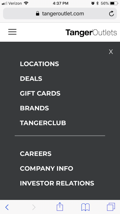
The Tanger Outlets navigation menu puts the “Locations” page right at the very top. It’s likely the first thing visitors search for as they aim to learn more about their local outlet mall and its offering of shops and brands.
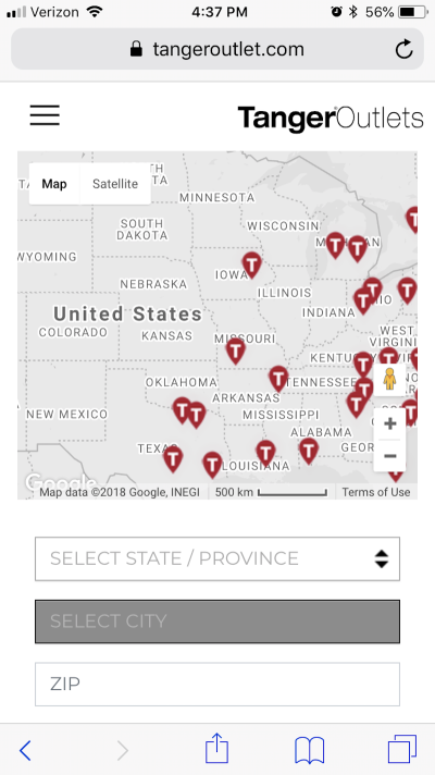
The “Location” page for the Tanger Outlets website then displays an interactive map. Users can drag the map around and try to find their location on their own or they can enter details below in the short form.
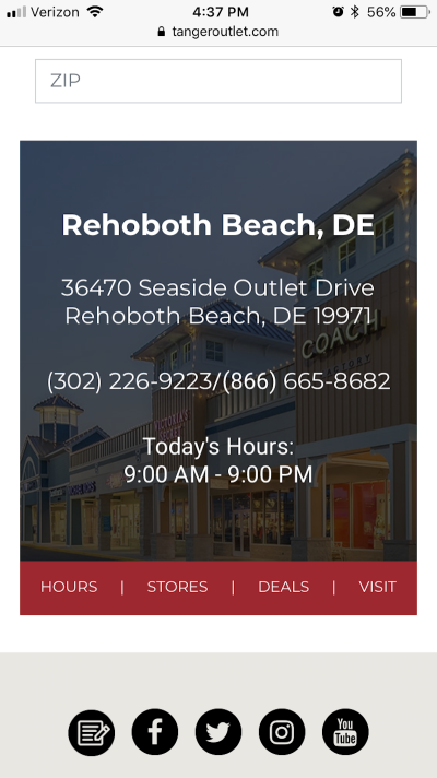
Upon finding their location, users then receive a high-level overview of the location, phone number, and hours of operation for the Tanger Outlets near them. There are additional pages they can visit to learn more about stores and deals at that particular mall.
By creating dedicated location pages on your website, you’re also giving it an extra chance to rank within local search results.
Strategy 6: Place Your CTA Front And Center
As you might have noticed, there are common themes running through these strategies: simplicity and straightforwardness. The more quickly you can deliver information to your visitors through smart design techniques, the greater the likelihood they will engage and/or convert.
As it pertains to these key checkpoints, you obviously know what to do about designing call-to-action buttons for mobile: make them big, colorful, clickable, and in the thumb zone. But what about placement? Some argue that a call-to-action should always be placed in the most logical of locations. In many cases, that’s directly after a descriptive section of text that “sells” visitors on the reason for clicking through.
On mobile, you don’t really have time to waste. And if they’re doing a search explicitly looking for a local business that does X, Y or Z, then it would be beneficial to put your CTA front and center.
The Atlantic Oceanside is an extreme example of how to do this, but it’s one I believe is done well all the same:
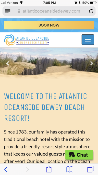
The very top of the Atlantic Oceanside website is a prominent “Book Now” button. Granted, some users might not be ready to pull the trigger on a hotel reservation the second they enter the site, but it’s still a good idea to have the button there. It’s a reminder that the booking process is going to be as painless as possible.
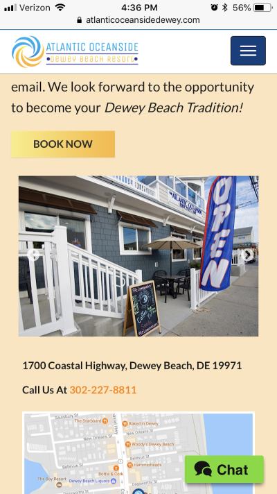
For visitors who aren’t ready to book right away, the website includes the same CTA throughout the rest of the site. It’s consistently designed and worded so that visitors always know where to find it.
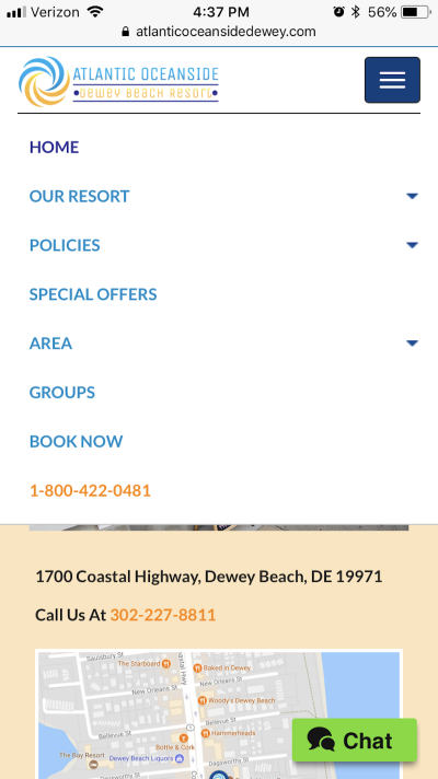
There’s another instance of the CTA that I think is placed quite well and that’s the one that exists in the navigation. You can see that all the important details about a guest’s stay are presented first, but then “Book Now” and the business’s phone number are at the bottom of the list so users don’t have to dig through pages to find that information.
If you want to make conversions easier for mobile users, don’t bury your CTAs.
Strategy 7: Include Geotargeting Features
The last strategy I’m recommending is less about design and more about features you can apply to your site that give visitors a personalized experience.
Geotargeting and geolocation services (like beacon technology) were really hot topics a few years ago. Think back to when Pokémon Go was all anyone could talk about. Mobile users were willingly giving apps their location data in return for what they considered to be a valuable experience. I believe you should be doing the same when designing mobile websites for local search users.
With geotargeting features, you have the opportunity to enhance visitors’ experience in a way that a global-serving website can’t.
WSFS Bank is an example of a business that makes good use of this feature. First, it asks for permission to use the current location as determined by the user’s mobile device:
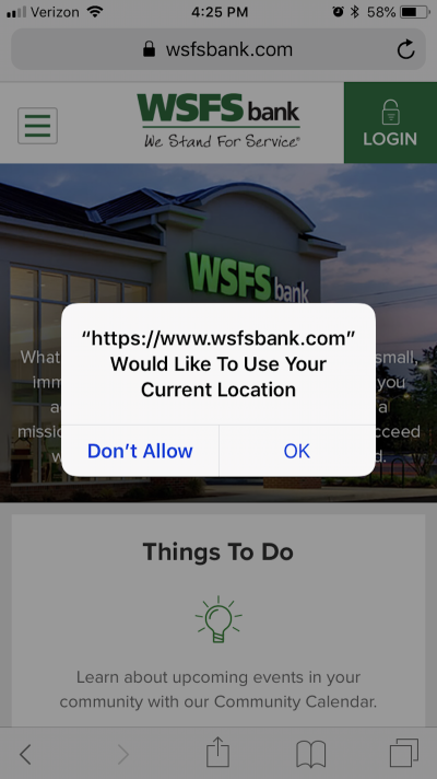
Upon granting access to the mobile website, the user is then presented with information at the top regarding the closest WSFS Bank location:
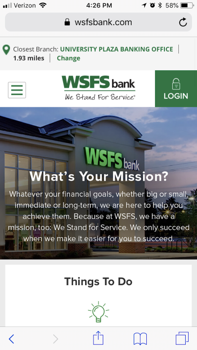
There are other use cases for geotargeting that your visitors might find useful as well. For instance, you could offer targeted discounts, include in-store availability checks, and convert prices to their local currency (if not the same as your own). Ultimately, your access to their location should be used to improve their experience and compel them to convert online or visit the brick-and-mortar location.
Wrapping Up
Designing for mobile-first isn’t all too tricky these days now that we’ve had time to adjust to it. That said, designing mobile websites for local search users is a different story. It’s not that they don’t appreciate a responsive design or shorter contact forms like everyone else. It’s just that their motivation and goals aren’t always the same as everyone else’s.
So, in addition to designing websites for mobile-first indexing, pay attention to how the design affects the website’s appearance in search results as well as how it’s received by local search users.
Further Reading
- Improving Core Web Vitals, A Smashing Magazine Case Study
- Picture Perfect: Meet Pixo, A Photo Editor For Your End Users
- Creating Accessible UI Animations
- Answering Common Questions About Interpreting Page Speed Reports


 Claim Your Free Spot!
 SurveyJS: White-Label Survey Solution for Your JS App
 Celebrating 10 million developers
 Register Free Now

