Onboarding Users Of Your Product: From Trial To Payment
(This is a sponsored article.) In part one of this series, we looked at the Attraction phase of the customer lifecycle. This three-part series outlines the three phases of the product lifecycle, the future for UX, and the skills and approach you’ll need to design modern digital products.
- Part 1: Attraction
Going out there to get users to evaluate your product. - Part 2: Activation
Signing up, onboarding users, asking for payment. - Part 3: Retention
Encouraging users to come back and keep using and paying for your product.
Part Two: Activation
Plotting Out The Journey
When we talk about the Attraction phase, we’re talking about users discovering they have a need, discovering our product and visiting our website to see if our product meets their needs.
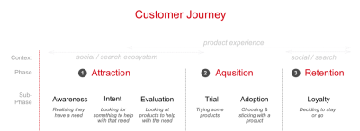
Within the lifecycle, we can split the larger three phases into smaller phases to help us plan our approach. In this case, we can use Philip Kotler's model (expanded to 6 steps by Bryony Thomas).
- Awareness
Realizing they have a need. - Interest
Looking for something to help with that need. - Evaluation
Looking at products that help with their need. - Trial
Trying the product to see if it meets their need. - Adoption
Choosing a product and using it for a while. - Loyalty
Deciding to stay using the product or switch to a different one.
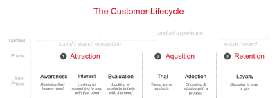
We’re interested in the middle two parts that fall under the Acquisition phase.
In part one, we looked at the Evaluation phase. The user is now ready to sign up and get going with our product; we used the example of the money management app:
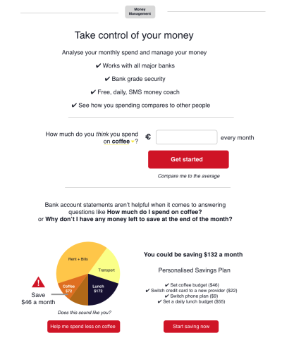
Let’s take that app forward into the Acquisition phase of the lifecycle.
A. Trial/Onboarding
In the Trial phase, our user is going to sign up and see if it is the product for them.
The first challenge is to onboard the user. Onboarding is a real challenge as it can be complex, involving the user entering personal information as well as getting to grips with what the product does. There is a huge potential for users to drop out and leave.
Joshua Porter sums it up:
“Onboarding should not be a separate function/consideration/afterthought. It should be an initial (and primary) focus of design.”
— Joshua Porter
So with that in mind, let’s take a look at onboarding.
Onboarding: Steady Progress Showing Value
For our money management app to work well we need for our user we need to accomplish three goals:
- Collect some personal data from our users.
Who they are (including email, mobile phone number, etc.). - Bank account access, to auto pull in transactions.
As we’re in the EU, open banking regulations mean that all banks have to provide API access to transaction data. - Familiarize them with the product.
That’s a big ask. Let’s think about how we can soften that. We need a simple hook to get started. We use a concept in psychology called ‘incremental commitment.’ We ask for a low commitment to the product and then when the user gets something in return was ask for more.
We ask the simple question, “How much do you think you spend on coffee a month?”

This can be done along with a hook to encourage people to compare their spend to others. There’s now a quick, easy win for the user.
We give something back, in this case comparing to the average. Then, we ask the next question.
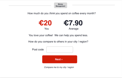
It allows us to build trust, and for the user to get value from our product early.
Next, the big ask. We want bank account access. If we’d asked for this early, we’d see a larger dropout. But we now have built some trust, and our user is invested in the product.
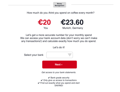
We then go for the big ask, granting bank access. As you can see, we are gently guiding our user through the onboarding, showing useful content at each step, trying to make it feel natural.
Asking for what could be challenging data like the mobile phone number is much easier if we offer context and say what benefit there is to the user. We could include the following on the sign-up page asking for the mobile number.

We can then ask further questions, like email and for a password which will have less impact being asked later after we’ve shown value.
Interaction by interaction we’re asking a question, gathering some data and showing how the product works.
Things To Avoid During Onboarding
There are other pitfalls to designing a product onboarding flow.
- Avoid the term registration, Registration is a meaningless concept, offer a reason for why you are asking for a pieces of information.
- Similarly don’t ask too many questions, that might sound obvious, but the more you ask the more likely it is for users to drop out.
- Answer these three simple questions when it comes to form fields:
- Why are you asking the question?
- What will you use the data for?
- What value does the user get from giving us this data?
- Avoid Captcha; it is a big cause of dropouts as captchas can harm conversion rates. Plus, they aren’t very friendly.
- And, of course, if your users are located in the EU, you need to wrangle with GDPR.
B. Adoption
Onboarding doesn’t end when the user has signed up. This is a common mistake made by organizations big and small. “Great, our new registrations are up month on month. But our retention rate is really poor” is a common problem.
We need to support our users through the first few weeks and months of using our app. We need to give them a reason to come back to us.
In part one, we talked about SEO and Marketing skills and tools we can use to improve the experience.
We’ll be expanding our skill set to look at email, and how we can improve the email experience. To encourage product adoption, we need to understand and map the email user journey.
Any modern UX or product designer needs to know how to design multi-channel experiences, and after the product itself email is the most important.
Planning And Encouraging The Second Visit
For our money management app we have access to the users' bank transaction data. Rather than hoping they return to our app, we need to reach out and give them a reason to come back.
The Pull: Using Email To Get Users To Come Back To Our App
Let’s look at an email we can send them the next day. But before we do that, let’s look back at one question we asked users:

The user could have changed ‘on coffee’ to be ‘at Restaurants’ or ‘at Amazon’ or another discretionary purchase option.
This is a tiny piece of personalization, and the best follow-up emails are personalized.
When designing an email the most important element is the subject line. A good subject line encourages the user to open it.
Let’s look at the most common email provider of them all, Gmail. Like we did in part one when designing Facebook ads, we’ll design in context, in this case the crowded inbox. Actually, the promotions inbox on Gmail.
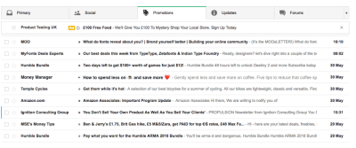
By referencing the Frotos we identified in part one (Frotos: are the current bad state the user has and their wish for a new state. The From and the To, Froto) we should get a better open rate.
And yes, that is an emoji you see. Two in fact. 😜
This article is great at helping you decide if emojis are right for you: Emojis in email subject lines: smiley face, or smiley poop? as it has a lot of data.
TLDR, emojis can help boost open rates, and well...
What an emoji (in a subject line) does is one of two things:
- It makes a bad subject line worse;
- Or it makes a good subject line better.
We also need to think about other email design considerations:
- Preview text called ‘preheader’ (shown in grey) we need to design this content: Improve your email open rates with preheader text.
- Short emails work better. A short paragraph of text and one call to action: How to Write Compelling Calls-to-Action for Email.
- More great tips and advice for UX and optimizing email in this article: The Current State Of Email Marketing Programming: What Can And Can’t Be Used.
Don’t forget to test your emails to make sure they look as designed — Litmus is great at this.
User Research And Email
It’s a good idea to user research your emails, you’ll be surprised at what useful ideas you’ll get back. Using the emails as prompt material will encourage users to answer the question “What could you offer me that would make me come back to the app?”
Drip, Drip, Drip That Email
That’s email one done, great job! But now we need to think about an ongoing programme of emails. It takes a while to form a habit, and that’s what we’re after. Getting our users to keep coming back. It can take from 18 to 254 days so we need to keep sending those emails.
These emails should offer value to our users. The key insights our product offers should be easy to deliver by email, SMS, or indeed any digital channel.
Our product promises a “Personalised Savings Plan” that’s what we need to deliver.
The best performing products work seamlessly across digital channels.
To encourage product adoption and to help our user save we could offer SMS messages.
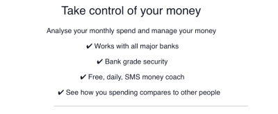
SMS is a neglected message format. Yes, it can be annoying if done badly, but it can equally be effective for our users.
Some SMS stats:
- 98% of text messages are read within 2 minutes;
- Open rates are around 99% for text messages compared to 20% for email;
- Click through rates are around 30% for SMS and less than 5% for email.
That makes a compelling case for the effectiveness of SMS. Look at the success of startup Shine and learn more about how they use SMS.
We can encourage our user to save money by using SMS, sending an email once a day. A daily, personalized, money coach is a huge benefit to our user.

This article is a great for planning your messaging approach: Level-Up Email Campaigns With Customer Journey Mapping — Smashing Magazine.
Here’s some more great advice on planning email drip programmes:
- How To Write Absolutely Irresistible Drip Campaign Emails
- 7 Lessons from Top Performing Drip Email Campaigns
User Research And Email/SMS
Researching the effectiveness of email and SMS is best done through AB testing. Testing different variants to see which performs better.
User research can help understand what content users will find useful and by what channel.
The Secret To Onboarding And Adoption: It Takes Time
Onboarding should be done gently, in short chunks offering value immediately. When it comes to asking for precious information like mobile phone number, bank account or email we need to demonstrate how we will deliver value.
To get a user to adopt our service takes time. We need to be able to deliver useful content over a long period of time to encourage them to keep using the product.
Next Up, Retention
In the first part we talked about the beginnings of the customer journey how to attract or users.
Coming up next, we’ll talk about how to retain users and get them to pay for our product — that holy grail of our user taking out a monthly subscription. Stay tuned!
This article is part of the UX design series sponsored by Adobe. Adobe XD tool is made for a fast and fluid UX design process, as it lets you go from idea to prototype faster. Design, prototype, and share — all in one app. You can check out more inspiring projects created with Adobe XD on Behance, and also sign up for the Adobe experience design newsletter to stay updated and informed on the latest trends and insights for UX/UI design.
Further Reading
- Better Context Menus With Safe Triangles
- Everything I Know About UX Research I First Learned From Lt. Columbo
- Creating And Maintaining A Voice Of Customer Program
- Crafting Experiences: Uniting Rikyu’s Wisdom With Brand Experience Principles

