Reasons Your Mobile App Retention Rate Might Be So Low
In business, there’s a lot of talk about generating customer loyalty and retaining the business of good customers. Mobile apps aren’t all that different when you think about it.
While the number of installs may signal that an app is popular with users initially, it doesn’t tell the whole story. In order for an app to be successful, it must have loyal subscribers that make use of the app as it was intended. Which is where the retention rate enters the picture.
In this article, I want to explore what a good retention rate looks like for mobile apps. I’ll dig into the more common reasons why mobile apps have low retention rates and how those issues can be fixed.
Let’s start with the basics.
Checking The Facts: What Is A Good Mobile App Retention Rate?
A retention rate is the percentage of users that remain active on your mobile app after a certain period of time. It doesn’t necessarily pertain to how many people have uninstalled the app either. A sustained lack of activity is generally accepted as a sign that a user has lost interest in an app.
To calculate a good retention rate for your mobile app, be sure to take into account the frequency of logins you expect users to make. Some apps realistically should see daily logins, especially for gaming, dating, and social networking. Others, though, may only need weekly logins, like for ride-sharing apps, Google Authenticator or local business apps.
When calculating the retention rate for anticipated daily usage, you should run the calculation for at least a week, if not more. For weekly or monthly usage, adjust your calculation accordingly.
Recommended reading: Driving App Engagement With Personalization Techniques
For daily usage, divide the following like so:
| Users Logged into the App on Day 0 |
|---|
| Users Logged into the App on Day 1 |
| Users Logged into the App on Day 2 |
| Users Logged into the App on Day 3 |
| Users Logged into the App on Day 4 |
| Users Logged into the App on Day 5 |
| Users Logged into the App on Day 6 |
| Users Logged into the App on Day 7 |
This will give you a curve that demonstrates how well your mobile app is able to sustain users. Here is an example of how you would calculate this:
| Number of New Users Acquired | |
|---|---|
| Day 0 | 100 |
| Day 1 | 91 (91% ) |
| Day 2 | 85 (85%) |
| Day 3 | 70 (70%) |
| Day 4 | 60 (60%) |
| Day 5 | 49 (49%) |
| Day 6 | 32 (32%) |
| Day 7 | 31 (31%) |
If you can, add the data into a line graph format. It’ll be much easier to spot trends in downward momentum or plateauing:
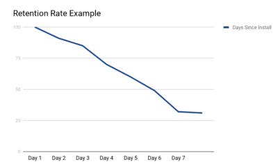
This is just a basic example of how a retention rate calculation works. Curious to see what the average (Android) mobile app’s retention curve looks like?
A Quettra study (with Andrew Chen) charted the following:
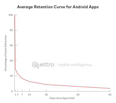
According to this data, the average app loses 77% of users within just three days. By the time the first-month wraps, 90% of those original new users are gone.
Recent data shows that the average cost per installation of a mobile app (globally) breaks down to the following:
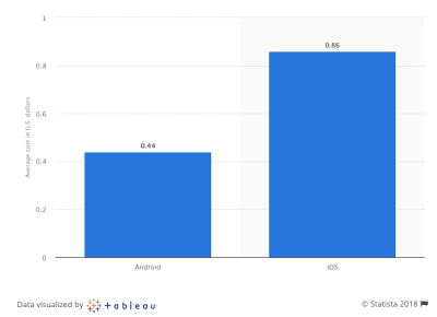
Basically, this is the average cost to build and market an app — a number you should aim to recuperate per user once the app has been installed. However, if your app loses about 90% of its users within a month’s time, think about what the loss actually translates to for your business.
Ankit Jain of Gradient Ventures summarized the key lesson to take away from these findings:
“Users try out a lot of apps but decide which ones they want to ‘stop using’ within the first 3-7 days. For ‘decent’ apps, the majority of users retained for 7 days stick around much longer. The key to success is to get the users hooked during that critical first 3-7 day period.”
As you can see from the charting of the top Android apps, Jain’s argument holds water:
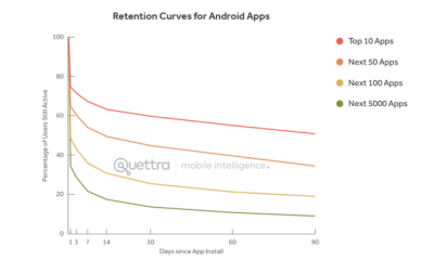
Top Android apps still see a sharp decline in active users after about three days, but then the numbers plateau. They also don’t bleed as many new users upfront, which allows them to sustain a larger percentage of users.
This is exactly what you should be aiming for.
A Retention Recovery Guide For Mobile Apps
So, we know what makes for a good and bad retention rate. We also understand that it’s not about how many people have uninstalled or deleted the app from their devices. Letting an app sit in isolation, untouched on a mobile device, is just as bad.
As you can imagine, increasing your retention rate will lead to other big wins for your mobile app:
- More engagement
- More meaningful engagement
- Greater loyalty
- Increased conversions (if your app is monetized, that is)
Now you need to ask yourself:
“When are users dropping off? And why?”
You can draw your own hypotheses about this based on the retention rate alone, though it might be helpful to make use of tools like heat maps to spot problem areas in the mobile app. Once you know what’s going on, you can take action to remove the friction from the user experience.
To get you started, I’ve included a number of issues that commonly plague mobile apps with low retention rates. If your app is guilty of any of these, get to work on fixing the design or functionality ASAP!
1. Difficult Onboarding
Aside from the app store description and screenshots users encounter, onboarding is the first real experience they have with a mobile app. As you can imagine, a frustrating sign-in or onboarding procedure could easily turn off those who take that as a signal the rest of the app will be as difficult to use.
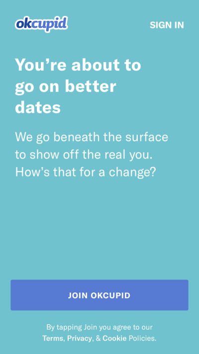
Let’s use the OkCupid dating app as an example. The initial splash screen looks great and is well-designed. It has a clear value proposition, and an easy-to-find call-to-action:
On the next page, users are given two options for joining the app. It’s free to use, but still requires users to create an account:
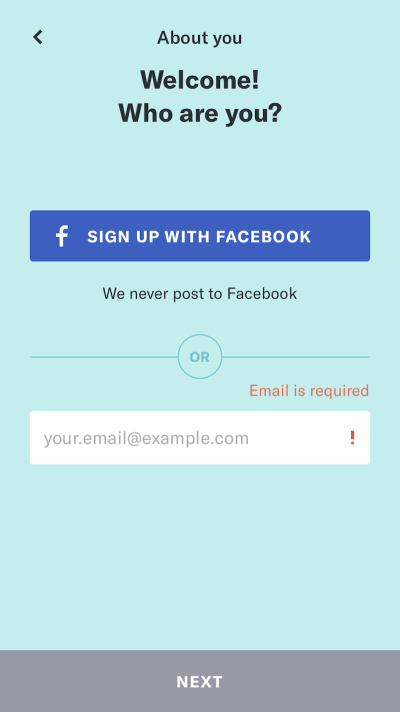
The first option is a Facebook sign-in. The other is to use a personal email address. Since Facebook logins can streamline not just signup, but the setup of dating mobile apps (since users can automatically import details, photos, and connections), this option is probably one many users’ choose.
But there’s a problem with it: After seven clicks to connect to Facebook and confirm one’s identity, here is what the user sees (or, at least, this is what I encountered the last couple of times I tried):
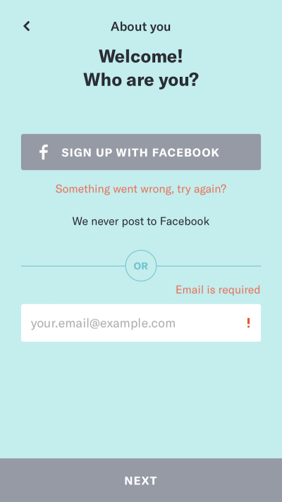
One of the main reasons why users choose a Facebook sign-in is because of how quick and easy it’s supposed to be. In these attempts of mine, however, my OkCupid app wouldn’t connect to Facebook. So, after 14 total clicks (7 for each time I tried to sign up), I ended up having to provide an email anyway.
This is obviously not a great first impression OkCupid has left on me (or any of its users). What makes it worse is that we know there’s a lot more work to get onboarded with the app. Unlike competitors like Bumble that have greatly simplified signup, OkCupid forces users into a buggy onboarding experience as well as a more lengthy profile configuration.
Needless to say, this is probably a bit too much for some users.
2. Slow Or Sloppy Navigation
Here’s another example of a time-waster for mobile app users.
Let’s say getting inside the new app is easy. There’s no real onboarding required. Maybe you just ask if it’s okay to use their location for personalization purposes or if you can send push notifications. Otherwise, users are able to start using the app right away.
That’s great — until they realize how clunky the experience is.
To start, navigation of a mobile app should be easy and ever-present. It’s not like a browser window where users can hit that “Back” button in order to get out of an unwanted page. On a mobile app, they need a clear and intuitive exit strategy. Also, navigation of an app should never take more than two or three steps to get to a desired outcome.
One example of this comes from Wendy’s. Specifically, I want to look at the “Offers” user journey:
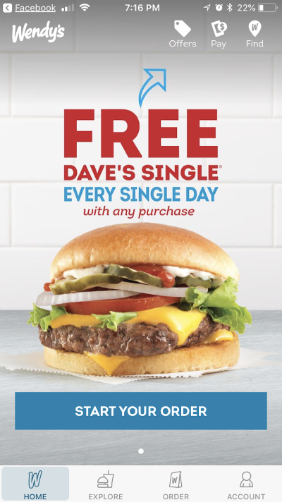
As you can see, the navigation at the bottom of the app is as clear as day. Users have three areas of the app they can explore — each of which makes sense for a business like Wendy’s. There are three additional navigation options in the top-right corner of the app, too.
When “Offers” is clicked, users are taken to a sort of full-screen pop-up containing all current special deals:
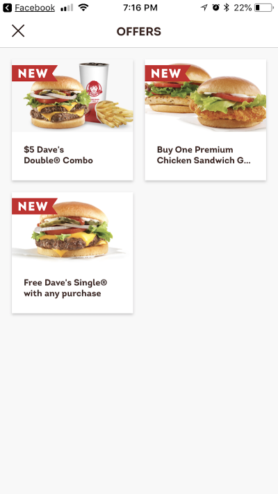
As you can see, the navigation is no longer there. The “X” for the Offers pop-up also sits in the top-left corner (instead of the right, which is the more intuitive choice). This is already a problem. It also persists throughout the entire Offers redemption experience.
Let’s say that users aren’t turned off by the poor navigational choices and still want to redeem one of these offers. This is what they encounter next:
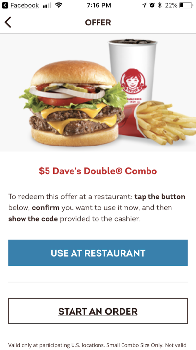
Now, this is pretty cool. Users can redeem the offer at that very moment while they’re in a Wendy’s or they can place the order through the app and pick it up. Either way, this is a great way to integrate the mobile app and in-store experiences.
Except…
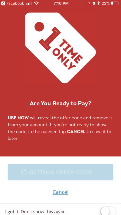
Imagine standing in line at a Wendy’s or going through a drive-thru that isn’t particularly busy. That image above is not one you’d want to see.
They call it “fast food” for a reason and if your app isn’t working or it takes just a few seconds too long to load the offer code, imagine what that will do for everyone else’s experience at Wendy’s. The cashiers will be annoyed that they’ve held up the flow of traffic and everyone waiting in line will be frustrated in having to wait longer.
While mobile apps generally are designed to cater to the single user experience, you do have to consider how something like this could affect the experience of others.
Recommended reading: How To Improve Your Billing Form’s UX In One Day
3. Overwhelming Navigation
A poorly constructed or non-visible navigation is one thing. But a navigation that gives way too many options can be just as problematic. While a mega menu on something like an e-commerce website certainly makes sense, an oversized menu in mobile apps doesn’t.
It pains me to do this since I love the BBC, but its news app is guilty of this crime:

This looks like a standard news navigation at first glance. Top (popular) stories sit at the top; my News (customized) stories below it. But then it appears there’s more, so users are apt to scroll downwards and see what others options there are:
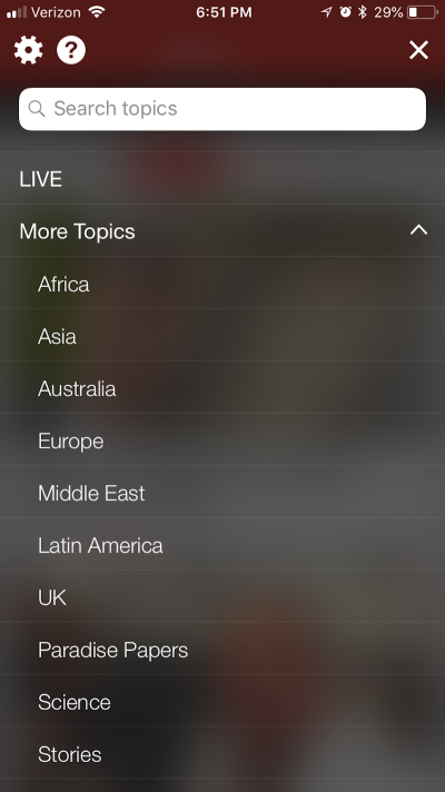
The next scroll down gives users a choice of stories by geography, by subject:
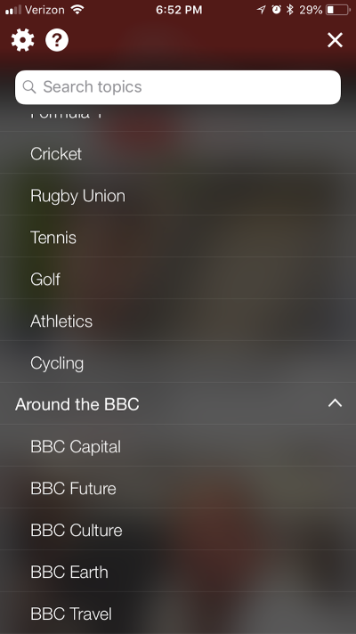
And then there are even more options for sports as well as specific BBC News channels. It’s a lot to take in.
If that weren’t bad enough, the personalization choices mirror the depth of the navigation:
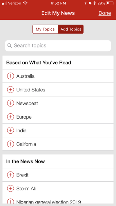
Now, there’s nothing wrong with personalizing the mobile app experience. I think it’s something every app — especially those that deliver global news — should allow for. However, BBC News gives an overwhelming amount of options.
What’s worse is that many of the stories overlap categories, which means users could realistically see the same headlines over and over again as they scroll through the personalized categories they’ve chosen.
If BBC News (or any other app that does this) wants to allow for such deep personalization, the app should be programmed to hide stories that have already been seen or scrolled past — much like how Feedly handles its stream of news. That way, all that personalization really is valuable.
Recommended reading: How BBC Interactive Content Works Across AMP, Apps, And The Web
4. Outdated Or Incomplete Experience
Anything a mobile app does that makes users unwillingly stop or slow down is bad. And this could be caused by a number of flaws in the experience:
- Slow-loading pages,
- Intrusive pop-ups,
- Dated design choices,
- Broken links or images,
- Incomplete information,
- And so on.
If you expect users to take time to download and at least give your app a try, make sure it’s worth their while.
One such example of this is the USHUD mobile app. It’s supposed to provide the same exact experience to users as the website counterpart. However, the app doesn’t work all that well:

In the example above, you can see that search results are slow to load. Now, if they were chock full of images and videos, I could see why that might occur (though it’s still not really acceptable).
That said, many of the properties listed on the app don’t have corresponding visual content:

Real estate apps or, really, any apps that deal in the transaction of purchasing or renting of property or products should include images with each listing. It’s the whole reason why consumers are able to rent and buy online (or at least use it in the decisionmaking process).
But this app seems to be missing many images, which can lead to an unhelpful and unpleasant experience for users who hope to get information from the more convenient mobile app option.
If you’re going to build a mobile app that’s supposed to inform and compel users to engage, make sure it’s running in tip-top shape. All information is available. All tabs are accessible. And pages load in a reasonable timeframe.
5. Complicated Or Impossible Gestures
We’ve already seen what a poorly made navigation can do to the user experience as well as the problem with pages that just don’t load. But sometimes friction can come from intentionally complicated gestures and engagements.
This is something I personally encountered with Sinemia recently. Sinemia is a competitor of the revolutionary yet failing MoviePass mobile app. Sinemia seems like a reasonable deal and one that could possibly sustain a lot longer than the unrealistic MoviePass model that promises entry to one movie every single day. However, Sinemia has had many issues with meeting the demand of its users.
To start, it delayed the sending of cards by a week. When I signed up in May, I was told I would have to wait at least 60 days to receive my card in the mail, even though my subscription had already kicked in. So, there was already a disparity there.
Sinemia’s response to that was to create a “Cardless” feature. This would enable those users who hadn’t yet received their cards to begin using their accounts. As you can see here, the FAQ included a dedicated section to Sinemia Cardless:
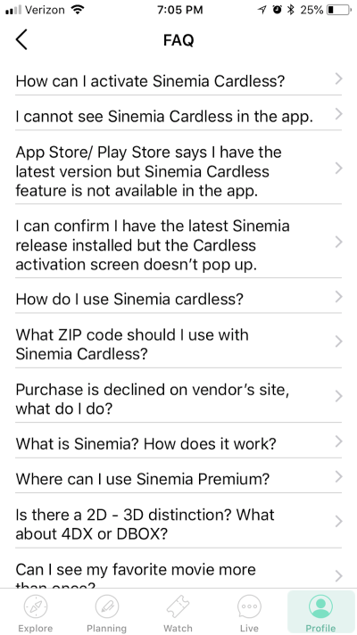
See that point that says “I can confirm I have the latest Sinemia release installed…”? The reason why that point is there is because many Sinemia Cardless users (myself included) couldn’t actually activate the Cardless feature. When attempting to do so, the app would display an error.
The Sinemia FAQ then goes on to provide this answer to the complaint/question:
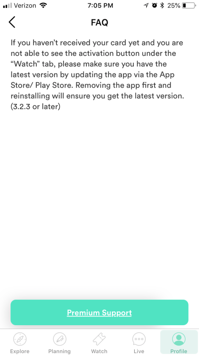
Here’s the problem: there were never any updates available for the mobile app. So, I and many others reached out to Sinemia for support. The answer repeatedly given was that Cardless could not work if your app ran on an old version. Support asked users to delete the app from their devices and reinstall from the app store to ensure they had the correct version — to no avail.
For me, this was a big problem. I was paying for a service that I had no way of using, and I was spending way too much time uninstalling and installing an app that should work straight out the gate.
I gave up after 48 hours of futile attempts. I went to my Profile to delete my account and get a refund on the subscription I had yet to use. But the app told me it was impossible to cancel my account through it. I tried to ask support for help, but no one responded. So, after Googling similar issues with account cancellations, I found that the only channel through which Sinemia would handle these requests was Facebook Messenger.
Needless to say, the whole experience left me quite jaded about apps that can’t do something as simple as activating or deactivating an account. While I recognize an urge to get a better solution on the mobile app market, rushing out an app and functionality that’s not ready to reach the public isn’t the solution.
Recommended reading: What You Need To Know About OAuth2 And Logging In With Facebook
6. Gated Content Keeps App From Being Valuable
For those of you who notice your retention rate remaining high for the first week or so from installation, the problem may more have to do with the mobile app’s limitations.
Recolor is a coloring book app I discovered in the app store. There’s nothing in the description that would lead me to believe that the app requires payment in order to enjoy the calming benefits of coloring pictures, but that’s indeed what I encountered:
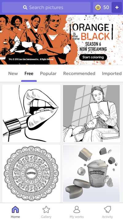
Above, you can see there are a number of free drawings available. Some of the more complex drawings will take some time to fill in, but not as much as a physical coloring book would by hand, which means users are apt to get through this quickly.
Inevitably, mobile app users will go searching for more options and this is what they will encounter:
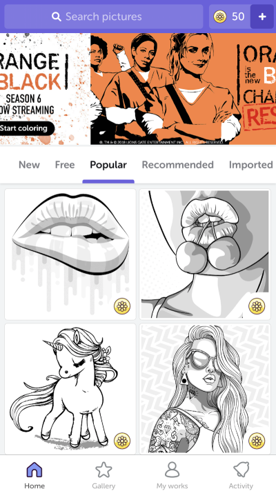
When users look into some of the more popular drawings from Recolor, you’d hope they would encounter at least a few free drawings, right? After all, how many users could possibly be paying for a subscription to this app that’s not outrightly advertised as premium?
But it’s not just the Popular choices that require a fee to access (that’s what the yellow symbol in the bottom-right means). So, too, do most of the other categories:
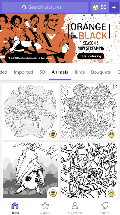
It’s a shame that so much of the content is gated off. Coloring books have proven to be good for managing anxiety and stress, so leaving users with only a few dozen options doesn’t seem right. Plus, the weekly membership to the app is pretty expensive, even if users try to earn coins by watching videos.
A mobile app such as this one should make its intentions clear from the start: “Consider this a free trial. If you want more, you’ll have to pay.”
While I’m sure the developer didn’t intend to deceive with this app model, I can see how the retention rate might suffer and prevent this app from becoming a long-term staple on many users’ devices.
As I noted earlier, those initial signups might make you hopeful of the app’s long-term potential, but a forced pay-to-play scenario could easily disrupt that after just a few weeks.
7. Impossible To Convert In-App
Why do we create mobile apps? For many developers, it’s because the mobile web experience is insufficient. And because many users want a more convenient way to connect with your brand. A mobile app sits on the home screen of devices and requires just a single click to get inside.
So, why would someone build an app that forces users to leave it in order to convert? It seems pointless to even go through the trouble of creating the app in the first place (which is usually no easy task).
Here’s the Megabus app:
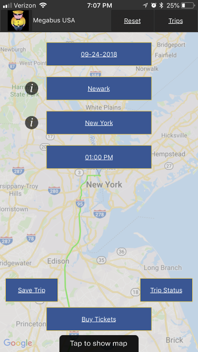
Megabus is a low-cost transportation service that operates in Canada, the United States and the United Kingdom. There are a number of reasons why users would gravitate to the mobile app counterpart for the website; namely, the convenience of logging in and purchasing tickets while they’re traveling.
The image above shows the search I did for Megabus tickets through the mobile app. I entered all pertinent details, found tickets available for my destination and got ready to “Buy Tickets” right then and there.
However, you can’t actually buy tickets from the mobile app:
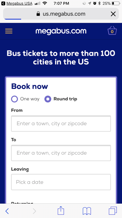
Upon clicking “Buy Tickets”, the app pushes users out and into their browser. They then are asked to reinput all those details from the mobile app to search for open trips and make a purchase.
For a service that’s supposed to make travel over long distances convenient, its mobile app has done anything but reinforce that experience.
For those of you considering building an app (whether on your own accord or because a client asked) solely so you can land a spot in app store search results, don’t waste users’ time. If they can’t have a complete experience within the app, you’re likely to see your retention rate tank fairly quickly.
Wrapping Up
Clearly, there are a number of ways in which a mobile app may suffer a misstep in terms of the user experience. And I’m sure that there are times when mobile app developers don’t even realize there’s something off in the experience.
This is why your mobile app retention rate is such a critical data point to pay attention to. It’s not enough to just know what that rate is. You should watch for when those major dropoffs occur; not just in terms of the timeline, but also in terms of which pages lead to a stoppage in activity or an uninstall altogether.
With this data in hand, you can refine the in-app experience and make it one that users want to stay inside of for the long run.
Further Reading
- The Things Users Would Appreciate In Mobile Apps
- Crafting Experiences: Uniting Rikyu’s Wisdom With Brand Experience Principles
- A High-Level Overview Of Large Language Model Concepts, Use Cases, And Tools
- Connecting With Users: Applying Principles Of Communication To UX Research


 Register Free Now
 Try ProtoPie AI free →
 Celebrating 10 million developers
 SurveyJS: White-Label Survey Solution for Your JS App

