Tips For Managing Design Systems
(This is a sponsored article.) A design system enables a product team to create a product faster by making the design reusable. But quite often, despite everyone’s best intentions, all the effort that a product team puts into making a thoughtful design system can go straight down the drain.
Nowadays, there’s no shortage of articles explaining what a design system is and how to create one. However, there’s still a lack of practical recommendations on how to manage a design system.
Let’s fill this gap. In this article, I’ll talk about things you can do to set up your organization for long-term success with your design system.
1. Encourage Adoption Of Your Design System
More important than building a design system is encouraging everyone to use it. A design system sets a new direction for an organization, and whether the organization accepts this direction will largely depend on how people react to the changes. Depending on the size of the company, encouraging people to adopt a single design system can be a tall order. People will be happy to adopt the system only when they find it to be valuable.
Here is what you need to do to get your organization to follow the direction you’ve established with the design system.
Create A Vision Statement
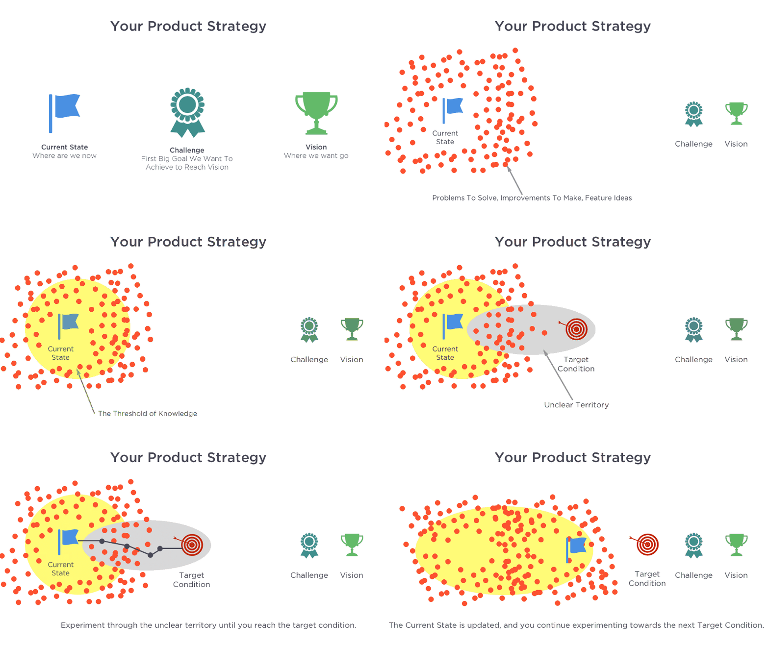
Where are we going? What do we want to achieve? Why do we want to achieve that? Those are fundamental questions that you need to answer in order to build a shared vision.
A vision statement defines what your team, product or company is attempting to achieve and, more importantly, why. The vision statement will become your North Star — it will unite the team and guide it towards a common destination.
A simple technique you can use to create your vision statement is to describe what your product or organization should look like in five years. By doing that, you’ll define a target condition.
Establish Guiding Design Principles
How do you define good design? How do you know when something is ready to ship? When it comes to evaluating the quality of a design, designers often rely on their own set of standards. But as a team grows, following such an approach can introduce a lot of chaos in the product design process, because every designer will have their own subjective ideals. That’s where design principles can save the day.
Design principles act as standards for the product team and help them to measure their work. They replace subjective ideals with clear standards that help team members make user-centered design decisions. However, in many cases, it’s not hard to make people follow guidelines, but rather it’s hard to make people agree on guidelines. That’s why it’s essential not only to establish grounding principles of design, but also to get a commitment to those principles from the people involved in the creation of the product.
Here are a few things to remember when working on design principles:
- Design principles should reflect the nature of the product. For example, when it comes to human-machine interface design for automobiles, the most important design principle should be “Safety first”. Every design decision should be measured for safety — the goal is to keep the driver and passengers safe.
- Practice open discussion. If an organization has many design teams, then involving them in a discussion is vital. By getting their feedback on the design principles, you can adapt the principles to the needs of users.
- Design principles should not sound like rules. Product creators should not feel limited or restrained. It’s important to make everyone comfortable when they do their work.
Magera Moon has written an excellent article, “Creating Etsy’s Design Principles”, that describes the process of creation.
Get Buy-In From Stakeholders
A design system won’t take off if the people who decide on funding don’t buy into it. You need to get buy-in from executives to fund the system.
Write a strategy with a clear proposal, and pitch it to key decision-makers. Your goal is to show that the system solves real problems. Identify key pain points — areas where people spend much time (especially routine operations), and pitch a presentation (or series of presentations) to show how the design system can save the day.
Quick tip: Wrap your presentation in the form of a story. By telling success stories, you will have a better chance of engaging stakeholders.
Promote Your Design System
You can create the best design system in the world, but if you don’t actively promote it in your organization, the entire effort will suffer greatly. That’s why, from the first release of your system, you need to work hard to foster its adoption and create a community of supporters.
Evangelize the design system. Create a group of volunteers, led by senior designers, who will pitch and sell ideas about your design system. The evangelists should participate in various activities such as workshops and webinars. The goal of all of those activities should be to raise awareness that the system exists and to educate people on how to use it.
Show Value Through A Sandbox Environment
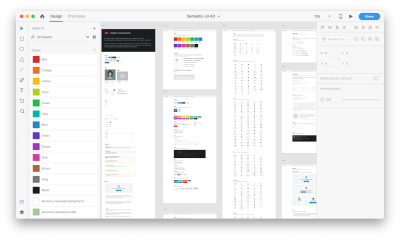
It’s well known that the best way for people to see value is to experience it. So, create a sandbox environment that will allow product team members to quickly prototype apps using your design system. Using Adobe XD, it’s easy to create an environment that empowers people to experiment with their own ideas. Actually, it’s a two-step process.
First, you need to teach people how to build things using XD. The XD team has prepared a series of tutorials to familiarize people with the basics of Adobe XD.
Secondly, you need to set a solid foundation for your design system. Again, you don’t need to start from scratch. Ole Fredrik Lie has made a UI kit especially for design systems: Semantic UI Kit (download the ZIP file). The kit includes all of the basic components you need to start designing at scale, such as buttons, inputs, search, tabs and more.
2. Establish A Culture Of Communication
Every team member should use the design system on a regular basis. In doing so, team members will learn to solve problems systematically, not individually. Communication plays a key role in this process. Invest in creating a culture of communication early in the process, because it will increase the likelihood of adoption of the design system.
Shared Language
Language is fundamental to collaboration. The design language needs to be shared among the people involved in the creation of the product. A shared language allows team members to follow the same approach when giving names to new components and interface elements and when referring to existing components in conversation.
Communicate Changes
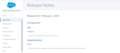
Once the design system is being used in product design, it’s vital to communicate changes and updates to the entire organization. Ship updates regularly and with a changelog. The log should tell users what changes were introduced in the new version and how upgrades will impact their work.
Open Channels For Getting Updates
Bake communication channels into the team’s daily workflow. This will help to keep both the design system’s users and makers engaged.
Start simple. Create a trigger for the update — whenever someone pushes updates to the design system, send a notification to your Slack channel, announcing to the team that a change has been proposed. Also, make an effort to be available via Slack to answer questions.
Establish A Practice Of Regular Checkups
In addition to a day-to-day conversation between the design system’s makers and users, it’s worth scheduling regular meetings to review the design system with makers, users and stakeholders. Discuss what works and what does not, what needs to be improved and when. The meetings will help you set priorities and create a roadmap to improve the system so that it better serves the needs of the business.
3. Improve Design Efficiency
Reduce Duplication Of Design Elements
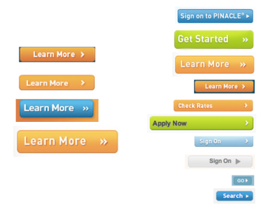
Duplication of design elements leads to fragmentation, and fragmentation leads to inconsistency. Identifying duplication of design elements helps a team to avoid the scenario in which team members build an element from scratch and after a while find out that a version of it already exists.
Conducting an interface inventory, as described by Brad Frost, is a popular way to understand what’s in use. It’s worth investing time in an interface inventory even before building the actual design system, because going through this process will enable you to identify problem areas that need attention and help you to understand how much design debt your team has.
Analyze How People Use Your Design System
Similar to any other product you design, you need to find the answer to the following question: Who will use your design system, and how will they use it? Conduct research to find the answer to this question.
If you’ve just started incorporating a design system into your organization’s design process, conduct a series of interviews to understand how people use it. By doing that, you can pinpoint problems ahead of time. Try to make time for in-person feedback sessions, because such sessions will give you more insight than you would get with remote interviews or online surveys.
It’s also recommended to conduct user journey mapping. User journey mapping helps you better understand the user’s experience.
Strive To Create Reusable Components
Many design systems suffer from the same problem: Team members create components that are too focused on a single use case. As a result, the system becomes too inflexible, and its users (designers and developers) have to create their own components each time they need to cover a particular scenario.
A successful design system is highly reusable. Take Bootstrap. Because it was architected with reusability in mind, thousands of websites use it as their foundation.
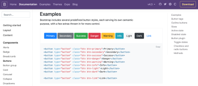
Try to develop components that are not tied to a single use case, but can be reused in multiple contexts. To be reusable and scalable, components need to be the following:
- Modular Modular components are self-contained — they don’t have any dependencies.
- Composable It’s possible to combine components to create new components.
- Customizable It’s possible to adjust and extend components to make them work in a variety of contexts.
Every time you want to introduce a new component, consider how it will work on the various platforms you are designing for. Ideally, every component you design should work on all platforms.
Introduce Versioning
Versioning makes it much easier to track changes. With versioned releases, users can reference a specific version as a dependency. They also have control over when and how upgrades to new versions are handled.
Versioning also helps you deal with breaking changes — situations where changes to a component’s code break existing usages of that component.
There are two types of versioning:
- Versioning the entire system Here, everything within the system belongs to just one version number. As users, we deal with versioning for the whole system every time we update our mobile OS — when we update iOS, we’re updating the entire piece of software. Following the same approach for a design system will mean that users will have to update everything within the design system during the update. For example, if you changed a primary font, add a new secondary color or deprecate a particular UI element, when a user of the design system chooses to upgrade, they will get all of those changes together.
- Versioning by modules This type of versioning involves having a version number for every component or style within the design system. Compared with versioning the entire system, versioning by module allows for more flexibility — users can choose to upgrade just the elements they need.
Establish A Clear Governance Strategy
Change is the only constant, as they say. Creating a clear governance strategy is essential to making sure your design system can adapt to changes. A robust governance strategy starts by answering some critical questions about how changes are handled, such as:
- Who approves changes to the design system?
- How are requests for new components handled?
- What happens when bugs are found in the design system?
The organization of a design system is really important to its scalability. In his article, “Team Models for Scaling a Design System”, Nathan Curtis describes the three models:
- Solitary model In this model, an “overlord” rules the design system.

- Centralized model In this model, one team is in charge of the system and guides its evolution.

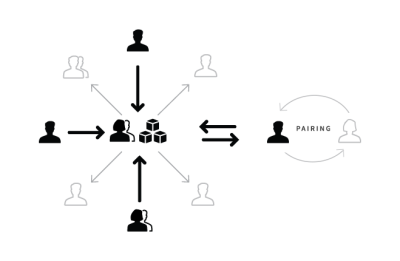
- Federated model In this model, several people from several teams are in charge of the system.
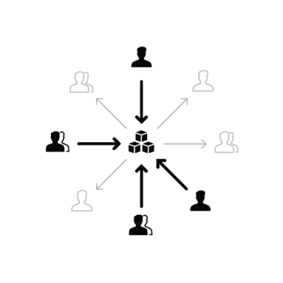
Each of the models above has strengths and weaknesses, but the first is the most fragile because it has a built-in risk — when one person is in charge of so much, that person can quickly become a bottleneck to the completion of many tasks. As Nathan Curtis mentions in his article, overlords don’t scale. That’s why many teams are moving away from the solitary model to the centralized or federated model — those models are usually much better for scaling the design system.
In many cases, it’s possible to try a combination of models. For instance, the Salesforce team’s model is a combination of the centralized and federated models. Though Salesforce’s Lightning Design System has a core team, there are also contributors who act as a federation of practitioners.
Find The Right Balance Between Strictness And Flexibility
One of the main goals of a design system is to extend creative direction. The system should give designers and developers the freedom to explore various approaches before they select one to follow.
It’s vital that the system does not prevent designers from exploring different styles. In her book, Alla Kholmatova defines two types of design systems:
- Strict Designers and developers have to follow a rigorous process when introducing a new pattern in a system.
- Loose The system acts as a framework, allowing designers and developers to experiment and try various approaches.
You have to find the right balance between the two extremes.
Cross-Functional Collaboration
Design is a team sport, and creating a design system is no exception. You need more than just designers to create an efficient design system. The expertise and creative energy of cross-functional collaboration will help you create a system that works best for your organization’s needs.
Product managers, project managers, executives and other stakeholders have unique perspectives that can undoubtedly inform and shape the work.
Here is a quick list of disciplines you’ll need to involve in the process of creating and managing the system:
- Front-end development Front-end developers review the code and rework it to make it modular.
- Back-end development Back-end engineers help to identify architectural decisions that could affect the front-end UI.
- Content management Content strategists set the voice and tone of the design system.
- UX research Researchers understand the needs of your users and help to bake those needs into the system.
- Performance testing Performance engineers help you to avoid performance degradation. Leadership Leaders align the vision throughout the company.
At the same time, it doesn’t mean that every discipline should be constantly involved in developing the system. Cross-discipline exploration is better. Conduct cross-team sprints: Create teams of people from different teams, and have them work together and explore different areas of design and development. Such activities will help them to find common problems that many teams think are important and to propose solutions — in other words, users of the design system will tailor the system to their own needs.
Ship Early And Often
As with regular products, the waiting time for updates plays a key role in adoption of the design system. Practice regular incremental releases, rather than big reveals, and work hard to integrate the components into the products as soon as possible.
To make that happen, define clear timelines for new components, code reviews and other procedures.
Test Your Design Decisions
Some product teams believe that once a design system is built, the work is complete. Not true. A design system is a product, and it’s vital to manage it as a product instead of a project — a designs system requires ongoing maintenance and improvements as needs arise.
It’s essential to test the design system and the products that use it. When you test the design system, you will become confident that you have a solid foundation for your design.
If you’re just starting to introduce the design system into your design process, start small and test the foundation of the system before extending to larger parts. Find a pilot project — rebuild a real part of a product using this new approach — and see whether it works for your team.
Here are three types of testing that will help you:
- Functional testing
- Visual regression testing Visual regression testing help you to catch unintended visual changes to component styles.
- Manual and automated accessibility testing This ensures that your components are accessible.
Measure Progress
Assess how effective your design system is at achieving your goals. Define key metrics, and track them with each release.
4. Invest In Documentation
A well-crafted design system is an excellent tool. But even more important than having a great tool is knowing how to use it properly. Documentation is key to adoption.
Write Documentation To Make It Crystal Clear
Minimize jargon and specific terms. Write the documentation in simple, human-readable sentences so that everyone on the team can understand it. This decision will also save a lot of time when onboarding new team members.
Keep Documentation Up To Date
If some part of the system is not documented, it doesn’t exist. When some elements of the design system go undocumented, you run the risk of duplicating elements. Thus, try to keep documentation up to date with your system’s code by automating documentation — the documentation should be automatically updated when a component changes. This should include both visual references and code samples.
Good Findability Of Information
Prioritize sections with information in the documentation, and make sure search works fine. The structure you choose should follow the pattern that users follow when browsing the documentation.
Users should be able to find what they’re looking for themselves and not have to ping other people to find it.
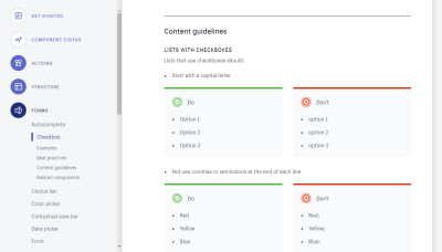
Bake Best Practices Into The Documentation
When best practices — such as accessibility, performance, ergonomics and so on — are baked into the system, it becomes much easier for users to apply them.
Conclusion
Incorporating a system into a design culture takes a lot of time; it’s a gradual process. And the way you manage the design system plays a vital role in its adoption. A successful design system needs to become part of the organization’s DNA, helping your team produce more consistent user experiences, building bridges between design and development, and improving your design process without exposing your orgchart.
This article is part of the UX design series sponsored by Adobe. Adobe XD tool is made for a fast and fluid UX design process, as it lets you go from idea to prototype faster. Design, prototype and share — all in one app. You can check out more inspiring projects created with Adobe XD on Behance, and also sign up for the Adobe experience design newsletter to stay updated and informed on the latest trends and insights for UX/UI design.
Further Reading
- Iconography In Design Systems: Easy Troubleshooting And Maintenance
- Beyond Tools: How Building A Design System Can Improve How You Work
- The Case For Brand Systems: Aligning Teams Around A Common Story
- How To Make And Maintain Atomic Design Systems With Pattern Lab 2

