Visual Design Language: The Building Blocks Of Design
“Design is not just what it looks like and feels like. Design is how it works.”
— Steve Jobs
Like written words are to language, fonts, colors, shapes and icons are to visual design. An effective visual design language not only acts as a communication framework for all stakeholders on a product development team, but unites a brand and its customers to ensure that a company’s brand identity matches a customer’s brand perception.
We use language as a tool for communication with other people. Writers use words to communicate with their readers, while designers use visual language to communicate with their users. Fonts, colors, shapes, visual elements such as icons — those are elements of design language. Effective design language streamlines communication.
While working at Fantasy in 2016, my team was tasked with designing the interface for Huawei’s mobile OS (EMUI 5 interface). I personally was responsible for the visual design language for this OS. Surprisingly, the company didn’t have its own language at initiation; instead, they relied on a customized version of Android that was plagued by inconsistency and lacked a coherent vision. This was largely due to the existence of multiple teams and multiple functional roles with different skillsets and perspectives all grasping at straws to invent a way to communicate. UX designers, interaction designers, visual designers and graphic designers had all worked on the OS in the past, all using their own best efforts to communicate.
Without a uniform system of communication, not only was the user experience jumbled and confusing, it was extremely difficult to integrate changes into a final design. It was a true Tower of Babel.
“
What Does Design Language Provide?
By unifying the project teams under one shared language, a project can move forward with clarity, cohesion and speed.
Consistency
Digital design has few physical constraints compared to industrial disciplines. This gives designers a lot of power to experiment and propose a variety of solutions to any given challenge. However, this can easily lead to disjointed user experiences.
To achieve consistency in design, it’s vital to define reusable and cross-platform components and styling options. Consistent design makes it much easier to ship products on a multitude of platforms and devices, which is especially crucial for companies like Huawei.
Brand Recall
When they interact with a product that has a strong visual language, users tend to remember it better. Unfortunately, a majority of products available on the market have generic designs. It is too easy to confuse one product with another when they share the same visual styles.
Creating a strong visual identity is a goal that design teams should state when working on visual design. This is the personality of a digital product! The colors, typefaces, photos, illustrations, animations are all part of a brand, and they should be designed in a way that helps people remember the product. When an authentic design language is followed consistently, it creates recognizability for the brand.
Clarity
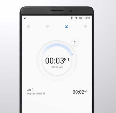
We put a strong focus on clarity — we wanted to make our GUI clean, not cluttered. By following a minimalist approach, we minimized the number of elements that users have on every screen and created a highly-focused experience.
A Way To Innovate
With so much competition in the phone market, companies invest significant resources to make people try their products. Companies invest in innovation and try to break new ground to attract users and peak their interest. Visual design is often the fastest and cheapest way for a product to innovate.
How Do We Create A Design Language?
For me and my teams, the process of creating a design language, we follow the same rubric we would create any complete consumer product: research-ideate-design-validate- implement. This is how we ensure that the language will work for our target audience.
Research
Often, the VDL is the most important, cornerstone product we create. And like every product you design, research should always be the first. When we started this Huawei project, it was important to understand the opportunities for our design. Jeshua Nanthakumar, a lead UX designer on this project, and his UX research team analyzed all mobile OS available on the market and identified the full range of challenges typically faced by users.
The UI Audit
As I’ve mentioned above, achieving consistency was one of the goals of creating a shared design language. It’s essential to standardize the visual design. That’s why even before starting work on a visual language, we decided to conduct a UI audit. Our goal was to understand the anatomy of the Android OS.
We broke down the whole mobile OS into atomic elements—colors, shapes, shadows, lines, transitions. By decomposing the design, our team was able to see how individual pieces work together and form a greater whole. At the end of UI audit, we had all the elements that make up the digital product (buttons, navigation bars, icons, etc.) grouped into distinct categories.
Understand How Users Perceive The Brand
When working on visual language, it’s essential to have a clear understanding of who you’re designing for and how they perceive your brand. Ideally, brand identity (the way the brand wants to be perceived by users) should match with the brand image (the way users actually perceive the brand). Designers have a direct impact on brand identity. Aesthetic styles, language & tone, iconography, and illustrations — all these are elements of brand identity.
Our goal was to create an innovative design language that feels customized for its audience. To understand how your users perceive the Huawei brand, our team invested in user research. We knew that design language should successfully meet the needs of both Eastern and Western design sensibilities, so we categorized large groups of users and created summaries based on the available information about our target groups. Every summary about our audience had the following information blocks — demographics, what they care about, and their expectations. Here is an example of the summary of the group of North American customers:
- Huawei’s core audience lives both Urban and Suburban environments;
- They are driven by business, social status, and personal organization;
- Age range 30-64;
- Average income: USD $75.000 per annum
- They care about:
- Being organized and ordered
- Efficiency and productivity to enable them to enjoy their own time
- Their expectations
- Contributing to something bigger than themselves
- Maximizing life and living for happiness
With the idea that design should match the audience’s lifestyle and be extremely refined, we evaluated every design decision in accordance with the needs of our target segments. This understanding will give you a reason for your visual direction.
Analyze Major Competitors
To identify strategic design opportunities, our team conducted the competitors’ analysis. We’ve identified four major competitors who had strong design languages and focussed on identifying their strengths and weaknesses. For example, when we evaluated Apple iOS, we’ve mentioned the following strengths of the language — scalable across devices, great focus on standardization, unique identity — and the following weakness — inconsistency with iconography, overuse of blur effects.
This analysis helped us to identify four major directions that brands followed when they create products:
- Empathetic to me (design tailored for the needs of the target audience; design that demonstrates real empathy with the human and truly reflects the audience)
- Novel design (design that uses innovative visual styles and interaction patterns)
- Commonplace design (design that utilizes conservative style elements)
- Standardized for all (heavy standardized design)
We put every brand on the plot with those four directions.
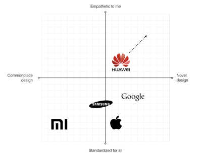
This process helped us to identify the opportunities for Huawei language:
- Scalable Design Language
The language should scale across devices and across third-party developer apps as well. - Unique Design DNA
The language should be unique and distinct from the major competitors. - Be Bold Yet Timeless
The language should be long-lasting.
Define Requirements For Visual Hierarchy
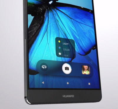
When UX researchers analyzed typical user complaints, they found that the location of key interactive elements was one of the most common problems that many mobile users mentioned. In 2016 mobile screens become larger and larger, but the location of key functional elements in Android remained the same — the top area of the screen. As a result, users had to stretch their fingers or change their grip in order to interact with the elements.
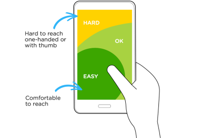
Today a bottom-area navigation is an industry-standard, but back in 2016, the situation was a bit different. We’ve reached the Huawei engineering team with this insight and asked about the technical feasibility of moving controls to the bottom area of the screen — this area is more comfortable for user interaction. The engineering team confirmed that it was possible to move the elements, and we helped define the new default location for functional elements.
Ideation: Defining A Design Vision
Creating A Philosophy Of Design
Imagine that you need to design a language that will be integrated into products that will be used by people all over the world. The natural language we use in interpersonal communications cannot be separated from a culture because it has a close relation to the attitude or behavior of speakers of the languages. The digital language is absolutely the same — it should look natural for customers in the Americas, Europe, Asia, Africa, and Oceania.
The success of any visual design highly relates to how people perceive it. Many factors are influencing human perception, and the significant part goes to psychology. To create a sophisticated design, you need to consider the meaning of shapes and the impact which they have on users’ minds.
Creating a philosophy of design is extremely challenging, and you cannot do it alone. That’s why I worked with Abigail Brody, a former Apple creative director who joined Huawei in September 2015 as Chief UX design and VP of Huawei Devices. At Apple, Abigail was responsible for iOS design. She was the one who described the methodology of visual language to me.
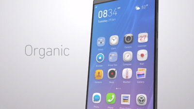
Together we spend a lot of time trying to find the direction for visual design, and we’ve decided to use the philosophy of organic design as a foundation for our design language. Organic design is centered around using nature as the biggest inspiration.
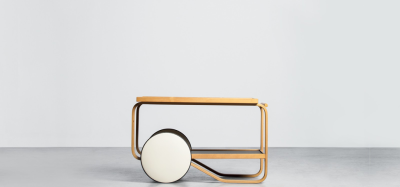
According to this philosophy, design should help to achieve harmony between people and nature. When we worked on our visual language, we focused on incorporating natural forms (smooth curves and organic forms) in our visual design. As a result, all visual elements, such as buttons, icons, and shapes, had an organic design aesthetic.
Using Motion Design To Create A Distinct Visual Identity
There is no doubt about the importance of the role that motion plays in mobile design. For many product motion serves a purely-functional role—it provides feedback for user action and connects different states of the mobile app together. The well-crafted motion also makes things more attractive, and as we know, attractive things work better (the aesthetic-usability effect says that people are more tolerant of minor usability issues when they find an interface visually appealing).
Our team put high stakes on the motion. Our ultimate goal was to use motion to breathe life into our products — make the interface feel alive and dynamic. We wrote a motion design manifesto with solid design principles. Every animated effect and transition that we wanted to introduce in our design was measured in accordance with the functional and emotional benefits it delivers to end-users.
We know that early impressions of a product design are especially important. And for that very reason our key focus was on creating magical moments — surprise and delight users while they interact with the OS.
Design And Testing: Build, Test, Iterate
Baking Meaning Into Every Design Element/Design Decision
Just like we have rules for using words in sentences in a natural language, we should have rules for using visual elements in visual language. Strong semantics is what makes visual communication efficient.
When a team works on a visual language, it should take two rules into account:
- There are no random visual elements in a visual language. Every element serves a purpose.
- There should be no isolated units in visual language. Every unit in a visual language should be a part of a greater whole.
Experimentation And Design Review
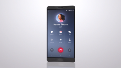
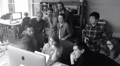
It’s impossible to create a great design from the first attempt. Design is an iterative process, and whenever our team created a new visual solution, they evaluated it by comparing it with previous solutions. The comparison was visual—the screens were laid side by side on a board, so everyone could see the parts that require additional polishing. Team members gather together on informal design reviews where they discuss the pros and cons of individual solutions.
Pattern Libraries, Style Guides And Design Principles
Pattern libraries (reusable building blocks such as UI bars), style guides, and design principles (principles that allow developers to propagate design language in their own apps) are essential elements of design language. They are the foundation of the design system — a shared resource that teams use when they create interfaces. The fact that we’ve conducted a UI audit during the research phase helped us to categorize the visual design elements. We’ve established a toolbox for everyone who worked on the project. So, when a new member joins a team, all they need is the toolbox, and they are set to maintain consistency.
There are no random visual elements in a visual language. Every element serves a purpose.
“
Test Early, Test Often
The Huawei EMUI project was an extremely important project for the Huawei Corporation. It was essential to ensure that the language we’ve defined work for the users. And the only way to get this understanding is to test our design as soon as possible.
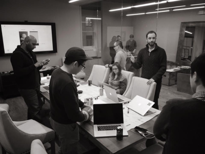
We’ve followed a simple but effective technique — build, measure, learn. By following this approach, the design team didn’t postpone the testing design until the release. We’ve incorporated visual language into functional prototypes and tested them both inside our group (dogfooding) and outside (with real users). The feedback collected during the testing allowed us to understand what worked/doesn’t work for users.
Implementation
If you have had a chance to use the Huawei EMUI 5 interface, you are probably thinking to yourself, “Um, that doesn’t look exactly like Gleb said!” And that’s true.
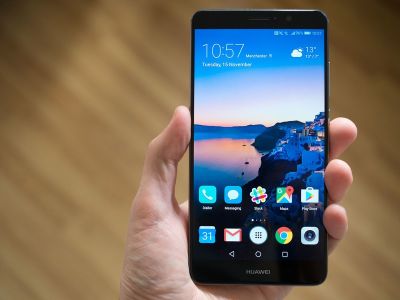
It is a sad reality that almost no design team is responsible for the implementation of this solution. Unfortunately, a lot of solutions we proposed to the engineering team weren’t implemented properly, or at all. As a result, the design language we’ve created and the design language the end-user saw in Huawei products end up as two different animals. But this is purely my opinion. In 2018, Huawei surpassed Apple in smartphone sales. The UI was a critical element to user confidence.
Based on my experience, the challenge of implementation is common for large-scale corporations. When designers who created the language aren’t invited into the process of implementing this language into the product, the final results will always be compromised. What usually happens is the engineering team follows a path of least resistance — they adjust the design solutions to the technical constraints they face when they start.
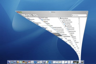
Every company needs a top-manager who cares about design and is ready to fight for it. It’s a well-known fact that when the original minimize animation in macOS that was proposed by the Apple motion design team, the engineering team said that it was impossible to implement that. At that time, Steve Jobs insisted that this animation is a must-have for MacOS. As a result, this animation became not only the most memorable transition for first-time users but also one of the things that contribute to good UX in MacOS.
A Robust Visual Design Language Is The Heart Of Good UX
Visual language can have a dramatic impact on user experience. It’s able not only to reduce friction by making UI more predictable but also to create delight. By pairing great form with excellent function, we will have an excellent user experience.
Visual language is a by-product of product design, and it requires a similar design process. It’s iterative and requires validation at every step along the way. When you build a visual language, you establish a new ecosystem for designers, and this ecosystem creates harmony between different teams involved in product development.
Further Reading
- The Principles Of Visual Communication
- Decision Trees For UI Components
- Inspired Design Decisions With Max Huber: Turning Mundane Subjects Into Exciting Visual Communication
- Recreating YouTube’s Ambient Mode Glow Effect


 Claim Your Free Spot!
 SurveyJS: White-Label Survey Solution for Your JS App
 Celebrating 10 million developers


