What Vitruvius Can Teach Us About Web Design
There’s no escaping the ancient masters. Their shadows loom large over philosophy, literature, architecture, warfare, and… web design? Believe it or not, yes. Although Plato infamously omitted CSS Grid from from the final draft of The Republic, there is nonetheless plenty the old heads can teach us about web development.
Today’s lecture is about architecture, and how some of its core tenets apply to the worldwide web. Architectural terms are not unusual in web development, and for good reason. In many ways, web developers are digital architects. This piece will focus on Vitruvius, a Roman architect, and how his principles can and should be applied to websites.
This will focus in particular on the Vitruvian triad, three qualities essential to any building: durability (firmitas) , usefulness (utilitas), and beauty (venustas). Familiarity with these terms - and what they mean in practice - will help make your website better.
Vitruvius
Marcus Vitruvius Pollio was a Roman architect, civil engineer, and author who lived during the first century BC. He is remembered mainly for his writings on architecture, De architectura. Addressing the then emperor Augustus, Vitruvius outlines his thoughts on architectural theory, history, and methods.
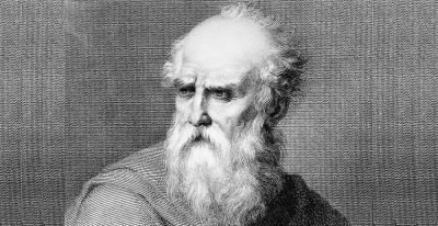
De architectura is the only treatise on architecture to survive from antiquity, and remains a design touchstone to this day. As you could probably guess, Leonardo da Vinci’s Vitruvian Man was inspired by Vitruvius’s writings about proportion.
For those of you interested in going down an architecture rabbit hole, the full text of De architecture is available for free on Project Gutenberg. This piece will not attempt to summarise the whole book. There are a couple of reasons for this. First, there’d be an awful lot to cover. Second, I haven’t totally lost sight of the fact this is a web design magazine. We will be honing in on the Vitruvian triad, a standard for design that applies well beyond architecture.
The ancients had a knack for reducing topics to their bare - you might say elemental - essentials. The Vitruvian triad is one such case. There are other architects worth studying, other design theories worth being familiar with, but Vitruvius offers a particularly neat ABC that applies just as well to the web as it does to temples.
The Vitruvian Triad
In De architectura, Vitruvius identified three qualities essential to any piece of architecture. In the centuries since they have established themselves as his ‘golden rules.’ If you want to make Vitruvius happy - which of course you do - whenever you make a thing you should strive to make it:
Designing with these three things in mind will elevate your work. Having one of these qualities is nice; having two is good; and having all three together is divine. Divine seems like the best option. Let’s break down what each of the three qualities mean in principle, then how they can be applied to web design.
Useful (Utilitas)
In principle
Buildings are designed and erected for a reason. Whatever that purpose is, it should always be an architect’s mind. If the structure does not meet its purpose then odds are it isn’t going to be very useful. A theatre with no stage has rather dropped the ball, for example.
According to Vitruvius, usefulness will be assured “when the arrangement of the apartments is faultless and presents no hindrance to use, and when each class of building is assigned to its suitable and appropriate exposure.”
You’ve heard this one before, albeit with different language. Vitruvius is the granddaddy of harping on about how form should follow function. Louis Sullivan, the ‘father of skyscrapers’, coined that particular term in 1896. Sullivan supposedly attributed the idea back to Vitruvius, although documentation of this is dubious. In any case, that’s what utilitas boils down to.
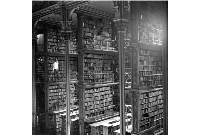
Different types of buildings have different requirements. A building designed with these requirements as an afterthought will likely disappoint. This may sound obvious, but there are enough white elephants in this world to warrant caution. Labyrinthine shopping centres and highly conductive metal domes in playgrounds may look cool in investor presentations, but they don’t wind up being terribly useful.

This also means the individual parts of a structure should be logically connected. In other words, they should be simple to access and navigate. If a building is useful and easy to use that’s a very good start.
Online
Utilitas also applies to web design. Every website has a purpose. That purpose may be practical, like a search engine or weather forecast, or it may be artistic, like an interactive story or graphic design portfolio. Whatever it is, it has a reason to exist, and if it is designed with that reason in mind it is more likely to be useful to anyone who visits the site.
An encyclopedia you would expect to be easy to search and navigate, with cleanly presented and properly cited information. Wikipedia, for example, ticks all of those boxes. It is the web equivalent of an enormous library, right down to the obscure sections and staff bickering behind the scenes. It was built with usefulness front and center, and so its core design has remained consistent in the years since its founding. Alternatively, the purpose of a publication is to produce original content that is of value or interest to its readers. To be useful, a website’s publication would present said content in a vibrant and direct way, paying special attention to the reading experience across various devices. A website with wonderful content and bad design undermines its own usefulness.Content precedes design. Design in the absence of content is not design, it's decoration.- zeldman (@zeldman) May 5, 2008


"Durability will be assured when foundations are carried down to the solid ground and materials wisely and liberally selected."
- Vitruvius
In other words, choose your destination carefully, lay deep foundations, and use appropriate materials.

We all instinctively understand longevity is a mark of good design. It reflects quality materials, meticulous planning, and loving maintenance. The Pantheon in Rome, or the Great Wall of China, are testaments to durable design, renowned as much for their longevity as for their majesty.
The principle also concerns environmental factors. Are buildings designed with due thought to the strains of weather, earthquakes, erosion, etc.? If not, it may not be a building for long…
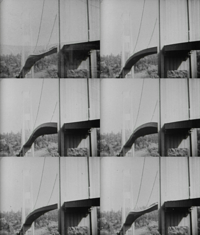
It’s reassuring to know you can count on a structure not collapsing for a while, and in the long run, it usually winds up being cheaper. A durable building sits on strong foundations and uses materials appropriate to its purpose and its environment. Buildings that aren’t designed to last are typically glorified film sets. Before long, they are rubble.
Online
Time seems to pass much faster on the web, but the principle of firmitas still applies. Given the endless turbulence of online life it makes sense to plant your flag in something sturdy. Out of the three qualities, it is the one least visible to users, but without it, everything else would fall apart.
This starts with under the hood considerations. The foundations must be strong. Where will the website go? Is the content management system the right fit? Can your web hosting provider handle the expected traffic (and more) and still run smoothly? As anyone who has migrated from one CMS to another can tell you, it’s worth getting it right the first time if possible.

There is also the longevity of the web technologies you’re using. New frameworks may seem like a good idea at the time, but if a site needs to be around for years it may make sense to fall back on HTML, CSS, and JavaScript, as well as universally supported SEO markups like structured data. As in architecture, building things to last often means using established materials rather than newfangled ones.
Durability extends to design. Web pages have to bend and stretch and warp in ways that would make architects weep. A responsive website is a durable website. As new devices - foldables, for example - and markups enter come at us, websites need to be able to take them in stride. Architects don’t get to cross their arms and sulk about earthquakes, so why should web designers shy away from the hazards of the web? Great design faces up to environmental challenges; it doesn’t avoid them.
As a site grows its users will become familiar with its design. The more that happens the more of a headache it is to make wholesale changes. If a site is designed carefully from the start then renovations are more likely than rebuilds, and the appearance remains familiar even when it is updated. In this sense, a site’s durability is helped immeasurably by clear purpose. That in itself is a kind of bedrock, helping to keep sites sturdy in times of change. Even the best sites need updates from time to time.
There is also the question of sustainability. Is due attention being paid to the commercial realities of the site? In other words, where is the box office? Be it paywalls, advertising, or membership systems, there’s no shame in incorporating these into the design process. They are not a site’s purpose, but they help make it durable.
Beautiful (Venustas)
In principle
As Vitruvius says, “the eye is always in search of beauty.” It is a perfectly legitimate quality to aim for.
According to De architectura, beauty occurs “when the appearance of the work is pleasing and in good taste, and when its members are in due proportion according to correct principles of symmetry.”
As well as being useful and well made, buildings ought also to be pleasing to the eye. Some may even touch the heart.
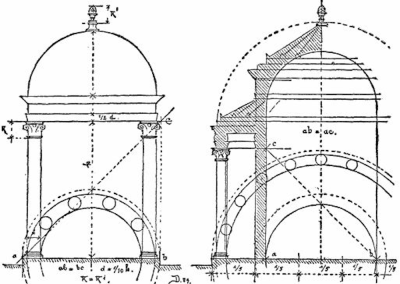
Vitruvius outlines several qualities that help make buildings beautiful. Symmetry and proportion were of particular interest to him (hence Da Vinci’s Vitruvuian Man). Obsessively incorporating shapes into everything predates graphic design by a few millennia.
Each element of a structure should be considered in relation to others near it, as well as to the environment that it is being built. Vitruvius sums up this interplay with one word: eurythmy, a Greek term for harmonious rhythm. (British pop duo Eurythmics drew their name from the same term, in case you were wondering.) Vitruvius defines it in an architectural context as follows:
"Eurythmy is beauty and fitness in the adjustments of the members. This is found when the members of a work are of a height suited to their breadth, of a breadth suited to their length, and, in a word, when they all correspond symmetrically."
Like music, buildings have rhythm; their individual pieces forming into a kind of harmony. A beautiful building might be the carved marble equivalent of a Beach Boys chorus, while an ugly one is like nails on a chalkboard.
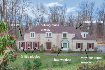
As well as being well proportioned and symmetrical, individual pieces can enhance beauty in other ways. Good craftsmanship is beautiful, as is attention to detail. Materials appropriate to the structure are also beautiful - reflecting the sound judgment and good taste of the designer.
Ornamentation is acceptable, but it must complement the core design of the structure - think column engravings, paving patterns, etc. All these little details and considerations amount to the building as a whole. When they all fall together, it’s breathtaking.
Online
Beautiful websites adhere to many of the same standards as architecture. Proportion and symmetry are mainstays of attractive design. Grid systems serve the same purpose of organizing content clearly and attractively. Beyond that, there are questions of color, typography, imagery, and more, all of which feed into a website’s beauty - or lack thereof.
To get the ball rolling, here are a handful of resources on Smashing Magazine alone:
- ‘Colour Theory For Designers’ by Cameron Chapman
- ‘Taming Advanced Color Palettes In Photoshop, Sketch And Affinity Designer’ by Marc Edwards
- ‘The Good, The Bad, And The Great Examples Of Web Typography’ by Jeremiah Shoaf
- ‘Brand Illustration Systems: Drawing A Strong Visual Identity’ by Yihui Liu
- Andy Clarke’s Inspired Design Decisions series.
An aspect of venustas that is especially relevant to web design is how users can interact with it. As well as being nice to look at, websites have the potential to be playful, even surprising. It’s one thing to sit there and be admired, it’s another to invite visitors to become part of the beauty.
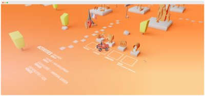
Google’s interactive doodles are another good - and less daunting - example of this. Covering all manner of subjects, they invite users to play games, to learn, and to be entertained. It’s nice in its own right, and aligns with Google’s purpose as a source of information.

With the web continuing its shift towards mobile-first experience, in which users can literally touch the websites they visit, it should be remembered that beauty pertains to all the senses - not just sight.
As for the ‘environment’, with web design that is the device it is being displayed on. Unlike buildings, websites don’t have the luxury of being one shape at all times. To be beautiful they must be responsive, shifting size and proportion to compliment the device. This is pleasing on its own, and done well the shape shifting itself becomes beautiful in its own way.
A Balancing Act
Vitruvius’s rules of utilitas, firmitas, and venustas have endured because they work, and they have endured as a triad because they work best together. Attaining all three is a balancing act. If they pull in different directions then the quality of whatever is being made will suffer. Beautiful but unuseable is poor design, for example. On the flip side, when they work together the result can be far greater than the sum of their parts.
As with architecture this requires a bird’s eye view. The pieces cannot be done one at a time, they must be done with the others in mind.
"The architect, as soon as he has formed the conception, and before he begins the work, has a definite idea of the beauty, the convenience, and the propriety that will distinguish it."
- Vitruviuas
No doubt the details will change, but the harmony should not.
This extends to the people making a website. As with architecture websites typically have to balance the wants of a client, an architect, and a builder - not to mention investors, financiers, statisticians, and so on. For a website to be harmonious, so do the people responsible for building it.
None of this is to say that the three qualities are equally important regardless of the project - only that each should be given due thought in relation to the others. The usefulness of the Eiffel Tower seems fairly trivial, as does the beauty of the Hoover Dam, and that’s fine. If a website is made to be ornamental or temporary, it doesn’t have to be more than that. The natures of utilitas, firmitas, and venustas themselves change depending on the project. Like most rules worth following, don’t be afraid to bend - or even break - them when the mood takes you.
My Website Is A Temple
Web developers are the architects of the Internet, and websites are their buildings. Vitruvius makes a point of saying architects are not - and indeed cannot be - experts in every field. Instead, they are jacks of all trades (my phrasing, not his). For the triad to be achieved it is better to have a good grasp of many subjects than expertise in one:
"Let him be educated, skillful with the pencil, instructed in geometry, know much history, have followed the philosophers with attention, understand music, have some knowledge of medicine, know the opinions of the jurists, and be acquainted with astronomy and the theory of the heavens."
The relevance of some of these is obvious, others less so, but it’s all valuable to architects and web developers alike. Geometry informs proportion and layout; history puts designs in context and ensures they are understood as they are meant to be; philosophy helps us to approach projects honestly and ethically; music awakens us to the role of sound; medicine gives thought to accessibility, and potential strains on the eye, ear, or even thumb; and law looms larger now than ever. The theory of the heavens might be a stretch, but you get the idea.
Here are yet more links to help you on your way:
- ‘Building Better UI Designs With Layout Grids’ by Nick Babich
- ‘History of the design grid’ by Alex Bigman
- ‘What Newspapers Can Teach Us About Web Design’ by yours truly
- ‘Best Practices With CSS Grid Layouts’ by Rachel Andrew
- ‘Designing With Audio: What Is Sound Good For?’ by Karen Kaushansky
- ‘The Beauty Of Imperfection In Interface Design’ by Javier Cuello
- ‘The Road To Resilient Web Design’ by Jeremy Keith.
Not that theory alone will get you there. There’s no substitute for learning through doing. As the Stanford Encyclopedia of Philosophy notes, “the Vitruvian picture of architecture is rooted in experiential knowledge of making, doing, and crafting.” Or better yet, as Vitruvius himself puts it: “Knowledge is the child of practice and theory.”
The Vitruvian triad is a worthy standard to use whether you’re building a coliseum or a portfolio website. Not everyone has the luxury of (or budget for) a team of experts, and even if we did, why deny ourselves of the breadth of knowledge that strong design requires? We can build Levittown or we can build Rome, and everything in between. A useful, durable, beautiful Internet sounds like a good deal to me.
Further Reading
- How To Improve Your Microcopy: UX Writing Tips For Non-UX Writers
- Getting To The Bottom Of Minimum WCAG-Conformant Interactive Element Size
- Is Your Website Stressing Out Visitors?
- Exploring The Latest Web Design Trends Together With Be Theme


 See the full picture →
 SurveyJS: White-Label Survey Solution for Your JS App

 Celebrating 10 million developers


