How To Create A Porsche 911 With Sketch (Part 1)
If you’re both a petrolhead (a.k.a. a big car enthusiast) with a special place in your heart for the legendary Porsche 911, and also a fan of the powerful Sketch app, then this tutorial is for you. Today, we’ll be pushing Sketch to its limits — step by step. You will learn how to create a very realistic and detailed vector illustration of a vintage Porsche 911 using basic shapes, layer styles and Sketch features (such as “Rotate Copies” and “Symbols”). You’ll learn how to master the Vector tool, apply multiple shadow effects and use gradients. I’ll also explain how you can rotate and duplicate objects with just a few special clicks. No bitmap images will be used, which means the final illustration could be scaled up to any size with no loss of detail.
This tutorial is geared more towards experienced illustrators but if you’re new to Sketch you should be able to profit from it too as all of the steps are explained in great detail.
Note: This is the first part of this tutorial in which we’ll focus on laying out the main “groundwork”, i.e. we’ll create and tweak the body of the car. In addition, we’ll also make the front signal lights and the tail lights. If you like, you can also skip to Part 2 and Part 3.
The Porsche 911
But first, a bit of background about the car that we’ll be making.
Model 911 is a 2-doors sports car produced by Porsche from 1963 through 1989 when it was succeeded by a new model with the same name. The original 911 series is often cited as the most successful competition car ever, especially its variations optimized for racing. In September 1999, the original Porsche 911 won 5-th place in the prestigious “Car of the Century” award.
The first 911 also had an almost unique concept for its time — rear-engine, rear-wheel-drive. (At a much later time, another company created a car with the same concept. It’s quite likely that you may have heard of this other car, too — this was the famous DeLorean DMC-12! The DeLorean became very popular in 1985 when Back to the Future was released in cinemas.)
Now buckle up and let’s go — as we have a long, narrow, windy (but fun) road ahead of us. Start the engine (Sketch app), shift into first gear (create a new file), and release the clutch (start drawing on the blank canvas)!
Note: I’ve written on the topic of using Sketch for vector illustration before. If you’re curious, do check my previous tutorial which is about designing a chronograph with Sketch: “Designing A Realistic Chronograph Watch In Sketch.”
Let’s Draw A Car!
To be able to better follow the steps in this tutorial, I will provide you with the original Sketch source file. This file will help you follow the process more easily but I encourage you to replicate the steps in a new file, starting with a blank canvas.
- Download the Porsche 911 Sketch file (1.4 MB)
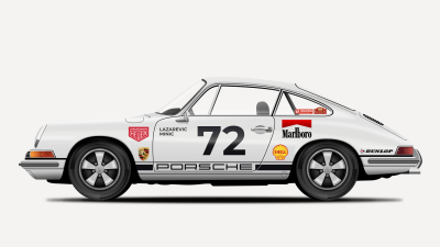
1. Artboard Settings
The first step is to create a new Sketch document. Name the document “Porsche911” and set up a new artboard with the same name, size: 1920px wide and 1080px high.
2. Tracing The Car With the Vector tool
For this step, we need an image of a Porsche 911 that will serve as a reference to outline the car in Sketch.
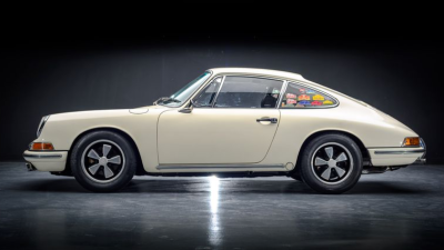
Download, copy and paste the image into the artboard. Right-click on the reference image in the list of layers in the Layers panel and choose Lock Layer to lock the layer with the reference image so that it doesn’t move accidentally.
Tip: The other way to lock a layer in Sketch is to hover the layer name while pressing Alt and clicking on the lock icon.

We will use the Vector tool to outline the car body. The result of this operation will be a vector shape. Each shape is made up of points and Bézier handles. Bézier handles are used to add curvature to a shape.

Know Your Points And Bézier Handles
For every point you add with the Vector tool, there are four point types to choose from: straight, mirrored, disconnected, and asymmetric. The point type describes how Bézier handles should behave. You can cycle through these types by selecting a point and hitting 1, 2, 3, or 4 on your keyboard. You can find point type for the selected point in the Inspector panel.
Point Types
1. Straight

The “straight” option will give you a straight corner. This type also allows you to add a corner Radius via the Inspector panel on the right.
2. Mirrored

“Mirrored” will add two Bézier handles that mirror each other so they are always parallel and the same length on both sides.
3. Disconnected

This option will give you two Bézier handles that you can change individually. Perfect for sharp corners!
4. Asymmetric

“Asymmetric” is almost the same as “mirrored”, but it only keeps the Bézier handles parallel. You can change the length of the handles individually.
Now that you know more about points and handles, let’s continue.
Note: To learn more about the Bézier Curves in Sketch app, check the following tutorial by Peter Nowell: “Mastering the Bézier Curve in Sketch”.
Select the Vector tool by pressing V on the keyboard, zoom in (press Z and click to zoom in) and start outlining the car body. Click once to create a point, move some distance away, click to add a second point and without releasing the mouse button, drag that point to create a curve and use Bézier to control the curve.
Tip: I’d suggest you give temporarily the border some bright color and a thicker width (use the Inspector panel to change these) so you can trace the car shape more comfortably.
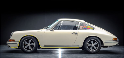
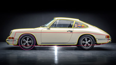
Carry on doing this around the main shape of the car, but exclude the front and back windshields. Practice is needed to reach perfection and with time you’ll get better with using the Vector tool. Once you are ready with tracing of the body of the car, the results should look like on the screenshot below.
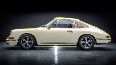
Next we need to “cut out” the side windows from the car main body. Use the Vector tool to create two shapes over the side windows. Name the shapes side window 1 and side window 2.

Duplicate these two shapes (Cmd + D) and hide the copies for now. (We will use the copies later for the side windows.) Select the car body shape and the two visible side windows shapes, and apply a Subtract operation from the top Sketch toolbar. Name the resulting shape car body.

Next, create the bottom part of the car with the Vector tool. You can trace it, but it’s not really important to be 100% accurate as the details of the shape which will not be visible do not particularly matter. Name this shape floor, then move it in the Layers panel below the car body.

There is only one more thing to do before we complete this step — to draw a wheel. Pick the Oval tool by pressing O on the keyboard and create a circle the same size as the wheel in the reference image.
Hold Shift and Alt as you drag to make a perfect circle from the center out. Give this shape the name of wheel base and make sure that its position is above the floor and below the car body layers in the Layers panel list.
3. Add Color, Shadows, And Reflections To The Car Body
Next, we will focus on the car body, so for now we can hide the reference image, as well as the wheel base and floor layers. What I usually like to do at this point is to unlock the reference image, move it outside the artboard and place it above it (or whatever other place works for you — below or on the left or right side of the artboard), so I can still use it for reference.
Or, alternatively, you can unlock the reference image, make a copy (Cmd + D), move the copy outside the artboard so it could be used for reference, and hide the original reference image inside the artboard.
Tip: Click on the eye icon next to the layer’s name in the Layers panel list to hide it. To unlock the layer, click with the right mouse button in the Layers panel and choose Unlock Layer, or just click on the lock icon next to the layer’s name.
First let’s set the basic color for our car. Select car body, uncheck Borders and for the Fills Color use #E9E9E7.
Tip: Use F on the keyboard to quickly toggle Fills on and off, and use B to quickly toggle Borders on or off.

Note: New to Sketch? Check first this very detailed Sketch help page about working with Fills: “Styling — Fills”.
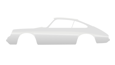
Next we will continue with the shadows (the darker parts of the car body). Use the Vector tool to draw a shape like on the image below.
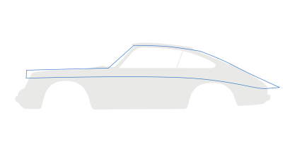
As you can see, the shape is longer than the car body, so we will fix that right now. Select both shapes (car body and the shape we’ve just created) and perform a Mask operation from the top toolbar. Sketch will place the result automatically into a group. Give this resulting group the name bodywork.
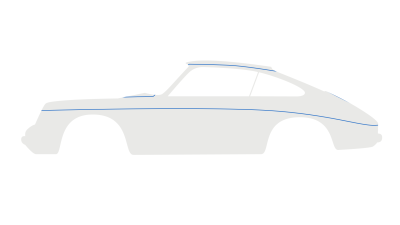
Now select again the shape that we’ve created, turn off Borders, set the Fills Color to #E1E1E1 and apply a Gaussian Blur with an Amount of 4.

Draw another shape with the Vector tool. Use the image below as a reference.
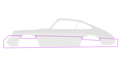
Use the Layers panel to move this shape into the group bodywork. Turn off Borders, and apply a Linear Gradient with the following parameters:
#E4E4E4#C5C5C5

Apply a Gaussian Blur with an Amount of 6 to soften its edges a bit, and add a Shadow:
- Color:
#FFFFFF - Alpha:
90% - X:
0; Y:-8; Blur:10
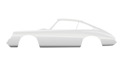
Next, to add a shadow at the bottom of the carrosserie, draw a shape using the Vector tool, set Fills to #4E4E4E, place it inside the bodywork group and apply a Gaussian Blur with an Amount of 12. Use the image below as a reference.

To finish with the shadows, draw a small shape using the Vector tool, like on the image below, fill it with #D8D8D8 and give it a Gaussian Blur effect with an Amount of 5. Don’t forget to place it inside the bodywork group.

To add light reflections we will create three shapes using the Vector tool and fill them with the following colors:
#F9F9F9#F1F1F1#F1F1F1

Move those layers inside the bodywork group, turn off Borders and apply a Gaussian Blur with an Amount of 6.
Finish this step by drawing two shapes using the Vector tool. Name these shapes front fender and rear fender. Set the color to #393939, remove the Borders, again move these inside the group and give them a Gaussian Blur effect with Amount of 2, and set Opacity to 50%. Use the image below as a reference.
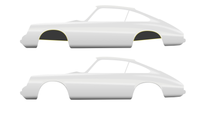
Note: From now on, everything we create needs to be placed inside the bodywork group.
4. Creating The Door (And All Sorts Of Lids)
This step is pretty straightforward and will take only a couple of minutes to complete. We will add a bunch of lids and a door in this step.
Select the Vector tool (V) and start drawing the lids. You don’t have to close the shapes, just leave them open, because we don’t actually need closed shapes — just the lines. To do that, press Esc key when you are satisfied with each line. Set the border Color to black (#000000) and Width to 1px. Use the image below as a reference.
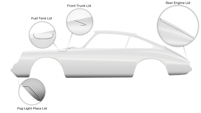
Select the Fuel Tank, Front Trunk and Rear Engine lids layers and add to them Shadows effects with the following parameters:
- Color:
#FFFFFF - Alpha:
90% - X:
0; Y:2; Blur:2; Spread:0;
Next, select the Fog Light Place Lid layer and apply slightly different Shadows:
- Color:
#FFFFFF - Alpha:
20% - X:
2; Y:0; Blur:2; Spread:2;
Pick up the Oval tool (O) and create a small circle that will represent the Jack Point cover. Turn off Fills and add an Outside border, with a Width of 1px and the Color set to #000000. Apply Shadows, with the Color set to #FFFFFF at 30% alpha and the Blur and Spread set to 2.

Next, we will draw a door with the Vector tool (V), the same way as we drew all the lids.
Make the reference image in the background visible, set the bodywork layer to 50% Opacity and trace the door lines from the photo.

When you are done, hide the reference image again, set bodywork layer Opacity to 100% and style the door shape.
Set the door’s shape border Color to black (#000000), Width to 2px and apply Shadows:
- Color:
#FFFFFF - Alpha:
40% - X:
2; Y:2; Blur:2; Spread:2;

Tip: Don’t forget to give appropriate names to the shapes/layers. Proper naming of each shape/layer may help you later on, as your Sketch file becomes more and more complex!
Draw two tiny rectangles using the Vector tool (V). Press and hold Shift while drawing to make the lines straight. It’s important to align the bottom of the rectangles like on the image below. Fill both rectangles with black color and turn off Borders.
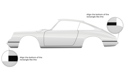
Tip: Alternatively, you can draw these two tiny rectangles using the Rectangle tool (R), enter Vector Editing mode by pressing Enter on the keyboard, select the bottom two points of each rectangle and align them properly.
Finally, draw a new shape using the Vector tool again. Set Fills to black, turn off Borders and apply Shadows with the Color set to #FFFFFF at 60% alpha and the Y and Blur set to 2. Give this shape a name of engine lid. Use the image below for reference.

5. Front Signal Lights And Horn
To start with the making of the signal lights, switch to the Rectangle tool (R) and draw a rectangle. Fill it with black Color, turn off Borders and apply Shadows:
- Color:
#FFFFFF - Alpha:
30% - X:
2; Y:-3; Blur:2; Spread:2;

Enter Vector Editing mode by double-clicking on the rectangle shape (or by pressing Enter), select the top right point, move it to the left 15px using the ← arrow on the keyboard and set the Radius to 9px. Press Enter again to exit Vector Editing mode.
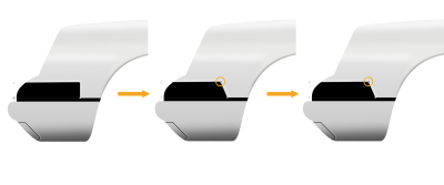
Duplicate (Cmd + D) this shape, turn off Shadows, and add a Linear Gradient fill; use #ECECEC for the first color stop and #7F7F7F for the last color stop.
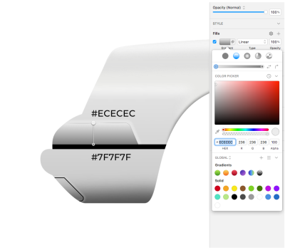
Move this shape 2px to the left using the left arrow key on the keyboard, then enter Vector Editing mode (double-click on the shape), select the top two points and push them down by 2px.
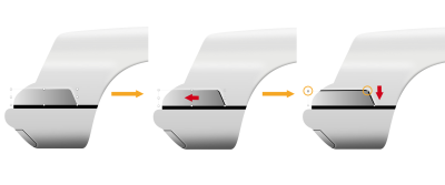
Duplicate this shape (Cmd + D), change Color from Linear Gradient to Solid Color and pick any color you want. I will use yellow, but this is just temporary. Next, double-click on the shape to enter Vector Editing mode, select the top two points and move them down 3px, select the bottom two points and move them up 3px, select the right two points and move them to the left 3px, and finally select the bottom right point and move it to the left 3px so the right edge becomes parallel with the right edge of the shape below.
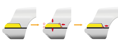
We need to split this shape into two parts. One shape will be used for the space for the horn and the other for the turn signal light. Let’s make it simple, without some fancy Boolean operations: duplicate the shape, name the original horn space and the copy turn-signal, and then hide the turn-signal shape because we will use it later.
First we need to modify the horn space shape. Select the shape, enter Vector Editing mode, select the top right point, set Radius back to 0 (using the Inspector panel on the right), move this point to the right until it’s aligned with the bottom right point (a vertical red line will appear), and then select both points on the right and move them to the left to create a small shape that we will use for the horn. Use the image below as a reference.
Tip: Hold Shift while dragging the points to maintain a straight path.
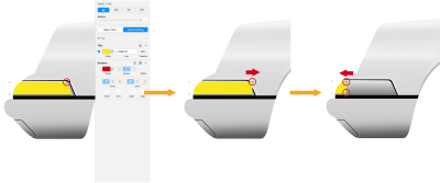
Next, un-hide turn-signal, double-click it to enter Vector Editing mode, select the two points on the left and drag them to the right until there’s a small gap between shapes.

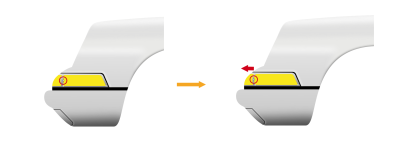
Back to the horn space shape. Double-click to enter Vector Editing mode, hold Shift and click on the right segment to add a point in the exact middle. Now, double-click on that newly added point to turn it into a Mirrored point type, and using the ← arrow on the keyboard move it 4px to the left. Then, select the bottom right point and move it 2px to the left.

We will modify the turn-signal in a similar fashion. Select the turn-signal shape, press Enter to access Vector Editing mode, add a point in the exact middle of the left segment, turn it into Mirrored type using the Inspector panel, and push it 3px to the left using the left arrow key on the keyboard.
Horn
Let’s complete the horn first. Select the horn space shape and apply a Linear Gradient — use #1D1D1D for the top color stop and #D0D0D0 for the bottom color stop, then drag the top stop to the right and the bottom stop to the left to adjust the gradient angle.
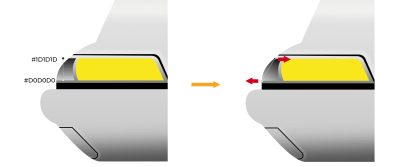
Now, duplicate this shape (Cmd + D), switch Color to Solid Color and set to #131313, switch to Vector Editing mode, select the two left points and drag them a bit to the right.
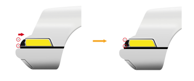
Select the top left point, push it a bit to the right, add a point in the middle of the left segment, turn it into a Mirrored point, and move it 2px to the left.
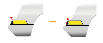
Let’s add a grille over the horn space.
Pick up the Rectangle tool (R) and create a tiny rectangle shape over the horn space, with a height of 2px, with the Fills set to #9A9A9A and the Borders turned off. Duplicate it, change the height to 1px, change the color to #000000, move it down so it’s below the grey rectangle, switch to Vector Editing mode, select the bottom left point and move it 2px to the right. Select both shapes and place them inside a group (Cmd + G). We will use this element to build the grille. Give it a name of grille element.

Duplicate this group and move it 7px up and 2px right, then duplicate it again and push it 7px up and 3px right.
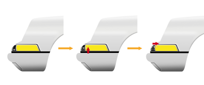
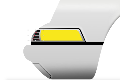
Our grille now extends past the horn space, so we need to fix it. Select all the elements that are part of the horn and perform a Mask operation so that none of the created elements go outside of the horn space.
Sketch will place the result automatically into a group. Give this resulting group the name of horn.
Turn Signal Light
Select the turn-signal shape and add a Linear Gradient fill. Set the gradient to a horizontal position with the right-pointing arrow in the color dialog and use the following colors:
#FFA137#B23821#B23821
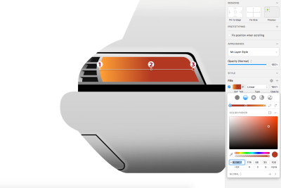
Add an Inner Shadows effect with the following properties:
- Color:
#000000 - Alpha:
40% - X:
0; Y:0; Blur:5; Spread:0
And apply a Shadows effect:
- Color:
#FFFFFF - Alpha:
50% - X:
0; Y:0; Blur:2; Spread:0
It’s time to add the light bulbs. First, use the Oval tool (O) to draw a circle like on the image below. Turn off Borders, set Fills Opacity to 0% and apply Inner Shadows:
- Color:
#000000 - Alpha:
12% - X:
-9; Y:0; Blur:9; Spread:0

Then, draw a small rectangle with the Rectangle tool (R) and use Radius (Round Corners) in the Inspector panel to create a rounded rectangle that will serve as a light bulb in our car illustration. Turn off Borders, and set Fills to Linear Gradient:
#C06D25#DE8D55#BC4E08#A64A15

Finally select both — the circle and the rounded rectangle — and perform a Mask operation to place the rectangle inside the circle. Name the resulting group light1.
Tip: Sketch may turn off Inner Shadows on the masking shape (in this case, light1) while performing a Mask operation, so select the masking shape and check. If Inner Shadows are turned off, turn them back on using the Inspector panel. It’s a good idea to check for this every time when performing a Mask operation.

We will add a second light bulb in a similar way. Draw a circle, turn off Borders, set Fills Opacity to 0% and add Inner Shadows:
- Color:
#000000 - Alpha:
18% - X:
0; Y:12; Blur:5; Spread:0

Duplicate this circle and scale it down. Modify the existing Inner Shadow:
- Color:
#000000 - Alpha:
28% - X:
0; Y:-5; Blur:5; Spread:0
And add another one on top of it:
- Color:
#000000 - Alpha:
50% - X:
0; Y:0; Blur:2; Spread:0
Then select both and group them into a light2 group.

In the Layers panel list select turn-signal, light1 and light2 and apply a Mask operation. This way light1 and light2 will be inside turn-signal. Name the resulting group turn signal light.

To complete the turn signal light, we need to add a tiny screw on the right side of it. We will construct our screw using a circle, so grab the Oval tool (O), and draw a small circle on the right, close to the edge of the signal light. Set the Fill Opacity to 0%, set Borders Width to 1px, position Inside, and color to #B3B3B3 with alpha 30%; and add an Inner Shadows effect:
- Color:
#000000 - Alpha:
50% - X:
0; Y:2; Blur:2; Spread:0

Duplicate this circle, scale it down, turn off Borders, set Fills to #B2CBDF with Opacity back to 100% and add the following Shadows and Inner Shadows.
First Inner Shadow:
- Color:
#FFFFFF - Alpha:
80% - X:
0; Y:0; Blur:1; Spread:0
Second Inner Shadow:
- Color:
#000000 - Alpha:
50% - X:
0; Y:0; Blur:1; Spread:0
And at the end, a Shadows effect:
- Color:
#000000 - Alpha:
100% - X:
0; Y:0; Blur:2; Spread:0

We need one more circle for the screw, so again, duplicate the previous circle, scale it down, set Fills to #303030, and turn off Shadows and Inner Shadows.

Tip: At this point, you may end up with a 1px circle which still looks a little bigger than what you can see in the screenshot above, and you may also have some trouble aligning it properly. If this happens, check whether Pixel Fitting is checked in Sketch Preferences, and if it is, it might be a good idea (at least temporarily) to disable it: go to Preferences → Layers → un-check the Pixel Fitting checkbox.
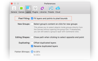
Select all circles that we used to create the screw and group them into a screw group, then move this resulting group inside the turn signal light group on top.
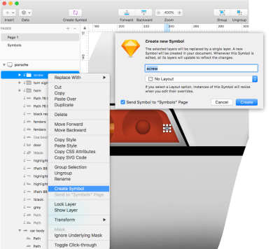
Now it’s time to use the Create Symbol feature in Sketch and create a new Symbol out of the screw group. Later, we could use this symbol in our illustration as many times as we need it.
Tip: Symbols are created for those elements that you expect to reuse. When you use them right, Symbols can become a very powerful feature; they can speed up your workflow by giving you a way to save and reuse common elements across your illustrations and designs. When you make changes to a Symbol, those changes will be automatically applied to all the instances of this Symbol in your designs.
To create a Symbol, select the screw group in the Layers panel list, right-click on it, and choose Create Symbol from the menu. The dialog box Create New Symbol will appear; give a name to the symbol (screw in this case) and click OK.
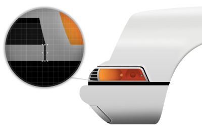
There is one more small detail to add. Zoom in close enough (i.e., 3200%) and draw a tiny rectangle. Turn off Borders and set Fills to #131313.
6. Tail Lights
We are going to build the tail lights the same way as we did in the previous step. Let’s quickly go through this step.
Draw the rectangle. Fill it with black color, turn off Borders and apply Shadows:
- Color:
#FFFFFF - Alpha:
30% - X:
-2; Y:-3; Blur:2; Spread:2;
Enter Vector Editing mode, move the top left corner 15px to the right and set Radius to 9px.
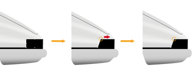
Duplicate the rectangle, turn off Shadows and add a Linear Gradient fill; use #ECECEC for the first color stop and #7F7F7F for the last color stop. Then, move it 2px to the right, enter Vector Editing mode, select the top two points and push them down 2px.

Duplicate this shape (Cmd + D), change Color from Linear Gradient to Solid Color and pick any color you want. Next, switch to Vector Editing mode, select the top two points and move them down 3px, select the bottom two points and move them up 3px, select the left two points and move them to the right 3px, and finally select the bottom left point and move it to the left 3px so the right edge becomes parallel with the right edge of the shape below.

Now, change Fills to Linear Gradient. Set the gradient to a horizontal position with the right-pointing arrow in the color dialog and use the following colors:
#5D1720#621822#662423#B04643#C25F56

Add an Inner Shadows effect with the following properties:
- Color:
#000000 - Alpha:
50% - X:
0; Y:0; Blur:5; Spread:0
And apply a Shadows effect:
- Color:
#FFFFFF - Alpha:
50% - X:
0; Y:0; Blur:2; Spread:0
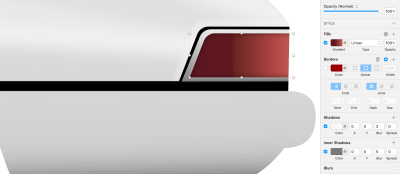
Let’s now move to the design of the tail light’s light bulbs.
Use the Rectangle tool (R) to draw a rectangle like on the image below. Turn off Borders, set Fills Opacity to 0% and apply Inner Shadows:
- Color:
#000000 - Alpha:
40% - X:
-2; Y:0; Blur:5; Spread:0

Then, draw a small rectangle with the Rectangle tool (R) and use Radius (Round Corners) in the Inspector panel to create a rounded rectangle that will serve the purpose of a light bulb. Turn off Borders, and set Fills to Linear Gradient:
#B75D61#6B2224

Finally, select both rectangles and perform a Mask operation to place the rounded rectangle inside the other rectangle. Name the resulting group tail-light1.
Tip: Again, remember that Sketch may turn off Inner Shadows on the masking shape while performing a Mask operation, so select the masking shape and check. If Inner Shadows are turned off, turn them back on using the Inspector panel.

Draw a rectangle, turn off Borders, set Fills Opacity to 0% and add Shadows:
- Color:
#000000 - Alpha:
30% - X:
-2; Y:0; Blur:2; Spread:0

Draw a small circle, turn off Borders, set Fills Opacity to 0% and apply the following Inner Shadows.
First Inner Shadow:
- Color:
#000000 - Alpha:
40% - X:
0; Y:-2; Blur:5; Spread:0
Second Inner Shadow:
- Color:
#000000 - Alpha:
30% - X:
0; Y:0; Blur:5; Spread:0

Select the rectangle and circle that we’ve just created and place them inside the group (Cmd + G) tail-light2.
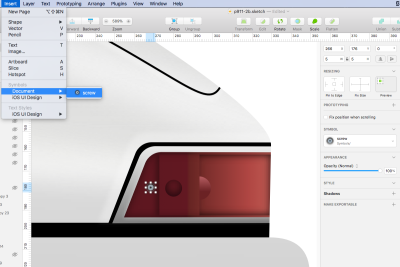
Finish this step by adding the screw symbol instance. Go to Insert → Document, choose screw, click over the tail-light2 to insert the symbol and then position it to the correct spot. Use the image below as a reference.
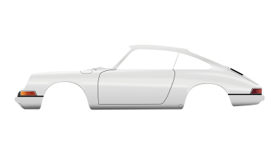
Let’s take a look at the bigger picture and check what we did so far!
Conclusion
Good job! The main body of the car is now ready; we have the door shape, the lids, the front turn light and the tale lights.
In the next part of the tutorial, we’ll continue with the windows, bumpers, headlights, the interior, and a few other elements of the car. Stay tuned!


 See the full picture →


 Celebrating 10 million developers
 SurveyJS: White-Label Survey Solution for Your JS App

