What Can Web Designers Do With Their Unused Designs?
I was working on redesigning my website the other day and was having a hard time deleting sections and pages I knew were unnecessary and keeping prospects from getting to the important stuff. It’s similar to the struggle I have whenever a client (design or writing) decides not to use something I’ve created for them.
I’m not a hoarder by any means, but when it comes to things I’ve taken a lot of time and energy to create, it’s so hard to let go.
But that’s part of what we have to do as creators: Trim the fat.
When it comes to client work, what do you do with that fat though? It’s not like you’re designing mockups or features that you hastily threw together and that deserve to be rejected or go unused. Sometimes the client just needs to decide which of the options they want to use. And other times it’s because they realize that a certain feature or element isn’t necessary after all. You might even come to that conclusion on their behalf, too.
When that happens, what do you do with the unused designs? Unless the client wants to take ownership of them for a rainy day, do you just throw them away?
If you have something really well-designed or even the inklings of something that could be great, you have a number of things you can do with your work.
What To Do with Your Rejected Designs
Let’s be clear about one thing before we look at your options:
Check your contract for the ownership and copyright rules before you do anything with your unused designs. Better yet, write your own contract and make sure the copyright rules are clearly stated and work in both of your favors.
The last thing you want is to repurpose a rejected design, only to hear from an angry client who believes they have the rights to everything you created during your time working together.
Once that’s settled, you can pursue one of the following options:
Option #1: Hold Onto Your Designs And Repurpose For Another Job
When you have designs that didn’t make the cut, put them into a dedicated folder. Give it a positive name so you don’t get into the habit of viewing this work as a graveyard for “Rejects” or “Unwanted” designs. It’ll be hard to do anything with them later if you view them in a negative light.
This is where mine live in Google Drive:

I keep this folder right next to my current client folders. That way, I almost always pass by my unused work every day, which keeps this good content top-of-mind.
Another thing you can do to turn these unused designs into a positive is to keep your folders organized. Here’s one way to do it:

You could also have high-level categories for “Branding”, “Social” and “Web” (or “Apps”) and put sub-categories beneath them. It’s easier for me to see everything at a glance like the above, but either way works.
The goal is to have your old designs on hand and well-organized so that when you start a new job and realize, “Oh, I created something before that could work for this”, it’s easy to retrieve.
While all of your unused work should be redesigned in some way when you repurpose it for another client, the amount of redesigning you do depends on what you created and why it was rejected.
Here are some examples of unused work you can do a more gentle redesign on (aside from the branded elements, of course):
- Trial websites, mockups or wireframes that you pitched and weren’t accepted,
- Web page mockups or components that wildly vary from the design picked by the client.
For anything custom-created for a client’s brand, give the original design an overhaul and perhaps even mix-and-match a number of elements from your rejects to create something new. Essentially, what you want to do is use the good foundation of your unused work to save yourself time creating something (mostly) from-scratch for someone else.
Option #2: Templatize And Sell Them On A Marketplace
Another option is to templatize your unused designs.
Unlike option #1 where you make a profit by spending less time building a new client’s website with the pieces from another, this one allows you to exponentially increase your profits by selling them over and over again. You just have to make sure your templates have mass appeal.
There are a couple routes you can take with this.
Templates Or Themes
If a client falls off the face of the Earth and ghosts you for good, you might have the makings of an entire website or app (if not the whole thing) sitting in your lap.
In that case, you could turn your designs into a ready-made template or theme and sell the license to numerous users instead of just the one client. You can do this with:
- Websites,
- Landing pages,
- Mobile apps,
- Web apps.
You could also strip down your creation and turn it into a UI kit.
Now, because you only have one set of unused designs (hopefully), you won’t be able to sell the template on your own website unless you already have an established shop where you make and sell templates from.
So, you’ll have to use a third-party marketplace to do this.
Thankfully, there are a number of marketplaces with high volumes of traffic. So, even if they do take a big chunk of your profits, the increased visibility (and your additional marketing efforts) will help you make enough sales where it doesn’t matter.
I’d recommend using one of the following platforms:
With Dribbble, you get the added benefit of selling your template alongside the rest of your portfolio (I’ll explain below why it’s not a bad idea to have a portfolio here as well as your site).
Licensable Components
Let’s say you’re not stuck with a ghosting client (phew!). Instead, you’ve presented your client with a lot of great options and there are some things they just don’t need. Or they decide to go in a different direction with their business and now you have unused assets.
In this case, you can turn these custom-made pieces into licensable components. This would work for:
- Imagery (photos, illustrations, videos, audio, etc.);
- Icon sets;
- Fonts;
- Textures;
- Backgrounds;
- Logo(s);
- Plugins or extensions.
Again, unless you have dozens of these to sell, your best bet is to license them through a marketplace. With the exception of MOJO Marketplace, you can license your components and graphics through the same list of sites above.
Envato Market (the umbrella company above ThemeForest) has a number of categories through which you can license your content: plugins, video, audio, graphics, photos and 3D files. CodeCanyon is the part of the marketplace where you can sell website extensions and plugins:

If you have a component you custom designed and coded (like a pop-up, contact form or a reviews widget), this is a good place to sell it.
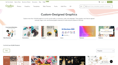
Creative Market, on the other hand, is a good place to sell stock photography, graphics and fonts:

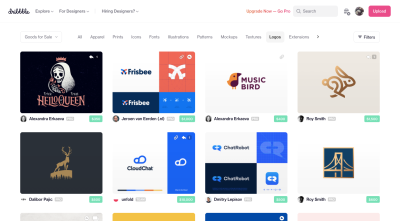
Dribbble would be a good option to license, well, everything. Though if you created branding that’s now going to go unused, this is definitely the place to use to find a buyer:

One thing to keep in mind is this:
It’s okay if you don’t license any of your unused components or templates right away. As your online reputation grows, the possibility of them selling will grow. It’ll just require some work on your part to market them and increase their visibility in the marketplaces.
Option #3: Show Off The Early, Unused Versions Of An Approved Design In A Case Study
How often do you really knock it out of the park on the first try with a design?
Unless you’ve worked with a client for some time or are super well-versed in their niche and what they do, it can be hard translating their vision into the perfect design in the first round. In some cases, you might even pitch them a few different options to better gauge what they want and get them as close as possible to perfect next time.
Eventually, you will nail it. But what happens to all those quality designs you created in the lead up to the approved design?
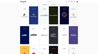
One of the things I love about the Rejected Design Instagram account is that it doesn’t hide the other designs that were created along the way. You get to see how a designer took a logo from “not crazy about it” to “love it”:

It’s an honest approach to showing how the design process works. And I think this is something that web designers can use when creating client case studies for their websites.
So, rather than tell the fairy tale version of the story:
“I met Client X. I designed this beautiful responsive website that they loved.”
You share the nitty-gritty details about how you and your client got the happy ending:
“I met Client X. We carefully reviewed their business plan, mission and values. After a lot of strategic planning, I created two mockups based on our discussions and research...”
This gives you a chance to show off different versions of the work you did as well as different iterations of the same design.
Unlike design portfolios that usually only show the winning design, your case study would show your prospects the before, the after and everything that happened in between — which includes showing off designs that didn’t work for the client.
I think in a time where consumers are demanding more transparency from brands, using rejected designs to build out client case studies could be a really good thing for your business.
First, you’ll get to show prospects how good of a designer you are that you could take a client’s feedback and turn a rejected or so-so design into a winner. Second, you’ll show them how your design process works, how you deal with negative feedback and how you’re able to use your creativity and skills to pivot when you’ve gone in the wrong direction.
You won’t be able to monetize this option, not directly anyway. But you can use it to attract more prospects to your business by being more honest about how you work and showing what you’ve done for your clients in the process.
Option #4: Put Them in Your Design Portfolio
There’s one last option for your unused designs and this is if you can’t find a way to monetize them and you’re not able to show them off in your case study (either because your client doesn’t want to put their experience out there or you’re not confident enough to show off earlier designs).
That said, you can still benefit from this option. I’d just say it’s more for fledgling designers struggling to bulk up their portfolio with quality work samples.
There are a couple of places to do this. I guess it depends on your confidence in the designs and what you want to happen with them.
For example, you can place unused designs into your website portfolio to:
- Bulk up a slim collection of work for prospects to glance over.
- Provide inspiration and examples to show off to existing clients.
- Show off your evolution as a designer over time, though that’ll require you to add more details to each portfolio piece like the year it was done and to explain that it was unused.
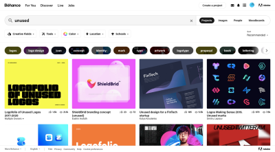
You can also use a site like Dribbble or Behance to share your unused work (on top of your regular portfolio). There’s a lot of work that designers showcase as “unused” on these sites:

There are a few benefits to this:
- Obviously, if your website doesn’t have a lot of organic traffic yet, your Behance portfolio can help boost your visibility.
- By sharing your unused work here, you’ll provide inspiration to other designers or even business owners looking for somewhere to start.
- If you sell your unused designs here, you’re likely to discover that one person’s trash is another person’s treasure.
Wherever you end up sharing your unused work, remember to strip out all branded elements from the designs. You can replace them with your own logo, company name, images, etc. or create some dummy ones to fill in the gaps. Then, let your prospects focus on the designs and not the company who turned down the work.
Wrapping Up
It can be very hard letting go of a design, feature or piece of content you created. This is one of those times in business, however, where it’s okay to let a deep personal connection to your work drive your decisions.
In this case, you’ll use your belief in the quality of the work to bring life to it in a different way than was originally intended. And that’s a really great thing. In addition to preserving a great piece of design, you can repurpose it into something that helps you make money in new ways.
Further Reading
- Interview With Björn Ottosson, Creator Of The Oklab Color Space
- Embracing Introversion In UX
- The Scent Of UX: The Unrealized Potential Of Olfactory Design
- How I Learned To Stop Worrying And Love Multimedia Writing


 Claim Your Free Spot!
 Celebrating 10 million developers

 SurveyJS: White-Label Survey Solution for Your JS App
 Register Free Now

