A New Way To Reduce Font Loading Impact: CSS Font Descriptors
Font loading has long been a bugbear of web performance, and there really are no good choices here. If you want to use web fonts your choices are basically Flash of Invisible Text (aka FOIT) where the text is hidden until the font downloads or Flash of Unstyled Text (FOUT) where you use the fallback system font initially and then upgrade it to the web font when it downloads. Neither option has really “won out” because neither is really satisfactory, to be honest.
Wasn’t font-display Supposed To Solve This?
The font-display property for @font-face gave that choice to the web developer whereas previously the browser decided that (IE and Edge favored FOUT in the past, whereas the other browsers favored FOIT). However, beyond that it didn’t really solve the problem.
A number of sites moved to font-display: swap when this first came out, and Google Fonts even made it the default in 2019. The thinking here was that it was better for performance to display the text as quickly as you can, even if it’s in the fallback font, and then to swap the font in when it finally downloads.
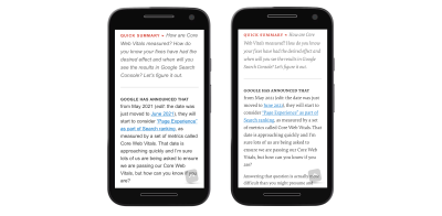
I was supportive of this back then too, but am increasingly finding myself frustrated by the “hydration effect” when the web font downloads and characters expand (or contract) due to differences between the fonts. Smashing Magazine, like most publishers, makes use of web fonts and the below screenshot shows the difference between the initial render (with the fallback fonts), and the final render (with the web fonts):

Now, when put side by side, the web fonts are considerably nicer and do fit with the Smashing Magazine brand. But we also see there is quite some difference in the text layout with the two fonts. The fonts are very different sizes and, because of this, the screen content shifts around. In this age of Core Web Vitals and Cumulative Layout Shifts being (quite rightly!) recognized as detrimental to users, font-display: swap is a poor choice because of that.
I’ve reverted back to font-display: block on sites I look after as I really do find the text shift quite jarring and annoying. While it’s true that block won’t stop shifts (the font is still rendered in invisible text), it at least makes them less noticeable to the user. I’ve also optimized by font-loading by preloading fonts that I’ve made as small as possible by self-hosting subsetted fonts — so visitors often saw the fallback fonts for only a small period of time. To me, the “block period” of swap was too short and I’d honestly prefer to wait a tiny bit longer to get the initial render correct.
Using font-display: optional Can Solve FOIT And FOUT — At A Cost
The other option is to use font-display: optional. This option basically makes web fonts optional, or to put differently, if the font isn’t there by the time the page needs it, then it’s up to the browser to never swap it. With this option, we avoid both FOIT and FOUT by basically only using fonts that have already been downloaded.
If the web font isn’t available then, we fall back to the fallback font, but the next page navigation (or a reload of this page) will use the font — as it should have finished downloading by then. However, if the web font is that unimportant to the site, then it might be a good idea to just remove it completely — which is even better for web performance!
First impressions count and to have that initial load without web fonts altogether seems a little bit too much. I also think — with absolutely no evidence to back this up by the way! — that it will give people the impression, perhaps subconsciously, that something is “off” about the website and may impact how people use the website.
So, all font options have their drawbacks, including the option to not use web fonts at all, or using system fonts (which is limiting — but perhaps not as limiting as many think!).
Making Your Fallback Font More Closely Match Your Font
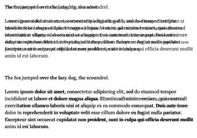
The holy grail of web font loading has been to make the fallback font closer to the actual web font to reduce the noticeable shift as much as possible, so that using swap is less impactful. While we never will be able to avoid the shifts altogether, we can do better than in the screenshot above. The Font Style Matcher app by Monica Dinculescu is often cited in font loading articles and gives a fantastic glimpse of what should be possible here. It helpfully allows you to overlay the same text in two different fonts to see how different they are, and adjust the font settings to get them more closely aligned:

Unfortunately, the issue with the font style matching is that we can’t have these CSS styles apply only to the fallback fonts, so we need to use JavaScript and the FontFace.load API to apply (or revert) these style differences when the web font loads.
The amount of code isn’t huge, but it still feels like a little bit more effort than it should be. Though there are other advantages and possibilities to using the JavaScript API for this as explained by Zach Leatherman in this fantastic talk from way back in 2019 — you can reduce reflows and handle data-server mode and prefers-reduced-motion though that (note however that both have since been exposed to CSS since that talk).
It’s also trickier to handle cached fonts we already have, not to mention differences in various fallback styles. Here on Smashing Magazine, we try a number of fallbacks to make the best use of the system fonts different users and operating systems have installed:
font-family: Mija,-apple-system,Arial,BlinkMacSystemFont,roboto slab,droid serif,segoe ui,Ubuntu,Cantarell,Georgia,serif;
Knowing which font is used, or having separate adjustments for each and ensuring they are applied correctly can quickly become quite complex.
A Better Solution Is Coming
So, that’s a brief catch-up on where things stand as of today. However, there is some smoke starting to appear on the horizon.
Excited for the CSS "size-adjust" descriptor for fonts: reduce layout shifts by matching up a fallback font and primary web font through a scale factor for glyphs (percentage).
— Addy Osmani (@addyosmani) May 22, 2021
See https://t.co/mdRW2BMg6A by @cramforce for a demo (Chrome Canary/FF Nightly with flags) pic.twitter.com/hEg1HfUJlT
As I mentioned earlier, the main issue with applying the fallback styling differences was in adding, and then removing them. What if we could tell the browser that these differences are only for the fallback fonts?
That’s exactly what a new set of font descriptors being proposed as part of the CSS Fonts Module Level 5 do. These are applied to the @font-face declarations where the individual font is defined.
Simon Hearne has written about this proposed update to the font-face descriptors specification which includes four new descriptors: ascent-override, descent-override, line-gap-override and advance-override (since dropped). You can play with the F-mods playground that Simon has created to load your custom and fallback fonts, then play with the overrides to get a perfect match.
As Simon writes, the combination of these four descriptors allowed us to override the layout of the fallback font to match the web font, but they only really modify vertical spacing and positioning. So for character and letter-spacing, we’ll need to provide additional CSS.
But things seem to be changing yet again. Most recently, advance-override was dropped in favor of the upcoming size-adjust descriptor which allows us to reduce layout shifts by matching up a fallback font and primary web font through a scale factor for glyphs (percentage).
How does it work? Let’s say you have the following CSS:
@font-face {
  font-family: 'Lato';
  src: url('/static/fonts/Lato.woff2') format('woff2');
  font-weight: 400;
}

h1 {
    font-family: Lato, Arial, sans-serif;
}
Then what you would do is create a @font-face for the Arial fallback font and apply adjustor descriptors to it. You’ll get the following CSS snippet then:
@font-face {
  font-family: 'Lato';
  src: url('/static/fonts/Lato.woff2') format('woff2');
  font-weight: 400;
}

@font-face {
    font-family: "Lato-fallback";
    size-adjust: 97.38%;
    ascent-override: 99%;
    src: local("Arial");
}

h1 {
    font-family: Lato, Lato-fallback, sans-serif;
}
This means that when the Lato-fallback is used initially (as Arial is a local font and can be used straight away without any additional download) then the size-adjust and ascent-override settings allow you to get this closer to the Lato font. It is an extra @font-face declaration to write, but certainly a lot easier than the hoops we had to jump through before!
Overall, there are four main @font-face descriptors included in this spec: size-adjust, ascent-override, descent-override, and line-gap-override with a few others still being considered for subscript, superscript, and other use cases.
Malte Ubl created a very useful tool to automatically calculate these settings given two fonts and a browser that supports these new settings (more on this in a moment!). As Malte points out, computers are good at that sort of thing! Ideally, we could also expose these settings for common fonts to web developers, e.g. maybe give these hints in font collections like Google Fonts? That would certainly help increase adoption.
Now different operating systems may have slightly different font settings and getting these exactly right is basically an impossible task, but that’s not the aim. The aim is to close the gap so using font-display: swap is no longer such a jarring experience, but we don’t need to go to the extremes of optional or no web fonts.
When Can We Start Using This?
Three of these settings have already been shipped in Chrome since version 87, though the key size-adjust descriptor is not yet available in any stable browser. However, Chrome Canary has it, as does Firefox behind a flag so this is not some abstract, far away concept, but something that could land very soon.
At the moment, the spec has all sorts of disclaimers and warnings that it’s not ready for real-time yet, but it certainly feels like it’s getting there. As always, there is a balance between us, designers and developers, testing it and giving feedback, and discouraging the use of it, so the implementation doesn’t get stuck because too many people end up using an earlier draft.
Chrome has stated their intent to make size-adjust available in Chrome 92 due for release on July 20th presumably indicating it’s almost there.
So, not quite ready yet, but looks like it’s coming in the very near future. In the meantime, have a play with the demo in Chrome Canary and see if it can go a bit closer to addressing your font loading woes and the CLS impact they cause.
Further Reading
- Sticky Headers And Full-Height Elements: A Tricky Combination
- Webfonts And Performance: SmashingConf Videos
- Useful DevTools Tips and Tricks
- Reporting Core Web Vitals With The Performance API


 Celebrating 10 million developers

 SurveyJS: White-Label Survey Solution for Your JS App

 Register Free Now

