Improving The Performance Of An Online Store (Case Study)
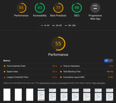
Every front-end developer is chasing the same holy grail of performance: green scores in Google Page Speed. Tangible signs of work well done are always appreciated. Like the hunt for the grail, though, you have to question whether this is really the answer you are looking for. Real-life performance for your users and how the website “feels” when you’re using it should not be discounted, even if it costs you a point or two in Page Speed (otherwise, we would all just have a search bar and unstyled text).
I work at a small digital agency, and my team mostly works on big corporate websites and stores — page speed comes into the discussion at some point, but usually by that time the answer is that a huge rewrite would be needed to truly achieve anything, an unfortunate side effect of size and project structure in corporations.
Working with jewellerybox on its online store was a welcome change of pace for us. The project consisted of upgrading the shop software to our own open-source system and redoing the shop’s front end from scratch. The design was made by a design and UX agency that also handled the HTML prototype (based on Bootstrap 4). From there, we incorporated it into the templates — and for once, we had a client obsessed with performance of the website as well.
For the launch, we mostly focused on getting the new design out the door, but once the website’s relaunch went live, we started focusing our attention on turning the red and orange scores to greens. It was a multi-month journey full of difficult decisions, with a lot of discussions about which optimizations were worth pursuing. Today, the website is much faster and ranks highly in various showcases and benchmarks. In this article, I’ll highlight some of the work we did and how we were able to achieve our speed.
Online Stores Are A Bit Different
Before we get into details, let’s take a short moment to talk about how online stores are different from many other websites (if you already know this, we’ll meet up with you in the next section). When we talk about an e-commerce website, the main pages you’ll have are:
- the home page (and “content” pages),
- category and search pages,
- product detail pages,
- the cart and checkout (obviously).
For this article, we will focus on the first three and the performance adjustments for these. The checkout is its own beast. There you will have a lot of extra JavaScript and back-end logic to calculate the prices, plus several service calls to get the appropriate shipping provider and price estimates based on the country being shipped to.
This is obviously in addition to the validation of the forms fields that you’ll need to record the billing and shipping addresses. Add to that the payment provider drop-in, and you have yourself some pages that no one will want to touch once they have been properly tested and work.

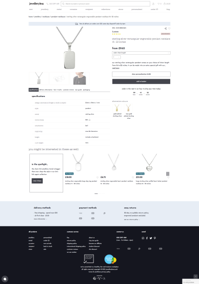
What is the first thing you think of when you imagine an online store? Images — lots and lots of product images. They are basically everywhere and will dominate your design. Plus, you will want to show many products to get people to buy from you — so a carousel it is. But wait! Do people click on the products in it? We can find out by putting some tracking on the carousel. If we track it, we can optimize it! And suddenly, we have external, AI-powered product carousels on our pages.
The thing is, a carousel will not be the last speed-penalizing element that you add to the page to showcase more products in the hopes of attracting more sales. Of course, a shop needs interactive elements, be it product image zooming, some videos, a countdown to today’s shipping deadline, or a chat window to get in contact with customer support.
All of these are very important when you measure conversions directly as revenue. Plus, every few months, someone on the team will spot some cool new functionality that could be added, and so the complexity and JavaScript start to accumulate, even though you started out with the best of intentions to keep it lean.
And while you can usually cache the full page of an article, the same is not true of many shop pages and elements. Some are user-specific, like the shopping cart in the header or the wish list, and due to the personal nature of the data, they should never be cached. Additionally, if you have physical goods, you are dealing with live inventory: During the Christmas rush especially, you will need the information about inventory to be precise and up to date; so, you’ll need a more complex caching strategy that allows you to cache parts of the page and combine everything back together during the server-side rendering.
But even in the planning phases, traps await. In a design — and often also the prototype phase — you will be working with finely crafted product names and descriptions, all nearly uniform in length, and ideal product images. They look amazing! The only problem? In reality, product information can be very different in length which can mess up your design. With several thousand products, you cannot check each one.
Therefore, it helps if designers or the people doing the prototype test with very short and very long strings to make sure the design still fits. Similarly, having information appear twice in the HTML, once for desktop and once for mobile, can be a huge issue for a shop — especially if it is complex information like product details, the shopping cart, or facets for the filters on a product category page. Keeping those in sync is hard to do — so, please help a fellow developer out and don’t do it.
Another thing that should never be an afterthought and should be incorporated from the prototype stage onward is accessibility. Several tools out there can help you with some of the basics, from having alternative text for all images and icons with a function, to color contrast, to knowing which ARIA attributes to use where (and when not to). Incorporating this from the start is a lot easier than later on, and it allows everyone to enjoy the website you are working on.
Here is a tip: If you haven’t seen people use a screen reader or navigate with just a keyboard, videos on this can be easily found on YouTube. It will change your understanding of these topics.
Back to performance: Why is it so important to improve the performance of a shop again? The obvious answer is that you want people to buy from you. There are several ways you can affect this, and the speed of your website is a big one. Studies show that each additional second of loading time has a significant impact on the conversion rate. Additionally, page speed is a ranking factor for search and also for your Google Ads. So, improving performance will have a tangible effect on the bottom line.
Practical Things We Did
Some performance bottlenecks are easy to identify, but a thorough improvement is a longer journey, with many twists and turns. We started off with all of the usual things, such as rechecking the caching of resources, seeing what we could prefetch or load asynchronously, ensuring we are using HTTP/2 and TLSv1.3. Many of them are covered in CSS-Tricks’ helpful overview, and Smashing Magazine offers a great PDF checklist.
First Things First: Things Loaded On All Pages
Let’s talk about resources, and not just CSS or JavaScript (which we will cover later). We started off by looking at things shared across multiple screens, each of which can have an impact. Only after that did we focus on page types and the issues unique to them. Some common items were the following.
Icon Loading
As on so many websites, we use several icons in our design. The prototype came with some custom icons that were embedded SVG symbols. These were stored as one big svg tag in the HTML head of the page, with a symbol for each of the icons that was then used as a linked svg in the HTML’s body. This has the nice effect of making them directly available to the browser when the document loads, but obviously the browser cannot cache them for the whole website.
So we decided to move them to an external SVG file and preload it. Additionally, we included only the icons we actually use. This way, the file can be cached on the server and in the browser, and no superfluous SVGs will need to be interpreted. We also support the use of Font Awesome on the page (which we load via JavaScript), but we load it on demand (adding a tiny script that checks for any <i> tags, and then loading the Font Awesome JavaScript to get any SVG icons it finds). Because we stick to our own icons above the fold, we can run the entire script after the DOM has loaded.
We also use emoji in some places for colorful icons, something none of us really thought about but which our content editor, Daena, asked for and which are a great way to show icons with no adverse effect on performance at all (the only caveat being the different designs on different operating systems).
Font Loading
Like on so many other websites, we use web fonts for our typography needs. The design calls for two fonts in the body (Josefin Sans in two weights), one for headings (Nixie One), and one for specially styled text (Moonstone Regular). From the beginning, we stored them locally, with a content delivery network (CDN) for performance, but after reading the wonderful article by Simon Hearne on avoiding layout shifts with font loading, we experimented with removing the bold version and using the regular one.
In our tests, the visual difference was so little that none of our testers were able to tell without seeing both at the same time. So, we dropped the font weight. While working on this article and preparing a visual aid for this section, we stumbled upon bigger differences in Chromium-based browsers on the Mac and WebKit-based ones on high-resolution screens (yay, complexity!). This led to another round of discussions on what we should do.
After some back and forth, we opted to keep the faux bold and use -webkit-text-stroke: 0.3px to help those particular browsers. The difference from using the actual separate font weight is slight, but not enough for our use case, where we use almost no bold font, only a handful of words at a time (sorry, font aficionados).
See the Pen [Jewellerybox Case Study (Example #1)](https://codepen.io/smashingmag/pen/MWprwyE) by Pfenya.
In addition, several products can be personalized with engravings. These engravings can be done in multiple fonts, and for some we offer a preview with the font applied. For these, we download the font on demand when it gets chosen in the dropdown font selector. The previews in the dropdown are sample images of what the font looks like. This keeps us from having to download 10 or more additional font files.
Legacy Support
One day, CSS-Tricks surprised me with an article on “How to Favicon in 2021”. We were using every touch icon size in the world — the article made me re-evaluate what we actually need and showed me that sometimes what was true a few years ago might not be needed anymore. Based on the article, we limited our favicon and touch icon lists to the recommended versions.
Similarly, we also converted a font that we had only as a WOFF version to WOFF2, which is a lot smaller, and we decided to provide WOFF2 for fonts (with WOFF remaining as a fallback). And we purged CSS directives that are no longer necessary.
Lazy And On-Demand Loading
Several metrics centre on the time after which users can interact with the page. Logic dictates that having fewer elements to load means that this point will be reached sooner. To account for this, it is important to ask yourself which parts of the page are essential and which the user will only need later. We went through a lot of debate and trial and error on this.
The waterfall of network activity helped a lot here, but so did thinking of user flows. For example, the zoomed product image can be loaded the first time a user interacts with the product image, and images in the footer usually don’t show above the fold and can be loaded later. If you are concerned about slowdowns, you can still work with prefetching resources.
One thing we noticed very early on was the big impact of the chat client. It was over 500 KB of JavaScript alone, and while I unfortunately don’t have a chart anymore, it was slow to load as well. Even though the JavaScript was set to load asynchronously, Google was including it in the time-to-interactive measurements.
We were not able to fully trace why this was the case, but between it and the sheer size of it, we started looking at alternatives, instead of trying to fix something that we had limited control over. We convinced jewellerybox to try a self-hosted open-source chat widget instead, which gives us more control over how it gets loaded and which is a lot smaller, too. To improve it further, we load only the icon for the chat initially; the rest gets loaded when you click to open it.
The Invisible Third-Party Carousel
Jewellerybox wanted to try a third-party service that uses AI to improve product personalization in the carousels on several pages. We decided to call its API from the back end for this, so that we would have more control over what gets loaded (with no big JavaScript dependencies) and how long we wait for a response from their service (with some fallbacks defined). Due to this, the carousels load in the same fashion as the non-personalized ones and can be cached with a unique cache key as well.

There is a drawback, however: This means that the initial page rendering on the server-side could be slower unless cached. For this reason, we are currently working on alternative ways to inject the results after the page has loaded and rendering a placeholder at first.
Second Up: Optimizing JavaScript — An Uphill Battle Against External Foes
The carousel brings us to the second big area we focused on: JavaScript. We audited the JavaScript that we had, and the majority is from libraries for different tasks, with very little custom code. We optimized the code that we had written ourselves, but obviously there is only so much you can do if it is just a fraction of your overall code — the big gains lie in the libraries.
Optimizing stuff in libraries or taking out parts you don’t need is, in all likelihood, a fool’s errand. You don’t truly know why some parts are there, and you will never be able to upgrade the library again without a lot of manual work. With that in mind, we took a step back and looked at which libraries we use and what we need them for, and we investigated for each one whether a smaller or faster alternative exists that fits our needs just as well.
In several cases, there was! For example, we decided to replace the Slick slider libary with GliderJS, which has fewer features but all the ones we need, plus is faster to load and has more modern CSS support! In addition, we took a lot of the self-contained libraries out of the main JavaScript file and started loading them on demand.
Because we are using Bootstrap 4, we are still including jQuery for the project but are working on replacing everything with native implementations. For Bootstrap itself, there is a bootstrap.native version on GitHub without the jQuery dependency that we now use. It is smaller in size and runs faster. Plus, we generate two versions of our main JavaScript file: one without polyfills and one with them included, and we swap in the version with them when the browser needs them, enabling us to deliver a streamlined main version to most people. We tested a “polyfill-on-demand” service, but the performance didn’t meet our expectations.
One last thing on the topic of jQuery. Initially, we loaded it from our server. We saw performance improvements on our testing system when loading it via the Google CDN, but Page Speed Insights complained about performance (I wonder who could solve that), so we tested hosting it ourselves again, and in production it was actually faster due to the CDN we use.
Lesson learned: A testing environment is not a production environment, and fixes for one might not hold true for the other.
Third Up: Images — Formats, Sizes, And All That Jazz
Images are a huge part of what makes an online store. A page will usually have several dozen images, even before we count the different versions for different devices. The jewellerybox website has been around for almost 10 years, and many products have been available for most of that time, so original product images are not uniform in size and styling, and the number of product shots can vary as well.
Ideally, we would like to offer responsive images for different view sizes and display densities in modern formats, but any change in requirements would mean a lot of conversion work to be done. Due to this, we currently use an optimized size of product images, but we do not have responsive images for them. Updating that is on the road map but not trivial. Content pages offer more flexibility, and there we generate and use different sizes and include both WebP and fallback formats.
Having so many images adds a lot of weight to the initial payload. So, when and how to load images became a huge topic. Lazy-loading sounds like the solution, but if applied universally it can slow down initially visible images, rather than loading them directly (or at least it feels like that to the user). For this reason, we opted for a combination of loading the first few directly and lazy-loading the rest, using a combination of native lazy-loading and a script.
For the website logo, we use an SVG file, for which we got an initial version from the client. The logo is an intricate font in which parts of the letters are missing, as they would be in an imperfect print done by hand. In large sizes, you’d need to show the details, but on the website we never use it above 150 by 30 pixels. The original file was 192 KB in size, not huge but not super-small either. We decided to play with the SVG and decrease the details in it, and we ended up with a version that is 40 KB in size unzipped. There is no visual difference at the display sizes we use.

Last But Definitely Not Least: CSS
Critical CSS
CSS figures hugely in Google’s Chrome User Experience Report (CrUX) and also features heavily in the Google Page Speed Insights report and recommendations. One of the first things we did was to define some critical CSS, which we load directly in the HTML so that it is available to the browser as soon as possible — this is your main weapon for fighting content layout shifts (CLS). We opted for a combination of automated extraction of the critical CSS based on a prototype page and a mechanism with which we can define class names to be extracted (including all sub-rules). We do this separately for general styles, product page styles, and category styles that are added on the respective page types.
Something we learned from this and that caused some bugs in between is that we have to be careful that the order of CSS is not changed by this. Between different people writing the code, someone adding an override later in the file, and an automatic tool extracting things, it can get messy.
Explicit Dimensions Against CLS
To me, CLS is something Google pulled out of its hat, and now we all need to deal with it and wrap our collective heads around it. Whereas before, we could simply let containers get their size from the elements within them, now the loading of those elements can mess with the box size. With that in mind, we used the “Performance” tab in the Developer Tools and the super-helpful Layout Shift GIF Generator to see which elements are causing CLS. From there, we looked not only at the elements themselves, but also at their parents and analyzed the CSS properties that would have an impact on the layout. Sometimes we got lucky — for example, the logo just needed an explicit size set on mobile to prevent a layout shift — but other times, the struggle was real.
Pro tip: Sometimes a shift is caused not by the apparent element, but by the element preceding it. To identify possible culprits, focus on properties that change in size and spacing. The basic question to ask yourself is: What could cause this block to move?
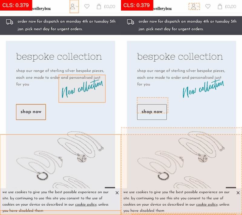
Because so many images are on the page, getting them to behave correctly with CLS also caused us some work. Barry Pollard rightly reminds us of as much in his article, “Setting Height and Width on Images Is Important Again”. We spent a lot of time figuring out the correct width and height values (plus aspect ratios) for our images in each case to add them to the HTML again. As a result, there is no layout shift for the images anymore because the browser gets the information early.
The Case Of The Mysterious CLS Score
After removing a lot of the big CLS issues near the top of the page, we hit a roadblock. Sometimes (not always) when looking at Page Speed or Lighthouse, we got a CLS score of over 0.3, but never in the “Performance” tab. The Layout Shift GIF Generator sometimes showed it, but it looked like the whole page container was moving.
With network and CPU throttling enabled, we finally saw it in the screenshots! The header on mobile was growing by 2 pixels in height due to the elements within it. Because the header is a fixed height on mobile anyway, we went with the simple fix and added an explicit height to it — case closed. But it cost us a lot of nerves, and it shows that the tooling here is still very imprecise.
This Isn’t Working — Let’s Redo It!
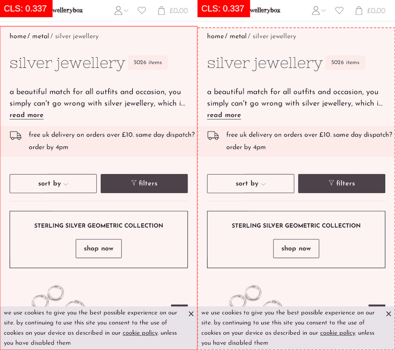
As we all know, mobile scores are much harsher for Page Speed than for desktop, and one area where they were particularly bad for us was on product pages. The CLS score was through the roof, and the page also had performance issues (several carousels, tabs, and non-cacheable elements will do that). To make matters worse, the layout of the page meant that some information was being shuffled around or added twice.
On desktop, we basically have two columns for the content:
- Column A: The product photo carousel, sometimes followed by blogger quotes, followed by a tabbed layout with product information.
- Column B: The product name, the price, the description, and the “add to basket” button.
- Row C: The product carousel of similar products.
On mobile, though, the product photo carousel needed to come first, then column B, then the tabbed layout from column A. Due to this, certain information was duplicated in the HTML, being controlled by display: none, and the order was being switched with the flex: order property. It definitely works, but it isn’t good for CLS scores because basically everything needs to be reordered.
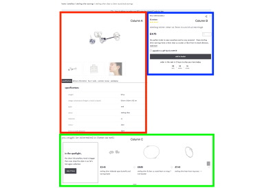
I decided on a simple experiment in CodePen: Could I achieve the same basic layout of boxes on desktop and in mobile by rethinking the HTML and using display: grid instead of flexbox, and would that allow me to simply rearrange the grid areas as needed? Long story short, it worked, and it solved CLS, and it has the added benefit that the product name now comes much sooner in the HTML than it did before — an added SEO win!
See the Pen [Jewellerybox Case Study (Example #2)](https://codepen.io/smashingmag/pen/OJpzyLg) by Pfenya.
Hacking A Carousel For CLS
The word “carousel” has come up several times already — and with good reason. Not only did we change the carousel library that we use (and change the loading behavior of the images in it), we also had to deal with it for CLS because we have several pages on which the carousel is above the fold and, therefore, could have a big impact on speed scores.
We started off by loading the carousel later to decrease the time-to-interactive, but that caused a visible delay until the JavaScript fired and the slides moved from being below one another to being in one row. We tried a lot of ways to write the CSS to prevent this from happening and to keep everything on one row, including hiding the whole carousel until it had finished loading. Nothing gave us the kind of solution that we would have liked to have seen when visiting a shop as a user.
Sorry for this short rant, but truly, product and category carousels are the perfect storm of flexible elements in a responsive shop: Images might not be of a universal height, product names might span multiple lines, and you may or may not have labels. Basically, it boils down to this: No fixed height for the row is possible, and you also don’t really know the width either. Fun times.
In the end, we decided to set all slides (apart from the first one) to visibility: hidden until the carousel has finished loading, at which point we add a class to the carousel to change all slides to be visible again. This solves the issue of it taking up additional height at first.
In addition, we set flex-shrink: 0 and flex-base: 340px for the slides in a non-wrapping flexbox initially. This causes them to be on a single line and gives an approximate initial width for the slides. With that puzzle solved — and yes, it was as much of a headache as it sounds — we added some fixes to keep room for the dots and arrows to fall into. With that in place, there is almost no CLS for the carousels anymore!
See the Pen [Jewellerybox Case Study (Example #3)](https://codepen.io/smashingmag/pen/vYxpNEK) by Pfenya.
Hindsight Is 20⁄20
In the end, it was a lot of small changes over several months that improved our scores, and we are not finished. We mostly worked with two people on the front-end improvements, while the rest of the team focused on improving the back end. While it was probably a bit slower this way, it ensured that there was no overlap, and the differences in scores could be clearly attributed. Some resources that helped a lot were the great articles here on Smashing Magazine about the magazine’s own improvements.
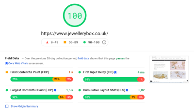
At some point, the things you should try become non-obvious because you don’t think they should make a huge difference, but sometime afterward you realize that they do. More than that, what this project taught us again is how important it is to have performance and the metrics for it in mind from the very beginning, from envisioning the design and coding the prototype to the implementation in the templates. Small things neglected early on can add up to huge mountains you have to climb later on to undo.
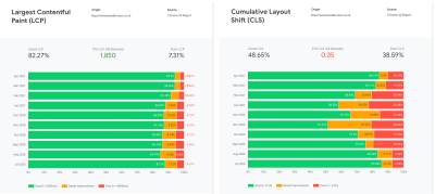
Here are some of the key aspects we learned:
- Optimizing JavaScript is not as effective as loading it on demand;
- Optimizing CSS seems to gain more points than optimizing JavaScript;
- Write CSS classes with CLS and extraction of critical CSS in mind;
- The tools for finding CLS problems aren’t perfect yet. Think outside the box and check several tools;
- Evaluate each third-party service that you integrate for file size and performance timing. If possible, push back on integration of anything that would slow everything down;
- Retest your page regularly for CrUX changes (and especially CLS);
- Regularly check whether all of your legacy support entries are still needed.
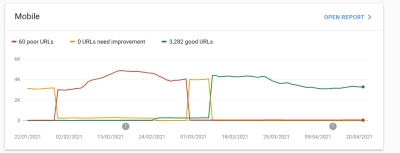
We still have things on our list of improvements to make:
- We still have a lot of unused CSS in the main file that could be removed;
- We’d like to remove jQuery completely. This will mean rewriting parts of our code, especially in the checkout area;
- More experiments need to be conducted on how to include the external sliders;
- Our mobile point scores could be better. Further work will be needed for mobile especially;
- Responsive images need to be added for all product images;
- We’ll check the content pages specifically for improvements they may need, especially around CLS;
- Elements using Bootstrap’s collapse plugin will be replaced with the native HTML
detailstag; - The DOM size needs to be reduced;
- We will be integrating a third-party service for faster and better search results. This will come with a large JavaScript dependency that we will need to integrate;
- We’ll work on improving accessibility both by looking at automated tools and by running some tests with screen readers and keyboard navigation ourselves.
Further Resources
- “DevTools Debugging Tips And Shortcuts (Chrome, Firefox, Edge),” Vitaly Friedman, Smashing Magazine
- “Some Performance Blog Posts I’ve Bookmarked And Read Lately,” Chris Coyier, CSS-Tricks
- “An In-Depth Guide To Measuring Core Web Vitals,” Barry Pollard, Smashing Magazine
- “From Semantic CSS To Tailwind: Refactoring The Netlify UI Codebase,” Charlie Gerard and Leslie Cohn-Wein, Netlify
- “CSS Auditing Tools,” Iris Lješnjanin, Smashing Magazine
- “Things You Can Do With CSS Today,” Andy Bell, Smashing Magazine
- “How To Improve CSS Performance,” Milica Mihajlija, Calibre
- “The Mobile Performance Inequality Gap, 2021,” Alex Russell
- “Maximally Optimizing Image Loading For The Web In 2021,” Malte Ubl
- “The Humble
<img>Element And Core Web Vitals,” Addy Osmani, Smashing Magazine
Further Reading
- 35 Beautiful Vintage and Retro Photoshop Tutorials
- 60 Rare and Unusual Vintage Signs
- Vintage and Retro Typography Showcase
- Rediscovering The Joy Of Design


 Celebrating 10 million developers
 Register Free Now
 SurveyJS: White-Label Survey Solution for Your JS App


