Your Image Is Probably Not Decorative
The img element’s alt attribute can be “nulled,” which is the act of setting it to an empty string instead of a text description. Nulling an alt description means there is no information between the opening and close quotes. If there is an empty space, it will not be considered nulled:
<img alt="" src="/images/cat.jpg" />
<img alt=" " src="/images/dog.jpg" />
What Does “Decorative” Mean?
Nulling an image indicates that it is for decorative purposes only.
In this context, decorative means that the image does not visually communicate information that is important to understanding the purpose of the page or view, and why the image is included as a part of that.
Decorative does not mean that the image contains content that is considered as decoration.
“
For example, a website that sells wallpaper will want to have alternate descriptions for wallpaper samples:
<a href="/products/umbrella?variant=73849024783051">
  <img
    alt="Small red and white illustrated umbrellas on a teal background."
    src="/images/73849024783051.png" />
</a>
Another example could be a museum website, where presenting a piece from their collection could benefit from both an alternate description and a caption:
<figure
  role="figure"
  aria-label="View of Rotterdam, by Cornelis Boumeester. Date: about 1700–20. Accession Number: 2005.1057. In Dutch homes, tiles typically served utilitarian purposes, such as covering the walls of kitchens, utility rooms, passageways, and fireplace surrounds.">
  <img
    alt="A tile painting, composed of 33 Delft tiles forming a view of the port of Rotterdam. Set in a modern mahogany frame, with gilded inscription on bottom border."
    src="/collection/w0895/2005-1057.png" />
  <figcaption>
    View of Rotterdam, by Cornelis Boumeester. Date: about 1700–20. Accession Number: 2005.1057. In Dutch homes, tiles typically served utilitarian purposes, such as covering the walls of kitchens, utility rooms, passageways, and fireplace surrounds.
  </figcaption>
</figure>
Make sure that your alternate description includes punctuation, as well!
Why Would You Want To Make An Image Decorative?
Assistive technology will skip over nulled images and not announce their presence. The reasons for wanting to do this are mostly historical.
Old Layout Techniques
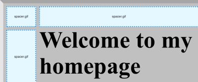
Early web development techniques relied on images to help them guarantee consistent layout across different operating systems, browsers, and browser versions. The most common example of this was a spacer.gif, a 1×1 transparent pixel that was stretched to different sizes to push content into place.

This technique would typically use many spacing images to create a visual design. Without a way to silence their presence, these images would clutter up what assistive technology announced and make it confusing and time-consuming to navigate and take action on web content.
Old Design Techniques
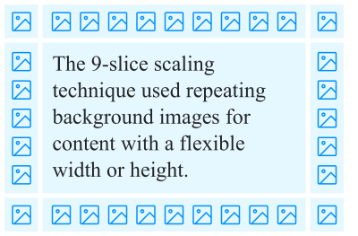
Before there were CSS properties such as box-shadow, developers had to use techniques that chopped up the decorative styling to make it work with content of indeterminate height or width. This technique was called 9-slice scaling, a term that refers to the 9 sections of content you would need to create.

Much like spacer images, 9-slice scaling used multiple images to create the desired visual effect. And, much like spacer images, the only way to remove the clutter these images created was to mark them as decorative.
Redundant Announcements
There is the rare scenario where an image is repeated on a page or view, and it’s repeat placements don’t supply any additional context. You should be careful about marking an image decorative in this situation, as the lack of an announcement for a visible image may be confusing for someone with low vision who is using a screen reader.
Supplemental Icons
Links and buttons that use icons should always have an accessible name that communicates functionality. If the design also incorporates an icon, the icon’s design does not need to be communicated.
<button type="button">
  <img src="icon-print.svg" alt="" />
  Print
</button>
If the component only uses an icon, the image itself should be used to create the accessible name:
<button type="button">
  <img src="icon-print.svg" alt="Print." />
</button>
Note that a visible text label is the preferred technique. A visible text label can be translated and communicates purpose more directly.
Contemporary Use
Modern CSS layout and styling techniques means that image placement is now highly intentional. This means that if an image is used, it is most likely going to need an alternate description.
Alternate descriptions should communicate the image’s purpose. That includes the image’s content, but may also include the reason it is included in context on the page or view it has been included in. This is one of the reasons why alternate image descriptions will never be able to be fully automated.
Other Ways Of Displaying Images
There are a few other ways to display an image on a page or view. It is important to ensure an alternate description is provided if the image contains meaningful content — regardless of the technique utilized.
The picture Element
The picture element does not have an implicit role, meaning that its presence does not communicate any purpose to assistive technology. This means it can’t be used to semantically describe the presence of a “picture.”
The picture element is a container for source and img elements. Use the img element’s alt attribute to provide an alternate description for the parent picture element.
<a href="/product/9091866/color/3">
  <picture>
    <source
      srcset="9091866-3.avif"
      type="image/avif" />
    <img
      alt="A black ankle-length boot with metal eyelets, yellow stitching, and a padded collar and tongue."
      src="9091866-3.png" />
  </picture>
</a>
Background Images
We can use CSS to declare an image as a background on an HTML element. This is most often used to add a sense of texture to a design.
However, another popular technique is to use a background-image to place an image in such a way where the developer will not have control over the size of the image someone uploads. background-image, combined with other properties such as background-size will ensure that content of an unknown size is displayed without breaking the design.
See the Pen [Background Image As Foreground Image Example](https://codepen.io/smashingmag/pen/OJprPwK) by Eric Bailey.
In a scenario like this, our old friend spacer.gif might be helpful again!
Inline SVG
SVG can be displayed by either linking to it via the src attribute in an img element, or by placing the SVG code inline in the page or view.
If you are using inline SVG, you need to use SVG’s title (and potentially desc) element in place of an alt attribute.
<svg
  role="img"
  aria-labelledby="icon-bookmark-desc"
  xmlns="https://www.w3.org/2000/svg" width="24" height="24" fill="none" stroke="currentColor" stroke-width="2" stroke-linecap="round" stroke-linejoin="round">
  <title id="icon-bookmark-desc">Bookmark.</title>
  <path d="M19 21l-7-5-7 5V5a2 2 0 012-2h10a2 2 0 012 2z"/>
</svg>
Equivalent Experience
In modern web design and development, displaying an image is a highly intentional act. Alternate descriptions allow us to explain the content of the image, and in doing so, communicate why it is worth including.
Just because an image displays something fanciful doesn’t mean it isn’t worth describing. Announcing its presence ensures that anyone, regardless of ability or circumstance, can fully understand your digital experience.
Further Reading
- Accessibility In Chrome DevTools
- A Complete Guide To Accessibility Tooling
- Accessible Images For When They Matter Most
- Accessible SVGs: Perfect Patterns For Screen Reader Users
- Designing With Reduced Motion For Motion Sensitivities
- Read more articles on accessibility, usability and UX.


 Try ProtoPie AI free →

 Register Free Now
 Celebrating 10 million developers


