An Introduction To Figma Interactive Components
Recently, Figma rolled out the beta for the newest interactive components feature that allows defining interactions and animations directly into the variants and propagates them to every component instance. This means that it is now possible to create a component with states (hover, active, clicked, focus) and make it interactive so that every copy of the component will inherit those same interactions by default, helping a lot in the prototyping phase.
Here’s a comparison example of how the workflow will change:

As you can see in the example above, it requires four screens and eight interactions to make the prototype work as a real product. And if I wanted to use three switches, I would have to add even more screens and interactions.
In the next example, it only requires one screen and one component with two variants for the interactions, and the switch is the same so it can be duplicated as many times as needed:

Using Interactive Components simplifies not only the final prototype but also the logic behind it, making it easier to learn how to build, maintain and update the prototypes.
Now, before we start:
Interactive Components (Beta Access)
You need to sign up for the Interactive Components Beta program to start experimenting with this new feature as it is not yet available in the current stable release. Joining the Beta is free and once you submit the form, it should not take more than two or three days before you see Interactive Components appear in your Figma design tool.
Freebie
I have created a Figma design file with the examples from this article. Once you join the Beta, you can duplicate my design and follow along more easily.
Before Starting
It’s necessary to understand some key Figma elements that we are going to use, if you’re already familiar with them you can skip this part and start directly with the first tutorial (section: “Create your first Interactive Component”).
Components
Think of these as items that, when duplicated, create a connection with its copy (called instance) and when the component is changed, the instance receives the same changes. You can also apply overrides to instances (which are basically style changes to the component properties which allow for some customization).
- Learn more about Components →
- Learn more about Overrides →
Variants
These are the different styles a component can have and are usually used to apply different properties such as size or states.
- Learn more about Variants →
Interaction Details Panel
It’s important to understand the Interaction Details panel because it allows us to define the different interactions and animations for our interactive components. Figma has a lot of information on their site so I will include links for those of you that want to dig deeper.
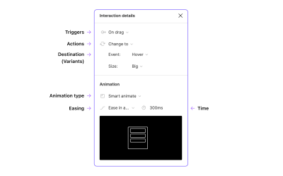
Hotspot
Even though this is not inside the panel, the hotspot is the element where the interaction will happen, in our case, each variant will be an interactive hotspot for which you can define triggers and actions.
Triggers
These are known in development as Events and are the different ways we the user can activate an interaction.
- On Click,
- On Drag,
- While Hovering,
- While Pressing,
- Key/gamepad,
- Mouse Enter,
- Mouse Leave,
- Mouse Down,
- Mouse Up,
- After Delay.
- More information about Triggers →.
Actions
In this setting, you can define what will happen when the interaction is activated; for interactive components, we will use Change To which allows swapping the variants inside a component.
- Change To,
- Navigate To,
- Open Overlay,
- Scroll To,
- Swap With (overlay),
- Back,
- Close Overlay,
- Open URL.
Destination
This is the final target of the action. In my examples, I will use a variant as the destination to swap it from Switch OFF to Switch ON.
Animations
Figma comes with a set of pre-defined transitions that can be useful for some cases (move in, push, slide-in) but I always prefer to go with Smart Animate and define my own transitions as it’s really easy to use — it basically checks the layer names and if there are changes between the selected frame and the destination frame, it will animate those layers.
- More information about Figma Transitions and Smart Animate →
Easing
Easing refers to the way the animation moves, it’s basically how the element accelerates and decelerates. I’m going to use two settings for this tutorial: Ease In and Out for the switch, and Linear for the loops, but have in mind that it’s also possible to define a custom easing so you might want to learn more about Easing.
Creating Your First Interactive Component
Now that you have all the information you can start making your first interactive component. I’ll show you a very common case by creating a simple switch that has two states (Off and On) and use the variants to replicate those states.

Create A Component
The first step is to create a component.
- Using the Rectangle tool (
R), create a grey rectangle (#A7A9BC)56x32pixels in size and apply a corner radius of16px. - Using the Ellipse tool (
O) create a white circle (#FFF)24x24pixels in size and place it over the rectangle in the left part, leaving4px of spacing. This is how it should look:

- Combine these two elements into a single component using Ctrl/Cmd + Alt + K (or using the Component icon from the top bar in Figma):

Note: Here and in other places, I will use the Windows/Mac universal key notation, where the Ctrl key in Windows corresponds to the Cmd key on the Mac; Alt in Windows is the equivalent of Alt/Option on the Mac, so I’ll use Alt for short, and Shift is the same on both platforms.
Add A Variant
- Select the component you’ve just created and, in the right panel (inside the Design tab), click on the plus button near Variants:
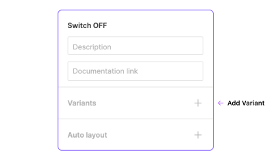
It will generate a purple frame with a dashed border that represents the group of variants you have.
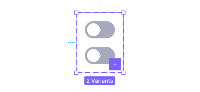
You should have two variants by now, use the first one for the Off state and the second one for the On state.
- Apply a different style to the On state to make it the active option, I recommend using a blue background (#0B5FFF) and move the circle to the right.
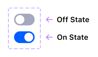
These are the states of the switch that are going to change from Off to On (and vice-versa) when the user clicks on the switch.
Useful tip: For this case it is not necessary but if you need to add more variants you can select a component inside the box and click the purple plus button, it will add a copy of the selected component and resize the box automatically. (It’s also possible to resize the box manually as if it was a frame and freely duplicate and arrange the variants inside it.)
Alternative Approach
As you’ve seen, we’ve created these components by duplicating them inside the variant group but it’s also possible to create them individually and combine them as variants, the final result will be exactly the same. If you want to try this method just create and select two components, the right panel will then have another action called “Combine as variants,” click it and done — you will now have the same two variants.

This alternative is really useful when you already have different components and only need to define the variants, if you’re working on a library it will help you update it without having to recreate everything from scratch.
Name Your Variants
Naming the variants won’t have a direct effect over the final result (unless you use the same name more than once), but defining the names and hierarchies will help you have everything better organized and understandable for other colleagues that might need to use the prototype for other projects.
By default the main group of variants is named “Property 1”, you can change this from the sidebar when selecting the entire group. I suggest renaming this to “State” since we’re going to use Off and On states.

Renaming a single variant is done by using the same process but you need to select the single variant inside the group and in the same panel you’ll find the names “Default” and “Variant 2” that you can overwrite, for the switch name these should be “Off” and “On”.
As a result, the layer names of the variants will be automatically changed to “State=Off” and “State=On”.
Fun fact: If your component only has two variants and you use the names “Off” and “On”, it will show a switch instead of a dropdown in the destination!
Let’s Make It Interactive!
Now that you have the component and the variants it’s time to apply the interactions.
- Click on the Prototype tab (at the top-right side of the screen) to open the Prototype panel and activate its features.
- Select the Off variant (it should have a blue dot) and drag it over the On variant to connect it.

- Double-check that you have selected the whole variant and not just the background layer, this will make the interaction work even when the user clicks on the circle element.
- In the Interaction Details panel set the trigger to On Click.
- Make sure the action is set to Change To.
- Change the animation to Smart Animate and use Ease In And Out for a natural feeling.
I’ll translate these settings into a single sentence to explain what will happen: when the user Clicks on Off State then Change to On State using Smart Animate with Ease In And Out at 300 milliseconds.
- Apply the same settings to the On State variant so that when clicked again it, will turn off the switch. (Note: Figma will remember the interaction settings applied to the elements inside the group and will apply the same settings when dragging a new interaction so in this case, you would only need to double-check.)
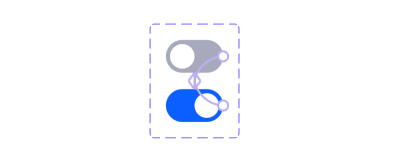
Done! If you want to check if it works you need to include one of the variants into a frame, select the frame and then click on the presentation button (represented by the play icon) that is placed over the tabs.
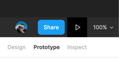
It should allow you to turn On/Off every switch individually.
However, if you want to see the real power of this feature, duplicate the component in the frame multiple times (at least three or more) and activate them individually in the presentation.

Using More Than Two Variants
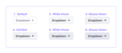
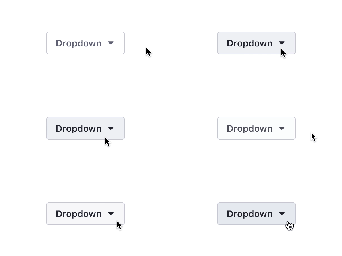
This feature becomes very powerful when you add multiple variants and connect them individually to make a realistic component. Here is an example where I’ve connected a total of six variants with small changes to the background color to recreate the multiple states of a button, a classic in the web design industry nowadays.
Component States
This is the list of the different states for this component, including also the triggers we’re going to use to change from one variant to another.
- Default — Default,
- Hover — WhileHover,
- Pressed — MouseDown,
- Active — MouseUp (It could be possible to use On Click for the same result),
- Hover while Active — WhileHover,
- Pressed while Active — MouseDown.
Useful tip: It’s possible to use MouseDown to simulate the button being pressed but not released and then use MouseUp to activate a transition, it’s a nice interaction detail that makes the button feel more real.
Nested Interactive Components
As for the regular components, you can also create nested interactive components.
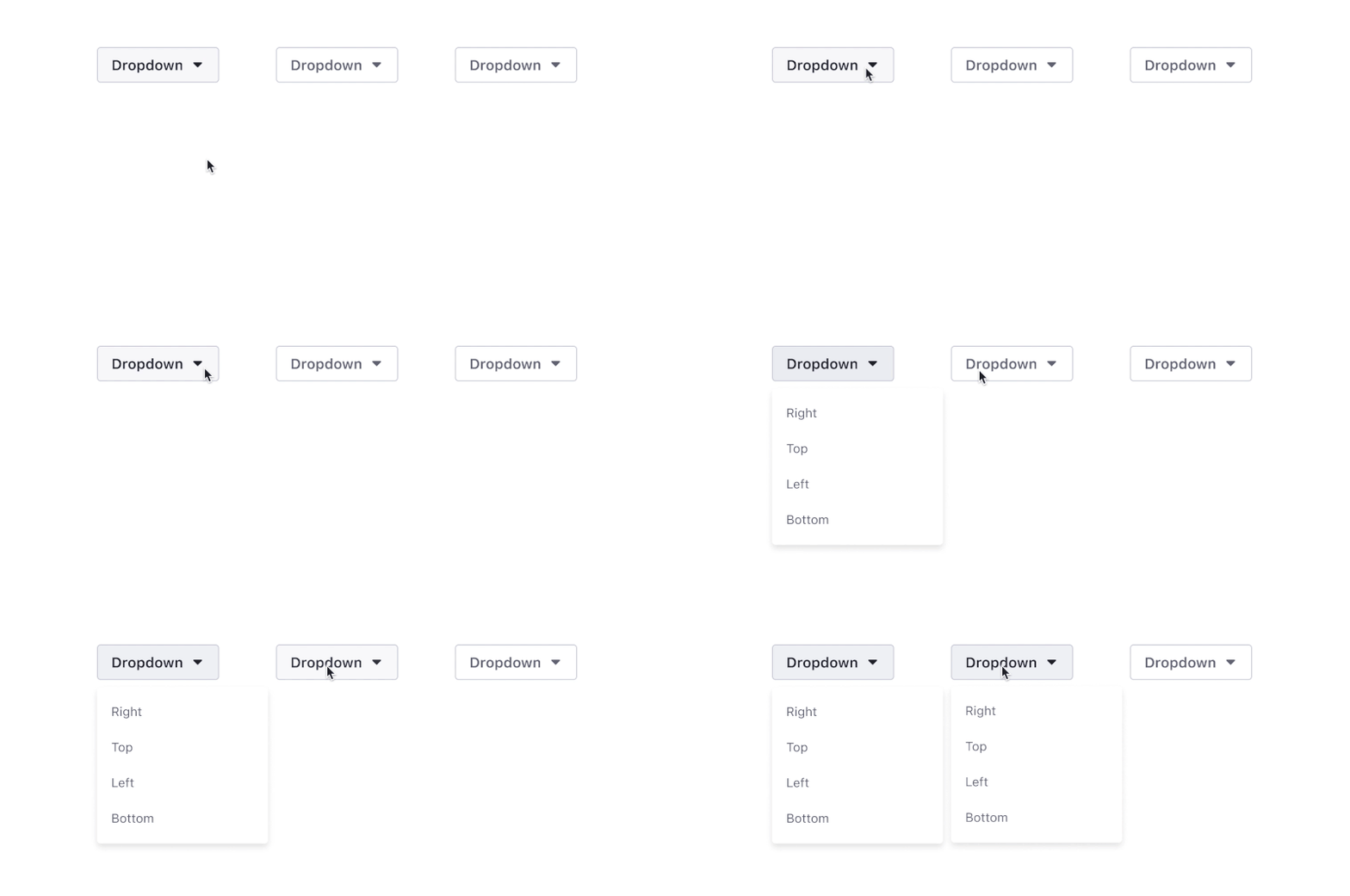
Using the same example of the dropdown it would be possible to create a single interactive component called Dropdown with two interactive components inside it: the Dropdown Button and the Dropdown Menu. This will help you control how the button and the menu interact with each other, allowing you to define which variant of the button will trigger the opening of the menu.
Note: It would be possible to create another nested component for the dropdown menu options and use the override to change the different texts.

The main benefit of using nested interactive components is the new level of modularity that it provides for prototypes, you could define the interactions individually and mix them into infinite interactive components. The Dropdown Menu could be included in other components (a card, for example) without having to prototype how it works every single time.
Navigation
We can go even further, it’s also possible to navigate from a variant to an external frame, you can connect the single variant to the frame by using the On Click trigger and Navigate To action. In this example I’ve connected each one of the actions from the Dropdown Menu component to an external frame with a grey rectangle in the same position as the menu (Right, Top, Left, Bottom).

When one of these actions is clicked, it will navigate to the connected frame as it happens with regular prototypes, the real magic happens when you need to reuse the Dropdown Menu for another component, it will have all the interactions inside already done, so you don’t have to connect it over and over again.

This workflow and the features of the nested components are amazing for product design cases where you have tons of frames to connect as they will reduce the amount of work required to create a high-fidelity prototype for testing, or even if you want to create a components library for prototypes.
Special Effects
That was all for the introduction to Figma interactive components. As you can see, it’s pretty easy to use this feature to create and connect interactions inside a prototype. But it’s also possible to create various kinds of special effects using variants.
In the following section, I will take a close look at these!
Loops
It’s finally possible to make infinity loops inside Figma without too much effort and also you can create various spinners and loading indicators.

To create a loop, use the After Delay trigger set to 1 ms to swap the variants automatically and connect at least two of them.

Note: 1 ms is the minimum amount of time we can set in Figma to change from a variant to another and make it an almost instantaneous change; and, thanks to the AfterDelay trigger, it will happen automatically. It’s possible to use a higher delay time if you need the loop to look like it has a pause between the variants.
Rotation
Let me start the next part of the article with a note about how strangely Figma handles rotation.
Figma has a weird way to rotate elements, it seems to be limited from -179º to a maximum of 180º and does not allow to go further than these values. In addition, there is no way to define a rotation direction so if you try to rotate from 0º to 180º and vice-versa, instead of doing a 360º turn, it will first rotate to 180º and then come back to 0º (like a swing).
So, to let the system identify correctly the rotation you will need to use at least three variants.
Here’s how you can do it:
- Create a component with three variants: VariantA, VariantB, VariantC (for this example I modified an ellipse to make the triangle shape).
- Apply the following rotation to the elements inside the variants (not the variants themselves).
- VariantA: set the element to
0º and connect the variant to VariantB. - VariantB: set the element to
-120º and connect the variant to VariantC. - VariantC: set the element to
120º and connect the variant to VariantA to complete the loop.
- VariantA: set the element to
- All the interactions should have After Delay (1ms) as a trigger and a Linear easing.
The result will be a neutral spinner that will have three small pauses of 1 ms each because of the variant swap, not perfect but fast and for a prototype, it’s good enough — and you will be probably the only one that will notice the pauses anyway.
Useful tip: You can either use the same animation time for each variant to make a linear loop, or you can play with the animation using a faster time for some variants and a slower time for others, this will simulate a curved easing.

Complex Spinners
I wouldn’t suggest using Figma interactive components for complex spinners, for such cases it might be better to create the spinner with a dedicated animation app (such as After Effects) and import it into the prototype as a GIF.
Micro Interactions
Interactive components allow you to include more delightful details into prototypes. I’ll go back to the switch example to show you how to add micro-interactions to this component using MouseDown and On Click.

Component
To recreate this example you need to apply some changes to the structure of the switch:
- Make a copy of the Off state switch that you already created.
- Create another ellipse shape of
16*24px, place it over the previous ellipse (the circle). - Unify the two ellipses as a boolean group using Union.
- Learn more about Boolean groups →.

- Apply
32px of border-radius to the Union layer, this will create the distortion effect you can see in the example. - Create the component (Ctrl/Cmd + Alt + K).
Variants And Prototype
You’ll need a total of four variants to make this work: OffState, OffStatePressed, OnState, and OnStatePressed.
- Use the Mouse Down trigger to simulate the mouse being pressed and activate the distortion by moving the bigger ellipse
8px to the other side. - Use the On Click trigger to change states from Off to On.

3D Animation With A Sequence Of Images
Before we continue, I want to thank Andrea Cau, the author of this cool 3D sequence that I’m going to use as an example.
This is more of a hack to integrate 3D animations into a Figma prototype, you could also use GIFs but this way you gain full control over the images, not just play/stop, allowing you to create a prototype that simulates an interface to rotate objects, commonly seen in car websites where you can rotate the car.
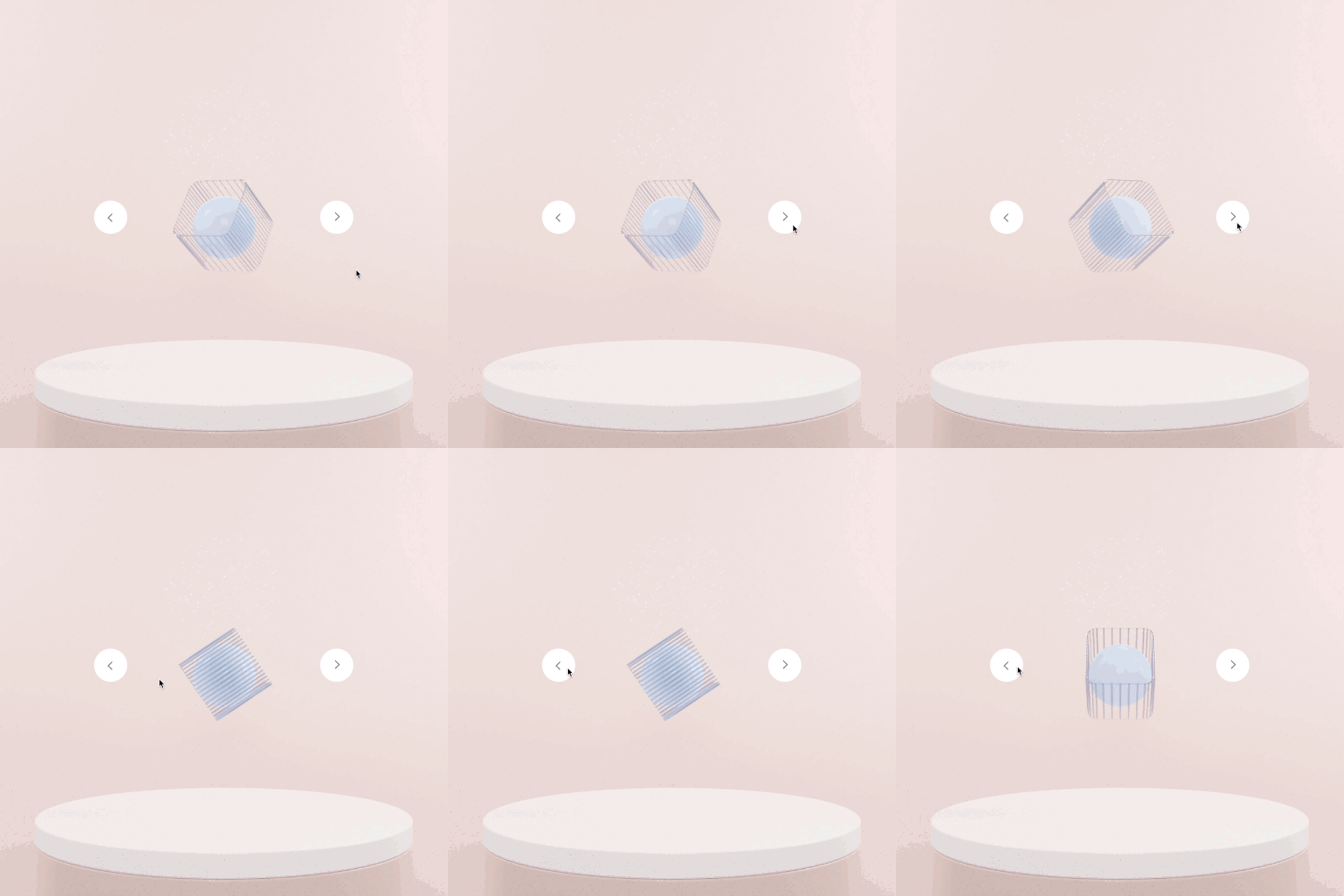
In this case, I’ve used nine images (you could use more, or less, depending on the rotation you need), the important steps to reproduce this interaction are:
- Create one variant per image (in this case 9 variants will be needed) and include one image in each one, following the sequence order.
- Create the arrow button, it will be the Hotspot.
- Connect the right arrow to the next variant (repeat for every variant).
- Connect the left arrow to the previous variant (repeat for every variant).
- Use the Instant animation instead of Smart Animate to avoid the fade in/out effect and create the illusion of movement.
Conclusion
The more I use this feature the more I think it will be a game-changer for companies working in the areas of web and product design. Mastering interactive components and variants will allow designers to produce better, more advanced, and realistic prototypes with less effort, giving you the freedom to work on the actual designs and focus less on the design tool itself.
As mentioned earlier, I’ve created a Figma community file with the examples from this article (and a few more experiments that I’ve been doing during the testing of the new feature). Once you join the Beta, feel free to duplicate my design, follow along or start experimenting, and share your results! Play with the animation times, change the easing, try to rotate, scale elements, try to nest different interactive components.
If you have questions or something is not entirely clear, leave a question in the Comments section below, or ping me on Twitter (@emi_cicero) — I’d be glad to help! :)
Other Resources
- Components
- Overrides
- Variants
- Triggers
- Smart Animate
- Easing
- Figma interactive components playground
- Interactive Components in Figma (video by @mds)
- Advanced Interactive Components in Figma (video by @mds)
- SketchTogether interactive components video
Further Reading
- Creating An Effective Multistep Form For Better User Experience
- An Efficient Design-to-Code Handoff Process Using Uno Platform For Figma
- Best Of Pro Scheduler Libraries
- How To Create A Weekly Google Analytics Report That Posts To Slack


 Register Free Now
 Celebrating 10 million developers
 SurveyJS: White-Label Survey Solution for Your JS App
 Try ProtoPie AI free →


