Useful UX Guidelines, Tools And Resources
What does it take to create meaningful user experiences? While there’s no one secret recipe for success, there are some fundamentals that you can consider to master the challenge. In this post, we compiled useful tools, tips, and resources that are bound to help you build better user experiences. You’ll find psychology heuristics just like tips for building a winning UX strategy, dive deep into user research and UX writing, and explore real-world examples — good and bad — from which you can learn to create experiences that truly matter. But be warned, there’s quite a lot to digest in this post, so you might want to consider to bookmark it and split it up over several coffee breaks. Happy reading!
Laws Of UX
Fitt’s Law, Miller’s Law, the Serial Position Effect. Do you know what’s behind these names? If not, Laws Of UX will shed more light on their meaning.
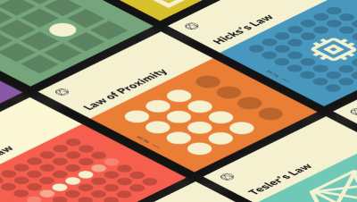
Created by Jon Yablonski, this lovely website explains 21 psychological principles that designers can consider to create more human-centered products and experiences. A great initiative to make complex psychology heuristics more accessible.
Tools To Build Better Digital Experiences
The right tools at the right time, help streamline the design process. To give you a better overview of which tools could enhance your UX design projects, Jordan Bowman and Taylor Palmer curate the site UX Tools.
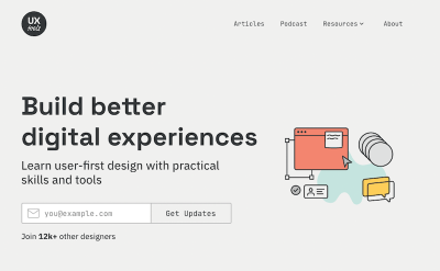
Their design tools database features tools for everything from UI design and prototyping, to user flow and handoff, design systems and versioning. Each tool is rated by usage and user rating and comes with detailed information on platform support, cost, and features. On the site, you’ll also find practical UX challenges to train yourself in crucial UX skills. A great resource to build better digital experiences.
The Ultimate Guide To UX Research
User experience research is a crucial component of the human-centered design process. But how do you tackle the task and integrate a UX research process into your team’s workflow? To get you up and running, the folks at Maze put together the “Ultimate Guide to UX Research”.

The comprehensive guide dives into the fundamentals of UX research and its various methods. It starts off taking a closer look at what UX research is all about and why it’s the backbone of building good products, dissects different research methods and tools, and shares tips for creating a research plan and establishing a UX research process. A great read for UX designers and product managers alike.
How To Build A Winning UX Strategy
As designers, we often get in heated debates on design processes, our workflows, and our tooling. Of course, we want to improve the overall user experience and user satisfaction, and we want to establish a lasting, positive relationship with our customers by keeping them happy and productive with our services. Yet how exactly do we get there? In his talk on UX strategy (transcript), Jared Spool has been looking into ways for us to create a better product and UX strategy. That involves regularly pruning features rather than adding them, continuously exploring common expectations and frequent frustrations, adding value by innovating where customers are most frustrated and establishing exposure hours with customers for the entire team.

In his other talk on growth stages in UX (transcript), Jared explains how everybody involved in the product is a designer as well, so increasing design literacy among the entire team is necessary to make the product fully focused on overall design and UX. He speaks about the UX tipping point which organizations need to reach when design becomes an organization’s competitive advantage. Both talks are a great starting point when you want to understand how to take your organization from status quo to a better place, and where to start.
The Maturity Of UX Writing
For the past few years, organizations and designers have turned their focus to the importance of writing. They’ve realized that content can indeed help to design clear and meaningful experiences. But what is UX Writing and why is it that important?
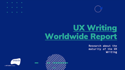
According to the UX Writing Worldwide Report, UX Writing focuses on users and helps create experiences that are relevant to their needs. The survey conducted among 110 writing professionals in May 2020 gives interesting insights into the role of the UX Writer in companies around the world.
The Food And User Experience Combination
What do food and UX have in common? Quite a lot actually! If you’re open for a different kind of approach to UX, we came across a project that already has a few years on its back but offers a perspective on user experience design that you probably haven’t taken on before.

For a talk he gave in 2010, Peter J. Bogaards collected thoughts, ideas, and resources, simply everything that creates a link between the disciplines food/gastronomy and user experience design on his blog Food UX. What might seem a bit strange at first will start to make sense the deeper you start to dive into Peter’s way of thinking. As it turns out, in the end both gastronomy and UX are really about the same thing: engaging the senses to allow experiences to emerge, setting the stage for something good to happen, and serving something delightful.
The Deck Of Brilliance
Do you sometimes find yourself facing a blank page with little or no inspiration whatsoever? Competing with creatives from every corner of the globe certainly doesn’t make it easy to generate brand-new ideas, especially when you feel like they’ve all already been taken.

The Deck of Brilliance gives you 52 free tools that are bound to help you work up ideas in short periods of time. All you need to do is pick a tool one after the other, and be prepared to note down your ideas when they start rolling in. The more ideas you generate, the better the chances of nailing the big one!
Accessibility For Teams
Accessibility goes far beyond the code, so when it comes to delivering accessible websites, each person in a team has their specific responsibilities. If you feel that your team hasn’t found the right strategy to tackle accessibility yet, Peter van Grieken’s guide “Accessibility for teams” has got your back.
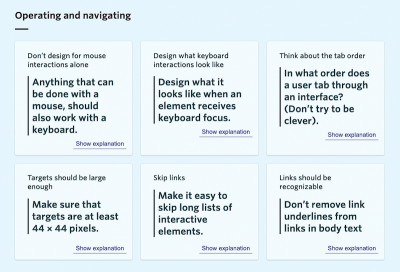
The guide consists of six parts, with each one of them aimed at the different specialists in your team: product managers, content designers, UX designers, visual designers, and front-end developers, plus a guide on accessibility testing. The latter two haven’t been released yet. A great resource that helps incorporate accessibility into your team’s workflow from the ground up.
Slack Communities For Designers
Supporting each other, sharing inspiration, asking for feedback, encouraging discussion — all of this is a crucial part of any creative process. If you’re a designer and are eager to connect with likeminded people, there are a lot of design communities on Slack to participate in. To help you discover the right one for your needs, Ryan Yao set up Designer Slack Communities.
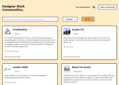
No matter if you’re into UX, animation, or web typography, or are looking for ways to create positive social change, explore how to shape a design culture, or just want to talk shop about design systems, Ryan’s overview has got you covered. If you know of a community that is worth joining but not listed yet, you are welcome to add it. Happy connecting!
The Past, Present, And Future Of Interfaces
Why do we interface? After several months of strict Covid quarantine gave product designer Ehsan Noursalehi a new perspective on our relationship with technology, he decided to convert his obervations and questions into an online micro book.
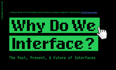
Why Do We Interface takes a historical look at interfaces to build an understanding of how they allow us to utilize information in such powerful ways that they can fundamentally change what it means to be human. A thought-provoking journey from the failed Apple Newton of 1993 to the voice-first interfaces of today and the challenges the future might bring, as well as a precious reminder about the true purpose of a designer’s job.
Fonts Knowledge
Without a doubt, it’s possible to do great design work with a poor quality typeface, but, on the other hand, well-considered typographic choices improve the user experience: they enhance the meaning of text, aid users in wayfinding, and improve readability. To ease your first steps into the world of typography (or help you take your skills to the next level) the Google Fonts team teamed up with typographic experts from around the world to create a library of typographic guides: Fonts Knowledge.
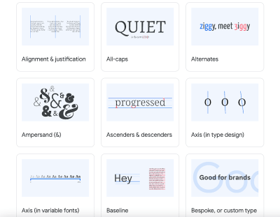
Fonts Knowledge enables designers and developers of all skill sets to choose and use type with purpose. The topics include OpenType, web fonts, type essentials, and variable fonts and are divided into three sections: “Introducing type”, “Choosing type”, and “Using type”. A glossary helps you make sense of typographic terms.
Designing Better Landing Pages
Persuading someone to take an action isn’t always about convincing them with arguments. Sometimes it’s enough to describe clearly what pain points a product addresses, make the pricing transparent, and explain what audience the product is addressing (perhaps backed up with some social proof).
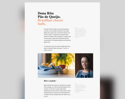
In a Twitter thread on Landing Page Hot Tips, Rob Hope, a passionate UX designer from Cape Town, South Africa, lists 100 useful tips to keep in mind when designing a landing page (or any other interface really). Each tip has a visual and a little cheatsheet — along with a few quick pointers of things to do and things to avoid. All tips are also collected in a lovely eBook.
The UX Of Banking
Every bank claims to offer the best overall banking experience, and why wouldn’t they, right? Well, in order to find out what the challenger banks did differently, UX specialist Peter Ramsey decided it was time to put a few of them to the test.
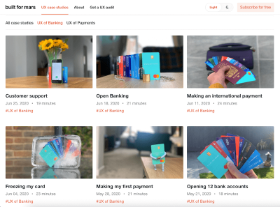
First, he opened 12 real bank accounts in the UK, and logged everything. What followed next were six detailed chapters of his user journey: opening an account, making his first payment, freezing his card, making international payments, open banking, and last but not least, customer support. A fantastic reference guide to help you craft better experiences indeed.
Common Pitfalls In Mobile E-Commerce UX
Large ads in primary areas of the mobile homepage, no autocomplete suggestions for only slightly misspelled search queries, no load indicators when new content is loading — these are just a few of the common UX pitfalls that the Baymard Institute came across when analyzing the current state of mobile e-commerce. For users, things like these are annoying; for the e-commerce industry, they are missed opportunities.
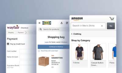
In fact, as the Baymard Institute found out, the mobile e-commerce performance for the average top-grossing US and European e-commerce sites is only mediocre. To help us all do better, they distilled their findings down into 18 common design pitfalls and strategic oversights that offer room for improvements, in particular when it comes to the UX within the mobile homepage, on-site search, forms, as well as site-wide features and elements. A must-read.
Streamlining The Checkout Experience
Fifty-six. That’s the number of actions a customer needs to complete to buy an American Airlines ticket. Let’s face it, checkout forms are often too long and a hassle to fill out. In the worst case, customers might even abandon the process. To help us do better, UX Planet published a four-part article series on streamlining the checkout experience back in 2017 which is still gold for everyone working on a checkout flow today.
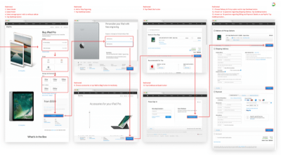
The first part in the series examines examples where the checkout experience has gone wrong and why. The second part pins down the most important things that will help improve any checkout form experience in 16 easy-to-follow tips. Part three is dedicated to form validation and how to minimize the number of errors a customer might make, while also taking a closer look at differences between B2C and B2B markets that lead to differences in design. Last but not least, part four is all about bank card details, teaching you how to detect and validate a card number and how to deal with the other payment form fields. A long but worthwhile read.
UX Takeaways From Streaming Services
Users are sensitive to any friction while using an app and as the number of apps that offer similar features is growing, the more important the experience is as a differentiator. Joseph Mueller analyzed the little experience decisions that make all the difference in the top streaming apps on iOS.

Diving deeper into Netflix’s “kitchen sink”, Hulu’s concept of “back 10 forward 30”, YouTube’s double tap targets, and “rotate for more” approaches, Joseph summarized five key takeaways to improve UX that can be applied to any kind of project: Remove the reasons a user will have to exit the app; pay attention to the nuance of a user’s motivation as it could lead to a new solution; educate the user with the interface; change exit points to opportunities; let your users get the results they want without having to be too precise. Joseph’s analysis shows great examples of how all of this can be achieved.
Getting Push Notifications Right
Many users genuinely dislike push notifications because many websites abuse them for the mere purpose of increasing engagement. But instead of forgoing them completely, Stéphanie Walter suggests a different approach — after all, if done right, there are use cases where notifications can improve the user experience.
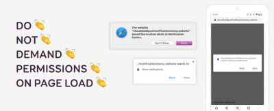
In her guide to push notifications Stéphanie shares valuable advice on how to stop ruining push notifications and get the trust of users back. The two pillars that a good notification is built upon: Give your users a chance to understand what they gain from notifications and ask for permission in context, not on page load. This could be an e-commerce site that asks customers if they want to receive notifications about parcel status and delivery after completing a purchase or an airline notifying users when their flight is delayed, for example. A must-read.
The “Back” Button UX
The quality of an experience shows in situations when something goes unexpectedly. What happens when the customer accidentally reloads the page in the middle of a checkout, e.g. when scrolling up and down on a mobile phone? Does the payment form get cleared out as a user notices a name’s typo on a review page? What happens when a customer hits the “Back” button in a multi-step-process within your single-page-application?
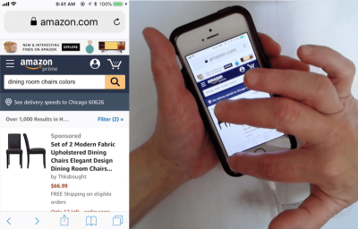
In fact, the unexpected “Back” button behavior often has severe usability issues, and some of them are highlighted in Baymard Institute’s article “Design Patterns That Violate ‘Back’ Button Expectations”. It’s worth testing the “Back” button for overlays, lightboxes, anchor links and content jumps, infinite scroll and “load more” behavior, filtering and sorting, accordions, checkout and inline editing.
We can use the HTML5 History API, or specifically history.pushState() to invoke a URL change without a page reload. The article goes into detail highlighting common issues and solutions to get things just right. Worth reading and bookmarking, and coming back to every now and again.
Should The Buttons Be Disabled?
It has become quite common for lengthy web forms to keep the “Continue” button disabled until the customer has provided all data correctly. This behavior acts as an indicator that something is wrong with the form, and it can’t be completed without reviewing the input. But be careful: It works if the inline validation for every input field is working well, and it doesn’t work at all when it’s glitchy or buggy.
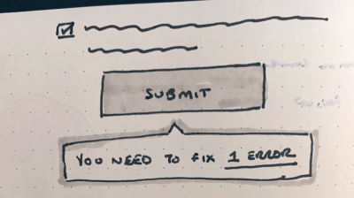
In “Disabled Buttons Suck”, Hampus Sethfors highlights the downsides of disabled buttons. With them in place, we do communicate that something is wrong, but we don’t really explain what is wrong or how to fix it. So if the customer has overlooked an error message — be it in a lengthy form on desktop, or even in a short form on mobile, they’ll be lost. In many ways, keeping buttons active and communicating errors is more efficient. And if it’s not possible, at least provide a way out with a button “I can’t complete the form, please help”, so customer support can get back to customers in case they get into trouble. If you need a more detailed refresher on web forms, “Form design: from zero to hero” will keep you busy.
Designing Better Complex Enterprise Tables
Designing large complex tables is tricky. There is quite a bit of information that we need to show, and showing that information in a structured form requires quite a bit of space. For desktop, we could allow customers to customize the table, move columns around and change the views. In fact, in her article, “The Ultimate Guide to Designing Data Tables,” Molly Helmuth highlights some of the best practices for designing complex data tables, and Andrew Coyle has some table design patterns that you can use as well.
When it comes specifically to enterprise tables that usually require inline editing and filtering, Fanny Vassilatos and Ceara Crawshaw have written a detailed guide to enterprise tables, with useful considerations about viewing options, scroll behavior, sticky headers and footers, pagination, sorting, filtering and search.

But what do we do for mobile? Transforming a table into a slightly narrower table on mobile usually doesn’t work particularly well. Usually, we’d need to redesign the experience from scratch. As Joe Winter shows in his piece on designing a complex table for mobile, we could allow customers to navigate the data set by column first or by row first — combining a dropdown with cards and filters to support this type of navigation. All excellent patterns that we can use to start off our project on the right foot!
Localization In UX
Localization goes far beyond translation. It’s also about small nuances in mindset and culture. As Tania Conte points out, an effective product, as for UX design, is not likely to be faithful to its original version when it becomes available to a different country. Instead, the experience needs to be aligned to different cultures, tastes, and styles.
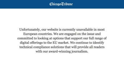
To prevent you from common pitfalls when introducing your product to new markets, Tania collected the main UX design actions applied to localization of products and services. In a nutshell: Consider that cultural value can change the way visual content is processed. Be respectful of cultural and religious pecularity. Introduce some variants that leverage the characteristics of a country. Get focused on habits and local traditions around the globe. And, last but not least, research legal aspects that might be involved. A great reminder to overcome assumptions.
Enhancing User Experience With CSS Animations
Animations have become a popular way to improve the user experience in the last years. But how do we make sure that our CSS animations and transitions will be meaningful to users and not just some nice decoration? Stéphanie Walter gave a talk about enhancing UX with CSS animations at the virtual Shift Remote conference in August last year. In case you missed it, she summarized everything you need to know in an accompanying blog post.
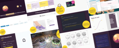
Starting with a reminder of CSS syntax to build transitions and animations, Stéphanie explores why certain animations work better than others. She shares tips for finding the correct timing and duration to make UI animations feel right and explains why and how animations do contribute to improving the user experience. And since great power brings along great responsibility, she also takes a closer look at how you can make sure your animations don’t trigger motion sickness. A great reference guide.
The Role Of Sounds
Just like logos, sounds play an important part in creating your visual brand identity. While there are two categories of UI sounds that designers mostly focus on (i.e. notification and interaction sounds), all of them need to draw users’ attention to a certain event and make the experience as pleasant as possible.

So how do sound designers find the best appropriate sound for a certain app notification or a particular event taking place at a particular moment in time? As sound designer and musician Roman Zimarev explains: “Only the sounds that provide useful information or improve the user’s experience should stay.” Make sure to study what kind of sounds there are, what their functions are, and where we actually need to use them. That way, there’s no doubt that users’ experiences will be more pleasant and memorable.
Wrapping Up
Have you come across a UX resource, article, or tool recently that comes in handy in your day-to-day work or that maybe even changed the way you approach UX challenges? Let us know in the comments below! We’d love to hear about it.


 See the full picture →


 Celebrating 10 million developers
 SurveyJS: White-Label Survey Solution for Your JS App


