Touch Design For Mobile Interfaces: Defining Mobile Devices (Excerpt)
In our brand-new Smashing book, Touch Design for Mobile Interfaces, Steven Hoober shares his in-depth research about designing for touch with guidelines and heuristics you can apply to your work immediately. Start reading: get the book right away.
The personal computer (PC) is still assumed to only be used at a desk-like workstation, in discrete sessions of work with the user focused entirely on the computer. Mobile devices have always been different from “computers” in that they are always on (there’s no need to turn them on to start or end work), always with us (not just close at hand, but also personal devices), and aware (by being connected, and full of sensors).
Mobile phones are rapidly becoming touchscreens and touchscreen phones are increasingly all-touch, with the largest possible display area and fewer and fewer hardware buttons. Today, about half of mobile devices are smartphones, and some of the remaining feature phones are also touchscreen. (Feature phones are mobile phones with extra features. Usually today this means internet connectivity, cameras, GPS, and so on, but they are distinct from smartphones.) With the majority of Internet access via mobiles, in just another decade almost everyone will use touch as their primary interaction method, worldwide.
To many designers and developers the process of designing for mobile assumes that touch is natural, so we don’t need to pay any particular attention to the design of touch systems. This is not true. As children we all had to learn — for years — how to touch, feel, and manipulate real-world objects. Touchscreens and our standard paradigms of interaction are not the same as the real physical world; touchscreen behaviors are as learned as the use of a mouse or a doorknob.
Touch is also not a direct analogue of “traditional” pointing devices like a mouse or trackpad, and there is no ‘one’ type of touchscreen. Changes in the technology of touch over time mean that many assumptions and standards of how to design for touch from just a few decades ago are no longer relevant — and may be actively misleading or dangerous.
Let’s start by defining what a mobile device is and examining the scope of how understanding mobile technology and use patterns is important when designing for the huge number of mobile devices in the world, as well as because the world is changing.
Smartphone
One of the more common assumptions is that mobile means a touchscreen smartphone. Something like one of these in the picture below is certainly in your pocket, or lying next to you. Some of you have more than one of them.
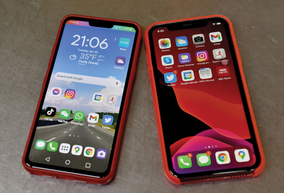
When you encounter a smartphone anywhere in the world, it is probably an Android phone. It barely matters which manufacturer, in the same way you probably barely care who made the Windows PC on your desk. The hardware matters, but the underlying OS is the same, and pretty much all apps will run on any device of the same age. Android holds a bit over half the US market, and closer to 75% of the installed base worldwide.
This simple Android/iOS market distinction was not always true and took a long time to settle into its current shape. It was a full six years after the iPhone launched before the then-ubiquitous Nokia Symbian S60 OS was overtaken by iOS. And perfectly good BlackBerry and Windows devices hung on with good market share in some regions for years longer. Why? Because the smartphone didn’t burst onto the scene fully formed, but it transitioned and offered multple solutions to people’s information and communications needs. The first smartphone was more often called a PDA phone, because at that time everyone knew what a PDA was.
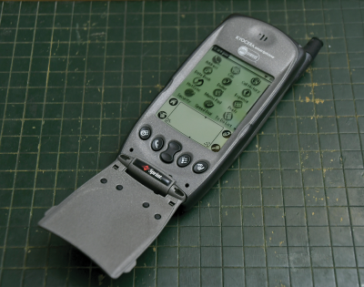
The personal digital assistant was a touch device — though most were used with a stylus or pen — with an interface much like we have today on smartphones. But PDAs were not connected and had to be docked to a computer to sync. When the first mobile phones became smart and acquired the PDA pieces, they quickly became marketed as smartphones to differentiate them from other device types.
Feature Phone
As shown in the introduction, today almost everyone in the world has a mobile device, but fully half of them are still not smartphones. Early cellular mobile phones only made phone calls. Fairly rapidly, text messaging (SMS, short for “Short Message Service”) was added, as it was baked into the network itself, originally as a way to send messages internally or for testing.
By 2002, mobile phones had access to the internet with what became perfectly good web browsers, had cameras, and within a few years would get additional features such as GPS receivers, faster Internet, Bluetooth, and Wi-Fi. These were called feature phones to differentiate them from plain old phones (they had more features, get it?) or what would later be derisively called dumbphones. While some feature phones are still clamshell or flip phones, the candy bar or slider are at least as common.
Feature phones all use proprietary and little known operating systems developed by the makers of the phones, as opposed to prevalent ones like Android or iOS. Though usually unable to be meaningfully upgraded, they can install apps. In many ways, the feature phone app ecosystem is simpler than the smartphone ecosystem we have today as almost every app works on almost every phone. Many phones come preinstalled with common apps such as social networking, email, and maps, or with shortcuts to the browser.
Users of feature phones are not the left behind, and can be connected through their mobile phones like any smartphone user. Most project teams, designers, and even governments are quite dismissive of this half of the world, but we shouldn’t be. These devices tie the world together, and have formed the foundation of many very large-scale and profitable projects. Your product could probably benefit from working at least in some way on feature phones.
Tablet
iPads are considered an entirely distinct market from phones, but I consider them clearly mobile as well, owing to the way they are used. People carry them around, work with them while standing, unlike how they use laptops. And the way they interact is a direct extension of mobiles.
Notice I just said iPads, because — as every expert says — iOS won that market and there are almost no Android tablets. At least that’s what I hear from all tech writers discussing how awesome the new iPad keyboard is, or when I go try to buy one at the local discount computer bodega.
Very often, however, what our gut instinct tells us and what “everyone knows” is flat wrong. Android is installed on a huge number of tablets, and there’s a whole other class of devices called Chromebooks. Most industry-tracking sources classify them as computers. But the majority are in tablet form factors, with maybe a dockable keyboard.
Chrome OS is also not really a different OS, much less a computer one, but simply a very minor offshoot of Android. When counted as computers, as they commonly are, they make up 10–20% of all PCs sold &mdahs; and this figure is rising rapidly. These are big numbers, and if considered part of the tablet market, since they are touch-first, mostly Android machines, Google would own over 70% of that.
Personal Computer
With the Chrome numbers included, “laptops” are no longer any such thing. But even for Windows, many have touchscreens and undock or fold up to turn into tablets or other types of touch-first devices. The picture below shows my corporate-issue Windows PC being re-docked to its magnetic keyboard:
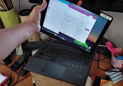
The classic clamshell laptop or notebook PC is losing ground to the convertible (fold around to turn into a flat device) and detachable form factors. Over 40% of laptops sold in 2020 were of one of these 2-in-1 designs.
As early as 2013, 10% of laptops had a touchscreen. Today (in 2021), it is hard to find an exact number, but it appears over half of all laptops sold include touchscreens. And their use is also very tablet-like. People carry them and use them in the hand, tapping the screen to interact and only placing them on a flat surface to type when very long forms have to be filled out.
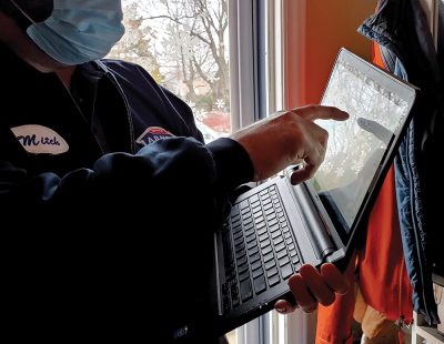
Even while sitting at a desk, people will tab their way through a spreadsheet, mouse into the ribbon to do some formula selection, then reach over and tap the screen to dismiss a dialog, or switch to another app.
In addition, a number of desktop all-in-one computers also include touchscreens, and are used much the same way as any convertible PC when on a desk. Touch and computers generally designed around mobile principles are everywhere.
How did this happen?
It’s helpful to have a clear understanding of what a mobile device is. We can all define them better for our projects, and be more aware of how far broadly mobile methods have reached into other more traditional computing platforms. Knowing what we mean by touch is equally important, and essential to that is an appreciation of the many methods and history of touchscreens and other pointing devices in computing.
Device Lab
I am very often asked what my favorite phone is. I have always told everyone that, professionally, I have no opinion. I make a point of having a lot of devices and switch between them regularly — not because I am indecisive or must always have the newest and best thing, but so I can stay familiar with the variations between devices and operating systems. I need to understand how real people use digital products and services.
If you design for mobile devices, you really need to create or get access to a device lab, a small collection of functional phones and tablets that address the range of the most likely devices your users employ. My choices in a lab should not be your choices.
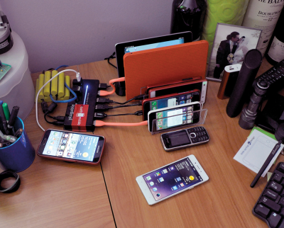
In the past, when there were four or five major OSes, I maintained a very large library of devices and switched which one was my personal phone at least twice a year. Right now as I write this, I mostly carry Android, but pick up the iPhone a lot.
If you’re building products for foreign or global use, don’t just go to the phone store and pick up what is popular wherever you live. Find the most common phones for your target market or audience, and try to get one of those. Yes, many foreign market devices are available in other countries, and work well.
Recommended Reading: “*Build A Mobile-Device Lab!*”
Remember that mobile networks are not the same as Wi-Fi, so carry a spare SIM and switch that out occasionally, especially during tests of whether your app or website operates properly. Likewise, I have both a Mac and a PC on my desk. My current tablet PC is employer-issued, but when I work for clients who don’t provide one, I buy a PC of my own. And I have a Chromebook. Yes, mostly the toddler watches TV on it, but this is one way that I keep a library on a budget and experience firsthand how they really work. I use these devices in my day-to-day life.
Yes, this will cost something, so with any luck you can get your employer to fund it, or maybe find an open device lab, a shared pool that you can use free or for a nominal fee. I have also known designers who share with one another to create ad hoc labs, so ask around the community and see what resources are already available.
Editor’s Note
Do you like what you’ve read so far? This is just an excerpt of Steven’s brand-new book, Touch Design for Mobile Interfaces, in which he shares his in-depth research about designing for touch as well as tips, tricks, trends, tendencies, guidelines, and heuristics you can apply to your work immediately to create human-centered mobile interfaces.
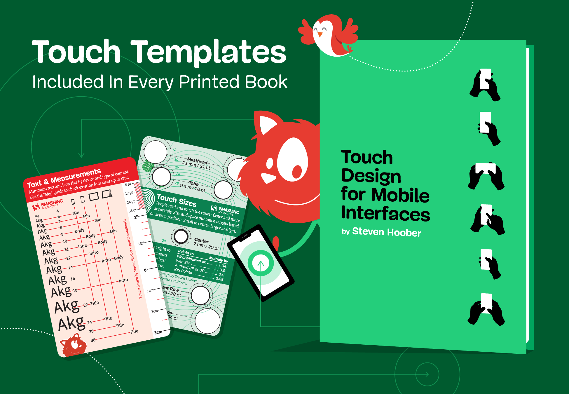
Bonus: We’ve included durable plastic templates to help you plan type and touch sizes! These templates will help you design usable, efficient interfaces with less guesswork. We’ll be tucking both of the templates into the back of every printed book, so pre-order now to get your hands on Steven’s book as soon as it starts shipping in mid-January 2022. (The templates are included in the eBook as well!)
eBook
DRM-free, of course.
ePUB, Kindle, PDF.
Included with your Smashing Membership.
Download PDF, ePUB, Kindle.
Thanks for being smashing! ❤️
Further Reading
- The Ultimate Guide To Push Notifications For Developers
- The Things Users Would Appreciate In Mobile Apps
- Picture Perfect: Meet Pixo, A Photo Editor For Your End Users
- How To Apply UX Principles To Embedded Systems: Learnings From The Field

