Using QR Codes In Your Business: Best Practices And Pitfalls
QR codes are a useful technology that simplify and enrich the customer journey. The technology is currently used almost everywhere: e-menus in restaurants, virtual business cards, customer feedback collection after food delivery, boarding passes at the airport. However, as with everything else, a business owner should consider several things when using this technology if they want to create a positive customer experience.
In this article, I’ve assembled a checklist of items to keep in mind as you try to leverage QR codes for your business, broken down by the steps of the customer journey. So, in this mini-journey, our customer:
- Sees the QR code for the first time,
- Examines the code,
- Scans it,
- Follows the link from the code.
Let’s take a closer look at what to consider in each stage.
Note: This list can and will be updated as it continues to grow, so if you have any ideas on what could be included, please do let me know. Let’s make this content even more valuable for everyone!
1. First Contact With The QR Code
Usage
A basic point: When appropriate, QR codes are worth using. The pandemic and the emergence of built-in code-scanning on our smartphones have set the stage: The public is ready for this technology. It’s a good time to use QR codes and to relieve your customers from having to memorize a long URL or type it in manually.
Gruzovichkof (a shipping company), for instance, states on its cars that its app is available in the App Store and Google Play, but it does not provide customers with any link to it:

Technopark (a retailer) performs this task more intelligently, allowing you to download the app by scanning the QR code placed on the surface of its delivery cars:

Code Visibility
Try to position the QR code in such a way that it is clearly visible from various points of the path that your customers are following. For example, if the QR code is not at eye level, then you run the risk of customers not noticing it at all.
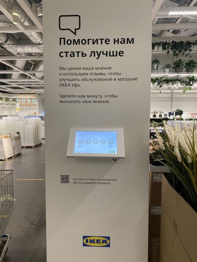
IKEA is good at this, although initially I thought of mentioning it as a bad example. By placing QR codes under the feedback collection terminal, which seems illogical, it simplifies the process of providing feedback for visitors on wheelchairs:
Free Space
If possible, place the QR code in a way that it doesn’t “stick” to the other design elements on the surface. And minimize the visual noise around it, so that the client’s attention doesn’t dissipate and the code is easier to notice.
2. Examining The Code
Call To Action
Don’t show a QR code without an explanation. Let customers know explicitly what they are being asked. To increase the likelihood that customers will scan your QR code, place an explicit call to action (CTA) next to it:

Explanation Of Value
In addition to the CTA, explain to customers why scanning the QR code would be valuable to them. By managing their expectations, you further increase the likelihood that they will take action.
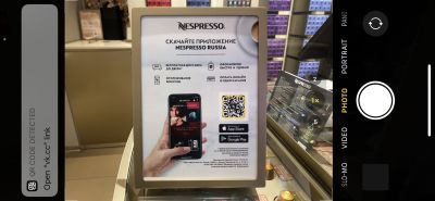
For example, the call to download the app in Nespresso’s boutique is accompanied by an infographic with key benefits:
Contact Details
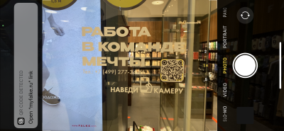
Some businesses also place contact details next to their QR codes. It’s important not to overwhelm, but in some cases these details would be appropriate, such as for a hotline:
Company Logo
Most QR code generators allow you to brand the code by placing your company logo at its centre. This will make your code look more professional and increase the chance of drawing your customers’ attention.
Brand Colors
QR code generators also allow you to select a color for your code. This is a great opportunity to use your brand’s colors and make the code more visually appealing.
3. Scanning A QR Code
Size
Make sure that any QR code you place in offline media is not too small. Also account for the distance from which the code will be scanned. If it’s too small, customers will have trouble scanning it, and the code will be useless.
Non-Contact Surface
Minimize direct physical contact with your QR code. Otherwise, the surface will erode over time, and the code will become more difficult to scan. For example, for a storefront, stick the code inside the window, rather than outside.
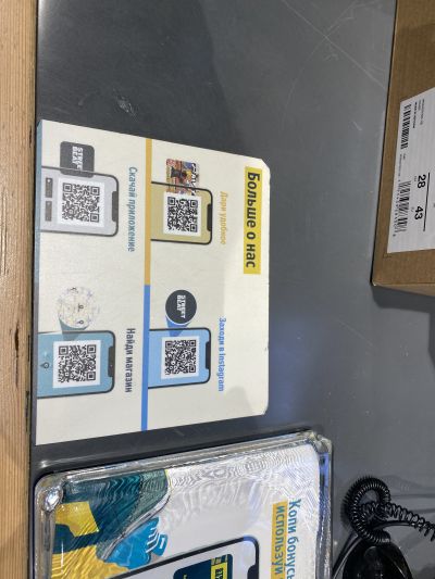
In one of Street Beat’s stores (a sports apparel retailer), QR codes are placed on the checkout counter. The idea is quite good, but because it’s a contact surface, the sticker will come off gradually, and then it will look untidy and eventually have to be replaced.
Comfort Of Scanning
Place your QR code in a location where it’s comfortable to scan, without rushing. For example, a highway billboard will not only be inconvenient for customers, but will also increase the risk of accidents.
Mobile Network Availability
Many QR codes are links to websites. If yours is, make sure it’s somewhere where a mobile network or Wi-Fi is readily available. Otherwise, the value of the code will be close to zero.
Proper Surface
You’ll see some QR codes placed on transparent surfaces, which makes them difficult to scan or not scannable at all.
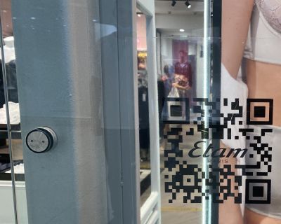
In Nespresso’s boutique, this issue is apparent: The code is almost unscannable. Store personnel found a solution: Every time a customer tries to scan the code, they hold up a sheet of paper as a background (which is still not the best customer experience at the end of the day):

X5 Retail Group (a food retailer) uses billboards along the streets to show its QR codes for downloading its app. Due to the format of the billboards, the codes are not as easy to read as they would be on a solid surface.

Environmental Factors
If you place a QR code outside, consider environmental factors such as lighting and weather. If the poster will be poorly highlighted at night, the code will be much harder to scan. If you’re using vehicles (such as delivery cars or cabs), ensure that they are cleaned regularly, especially in bad weather — the usefulness of a code covered with dirt is close to zero.
Explaining The Scanning Process
Despite the prevalence of QR codes, not everyone is aware of what to do with them. That’s why it’s a good practice to clearly explain this next to the code. For example, you could write, “Point your smartphone camera at the QR code to scan it”, along with an icon of a camera.
Scanning With Native Camera App
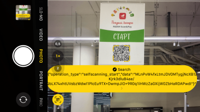
Set customers’ expectations correctly about how to scan the QR code, and if possible, do not implement a solution that requires people to install a specialized camera app.
When Auchan launched its innovative “Scan & Pay” system, corresponding QR codes were placed all over the store. Hundreds of visitors tried to scan the codes with a standard camera and encountered an error. They were not taken to the landing page but came across a system code. (The QR codes had to be scanned with the camera in Auchan’s app.)
Scanning From Different Devices
A QR code may be easily scannable on some devices and not scannable at all on others. Check the scannability of your code on different smartphone models before sending it for printing.
Color Contrast
Standard QR codes are black and white. If you use your brand’s color, make sure that it contrasts with the background enough to be scanned without any issue.
Dark On Light
Always use a color contrast of dark on light — that is, a dark QR code on a light background. Not all devices can scan the opposite correctly.
Resolution
Before submitting the code for printing, make sure the code is at a resolution high enough not to blur or pixelate. Otherwise, your effort and money will be wasted.
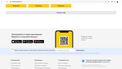
Website Code: Desktop
QR codes can also be used in a digital environment. For example, if I’m visiting a website on a desktop computer, the usefulness of an HTML button to download an app is questionable. However, a QR code can be scanned from the page with a smartphone, resulting in a smoother download process:
Website Code: Mobile
Unlike on a desktop website, where a transition to a mobile environment can be justified, think twice about whether to put a QR code on your mobile website. If a user encounters a code on their smartphone screen, they will not be able to read it with their camera. In this case, using a button makes more sense.
A while ago, I noticed that both the desktop and mobile versions of Auchan’s e-commerce website contained QR codes. While the former was justified, the usefulness of the latter was questionable:
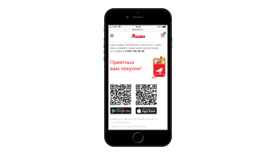
An exception is when users can share a code with others. A particular and quite widespread case nowadays is the verification of a person’s COVID-19 vaccination status using the QR code from the mobile version of a public-service website.
4. Opening A Link From A QR Code
Active Link
This is a basic point, but I decided to include it nonetheless. Mistakes sometimes happen at the execution level of a business. Before sending a QR code for printing, check that the link in the code does not contain any errors and is active. Also, check regularly that all existing QR codes are active and working.
Content Relevance
Don’t forget to regularly check the relevance of content both on the page that is accessible via the link and in the area surrounding the QR code, especially if you’re using the code for a limited-time offer, an event invitation, or the like. Otherwise, it could result in unmet expectations and a negative customer experience.
Landing Page vs. Several Codes
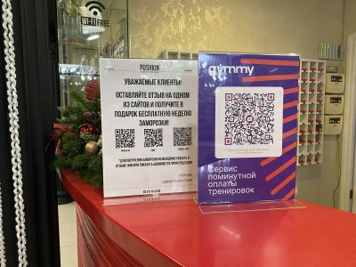
If you want your customer to take several actions, don’t create a QR code for each action. A better solution would be to present one QR code, and then outline the CTAs on the page that is accessible via the link in the QR code. This way, the presentation of the code will look neater, and the customer won’t be distracted when scanning it.
Below is an example of a case when this point was not thought through (by Persona Sport, a gym and wellness club). Links to Google My Business, Yandex.Maps, and 2GIS could have been placed on the landing page that is accessible via the QR code:
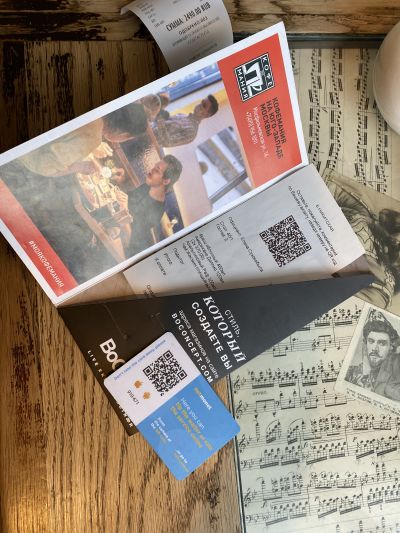
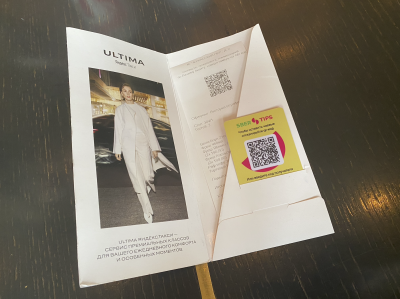
A while ago, Coffeemania (a restaurant) used one QR code for patrons to submit reviews, and another one for patrons to send tips to servers (whereas these actions could have been combined in a single code):
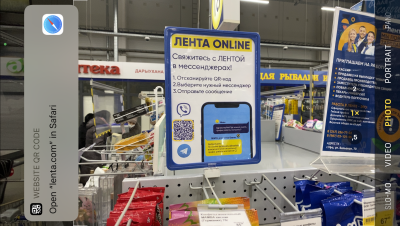
Lenta (a retailer) does this more efficiently, allowing customers to choose the medium by which to communicate with support at the level of the web page, rather than from printed media:
Managing Expectations
The content accessed via the link should match the CTA next to the QR code. If an invitation to subscribe to a social media account is the CTA, and the customer is prompted to take several unrelated actions upon scanning the code, then their attention might get diverted, and they might not take any action at all.
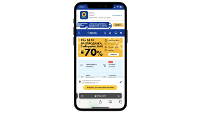
The drawback of the last example is that the QR code, which allows the customer to choose the medium by which to communicate with customer support, leads not to a dedicated landing page, but simply to the main e-commerce page, blurring the customer’s focus:
Mobile Optimization
It’s important to understand that scanning a QR code is just one part of the journey that a customer takes. That’s why thinking through all of the steps is important. Specifically, if the customer scans a QR code with their phone and ends up on a page that isn’t optimized for mobile devices, it won’t do them (or you) any good.
App Downloads
You can use deep linking to reduce your number of QR codes and to simplify the customer journey. This strategy allows you, among other things, to identify the type of device that the customer is using when scanning your QR code. It is useful when you’re providing a link to download an app. iPhone users who have scanned the QR code will go to the App Store, while Android users, having scanned the same code, will go to Google Play. The customer’s focus is not distracted by multiple QR codes, and there is no need to choose, while the value is the same.
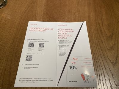
Coffeemania’s loyalty program offers several QR codes, depending on the way the client wants to register. This could be overwhelming:
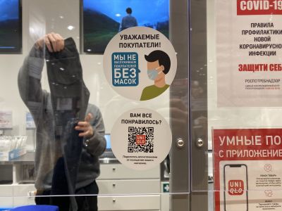
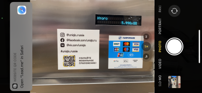
Uniqlo, on the other hand, doesn’t ask what kind of smartphone I have. The relevant app store will open automatically when I follow the link from the QR code:
Personalization
You can personalize the customer’s experience by leveraging UTM parameters in the link from the QR code. For example, to allow customers to evaluate a restaurant server’s work, you can add the server’s ID as a link parameter and personalize the feedback page with their name.
Analytics
Besides personalization, UTM parameters can also be used for analytics. For example, when placing QR codes on different banners around the city, you can add corresponding parameters with the ID of each banner to see which banners get more traffic and which ones should be relocated in the future.
To Be Continued
QR codes can simplify the customer journey and make it more convenient. As with everything else, however, the effectiveness of this touch point depends on the details, and poorly implemented details can turn your bright prospects into a bad customer experience.
If you use QR codes in your business, be aware of the pitfalls along the way, and leverage all of the technology available, and don’t rely on having to learn from your own mistakes. I hope this article was valuable, and if you have something to add, drop me a message — we’ll continue to refine the best practices.
Good luck and keep in touch!
Further Reading
- Alternatives To Typical Technical Illustrations And Data Visualisations
- The Role Of Illustration Style In Visual Storytelling
- Creating An Effective Multistep Form For Better User Experience
- Timing is Everything: Good Design Is All About The Right Timing


 Celebrating 10 million developers

 Try ProtoPie AI free →
 SurveyJS: White-Label Survey Solution for Your JS App
 Register Free Now

