Windows High Contrast Mode, Forced Colors Mode And CSS Custom Properties
I’m extremely excited about the upcoming Forced Colors media query. It takes the work done for Windows High Contrast mode and elevates it to an open, cross-browser standard. This means that a person will be able to use whatever browser works best for them to get what they need, instead of being forced to use one specific browser.
What Is Windows High Contrast Mode? What Is Forced Colors Mode?
Windows High Contrast mode, and its successor, Forced Colors mode, are important pieces of assistive technology. These two display modes affect:
- The operating system installed on a device,
- The browser is installed on the operating system, and
- All web content is loaded by that browser.
These display modes prioritize legibility above all else. Ornamentation and decoration are discarded in order to allow content to be displayed clearly.
All content affected by these two modes maps to a color theme. This color theme can be modified by someone to use any combination of colors, to create a suite of colors that works for their specific access needs.
For some, Windows High Contrast/Forced Colors mode represents the last option they have to view content on their device — including web content. This is highly specialized, highly personalized assistive technology, and using it is a very intentional act.
Others may circumstantially benefit from using Windows High Contrast/Forced Colors mode. One of my favorite examples of this is being able to use your laptop in the park, despite the glare of the noonday sun.
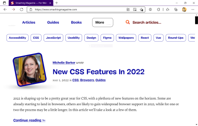
Here’s how Smashing Magazine looks with Forced Colors activated and set to use the High Contrast #1 theme:

And this is how Smashing Magazine looks with Forced Colors activated and set to use the High Contrast White theme:
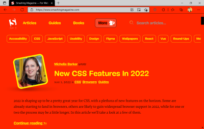
And this is how Smashing Magazine looks with Forced Colors activated and set to use a custom theme:
High Contrast Mode, Forced Colors Mode, And Browser Support
I’ll be honest, the current state of Forced Colors support is a bit of a mess.
Internet Explorer will never support Forced Colors mode because Microsoft has discontinued support of the browser. It will also never support Custom Properties. Internet Explorer does, however, support High Contrast mode.
Edge supports Forced Colors mode. It also has legacy support for Windows High Contrast mode. This means that code written specifically to support High Contrast mode in Internet Explorer will work in Edge as well.
The Forced Color mode syntax is an update on Windows High Contrast mode syntax, which uses specialized keywords (more on this in a bit). As a consequence of this, Internet Explorer supports some, but not all Forced Color mode syntax.
Every other major evergreen browser has support for Forced Colors mode, except for Safari. The trick here is that macOS, iOS, and Android currently do not have a way to specify Forced Color mode themes. This means that for now, only Windows is capable of fully supporting a full Forced Color mode experience.
Here are two tables of the current support landscape if you need help visualizing this:
| Browser | Supports legacy High Contrast Mode CSS properties? | Supports Forced Colors mode CSS properties? | Supports CSS Custom Properties? |
|---|---|---|---|
| Internet Explorer | ✅ Yes | ⚠ Some | 🚫 No |
| Edge | ✅ Yes | ✅ Yes | ✅ Yes |
| Chrome | 🚫 No | ✅ Yes | ✅ Yes |
| Firefox | 🚫 No | ✅ Yes | ✅ Yes |
| Safari | 🚫 No | ⏳ Soon | ✅ Yes |
| Operating System | Supports switching and creating Forced Color mode themes? |
|---|---|
| Windows | ✅ Yes |
| macOS | 🚫 Not yet |
| iOS | 🚫 Not yet |
| Android | 🚫 Not yet |
SVG That Uses currentColor
This is a whole thing unto itself, and beyond the scope of this post, but there are some issues right now with how Forced Color mode works with SVGs that utilize currentColor to control their coloring.
If you’d like to learn more about the particulars — including how to work with them — I recommend reading this excellent, in-depth article by Melanie Richards.
Why This Is All Worth Mentioning
The reason why this is important is that Forced Colors mode syntax differs slightly from the Windows High Contrast mode syntax.
Edge has backwards compatibility, but Internet Explorer will never have forwards compatibility. This means that Internet Explorer viewing web content with High Contrast mode activated may not properly display content using the newer Forced Color mode syntax.
This is worth mentioning because not everyone can or will be able to upgrade their device to use something other than Internet Explorer, regardless of Microsoft’s upcoming discontinuation of support.
As a result of this, it is vital to approach High Contrast/Forced Color mode work with a cautious, ego-free mindset. If at all possible, talk to High Contrast/Forced Color mode users to determine what their specific preferences actually are.
How To Design For Windows High Contrast And Forced Colors Mode
High contrast mode is not about design anymore but strict usability. You should aim for highest readability, not color aesthetics.
— Kitty Giraudel (@KittyGiraudel) June 20, 2017
No, seriously. Forced Colors and Windows High Contrast modes are all about presenting all content — including web content — in a predictable and consistent way.
You only want to make small, surgical tweaks to your content, not create a completely new, bespoke Forced Color mode experience.
Each element’s inherent HTML semantics tell Forced Colors and Windows High Contrast modes how to be displayed. Areas, where semantic HTML isn’t used, are good areas to check — to see if your content holds up.
Forced Colors Mode Keywords
Forced Colors mode — like Windows High Contrast mode — uses a suite of specialized keywords. These keywords assign color to meaning. For example, all inert, regular text will use the same theme color, with this color being mapped to the CanvasText keyword.
The reason keywords are used is because the text color could be any color. Every content type Forced Color mode effect can also, potentially, be any color.
Forced Colors mode has multiple themes, including ones that a person can create for themselves. This lets someone tweak how things look until it works for them.
Sourced from this excellent post, the list of Forced Color keywords is:
| Content | Keyword |
|---|---|
| Text | CanvasText |
| Hyperlinks | LinkText |
| Disabled Text | GrayText |
| Selected Text, foreground | HighlightText |
| Selected Text, background | Highlight |
| Buttons, foreground | ButtonText |
| Buttons, background | ButtonFace |
| Backgrounds | Canvas |
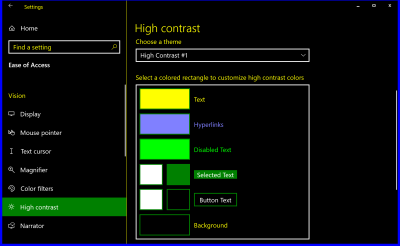
Here is how these keywords map to the Windows High contrast theme selection interface:
And here is an example of a custom theme:
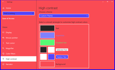
This theme might look like the ugliest thing you’ve ever seen, but it’s vital to remember, that this combination of colors might be what lets someone use their device.
CSS Custom Properties
The upgrade of Windows High Contrast mode into Forced Colors mode works really well with another contemporary feature of CSS: Custom Properties.
If you are unfamiliar, Custom Properties are a way to create “variables” in CSS—formalized, encoded values that can be dynamically manipulated.
:root {
  --color-background: #ffffff;
  --color-text: #000000;
}

@media (prefers-color-scheme: dark) {
  :root {
    --color-background: #000000;
    --color-text: #ffffff;
  }
}

body {
  background-color: var(--color-background);
  color: var(--color-text);
}
In this example, I’m creating Custom Properties in the :root selector that will be used to control the background and text color.
I’m initially setting the text color to black and the background color to white, and then updating the Custom Properties to use white text and a black background when dark mode is activated. Invoking the Custom Properties in the body selector is the magic that makes it all happen.
CSS Custom Properties can be used for far more than just color, and their values update in realtime, both via display mode updates and JavaScript logic. This is powerful stuff.
Using Custom Properties With Forced Colors Mode
We’re going to take all this background information and apply it to something concrete: A modal dialog. Do you remember how I said Custom Properties can use more than just color values? We’re going to take advantage of that now.
Unfortunately, the dialog element still has assistive technology compatibility issues, meaning that the most accessible solution is still to use one constructed with the help of ARIA and JavaScript. Kitty Giraudel’s a11y-dialog is a wonderful, flexible resource that I enthusiastically recommend to help you do just that.
Accessibility Workarounds
Since the modal is constructed by using divs, Forced Colors mode does not know it is a modal. It, like Windows High Contrast Mode, does not take ARIA into consideration when determining how color is assigned.

This is one of the reasons why the Forced Color mode media query and its keywords exist — to tweak content until it works the way someone would expect it to.
Sometimes content isn’t written semantically, and there’s nothing you can do about it. It is no different than using CSS to make tweaks to vendor-supplied code you have no direct control over.
Styling The Modal For Forced Colors Mode
Here’s a CodePen for our modal, before we make our Forced Color mode tweaks:
See the Pen [Modal dialog [forked]](https://codepen.io/smashingmag/pen/KKyjovK) by Eric Bailey.
Here’s how it looks without Forced Color mode activated:

And here is a screenshot of how it looks with Forced Color mode activated:
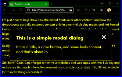
CanvasText color, and the modal’s close button is using the ButtonText color. (Large preview)While a blind person using a screen reader may know a modal is present, because of how it is announced, a low vision person using Forced Colors mode may be confused because the modal’s boundaries are not communicated strongly enough visually. This may be further complicated by low vision people who use both Forced Colors mode and a screen reader.
Notice, that even though Forced Colors mode does not know it is a dialog, it does know what a CSS outline declaration is. It takes the very faint, thin light gray border we’re using and colors it with the color value mapped to the CanvasText Forced Color mode keyword.
Also notice, that the modal’s box-shadow has been discarded when Forced Color mode is activated. This, and the outline recoloring are by design.
Remember: Forced Color mode prioritizes legibility above all else, and makes visual updates to honor that.
Making Our Update
Much as how we’re redefining component-level CSS Custom Properties for things like :hover and :active state on the modal close icon, we can redefine for different display modes. Here is a CodePen for our modal after our Forced Color mode tweaks have been made:
See the Pen [Modal dialog with Forced Color mode tweaks [forked]](https://codepen.io/smashingmag/pen/zYPVjPa) by Eric Bailey.
On line 104 of this CodePen example, we are redefining the --dialog-border-width Custom Property inside a Forced Color mode media query declaration. The reason for doing so is a highly intentional tweak. It takes the thin outline border and makes it dramatically thicker.
 @media (forced-colors: active) {
  --dialog-border-width: var(--size-300);
}
The reason for this adjustment is that it helps to show the modal’s outer boundary and communicate that it is floating on top of the rest of the page’s content. Forced Color mode removes the modal’s box-shadow, so we cannot rely on that visual affordance in this specialized viewing mode.
Here is a screenshot of it in action:
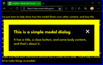
Testing
Here’s how to enable contrast themes in Windows. Use macOS or Linux? You’re in luck! There are multiple ways to test for Forced Color support:
- Get a Windows craptop and use a tunneling service, such as ngrok. The craptop is also a chance to test your website or web app’s performance — another potential access barrier.
- Use an app to load a Virtual Machine with a Windows image provided by Microsoft.
- Use a service like Assistiv Labs, which provides a cloud-hosted on-demand Windows Virtual Machine geared towards accessibility testing.
- Use Polypane’s media emulation functionality to toggle an emulated Forced Color mode.
- Use Microsoft Edge’s DevTools to toggle an emulated Forced Color mode.
I would advise some caution for options four and five, as an emulated experience only uses a single theme, and it’s not representative of the Forced Color mode’s full capabilities.
I particularly like the Assistiv Labs option, because it’s focused on accessibility testing, and it does not heavily tax my laptop the way a local app-run Virtual Machine would.
Wrapping Up
At the surface level, this might seem like a lot of words just to demonstrate how to update a CSS Custom Property. This post’s goal, however, is to introduce you to a powerful piece of assistive technology and show how modern CSS can elegantly thread into it to make flexible, maintainable, and adaptive digital experiences.
Now that you know about Forced Color mode and how it works, why not take some time and audit how your websites and web apps look when it is activated? Some little tweaks might make a huge difference for someone who relies on a Forced Color mode experience to browse the web.
Other Resources
- “Styling for Windows high contrast with new standards for forced colors,” Microsoft Edge Team
- “CurrentColor SVG in forced colors modes,” Melanie Richards
- “Assistive technology: Operating System and Browser Accessibility Display Modes,” Eric Bailey
- “Working with the text backplate in Windows High Contrast,” Greg Whitworth
- “WHCM and System Colors,” Adrian Roselli
- “Quick Tips for High Contrast Mode,” Sarah Higley
Further Reading
- In Praise Of The Basics
- How OWASP Helps You Secure Your Full-Stack Web Applications
- The Hype Around Signals
- A Designer’s Accessibility Advocacy Toolkit


 Try ProtoPie AI free →
 Register Free Now
 Celebrating 10 million developers
 SurveyJS: White-Label Survey Solution for Your JS App

