Developing An Award-Winning Onboarding Process (Case Study)
The notion of onboarding is all about helping users quickly and easily find value in your offering. Speed and ease of use are equally important because users might lose interest if going through an onboarding takes more time or is more complicated than what they expected. Speed and ease of use are also relative to a person’s point of view: a salesperson can have vastly different expectations for an onboarding than a developer.
A well-constructed onboarding process boosts engagement, improves product adoption, increases conversion rates, and educates users about a product. Optimizing the onboarding experience is a journey. You should have a plan but be agile, utilizing processes and tools to garner feedback from target users in a bid to constantly improve.
In this article, we will walk you through how we developed the onboarding processes for platformOS from the very beginning. You will be able to follow how we carried out user experience research, how our onboarding has changed over time, what assumptions we made, and how we adjusted them. We will talk about all the tools we used as examples, but the same processes can be implemented with a wide variety of other tools. You will get practical examples and a complete overview of how we built our onboarding, with insights into UX research and the specifics of working with different audience segments.
Our audience has always combined technical people with various levels of programming skills, and non-technical people who come to our docs to evaluate if platformOS would be a good fit for their projects like Project Owners, Business Analysts, and Project Managers. Because our main target audience is divided into different segments, you will also get a glimpse of the processes we developed for our documentation, developer education, and developer relations.
Challenge: Onboarding For Different Target Audiences
platformOS is a model-based application development platform aimed at front-end developers and site builders automating infrastructure provisioning and DevOps.
"DevOps is a combination of development methodologies, practices, and tools that enable teams to evolve and improve products at a faster pace to better serve their customers and compete more effectively in the market. Under a DevOps model, development and operations teams are merged into a single team where the engineers work across the entire application lifecycle, from development and test to deployment to operations."
Our main target audience is developers, and the foundation for their onboarding, education, and support is our developer portal — but our onboarding has to cater to other target audience segments as well.
Defining Our Target Audience Segments
We defined our target audience during the discovery phase of the Design Thinking process that we used to plan our developer portal. Since then, we have frequently revalidated the results to see if we are on the right track because we want to be sure that we understand the people who will be using our product, and what motivates them. We also know that in the lifecycle of a product this audience can change as a result of product positioning, and how well we can address their needs.
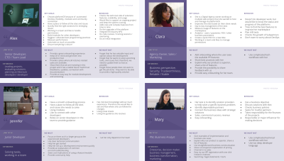
Our target audience currently has four segments:
- Experienced developers,
- Junior developers,
- Agency Owner, Sales/Marketing,
- PM, Business Analyst.
User Base Shifts
We created the first target audience map when we started planning our developer portal. In the discovery phase, we mapped out four proto-personas that covered the following segments: Experienced Developers, Junior Developers, Site Builders, and Marketplace Owners.
We revalidated these results a year later, and we realized that our audience had shifted a bit.
- The Experienced Developers and the Junior Developers stayed as the main target audiences. However, we collected new knowledge related to the needs of the junior devs. They needed more detail to be able to understand and start working with the product. This new information helped us specify their user journey.
- At this point, the Site Builders were the smallest group. We identified we needed to address the needs of the developers group first, creating a strong foundation to support site builders in the platform.
- The non-technical segment shifted on the way. The Marketplace Owners segment was divided into two separate audiences: the Agency Owners, who have a sales and marketing background, and the Business Analysts, who have an enterprise background in business management or transformation — a new audience who started to show interest in our product.
Along the way, we were able to specify the needs of these audiences in more detail. These details helped with the prioritization of the onboarding tasks and kept our focus on the needs of the audience.
Defining Entry Points For Target Audience Segments
Getting to know the needs of the target audience segments provided guidance for identifying the entry points to the product.
- The Agency Owners’ key goal is to work on multiple web projects that they host and manage on the platform. They won’t work on the platform themselves, but they would like to know the status and the progress of the platform without worrying about DevOps. They need to see the business perspective, the security, and that they are part of a reliable ecosystem with a helpful community around without diving deep into the technical part of the product.
- The Business Analysts’ goal is to identify solution providers for their specific business problems. They need to find a long-term solution that fits with their use case, is scalable, and gives them the possibility for easy evaluation that shows the key business values in action.
- The Junior Developers’ goal is to learn the basics without much hassle, under the guidance of experienced community members. They need clear technical communication on how to set up a dev environment and how to troubleshoot common errors.
- The Experienced Developers’ goal is to find a solution that is reliable and flexible enough for all their project needs and at the same time provides good performance. They need to be able to evaluate quickly if it’s a good fit, then see how their project could work on the platform. They also need to see that the platform has a future with a solid community behind it.
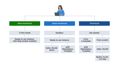
All segments needed an actionable onboarding where they can interact with the product (and engage with the community) based on their level of technical knowledge.
- In the non-technical journey, users can go from the 1-click route that takes them through registering on the Partner Portal to creating a demo site and installing the blog module by clicking through a setup wizard.
- In the semi-technical journey, users can create a sandbox in which they can experiment by cloning a demo site from our GitHub repository, and they also have the option to go through our “Hello, World!” guide.
- In the technical journey, users can follow a more complex tutorial that walks them through the steps of creating an app on platformOS from setting up their development environment to deploying and testing their finished app. It explains basic concepts, the main building blocks, and the logic behind platformOS, while also giving some recommendations on the workflow.
How We Approached The Challenge: Methods And Tools
We followed various methods to tackle different aspects of the main challenge. We selected a Design process to follow, used many different user research methods to collect insights and feedback from our users, chose a framework for our editorial workflow and technical implementation that could work well for our Agile, iterative process and our target audience, and went with an approach for content production that allowed community members to contribute early on.
Design Thinking
Because of the strategic role our developer portal plays in the adoption and use of our product, we wanted to use a creative design process that solves traditional business problems with an open mindset.
Our goal was to:
- help our community to be able to use our documentation site for their needs as early as possible;
- measure user needs and iterate the product based on the feedback;
- keep the long-term user and business goals in mind and take a step closer with each iteration.
We found the Design Thinking framework a perfect fit because it is a user-centric approach that focuses on problem-solving while fostering innovation.
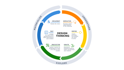
We followed the stages of the design thinking process:
- Empathize
In the beginning, we explored our audience, our documentation needs, and existing and missing content through in-depth interviews and workshops. - Define
Then, we defined personas and our Content Inventory. - Ideate
We shared our ideas for content and features through a Card Sorting exercise. - Prototype
Based on our findings, we created a sitemap and prioritized content needs, and created layouts and wireframes. Content production started based on the results of our discovery phase. - Test
We followed an iterative, Docs as Code approach: at each stage, we work with quick feedback rounds, deploy often, and improve features and content based on feedback from real users.
User Research
In the life of a product, each development stage has a fitting UX research method that we can use, depending on the business plans, time constraints, stage of product/feature, and the current concerns.
In the last three years we used the following methods:
- Interviews
We met with users, sales, and support persons to discuss in-depth what the participant experienced about various topics. - Remote Usability Testing
We asked potential or current users of the product to complete a set of tasks during this process, and we observed their behavior to define the usability of the product. We used two types of remote usability testing:- Moderated: We conducted the research remotely via screen-sharing software, and the participants joined in from their usual work environment. This approach is advantageous when analyzing complex tasks — where real-time interaction and questioning with participants are essential.
- Unmoderated: We sent tasks for users to complete in their own time. As moderators are not present, we measured less complex tasks and focused on the overall level of satisfaction they experienced when interfacing with the product.
- Card Sorting
A quantitative or qualitative method, where we ask users to organize items into groups and assign categories to each group. This process makes it possible to reflect the users’ mental model on the architecture. - Tree tests
We used tree tests to validate the logic of the used information architecture. We gave users a task to find certain elements in the navigation structure and asked them to talk about where they would go next to accomplish the task. - Surveys, Questionnaires
We used questionnaires and surveys to gather a large amount of information about a topic. This quantitative data can help us have a better understanding of specific topics that we can further research to understand what motivates users. - Analytics review
We used site analytics to gather quantitative data about usage patterns and identify possible flow breaks. Based on the data we either fixed the problem or if needed, we further tested with usability research.
Docs As Code And CI/CD
We engaged our users in an Agile and iterative process right from the beginning discovery phase. This ensured that we were able to test and validate all of our assumptions, and quickly make modifications if needed. As our internal team members and our community participants are distributed, we needed a workflow that made it possible to collaborate on changes, large or small, remotely. Consequently, we needed a robust approach to version control accommodating authors, reviewers, and editors all working on content concurrently. As we wanted to encourage developers to contribute, we needed a framework that they’re familiar with. We also wanted to make our documentation open-source, so that anyone could duplicate and reuse it for their own projects. Based on these requirements, we decided to follow the Docs as Code approach.
Documentation as Code or Docs as Code refers to a philosophy of writing documentation with the same tools as software coding. This means following the same workflows as development teams, including being integrated into the product team. It enables a culture where writers and developers both feel they have ownership of the documentation and work together to aim for the best possible outcome. In our case, we didn’t only have writers and developers working on our onboarding but also UX researchers, account and project managers, and of course, a range of users in varying roles.
Our documentation is in a separate repository on GitHub. We have a central branch, and we work locally in a dedicated branch, then we send pull requests for review to be merged into the main branch. To preview docs, we use our own staging site which is an exact copy of the live documentation site.
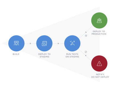
Once we accept changes, we take steps to push them live almost immediately. To maintain the integrity of the site during this process, we follow the practice of continuous integration and continuous deployment (CI/CD). We run test scripts automatically and deploy the codebase to staging. If a test fails, an error report is generated. Alternatively, if everything goes well, our CI/CD of choice — GitHub Actions — deploys the codebase to production and sends us a notification. We release updates continuously, at times merging multiple changes in a single day, at other times only once or twice a week.
Editorial Workflow
Docs as Code provides the foundation for our processes, but for the various users to work efficiently together, we needed to define a clear editorial workflow that worked for all participants (internal and external writer, developer, contributor, and so on) and for all stages of the process (writing, reviewing, editing); but that was also simple enough to involve new contributors. Following Docs as Code, each stage of our workflow is in git, including project management (contributors can also add tickets to report issues or requests).
These are the steps of our editorial workflow:
- Write new content in Markdown using the templates. You can use any editor that can produce Github Flavored Markdown.
- Submit the new topic as a pull request on GitHub.
- Review. We have a peer-review system in place for code and docs alike. Topics are reviewed by both technical reviewers (developers) and writers.
- Edit as needed. Repeat steps 3-4 until approved.
- Merge approved pull request.
- Deploy to staging, then to production.
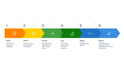
Our editorial workflow ensures that contribution works the same way for everyone, and we support our contributors with guidelines and ready-to-use templates.
Content Production And Contribution
When we started developing our onboarding and documentation, we followed the Content First approach. We planned to develop some initial content that we could work with, but even before that, we decided what types of content we would need and outlined the structure of each content type. These outlines became templates that ensure consistency and encourage contribution.
We were inspired by topic-based authoring and DITA, in the sense that we decided to have three main content types for our documentation, tutorials that describe how to accomplish a task, concepts that provide background information and context, and references like our API Reference. Our onboarding consists of tutorials that link to concepts and references when needed.
"DITA, short for Darwin Information Typing Architecture, is an XML standard, an architectural approach, and a topic-based writing methodology where content is authored in topics rather than in larger documents or publications. A DITA topic must make sense in its own right."
Involving our users from the beginning ensured that we could test and validate all of our assumptions, and quickly modify anything if needed. This proved to be a time and cost-efficient approach: although we edit and rewrite our content, and change things on our documentation site all the time, we don’t run the risk of creating large chunks of work that have to be thrown away because they don’t correspond to the needs of our users.
Constant collaboration also builds trust: as our process is completely transparent, our community continuously knows what we’re working on and how our docs evolve, and community members can be sure that their opinions are heard and acted upon.
Involving the community from an early stage means that our users saw lots of stuff that was partially done, missing, or ended up totally rewritten. So, for all of this to work, our users had to be mature enough to give feedback on half-done content, and we had to be level-headed enough to utilize sometimes passionate criticism.
Encouraging Contribution
We wanted to make it very easy to get involved for all segments of our target audience, so we offer several ways to contribute, taking into consideration the time contributors have available, and their skill level. We describe ways for our community members to get involved in our Contributor Guide. For some quick editing, like fixing typos or adding links, contributors can edit the content easily on the GitHub UI. For heavy editing, adding new content, or for developers who prefer to use git, we provide a complete Docs as Code workflow. This approach proved to be extremely valuable for our onboarding. We got direct feedback on where users struggled with a step or had too little or too much information, and we could immediately make adjustments and verify that we have fixed the issue.
To help contributors write larger chunks of text or complete topics, we provide guidelines and templates to start from:
- Style Guide
Our style guide contains guidelines for writing technical content (e.g. language, tone, etc.) and each content type in our documentation (e.g. tutorials, concept topics, etc.).
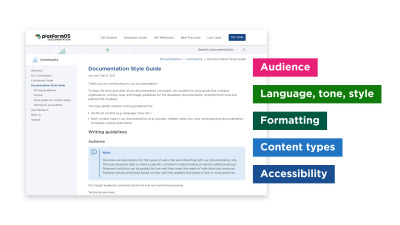
- Templates
Our site uses Liquid pages, but to make editing easier for contributors, we write documentation content in Markdown and use a Markdown converter to turn it into Liquid. Our templates include all non-changeable content and placeholders with explanations for the parts that are editable. Placeholders provide information on the recommended format (e.g. title) and any requirements or limitations (e.g. maximum number of characters).
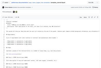
We thank all of our contributors by giving recognition to them on our Contributors page as well as on our GitHub repository’s README page.
Communication
Our team and community members are scattered across different time zones. Similarly to how we communicate among team members, we use mostly asynchronous and sometimes real-time communication tools to communicate with our community. We even leverage real-time communication tools, like a video conference, to become somewhat asynchronous. For example, video conferences and webinars are recorded, and community members can discuss them on various channels.
- pOS Community site
One of our main communication channels is our community site, where you can ask, answer, upvote, and downvote questions, and get to know other members of the platformOS Community. More features coming soon! - Slack support
One of our main communication channels is dedicated Slack channels, where community members ask questions, share ideas, and get to know our team members and each other. Based on their feedback, community members have confirmed how helpful it is to be able to communicate directly with us and each other: they can share what they’ve learned, plan their module development in sync with our roadmap and each other’s projects, and allocate their resources according to what’s going on in the business and the wider community. This communication seeds the documentation site with the most sought-after topics. - Video conference
We regularly have video conferences over Zoom called Town Halls, where community members and the platformOS team share news, demo features, and modules and have the opportunity to engage in real-time, face-to-face conversation. Our team and community members are distributed over different continents, so we try to accommodate participants in different time zones by rotating the time of this event so that everyone has the chance to participate. We also share the recording of each session. - User experience research
Besides getting constant feedback from the community through the channels described above, we plan regular checkpoints in our process to facilitate testing and course correction. During development, we tie these checkpoints to development phases. At the end of each larger release, we conduct user interviews and compile and share a short survey for community members to fill out. This helps us clarify the roadmap for the next development phase.
We make sure to keep community members informed about what’s happening through different channels:
- Status reports
We regularly share status reports on our blog to keep our community updated on what we’ve achieved, what we are working on, and what we are planning for the near future. Our status reports also include calls for contribution and research participation and the results and analysis of UX research. Subscribers can also choose to receive the status reports via email newsletter. - Release notes
We share updates regarding new features, improvements, and fixes in our release notes. - Blog
We regularly share articles about best practices and general news on our blog.
Accessibility And Inclusiveness
We address accessibility right from the design phase, where we use Figma’s Able accessibility plugin. We regularly test for accessibility with various tools and ensure that the site complies with all accessibility requirements.
From a technical writing perspective, we support Accessibility and Usability by providing well-structured, clear, concise, and easy-to-understand copy. All of our documentation topics follow a predefined structure (predefined headings, steps, sections, link collections, and so on) applicable to that topic type (tasks, concepts, references), inspired by the principles of topic-based authoring.
Semantic HTML is important for Accessibility, and we make sure not to style text any other way than through Markdown which is then translated into HTML. This way, screen readers can properly navigate through the content, and it also helps overall consistency when, for example, we want to do a design update.
We also review all content to ensure accessible and inclusive language as specified in our style guide.
How We Developed Our Onboarding: Rounds And Lessons Learned
Developing Our Onboarding Using Continuous Iteration Rounds
At the beginning of the project, we started with a focused effort around discovery to identify the main business goals and user needs. As a result of this research, we were able to articulate the big picture. After we had all the user journeys and a sitemap for the big picture plan, we were able to break it down to identify the first iteration that would become the first working MVP version of the site.
Moving forward, we continue to follow an iterative approach, moving fast with an agile mindset. Steps: gather user feedback, identify areas of improvement and possible new directions, define the solution based on resources, business goals, and user needs, and implement it. This circle repeats indefinitely. So, we have an overarching plan outlined for our documentation that we keep in mind, but we always focus on the next couple of action steps we’d like to take.
We can highlight five distinctive rounds that had a great impact on the development of our developer portal.
- For our onboarding process, we started with exploring the requirements following the Design Thinking approach. Through a Card Sorting session, we explored the areas of interest for each target audience and that helped us define the topics that concern them the most. This worked as a persona-based content prioritization for the documentation site.
- We wanted to guide our users with actionable items that they can try out on our site as a next step. At this point, we were already aware that our target audience shifted. The interviews and the support feedback helped us understand their needs that pointed in two main directions. We needed an easy journey for non-technicals and another one for technicals who like to understand the logic of the platform. In this stage, we planned, tested, and developed the first version of the 1-click journey and the sandbox.
- We already had experienced platform users who we wanted to see in action. Using remote field studies, we discovered how they use the tools, the documentation site, and the partner portal we provide. At the same time, we started to conduct continuous onboarding interviews with partners who joined the platform. The two research directions helped us to realize how users with a varying degrees of experience interpret the platform.
- By this point, our content grew a lot on the developer portal, and we wanted to discover if we needed a structural and content reorganization based on the user research.
- In this latest round, we wanted to dedicate some time to fine-tuning and adjustments, and to double down on the developer portal’s accessibility and inclusiveness.
Round 1: Identifying The Target Audience Segments, Defining Proto-Personas, Base Discovery
With the Design Thinking workshops, we first focused on understanding our users. Based on the user research results, we defined the proto-personas and created a detailed description of each to show their needs and expectations and help us identify who we were designing for. It provided a good foundation for guiding the ideation process and prioritizing features based on how well they address the needs of one or more personas.
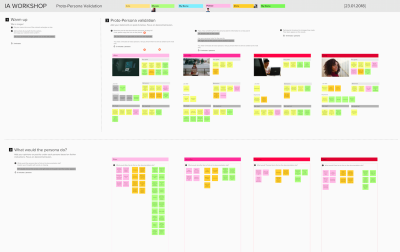
On our documentation site, we are working with a large amount of data that we need to present clearly to all users. To define a Content Inventory:
- we created a list of our proto-personas’ needs based on the problems they needed to solve with the platform;
- we created a detailed list of content from our previous documentation site and identified missing, reusable, and non-reusable content for our future site;
- we analyzed the competitor sites to create a list of inspirations.
We ideated with the workshop participant using a Card Sorting exercise. The task was to map out the Content Inventory elements and define connections between them. The result showed us the connected areas and the proto-persona’s preference through color coding.
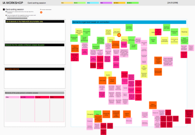
Based on the Content Inventory and the results of the Card Sorting sessions, we outlined the Information Architecture by creating a sitemap and the navigation for our future site. This plan included all the needs that were discovered and offered a roadmap to keep track of site improvements, content needs, and project phases.
During the Card Sorting sessions, we explored areas of interest for each user persona and, on the sitemaps, we highlighted these as user journeys. We also validated the importance of these areas to assign higher priorities to the ones that need more attention. This process kept our focus on the most important needs of the personas.
The most important sections for the four segments:
- Experienced Developers: Quickstart guide, How to guide, API docs;
- Junior Developers: Quickstart guide, Tutorials, Conceptual documentation;
- Site Builders: Quickstart guide, Tutorials, FAQ, Forum;
- Marketplace Owners: About platformOS, Blog.
This concluded our Information Architecture phase. We have discovered and organized all the information we needed to continue to the next phase, where we started creating templates for content types, building the wireframes for each page, producing content, and making Design decisions.
Round 2: Onboarding Strategy And Testing Of The Onboarding Process
Strategy
Before we jumped into planning an onboarding strategy, we did a revalidation on proto-personas. At that point, we discovered that our audience shifted to Experienced developers, Junior developers, Agency Owner, Sales/Marketing, PM and Business Analyst, and we realized that we needed to cover a broader spectrum of needs than previously identified.
We interviewed 20 platformOS users. We identified how long they have been using the system, how they use the platform, what the key ‘aha’ moments were, what struggles they faced, and how they solved them. Their needs pointed in two main directions: we needed an easy journey for non-technicals and another one for technicals, covering those with less experience as well as those more capable developers who wished to understand the deeper logic and nuances of platformOS.
Our main goals with the new onboarding strategy were:
- to connect our systems (developer portal — partner portal — platform), so our users can go through their discovery experience in one flow during their first visit;
- to provide an actionable stepped process that the users can walk through;
- allow users/personas to quickly identify the most fitting journey.

Usability Test
We conducted remote Usability Test sessions in three rounds to validate the platformOS onboarding process.
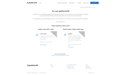
The onboarding section connects the Documentation site and the Partner Portal where users can select one of three journeys based on their programming experience. The goal was to learn how users with different levels of technical knowledge reacted to the three journeys. Are they able to quickly identify what is included in each journey? If yes, how do they engage from that time forward? Did they follow the pathway most appropriate for them?
During the Usability study, we asked users to do several short tasks using a prototype of the planned features built with Figma. We used both moderated and unmoderated remote usability testing techniques and conducted extra tests with platformOS team members to verify the represented business, technical, and content goals.
We conducted six moderated remote Usability Tests in two rounds and set up three unmoderated remote Usability Tests. These tests were separated into three rounds, and after each round, we updated the prototype with the test results.
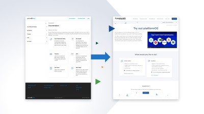
Based on the test results, we decided that instead of showing three options to the users, we show the two quickest options: 1-click install and Build a basic ‘Hello world’ app. This helps them to quickly decide which is the best fit for them, and at the same time they can immediately try out the platformOS basics. Then, if they want to, they can check out our third journey — the Get Started guide that explains how to build a to-do app.
We redesigned the Instance welcome screen to help users identify the next steps. Based on the results, we had to optimize the UI copy to make it comfortable for non-technical users as well.
As the flow connects two sites and shows the product, the main goal was to show that the user is on the right track and still on the selected journey. We achieved it by showing the steps of the journey upfront, using consistent wording, and allowing the user to step back and forth.
Round 3: Remote Field Study And Onboarding Interviews
In this round, the goal was to examine the overall journey of the experienced and prospective pOS users, focusing on both successes and challenges they are facing. We conducted an interview with a remote field study to get a better understanding of how they work and what processes they are using.
We focused on four main topics:
- Development with pOS (workflows, preferences on version control, tools),
- Community and collaboration (support, discussions),
- Developer Portal (overall experience, obstacles, suggestions for improvements),
- Partner Portal (usage, dashboard preferences).
Key insights from the user research results:
- The development with platformOS has a flexible and limitless offering which is a great strength of the system, but it also means that learning the workings of the platform, especially in the very beginning, takes more effort and patience from developers.
Solution: Templates might provide aid during the learning process. - As platformOS is new in the market, there’s not much information on Google or StackOverflow yet. On the positive side, the pOS team always provides great support via Slack and introduces new solutions in Town Hall meetings, status reports, and release notes.
Solution: To further strengthen the community, a separate Community Site can be an efficient and quick platform for peer-to-peer support by having a search function, and users can follow useful topics. - Related to the Developer Portal, we saw that the user easily gets to the documentation and finds the solution for most of their use cases. However, the search results were not precise enough in some cases, and the naming of the tutorials caused uncertainty about where to find items.
Solution: Run a content reorganization session for the tutorials and fix the search function. - We discovered that the Partner Portal was used mostly at the beginning of the projects by experienced devs. Junior developers preferred that they can find helping instructions on the instances page that supported their work on the new instances. Agency Owners/Business Analyst preferred to use the site to see the payments related information and the analytics of the instance use. We saw that they generally had problems handling the permissions related to the instances and identifying the hierarchy between their instances.
Solution: Partner Portal design update with new information structure of the instances and permissions.
Round 4: Structural And Content Reorganization, User Testing, Implementation
Structural And Content Reorganization
In this round, we renamed the Tutorials section to Developer Guide. This was in line with our plan to extend our tutorials in this section with more concept topics, as requested. We planned to have a comprehensive Get Started section for beginners with the “Hello, World!” tutorial and the Build a To-do List App series, and the Developer Guide for everyone working with platformOS — from users who have just finished the Get Started guides to experienced platformOS developers. This separated and highlighted the onboarding area of the site, and this is when the current structure of our Get Started section came to be: a separate tutorial for when you start your journey with platformOS, that you can use as a first step to go through the more advanced onboarding tutorials.
Card Sorting
At this point, we had 136+ topics in our Tutorials section organized into 27 groups, and we knew that we wanted to add more. Based on user feedback, we could improve the usability of the Tutorials section by organizing the topics better. Our goal was to identify a structure that best fits users’ expectations. We used a Card Sorting exercise to reach our goal.
We have analyzed the inputs, and based on the results, we concluded that seven categories can cover our 27 topics: Data management, Schema, Templates, Modules and Module examples, Partner Portal, Third-Party Systems, and Best Practices. We used the similarity matrix and the category namings to identify which topics are connected and what names users suggested for them.
With this research, we managed to restructure the Tutorials section to become in line with the mental models of the users.
Round 5: Fine-Tuning, Content Production
In the latest round, we added the possibility, on our onboarding, to start from a template. Based on our discovery, the marketplace template is a good option for site builders who would like to have a marketplace up and running fast and don’t want to explore the development in detail.
The pOS marketplace template is a fully functional marketplace built on platformOS with features like user onboarding, ad listings and ads, purchase and checkout process, and online payment. Following the tutorial we added, users can deploy this code within minutes to have a list of working features and start customizing the back- and front-end code.
We also keep fine-tuning our content for clarity, brevity, readability, accessibility, and inclusive language. We have regular accessibility reviews where we pay attention to aspects, such as terminology, technical language, gender-neutral pronouns, and informative link text while avoiding ableist language, metaphors, and colloquialisms. We summarized our experience with fine-tuning accessibility in the article “Code and Content for Accessibility on the platformOS Developer Portal” which includes examples of what we changed and how.
Future Plans
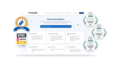
The platformOS Developer Portal was very positively received and even won a few peer-reviewed awards. We are honored and grateful that our efforts have yielded such great recognition. We will keep revalidating and improving our onboarding just like we have been doing since the beginning. We are also working on a developer education program for our soon-to-be-launched community site that includes various learning pathways that will try to accommodate users’ different learning styles and also offer ways for them to get more involved with our developer community.
Conclusions
So, after years of working on our onboarding, what are our key takeaways?
- Don’t feel pressured to get everything right the first time around. Instead, become comfortable with change and consider each adjustment progress.
- Get to know your target audience and be ready to revalidate and shift target audience segments based on your findings.
- Get familiar with different user research methods to know when to use which approach. Carry out extensive user research and, in turn, listen to your users. To support feedback, allow users multiple different channels to give you feedback.
- Choose a flexible workflow, so that the editorial process does not become an obstacle to continuous change. We love Docs as Code.
- A product is never ready. Shaping and updating an already done flow is perfectly fine.
- Iteration and prioritization are your best friends when it comes to delivering large amounts of work.
We hope that this case study helps and encourages you as you build an onboarding experience for your product.
Further Reading
- How OWASP Helps You Secure Your Full-Stack Web Applications
- Uniting Web And Native Apps With 4 Unknown JavaScript APIs
- The Case For Minimal WordPress Setups: A Contrarian View On Theme Frameworks
- Crafting Experiences: Uniting Rikyu’s Wisdom With Brand Experience Principles


 See User Testing Live
 Custom Web Forms for Angular, React, & Vue. Your backend.
 Celebrating 10 million developers
