The Guide To Windows High Contrast Mode
forced-colors and its toolset to tweak our website as needed.When we talk about accessibility, we tend to talk about many things — such as dark mode, keyboard navigation, prefers-reduced-motion, and screen readers — but there is one thing that does not receive that much attention: Windows High Contrast Mode (from now on, abbreviated as WHCM). This is a tendency I have seen in some websites at a point where we have normalized some practices that can harm users’ experience in WHCM. In this article, I want to explain what it is and give a good set of practices we can keep in mind to make our sites more usable with this mode.
About Windows High Contrast Mode
High Contrast mode is an accessibility feature that changes the look of our website and Windows applications by replacing the color of the different elements (like background, buttons, or text) with some user’s set up colors. This has multiple purposes, like increasing readability, reducing a website’s visual noise by removing certain elements (and by extension, allowing them to have a better focus), and giving users full control of the website’s contrast. You can check out by going to Settings, then clicking on Accessibility, and finally clicking on High Contrast.
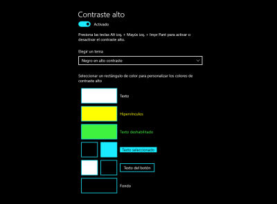
To talk about some statistics, according to Melanie Richard in her talk “The tailored web: effectively honoring visual preferences”, around 4% of active devices use Windows High Contrast Mode, and thanks to WebAIM’s Survey of Users with Low Vision we can estimate that around 30% of users with low vision user Windows High Contrast Mode. All this should give you some perspective about the importance of making our website friendly with this mode.
The name “High Contrast Mode” is a bit misleading because the user can choose their preferred colors, leading to a color palette that has lower contrast than usual — which is not a very odd case. According to WebAIM’s survey, around 3% of users of Windows High Contrast Mode set it up to create a low contrast color pallete. The users with migraines or light sensitivity can do that to mitigate their disabilities’ impact. Just to give you a quick example:
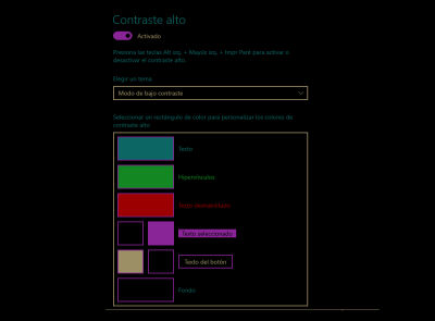
I’m sure you understand the importance of making our website friendly with WHCM, and you might think that due to its nature of replacing a big part of our styles, making a website that works for that mode can be hard. Great news, it’s not! We just need to consider some important issues to ensure the user experience is not harmed.
Considerations About Windows High Contrast Mode
Despite how much control we lose when our website is displayed in WHCM, we can make it work without too much effort as long as we keep in mind some considerations. Before I start with that, I’d like you to keep in mind the golden rule with this mode: above all things, High Contrast Mode is about usability, and we need to respect that above any other aesthetics matter. Our biggest priority with this mode is easing readability and not harming the user experience in any way.
How can we ensure readability and usability works in WHCM? We can have certain important considerations for that:
Use Semantic HTML
This has been a very important topic when we talk about accessibility due to its importance for screen readers, and it’s very important in WHCM as well! Why? Because Windows will add the styles depending on the semantics of an element and not because of how it looks outside WHCM. A link will have the hyperlinks styles, a button will have the Button Text styles, and so on.
Some devs (for some reason) decide to use aria roles on divs to camouflage them as buttons for assistive technology. However, in WHCM, aria roles are irrelevant for Windows to determine which style to apply, so we depend on semantics to make our website works properly in this mode.
To validate this point, let’s check how a div that acts as real button and a link would behave in High Contrast Mode using the same styles.
<div role="button" class="button" tabindex=0>
  Not a button
</div>
<button class="button">
  Definitely a button
</button>
<a href="#" class="button">
  This is a link
</a>
.button {
  padding: 0.5em 1em;
  border: 2px solid hotpink;
  background-color: hotpink;
  width: fit-content;
  border-radius: 0.5em;
  font-size: 1.5rem;
  font-family: sans-serif;
  text-decoration: none;
  color: black;
}
In default settings, the div and the button will have the same colors but remember: users can change that. Let’s use this color palette, and let’s check the results:
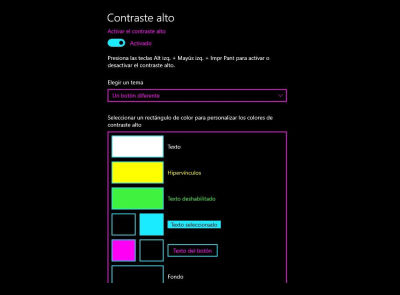
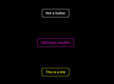
Notice that semantics have a significant matter in WHCM for styling. Remember, in this mode, we have to focus on not harming the user’s experience, and choosing the wrong element can confuse users.
transparent Properties Are Useful!
When we style certain interactive components like buttons or links, we tend to remove certain properties with border: none, outline: none, or text-decoration: none because those properties might not match with our design system. Usually, that’s not a bad idea as long as you keep in mind things like hover or focus state for those components. For WHCM, however,it is a serious problem because background elements are completely overwritten, and we’ll depend on borders to differentiate those components from the background.
Just to give you an example, a very common design pattern I have seen is with the primary and secondary buttons, where the former has a background color and no border, and the latter has just a border and no background. It looks good, but when you see them under High Contrast Mode:
<button class="primary">
  Primary action
</button>
<button class="secondary">
  Secondary action
</button>
    button {
      font-size: 1.3em;
      padding: 0.5em 1em;
      border: none;
      font-family: sans-serif;
      border-radius: 0.4em;
      background-color: transparent;
    }

    .primary {
      background-color: hotpink;
    }

    .secondary {
      border: 2px solid hotpink
    }

The primary button can be easily mistaken for a normal text! This is where transparent borders come into play because transparencies will be visible under a High Contrast Mode. So by replacing the border property in the button element with this: 2px solid transparent, we’ll have this result:
    button {
      border: 2px solid transparent
    }

As you can imagine, that also happens with links if you use the property text-decoration-color: transparent, and with outlines if you use outline-color: transparent. Let’s check some quick examples about those properties.
text-decoration-color: transparent is useful if you’re using another element to represent a link in your site. Just to give an example, you can use background-image to animate the underline, as you can see in this video made by Kevin Powell. However, in WHCM, you’ll only depend on the color the user has in his settings, so if you want to give an additional visual cue, a transparent underline will work great there!

Outlines are a particularly important topic in this mode because some developers rely on other properties to add focus states to interactive elements — such as changing the background-color or even the box-shadow hack (even if it’s not necessary nowadays because now the outline will follow the element’s border-radius since Chrome 94 and Firefox 88). However, all those things are completely overwritten in this mode, so outline remains as the only reliable way to apply a focus state on an element in WHCM. Always keep that in mind: if you’re going to use something different than an outline to highlight a focus state in an element, add the property outline-color: transparent as a fallback to not missing a focus state in this mode.
Keep In Mind Scrollbars
Scrollbars can be styled, but does that mean we should style them? There are some usability and accessibility concerns about this topic. The one I want to bring here is the fact that, depending on how you style it in WHCM, they’ll look clunky in the best of cases, or they won’t be visible at all at worst of scenarios.
Is there a way to solve that? That depends on how you decide to style a scrollbar. Some people decide to use a solid color to fill the scrollbar’s thumb, and that does have a very easy fix. Let’s suppose we decided to style our scrollbar that way, then you will go for something like:
    ::-webkit-scrollbar {
      width: 20px;
    }

    ::-webkit-scrollbar-track {
      background-color: #e4e4e4;
      border-radius: 100px;
    }

    ::-webkit-scrollbar-thumb {
      border-radius: 100px;
      background-color: green;
    }
As you might guess, the scrollbar won’t be visible in WHCM due to its background-color property being forcedly replaced. The great news is that we have already seen how to remediate this problem!
Transparent borders can cover this situation. You can use them to cover all the scrollbar’s thumb, and it’ll look like it’ll have a solid color (the one you choose as text color in settings) which will be pretty similar to how it works as a default scrollbar in this mode. To follow our previous example, if we use the property border: 10px solid transparent, it will make it look like it has a solid background in WHCM.
Be careful using this technique with scrollbar thumbs styled with box-shadow insets, though. If you do that, it’ll make it invisible. Not in WHCM, I mean invisible outside of it. You can check this problem in this scrollbar style made by Ahmad Shadeed, go to the scrollbar thumb styles, and add the same style we added before (border: 10px solid transparent) . You’ll see it’ll become invisible, a good way to make it visible (both regularly and in WHCM) is just using a smaller border (something like 2px instead of 10px) to make it look like this in WHCM:

It looks good! The only problem is that it looks a bit weird outside of WHCM, so keep this in mind if you decide to style a scrollbar using an inset box-shadow.
Remember that all that applies only to Chromium-based browsers, as Firefox has a different way to style scrollbars using scrollbar-color and scrollbar-width properties. The good news is that in WHCM, you won’t have to do a thing to make it work properly! The colors will be overwritten, and the scrollbar’s thumb will have the same color user has set up as text color.
Behavior Of Images
We have different ways to use images on a site: using the tag img, the background-image CSS property, using SVGs, and even CSS art! Let’s dig about those quickly. img tag will behave the same in WHCM, so let’s talk about the other three.
First, we have the background-image property — and this one will remain the same in WHCM as long as you’re using the url() value. A gradient made with background-image will be overwritten by WHCM’s background color. However, there is only one catch with this. Even though Firefox supports background images in High Contrast Mode since around 2018-2019, it won’t be visible if you put background-image in the body element.
You can try it out by seeing the CodePen I made to try to open it while using WHCM. So keep that in mind in case you’re using a background image like that.
See the Pen [CodePen Home Background Image In Body](https://codepen.io/smashingmag/pen/vYdreLY) by Cristian Diaz.
The next one is SVG. Similar to images, their properties will remain unchanged during High Contrast Mode. The only difference here is that, for certain patterns, you do want it to change its color in WHCM. One example I want to bring in here is one I personally used to show an external link to the users.
<a class="ext-link" href="#" target="_blank" rel="noopener">
  Link
  <svg class="inline-icon" aria-hidden="true" fill="#000000" xmlns="http://www.w3.org/2000/svg"  viewBox="0 0 24 24" width="24" height="24" focusable="false">
    <path d="M 5 3 C 3.9069372 3 3 3.9069372 3 5 L 3 19 C 3 20.093063 3.9069372 21 5 21 L 19 21 C 20.093063 21 21 20.093063 21 19 L 21 12 L 19 12 L 19 19 L 5 19 L 5 5 L 12 5 L 12 3 L 5 3 z M 14 3 L 14 5 L 17.585938 5 L 8.2929688 14.292969 L 9.7070312 15.707031 L 19 6.4140625 L 19 10 L 21 10 L 21 3 L 14 3 z"/>
  </svg>
</a>
.inline-icon {
  height: 0.75em;
  height: 1cap;
  width: 0.75em;
  width: 1cap;
  fill: currentColor;
}
With this code, your SVG will be the same color as the one you use for your link text, and that’ll cover all the states of a link (hover, visited, active, etc.) However, in WHCM, it won’t be enough. If we take a look at it in this mode, this will be the result:

That’s a bit problematic. Even when we normally want SVG to remain the same, there should be a way to manage those situations for specific scenarios. The good news is that, indeed, there is one! But let’s put a pin on this topic for now.
Keep in mind that this scenario only happens in Chromium-based browsers — Firefox has its own way to manage this. SVGs inside an anchor that use the currentColor property will receive the same color as the link color user has set up. It’ll even respect whatever color the theme uses as a visited link, as this picture shows:

Finally, we have CSS art. Due to its nature of using elements like box shadows and background gradients, you might guess it won’t look good in WHCM — and you’re absolutely right. Due to its artistic nature, it’s no big deal, so you should be fine. But, if it does have a purpose in your website, we need to look for a way to make it visible. Just a quick note about CSS art: remember you can — and should — make your CSS art accessible!
As long as you keep in mind those small suggestions, our website will be almost done for WHCM! As you saw, some elements would need some tweaks to make them work to their full extent in this mode, but luckily for us, CSS has a way to help us to get this last part of the job done!
Media Query Forced-Colors
Microsoft made an effort to create a standard to support WHCM, and the result of this work was the media query forced-colors, which will help us to detect if the browser or operating system has enabled a mode that limits a website’s styles to a user-chosen color palette. As you might guess, WHCM is the most popular choice among them.
This media query will act a bit differently due to how WHCM works. Some properties will be limited to certain values, some won’t be able to be overwritten at all, and we have new properties’ values to work with! But before digging into what we can do with this tool, let’s remember that WHCM (and other modes that restrict user’s color palettes) prioritize usability, and this is something we need to respect. So don’t use those properties unless it’s necessary to tweak some elements in your website to give it good usability in this mode.
With that said, let’s start talking about the media query itself. It has two values: none and active. The former will detect when there is no forced colors mode active, and the second one will detect when there is. Under forced colors mode, the next properties will be replaced with the ones that are set up by the user:
colorbackground-colortext-decoration-colortext-emphasis-colorborder-coloroutline-colorcolumn-rule-color-webkit-tap-highlight-color- SVG
fillandstrokeattributes
Additionally, there are some properties that will have a forced behavior:
| Property | Value |
|---|---|
box-shadow | none |
text-shadow | none |
background-image | none (unless it’s url() ) |
color-scheme | light dark |
accent-color | auto |
scrollbar-color (Firefox) | auto |
With that explained, let’s dig into two tools we have we can use to enhance the experience in this mode.
Forced-Color-Adjust
Now, how can we change how those properties behave? There is a way to avoid WHCM overwrites colors, and this is by using the property forced-color-adjust. This property has two values: auto and none, and it’ll let us decide if we want an element’s colors will be replaced by the user agent’s colors or not, respectively. Let’s check an example of how those work, and there aren’t better examples than the ones we left uncovered in the previous section!
Let’s check the link with the external link’s SVG we used earlier. Keep in mind that in Chromium-based browsers, this SVG won’t change its color to match the one that is used as a link color because SVGs have a default value of none. So, if we add the property forced-color-adjust: auto to our SVG as follows:
.inline-icon {
  /* Previous CSS properties */
  forced-color-adjust: auto;
}
This will be our result:

I know this section is about the media query itself, and usually, what you’d do is put that rule inside the media query like this:
@media screen and (forced-colors: active) {
  .inline-icon {
    forced-color-adjust: auto;
  }
}
That’s a valid approach (and, honestly, the most intuitive one). However, while I did some experiments for this article, I noticed that you can put this property in an element without the need to use the media query, and you’ll get the same result! And because this property will affect only the behavior of this element in a forced colors scenario, it won’t give you any unexpected behavior.
Now, with CSS art, we want the opposite to be true (again, as long as this CSS is necessary to give enough context to the user), so we can use forced-color-adjust: none in the art’s parent element, and now all of it will be visible in WHCM.
You may be thinking that this is not a common use case of forced-color-adjust: none, and you’d be right, so let’s check a more realistic one: showing color palletes on your website! Let’s take a look at any pallete generated by mycolor.space for example:
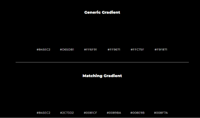
Those colors are not visible, and it’s an important part of the website, so if we go to the color container element and we add this property, we’ll solve this problem.
System Colors
Now let’s talk about colors. With media query forced-colors we have a handful of system colors we can use. You can see a list of colors in MDN’s documentation, and we can use this list of colors to replace certain properties. Using the property color: LinkText will make it look like a link, for example.
Just remember: those colors are closely related to HTML semantics, so maybe you’d be better changing an element to its correct tag instead of trying to change how it looks in WHCM. That doesn’t mean it doesn’t have its uses. We just have to be sure we are doing this for the right reasons. Which is a good reason to use this? Well, that depends on the complexity of what you are creating. Let’s take, as an example, this link I created with the help of the clip-path property.
.link {
  --clip-path: polygon(0% 0%, calc(100% - 0.8em) 0%, 100% 0.8em, 100% 100%, 0.8em 100%, 0% calc(100% - 0.8em));
  font-size: 2rem;
  padding: 0.1em;
  border: none;
  background-color: #0E0054;
  clip-path: var(--clip-path);
  font-family: sans-serif;
}

.link:focus {
  outline: none;
}

.link:focus span, .link:hover span {
  outline-offset: -0.5em;
  outline: 3px solid transparent;
  background-color: #0E0054;
  color: white;
  text-decoration-color: white;
}

.link span {
  display: inline-block;
  padding: 0.5em 1.2em;
  clip-path: var(--clip-path);
  background-color: white;
  color: #0E0054;
  text-decoration: underline #0E0054;
  text-underline-offset: 2px;
}

.link span {
  display: inline-block;
  padding: 0.5em 1.2em;
  clip-path: var(--clip-path);
  background-color: white;
  color: #0E0054;
  text-decoration: underline #0E0054;
  text-underline-offset: 2px;
}

Let’s make a quick check of the problems with this element in WHCM:
- I used a
background-colorto mimic a border with this element, but because it’s a background, it won’t be visible in WHCM. - Even if I used a transparent outline to make a focus state in this mode, its color would be the one that the system uses as a link color, instead of the one WHCM’s usual outline color.
With this in mind, we can tweak system colors using the media query forced-colors to give enough visual feedback to users by showing them that that is a link.
@media screen and (forced-colors: active) {
  .link {
    background-color: LinkText;
  }

  .link:visited {
    background-color: VisitedText;
  }

  .link:focus span {
    outline-color: Highlight;
  }
}
Remember Firefox has a visited state color for links, so to respect that. We should add the VisitedText system color in the visited pseudo-class of our link. With that said, this is our result:

Another simple example of how we can use system colors to tweak the experience is something we saw in the previous section: scrollbars! Let’s suppose that, for some reason, transparent borders are not an option. In this case, we can use system colors to make our scrollbar looks good in this mode! Let’s come back to one of the examples we used previously, and instead of using a transparent border, we’ll use the media query to tweak the scrollbar’s thumb’s color.
::-webkit-scrollbar {
  width: 20px;
}

::-webkit-scrollbar-track {
  background-color: #e4e4e4;
  border-radius: 100px;
}

::-webkit-scrollbar-thumb {
  border-radius: 100px;
  background-color: green;
}

@media screen and (forced-colors: active) {
  ::-webkit-scrollbar-thumb {
    background-color: CanvasText;
  }
}
Other Uses Of This Media Query
As you read, forced-color-adjust and system colors are great tools to tweak our design if needed, but that’s not all we can do with this media query. Yes, we saw that some properties are restricted to certain uses, but most of them can be used normally! Remember, this is just to improve usability in WHCM, so there is no need to go too wild with that. Use it just when it’s needed.
Let’s come back to the clip-path link we used. You could decide that the approach to how it looks in WHCM is to use a simpler design, like maybe just using a regular bordered element. We can do that! Let’s ignore the CSS rules I used in my previous example, and let’s use those instead:
@media screen and (forced-colors: active) {
  .link {
    --clip-path: none;
    border: 3px solid transparent;
    border-radius: 8px;
  }

  .link:focus {
    outline: 3px solid transparent;
    outline-offset: 3px;
  }

  .link:focus span {
    outline: none;
  }
}
And this is our result:

With that approach, you still show the user this is a link, and you avoid any possible confusion with this topic. Uses of CSS properties in this media query can open some interesting doors to improve how sites work. You can remove a merely decorative image in this mode — with display: none (if you used an img tag) or background-image: none (if you added it with CSS) — if you consider it can bring a better experience — it might have very bright colors for users with migraine, or it can be a bit distracting, for example.
As long as you prioritize usability in your website with this mode, it should be good enough. However, most of the times you might not need it as long as you keep into consideration the previous suggestions I mentioned.
You can also use custom properties in this mode, which will lead to some interesting uses, as you can see in this article by Eric Bailey.
Other Resources
It’s important to note that in the case you still need to support Internet Explorer, media query forced-colors won’t work. If you want to know how to give support to High Contrast Mode in this browser, you can read about it in this article written by Greg Whitworth and this one by Adrian Roselli. For the topics covered in this article, you can read the following articles:
- “Styling for Windows high contrast with new standards for forced colors” by Microsoft Edge Team.
- “Using JavaScript to detect high contrast and dark modes” by Scott O’Hara.
- “Making Websites Work with Windows High Contrast Mode” by Dietra Rater, a case study of Khan Academy website about this topic.
Wrapping Up
Windows High Contrast Mode is something I have seen some websites overlook, which can create problems for people who use this accessibility feature. The good news is that we have enough tools to make our website works great in WHCM, even more with Microsoft’s efforts to create the media query forced-colors — which opens new doors to make our sites look better in this mode. Just remember: it’s an accessibility and usability feature so keep this in mind when you want to tweak your project in this mode!
Further Reading
- “Windows High Contrast Mode, Forced Colors Mode And CSS Custom Properties,” Eric Bailey
- “Manage Accessible Design System Themes With CSS Color-Contrast(),” Daniel Yuschik
- “When CSS Isn’t Enough: JavaScript Requirements For Accessible Components,” Stephanie Eckles
- “A Complete Guide To Accessible Front-End Components,” Vitaly Friedman


 Register Free Now
 Try ProtoPie AI free →
 Celebrating 10 million developers


