Measuring The Performance Of Typefaces For Users (Part 1)
Our focus is on typefaces for reading large amounts of text and information in the most efficient, legible, pleasurable, comprehensible, and effective way possible. For instance, typefaces used for a novel, an academic paper in a journal, or a lengthy online article like this one that uses the Elena typeface, that you are reading now on this webpage. The questions that we will explore are:
- How well do typefaces for extended reading actually work?
- How well does a typeface work and perform against another similar typeface?
- How would we test to see if there is any difference between a good sans serif and a serif typeface with users?
- What would the world’s most ideal, best practice and design research-driven highly legible serif, sans serif, and slab serif possibly be like? What characteristics and themes would be most advisable, and do we need a central public list of aspects and features?
- There is both the aesthetic and functional aspect to a typeface, but what is the functional aspect, and how can it be investigated and measured?
- How good is a new typeface, and how good is it compared to a similar typeface designed in previous years?
Should typefaces be measured? There is no simple answer. The short answer: yes. The long answer: it is a difficult and imprecise task. We will discuss the pros and the cons, and I will show you what things are involved and how we could go about doing it.

A Very Short Introduction To Typefaces
For 100s of years, we have enjoyed using typefaces. These compiled systems for letters and symbols, which are representations of sounds and information, get a lot of use and are a large part of graphic communication.
The first movable type machine, and therefore the first printing press, was created by a man named Bi Sheng, who lived in Yingshan, China, from what we believe to be 970–1051 AD — over four full centuries before Johannes Gutenberg was even born. The moveable type, sculptured in a lead-based alloy — which is essentially metal blocks of letters and symbols that can be moved, arranged, and used for mass printing — was Johannes Gutenberg’s contribution. Fast forward to the early 1960s, phototypesetting systems appeared. These devices consisted of glass disks (one per typeface) that spun in front of a light source, which exposed characters onto light-sensitive paper. Later on, in the 1980s, type started to be used in a digital context in computers. And today, we still have type in a digital context, but it travels through cables, wirelessly on smartphones, and in virtual reality glasses in 3D.
There are many different classifications of typefaces. To name a few: sans serif, serif, slab serif, script, handwritten, display, ornamental, stencil, and monospace. In a way, technology also created new typeface classifications. Today, we even have mixed typefaces with elements of serif and sans serif, such as the Luc(as) de Groot’s typeface TheMix. This diversity adds to the difficulty and complexity of defining and testing typefaces.
Reasons To Measure The Performance Of Typefaces?
Because technology has made it possible to design typefaces easier than ever before, we seem to be reinventing “different types of wheels” that already get the job done. However, rather than reinventing these typefaces, maybe we can get some objective measures, learn from what works and what does not work, and then design objectively better wheels (typefaces).
If your aim is to produce a new typeface based on historical exemplars, tradition, or design, then fine, this is what you will be aiming for. Alternatively, if you want to do something new and expressive, or that has never been done before, then fine, of course. However, some contexts, situations, and users need and demand highly functional typefaces.
As I briefly mentioned, measuring a typeface’s effectiveness is difficult. Since many new typefaces are not supplied with any objective concrete testing data, how do we determine how well they work and where they succeed or fail?
Should We Measure The Typeface Alone, And/Or The Context And Environment That The Typeface Is Used In?
When considering the questions above, we can see that this is a large and complex issue. There are many different types of information, situations in which information is used, types of environments, and there are many different categories of people. Here are some extreme examples:
- A person who is elderly trying to read road signs, driving home at night;
- An accountant doing a large amount of numerical calculations for a million-pound/dollar company, needing to turn around the work in 30 minutes;
- A young person learning to read for the first time, sitting in the back of a car full of people on bumpy roads;
- A person with dyslexia trying to read and complete their evening class assignment.
Measuring Typefaces And The Resulting Performance Data
One of the reasons why measuring a typeface’s effectiveness is difficult is that we cannot accurately measure what goes on in people’s minds. Many factors are invisible, as Paul Luna — a professor at the University of Reading’s Department of Typography & Graphic Communication — mentions in this video Paul Luna on the typographer’s task. In addition, Robert Waller, information designer at the Simplification Centre states:
“Legibility research has a long history (going back to the 1870s). A wide range of issues has been studied, including type size, line spacing, line length, typestyle, serifs, and more. However, as Buckingham in New data on the typography of textbooks pointed out relatively early on, these factors interact in complex ways, apparently unrecognizable by many researchers. Indeed, in recent times a consensus has grown that the interaction of variables in type design is so complex that few generalizable findings can be found (see a longer review in Robert Waller’s “Typography and discourse”).”
— Robert Waller in Comparing Typefaces For Airport Signs
Furthermore, Ralf Hermann, director of Typography.Guru in his article says:
“Doing scientific studies to test which typefaces work best in this regard, is almost impossible to do. For a proper test setup you would need to modify one parameter while keeping every other parameter unchanged. But setting a letter or word in different typefaces can not be considered as “changing one parameter”, because a typeface consists of dozens of relevant parameters like x-height, weight, contrast, width — just to name a few. So scientific tests for typeface legibility are often full of flaws. Very often the typefaces are set at the same point size, but as every graphic designer should know, the point size does not reflect the actual size of the letters in print or on-screen. So if you come across a scientific legibility study that compares typefaces set at the same point size, don’t even bother to read on!”
— Ralf Hermann at What Makes Letters Legible?
The observations expressed in these quotes demonstrate that testing typefaces involves many complex factors. Because of this complexity, it has to be carefully controlled and modified, but it may not even be worth the effort.
Consistency And Variables
When testing typefaces or a selection of typefaces against another, we need to keep the typographic design parameters and variables the same, so we do not introduce or change the previously tested type settings. One example is the difference between the typefaces’ x-height’s (the height of a lowercase x) of any two typefaces we are testing. It is unlikely that they will be the same, as x-heights differ greatly. Thus, one of the two typeface x-height’s will seem to be larger in size, although it may be the same point size in the software. I will show you more about typographic variables under the section “Specific Typographic Design Variables Affecting Performance” in the second part of this article.
Robert Waller mentions in “The Clear Print standard: arguments for a flexible approach” that “although both point size and x-height are specified, it is the point size (pt) that is most commonly quoted — and point size is a notoriously imprecise measure.” It is, however, more effective and accurate to set an x-height measurement and set the typefaces being compared to that same x-height measurement. The x-height using point sizes actually results in different sizes — and does not look inconsistent between different typefaces.
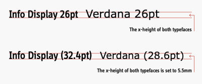
Notice on the 1st line that we can see that both typefaces are set to 26 pt in Adobe InDesign. However, if you look at the tops of the “erdana” you can see that they go slightly above the line, so the Verdana typeface is, in essence, larger than the Info Display typeface, even when they are both typeset at 26 points. On the 2nd line, both typefaces have been typeset to a consistent and accurate measurement of an x-height of 5.5 mm. Notice that while the x-height is the same for both typefaces on the 2nd line, it gives a different point size for each typeface. This is why point size is not an accurate way to measure typeface size and for testing and comparing two or more typefaces.
Additionally, how you use and typeset the typeface in the actual typographic design and layout (line length, typeface size, color, spacing, leading, and so on) is probably more important than the actual typeface used. Thus, you could use one of the world’s most legible typefaces, but if you typeset it with a leading of -7 points and a line length of 100 characters, it would be rendered nearly useless.

As you can see, we can’t use a singular factor to measure typefaces. Instead, we need to address multiple factors within the design system. They all have to work well together to bring an ideal and effective final presentation.
Do We Need To Decide On A Base Default Typeface To Standardized Test Typefaces Against?
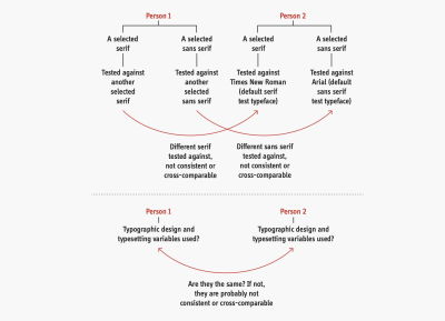
I would like to make things more complicated. (Remember when I told you this article had some difficult and complex issues?) So as an example, let’s say that we want to test a serif typeface against another serif and then again a sans serif against another sans serif. One would think that one of the two serifs or one of the sans serifs would perform better than the other, right? Well maybe, but not quite. Now, let’s say that we have the previous person testing two serif typefaces and two sans serif typefaces. What would happen if someone else did the same test but then tested their serif and sans serif against a different serif and sans serif typefaces that the 1st person used. Well, the result is simply that two people tested a serif and a sans serif typeface against different serif and sans serif typefaces, and they are not cross comparable.
So, the question is: should we, as a community, decide on base typefaces to test against? So, for a serif, it is quite popular and common in academic journals to test against Times New Roman. So, for sans serif, Arial is again another popular base typeface typically used to test another sans serif against. Then for monospace, Courier?
Last but not least, we have 2 people previously testing typefaces, but what typographic design and typesetting settings and variables did they use? Once again, even more inconsistency is introduced because they would most definitely test their typefaces with different typographic designs and typesetting settings. Do we need to set a base/default typographic design and typesetting, so everyone tests and measures against the same thing?
The Difference Between Near-identical Typefaces: Two Brief Discussions
There are many typefaces, and many of them are very similar or are nearly identical to previous or contemporary versions available. Here are some examples:
- Neue Haas Grotesk (1956), Helvetica (1957), Arial (1982), Bau (2002), Akkurat (2004), Aktiv Grotesk (2010), Acumin (2015), Real (2015);
- Frutiger (1976), Myriad (1992), Monotype SST (2017), Squad (2018), Silta (2018);
- Collis (1993), Novel (2008), Elena (2010), Permian (2011), Lava (2013).
Note: For more information, see my article “No more new similar typefaces for extended reading, please!”
If we look at a typeface like Garamond, we can see that there are many versions of Garamond — all with slightly different interpretations of what the ultimate or most accurate version of Garamond is. Furthermore, they are all designed for slightly different uses, contexts, and technological choices:
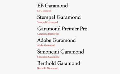
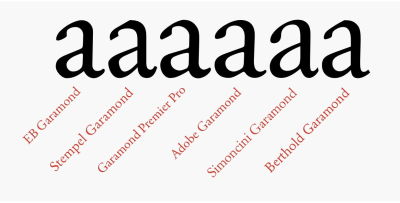
Typeface designers and foundries supplying these versions of Garamond say theirs is the best, but which one is right? They were all designed for slightly different contexts and technological times. It would be interesting to find out what the performance differences are between these very similar typefaces.
Furthermore, if we compare a typeface like Minion Pro (which is quite robust and sturdy) against a typeface like Monotype Baskerville, we can observe that Minion Pro has more consistent stroke widths and slightly less personality than Monotype Baskerville. In contrast, Monotype Baskerville has more variance in stroke width, with more of a posh and sophisticated personality than Minion Pro. Therefore, how would these differences affect their performance? Perhaps there is no one right answer to these questions.
I certainly feel, in 2022, that we, as designers, researchers, and academics, have certainly built up some fairly sensible and reasonable conclusions based on previous research and previous arguments over the last years. Nevertheless, the questions seem to remain around — what are the characteristics that make typefaces work a little bit better, and what would be “more advisable?”
Kai Bernau’s Neutral Typeface
Neutral, a typeface designed by Kai Bernau, is an interesting example of how an ideal utopian legible typeface might look and be like. We can see in the image below that Bernau has analyzed the fine and very subtle characteristics that are common in neutral typefaces, such Univers, Helvetica, TheSans, and so on.
The term “neutral” basically refers to a typeface design that does not say much or does not say anything and that has a very “no style/anonymous” feel and voice — like the color grey. Think of it like speaking to someone with little personality or who has a not-obvious personality. In his design, Bernau is attempting to find out what an almost merged letter skeleton of all these neutral typefaces would look like when comparing all these typefaces.
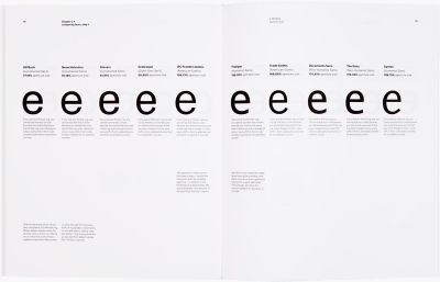
Kai Bernau’s Neutral typeface began as a graduation project at KABK (the Academy of Art, The Hague), taking inspiration from typefaces that seem ageless, remain fresh and relevant even decades after they were designed. His project was constructed based on a set of parameters derived by measuring and averaging a number of popular 20th-century sans serif fonts (like Helvetica, Univers, Frutiger, Meta, and TheSans), trying to design the ultimate “neutral” font. It is a very interesting idea that builds on previous best practices to find an optimal solution. This is much more like the conceptual typeface design that we need to see in the future. For more, see the “An Idea of a typeface” article by Kai Bernau.
Can A Utopian Highly Legible Typeface Exist?
Bernau’s typeface aims for neutrality and utopian legibility. However, if I asked the question: what would the world’s most legible sans serif, serif, or slab serif typeface look like? How much better than a typically good highly legible sans serif, serif, or slab serif typeface would it be? Furthermore, is it even worth the effort?
Whatever your thoughts are, it is the designer’s job to design things that work and read well. Adding to this conversation, Sofie Beier (a legibility expert) says:
“In the history of design, there are many examples of designers proposing an “ideal typeface”. The fact is that there is no optimal typeface style. A thorough literature review shows that typeface legibility varies significantly depending on the reading situation.”
— Sofie Beier in Bringing Together Science And Typography
Perhaps, we should consider developing a central list of the elements, research, data, sources, and aspects to create legible and usable typefaces, so we can easily choose? This may lead to better typeface design decisions, choices, and better typefaces in the future.
Changing The Change: From What To What?
Another reason why we need to measure typefaces and know how well they work is highlighted by David Sless, information design pioneer and director of the Communication Research Institute in Australia, in his article “Changing the change: from what to what?”:
“Change is good. Design is all about change; bringing something into the world that didn’t exist before; changing from an undesirable to a desirable state of affairs; improvement; progress! And now we are even changing the change! […]
Benchmarking is that part of the design process where you ask how an existing system is performing against agreed performance requirements set at the scoping stage of the design process. Putting the matter simply, if you change something and then claim that the change is an improvement, you need to have some before and after measurements. […]
Much design work… is redesign rather than design from scratch. An important part of redesign is to ask: where are we right now? What is the current performance of this design? What is happening in the world now which we don’t want to happen, or we’d like to change? Where do we want to go? What do we want to achieve here? […]
So I’m all in favour of change, even changing the change. But we need to know what we are changing from. […]
Unless we look carefully at what we are doing now before making a change, we might throw out some good bits.”
— David Sless
This is one of the reasons we need to measure typefaces and know how well they perform. That way, when we design new ones in the future, we can learn from past data and then use that knowledge in future typefaces, rather than relying on a bit of research and personal self-expression.
Redesigning typefaces makes us end up in the same place (whether good or bad), and we are not necessarily making and designing better typefaces. Although typeface design provides us with both the aesthetic appeal to meet the functional needs, it is the functional need and its functional aspect that is frequently missing.
With the thoughts mentioned above, I would like to raise another debate, because I know that typographic discussions and debates are usually beneficial and productive for all involved.
Are Typefaces Tools, Software, Objects, Products Or What?
This is a question that is not easily answered. It depends on what position you decide to take. Kris Sowersby, director of Klim Type Foundry argues that typefaces are not tools in his article “A typeface is not a tool”:
“In theory, designers could perform all of their typesetting jobs with the same one or two typefaces. But they don’t. I can almost guarantee this comes down to aesthetics. They choose a typeface for its emotive, visceral and visual qualities — how it looks and feels. Designers don’t use typefaces like a builder uses a hammer.
The function of a typeface is to communicate visually and culturally.”
— Kris Sowersby
Though Sowersby points out a functional aspect, he makes no mention that typefaces are used to achieve certain and precise responses and effects from users’ behaviors and emotional responses. For example, I might choose typefaces specifically because of their legibility — when a typeface is considered legible and easy-to-read by people with less-than-good eyesight. And so a well-designed typeface (or tool) is crucial.
Another reason I may choose a typeface is to bring a certain “more ideal” and to bring a “more specific” response and behavior from people. So, I may also choose a typeface as a tool for better communication with specific audiences. This is similar to why we choose a hammer over another, even though they all do the same job. There are 100s of different types of hammers, but builders do seem to have an “emotional favorite.”
In addition, typefaces can be more or less legible on different screens and monitor resolutions because they can be rendered with varying degrees of quality and sharpness.
Let us move on to a more precise and probably more important aspect, and that is testing data value.
The Two Types Of Testing Data: “Subjective” And “Objective”
When testing, there are two types of testing data: subjective (meaning mainly coming from a personal view and opinion) and objective (coming from a result from reality or the ability to do or not do something). They are valuable in their own ways. However, an objective measurement may be more desirable. It is important to know the difference between the two. Below is a brief description of both as it applies to our topic:
- A subjective measure:
A user says: “I can read this typeface better.” This may be the case and what the person feels. However, if the measurement, in this case, is “better,” then the questions are: how much better, what kind of a measure and how accurate a measure is “better,” and how much better (than what) is it? However, what one person likes may not be what another one likes. Is it better because I said so? They may not be able to describe or know why they like it, but they just say: “I like it.” Because this measure is based on what the person feels, it is not accurately measurable. - An objective measure:
A user identified a letter correctly and within a certain timeframe. The data is either correct or incorrect, they could or could not do it, and they did or did not do it in a measurable recorded time span.
Kevin Larson, principal researcher on Microsoft’s Advanced Reading Technologies team, explains:
“While I generally agree with you on the importance of objective data, and most of my work has collected reading speed measures of one kind or another, I think there can be interesting subjective data.”
— Kevin Larson
David Sless also states in his article “Choosing the right method for testing:”
“The first is that inexperienced, untrained, or misguided information designers ask the wrong questions: what do people think of my designs? Which of my designs do they prefer? What must my artifact look like? What information must my artifact contain? The second reason is that asking the wrong questions about the design, leads inevitably to certain ways of asking questions — methods of testing which give inadequate answers.”
— David Sless
David Sless continues the discussion by adding [slightly reworded and edited by me]:
“Attitude and opinion surveys, preference tests, expert opinion, and content-based design, are based on the wrong questions and are highly subjective because they come from people’s views, knowledge build-ups and preferences… The right, or much better, more easily measurable and more accurate question, is based on user performance, setting them tasks to do, then using diagnostic testing to see if they can or cannot do the tasks, and making any notes, possibly recording how long it took them to do it. A far more useful question to ask before you design a new information artifact or redesign an existing one is: what do I want people to be able to do with this artifact?”
In summary, the most important question is: what do we want the users to do? Based on the previous examples and discussions in this article, we can see that not all data or information gained is necessarily useful or accurate.
What Do We Want People To Do With Highly Legible Typefaces?
Consulting Sless’ article “Changing the change: from what to what?” again:
“A far more useful question to ask before you design a new information artifact or redesign an existing one is: what do I want people to be able to do with this artifact?”
— David Sless
Let’s try to outline what we want people to do with highly legible typefaces for extended reading, like reading large amounts of information, effectively and precisely:
- We want them to be able to recognize what each letter, word, and symbol is;
- We want the typeface to reflect and fit the content and message for the typeface to enhance and support it;
- We want them to understand, absorb and comprehend as much of the information as possible;
- We want to encourage, sustain and enable high motivation levels when looking at and reading the text;
- We want them to maybe form a bond with the text and typography, feeling that the information is high quality, respectful and worthy;
- We want to tire them as little as possible;
- We want to provide typography in the most efficient way, such as leading, tracking, kerning, typeface size, color, line length, hyphenation, capitalization, and word spacing;
- We want different categories of people — like people with vision impairments, people with low vision or very bad eyesight, people with dyslexia or aphasia, or who have specific letter requirements, like children learning to read — to at least have letters and symbols designed to support or fit their needs as best as possible. We want to allow accessibility via OpenType or stylistic options with the typeface, so they are available to use if needed. These points could be extended to language support as well.
More Coming Up In Part 2
Let us dive into more of these amazing complex issues (as I said they would be) in the second part of this article — Measuring The Performance Of Typefaces For Users (Part 2). We will look deeply at how we can test typefaces, how to get the best out of every aspect of the process, and more!
Further Reading
- “Micro-Typography: How To Space And Kern Punctuation Marks And Other Symbols,” Thomas Bohm
- “A Reference Guide For Typography In Mobile Web Design,” Suzanne Scacca
- “7 Gorgeous Free And Open-Source Typefaces And When To Use Them,” Noemi Stauffer
- “Exo 2.0, A Contemporary Geometric Sans Serif Font (Freebie),” Vitaly Friedman


 Claim Your Free Spot!
 SurveyJS: White-Label Survey Solution for Your JS App
 Register Free Now
 Celebrating 10 million developers

