Lessons Learned As A Designer-Founder
In the quarter-century I’ve been a product designer, design has matured. We’ve developed tools and practices that allow us to work faster, better, and more in concert with engineers and product managers. Things are a lot less chaotic than they used to be.
But with that change comes the process. I’ve written elsewhere about the dangers of too much process; in the years I spent building the design practice at Heap, I tested and evolved my ideas around Pragmatic Design and its potential to reduce process. I encouraged lower-fidelity artifacts; design briefs instead of endless mockups; product-quality reviews instead of design reviews; and I pushed for early, ongoing collaboration between Design, Product, and Engineering. The results were encouraging: we got more done with a smaller, scrappier team.
In 2020 I left Heap to found Miter, a startup whose mission is deceptively simple: make meetings better. And if Heap was a testing ground for pragmatic design, Miter’s been a crucible for extreme pragmatism: nothing is scrappier than being the only designer, the only PM, and the only engineer. What process is worth keeping? What can be optimized and what can’t? And what needs to change again as we build a team?
That’s useful context if you’re a designer-founder yourself. Still, even if you’re not, it’s valuable to think about why each part of the design process exists and how (and whether) we can optimize it in various ways to be more efficient and better collaborators. So whether you’re designing on a team of ten or ten thousand, this post is for you.
Multiple Hats
Founder or not, designers are often multidisciplinary. Many of us do some PM’ing or make a little prototype if we’re technical. If you’re like me, you enjoy that breadth and chafe a bit when forced to wear just one hat.
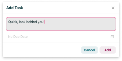
What makes being multidisciplinary an advantage? To begin with, it represents a broader design toolkit. With a little engineering knowledge, you can build working prototypes or even design directly in the codebase if that’s the most efficient way to experiment. And small, straightforward projects can sometimes go straight from brain to product:
As a team grows, understanding diverse perspectives can improve collaboration and results. We can’t predict all the twists and turns our designs will take as they’re built, no matter how diligent we are at thinking through edge cases. I’ve always advocated for design and engineering to proceed in lockstep throughout the process; being a lone designer-engineer has reminded me just how powerful that is. My designs can change radically long after they’re “done.” That’s easy to deal with when it’s just me but feasible to manage as a team, too.
To put it simply, you can substitute a little conversation for a lot of process. And that’s easier when your designers speak a little Engineer, your engineers speak a little Designer, and everybody speaks a little Product. In a quick conversation, you can make trade-offs, generate creative solutions, and reprioritize the backlog as your understanding of ROI evolves.
For example, Miter was built to work whether you’re signed in or not: if you have the URL for a meeting, you can join and participate without an account. That’s a strength for us, and when we set out to build our new Dynamics facilitation feature, we figured that would remain true. But during one sprint planning, Nico — our first engineer — raised some questions about how we’d distinguish among anonymous users given we’re unable to identify them; doing so is central to Dynamics in a way it’s not elsewhere.
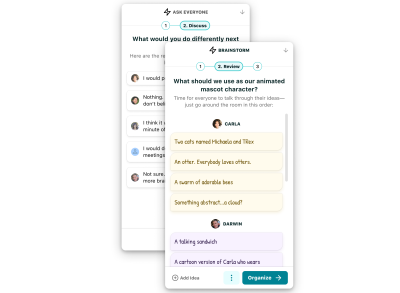
It was doable, but none of the options was easy, so I made the call (Product hat) to make the feature signed-in-only. Nico disabled the button for signed-out users; I recognized we needed to give users a bit more feedback (Design hat), decided that was worth doing before launch (Product hat), and spent a couple of hours implementing it (Engineering hat).
Wear Your Hats Carefully
Designing in code can be efficient, but be careful: it can hurt the design, too. You know all those arguments designers have with engineers? There’s a reason for them. When wearing your engineer hat, you’re looking to simplify: reducing code paths, avoiding async situations that could yield race conditions, and so on. But sometimes, those are the very things that make a design great. As I implement, I find myself pushing back on my designer self, and (because the engineer self is doing the work) the designer self tends to lose. I have to step back periodically, put the design hat on, and consider.
That separation is easy to maintain if you do all your design in design tools, but I don’t recommend going that far. Sometimes things are straightforward enough (as in the Add Task example above) that it’s just not worth the time to design separately. The key is to recognize when you need to be thinking in design mode vs. engineer mode.
Broadcast Your Hats
It’s valuable not only to understand which hat you’re wearing but also to communicate it to others.
One afternoon my co-founder wanted help with a marketing email. I started with the usual designer questions: what’s the goal of this project? What does success look like? All good questions, but he didn’t realize which hat I was wearing. Instead of the curious designer understanding project requirements, he heard the skeptical CEO challenging them. After a few tense moments, we figured it out, and I’ve been more careful to clarify my hat up front.
This matters most when you’re in a leadership role since power dynamics are at play. The CEO of a startup I advised once took this a step further with actual hats: on his desk, he had two baseball caps, one labeled “CEO” and one labeled “Product.”
Know Your Environment
A multidisciplinary approach isn’t always a path to success. Some teams value specialization and want people to stay in their lanes, especially at larger companies. I once received feedback that I needed to “act more like a designer.” It was hard to hear at the moment, but ultimately I concluded it was more about my fit with that team than anything I was doing wrong.
Takeaway
On any team, it’s valuable for everyone to understand each other’s specialties. Actually wearing all those hats may be less valuable at larger companies, but the fastest way to understand is doing. I’d encourage any designer to learn to code and to think holistically about roadmaps and launches as a PM would. How you deploy that knowledge will depend on your team’s dynamic.
The Bare Minimum Design Process
As designers, so much of what we do is communicating and convincing. We run user tests to justify our decisions. We create multiple options because it’s expected. We write up specs, make flow diagrams, or mock every state, so engineers get the details right. We present in critique to get feedback, but also because our peers want a venue to question our decisions.
But for much of Miter’s existence, none of that has been necessary — the only person I really need to communicate with or convince has been myself. So what’s left? What pieces of the process are still valuable?
Rapid Sketching
In general, the design goes from broad and low-fidelity to detailed and high-fidelity: bullet points to sketches to wireframes to mockups to prototypes to implementation. Though, of course, we rarely do all of that.
In the early stages, I’m a big fan of paper sketches. It’s been years since I accepted their messiness and realized how much faster and more powerful they can be than wireframes (which I rarely use anymore). I even advocate for their use in executive reviews.
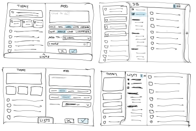
In some ways, sketches are more powerful when you are your only audience because they don’t even have to be legible. What’s that weird blob in the corner? Doesn’t matter, as long as you know. You can tear through permutations quickly, which means I sketch regularly but briefly before moving on to higher-fidelity methods.
Design Briefs
I conceived of the Design Brief when I was at Heap as a substitute both for longer design docs and unnecessarily-exhaustive mockups. We used it (along with sketches) as a fast, early artifact to ground cross-functional discussions — from scoping to prioritization to leadership reviews — before spending significant time on the details.
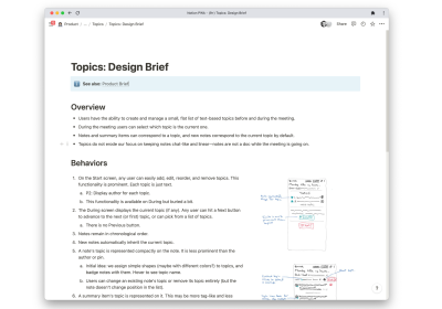
I still use design briefs on larger projects. They don’t take long, and the act of writing them helps me think — taking high-level, hand-wavy ideas to a more practical level. They serve as a record of what I was thinking and why to help clarify for my future self. And we do sometimes conduct design reviews.
I also write product briefs and encourage engineers to write engineering briefs. Both have worked well. The key is not to go overboard, as they’re called “briefs” for a reason. And while it’s useful to have templates for them, I treat those as guidelines rather than requirements.
Hero Mockups
I find mockups to be an indispensable part of the design process. For significant changes and new functionality, it’s much faster to mock it up than to build even a semi-functional prototype. But I only do “hero” mockups — key states of whatever I’m designing rather than a comprehensive set.
As our team grows, those will probably expand, but — just as we did at Heap — I’ll continue to rely on the design brief, real-time conversations, and design-minded engineers rather than go crazy with mocks.
Design System
Miter does have a design system of sorts. I’ve built an extensive set of reusable Figma components, as well as global colors and text styles that I try to use consistently across mocks.
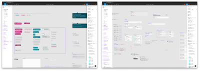
Why bother, with nobody else on the team? Because change is easier, safer, and — most importantly — faster when it’s centralized. If I want to make all our buttons square tomorrow, I can do it once and have it propagate everywhere.
Not everything deserves a component. Sometimes it’s just too early, too prone to change. So when’s the right time to turn one-off work into components? I try to do it when I recognize that a component I built for Project N is needed in Project N+1. (This would be much easier if Figma behaved as advertised, and one could cut-and-paste components from individual files to your library. Hint hint.)
This sort of centralization is even more important in code, and when our mocks and codebase disagree, it’s often the code that wins. To be clear: I don’t see that as a problem. Our canonical style guide is the Global.less file with all our CSS variables. We have one and only one button component, and we use it everywhere. When I write and review code, I’m ruthless about centralization because it’s what will ensure things remain consistent and easy to change.
Five years from now, I don’t want to be a company where simple design improvements get killed because they’d have to be implemented five times over.
Critiques & Reviews
I thrive on feedback; I can’t do my job without it. We don’t have designers on the team, but we do have design-minded engineers and a COO who can critique our UX from both a product and a go-to-market perspective. I do a lot of “What do you think about this?” on Slack, and occasionally, I schedule design reviews.
That said, I miss having other designers around when we brainstorm or critique. I look forward to the point when I can justify hiring a designer to fill out that conversation. In the meantime, there’s no silver bullet. I love the idea of gathering a group of solo designers to review each other’s work across companies, but it’s not something I’ve actually found the time to do. What I do do is take the time to explain my rationale — and design principles in general — to the rest of the team, so over time, they’ll be critiquing from a more and more informed perspective.
Research: Focus On The 20%
Working elsewhere, I’ve been frustrated by the state of user research. It’s underfunded. It’s used to settle cross-functional debates rather than to answer real questions about users. Foundational work takes a back seat to tactical studies. Usability tests are misinterpreted as feedback, so we end up doing what users tell us rather than determining what they need. And too often, research findings are dropped on the floor due to timelines.
At Miter, we’re still too small to hire a dedicated researcher, so I’m responsible for whatever research we do. And because my time is so split, that research really, really needs to count. In making those trade-offs, I rely on a simple truth: designers know how to design. That may seem self-evident, but I think we all forget it sometimes and assume anything that hasn’t been tested has an equal probability of being a disaster.
80% of what a good designer does should be usable. Just as importantly, a good designer has a sense of what lies in that other 20%. I like to think in terms of “UX Risk”: what are the bits of my design that need testing? What’s bold, unique, unknown, ambiguous?
Of course I make mistakes in the other 80%, and it’s essential to watch for unexpected usability issues in the data. For instance, a couple of months ago, we noticed several users had interacted with Miter’s pre-meeting screen but never hit the Start button to start the meeting. We came up with a hypothesis: people thought our topic list was a note-taking UI. Digging into user sessions and looking at average topic length confirmed it. Thankfully, it was an easy fix: make the topics more topic-like and less note-like.

I suspect we’ve done more user research than a typical early-stage startup, and other founders might question that. Still, as we head into our next round of fundraising, I can tell you it’s given me the ability to speak about our target audience and their needs with far more confidence.
Takeaway
What strikes me about my “bare minimum” design process is, in fact, how many of the traditional artifacts I still use. There’s very little that I would do as part of a larger team that I don’t do on my own. The tools I use to explore and iterate are the same ones I’d use to communicate and convince. The biggest difference is in comprehensiveness. So, what can that tell us?
- We have a broad array of tools at our disposal. Use them!
But, use the right tool for the job. Not every project needs every type of artifact. (This is true whether your team uses Agile, “waterfall,” or some other approach.) - Low fidelity can be better than no fidelity.
I’ve always advocated for low fidelity. It’s faster, easier, and in cross-functional situations, can help focus stakeholders on the forest rather than the trees. But skipping over this phase altogether, while tempting when you’re on your own, can be dangerous. A few minutes spent sketching or writing bullet points can clarify and solidify your design at a stage where that’s extremely low cost. - Know your reasons.
Are you mocking this up because you need it or because your stakeholders do? Neither is necessarily bad, but you might want to approach the work differently depending. Or put another way: a mockup whose target audience is you has very different requirements than one whose target is a slide in an All-Hands meeting.
Pitfalls Of The Designer-Founder
The designer’s curse is we see pixels: if the alignment is off, if the border is fuzzy, if the context is lost without an animated transition, and so on. We see it when nobody else does, and it bothers us.
The curse of the early-stage founder, meanwhile, is a lack of resources. My team has greater agility than it will ever have again, but we can’t do more than one or two things at a time.
Those curses come into conflict. On the one hand, nobody can stop you from polishing your product into oblivion. And our industry is littered with the corpses of “design-led” companies that built beautiful things nobody wanted.
On the other hand, a design-led company’s superpower is great design. Unlike your competitors, you can present a polished, elegant, usable face to the world, and that’s worth doing.
So it’s a balance. Wear the design hat, revel in it, and sweat the details. And then swap it for the product hat and keep that detail work under control. I’ve hired engineers who are design-centric enough that I’ve had to stop them from polishing things further, and honestly, that’s probably a good dynamic.
As the leader, if you nitpick the details, then the details will get fixed. And that’s marvelous, but it also carries a cost.
What’s your experience been optimizing the design process? Have you found success, or challenges, as a multidisciplinary designer? I’d love to hear about it! And of course, if you wish your meeting could be better, check out Miter and let me know what you think!


 Claim Your Free Spot!
 Celebrating 10 million developers

 Register Free Now


