The View Transitions API And Delightful UI Animations (Part 2)
Last time we met, I introduced you to the View Transitions API. We started with a simple default crossfade transition and applied it to different use cases involving elements on a page transitioning between two states. One of those examples took the basic idea of adding products to a shopping cart on an e-commerce site and creating a visual transition that indicates an item added to the cart.
The View Transitions API is still considered an experimental feature that’s currently supported only in Chrome at the time I’m writing this, but I’m providing that demo below as well as a video if your browser is unable to support the API.
See the Pen [Add to cart animation v2 - completed [forked]](https://codepen.io/smashingmag/pen/GReJGYV) by Adrian Bece.
That was a fun example! The idea that we can effectively take “snapshots” of an element’s before and after states and generate a transition between them using web standards is amazing.
But did you know that we can do even more than transition elements on the page? In fact, we can transition between two entire pages. The same deal applies to single-page applications (SPA): we can transition between two entire views. The result is an experience that feels a lot like an installed mobile app and the page transitions that have been exclusive to them for some time.
That’s exactly what we’re going to cover in the second half of this two-part series. If you want to review the first part, please do! If you’re ready to plow ahead, then come and follow along.
A Quick Review
The browser does a lot of heavy lifting with the View Transitions API, allowing us to create complex state-based UI and page transitions in a more streamlined way. The API takes a screenshot of the “old” page, performs the DOM update, and when the update is complete, the “new” page is captured.
It’s important to point out that what we see during the transition is replaced content in CSS, just the same as other elements, including images, videos, and iframes. That means they are not actually DOM elements, and that’s important because it avoids potential accessibility and usability issues during the transition.
const transition = document.startViewTransition(() => {
  /* Take screenshot of an outgoing state */
  /* Update the DOM - move the item from one container to another */
   destination.appendChild(card);
  /* Capture the live state and perform a crossfade */
});
With this little bit of JavaScript, we can call the document.startViewTransition function, and we get the View Transition API’s default animation that performs a crossfading transition between the outgoing and incoming element states.
What we need to do, though, is tell the View Transitions API to pay attention to certain UI elements on the page and watch for their position and dimensions. This is where the CSS view-transition-name property comes in. We apply the property to a single element on the page while the transition function is running; transition names must be unique and applied once per page — think of them like an id attribute in HTML.
That being said, we can apply unique view transition names to multiple elements during the transition. Let’s select one element for the time being — we’ll call it .active-element — and give it a view transition name:
.active-item {
  view-transition-name: active-item;
}
We could do this in JavaScript instead:
activeItem.style.viewTransitionName = "active-item";
When we decide to set the transition name, the element itself becomes what’s called a transition element between the outgoing and incoming state change. Other elements still receive the crossfade animation between outgoing and incoming states.
From here, we can use CSS to customize the animation. Specifically, we get a whole new set of pseudo-elements we can use to target and select certain parts of the transition. Let’s say we have a “card” component that we’ve identified and given a transition name. We can define a set of CSS @keyframes, set it on the two states (::view-transition-image-pair(card-active)), then configure the animation at different levels, such as applying a certain animation timing function, delay, or duration to the entire transition group (::view-transition-group(*)), the “old” page (::view-transition-old(root)), or the “new” page (::view-transition-new(root)).
/* Delay remaining card movement */
::view-transition-group(*) {
  animation-timing-function: ease-in-out;
  animation-delay: 0.1s;
  animation-duration: 0.2s;
}

/* Delay container shrinking (shrink after cards have moved) */
::view-transition-old(root),
::view-transition-new(root) {
  animation-delay: 0.2s;
  animation-duration: 0s; /* Avoid crossfade animation, resize instantly */
}

/* Apply custom keyframe animation to old and new state */
::view-transition-image-pair(card-active) {
  animation: popIn 0.5s cubic-bezier(0.7, 2.2, 0.5, 2.2);
}

/* Animation keyframes */
@keyframes popIn { /* ... */ }
Notice how we’re selecting certain UI elements in each pseudo-element, including the entire transition group with the universal selector (*), the root of the old and new states, and the card-active we used to name the watched element.
Before we plow ahead, it’s worth one more reminder that we’re working with an experimental web feature. The latest versions of Chrome, Edge, Opera, and Android Browser currently support the API. Safari has taken a positive position on it, and there’s an open ticket for Firefox adoption. We have to wait for these last two browsers to formally support the API before using it in a production environment.
And even though we have Chromium support, that’s got a bit of nuance to it as only Chrome Canary supports multi-page view transitions at the moment behind the view-transition-on-navigation flag. You can paste the following into the Chrome Canary URL bar to access it:
chrome://flags/#view-transition-on-navigation
Full View Transitions For Multi-Page Applications
Let’s start with multi-page applications (MPA). The examples are more straightforward than they are for SPAs, but we can leverage what we learn about MPAs to help understand view transitions in SPAs. Specifically, we are going to build a static site with the Eleventy framework and create different transitions between the site’s different pages.
Again, MPA view transitions are only supported in Chrome Canary view-transition-on-navigation flag. So, if you’re following along, be sure you’re using Chrome Canary with the feature flag enabled. Either way, I’ll include videos of what we’re making to help demonstrate the concepts, like this one we’re about to tackle:
That looks pretty tricky! But we’re starting with the baseline default crossfade animation for this transition and will take things one step at a time to see how everything adds up.
Starting With The Markup
I want to showcase vanilla JavaScript and CSS implementations of the API so that you can apply it to your own tech stack without needing to re-configure a bunch of stuff. Even If you are unfamiliar with Eleventy, don’t worry because I’ll use the compiled HTML and CSS code in the examples so you can follow along.
Let’s check out the HTML for a .card element. Once Eleventy generates HTML from the template with the data from our Markdown files, we get the following HTML markup.
!-- Item grid element on the listing page (homepage) -->
<a href="/some-path" class="card">
  <figure class="card__figure">
    <picture>
      <!-- Prefer AVIF images -->
      <source type="image/avif" srcset="...">
        <!-- JPG or PNG fallback -->
      <img class="card__image" src="..." width="600" height="600">
    </picture>
    <figcaption class="card__content">
      <h2 class="card__title">Reign Of The Reaper</h2>
      <h3 class="card__subtitle">Sorcerer</h3>
    </figcaption>
  </figure>
</a>
So, what we’re working with is a link with a .card class wrapped around a <figure> that, in turn, contains the <img> in a <picture> that has the <figcaption> as a sibling that also contains its own stuff, including <h2> and <h3> elements. When clicking the .card, we will transition between the current page and the .card’s corresponding link.
Crossfading Transitions
Implementing crossfade transitions in MPAs is actually a one-line snippet. In fact, it’s a <meta> tag that we can drop right into the document <head> alongside other meta information.
<meta name="view-transition" content="same-origin" />
We can still use the document.startViewTransition function to create on-page UI transitions like we did in the examples from the previous article. For crossfade page transitions, we only need to apply this HTML meta tag, and the browser handles the rest for us!
Keep in mind, however, that this is what’s currently only supported in Chrome Canary. The actual implementation might be changed between now and formal adoption. But for now, this is all we need to get the simple crossfade page transitions.
I have to point out how difficult it would be to implement this without the View Transitions API. It’s amazing to see these app-like page transitions between standard HTML documents that run natively in the browser. We’re working directly with the platform!
Transitioning Between Two Pages
We’re going to continue configuring our View Transition with CSS animations. Again, it’s awesome that we can resort to using standard CSS @keyframes rather than some library.
First, let’s check out the project pages and how they are linked together. A user is capable of navigating from the homepage to the item details page and back, as well as navigating between two item details pages.
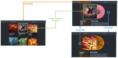
Those diagrams illustrate (1) the origin page, (2) the destination page, (3) the type of transition, and (4) the transition elements. The following is a closer look at the transition elements, i.e., the elements that receive the transition and are tracked by the API.
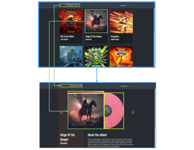
So, what we’re working with are two transition elements: a header and a card component. We will configure those together one at a time.
Header Transition Elements
The default crossfade transition between the pages has already been set, so let’s start by registering the header as a transition element by assigning it a view-transition-name. First, let’s take a peek at the HTML:
<div class="header__wrapper">
  <!-- Link back arrow -->
  <a class="header__link header__link--dynamic" href="/">
    <svg ...><!-- ... --></svg>
  </a>
  <!-- Page title -->
  <h1 class="header__title">
    <a href="/" class="header__link-logo">
      <span class="header__logo--deco">Vinyl</span>Emporium </a>
  </h1>
  <!-- ... -->
</div>
When the user navigates between the homepage and an item details page, the arrow in the header appears and disappears — depending on which direction we’re moving — while the title moves slightly to the right. We can use display: none to handle the visibility.
/* Hide back arrow on the homepage */
.home .header__link--dynamic {
    display: none;
}
We’re actually registering two transition elements within the header: the arrow (.header__link--dynamic) and the title (.header__title). We use the view-transition-name property on both of them to define the names we want to call those elements in the transition:
@supports (view-transition-name: none) {
  .header__link--dynamic {
    view-transition-name: header-link;
  }
  .header__title {
    view-transition-name: header-title;
  }
}
Note how we’re wrapping all of this in a CSS @supports query so it is scoped to browsers that actually support the View Transitions API. So far, so good!
Card Transition Element
Turning our attention to the card component, it’s worth recalling that all view transitions on a page must have unique names. So, rather than set the card’s name up front in CSS, let’s instead assign it to the card once the card’s image is clicked to help avoid potential conflicts.
There are different ways to assign a view-transition-name to the clicked card. For example, we can use mouse events. For this demo, however, I’ve decided to use the Navigation API because it’s a good excuse to work with it and put its ability to track back and forward browser navigation to use. Specifically, we can use it to intercept a navigation event and use a query selector on the card image containing the matching target href that has been clicked on to assign a name for the transitioning element.
// Utility function for applying view-transition-name to clicked element
function applyTag(url) {
  // Select an image in a link matching the link that has been clicked on.
  const image = document.querySelector(
    `a[href="${url.pathname}"] .card__image`
  );
  if (!image) return;
  image.style.viewTransitionName = "product-image";
}

// Intercept the navigation event.
navigation.addEventListener("navigate", (event) => {
  const toUrl = new URL(event.destination.url);

  // Return if origins do not match or if API is not supported.
  if (!document.startViewTransition || location.origin !== toUrl.origin) {
    return;
  }
  applyTag(toUrl);
});
The item details page is our destination, and we can assign the view-transition-name property to it directly in CSS since it is always going to be a matching image.
<section class="product__media-wrapper" style="--cover-background-color: #fe917d">
  <nav class="product__nav">
    <span>
      <a class="product__link product__link--prev" href="...">
        <svg ... ><!-- ... --></svg>
      </a>
    </span>
    <span>
      <a class="product__link product__link--next" href="...">
        <svg ... ><!-- ... --></svg>
      </a>
    </span>
  </nav>
  <article class="product__media">
    <div class="product__image">
      <!-- LP sleeve cover image -->
      <picture>
        <source type="image/avif" srcset="...">
        <img src="..." width="600" height="600">
      </picture>
    </div>
    <div class="product__image--deco">
      <!-- LP image -->
      <picture>
        <source type="image/avif" srcset="...">
        <img src="..." width="600" height="600">
      </picture>
    </div>
  </article>
</section>
We can also customize the animations we’ve just created using standard CSS animation properties. For now, let’s merely play around with the animation’s duration and easing function.
@supports (view-transition-name: none) {
  .product__image {
    view-transition-name: product-image;
  }
  ::view-transition-old(*),
  ::view-transition-new(*) {
    animation-timing-function: ease-in-out;
    animation-duration: 0.25s;
  }
  ::view-transition-group(product-image) {
    animation-timing-function: cubic-bezier(0.22, 1, 0.36, 1);
    animation-duration: 0.4s;
  }
}
And just like that, we have created a neat page transition! And all we really did was assign a couple of transition elements and adjust their duration and timing functions to get the final result.
Working With More Complex Animations
Let’s move on to additional, more complex animations that run after the page transition has finished. We won’t actually use them just yet, but we are setting them up so that we can use them for transitioning between two product details pages.
Why are we going with the CSS animations, all of a sudden? If you recall from the first article in this two-part series, the page is not interactive while the View Transitions API is running. Although the transition animations look smooth and gorgeous, we want to keep them as short as possible so we don’t make the user wait for too long to interact with the page. We also want to be able to interrupt the animation when the user clicks on a link.
The following CSS defines two sets of animation @keyframes: one for the album to open up its cover, and another for the album itself to rollOut of the sleeve.
/* LP gatefold sleeve open animation and styles */
.product__media::before {
  /* Hide until animatton begins (avoid z-index issues) */
  opacity: 0;
  /* ... */
  animation: open 0.25s 0.45s ease-out forwards;
}

/* LP roll out animation and styles */
.product__image--deco {
  /* Hide until animatton begins (avoid z-index issues) */
  opacity: 0;
  /* ... */
  animation: rollOut 0.6s 0.45s ease-out forwards;
}

@keyframes open {
  from {
    opacity: 1;
    transform: rotateZ(0);
  }
  to {
    opacity: 1;
    transform: rotateZ(-1.7deg);
  }
}

@keyframes rollOut {
  from {
    opacity: 1;
    transform: translateX(0) translateY(-50%) rotateZ(-45deg);
  }
  to {
    opacity: 1;
    transform: translateX(55%) translateY(-50%) rotateZ(18deg);
  }
}
Check it out! Our CSS animations are now included in the transitions.
We aren’t quite done yet. We haven’t actually applied the animations. Let’s do that before playing with the animation a little more.
Transitioning Between Two Items Linked To Different Pages
OK, so we’ve already completed an example of a view transition between two pages in an MPA. We did it by connecting the site’s global navigation to any product details page when clicking either on the header link or the card component.
We also just created two CSS animations that we haven’t put to use. That is what we’ll do next to set a view transition when navigating between two product pages. For this one, we will create a transition on the product images by clicking on the left or right arrows on either side of the product to view the previous or next product, respectively.
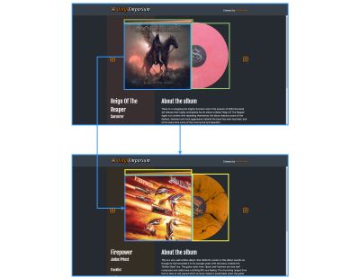
To do that, let’s start by defining our transition elements and assign transition names to the elements we’re transitioning between the product image (.product__image--deco) and the product disc behind the image (.product__media::before).
@supports (view-transition-name: none) {
  .product__image--deco {
    view-transition-name: product-lp;
  }
 .product__media::before {
    view-transition-name: flap;
  }
  ::view-transition-group(product-lp) {
    animation-duration: 0.25s;
    animation-timing-function: ease-in;
  }
  ::view-transition-old(product-lp),
  ::view-transition-new(product-lp) {
    /* Removed the crossfade animation */
    mix-blend-mode: normal;
    animation: none;
  }
}
Notice how we had to remove the crossfade animation from the product image’s old (::view-transition-old(product-lp)) and new (::view-transition-new(product-lp)) states. So, for now, at least, the album disc changes instantly the moment it’s positioned back behind the album image.
But doing this messed up the transition between our global header navigation and product details pages. Navigating from the item details page back to the homepage results in the album disc remaining visible until the view transition finishes rather than running when we need it to.
The way we fix this is by removing transitions when returning to a previous state. When we’re working with elaborate page transitions like this one, we have to be mindful of all the different types of navigation paths that can occur and ensure transitions run smoothly regardless of which route a user takes or which direction they navigate.
Just like we can assign view-transition-name attributes when needed, we can also remove them to restore the element’s default crossfade transition. Let’s once again use the Navigation API, this time to intercept the navigation event on the item details page. If the user is navigating back to the homepage, we’ll simply set the view-transition-name of the album disc element to none to prevent conflicts.
function removeTag() {
  const image = document.querySelector(`.product__image--deco`);
  image.style.viewTransitionName = "none";
}

navigation.addEventListener("navigate", (event) => {
  const toUrl = new URL(event.destination.url);

  if (!document.startViewTransition || location.origin !== toUrl.origin) {
    return;
  }

  // Remove view-transition-name from the LP if navigating to the homepage.
  if (toUrl.pathname === "/") {
    removeTag();
  }
});
Now, all our bases are covered, and we’ve managed to create this seemingly complex page transition with relatively little effort! The crossfade transition between pages works right out of the box with a single meta tag added to the document <head>. All we do from there is set transition names on elements and fiddle with CSS animation properties and @keyframes to make adjustments.
Demo
The following demo includes the code snippets that are directly relevant to the View Transitions API and its implementation. If you are curious about the complete codebase or want to play around with the example, feel free to check out the source code in this GitHub repository. Otherwise, a live demo is available below:
Full View Transitions For Single-Page Applications
The View Transition API gets a little tricky in single-page applications (SPA). Once again, we need to rely on the document.startViewTransition function because everything is handled and rendered with JavaScript. Luckily, routing libraries exist, like react-router, and they have already implemented page transitions with the View Transitions API as an opt-in. Other libraries are following suit.
In this next tutorial, we’ll use react-router to create the transitions captured in the following video:
There are a few different types of transitions happening there, and we are going to make all of them. Those include:
- Transition between category pages;
- Transition between a category page and a product details page;
- Transition the product image on a product details page to a larger view.
We’ll begin by setting up react-router before tackling the first transition between category pages.
React Router Setup
Let’s start by setting up our router and main page components. The basic setup is this: we have a homepage that represents one product category, additional pages for other categories, and pages for each individual product.
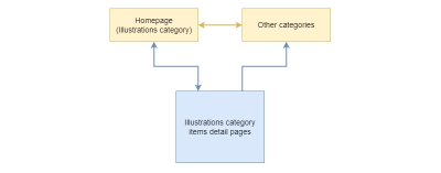
Let’s configure the router to match that structure. Each route gets a loader function to handle page data.
import { createBrowserRouter, RouterProvider } from "react-router-dom";
import Category, { loader as categoryLoader } from "./pages/Category";
import Details, { loader as detailsLoader } from "./pages/Details";
import Layout from "./components/Layout";

/* Other imports */

const router = createBrowserRouter([
  {
    /* Shared layout for all routes */
    element: <Layout />,
    children: [
      {
        /* Homepage is going to load a default (first) category */
        path: "/",
        element: <Category />,
        loader: categoryLoader,
      },
      {
      /* Other categories */
        path: "/:category",
        element: <Category />,
        loader: categoryLoader,
      },
      {
        /* Item details page */
        path: "/:category/product/:slug",
        element: <Details />,
        loader: detailsLoader,
      },
    ],
  },
]);

const root = ReactDOM.createRoot(document.getElementById("root"));
root.render(
  <React.StrictMode>
    <RouterProvider router={router} />
  </React.StrictMode>
);
With this, we have established the routing structure for the app:
- Homepage (
/); - Category page (
/:category); - Product details page (
/:category/product/:slug).
And depending on which route we are on, the app renders a Layout component. That’s all we need as far as setting up the routes that we’ll use to transition between views. Now, we can start working on our first transition: between two category pages.
Transition Between Category Pages
We’ll start by implementing the transition between category pages. The transition performs a crossfade animation between views. The only part of the UI that does not participate in the transition is the bottom border of the category filter menu, which provides a visual indication for the active category filter and moves between the formerly active category filter and the currently active category filter that we will eventually register as a transition element.
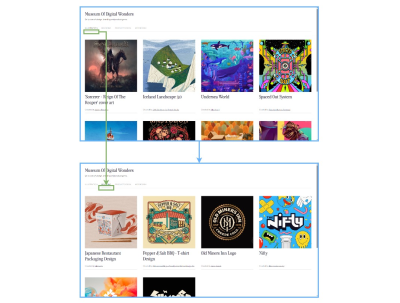
Since we’re using react-router, we get its web-based routing solution, react-router-dom, baked right in, giving us access to the DOM bindings — or router components we need to keep the UI in sync with the current route as well as a component for navigational links. That’s also where we gain access to the View Transitions API implementation.
Specifically, we will use the component for navigation links (Link) with the unstable_viewTransition prop that tells the react-router to run the View Transitions API when switching page contents.
import { Link, useLocation } from "react-router-dom";
/* Other imports */

const NavLink = ({ slug, title, id }) => {
  const { pathname } = useLocation();
  /* Check if the current nav link is active */
  const isMatch = slug === "/" ? pathname === "/" : pathname.includes(slug);
  return (
    <li key={id}>
      <Link
        className={isMatch ? "nav__link nav__link--current" : "nav__link"}
        to={slug}
        unstable_viewTransition
      >
        {title}
      </Link>
    </li>
  );
};

const Nav = () => {
  return
    <nav className={"nav"}>
      <ul className="nav__list">
        {categories.items.map((item) => (
          <NavLink {...item} />
        ))}
      </ul>
    </nav>
  );
};
That is literally all we need to register and run the default crossfading view transition! That’s again because react-router-dom is giving us access to the View Transitions API and does the heavy lifting to abstract the process of setting transitions on elements and views.
Creating The Transition Elements
We only have one UI element that gets its own transition and a name for it, and that’s the visual indicator for the actively selected product category filter in the app’s navigation. While the app transitions between category views, it runs another transition on the active indicator that moves its position from the origin category to the destination category.
I know that I had earlier described that visual indicator as a bottom border, but we’re actually going to establish it as a standard HTML horizontal rule (<hr>) element and conditionally render it depending on the current route. So, basically, the <hr> element is fully removed from the DOM when a view transition is triggered, and we re-render it in the DOM under whatever NavLink component represents the current route.
We want this transition only to run if the navigation is visible, so we’ll use the react-intersection-observer helper to check if the element is visible and, if it is, assign it a viewTransitionName in an inline style.
import { useInView } from "react-intersection-observer";
/* Other imports */

const NavLink = ({ slug, title, id }) => {
  const { pathname } = useLocation();
  const isMatch = slug === "/" ? pathname === "/" : pathname.includes(slug);
  return (
    <li key={id}>
      <Link
        ref={ref}
        className={isMatch ? "nav__link nav__link--current" : "nav__link"}
        to={slug}
        unstable_viewTransition
      >
        {title}
      </Link>
      {isMatch && (
        <hr
          style={{
            viewTransitionName: inView ? "marker" : "",
          }}
          className="nav__marker"
        />
      )}
    </li>
  );
};
Transitioning Between Two Product Views
So far, we’ve implemented the default crossfade transition between category views and registered the <hr> element we’re using to indicate the current category view as a transition element. Let’s continue by establishing the transition between two product views.
What we want is to register the product view’s main image element as a transition element each time the user navigates from one product to another and for that transition element to actually transition between views. There’s also a case where users can navigate from a product view to a category view that we need to account for by falling back to a crossfade transition in that circumstance.
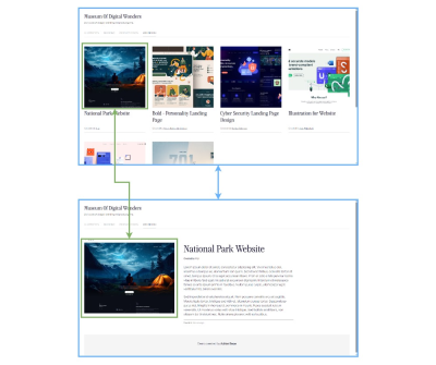
First, let’s take a look at our Card component used in the category views. Once again, react-router-dom makes our job relatively easy, thanks to the unstable_useViewTransitionState hook. The hook accepts a URL string and returns true if there is an active page transition to the target URL, as well as if the transition is using the View Transitions API.
That’s how we’ll make sure that our active image remains a transition element when navigating between a category view and a product view.
import { Link, unstable_useViewTransitionState } from "react-router-dom"; /* Other imports */ const Card = ({ author, category, slug, id, title }) => { /* We'll use the same URL value for the Link and the hook */ const url = `/${category}/product/${slug}`; /* Check if the transition is running for the item details pageURL */ const isTransitioning = unstable_useViewTransitionState(url); return ( <li className="card"><Link unstable_viewTransition to={url} className="card__link"><figure className="card__figure"><imgclassName="card__image"style=}}/* Apply the viewTransitionName if the card has been clicked on */viewTransitionName: isTransitioning ? "item-image" : "",}}src={`/assets/${category}/${id}-min.jpg`}alt=""/>{/* ... */}</figure><div className="card__deco" /></Link></li>);};export default Card;
We know which image in the product view is the transition element, so we can apply the viewTransitionName directly to it rather than having to guess:
import { Link, useLoaderData, unstable_useViewTransitionState, } from "react-router-dom"; /* Other imports */ const Details = () => { const data = useLoaderData(); const { id, category, title, author } = data; return ( <> <section className="item"> {/* ... */} <article className="item__layout"> <div> <imgstyle={{viewTransitionName: "item-image"}}className="item__image"src={`/assets/${category}/${id}-min.jpg`}alt=""/></div>{/* ... */}</article></section></>);};export default Details;
We’re on a good track but have two issues that we need to tackle before moving on to the final transitions.
One is that the Card component’s image (.card__image) contains some CSS that applies a fixed one-to-one aspect ratio and centering for maintaining consistent dimensions no matter what image file is used. Once the user clicks on the Card — the .card-image in a category view — it becomes an .item-image in the product view and should transition into its original state, devoid of those extra styles.
/* Card component image */
.card__image {
  object-fit: cover;
  object-position: 50% 50%;
  aspect-ratio: 1;
  /* ... */
}

/* Product view image */
.item__image {
 /* No aspect-ratio applied */
 /* ... */
}
In other words, the transition element is unaware of the CSS that is responsible for those styles and is unable to track it on its own. We need to customize it with CSS pseudo-elements in the same way we did in the previous article of this two-part series.
Jake Archibald shared this simple and effective CSS snippet for handling the aspect ratio changes. We’re going to use it here with some minor adjustments for our specific use case.
/* This is same as in the Jake Archibald's snippet */
::view-transition-old(item-image),
::view-transition-new(item-image) {
  /* Prevent the default animation,
  so both views remain opacity:1 throughout the transition */
  animation: none;
  /* Use normal blending,
  so the new view sits on top and obscures the old view */
  mix-blend-mode: normal;
  /* Make the height the same as the group,
  meaning the view size might not match its aspect-ratio. */
  height: 100%;
  /* Clip any overflow of the view */
  overflow: clip;
}

/* Transition from item details page to category page */
.category::view-transition-old(item-image) {
  object-fit: cover;
}
.category::view-transition-new(item-image) {
  object-fit: contain;
}
/* Transition from category page to item details page */
.details::view-transition-old(item-image) {
  object-fit: contain;
}
.details::view-transition-new(item-image) {
  object-fit: cover;
}
Next, we’ll use the unstable_useViewTransitionState to conditionally set a viewTransitionName on the image only when the user navigates from the product view back to the category page for that product.
import { Link, useLoaderData, unstable_useViewTransitionState, } from "react-router-dom"; /* Other imports */ const Details = () => { const data = useLoaderData(); const { id, category, title, author } = data;const categoryUrl = `/${category}`;const isTransitioning = unstable_useViewTransitionState(categoryUrl);return ( <> <section className="item"> { /* ... */ } <article className="item__layout"> <div> <imgstyle={{viewTransitionName: isTransitioning ? "item-image" : "",}}className="item__image"src={`/assets/${category}/${id}-min.jpg`}alt=""/></div>{/* ... */}</article></section></>);};export default Details;
Let’s keep this example simple and focus solely on how to conditionally toggle the viewTransitionName parameter based on the target URL.
Transitioning Between Image States
It’s time for the third and final transition we identified for this example: transitioning the product image on a product details page to a larger view. It’s actually less of a transition between views than it is transitioning between two states of the image element.
We can actually leverage the same UI transition we created for the image gallery in the last article. That article demonstrated how to transition between two snapshots of an element — its “old” and “new” states — using a grid of images. Click an image, and it transitions to a larger scale.
The only difference here is that we have to adapt the work we did in that example to React for this example. Otherwise, the main concept remains exactly the same as what we did in the last article.
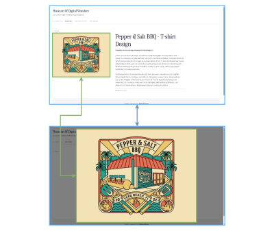
Jake has recommended using React’s flushSync function to make this work. The function forces synchronous and immediate DOM updates inside a given callback. It’s meant to be used sparingly, but it’s okay to use it for running the View Transition API as the target component re-renders.
// Assigns view-transition-name to the image before transition runs
const [isImageTransition, setIsImageTransition] = React.useState(false);

// Applies fixed-positioning and full-width image styles as transition runs
const [isFullImage, setIsFullImage] = React.useState(false);

/* ... */

// State update function, which triggers the DOM update we want to animate
const toggleImageState = () => setIsFullImage((state) => !state);

// Click handler function - toggles both states.
const handleZoom = async () => {
  // Run API only if available.
  if (document.startViewTransition) {
    // Set image as a transition element.
    setIsImageTransition(true);
    const transition = document.startViewTransition(() => {
      // Apply DOM updates and force immediate re-render while.
      // View Transitions API is running.
      flushSync(toggleImageState);
    });
    await transition.finished;
    // Cleanup
    setIsImageTransition(false);
  } else {
    // Fallback
    toggleImageState();
  }
};

/* ... */
With this in place, all we really have to do now is toggle class names and view transition names depending on the state we defined in the previous code.
import React from "react"; import { flushSync } from "react-dom"; /* Other imports */ const Details = () => { /* React state, click handlers, util functions... */ return ( <> <section className="item"> {/* ... */} <article className="item__layout"> <div><buttononClick={handleZoom}className="item__toggle"><imgstyle={{viewTransitionName:isTransitioning || isImageTransition ? "item-image" : "",}}className={isFullImage? "item__image item__image--active": "item__image"}src={`/assets/${category}/${id}-min.jpg`}alt=""/></button></div>{/* ... */}</article></section><asideclassName={isFullImage ? "item__overlay item__overlay--active" : "item__overlay"}/></>);};
We are applying viewTransitionName directly on the image’s style attribute. We could have used boolean variables to toggle a CSS class and set a view-transition-name in CSS instead. The only reason I went with inline styles is to show both approaches in these examples. You can use whichever approach fits your project!
Let’s round this out by refining styles for the overlay that sits behind the image when it is expanded:
.item__overlay--active {
  z-index: 2;
  display: block;
  background: rgba(0, 0, 0, 0.5);
  position: fixed;
  top: 0;
  left: 0;
  width: 100vw;
  height: 100vh;
}

.item__image--active {
  cursor: zoom-out;
  position: absolute;
  z-index: 9;
  top: 50%;
  left: 50%;
  transform: translate3d(-50%, -50%, 0);
  max-width: calc(100vw - 4rem);
  max-height: calc(100vh - 4rem);
}
Demo
The following demonstrates only the code that is directly relevant to the View Transitions API so that it is easier to inspect and use. If you want access to the full code, feel free to get it in this GitHub repo.
Conclusion
We did a lot of work with the View Transitions API in the second half of this brief two-part article series. Together, we implemented full-view transitions in two different contexts, one in a more traditional multi-page application (i.e., website) and another in a single-page application using React.
We started with transitions in a MPA because the process requires fewer dependencies than working with a framework in a SPA. We were able to set the default crossfade transition between two pages — a category page and a product page — and, in the process, we learned how to set view transition names on elements after the transition runs to prevent naming conflicts.
From there, we applied the same concept in a SPA, that is, an application that contains one page but many views. We took a React app for a “Museum of Digital Wonders” and applied transitions between full views, such as navigating between a category view and a product view. We got to see how react-router — and, by extension, react-router-dom — is used to define transitions bound to specific routes. We used it not only to set a crossfade transition between category views and between category and product views but also to set a view transition name on UI elements that also transition in the process.
The View Transitions API is powerful, and I hope you see that after reading this series and following along with the examples we covered together. What used to take a hefty amount of JavaScript is now a somewhat trivial task, and the result is a smoother user experience that irons out the process of moving from one page or view to another.
That said, the View Transitions API’s power and simplicity need the same level of care and consideration for accessibility as any other transition or animation on the web. That includes things like being mindful of user motion preferences and resisting the temptation to put transitions on everything. There’s a fine balance that comes with making accessible interfaces, and motion is certainly included.
References
- CSS View Transitions Module Level 1 Specification (W3C)
- View Transitions API Explainer (GitHub repo)
- View Transitions API (MDN)
- “Smooth And Simple Transitions With The View Transitions API,” Jake Archibald


 Celebrating 10 million developers
 SurveyJS: White-Label Survey Solution for Your JS App
 Register Free Now
 Try ProtoPie AI free →


