Crafting Experiences: Uniting Rikyu’s Wisdom With Brand Experience Principles
In today’s dynamic and highly competitive market, the concept of brand experience is a key aspect of customer engagement: designers, take note.
Brand experience refers to all customer interactions and engagements with a brand, encompassing various brand channels, products, services, and encounters from the company website to unpacking its product. It involves following the user each time she comes into contact with the brand and ensuring that her experience is consistent and pleasant.
Beyond merely designing products or services, the designers or design team (along with the marketing department) must strive to create memorable, emotional, and immersive interactions with their customers. A compelling brand experience attracts and retains customers while reinforcing the brand promise.
Achieving this goal can be daunting but not impossible as long as designers follow specific principles. Recently, I attended a tea ceremony in the Japanese city of Kyoto, where I was introduced to Rikyu’s timeless wisdom. With fascination, I saw that such wisdom and insight could be applied to the principles of a compelling brand experience in the following ways.
The Japanese Tea Ceremony, According to Tea Master Rikyu
The seven principles of Rikyu were developed by Sen no Rikyu, a revered tea master of the 16th century. Each principle encapsulates the essence of the Japanese tea ceremony, emphasizing not only the preparation of tea but also the creation of a harmonious, meaningful experience.

During my own captivating tea ceremony experience, I gained valuable insights and a fresh perspective on how designers can help create meaningful connections between brands and their audiences, much as the tea ceremony has done for generations.
Rule One: Making a Satisfying Bowl of Tea
The first principle of Rikyu goes right to the heart of the tea ceremony: preparing a satisfying bowl of tea.

This deceptively simple principle reminds designers that everything we design for a brand should be able to provide a memorable experience for the final user. We should aim to go beyond simple brand and customer transactions and instead focus on crafting experiences through products and services.
Examples:
- Airbnb,
- Duolingo.
Both of them facilitate extraordinary experiences beyond the basic user interaction of “rent a house for my trip” and “learn a foreign language.”
Airbnb: Redefining Travel Through Experience
Compared to competitors like Booking.com, Airbnb has completely redefined the experience of travelling, adding a strong storytelling aspect.
From the beginning, the brand has offered a way for travelers to truly immerse themselves in the culture and lifestyle of their destinations.
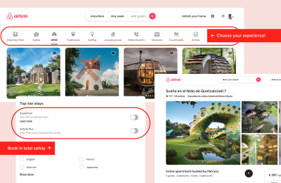
Today, Airbnb’s website shows the brand offering the possibility of “living” in an extraordinary place, from cozy apartments to extravagant castles. We can see that their brand isn’t just about finding the right accommodation but also about creating enduring memories and stories.
Their services have been significantly updated in recent years, offering customers great flexibility to book in total safety from qualified hosts (called Superhosts) with homes that have been reviewed and reflect Airbnb quality standards.
Takeaway: Aim to create experiences that stay with people long after they have interacted with your brand.
Duolingo: Language-Learning as a Playful Adventure
Language learning is often considered a daunting task, one that pushes us out of our comfort zones. But Duolingo, with its playful and gamified approach, is changing that perception.
Their app has transformed language learning into a delightful adventure that anyone can join, even for just five minutes a day.

By creating characters that team up with Duo (the owl mascot), Duolingo injects a sense of companionship and relatability into language learning, making it feel like taking a journey alongside a helpful friend.
Takeaway: Break down complex tasks into enjoyable, bite-sized experiences that improve the long-term experience.
Rule Two: Efficiently Laying the Charcoal for Boiling Water
As I took my place in the tea room, just opposite the tea master, he explained that charcoal plays an extremely important role in the ceremony. It must be precisely placed to encourage airflow, prevent the fire from extinguishing prematurely, and prepare tea at the perfect temperature.

For designers, this translates into creating a comprehensive set of guidelines and rules that dictate how every brand element should look, feel, and behave.
Much like the precise arrangement of charcoal, a well-designed brand system is the foundation of consistent and efficient brand representation that ensures harmony and coherence across every touchpoint.
This may seem obvious, but it is only in the last decade that technology companies have started creating elaborate and complete brand guidelines.
Examples:
- IBM,
- Atlassian.
IBM: Consistency Breeds Loyalty and Recognisability
When we think about the connection between brand and technology, it’s natural to think immediately of Apple and Steve Jobs. So you could be surprised that in fact, IBM was one of the first tech companies to hire a professional graphic designer.
Acclaimed graphic designer Paul Rand designed the iconic IBM logo in 1956. The collaboration between Paul Rand and the company went on for many years, becoming a benchmark for the integration of design principles into the corporate identity of a tech company.
Even today, IBM’s design system Carbon is a testament to the power of simplicity and consistency. Focusing on clarity and functionality, IBM’s brand elements work seamlessly across a diverse range of products and services, including events and workplaces. The Carbon design system is also open source, meaning anyone can contribute to improving it.

Takeaway: A consistent and well-designed brand identity allows for organic growth and expansion without diluting the brand, reinforcing brand loyalty and recognition.
Atlassian: Guiding Future Decisions
Atlassian is a software company with a diverse product portfolio. Their design system promotes scalability and flexibility, while their brand elements are designed to adapt harmoniously across various Atlassian applications.
This adaptability ensures a unified brand experience while accommodating the unique characteristics of each product. It serves as a compass, helping designers navigate the vast landscape of possibilities and ensuring that each design decision made for each Atlassian product aligns with the brand’s essence.

Takeaway: A strong design foundation serves as an invaluable guide as brands evolve and expand their offering through more different products and services.
Rule 3: Providing Warmth in Winter and Coolness in Summer
In the art of the Japanese tea ceremony, the provision of warmth in winter and coolness in summer is a delicate balance, attuned to the emotional and physical states of the participants. This is well-reflected in the tea room’s decoration, and the tea served, depending on the hour and the season, in a bowl chosen by the tea master.
When I attended the tea ceremony, the room was decorated to reflect the spring season. The sweet was also inspired by the blooming cherry blossoms, which were pink and light green. The door to the garden was left open so that we could appreciate the scent of fresh blossoms in the gentle spring breeze.

In the design world, this rule translates into the profound understanding and adaptation of experiences to align with customers’ ever-changing needs and emotional states throughout their journey.
Understanding the natural flow of emotions during the user journey allows brands to create responsive experiences that feel personal.
Examples:
- Nike,
- Netflix.
Nike: Versatility in Style and Experience
Nike, better than any other brand leader in sportswear, exemplifies mastery in tailoring brand experiences.
The brand recognizes that customers engage with their products across diverse activities.
For this reason, Nike offers a wide range of products, sometimes presented with mini-websites and beautiful campaigns, each with its own distinct style and purpose.
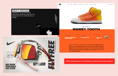
Takeaway: By catering to their users’ varied tastes and needs, brands can tailor experiences to individual preferences and emotions, fostering a deeper connection and resonance.
Netflix: Personalised Home Entertainment
Netflix has deftly pioneered the use of advanced algorithms and artificial intelligence to tailor its content recommendations. These are not only based on geographic location but individual user preferences.
The platform dynamically adjusts preview images and trailers, aiming to match each user’s unique taste.
Their latest update includes Dynamic Sizzle Reel, short personalized clips of upcoming shows that offer each member a unique and effective experience.

It is worth noting, however, that while Netflix puts effort into yielding greater engagement and enjoyment for their members, the subjective nature of taste can sometimes lead to surprises, where a preview may align perfectly with an individual user’s taste, yet the show itself varies in style.
Takeaway: When customizing experiences, designers should create an interplay between familiarity and novelty, tailoring content to individual tastes while respecting the user’s need for both comfort and discovery.
Rule 4: Arranging Flowers as Though They Were in the Field
As I stepped into the tea room, there was a sense of harmony and tranquillity infused by nature forming part of the interior environment.
The flowers were meticulously arranged in a pot as though plucked directly from the field at that very moment. According to Rikyu’s principles, their composition should be an ode to nature’s simplicity and authenticity.

For designers, this rule echoes the importance of using aesthetics to create a visually captivating brand experience that authentically reflects the brand’s values and mission.
The aesthetic choices in design can convey a brand’s essence, creating a harmonious and truthful representation of the brand and its services.
It is important to remember, however, that a visually appealing brand experience is not just about aesthetics alone, but using them to create an emotional and truthful connection with the audience.
Examples:
- Kerrygold,
- WWF.
Kerrygold: Forging Memorable Narratives
The Kerrygold “Magic Pantry” website is testament to the art of visual storytelling, following the brand’s mission to spread authentic Irish recipes and stories from Ireland and its farms.
Through a captivating storytelling game, users explore a recipe or storybook, pick a favorite dish based on their meal, and choose their assistant.
In a perfect story fashion, with a good amount of personalization, users then learn how to cook their chosen recipes using Kerrygold products.
This immersive experience showcases the excellence of Kerrygold’s products and conveys the brand’s commitment to quality and authenticity, while the storybook confers the idea of passing family traditions across the world (so common in the past!)
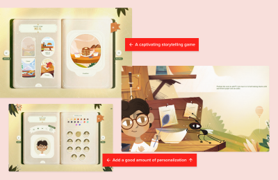
Takeaway: Through visuals, designers need to be authentic, reflecting the truth about the brand. This truthfulness enhances the credibility of the brand’s narrative and establishes deeper user connections.
WWF: Enhancing Memorability Through Beauty and Truth
WWF employs visual storytelling to raise awareness about environmental issues and species in danger of extinction. Their campaign websites always present a beautiful and immersive visual journey that authentically communicates the urgency of their mission.
While these two websites are grounded in the universal act of eating, WWF prompts users to reflect on their habits’ profound impact on the environment.
Both websites ingeniously guide users to think about food consumption in more detail, fostering a journey toward mindful eating that respects both species and the environment.
The websites adopt a quiz-like approach for users to reflect on and reassess their food consumption patterns, fostering a journey toward mindful eating that respects both species and the environment.
Beyond individual insights, the interactive nature of these platforms encourages users to extend their newfound knowledge to their friends, amplifying awareness of crucial topics such as food consumption, CO2 emissions, and sustainable alternatives.
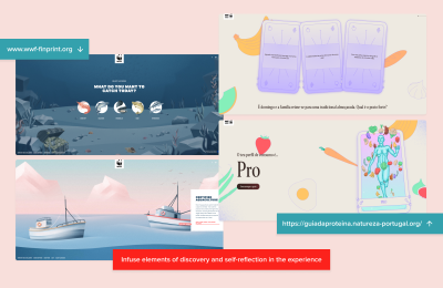
Takeaway: By infusing elements of discovery and self-reflection, designers can help brands promote their values and missions while empowering their users to become ambassadors for change.
Rule 5: Being Ready Ahead of Time
In the Japanese tea ceremony, Rule 5 of Rikyu’s principles places emphasis on the seamless art of preparation, ensuring that everything is ready for the guests.
For their part, guests are expected to arrive on time for their appointment and be mindfully prepared to attend the ceremony.

Designers should note that this principle underscores the significance of foresight, careful planning, and meticulous attention — both to detail and the user’s time.
“
By proactively addressing customer needs and meticulously planning every touchpoint, designers can create a seamless and memorable brand experience that fosters customer satisfaction and loyalty by respecting the value of time.
Examples:
- IKEA,
- Amazon.
IKEA: Anticipating Customer Expectations
IKEA, the global furniture and home goods giant, is a brand that, since the beginning, has used its vast warehouse store layout to anticipate and plan customers’ needs — even the unconscious ones. In fact, you could well be among those shoppers who plan to buy just a few items but leave the store with a trolley full of things they never knew they needed!
When customers enter an IKEA store, they encounter a meticulously planned and organized environment designed as a circular one-way system.
This specific layout of the IKEA store creates a sense of discovery. It encourages shoppers to keep walking through the different departments effortlessly, anticipating or projecting needs that they may have been unaware of before they entered.

Takeaway: Brands should harness the creative ability to tap into customers’ subconscious minds through environment and product display in a way that exceeds their expectations.
Amazon: A Ready-to-go Shopping Experience
Amazon understands that their customers’ time is valuable, creating seamless online and offline experiences that streamline the shopping experience. Their unique systems strive to avoid inconveniences and provide a quick, ready-to-go shopping experience.
For example, their patented one-click ordering system simplifies the checkout process, reducing friction by saving users the trouble of manually selecting or entering settings (like address and payment methods) that are used repeatedly.

Meanwhile, the brick-and-mortar Amazon Go stores exemplify innovation, offering a shopping experience where customers can grab items and go without waiting in line.
These stores work by using the same types of technologies found in self-driving cars, such as computer vision, sensor fusion, and deep learning.
This technology can detect when products are taken or returned to the shelves, tracking them in the customer’s virtual cart. When customers leave the store with their goods, their Amazon account is charged, and a receipt is sent.
Please note: Even though Amazon recently announced the closure of some of its physical shops, the experience remains an example of innovative and efficient shopping methods.
Takeaways: Ingrain the art of preparation by utilizing advanced technologies in the brand’s operational philosophy to avoid inconvenience and provide an effortless customer experience.
Rule 6: Being Prepared in Case It Should Rain
In the context of the Japanese tea ceremony, being prepared for rain means being prepared for unexpected challenges.
According to Rikyu, when having tea, the host must be intentionally calm and ready to accommodate any situation that arises. Of course, this doesn’t just apply to changes in the weather!

For designers crafting brand experiences, this principle underscores the importance of building resilience and adaptability into the core of their strategies.
Examples:
- Zoom,
- Lego.
Zoom: Pioneering Remote Communication
Zoom was mostly used for business meetings before the Covid-19 pandemic struck. When it did, it forced most companies to digitize far more quickly than they otherwise would have done.
Zoom stepped up, improving its features so that everyone, from children to their baby boomer grandparents, found the user interface seamless and easy when connecting from their homes.

One of the most exciting business decisions taken by Zoom was to turn their Freemium tier wholly free and unlimited for K-12 students. This decision was taken during the early stages of the pandemic (March 2020) demonstrating empathy with the challenges faced by K-12 educational institutions.
The program significantly impacted schools, teachers, and students. It allowed for more collaborative and engaging virtual classrooms, thanks to features like Groups and useful interactions like whiteboards, raising hands, and replying with emojis.
As schools gradually returned to in-person learning and adapted to hybrid models, the free program ended. However, the positive impact of Zoom’s support during a critical period underlined the company’s adaptability and responsiveness to societal needs.
Takeaway: Designers should prioritize creating intuitive interfaces and scalable infrastructure that can accommodate surges in demand whilst also considering the impact on society.
Lego: Rebuilding From The Bricks Up
Without continuous adaptability and recognition of the ever-changing landscape of play, even a historic brand like Lego may have closed its doors!
In fact, if you are a Lego fan, you may have noticed that the brand underwent a profound change in the early 2000s.
In 1998, Lego launched an educational initiative known as Lego Mindstorm. This project used Lego’s signature plastic bricks to teach children how to construct and program robots — an innovative concept at the time since Arduino had not yet been introduced.

Lego’s decision to merge traditional play with technology demonstrated their dedication to keeping up with the digital age. Additionally, Lego Mindstorm appealed to a new audience: the broader open-source hardware and DIY electronics community that emerged during the period (and who, in 2005, found a better match in Arduino).
Please note: Even though the program is set to be discontinued by 2024, Lego’s resurgence is often cited as one of the most successful corporate turnarounds.
Lego still continues to thrive, expanding its product lines, collaborating with popular franchises, and maintaining its status as a beloved brand among children and adults alike.
Takeaway: Designers can adapt to change by refocusing on the brand’s core strengths, embracing digital innovation and new targets to exemplify resilience in the face of challenges.
Rule 7: Acting with Utmost Consideration Towards Your Guests
During the tea ceremony in Kyoto, I perceived in every gesture the perfect level of attention to detail, including my response to the tasting and the experience as a whole. I felt the impact of my experience from the moment I entered until long after I left the tea room, even as I write about it now.
This rule highlights the importance of intuitive hospitality and involves creating an environment in which guests feel welcomed, valued, and respected.

For designers, this means facilitating brand experiences that put customer satisfaction first and aim to build strong and lasting relationships.
Brands that excel in this rule go above and beyond to provide uniquely personalized experiences that foster long-term loyalty.
Examples:
- Stardust App,
- Tony’s Chocolonely.
Stardust App: Empowering Women’s Health with Privacy and Compassion
Stardust is an astrology-based menstrual cycle-tracking app that debuted in the Apple Store. It became the most downloaded iPhone app in late June after the U.S. Supreme Court struck down Roe v. Wade (which ended the constitutional right to an abortion and instantly made abortion care illegal in more than a dozen states).
In a world where tracking apps often lack sensitivity, Stardust App emerges with an elegant interface that makes monitoring women’s health a visually pleasing experience. But beyond aesthetics, what really sets Stardust apart is its witty and humorous tone of voice.
Acknowledging the nuances of mood swings and pains associated with periods, Stardust’s notification messages and in-app descriptions resonate with women, adding a delightful touch to a typically challenging time.
This blend of sophistication and humor creates a unique and supportive space for women’s wellness.

Note:
The female-founded app underwent scrutiny from TechCrunch, Vice, and Screen Rant, which questioned their collaboration with third parties and its safety. So on October 29th, 2022, they released a more precise and comprehensive Privacy Policy that explains in a readable way how third parties are used and how the end-to-end encryption works.
They also ensured that all sessions were anonymous so that the app would not be able to associate data with users in case of law enforcement.
Takeaway: Design a brand experience with utmost consideration toward users and that transcends the transactional to foster an enduring sense of trust, empathy, and loyalty.
Tony’s Chocolonely: Sweet Indulgence and Ethical Excellence
In their commitment to fair trade, Tony’s Chocolonely exemplifies acting with utmost consideration towards both consumers and the environment beyond merely offering delicious chocolate.
More specifically, Tony’s Chocolonely has redefined the chocolate industry by championing fair-trade practices. By introducing a sustainable business model, not only do they satisfy the cravings of chocolate enthusiasts, but they also address the broader demand for ethically sourced and produced chocolate.
In every detail, from the wrapper to the chocolate bar itself, Tony’s Chocolonely is a brand on a mission. The intentional unevenness of their chocolate bar is a profound symbol, mirroring the uneven and unjust landscape of the chocolate industry. This urges consumers to choose fairness, ethical sourcing, and a commitment to change.
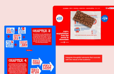
Takeaway: Designers can elevate brand experiences by integrating thoughtful and personalized elements that speak to their industry and resonate with the values of their audience.
Conclusion
In the gentle and artistic practice of the Japanese tea ceremony, I discovered through Rikyu’s seven principles an illuminated path of consideration that resonates beyond the tea room, offering profound insights for crafting compelling brand experiences.
Rikyu’s ancient wisdom serves as a timeless guide, reminding us that creating a memorable experience is a balanced dance between intention and harmony and, above all, the valuable attention of those we invite into our brand spaces as welcome guests.


 SurveyJS: White-Label Survey Solution for Your JS App
 Celebrating 10 million developers
 Register Free Now
 Try ProtoPie AI free →


